Skip to content

January 2016 Papertrey Ink Blog Hop

  • by

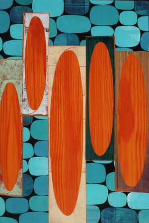
The inspiration piece for this month’s Papertrey Ink Blog Hop was a bit of a challenge. The colors are not ones I would typically gravitate toward, although I find them striking. And there is no clear focal point, just a variety of shapes.

PTIJanuaryBlogHop

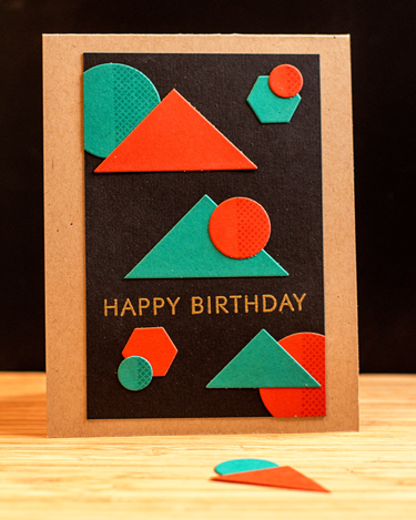
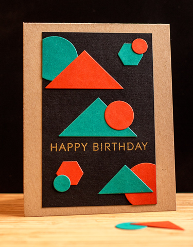
I started with the colors and chose Tropical Teal and Terra Cotta Tile as the closest I could get to the colors above. Then I remembered I’d purchased the dies (but not the stamps) for “Sketched Shapes.” I cut out two sets of the dies and chose the triangles and the circles. I lay them on some black card stock and started moving them around, and this is what I came up with.

PTIJan1

Classic Kraft ended up being the best choice for the card base, and matches pretty well the background color on the largest shape in the inspiration piece. I was pretty happy with this card, but then noticed that some of the shapes in the inspiration piece were darker on one half, and thought I’d try stamping the one half of the circles with the corresponding inks. I ended up using one of the pattern blocks in “Bitty Background Blocks.”

PTIJan2

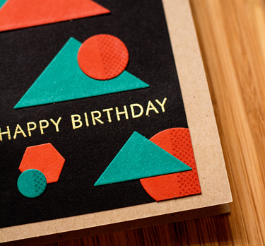
And I like this one even better. Here’s a better look at the stamped circles.

PTIJanClose

The sentiment from “Stylish Sentiments:  Birthday” was embossed with gold. Both cards went in the mail as soon as they were completed since I needed two birthday cards for weekend birthdays. Fortunately, both live locally so I’m pretty sure they arrived on time. 

Addicted to CAS: Red

  • by

A quick post to enter this week’s challenge at Addicted to CAS. 

ATCAS - code word red

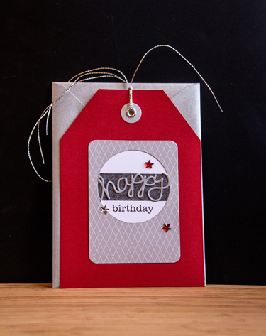
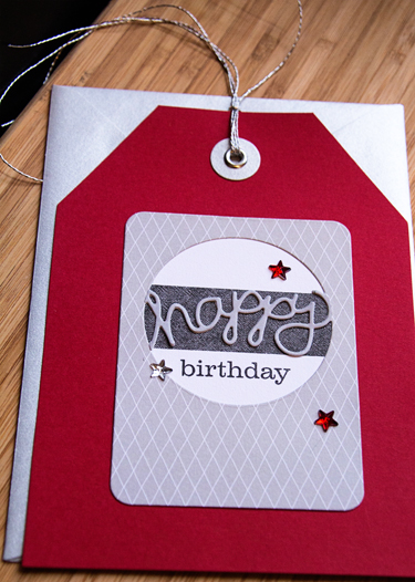
Red is my favorite color, so I wanted to play along. I started with a Paper Source tag and envelope that’s been in my stash for a long time. 

HBJune

I cut some Amy Tangerine “Plus One” patterned paper with Papertrey’s Phrase Play #5 die, backed it with a strip of paper from the scrap dish and some white card stock. I cut a second Phrase Play die from gray card stock, cut out the “happy” and layered it over the original. The stamp was also Phrase Play #5. Three Jenni Bowlin rhinestone stars (also in my stash forever) and some silver thread finished it off.

HBJuneClose

I love the silver envelope, and am glad I still have a couple of these tag sets left in my stash.

SNAP Week 3: Fresh Produce

  • by

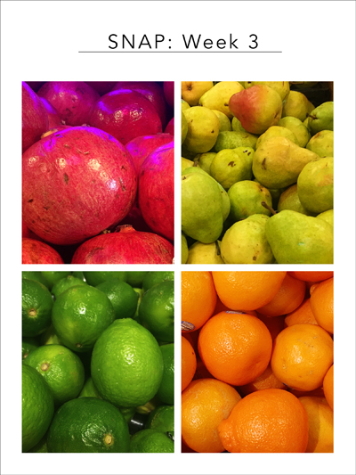
We make an effort to eat and purchase locally three seasons a year, but during the winter it would be slim pickings. I’m so grateful that one of the best grocery chains in the United States makes its home in Rochester. The flagship store is Pittsford is actually a tourist destination, and it’s my go-to grocery store along with Trader Joe’s. I had a couple things in mind for SNAP this week, but after several gray, snowy days here, when I walked into Wegman’s this morning I knew right away I wanted to feature the bright colors of the produce.

SNAP3_blog

At least half, maybe more, of my grocery cart each week is produce (except in the summer when I shop at the local farmers’ markets). It’s not inexpensive, but I figure it’s part of our health plan! Linking to Helena’s meme SNAP, and off to see what other finds folks have made this week.

Memorandum Monday

  • by

A good part of our weekend was spent unpacking, getting groceries, and organizing. We did take time to go see a movie that’s received multiple Oscar nominations, The Big Short. It was both a fascinating and infuriating movie about the financial collapse in the mid-2000’s. One of the most interesting things the director did was to have several of the actors speak directly to the audience. It was effective and instructive, especially for someone like me, who didn’t understand the financial trickery that was really going on!

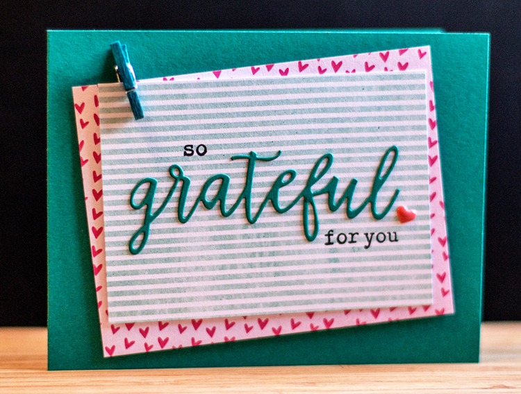
I needed a few more thank you cards, so here’s the “new” for the weekend. When I was at Whim-so-Doodle in St. Petersburg, I picked up a new die by Technique Tuesday. I’m guessing it will get a lot of use, since I make multiple thank-you cards every year. There were also two small open leaf dies that came with it, which I didn’t use this time. After taking the photos this morning, I realized I need to up the aperture on the camera.

Grateful

The cardstock is Papertrey Ink’s Tropical Teal and the patterned papers are from a 6X6 pack by Amy Tangerine called “Rise and  Shine.” I have a collection of these little clothespins, but have long ago lost the tag that tells me who made them. The little enamel heart is from another new goodie by Shimelle.

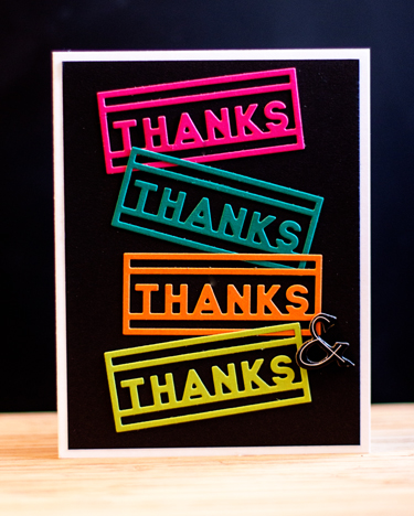
Here are two more thank you cards that I made yesterday afternoon as well.

Thanks1

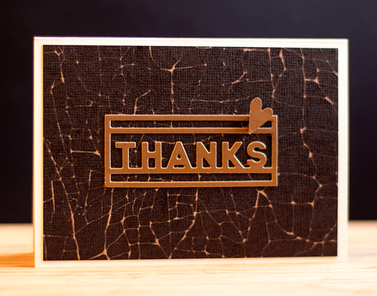
I love the Block Talk Thanks die by PTI, and found this pretty patterned paper in my scrap tin—have no idea where it came from!

Since I had the Block Talk die out, I thought I’d try a variation of a card I pinned some time ago by Sheri Carroll.

3Thanks

I love the bright colors against the black background, a very different look from the inspiration piece.

Waving to everyone on this cold, windy, wintery day in western New York! Hope your week is a good one.


Simon Says Wednesday Challenge: Ombre

  • by

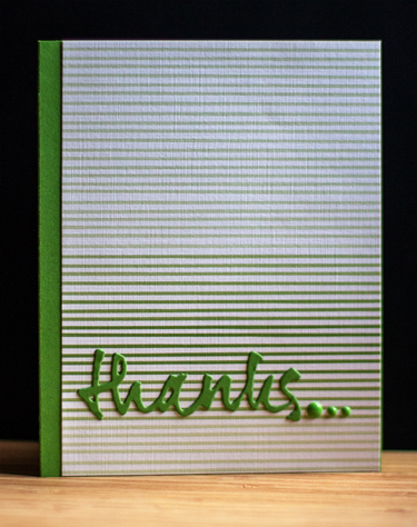
Having been on the road, I’m taking a quick and easy route to entering this week’s Wednesday Challenge, Ombre, at Simon Says. Papertrey Ink recently introduced a new paper pad called Ombre Stripes, and I snatched up a set. I’m always in need of a thank you card, and this was a quick one to create.

Thanks_blog

Among the many things I love about Papertrey Ink is how the products coordinate with one another. The ombre striped paper is a variation on New Leaf card stock, so I trimmed off one edge of the paper so there would be a border on the side. The sentiment is from the Wet Paint series of dies, and the enamel dots are My Mind’s Eye.

I have a whole list of crafty projects I’m hoping to get to now that we’re home, so hopefully, the blog will be a bit busier.

Five in Five

  • by

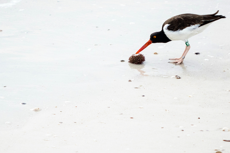
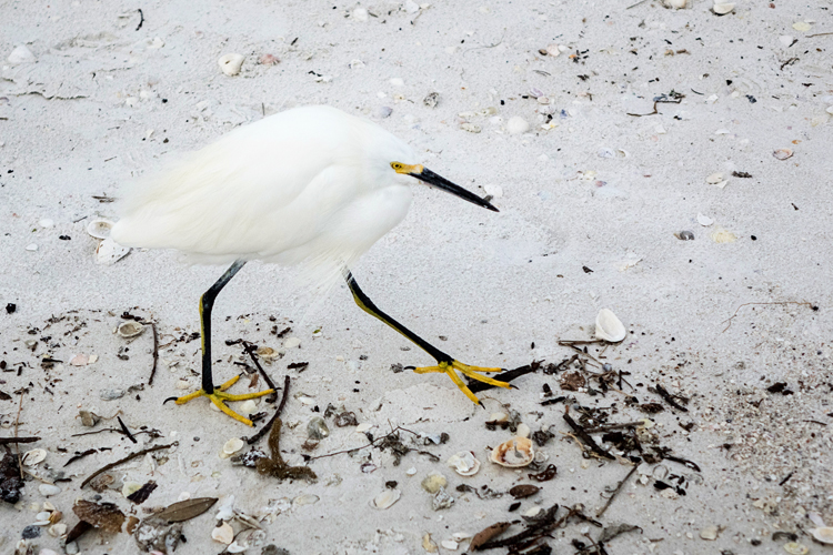
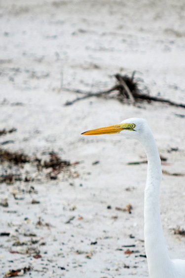
I’ve been following Miriam’s Five in Five posts for some time, and decided this might be a good year to join in with Sandie’s meme. Since I’m not doing a Project 365 this year, I’ll need some motivation to keep the camera at hand. We’re on our way back to the sub-zero cold, so I decided to start my year out with five photos in five minutes on Fort Myers Beach—a much more pleasant outdoor environment than I’m likely to find at home. (Although Sandie’s “5 in 5” of her art journal page is fabulous, so I guess I can’t use the weather as an excuse!)

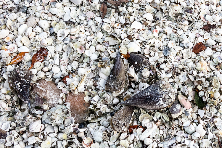
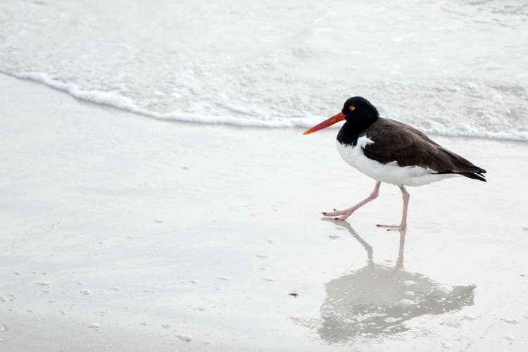
It hasn’t been as warm here as it has the last couple of years, but we’ve managed a long walk every day even though we’re in jeans and sneakers instead of shorts and sandals. Here are five shots in five minutes—lots of birds, of course. They’re my favorite subject when we’re here.

DSC00738ed_blog

DSC00741ed_blog

DSC00743ed_blog

DSC00745ed_blog

DSC00746ed_blog

I’m happy to have a new project to add to my list for 2016.


SNAP: Week 2

  • by

Here’s another photographic peek into our road trip from Rochester to Florida. We always make a stop in St. Petersburg to have lunch at The Red Mesa Catina—one of my favorite Mexican restaurants. I once had a special posole there that I’ve managed to replicate with some success at home, and their chicken quesadillas are the best I’ve ever had. This time I had the Cuban torta which was wonderful, and big enough for two lunches. Our other stop, Whim-So-Doodle, is just around the corner. It’s the best scrapbook/stamp/stationary store I know. Tracy entertains himself with Facebook while I shop.

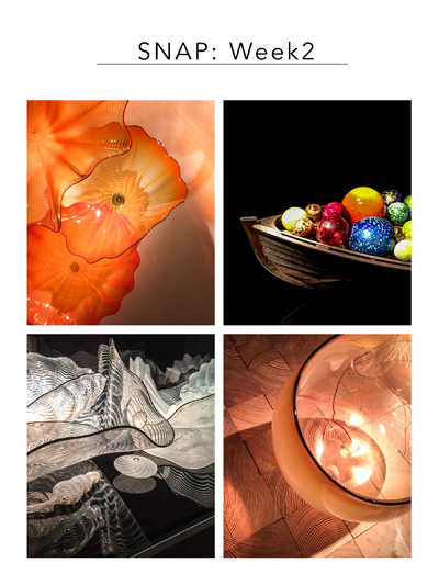
This weekend, after our lunch and my shopping, we went to see the Chihuly Collection. We’ve seen one of his garden installations in Atlanta, and a fabulous show at the deYoung Museum in Golden Gate State Park, so we were really looking forward to seeing some new and different pieces. It was, however, a bit of a disappointment as the collection is much smaller than we anticipated. Many of the larger sets are ones we’ve seen elsewhere, although there were a few new pieces I liked a lot, including the white one below. If you don’t know Dale Chihuly, it’s definitely worth a look at his site.

SNAP2_blog

Check out Helena’s blog for more SNAP collections this week. We’re on our way back to the cold, and evidently very snowy, northeast tomorrow. Although I’ll miss the mild Florida weather, I’m very ready to settle in at home after having been on the road since Christmas. 


Memorandum Monday

  • by

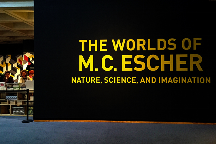
I’m joining in with Sian’s Memorandum Monday which encourages you to share something you learned or someplace new you visited over the weekend. I managed both—a new place and lots of new information. Over the weekend we were on the road from Rochester to Fort Myers Beach. To break up the long days of driving, we try to make a stop along the way. Last March someone recommended the North Carolina Museum of Art in Raleigh, North Carolina. The weather was so bad that trip that we didn’t get to Raleigh in time to visit the museum. This trip the roads were great–no weather to contend with at all, and I’m now glad we missed the museum last year since the special exhibit on now is one of M.C. Escher’s work.

IMG_1530ed_blog

What I knew of M.C. Escher’s work were his fantastic woodcuts of patterns and designs where one image merges into another, or his explorations of space. I didn’t know he had also created wonderful drawings and woodcuts of landscapes, particularly of Italy. The exhibition hung his working drawings, the actual wood blocks, and then the final woodcuts side by side. It was a fabulous exhibit; the largest exhibit of his work ever mounted. Some of his works involving geometry were really beyond my ability to comprehend, although I stood in front of some of them trying hard. I should have known better, since geometry was possibly the most difficult course I ever took! (My mother was the teacher which made it even worse. I just didn’t get it.)

Clearly, I needed some help with this:

IMG_1531ed_blog

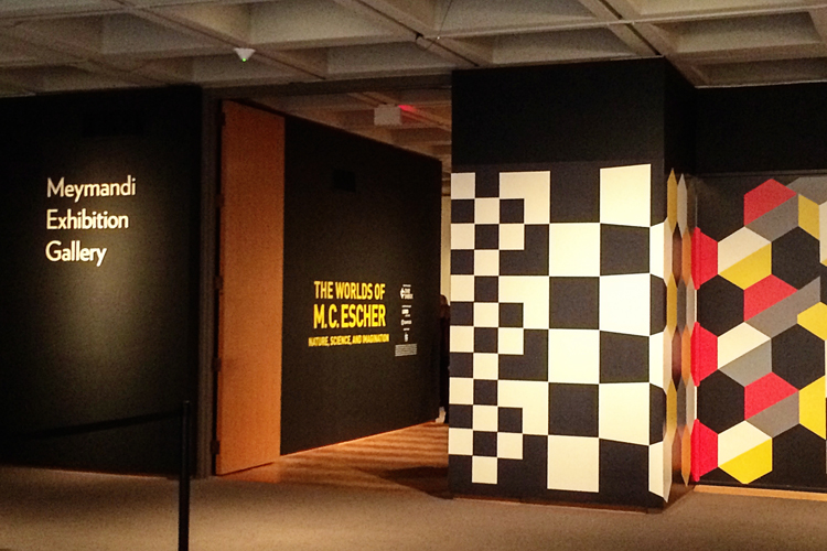
 Here is another photo (photos in the exhibit were, not surprisingly prohibited) of the striking graphics designed for the exhibit.

IMG_1537ed_blog

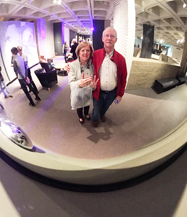
And a fun selfie we took on our way to the cafe for lunch.

IMG_1527ed_blog

We’ll definitely come back again since we didn’t have time to see the permanent collection which is housed in a beautiful modern building. 


SNAP 1 and Winter Scavenger Hunt

  • by

Helena has come up with another great photography meme for 2016. I knew I wanted to start with one of the Winter Scavenger Hunt items, and thought I’d post the rest of the items I’ve found at the same time.

SNAP1

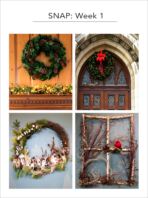
A wreath is #8 on the Winter Scavenger Hunt. The first is over our fireplace, the second hanging above the chapel door at our church, and the bottom two were on the wall at the Chicago Botanic Garden as part of a wreath making competition. I’m quite fond of the rectangular one with the bright red cardinal.

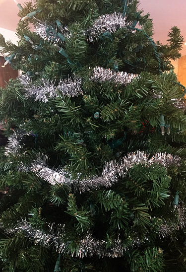
Tinsel is #2. I was beginning to think I’d waited too long for this one, but in the entryway to a restaurant on Sunday I found this tree with silver tinsel.

Tinsel_blog

A star is #4. 

Star_blog

Number 5 is a snowman. I’m pretty sure I’ll find one made of snow before winter is over here, but there hasn’t been enough snow in Rochester (thankfully), and the snow in Chicago wasn’t the right kind for making snowmen (much to Caleb’s disappointment.)

Snowman1_blog

Snowman2_blog

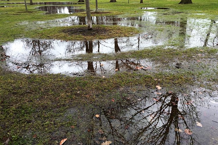
Driving to Whole Foods in Evanston, I passed this park, hopped out of the van, and took this photo of #6: puddle(s).

Puddles_blog

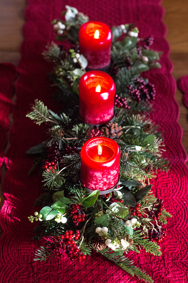
And last, for now, is #15: candlelight on our dining room table.

Candlelight_blog

I’m linking this with Helena’s meme, SNAP, and to Joy and Eileen’s link-up for the Winter Scavenger Hunt. The only item I’m a little worried about is pudding. I think there’s a broader definition in Europe, and I need to do some investigating. 


One Little Word: 2016

  • by

Sometime in the middle of December, I start thinking about my One Little Word for the next year. This year I listed three possibilities and let them rest. Suddenly one of them began to speak to me and seemed like a word that would encompass most of the intentions I’ve set for the new year.
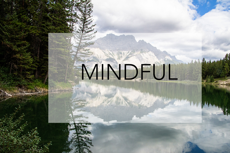
MINDFUL_BLOG
(photo: Johnson Lake, Banff, AB)

I want to be mindful of my relationships with others.

I want to be mindful and attentive to the activities I engage in.

I want to be mindful of my body and how I treat it.

One of the pleasures of being away from home is the time to surf around the internet, and do some research. I’ve done a lot of reading about mindfulness in the last couple of weeks. It all started in November when I attended a Sunday Seminar on Mindfulness. I’ve tried and failed to start a meditation practice over and over again, but the professor presenting the seminar led me to believe I was being far too hard on myself. So, yes, I’m interested in the study of meditation and mindfulness in the more traditional sense. In fact, a friend gave me a wonderful set of books by Thich Nhat Hanh for Christmas.
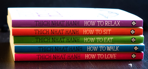
Books

But I look at this word in a more global way for my OLW. The best explanation I’ve found for my intentions was on Mindfulnet.org:

Mindfulness is a way of paying attention to, and seeing clearly whatever is happening in our lives.  It will not eliminate life’s pressures, but it can help us respond to them in a calmer manner that benefits our heart, head, and body. It helps us recognise and step away from habitual, often unconscious emotional and physiological reactions to everyday events. It provides us with a scientifically researched approach to cultivating clarity, insight, and understanding. Practicing mindfulness allows us to be fully present in our life and work, and improve our quality of life.

I think it will help me with the intentions I’ve set for 2016. I limited myself to ten this year. Some are more specific than others, and some you’ll recognize from my 2015 recap. Liz Steel commented in a recent blog post that her “intention becomes a motivation,” and that’s been true for me.

1. Establish Morning and Evening Rituals:

    Morning: An hour to read and reflect: I have a list of reading projects that are perfect for this.

    Evening: Short daily recap; keep a daily gratitude journal.

2. Work to have a fitter, healthier, and trimmer body. I’ve joined Cheri and Melissa in Cathy Zielski’s FIT class, and want to continue the menu planning and food tracking I began in the fall.

3. Block out one day with no commitments/week.

4. Complete five sketches/week.

5. Read three books/month.

6. Complete one online class/month.

7. Purge: craft closet (again), digital folders, and attic.

8. Participate in Helena’s photography meme, Snap.

9. Catch up and continue with Project Life.

10. Work through my stamp collection when making cards; purge those that don’t work for me. Aim for one challenge/week.

We’re home for a brief stay to get Christmas put away, unpack, and repack in order to drive Tracy’s mother’s van to Fort Myer’s Beach for her. Once we return, I can set my focus on making 2016 the year of MINDFULNESS.
Less is More Challenge

  • by

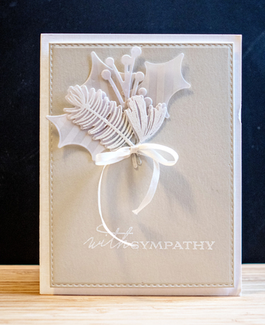
This week’s challenge at Less is More is NEUTRALS. I rarely create a sympathy card with much color, and this one is all neutrals. It might be one of my favorite sympathy cards ever.

SympathyCard

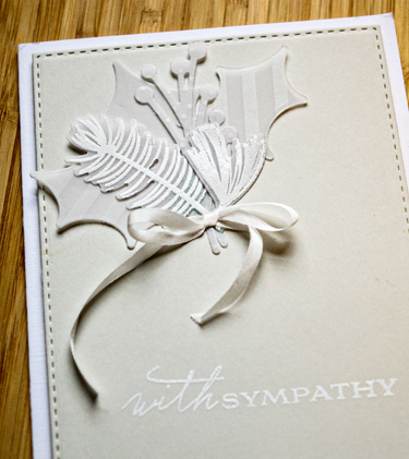
I started with a Fog card cut with Simon Says “Stitched Rectangles,” embossed the sentiment from Papertrey Inks “Botannical Silhouettes” and then arranged a group of die cuts from PTI’s “Spruce and Sprig” cut from a variety of patterned and plain vellum. The silk ribbon bow is also Papertrey Ink. They no longer carry the ribbon, so I use it sparingly. The fog card was then attached to a card of Fresh Linen (also PTI.) Here’s a closer look:

SympathyClose

The first challenge of 2016. I think I’ll try to keep track of the number of challenges I enter this year. I’d like to do one once a week, so 52 by the end of the year would be awesome. Most likely they won’t be week by week, but that’s OK too.