Skip to content

Project Life: October 2015

  • by

I’m plodding along with my Project Life pages, trying to keep ahead of being behind an entire year! Meanwhile, we (fortunately) continue to accumulate photos and wonderful memories, so once the summer is over I need to dedicate myself to scrapping every day! But, for now, here’s another month completed.
Oct1

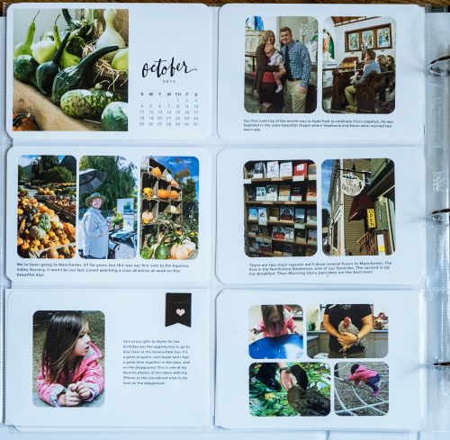
Early in the month, we made a trip to Hyde Park for my grand-nephew’s baptism, and followed it up with a day in Manchester, Vt., one of our favorite getaways. Skylar and I attended our first ZooClass at the Seneca Park Zoo—a wonderful educational program geared to 4-5 year olds. They also have a class for 2-3 year olds.
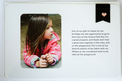
Skylar

Oct2

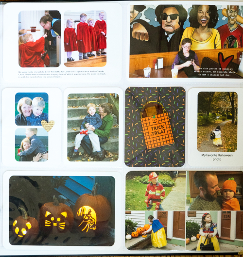
The end of the month found us in Chicago. We were lucky enough to be there for Caleb’s first appearance in the Cherub Choir. I loved this shot of Sarah sitting in front of the fabulous mural at Herm’s Palace in Skokie. It’s my favorite place for a Chicago hot dog, a true indulgence, but delicious! By Halloween, we were home, but I included an Instagram shot of Caleb in his Halloween costume as well as the little girls around the corner with whom we went trick or treating.
Insert

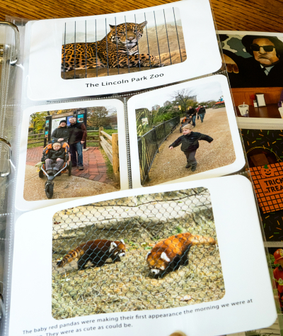
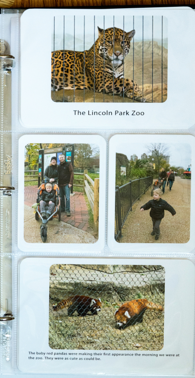
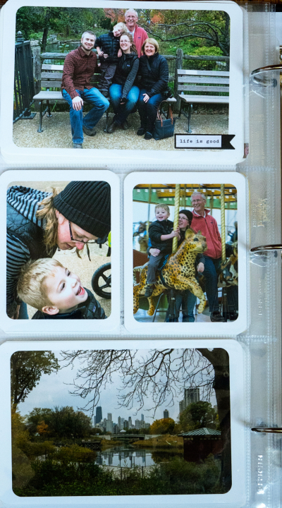
While we were in Chicago, we spent a morning at the Lincoln Park Zoo, and I added an insert with photos to record that special event.
Pg1Insert

Pg2Insert

A gentleman kindly took a family photo of us at the zoo, which turned out to be a favorite of mine.

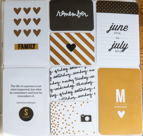
I finished an album after the July 2015 pages, but had never created an opening page for the album, but have gotten that finished as well. 
AlbumOpening

Most of the cards came from the Becky Higgin’s Project Life “Everyday” Edition created by Paislee Press. I painted some wood veneers to spell Family, and as well as the little camera, and added some Papertrey Ink die cuts and stamps to create the date card. There’s quite a bit of gold metallic accent on the cards, but it doesn’t show up in the photos. I die cut the hearts with a Simon Says die and backed it with metallic gold paper to match the gold in the cards. I came across the quote somewhere on the internet a long time ago, printed it out and stuck in the album, knowing it would be great for an opening page. 
2016 Summertime Scavenger Hunt

  • by


It’s July 31st, and time for the July edition of Rinda’s Summertime Photography Scavenger Hunt. 

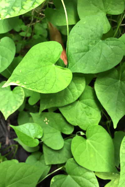
The first item on the list was a “wild heart-a naturally occurring heart.” I wasn’t sure where I’d find that one, but one morning while I was sitting on our patio, I looked up and there they were on our Morning Glory.

IMG_2762ed

Matt and Betsy have a fabulous deck (#7), and while Sarah, Adam, and Caleb were here we spent a lot of time there. That week turned out to be a good one for scavenger hunt photos.

DSC01608ed

It was also the site of another family gathering, # 11.

IMG_2780ed

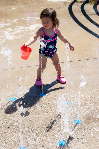
The three grandchildren had lots of fun at a local splash park one day, so here are a couple entries for #9, “someone playing in or around water.” (Think I’ll have some more for this one when we get back from our summer vacation.)

DSC01599ed

DSC01584ed

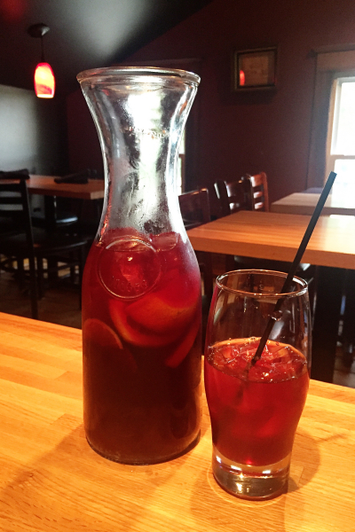
One night we went out to eat, and Adam and I shared a carafe of sangria, #29, “a seasonal cocktail or drink.”( It was so good, I made a pitcher of it this weekend when we entertained our bridge group.)

IMG_2874ed

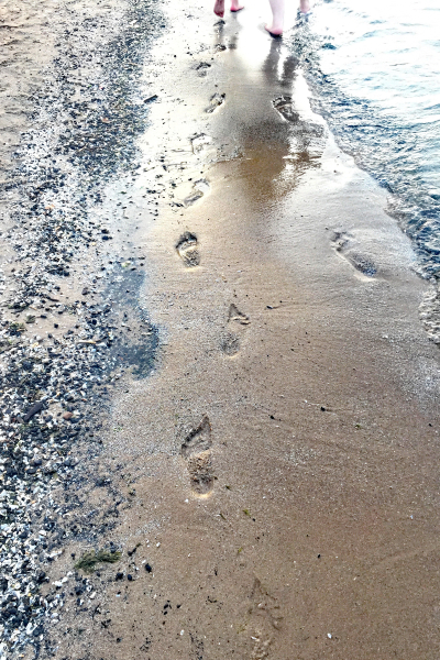
One absolute “must” on Sarah’s list when she visits is a trip to Abbott’s Ice Cream. Their chocolate almond soft ice cream is terrific. We decided to go to the Abbott’s on Lake Ontario so Caleb could ride the carousel there (last year’s item), and we walked along the beach afterwards, and I got #2, “a footprint.”

IMG_2835ed

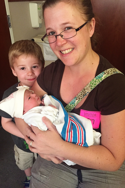
The reason that Sarah, Adam, and Caleb chose the first week of July to visit, was the arrival of Madelyn Tyler. Although I posted this photo earlier, I didn’t mark it as a scavenger hunt item. It’s one of the alternates, “baby.”

IMG_2856ed

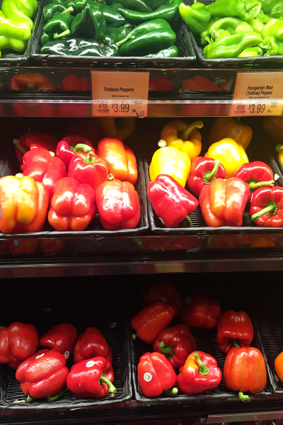
The next two photos were taken at our local grocery store: #17 “fresh produce,” and #18 ” a cart full of groceries.” This was my shopping trip before our family party early in July so it’s the fullest cart of the summer, I’m sure.

IMG_2754ed

IMG_2755ed

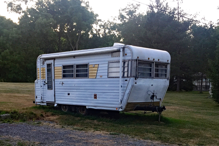
I found #9 on a walk along the cottage road at Honeoye Lake a week or so ago, “a camper.” I’m hoping to find a cuter one along the way, but at least I’ve got it covered.

IMG_2949ed

Earlier this month I posted #13, “the moon,” as a SNAP meme, #12 , “a window” and the other alternate, “a lighthouse,” as part of my Memorandum Monday post. That leaves me with seven items left to find in August and early September. Doable, I hope!


SNAP: The Brickyard Trail

  • by

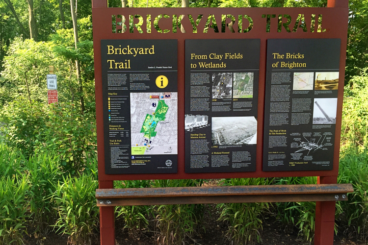
Recently the town of Brighton, where we live, opened a new nature park and trail. Round trip, it’s about 1.75 miles, just the right length for a short and pleasant walk. I’ve walked it several times already, and have enjoyed it. It’s called the Brickyard Trail because it traverses a wetland that was once the site of a large brick making facility. I haven’t taken photos of it yet, but about halfway through the trail there is a wonderful interpretive site that talks about the huge numbers of bricks once made from the clay in this area.

Trailsign

This week’s SNAP collection are four photos from my walks on the trail.

SNAP30

Linking up with Helena’s meme, SNAP, that asks for three or four related photos. It’s a great way to look each week for something new to photograph.

Papertrey Ink Stamp-a-Faire

  • by

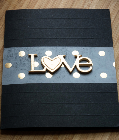
Papertrey Ink hosted a Stamp-a-Faire on Saturday. There were nine different challenges with video tutorials. I’ve watched all the videos, and they were all wonderful, but time constraints limited me to participating in just three of them. I picked the three I thought would be most challenging, since they involved brand new products (gold leaf paint) or techniques I often struggle with. The first was Gilded with Gold by Danielle Flanders. I didn’t start with any vision for a card, and ended up with four cards, none of which I’m thrilled with. Why four? So many attempts went south, I had bits and pieces all over my desk which ended up as cards. I definitely love the gold leaf paint (I purchased Martha Stewart’s), and learned quite a bit in the process. The next time won’t be so fraught with difficulties!

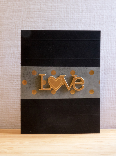
Here’s the first one, and probably my favorite.

Love

Looking for something else entirely, I came across a scrap of vellum with gold dots, and a card I had previously scored six times. The vellum piece fit in exactly right.

Love2

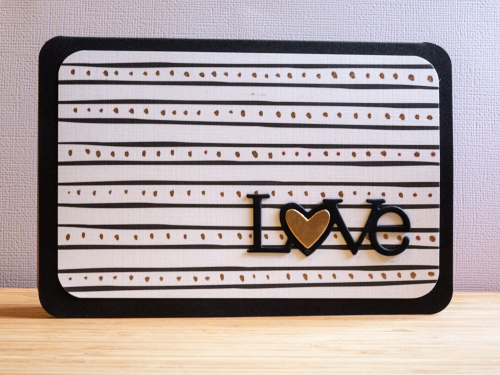
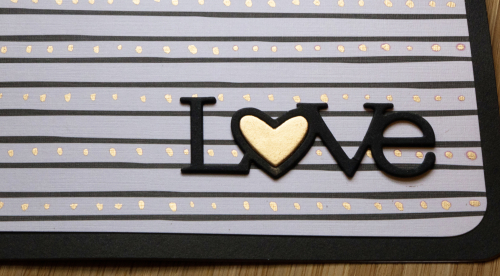
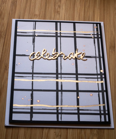
Next up, I tried adding gold leaf to a couple of Maile Belle’s “Black and White” patterned papers. The first time I dotted on some gold leaf between the black stripes.

StripesGilded1

StripedGilded

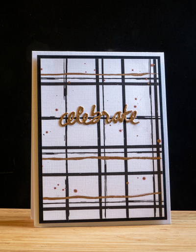
Then I tried adding some gold stripes to this design:

Celebrate

Celebrate2

I ended up with one Love die cut (Wonderful Words) and it fit perfectly onto this piece of patterned paper from the “Star Scribbles” pack of papers.


StarsGilded1

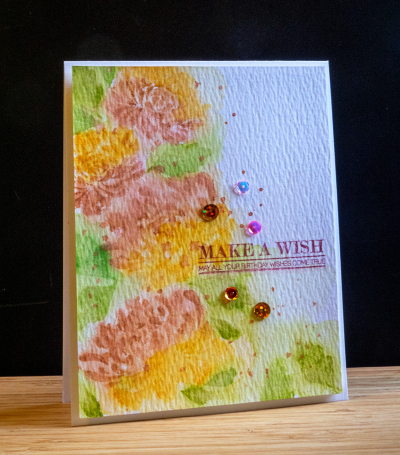
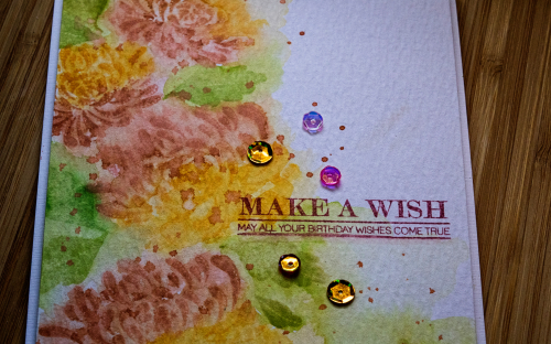
The second challenge I took on was Kay Miller’s watercolor challenge. She’s a master at watercoloring, and I was so interested in her technique which combines stamping with watercoloring. I ended up sticking very close to Kay’s design. I didn’t have the Berry Sorbet ink so substituted Melon Berry which is a much more subdued color. I think it worked out alright though, and it will make for a good fall birthday card.

Wish

I was pretty happy with this one, and my husband who rarely comments on my cards, said he liked it a lot.

WishClose

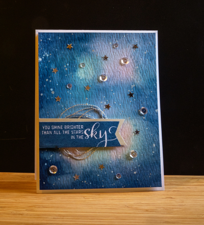
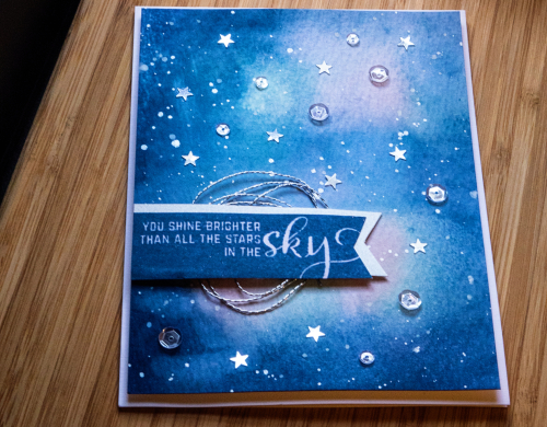
The last challenge I took on was Amy Sheffer’s Starry Night challenge. As soon as I saw it I was taken with it, but didn’t have high hopes that I could pull it off. My ink blending skills leave a lot to be desired, so when I finished this card, I was really pleased. For once, I took my time and let everything dry before moving on to the next stage.
Sky

It also gave me an opportunity to use the new sentiment set, Number the Stars. I stamped the banner with Enchanted Evening, and backed it with the same banner cut from silver paper. I had some silver thread which is one of the elements on Amy’s card, and added some sequins and silver stars in my stash.

Skyclose

I also splattered some white acrylic paint and some silver metallic watercolors. Finally got the splatter technique down! You can’t see it from the photos, but I added some Wink of Stella glitter to the banner as well.

I have a couple other challenges I’d like to try, but won’t have time to get to them until long after the galleries close. Given my schedule this weekend, I’m happy to have managed these three. 


Papertrey Ink July 2016 Blog Hop Challenge

  • by

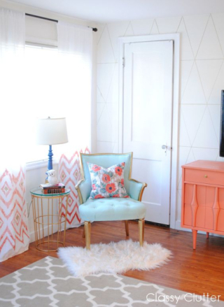
It’s the 25th of the month and the day for the Papertrey Ink Blog Hop Challenge. No surprise, I’m still working on the Stamp-a-Faire projects, and hope I’ll be back later with another post before the galleries close tomorrow morning. I didn’t want to miss the chance to participate in this month’s blog hop, though, because the minute I saw the inspiration photo, I had an idea for the card.
Pti bloghopJUly

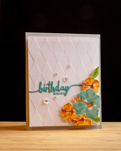
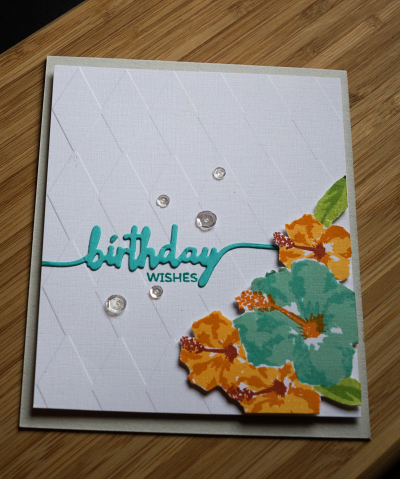
The idea was contingent on the Papertrey order arriving in time, which it did. I knew I wanted to use the new “Some Like It Hot” set which features one of my favorite flowers, the hibiscus. I used the colors in the photos–aqua and orange, the diamond pattern on the wall for my background, and the gray carpet as the card base. I would never have chosen gray had it not been for the photo, but it turned out to be a great choice.
BDWishes

It’s not often that a card turns out the way I envisioned it from the start, but this one did. I stamped the hibicus on separate card, masking them to group them together, and then fussy cut them out, and popped them up with some foam tape on the diamond embossed background. It’s been awhile since I pulled out an embossing folder (Quickcutz). I die cut “birthday” with the Swoosh die and the small stamp sentiment came from Swoosh as well. It just needed a few clear sequins to finish it off.

BDWishes2

Until I purchased a MISTI, getting the layers right for multi-stamped images was always a struggle. The MISTI solves those problems. I used three different inks for each of the flowers, and love the dimension you get with these. 

I’m babysitting for my new granddaughter this afternoon, but hope to be back in the craft room later today. You can see others’ interpretations of the inspiration piece right here.

SAF: Masterpiece Gallery

  • by

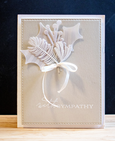
Today is the Papertrey Ink Stamp-a-Faire. Because we’ll be going to the lake soon, I won’t get to participate in the challenges as they appear, but hope to play along tomorrow. Last night they opened up a gallery so you could post one of your favorite cards made with Papertrey products. When I posted this card last January, I said it was probably my favorite sympathy card ever. I haven’t changed my mind about that.

Sympathy card

You can find the original post right here.

It’s supposed to be another 90° day here, so a good last day to be at the lake. Hope your weekend is off to a good start.

SNAP: The Moon

  • by

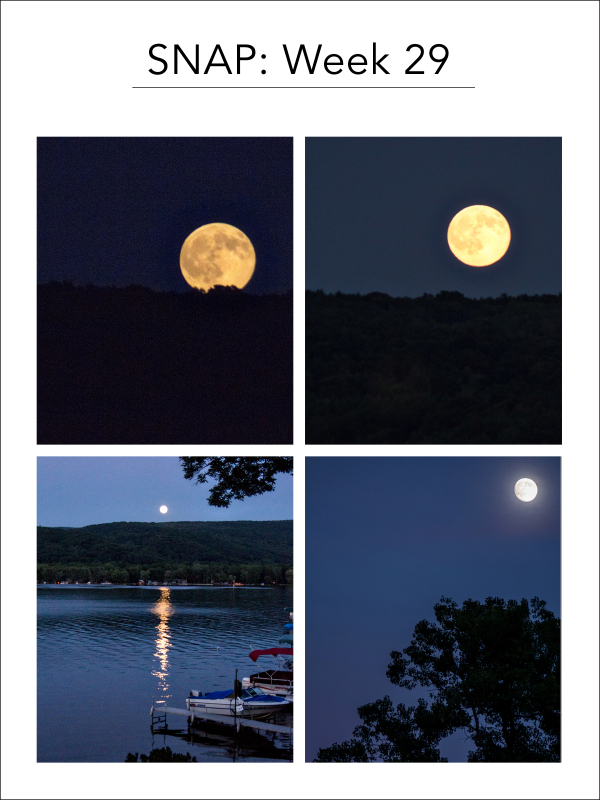
Tracy’s family rents a cottage each summer on one of the Finger Lakes. This year it’s on Honeoye Lake, and luckily, a week for the full moon. Here are four shots taken on two different nights, checking off #13 on Rinda’s Summertime Photography Scavenger Hunt.

SNAP29

These are not the best shots of the moon I’ve ever taken, but I’m really quite happy with them, since they were all handheld shots. Better than I expected. I’m hoping to have the tripod ready tomorrow night. After tomorrow, the moon rise gets pretty late, and we drive the hour home every night. Plus the moon will be waning after tonight. Linking up with Helena for another week of SNAP sets. You can find others right here.

CASE(E) this Sketch 181

  • by

CTS_181

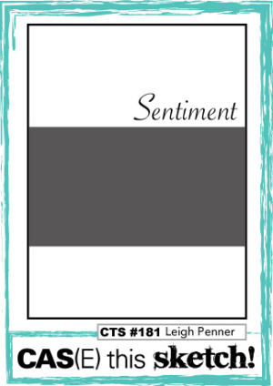
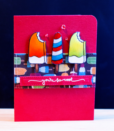
As soon as I saw this sketch from CAS)E) this Sketch, I knew I wanted to use a new piece of patterned paper I picked up over the weekend in Buffalo. I bought it to use with some summer layouts for Project Life, but when I saw this sketch I knew I had the perfect stamp set to go with the patterned paper.

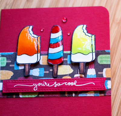
  Cool2

The patterned paper is from imaginesce, and the stamp set is “Ice Cream Dreams” by Simon Says–from a stamp kit two summers ago. I colored the ice cream treats with Copics and gave them a heavy coat of Glossy Accents after fussy cutting them. The sentiment (which I moved from the top of the sketch to the bottom) was stamped on a banner from MFT Dynamics Blueprints #28. It’s hard to see in the photo, but I partially die cut the edges of the patterned paper with one edge of a Stitched Rectangle by Simon Says.

CoolClose

At the end, I decided the card needed just a little something, and three rainstones from PTI did the trick. 

I love it!

  • by

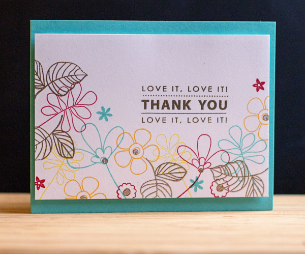
On my creative calendar was to try another technique from the Online Card Class, Heat Wave. Kristina Werner created a card that combined stamping some images with colored inks and embossing others. I ended up using three different stamp sets to create the flower border: “Build-able Bouquet” by My Favorite Things, “Handwritten Floral Greetings,” by Simon Says, and “One Big Happy,” by Papertrey Ink.

LoveIt

The sentiment is from Penny Black’s “Kind Words,” and you’ll see in a moment how very appropriate it is. After embossing the sentiment, the centers of some of the flowers, and  leaves with Liquid Platinum embossing power, I attached the card to some fun foam, and then to a card made with Hawaiian Shores.

LoveIt2

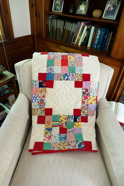
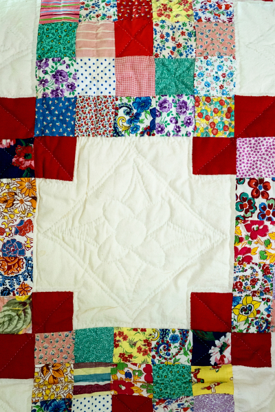
The card is for the mother of a close friend. Ruth is a wonderful quilter who is now in her 90’s. She had a collection of over 40 quilts that she hadn’t already given away, and decided it was time to share them. (She made a beautiful quilt for Sarah from quilt squares created by my great-grandmother and great aunts, and gave it to her as a high school graduation gift.) This time I was the lucky recipient. Since red is my favorite color, it was a perfect choice. Here it is folded on a chair in my living room.

QuiltChair

And spread out on the back of my couch.

Quilt

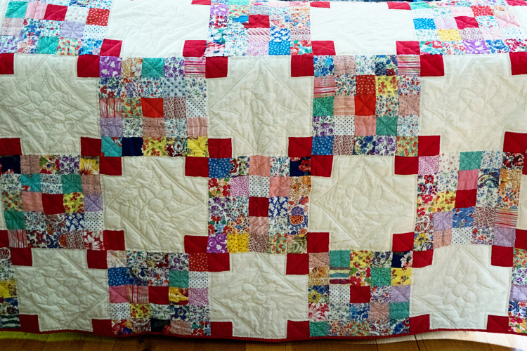
It’s entirely hand-stitched and here’s a close-up:

QuiltClose2

I’ve yet to find the perfect spot to showcase it, maybe on my bed—although I’d love to hang it. It was a very special gift, and I’m very grateful to have received it. It’s not often that I post twice in one day, but I wanted to get the card posted to the class gallery before it closes this week.


Memorandum Monday

  • by

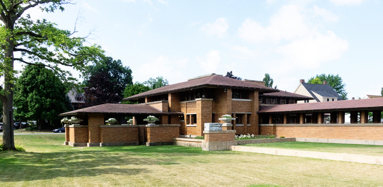
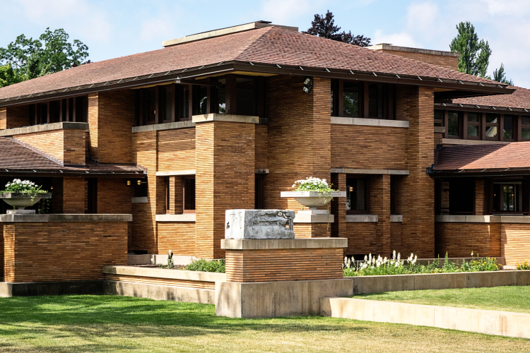
It’s been a few weeks since I could truly say I’d done something new over the weekend. But this weekend, friends of ours met us in Buffalo, NY to visit and tour the Darwin Martin House, one of Frank Lloyd Wrights early architectural projects. Darwin Martin was an executive in Buffalo at the turn of the century and hired Frank Lloyd Wright to design a home for his family. It’s a beautiful place, with several buildings on over an acre of land. Over time, the foundation has restored much of the home, but the work is still ongoing. Much of the interior of the main house is still under restoration, and next summer they are planning to install all the gardens that were originally part of the plan. Wright was also the landscape architect. 

DSC01670ed

This is a view of the main house, part of the pergola which connects the main house to a beautiful conservatory, and the covered porch on the left. The pergola and conservatory were dismantled by subsequent owners in the 1950’s and part of the property was sold off. An apartment building was constructed across the back of the property. In the early 1990’s a corporation was formed to restore the house which had sat empty for many years. Shortly thereafter, the apartment building went up for sale, and was purchased by the foundation. The apartment building was taken down, and the pergola and the conservatory as well as the stables have been reconstructed using Wright’s detailed plans. They have done a remarkable job, as I would have been unaware that they were relatively new constructions.

DSC01662ed

Here’s the view of the pergola from the other side. I didn’t get a photo of the conservatory, and no photos inside the complex are allowed.

DSC01672ed

A closer view that lets you see the remarkable detail and many angles that reflect Wright’s prairie style. The house and most of the complex were originally built between 1903 and 1905. 

DSC01668ed

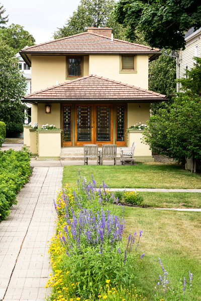
In addition to the main house, the pergola, the conservatory, and the stables two other buildings are on the property. A much smaller home that was built for Darwin Martin’s sister and her family and the house above, which was the gardener’s cottage, built in 1909. Neither Martin nor his wife came from wealthy families. Martin made his fortune as an executive with the Larkin Company. The Martin’s treated their help more as members of the family than servants. One of the chauffeur’s daughters was married in their home.

DSC01669ed

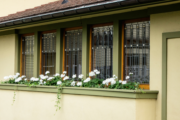
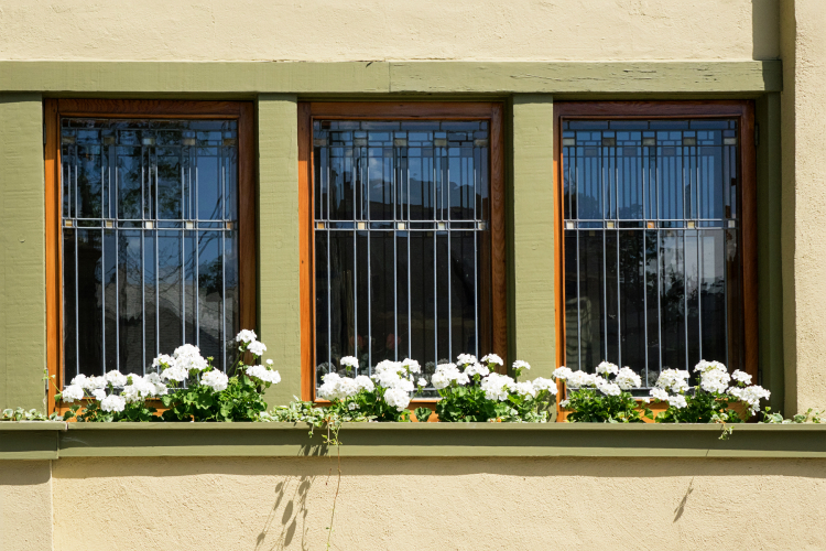
Wright is known for his beautiful windows. These are the windows in the gardener’s cottage. I’ll count these as #12 in Rinda’s Summertime Scavenger Hunt–a window.

DSC01681ed

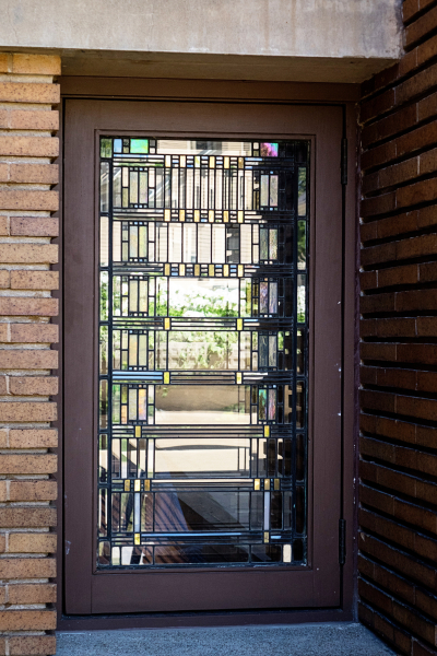
Another view of the windows, and finally, another gorgeous window near the front door of the main house. The windows in each of the buildings are a different design, but consistent throughout that building.

DSC01679ed

We had a wonderful docent for our 90 minute tour, and we all agreed we’d like to return in two years to see the completed restoration of the interior as well as the extensive gardens that were part of the original plan. 

After our tour and lunch at a lovely little restaurant nearby, our friends drove on to Michigan to visit their daughter. Tracy and I decided to go to Buffalo’s newly restored Outer Harbor and Canalside.  I have to admit I was a bit disappointed. It’s a lovely parklike area, but there isn’t much to do there unless you’re interested in military history, water parks, or fast food. 

DSC01682ed

We did walk along the river and I got a couple photos, and one more photo for the scavenger hunt (alternative #1), a lighthouse. (I expect to find a better example for this one in August when we’re on vacation.)

DSC01686ed

Waving to Sian and other friends who are posting for Memorandum Monday!


Heat Wave: Day 2

  • by

HW_participant-1

Day 2 of the Online Card Class focused on heat embossing techniques. Who knew you could emboss with a Quickie Glue pen? Not I, but I decided to give it a try.

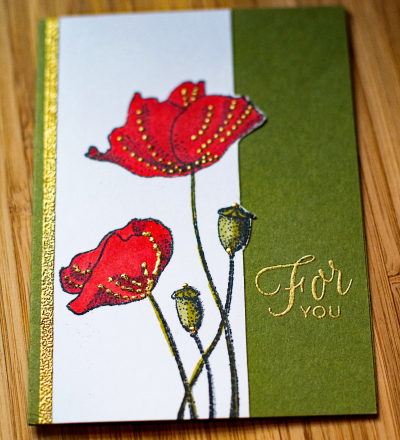
ForYou

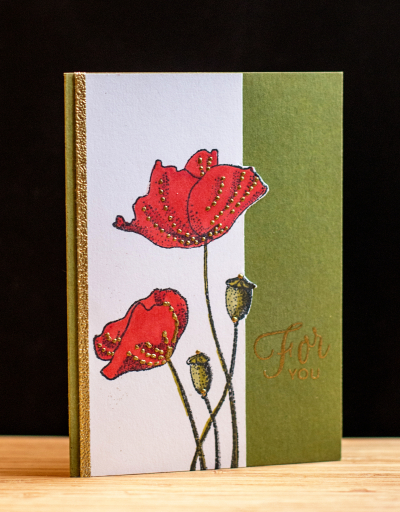
I stamped the image from Penny Black’s “Blooming Garden,” and colored it with Copic markers. Then I added the gold dots by applying tiny dots with the Quickie Glue pen and sprinkling them with gold embossing powder. Worked like a charm. I didn’t intend to cut the stamped panel, but made a mess of the sentiment, and decided that the design technique I used for Day 1 would work here as well. It’s actually a better design all the way around. Sometimes a mistake turns out for the best! I added a strip of 1/8″ Scor-tape to the edge and embossed it as well. It’s a technique I’d totally forgotten about and added just the right touch.


ForYou2

The sentiment is from Papertrey Ink’s “Friendship Jar Flowers.” I love the script font in this one. I have at least one more technique I want to try, so likely I’ll be back with another card over the weekend.

SNAP: the Grandchildren

  • by

We spent more time with our grandchildren last week than we usually do. Caleb’s visit combined with the arrival of Madelyn meant we had lots and lots of time together. They played in Matt and Betsy’s wonderful yard, went to a splash park, went to the playground, and in general, had a wonderful time together. It amazes all of us that the minute Caleb arrives, it’s as if he lived next door. Actually it’s been almost a year and a half since they’ve seen one another. I’ve got a pile of photos, but I tried to find four that represented a bit of the different activities, and one that included the new addition to the family. 

SNAP28

Linking up with Helena where you’ll find more SNAP sets: three or four related photos.

A Happy Hello!

  • by

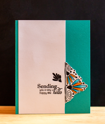
The Online Card Classes are among my favorites, and I’m currently enrolled in “Heat Wave,” a class on embossing. The first day was lots of quick tips for embossing with different inks, embossing powders, and different kinds of cardstock. I picked up a few tips, even though I’ve been embossing for nearly 20 years now. At the same time, Papertrey Ink is in the midst of their July release. They host a challenge, “Create Along with Us,” where you choose a card one of the designers posts to use as inspiration. I always love Maile Belle’s designs and had already pinned one of her cards. So here’s an embossed design, inspired by Maile Belles, and using one of her earlier stamp sets, “Splits:  Just a Note.”

Hello

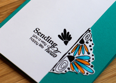
I used just half of the stamp design and turned it on its side, trimmed the white cardstock to the stamped design and fussy cut around it. I colored the petals with Copic markers, and added a sentiment from Papertrey’s “Delightful Dahlia Additions.” Then I adhered it to a Tropical Teal card. I’m pretty sure I’ll use this design concept again.

HelloClose


5 in 5: July

  • by

Last month, I missed the linky for Sandi’s monthly meme: 5 in 5: five photos shot within a five minute time frame. Kindly, Sandi linked me up after the fact, but I was determined to be more timely this month. In June, most of the photos were from the gardens surrounding our patio.  Last night when we came home from dinner, the light was just right so I went out to my cutting garden in our lower yard to take some photos. It takes awhile in western New York for the flowers to get established. The cutting garden is about 85% perennials, and 15% annuals this year. I always plant a patch of zinnias, and usually some snapdragons. The goal is to have flowers to cut and bring inside all summer long.

IMG_0179ed

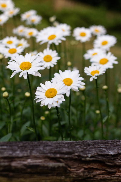
I love the Shasta daisies. They bloom almost all summer long, and always look great in an arrangement.

IMG_0181ed

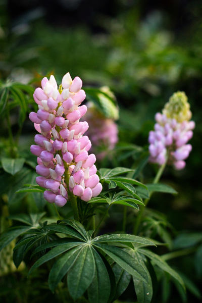
Last year a critter ate all of my lupine plants, so I am thrilled to have four lupines one of which is always blooming this summer.

IMG_0182ed

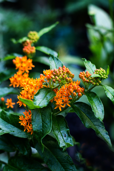
Last year, I bought some plant identity signs and carefully added all the plants’ names to them. Despite the assurance that the ink was permanent, it turned out not to be, and I no longer know for sure what this beautiful orange flower is. I’m guessing someone who’s a finer gardener than I am will be able to identify it.

IMG_0185ed

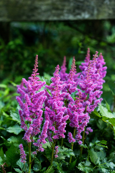
We have lots of astilbe in our shade garden, and although it provides some color there, it is much more beautiful in this garden where it gets more sunlight.

IMG_0186ed

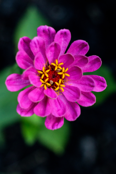
And finally, one of my lovely zinnias.

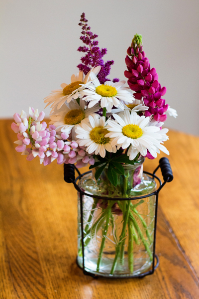
I thought I’d add one last photo, not part of the 5 in 5 to show you the vase that’s currently on the kitchen table. There’s another arrangement in the living room as well.

IMG_0203ed2

Linking up to Sandi at itchifingers where you can find other 5 in 5 sets.

Welcome Madelyn Tyler

  • by

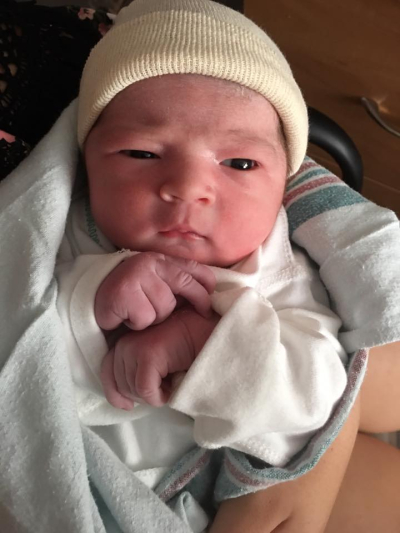
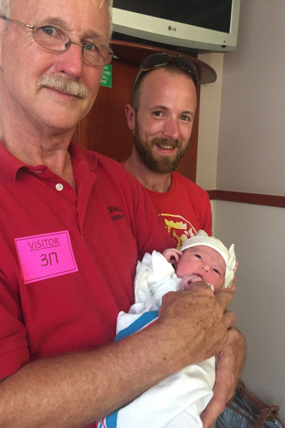
Matt and Betsy welcomed little girl #3 this morning. Madelyn Tyler weighed in at 7#13oz. Everyone is doing great. Here are some unedited iPhone photos, and then I’m off to make dinner for the other two little girls, their dad, and Sarah, Adam, and Caleb who came to spend the week, knowing they’d be here for the big event.

13592333_922812641160519_3808795761433144638_n

IMG_2856

IMG_2858

Neither of the big sisters were interested in photos today at the hospital, but they were happy to meet her.