Skip to content

First Day of School

  • by

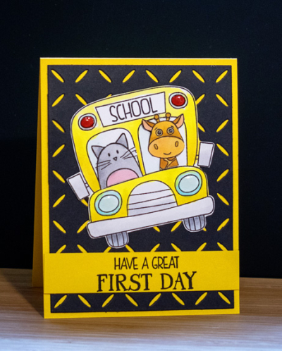
Well, actually, Caleb attended full-day kindergarten last year, but today marked the first day of first grade and his very first school bus ride. For both pre-school and kindergarten he could walk to school. It’s a new town as well, and he’s attending a magnet school with grades K-8 in the same building. Sarah was a bit concerned about putting him on a bus with 8th graders and wondered if she should drive him the first day, but Caleb decided he wanted to ride the bus. In anticipation of this very big first day, I sent Caleb a card. As soon as I saw the “School Bus Messages” set during the July or August release at Simon Says, I knew I had to have it. (There are still three more very first days to come for my grandchildren!)

School Bus

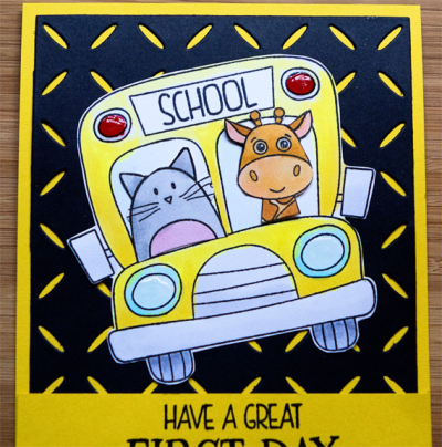
I stamped the bus and colored it with Copic markers before cutting it out by hand. Then I stamped, cut, and colored two cute critters—one from Simon Says ” Quite the Pear,” and one from Simon Says “Wild Cuddly Critters,” I cut them to fit into the school bus windows. Another new product from that Simon Says order was the “Diamond Pattern” card cover die. (I already have lots of ideas for using that.) I layered it on a card made from Papertrey’s “Bright Buttercup,” and then adhered the school bus, adding some Crystal Nuvo to the lights on the school bus. The sentiment is also from the “School Bus Messages” set.

School Bus Close

We were anxious to hear about Caleb’s first day, and had a great FaceTime conversation with him when he got home. The bus ride was fine (and not as long as anticipated), and he had a great first day just as we wished for him.


Summer Photography Scavenger Hunt: August Link-up

  • by

It’s the last day of August, and in some ways it still feels like the end of summer which it surely was all the years I taught! Officially, we still have a few weeks before the end of the Summer Scavenger Hunt, and I have two items left to find. Fortunately, Mary-Lou offered up a couple alternate items which may be easier to find than the last two I need. We’ll see. I have posted earlier finds here, here, and here.

For August, I have three new offerings and one more for Mellow Yellow:

MellowYellow

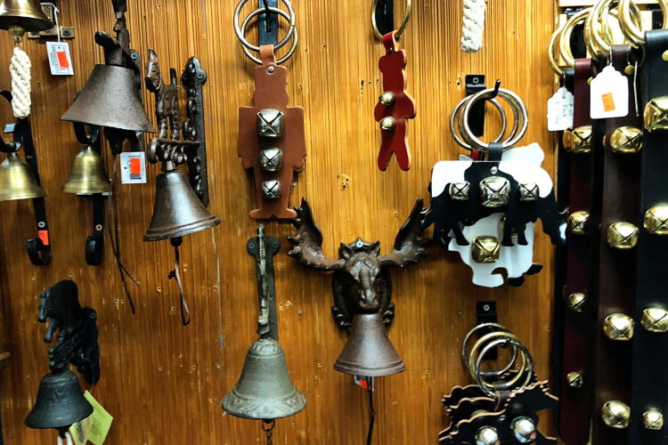
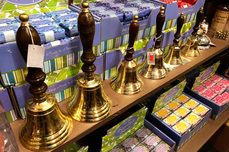
On our weekend trip to the Adirondacks, I found two more items.: #12 Bells and #16 Something that Could Be From a Favorite Book or Movie. Both photos of bells came from the Old Forge Hardware, one of Tracy’s favorite haunts.

Bells

Bells2

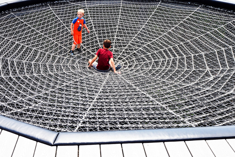
At the Wild Center in Tupper Lake, we found this web which immediately made me think of my very favorite book from childhood, Charlotte’s Web.

FromaBook

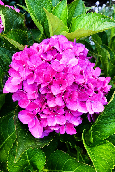
Last, #15, Out of the Blue–gorgeous hydrangeas.

OutoftheBlue2

One of our neighbors has this sign posted. It’s so sad that such a sign is necessary in this country, but it speaks to one of my biggest concerns–the lack of tolerance and lack of civility in our country. 

OutoftheBlue1

Thanks, as always to Mary-Lou for creating the hunt and hosting the link-ups!

Watercolor Basics and Beyond: Part 3

  • by

Back again with another project from Altenew’s “Watercolor and Beyond” class. This has been such an easy class to keep up with. Jennifer’s video’s are short and to the point, but with enough detail to easily understand the concept she’s teaching. I have just two more lessons to complete—the one that failed the first time (I think now I know how to correct my problems), and the last lesson of the class which I watched this morning. I should be able to meet my self-imposed goal of being done by the weekend.

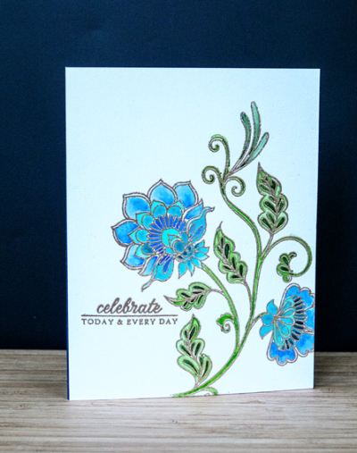
This lesson was about coloring a detailed embossed image with watercolor. It’s a technique I’ve used before but not with such a detailed image. Jennifer used the new Altenew “Needlework Motif” set. I’d seen a lot of beautiful projects using the stamp during Altenew’s release week, and ordered it. It was sitting on my desk awaiting this opportunity.

Motif

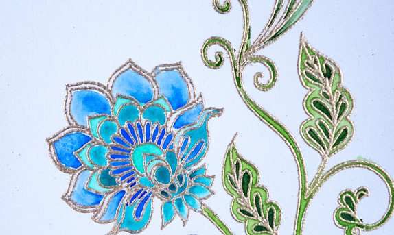
I’m very happy with the results. I took my time and used a very small watercolor brush, following the advice to move around the image letting one area dry before watercoloring the area next to it. It’s advice I’ve read many times before, but haven’t always heeded. It’s clear it’s advice worth following. I stuck to four colors of blue and two colors of green all from my Gansai Tambi watercolors. I do think I’m about to splurge on the Altenew set because of it’s compact size and the wide range of bright colors. I embossed the image with rose gold embossing powder which is so lovely. Here’s a closer look.

MotifClose

We’re off to lunch with our couples book group–discussion of Killers of the Flower Moon at one of the member’s home afterwards. Later this evening, we’re going to the Food Truck Rodeo at the Public Market with good friends. It’s our first of the rodeos this summer. Although summer days are waning, the heat and humidity are not, so it still feels like summer for sure. 

Watercolor Basics and Beyond: Part 2

  • by

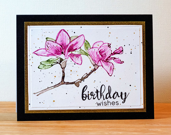
The next lesson in Altenew’s watercolor class was on using watercolors as ink. It’s important in this technique to use concentrated amounts of watercolor which you apply directly to the stamp, and then lightly spritz the stamp with water before stamping onto watercolor paper. Following that you can use a small brush to distribute some of the watercolor and enhance some of the details. I don’t have a lot of Altenew’s layering stamps (it’s a technique I’m still learning to master), but using the detail stamp for the layering was recommended. Actually, the “Build a Flower” Magnolia” worked out pretty well for this technique.

BDWishesWatercolor

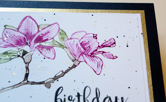
I actually had a lot more trouble turning the piece into a card than I did executing the watercolored flower. I added some black and gold splatters after stamping the sentiment (from Altenew’s “Floral Frame” stamp set) and let them dry for over three hours. When I went to adhere the watercolor piece to a card I weighted it down and when I picked it up, some of the black splatters had smeared in the upper left-hand corner! I finally found a Spellbinders die that was the right size to incorporate the flower, the sentiment, and eliminate the smeared splatters. What a pain! I added a gold border and used a Memory Box licorice card. Here’s a closer look at the gold border and splatters.

  BDWishesClose2

I’m halfway through the videos for the class, and hope to finish it before the weekend. The next technique we learned was watercoloring an embossed sentiment. Looks easy, probably should be easy, but three attempts have hit the circular file. I’m moving on, although I’ll probably come back later and try again.


Watercolor Basics and Beyond: Part 1

  • by

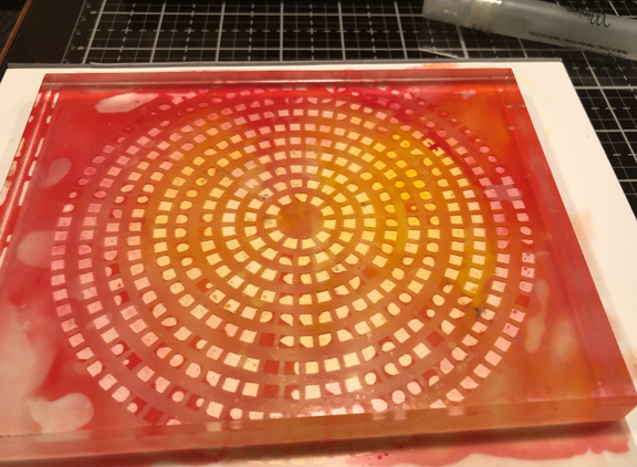
On a whim, I enrolled in Altenew’s “Watercolor Basics and Beyond” class this week. It’s designed to showcase Altenew’s new set of 36 watercolors which look lovely, but I don’t own them (yet). It doesn’t matter, as I’m already enjoying the class, and have several sets of watercolors to choose from. In lesson 2, Jennifer Raza introduced watercolor washes. I’ve done these for a variety of card backgrounds, but she added a twist I would never have thought of on my own: pressing a stencil into the watercolor wash and letting it dry. I can tell you when I set it aside to dry overnight, I did not have high hopes for it. It appeared to be a hot mess. It’s weighted down with an acrylic block.

HotMess

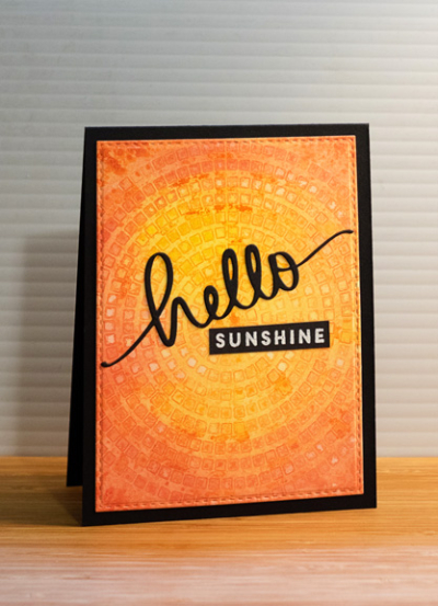
Much to my surprise the next morning, I discovered quite a lovely background which was fun to use in creating this card. 

Hello

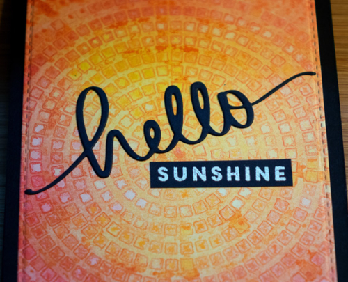
As I often do, I die cut the watercolored piece with the largest of Simon Says “Stitched Rectangles.” The die cut sentiment is from Mama Elephant, and the white embossed sentiment is from Papertrey Ink’s “Blue Skies.” After they were added to the background, I mounted it all on a True Black  top-folded card.

HelloClose

It’s definitely a technique I’ll try again, although I didn’t seem to have many stencils that I thought would work for this technique. 

Take Three Thursday: Hydrangeas

  • by

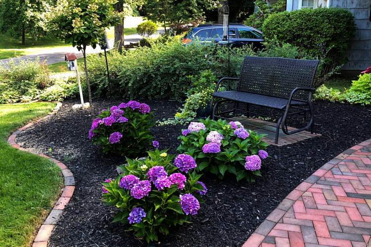
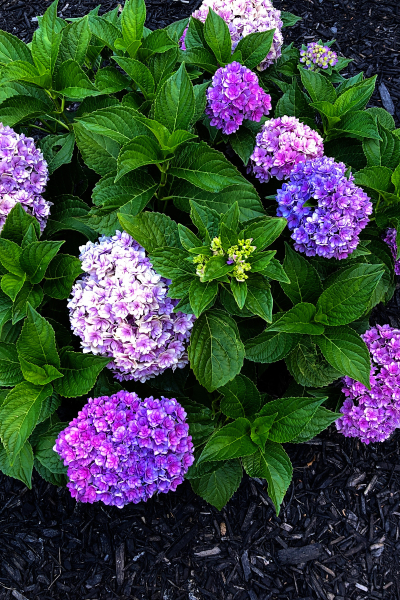
A quick post at the end of Thursday to join Mary-Lou in her Take Three Thursday meme. I commented to Maggie the other day that the flowers in my cutting garden are nearing the end of their bloom. Not so the beautiful hydrangeas Matt planted in our front yard last year. In the first photo, you see just half the landscaping of the front yard, and three of the six hydrangeas bushes.

IMG_0451ed

IMG_0453ed

IMG_0458ed

The hydrangeas in the back of the house haven’t done as well this year. I usually cut some of those blooms to put in a vase in the house. I can’t quite bring myself to cut any of these. Last fall, the flowers on these bushes turned a beautiful burgundy color and I let them dry in a vase. They were lovely all winter long. 

Me on Monday–August 20

  • by

We’ve had a special trip on our calendar for a long time, and we were afraid Tracy’s illness was going to keep us from it, but over the last week he made steady improvement, and now seems to be almost completely recovered. So on Friday, we drove to the Adirondacks to meet up with our very close friends for a memorial hike. Tracy’s backpacking partner passed away a year and a half ago from cancer. Before he died, we told Bob we’d like to take some of his ashes to the high peaks in the Adirondacks where he and Tracy hiked every September. Even before Tracy’s illness we had agreed that hiking to the top of Giant Mountain (our original plan) was probably overly ambitious for at least some of us. None of us, truthfully, had been on a trail for several years, and for four of us it had been a very long time. All of us hiked together when the kids were young, and during that time, we climbed several of the 46 High Peaks.

Saturday we hiked Mt. Jo, one of the shorter trails with a bit less incline, and not one of the 46. Nonetheless, the trail was more strenuous than any of us remembered. All of us had hiked it many years ago when our kids were quite young. But we did great. 

IMG_0479ed

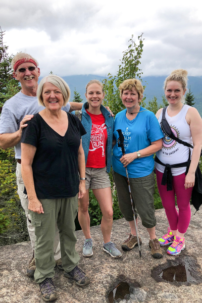
Here we are at the summit of Mt. Jo–me and Tracy, Cathy, Rachel, and Sarah—Bob’s wife and two daughters. 

IMG_0478ed

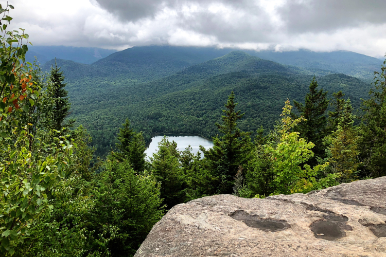
It was a cloudy, overcast day, but the clouds had lifted from the summit by the time we arrived. We had a lovely view of Heart Lake. The trailhead leaves not far from the lake.

We were, not surprisingly, not alone at the summit, but were able to hike into a clearing and have some quiet time to remember Bob and all the wonderful times we had with him on these mountains. We all agreed, it was just as we hoped it would be, and we knew Bob would be pleased. We spent two nights near Whiteface Mountain, and enjoyed our time together there as well. 

On Sunday after a wonderful breakfast at our favorite diner in Lake Placid, Tracy and I headed off for the Wild Center. For many years, while Tracy and Bob hiked, Cathy and I had a girls’ weekend in the Lake Placid area. When the Wild Center opened up, we spent a wonderful morning there, and then returned with the guys several years later. Since that last visit, they’ve built and opened the Wild Walk, an elevated walkway among the treetops of the forest which Tracy was anxious to see.

P8190013ed

P8190015ed

P8190017ed

P8190023ed

It does give you a very different perspective, and we thoroughly enjoyed our time there. The Wild Center also houses a wonderful interpretive center. Since we had previously spent a lot of time there, we walked through more quickly this time.

P8190001ed

We drove home through Old Forge where we had a late lunch and visited the Old Forge Hardware—one of Tracy’s favorite establishments. I have a photo from there for the Summer Scavenger Hunt (as well as one from the Wild Center), but I’ll save those for the SPSH link up at Mary-Lou’s on Friday.


Anniversary Cards

  • by

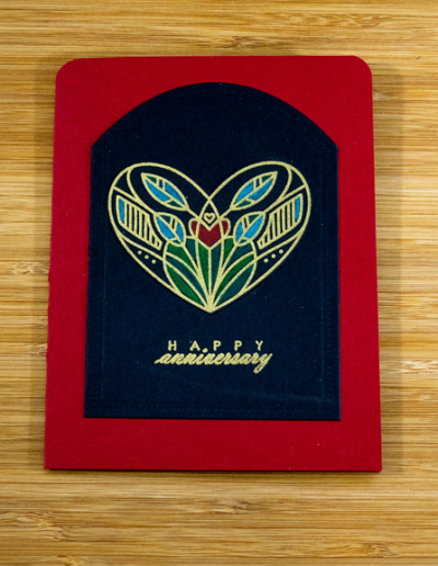
Sarah and Adam as well as two sets of friends celebrated anniversaries in the last several months. The cards went out on time, but were never posted. Like the Fence Line post a couple of days ago, these cards are variations using the same stamp.

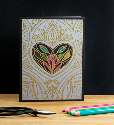
GoldHeart

Both cards use the Simon Says “Center Cut Heart” which has become my “to-to” stamp for anniversary cards. The center heart pops out of the stamp so you can stamp it separately which I did here. First I embossed the outer portion in gold on Papertrey’s Weathervane cardstock. Then I gold embossed the center heart on True Black. After watching multiple videos on Yana Smakula’s blog using Polychromos pencils on dark cardstock, I decided to give it a try. I trimmed down the outer edge of the stamped piece so a thin black border would appear when I adhered it to the card.

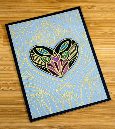
GoldHeartFlat

I took a different approach to Sarah and Adam’s card, and ended up just using the center heart. 

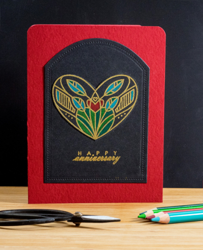
S&AAnniversary

After coloring it with the Polychromos, I carefully cut it out and layered it on a Reverse Confetti Pierced Round Top die. The sentiment from an old Papertrey Ink set, “Fillable Frames #8” was gold embossed below and the pieces added to a Bazzill textured red card. I think I purchased this at a wonderful scrapbook store near Phoenix, AZ the last time I was there (it’s been at least 10 years!) I rounded the top two corners of the card to complement the round top die.

S&AAnniversaryFlat

I was hoping the textured cardstock which is subtle but so pretty would show up better with this view, but it didn’t happen. This is my favorite of the two (and the reason it went to Sarah and Adam!)

Fence Lines for Inspired By . . . Seascapes

  • by

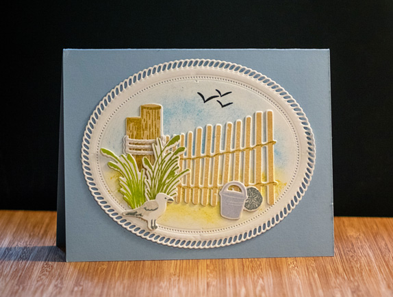
A generous friend gave me a gift certificate to Papertrey Ink for my birthday. I saved it for something special, something I wouldn’t ordinarily order. When I saw the Fence Line: Summer stamps and die sets I knew I’d found the perfect way to use the gift certificate. I don’t usually buy stamps that are so specific to a season, but I really love these, and I love how the cards turned out.

The first card went to my friend so she could see how I had used her gift certificate.

SummerFence

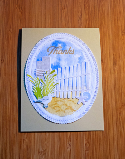
After I had stamped and die cut the elements from Fence Line, I die cut the outer two pieces to the Shape Shifters: Oval 2 die. The Shape Shifter dies are among my favorites because they are so versatile. Using a stencil brush, I added some Salty Ocean Distress Oxide ink to the top of the oval fro the sky, and some Fossilized Amber for the sand. Since I was writing a note I decided not to add a sentiment to the front of the card.

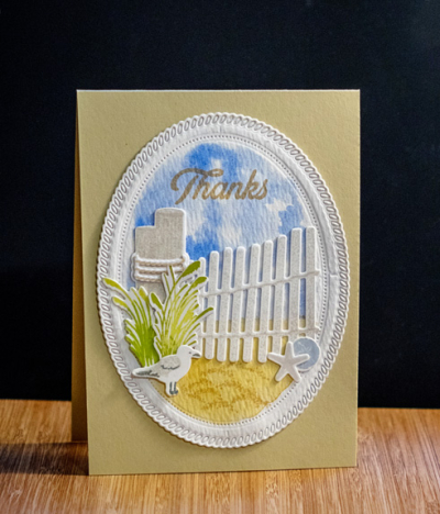
The second card is a top folded card. I like that you can use these elements in both a horizontal and a vertical format.

FenceLineThanks1

When I made this card, I had just finished watching all the videos for Kristina Werner’s “Simply Watercolor” class. It was the week Sarah and her family were here. I was able to watch the videos, but had no time to play with the watercoloring techniques she demonstrated. Both the sky and the sand were done with watercolors, and I used Kristina’s technique to create a sky filled with white clouds. Right as Sarah left, Tracy came down with what appeared to be a virus (and was diagnosed twice as such), but turned out to be mono. Who knew a 70 year old could get mono? It’s the sickest I’ve ever known him to be. At any rate, he is still slowly recovering, so time in the craft room has been very limited. I’m hoping to get to Kristina’s other lessons in the next week or so.

FenceLineThanks

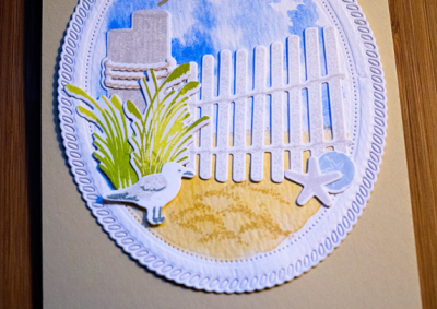
On top of the watercolored “sand” I stamped the sand image from the set to add some texture. Once again I used the Shape Shifter: Oval 2 as the canvas for the card. I did stamp a sentiment on this card which was given to my daughter-in-law for her generous invitation to stay with them in Nantucket in July. I used the MISTI and stamped it two or three times, but in retrospect wish I had used a die cut for the sentiment instead.

FenceLinethanksFlat

Unlike the first card, I didn’t bother to “punch out” all the little die cut pieces from the frame. I think it works well either way.

I’m linking up the first card to Inspired By . . . Seascapes.

Sea scape

Masculine Birthday Cards

  • by

Recently I posted a card for a sailor who is about to turn 60. His avocation prompted the theme of the card, and it was one of the easier cards I’ve made for a man recently. Usually I struggle with masculine cards but I have two more to share today. Both are CAS cards, and were also very quick to make. I still have one to make sometime before the 25th for a close friend who is turning 70. I have something in mind, but it’s likely to be a bit more involved.

BWBD

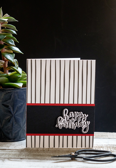
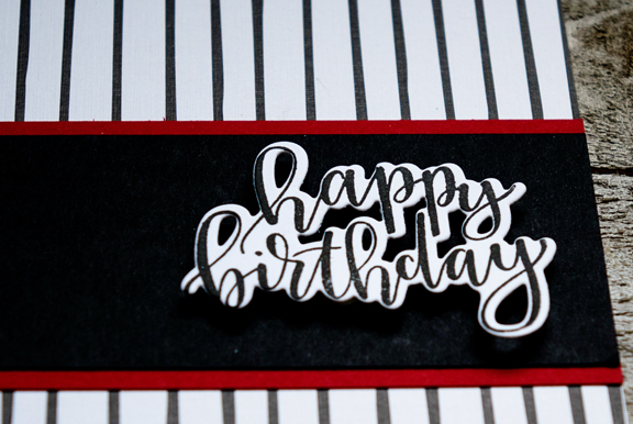
This card uses one of my favorite patterned papers ever–“Black and White All Over” by Papertrey Ink. Sadly, it’s no longer available. The paper is exactly the size of an A2 card, and I added a border of True Black, two thin pieces of Pure Poppy, and a die cut from “Penned Elegance” to complete it. It truly was a quick and easy card with one of my favorite color combinations: red, black, and white.

BWBDFlat

Next up is another card that uses patterned paper from another of Papertrey’s sets, “3 Piece Suits.” It appears to have been discontinued as well.

TomBD

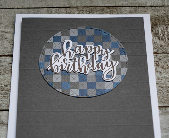
I used one of the Simon Says “Stitched Circles” to die cut a piece of the patterned paper, and added it to a piece of Smoky Shadow cardstock that I had scored every 1/2 inch. The same die cut sentiment from “Penned Elegance” fit into the circle perfectly, and I used a piece of fun foam behind the Smoky Shadow before adding it to a white top-folded card.

TomBDFlat

I love that the stitching in the patterned paper echoes the stitched die cut for the sentiment. I’m entering this one in the Addicted to CAS challenge: Masculine before the challenge closes on Friday.

ATCAS - code word MASCULINE


Five in Five: August Sunflowers

  • by

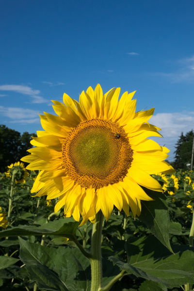
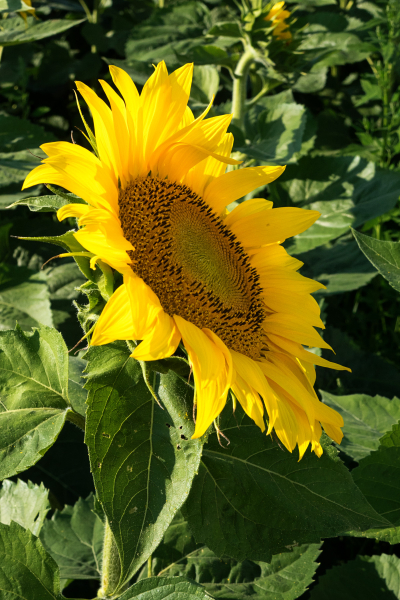
The fifth of the month always takes me by surprise, and although Sandie gives us to the 25th to post our five photos taken in five minutes, I think it’s fun if I manage to do it on the 5th of the month as well. This month it paid to be late because this weekend the field of sunflowers just south of us is at its peak, and the weather was perfect. I drove out just before dinner last night, and although I managed to get photos without other photographers, there were lots of folks, some with professional photographers, getting photos of themselves with the sunflowers.

This first photo also qualifies for two prompts on the Summer Photography Scavenger Hunt: #10 Field of Plenty and # 20 Mellow Yellow. I’ve already posted images for those, but I like this one a lot better.

DSC07182ed

DSC07181ed

DSC07184ed

DSC07187ed

DSC07189ed

Off to link up to Sandie’s meme: Five in Five.

A Sunny Card for Two Challenges

  • by

I have a bright and sunny card for two challenges today. It was first inspired by the CASology Challenge: Sunbeam,

Week 309 - Sunbeam

and then by the code word at AAA Cards: Friendship.

#121Friendship

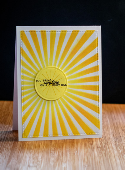
Hopefully the sunbeam won’t disqualify the card for lack of white space at CASology. I see this as a CAS card, but there isn’t much true white space. It was fun to make, regardless. 

Sunshine

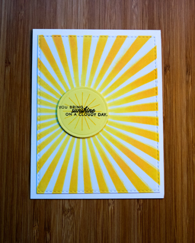
I recently purchased the MFT stencil “Radiating Rays” and was anxious to put it to use. I blended two Distress Oxide Inks–Squeezed Lemonade and Wild Honey–to create the sunbeam. It was, as often is the case, die cut with the Simon Says “Stitched Rectangle” die. Then I die cut a small circle with a Spellbinders die and stamped it twice, once with small rays and then the sentiment.

SunshineFlat

Both the rays and the sentiment are from Papertrey Ink’s “Hello, Sunshine” set, and I chose the sentiment as it fit the Friendship challenge at the AAA Card Challenge. We’re getting some much needed rain today, so this is probably the only sunshine we’ll see.


Me on a Monday

  • by

I’m joining in with Mary-Lou with a Monday update. My blogging has certainly been erratic this summer, and when I look back at our schedules I can see why. I thought by the end of July things would calm down, but it just got more complicated. However, I’m here to share a lovely little interlude–although exhausting! In April, two of my friends announced we would celebrate my 70th birthday with a trip to New York City. It’s been over 15 years since I’ve spend more than one day in the city, and I was as excited as they were to plan for it. 

This is a long and photo-heavy post, but Lady Ella asked if I would get a post up. I still want to do one for our stop at the Hancock Shaker Village as well.

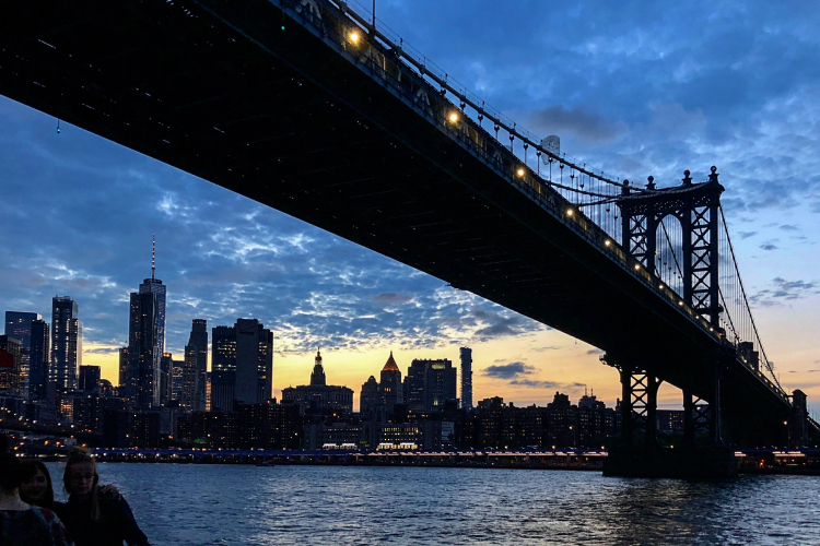
Last week the three of us left on the 5:19 am train from Rochester to Grand Central station, arriving in time for a late lunch. We stayed at the Hilton Times Square on 42nd St. The area is anything but luxurious–rather seedy and loaded with tourist attractions and shops selling NYC souvenirs. Stepping into the Hilton, however, is like finding an oasis in the desert. Lovely and calming. We had made advance plans for our full day in NY, but hadn’t made any for Tuesday night. Luckily, it was a gorgeous evening and after an excellent dinner we were able to get tickets on the Circle Line’s evening tour of the New York Harbor. It started at the pier on 42nd St. and was an easy walk from the restaurant and the hotel. The two hour tour went down the Hudson River, around the Battery, and up the East River as far as the United Nations. I took most of the following photos with my Olympus mirrorless camera until it got dark, and then relied on my iPhone because I’m just not sure how the Olympus would do with night photography. On my agenda is to watch some tutorials and learn more about the camera. On automatic, it takes wonderful photos that need almost no editing. 
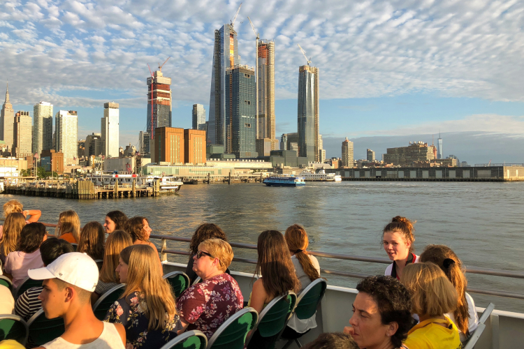
IMG_0355ed

IMG_0359ed

P7310577ed

There are several (many?) photos of the Statue of Liberty because I couldn’t choose a favorite!
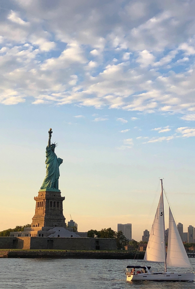
IMG_0360ed

P7310586ed

P7310587ed

P7310588ed

IMG_0368ed

The Brooklyn Bridge on our way back down the East River.

IMG_0377ed

On Wednesday we had booked a double tour—first of the High Line, an elevated railway that has been turned into a mile+ park and walkway, followed by a food tour of the West Village. The tours are limited to 8, and we had just 7–the three of us and a lovely family from Texas. Our guide could not have been more knowledgeable or personable. It was very hot and humid, but no one was complaining because the forecast had been for thunderstorms, and we had none! Here are the three of us on the High Line.
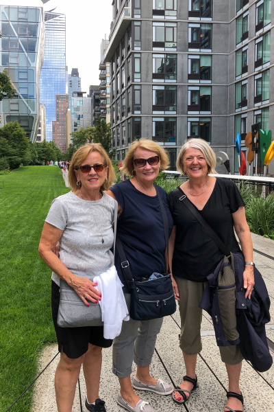
IMG_0391ed

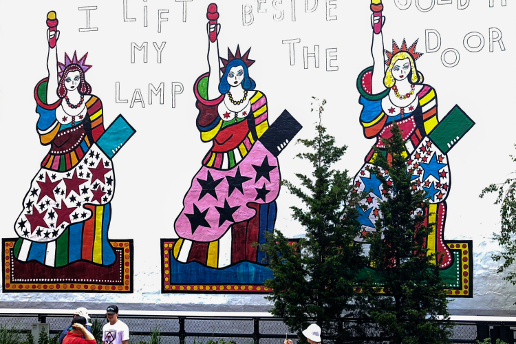
As we walked, we learned lots about the surrounding area—its history, the architecture, and the art that has been installed along the trail.
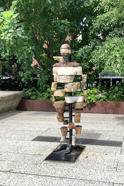
IMG_0387ed


IMG_0393ed

This mural is another entry for A Trilogy of Three for the SPSH. And here is another entry—for Mellow Yellow:

IMG_0397ed

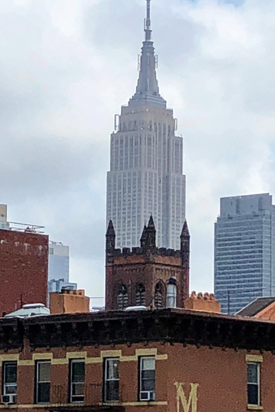
One last photo from the High Line. At one point it was possible to line up the Empire State Building with the tower of an historic building near the Village. I couldn’t pass up the opportunity.
IMG_0398ed

When we left the High Line near the Chelsea Market, we began an incredible food tour. I was expecting small bites at the different establishments, but by the end of the tour almost none of us (with the exception of the two teenage boys) could eat the Italian sub we were offered. Between the different bakeries, confectioners, restaurants, and delis, we learned about the history of the West Village which was a rural area with homes originally built to escape the epidemics that afflicted the city which at that time was much further south centered on the Battery. It’s almost impossible for me to imagine that NYC was once so small that the West Village was the “country.”

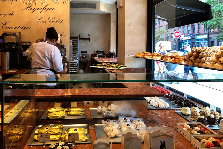
Our first stop was at Aux Merveilleux where they create a century old, gluten fee, low calorie meringue pastry. They are beautiful to behold, and so delicious. This store is the only one of its kind in North America. It’s hard to believe they are low calorie. We were treated to a mini which you can see in the lower right had corner of the photo.
IMG_0405ed

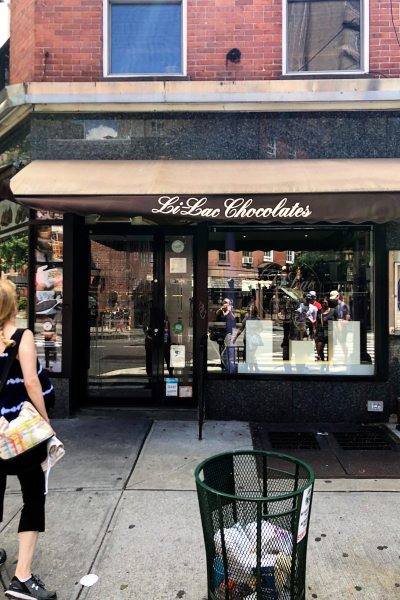
The next stop was Li-Lac Chocolates. We were given a salted chocolate caramel, and a bag to take with us of chunks of both milk and dark chocolate. We purchased more at a small Grand Central shop on our way out of town. Delish!
  IMG_0408ed

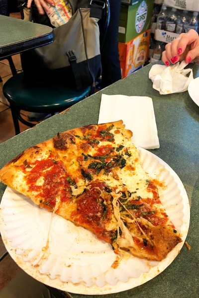
Bleecker Street Pizza has won the first place award for pizza in the NYC area for three years in a row. This may not look exceptional, but it truly was the best pizza I’ve ever had. Usually I like some meat and/or veggies on my pizza. No need here—the homemade sauce, perfect crust, and fresh mozzarella is all you need.
IMG_0412ed

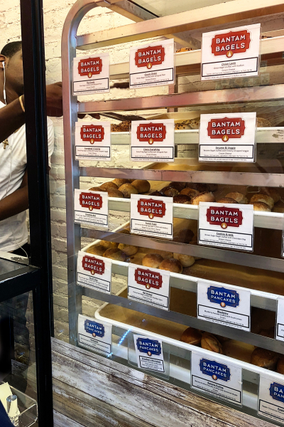
I knew I shouldn’t eat the whole thing, but I couldn’t help myself. And I was right, there were still three stops to go. Next up, Bantam Bagels which makes mini bagel balls filled with cream cheese. They have a wide variety, but I went with the everything bagel filled with veggie cream cheese. Supposedly, every Starbuck’s in the US carries these now, but I’ve yet to check it out.
IMG_0415ed

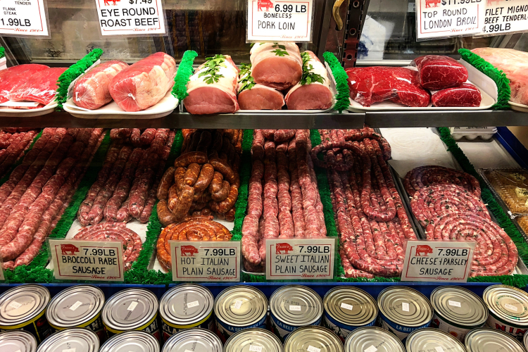
Our next stop was an Italian deli where we were offered an arancini and then a small Italian sub. That is my favorite kind of sub but there was no way I could eat it. They wrapped them for us, but it was so hot and humid, we thought better of eating them after carrying them back to the hotel. What a disappointment! If I lived in the Village, I’d be buying sausages here as well as subs.
IMG_0420ed

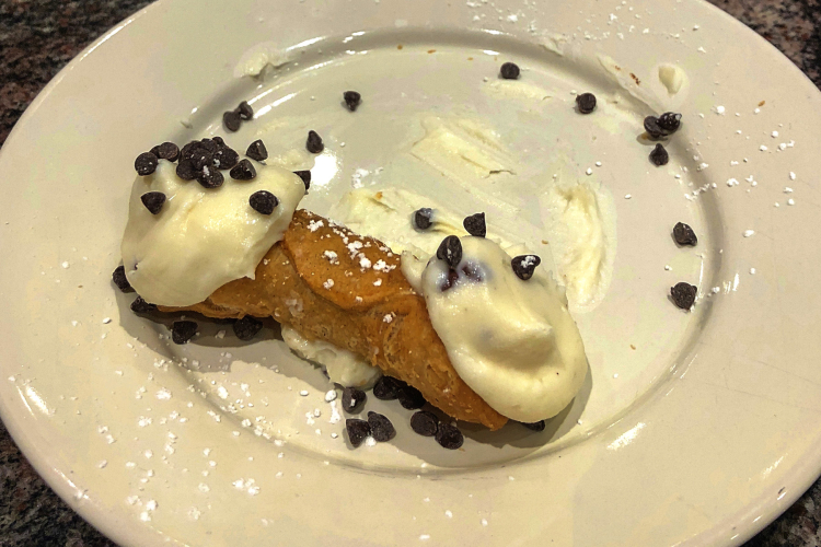
The last stop of the day was for a cold drink (or coffee) and an Italian cannoli. These cannoli were delicious—made with fresh ricotta—not too sweet. As full as I was, I managed to eat half of mine.
IMG_0423ed

Needless to say, we did not need dinner. We had tickets to The Book of Mormon that night. It was pretty raunchy, but it certainly kept us awake.

Our train didn’t leave until 2:15 on Thursday. Debbie had never been to NYC, so we walked through Times Square and up to Rockefeller Center. 
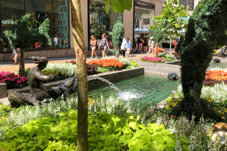
IMG_0428ed

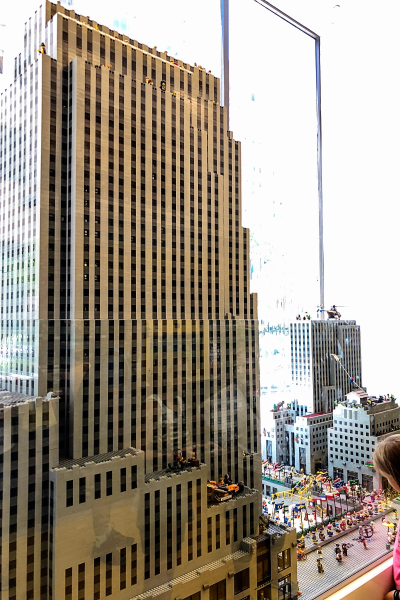
And to the Lego Store where we saw an amazing replica of Rockefeller Center built from Legos. Check out the little girl in the lower righthand portion of the photo to get  a sense of perspective. This was huge.
IMG_0430ed

Right across the street is Saks Fifth Ave. In my high school and college days, it was an elegant, and somewhat affordable department store. No more. Nothing but very high end designer items, and a very modern interior. I was so disappointed to see what had become of it. Next door is St. Patrick’s Cathedral which never disappoints.

IMG_0433ed

We had just a bit of time left so rode the subway to Central Park so Debbie could get a sense of it. I didn’t take any photos there. The train to NYC takes about 7 hours, and it is vastly improved since the days I rode it back and forth to Poughkeepsie to visit my dad. It’s very comfortable, and on the way down, very prompt. On the way home, we were a bit over an hour late. We had a great time. It was our first “girls out” trip, and we’ve decided it must become an annual event. It certainly was the highlight of my way too significant birthday!


Cards for Challenges

  • by

I have two cards to share today and both were created for current challenges. The first card is for three separate challenges: Freshly Made Sketches, Addicted to CAS,  and Seize the Birthday.

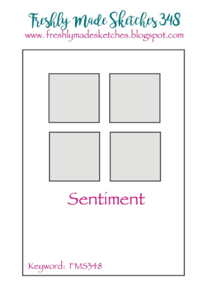
Here’s the sketch:

FMS Final 348-001

The challenge at Addicted to CAS is:

ATCAS - code word MASCULINE

And finally, the Seize the Birthday topping word this time around is: WATER.

SeizetheBirthday badge

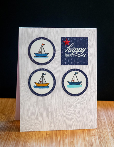
Here’s my card which is also for an upcoming 60th birthday of our friend who races sailboats.

SailboatBD

I’m really happy with how this turned out. I found the three sailboats from Papertrey’s “Tiny Treats: Valentines” in my “extras” box and immediately knew just what I wanted to do. The patterned paper is from Authentique’s “Seaside” pack which came in the July 2015 Simon Says card kit. The tiny anchors and navy blue were just perfect. I white embossed the sentiment from Papertrey’s “Inside and Out: Birthday” on a stitched square die from Simon Says, and added the star from a Bella Blvd sticker sheet that I colored with a red Copic marker.

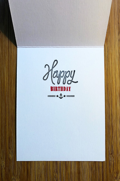
SailboatInside

The inside sentiment repeats the outside one, but I couldn’t help myself. The W+9 set, “Dockside” was just too perfect.

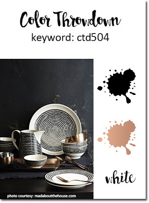
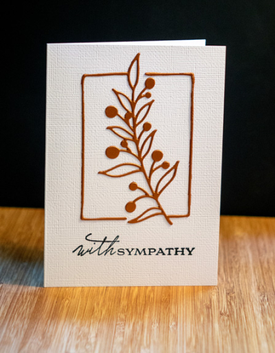
The next card is for The Color Throwdown Challenge. I recently acquired a gorgeous new die by Pinkfresh Studio called “Botanical Branch” and thought it would be perfect for a simple sympathy card using this gorgeous color combination of black, copper, and white:

Swatch504

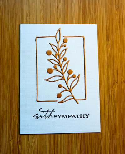
I die cut the Botanical Branch from copper cardstock from Paper Source. It’s metallic, but with a subtle sheen rather than a bright reflective surface. It was adhered to a white textured card with spray adhesive. Getting this delicate die cut on the card was the only challenge in making the card. 

WithSympathyCTD

The image, stamped in black, is from Papertrey Ink’s “Botanical Silhouettes.” CAS is definitely my preferred style, and I’m especially careful to be sure sympathy cards follow that design. Fortunately, I have no need for a sympathy card at the moment, but I never seem to have one in my stash and now I have two since I made a second one while I was at it.

CTDFlat

Thanks for checking in today. I’ll be back tomorrow to join Mary-Lou’s “Me on Monday” meme, and have a couple more cards to share this week as well.


Make It Monday: Repeating the Greeting

  • by

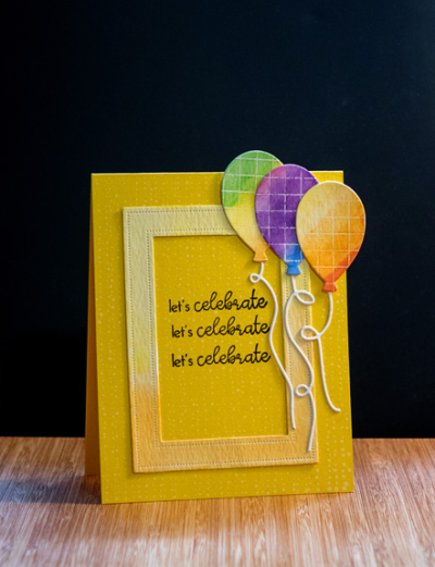
A quick post to share a card for Papertrey Ink’s Make It Monday challenge. I had a lot of time today in the craft room and took the opportunity to play. As it often happens, a fair amount ended up in the circular file, and this card is a far cry from the original idea in my mind. Nonetheless, it ended up an extremely bright and cheery birthday greeting.

Celebrate

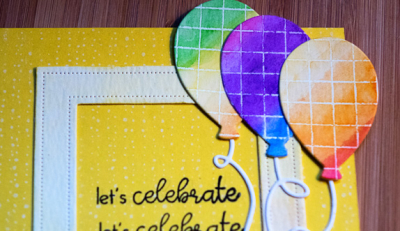
The card base is Bright Buttercup. I die cut a Pierced Frame from watercolor paper and used my watercolors create an ombre effect. The Pierced Frame dies are new and I think I’ll get a lot of use from them. The balloons were die cut with dies from “Balloon Bash” from a piece of watercolored paper I’d embossed with the Cover-up Grid stamp (also new). It didn’t work for the original plan, but it made pretty cute balloons. I die cut the “Balloon Strings” from watercolor paper as well.

CelebrateClose

The repeated sentiment is from “Ways to Say: Birthday.” It’s a $5 set that sees lots of action here. Before I added any of the elements to the card, I stamped it in white with Hero Art’s “Tiny Ink Dots.” I’ve had that so long, I don’t think it’s available any longer. I found all kinds of things when I purged my stamp collection earlier this week. You can’t see it in the first photo, but it’s visible in this one.

Tomorrow a friend and I are off to Buffalo Stamps and Things for their annual garage sale (hence the purging of stamps). Even if I don’t sell many of them, I’m much better organized, and I’ve cleared out a lot of space, especially in my storage cabinet for wooden stamps. Hopefully, I’ll restrain from buying any more stamps, though that probably won’t be easy!