Skip to content

The Flower Challenge: Use Your Latest Stamps–Take 2 and Seize the Birthday

  • by

A couple of nights ago, I spent the evening coloring all the images I had stamped with my new Pink Fresh Studio set, “Fleur 1.” I didn’t have anything in particular in mind. The next morning I set out to create some cards with the images, and I ended up with four cards, all quite different. This is definitely not my usual method for creating cards, but in this case, it proved rather interesting. You’ll see the results over the next few days.  I also tried to use some of the pre-cut die cuts and card fronts I had in my stash. Today’s card is another entry for The Flower Challenge to use your latest stamps, and for the Anything Goes theme at Seize the Birthday.

TFChallenge#29

SeizetheBirthday badge

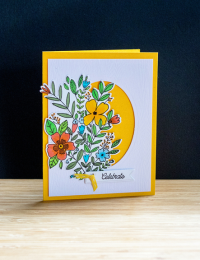
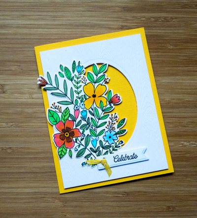
The floral arrangement on this card is the largest of the designs in the “Fleur 1” set. The woodgrain panel with the oval die cut was in my stash, and I added it to the front of a bright yellow card. The tiny tag is from Papertrey Ink’s “Stemmed Statements” set as is the sentiment. 

Celebrate

The oval die cut was adhered to the yellow card with dimensional tape, and the flowers were colored with Copic markers. The tag is embellished with a piece of yellow and white ribbon that has been in my stash for years.

CelebrateFlat

My first card created with this set was very clean and simple and you can find it here. All five cards that I’m made so far are quite different, and I have some ideas for other designs as well. I think this set will get a lot of use.

The Card Concept: Pineapple Party

  • by

TCC109 022019

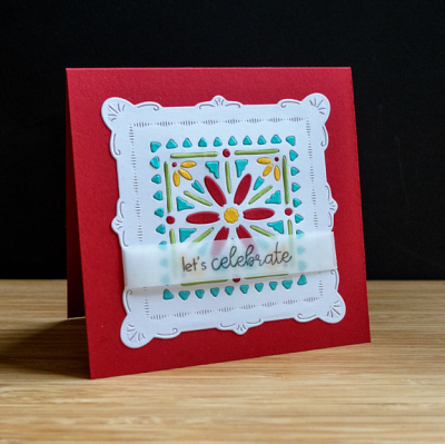
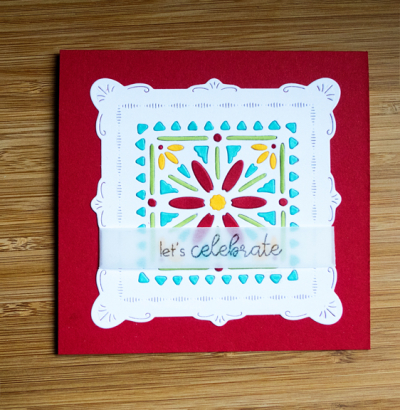
There’s no pineapple in sight on my card inspired by this week’s Card Concept Challenge, but you’ll see the same bright, cheerful colors—lots of fun to play with on these dull, gray days of winter. The card was also inspired by one created by Lizzie Jones for the Papertrey Ink’s release of the die I used. 

JasmineHB

It took a bit of time and patience to put this one together, but it was worth it in the end. I die cut the “Shape Shifters Square #4” from white, Pure Poppy, Summer Sunrise, Green Parakeet, and Hawaiian Shores. I backed the white die cut with a piece of “Stick It” which meant I didn’t have to glue each little piece into the die. It’s like putting a puzzle together. 

JasmineBDFlat

I followed Lizzie’s lead in putting the sentiment on vellum so the design on the card would show through. It’s from Papertrey’s “Ways to Say: Birthday” set, an inexpensive set with a good variety of sentiments.

Hope your Thursday is off to a good start!


Take Two on the AAA Card Challenge

  • by

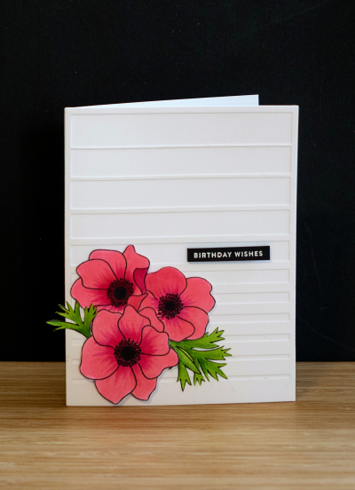
Here’s another take on the One Corner Challenge at AAA Cards. It really wouldn’t qualify for the challenge since there’s definitely a design in the white space, but I’m fond of it anyway. I used the same stamps as I did on the first card as guest designer, but chose a different color. Anemones come in so many colors. It’s a lot of fun to look at the images on the internet and choose which one you’d like to try.

Corner2

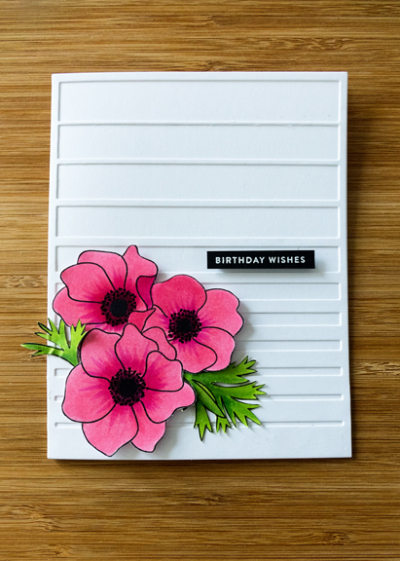
All the elements are the same as on my previous post with just the addition of Altenew’s “Gradient Stripes” cover die. I love these anemones by Pretty Pink Posh which I colored once again with Copic markers. 

CornerFlat

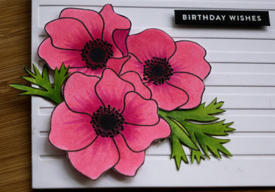
This time I added the black Glaze pen to the stamens which I like a lot better.

CornerClose

It’s nice to have a few birthday cards in the stash. Now I need to get busy with some “Thinking of You” cards. That category is just about depleted. 


The Flower Challenge

  • by

TFChallenge#29

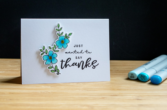
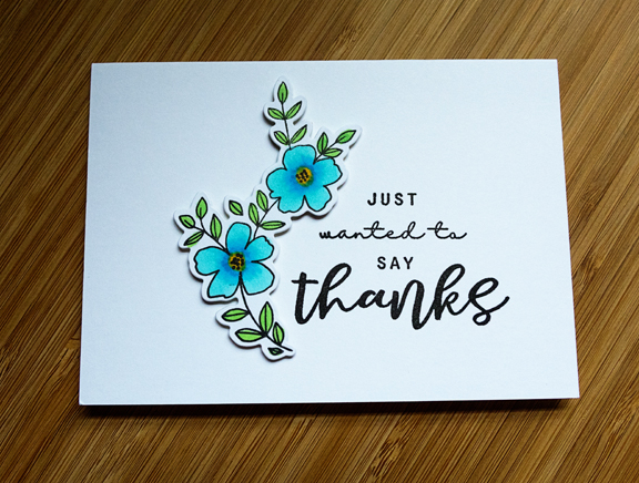
I’ve just recently found The Flower Challenge, and finally had time to make a card for the current challenge: use your latest stamps and dies. While we were in Racine, I got an email from Pink Fresh Studio (one of my new favorite companies) offering a free set of dies if you purchased the stamps. Caleb was sitting near me, and said I ought to go for it, since I would have new stamps when I sent him a card. I don’t think he realized it was a floral set. I needed a thank you note and after stamping all the flowers from the “Fleur 1” set, decided to color this simple cluster of flowers and leaves. 

Thanks

The sentiment is also from a new set from Papertrey Ink–“You Made My Day,” although I’ve had it a bit longer, I’ve never used it. I love how the flowers just fit around the sentiment.

ThanksFlat

I’m quite sure this combo will be pulled out again when I need a quick, CAS thank you note. 

AAA Cards: Guest Designer

  • by

Guest designer 2019

I’m thrilled to be joining the AAA Cards as Guest Designer. This honor follows another one—winning the “Mostly White” challenge in December. Luckily, I was able to postpone my guest designer stint until after our January travels. The challenge for CAS Game #134 is “One Corner” with an optional twist of “Music.” 

#134

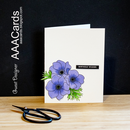
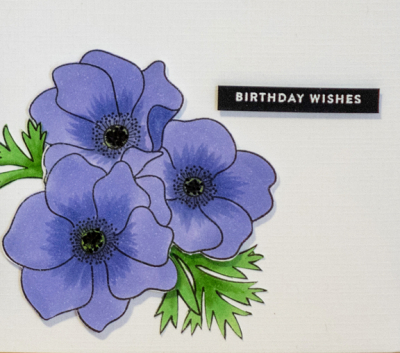
It was a bit of a surprise to me that I own very few “musical” stamps, and none that would grace a corner design. Instead I went with a relatively new Pretty Pink Posh floral set, “Anemones.” One of the criteria for the AAA Card Challenge is to have significant white space unadorned with any embossing folder or design. 

AAAChallege

After coloring the images from the Anemones with Copic markers, I fussy cut them out. I mounted the flowers on the corner of the Fresh Snow Linen card with dimensional tape, and then tucked the leaves in underneath. The sentiment from Simon Says “Tiny Words,” was embossed in white on a thin strip of black cardstock. Simple, CAS for sure, and lovely, I think.

AAAClose

Here’s a closer look at the flowers. I added some dots to the center of the flowers with a black Glaze pen, but it doesn’t photograph well! Thanks to the team at AAA Card Challenges for the honor of guest designing, and to STAMPlorations for the generous gift certificate.


Five in Five & Photowalk #06

  • by

The weather here has been pretty frightful—snow, strong winds, and cold temperatures. Even on the days when it has warmed up a bit, the sidewalks are still too icy for safe walking. Any exercise is coming from the gym. This is about the time of winter when I begin to tire of the whole event, and yet I know from experience, there’s a good 6-8 weeks of winter left for those of us in western New York. 

Fortunately, there are a few places (and times) we you can take solace—and your camera—to events and places where the organizers know exactly what Rochesterians need right now. For the next two weeks, The George Eastman Museum is hosting The Dutch Collection. George Eastman loved plants and flowers and every year imported thousands of bulbs to bring spring into his mansion. I’ve posted photos from this event in the past, although last year I missed it. Here are some photos from my trip on Thursday, the first five taken within five minutes for Sandie’s Five in Five meme.

IMG_1183ed

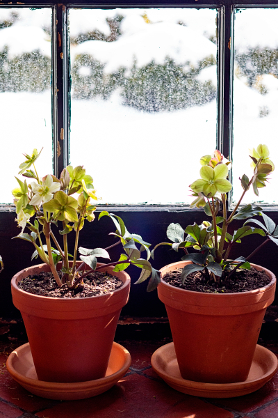
Pots of Helleborus lined the hallway from the photographic museum to the mansion. In the pots, they were not terribly impressive, but . . .

IMG_1184ed

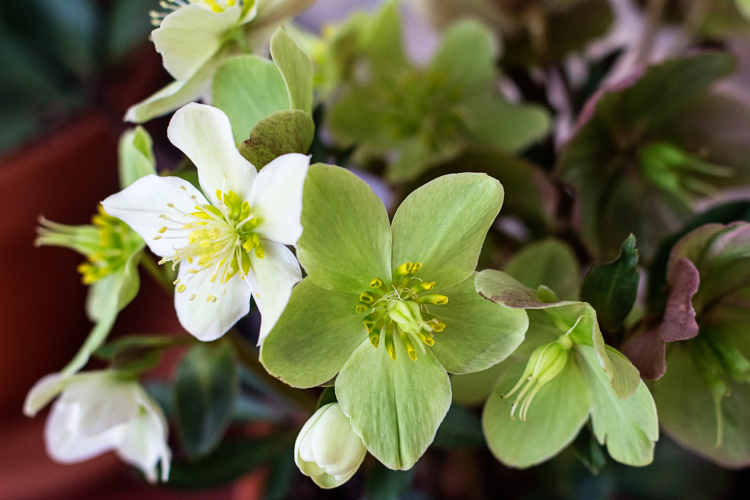
. . . close up they were lovely.

IMG_1186ed

Looking down on some beautiful Fox Trot tulips.

IMG_1187ed

Flowers in the atrium.

IMG_1188ed

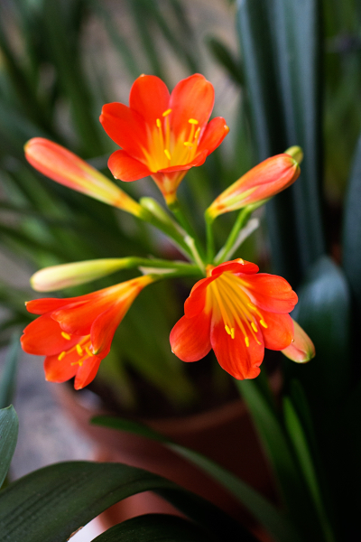
And always one of my favorites, the clivia.

One of the challenges I’ve set for myself this year is to try to use the different cameras and lenses I own. I finally mastered the controls of my Olympus mirrorless camera in January, and all the photos I took on the trip to Disney World and Wisconsin were taken with the Olympus or my iPhone. The last few years when we’ve traveled I’ve taken my Sony Cyber Shot RX10, lighter than my Canon Rebel, no interchangeable lenses, but a great zoom. What’s been neglected is the camera I relied on for years–my Canon Rebel and my favorite fixed lens the 50mm. So that’s what I took with me on Thursday. I was surprised at how much heavier it is, and how much I’ve come to rely on Live View and a zoom when taking photos. It forced me to “see” things a bit differently than I’ve been accustomed to. 

IMG_1190ed

The bank of flowers (mostly tulips) in front of the organ in the Conservatory.

IMG_1194ed

Even more flowers upstairs overlooking the Conservatory.

IMG_1198ed

Purple Rain Amaryllis

IMG_1199ed

And last, a collection of narcissus in front of windows showing the snowy landscape of the outside gardens.


Too cute—Five More Valentines

  • by

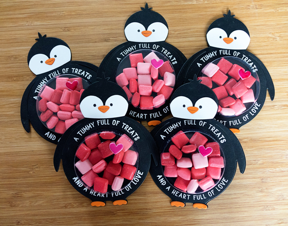
I made all five of the grandchildren identical valentines this year, and I love how they turned out! 

Penguins5

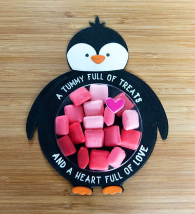
They were easy to put together thanks to Betsy Veldman’s design for the Potbellies (Papertrey Ink.) She designed several different versions–a Santa, a reindeer, and a unicorn, but the penguin was my favorite and I thought it would make a great valentine. I love the sentiment that she included in one of the sets. Perfect for Valentine’s Day. The only thing I added was a puffy heart to each of the tummies. 

Penguin1

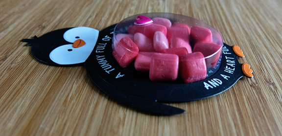
I wasn’t sure what to fill the tummy with. Chocolates might not have made it to Wisconsin, and gummies (the kids’ favorites) would have probably stuck together. I found these mini Starburst, and even if the kids didn’t like them, they were the right colors, and they stay separated.

PenguinSide

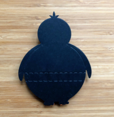
In case they wanted to try the candy, I die cut a Lawn Fawn “zipper” on the back of the penguins. I’ve had the die for awhile, but this is the first time I’ve ever needed it. 

PenguinZipper

I love Valentine’s Day, and I love creating cards for it. These were definitely the most fun this year.

Happy Valentines Day!

  • by

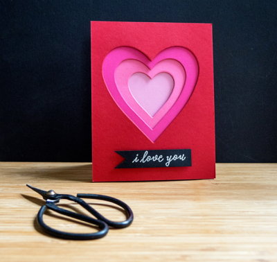
I have two more valentines to share today, and some more for another post tomorrow. Today’s cards use the positive and negatives of the same die. The first card was inspired by Dawn McVey’s card during Papertrey Ink’s December release. 

TracyVal

I used My Favorite Things nested heart dies to cut hearts from Pure Poppy (my favorite PTI color,) Raspberry Fizz, Hibiscus Pink, and Lovely Lady. Then I layered the hearts, one on the other, using dimensional tape. I love the way it came out. The sentiment is from the Hero Art’s January kit which I embossed in white on a strip of black cardstock.

TracyValClosejpg

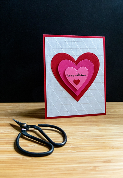
When I finished the card, I had three hearts laying on my desk, and wanted to make a valentine for the sixth grader I tutor twice a week. 

Serena

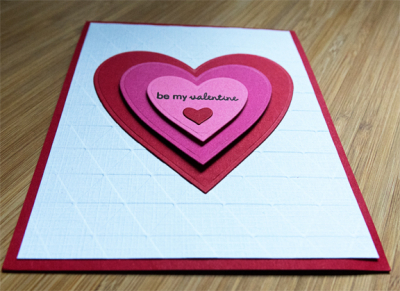
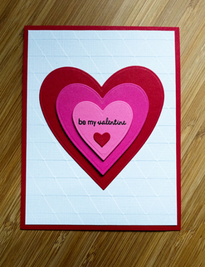
Once again, I used my favorite Pure Poppy for the card base and the largest and smallest of the hearts. The white panel was created with an old Cuttlebug embossing folder on Fresh Snow Linen cardstock which was also lying on my desk from a previous project. This was definitely the quickest of the valentines I made. The sentiment is from an oldie but goodie: Papertrey Inks “Tiny Treats: Valentine.”

SerenaClose

I layered these hearts with dimensional tape as well.

SerenaFlat

I’m entering these at Papertrey Ink’s new Win It Wednesday challenge. Laura Schmidlin is hosting a “favorite” there. Last week it was a favorite stamp; this week it’s your favorite color of cardstock. Pure Poppy wins hands-down!

Lauries-Fabulous-Favorites-1

I’m joining The Card Concept “Love is in the Air” as well.

TCC108 020619

If you celebrate Valentine’s Day, I hope it’s a good one. We went out to dinner to celebrate on Saturday night. We had a fabulous meal at one of the best Italian restaurants in town. I was chair of the planning committee that hosted a Presbytery-wide conference on Saturday. We had over 200 people register, and most of them attended. We decided celebrating Valentine’s Day early had a double advantage. I was definitely not interested in cooking that night, and Valentine’s Day can be crazy at a restaurant. We’re having meatloaf at home tonight—one of Tracy’s favorites.


Simon Says Wednesday Challenge: Black, White plus One

  • by

Wednesdayblog-logo

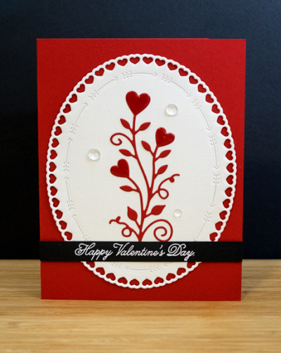
The new challenge at Simon Says Wednesday Challenge is “Black, White, plus One Other Color.” I have my favorite color combination in a valentine for a friend: black, white, and red.

JeanValentine

Creating this card gave me an opportunity to use two new products: Papertrey Ink’s “Shape Shifter Oval #4” and Penny Black’s “Love is Growing” die. I purchased the Penny Black die at my favorite store in Florida—Whim So Doodle. I’m not often in Florida, but if I am, and I can get to Whim So Doodle I don’t pass up the opportunity. They carry an extensive array of art supplies, journaling supplies, stamps, stencils, and dies. There’s nothing like it anywhere near here.

I die cut the two outer layers of the Shape Shifter die and adhered the Penny Black die to the center. The sentiment is from Papertrey Ink’s “Keep It Simple: Valentine” set which got a workout this year. I think I used it on nearly every valentine I made-either inside or on the front.

JeanClose

Although you can see it a bit better here, it’s still hard to tell that I coated the three hearts with Nuvo Crystal Glaze, and then added three “Clear Drops” by Katia Studio.

I’ll be back tomorrow with some more valentines.

Valentine Challenges

  • by

It’s been a crazy week, but in between all the appointments and commitments I managed to get some valentines made. The ones going to Wisconsin were in the mail earlier this week. I have one to share today for a couple of challenges. First off, the current Time Out Challenge:

Time Out Challenge 128 (1)

I was attracted to the red and white color combination, the embossed background, and of course the hearts. On our way to Wisconsin in January, we stopped at Buffalo Stamps and Things. All Alexandra Renke products were 20% off with a coupon so I picked up some paper, a die, and two embossing folders. This one was perfect for Valentine’s Day, but I can easily see using it for an anniversary or a wedding card.

ValentineMB

After running the white cardstock through with the embossing folder, I used an old, old corner punch to add a bit more interest. The sentiment, from Papertrey Ink’s “Keep It Simple: Valentine” was embossed in gold on a banner die cut from Pure Poppy cardstock. The whole panel then was added to a top-folding Pure Poppy card. CAS, but pretty.

ValentineMBClose

Here’s a closer look at the amazing dimension you get with the embossing folder. 

I’m also linking this up to Simon Says Monday Challenge: Add Some Red.

Mon-challenge-badge_zps05647c53

Photowalk #05: Brickstone Trail

  • by

There’s been a dramatic change in the weather. On Friday, the majority of the schools in the county were closed due to freezing weather. It was -20° with wind chill. Today we broke a record for a high temperature 63°. It was definitely time to get out and take some photos. I chose to try the Brickstone Trail which I’ve enjoyed before. It turned out to be somewhat more treacherous than I imagined. The first part of the trail is shaded, and it was still snow-covered and quite icy. By the time I reached the bridge, the trail was clear, and the walking was much easier. 
 
I have to admit after the first four photowalks were a lot more interesting, and it was a lot easier to find interesting subjects. All of them, of course, occured while we were traveling. Nonetheless, although not very colorful, here is a look at western New York during a January thaw. 
 
IMG_1347ed
 
IMG_1348ed
 
IMG_1350ed
 
IMG_1357ed
 
P2040447ed
 
P2040448ed
 
I have one more image to share, but I’m saving it for a Winter Scavenger Hunt post which I hope to have up by the end of the week.
 

Seize the Birthday: Black and White

  • by

SeizetheBirthday badge

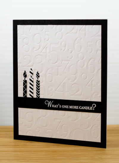
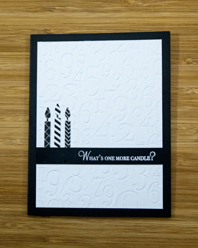
The current optional “topping” at Seize the Birthday is Black and White. I often participate in the challenge without using the “topping,” but this time I had an idea and decided to go with it. I’m a huge fan of red, black, and white, but I don’t think I’ve ever created a card (birthday or otherwise) that was just black and white. Here’s what I came up with:

B&WCandles

I knew I wanted a tone on tone background. Last weekend, I organized and cataloged my die collection so I knew I had the perfect Impression Plate by Papertrey Ink for a birthday card: “By the Numbers.” I also found an Impress die that cuts five candles and I die cut them from a variety of patterned papers by My Favorite Things. After I embossed the sentiment from Papertrey’s “Wishes Come True,” there was really only room for three candles. Since this isn’t meant to be an age-related birthday card three candles was fine.

B&WCandlesFlat

I have another idea or two for this challenge, but need several “custom” birthday cards for friends and family before I start playing again.

Since this is definitely CAS, I’m also entering it in the CAS on Friday challenge which is “Birthday.”

Fan Friday

Celebrate!

  • by

We’re home, and we brought the freezing temperatures with us. The city schools closed for today, and several school districts have now closed for after-school and evening activities. The wind chill is -14°; not as cold as Chicago or Racine, but pretty bitter. Makes for a good day for crafting.

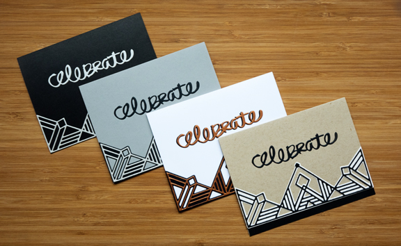
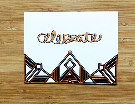
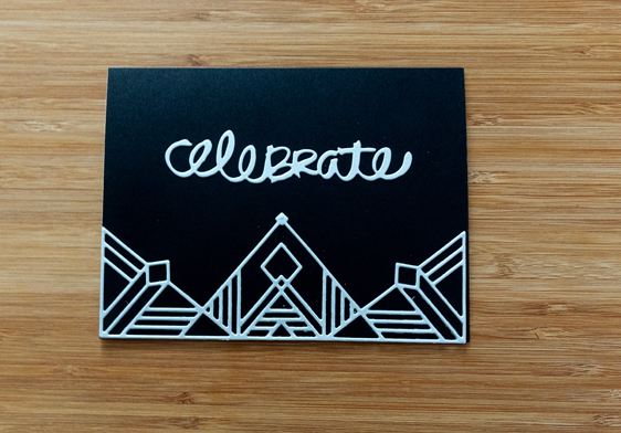
I have four cards to share today; no stamping in sight. While we were away, PinkFresh Studios had a wonderful release. One of the dies I ordered was the Gatsby. As soon as I saw it, I knew it had great potential for masculine cards. There are two dies, meant to be layered one on the other, although the top layer is lovely on its own. I die cut them from a variety of shimmer and metallic cardstock and came up with four variations.

Celebrate4

The sentiment is from Papertrey Ink’s “Good Times” set. The stamp set came in an odd size, and so it’s stored at the back of my box for birthday stamps, and I often forget it. Over the weekend I organized dies, and started to inventory them, and rediscovered it.

CelebrateKraft

I think this is my favorite. I found this card in a box; I’d already trimmed the front and added a black border to the inside of the card.

CelebrateGray

Gray, silver and black

CelebrateWhite

White, bronze and black; I die cut the sentiment twice and layered them for a subtle shadow.

CelebrateBlack

Black and silver; only the top layer die cut. This card proved to be very difficult to photograph!

This week’s challenge at Simon Says Wednesday Challenge is “Anything Goes.” Perfect!

Wednesdayblog-logo

Photowalk #04: Wingspread

  • by

P1240405ed

Sarah and Adam’s new home is just a mile or so away from The Johnson Foundation at Wingspread. Wingspread was originally the home of H. F. Johnson and his family and was designed by Frank Lloyd Wright, who also designed the corporate headquarters for the SC Johnson Company. Completed in 1938, it remained their family home until the late 1950’s, when Johnson and his family moved into a newer home on the property and Wingspread became the home of the Johnson Foundation.

P1240442ed

The Johnson Foundation is a retreat and conference center. “The mission of the Johnson Foundation at Wingspread is to create intimate, inspiring meeting and conference experiences that foster collaboration and innovative problem-solving.  Bringing almost six decades of convening expertise to regional, national and global groups of leaders and experts, the Foundation is wholly dedicated to convening for positive and lasting change.” Their initiatives have resulted in the formation of the National Endowment of the Arts, the International Criminal Court, and National Public Radio, among others.

P1240417ed

When there are no conferences being held, they offer free tours of the building. Given the weather, we ended up having a personal tour of the house which includes a video about the design and building of the house, as well as some interesting history. Two of H.F Johnson’s children share their memories of growing up in the house and tell stories of some of the design problems inherent in Frank Lloyd Wright’s design.

P1240411ed

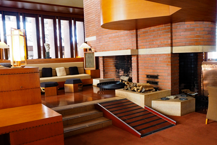
We’ve been lucky enough to visit several Frank Lloyd Wright homes: Taliesin, Taliesin West, Oak Park, Fallingwater, and the Darwin D. Martin House. This home is more dramatic than any of the others we’ve visited. The main room is 30 feet high with four fireplaces.

P1240419ed

The tall windows you see in the back are also doors that open onto the veranda and lawns. One hallmark of Frank Lloyd Wright architecture is the connection he makes between the home and the natural landscape. If you click on this link, you can see an aerial view of the home and can immediately grasp why it was named Wingspread. One of the design flaws involves the beautiful, small windows that encircle the main room. They leaked during rainstorms!! It took a long time, and lots of work to correct the problem.

P1240418ed

One of the four fireplaces in the main room reaches from the floor to the ceiling. Frank Lloyd Wright thought it would be very cool to put birch logs in the bottom and watch them burn. Turns out the logs burned on the bottom (of course!) and fell out of the fireplace into the sitting room!
P1240428ed

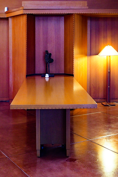
Another idea that didn’t work out was the dining room table. (Frank Lloyd Wright almost always designed furniture for the interiors of all the homes he built.) You can’t see them in this photo, but there are wheels just inside the legs. The cupboard at the end of the table opens up into the kitchen. His idea was to roll the table into the kitchen after the first course, reset the table with the next course, and wheel it back out. The problem was that not everyone finished their course at the same time, and some found their plates disappearing before they had finished. According to one of the family members, it was only used once or twice.
P1240413ed

P1240431ed

The light from all the windows changes constantly throughout the day. As we were finishing our tour, the sun came out and made lovely patterns on the walls. And now, some views of the outdoors.
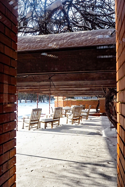
P1240433ed

The view of the patio from the main room.

P1240438ed

P1240437ed

And because I like trees, one of a snow-covered tree that was along the circular drive. (I had a tree image from the first photowalk as well. Maybe I’ll have a collection by the end of the year.)

P1240439ed

On our next trip, we’re hoping to get in a tour of the SC Johnson company campus.


Take Three Thursday: Winter Photography Scavenger Hunt

  • by

I’m joining Mary-Lou for Take Three Thursday with three photos taken in the last week or so for the Winter Photography Scavenger Hunt organized by Eileen at A Bracelet of Days. For some reason it’s taken me some time to get into the groove for this years scavenger hunt. I now have six of the items, but will share three today.
P1090208ed

The first prompt was “At the end of the day.” We arrived by boat in Disney Springs just at sundown. I shared a similar photo on this post.

IMG_1284.edjpg

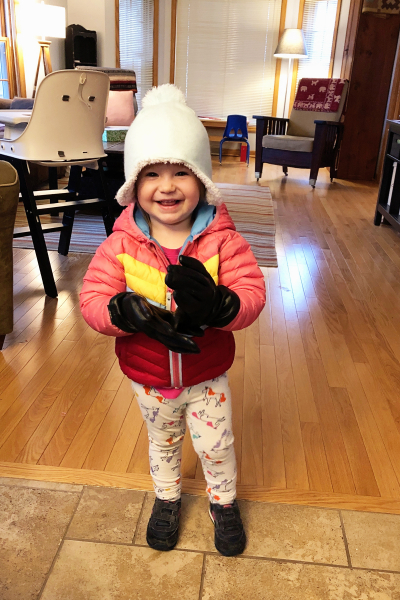
Here’s Hannah, “Dressed for the Season,” #11.

IMG_1282ed

“Flight” was #15. I took this as we left Orlando, headed back to cold temperatures and lots of snow!