Skip to content

Photo Inspiration at Just Us Girls

  • by

I’ve become a fan of the rotating challenges at JUGS: colors, trends, words, photos, and occasionally a wild card week. This week is the photo challenge:

Screen Shot 2020-06-03 at 10.06.01 AM

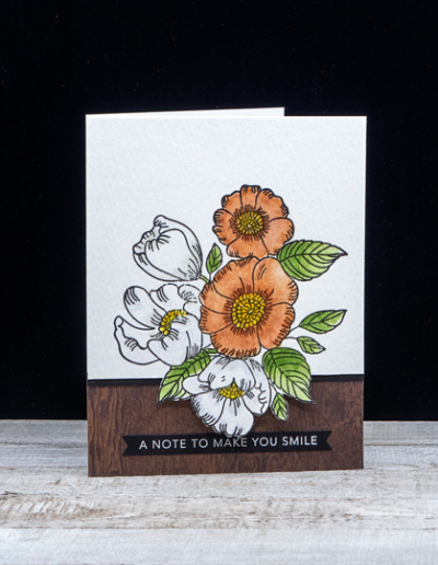
I was inspired by the color of the flowers and the wooden tray and table.

PhotoFlowersBlog

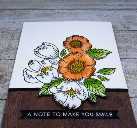
The cluster of flowers on Simon Says “Thankful Flowers” seemed to be a good fit. I stamped them on Arches Cold Press watercolor paper and watercolored them with my Daniel Smith watercolors. I decided to fussy cut just around the bottom flower and then carefully cut to the edges with a craft knife. That allowed me to layer the woodgrain paper beneath the flowers.

PhotoFlowerClose

I added a narrow strip of black cardstock to separate the watercolored flowers from the woodgrain paper.

PhotoFlowerFlat

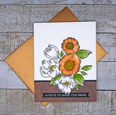
A sentiment banner from Taylored Expressions “Sentiment Strips” finished it off. I found a bronze metallic envelope from a Simon Says kit which goes well with the card, so the recipient will get a little glitz along with the card. 

Take a look at what the Design Team has created at Just Us Girls this week.

Christmas is Coming

  • by

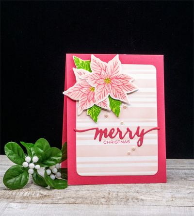
One of my goals for October is to complete five Christmas cards a week. Although making multiples of one design is certainly the most efficient way to meet the goal, today I have two cards that were created for specific challenges. First off is a pink poinsettia for the Christmas Kickstart Challenge whose current theme is PINK!

Challenge Badge Pink

For several years, I’ve owned a Hero Arts set, “Color Layering Poinsettia.” The first two words of the title tell me exactly why I’ve never used it. For some reason, color layering is something I always struggle with. One of my good friends who is also a stamper loves layering and hates coloring. I’m the reverse. But I was determined to make this work, and it wasn’t quite as frustrating as I anticipated.

PinkPoinsettia

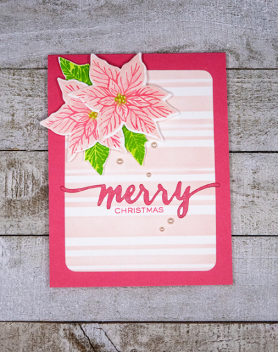
In fact, stamping and die cutting the poinsettias went pretty well. It was figuring out a design for the card that took some time. I finally decided on a stenciled background and used Altenew’s “Beach Towel Stripe.” It may be a summery name, but it worked out well. The inks and papers are all from Concord & 9th.

PinkPoinsettiaFlat

It’s almost impossible to see, but the die cut “merry” from W+9’s “Hand Lettered Holiday” is coated with glitter as are the petals of the poinsettias. I added a few pale pink pearls from AMuse which have been in my stash for years.

I’ll be adding this card to Darnell’s NBUS Challenge since I’ve never used the Hero Arts set before.

NBUS

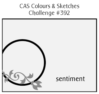
The next card was created specifically for two challenges. First the CAS Colour and Sketch Challenge:

Sketch 392

And also for The Flower Challenge where the current challenge is to use a circle.

TFChallenge#49

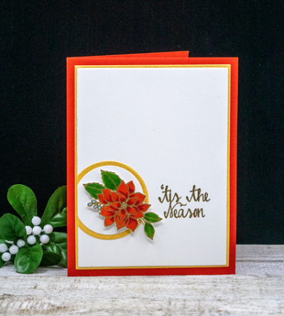
I had already stamped and embossed this poinsettia cluster from Waffle Flower’s “Poinsettia,” so it was just a matter of coloring it with Copics and assembling the card according to the sketch.

TisThe Season

Metallics are so hard to photograph! The gold circle and thin border are a beautiful gold shimmer paper, and the sentiment is also embossed in gold. It’s a little easier to see here:

TisTheSeasonFlat

It’s not often that a sketch inspires me, but I loved this one. 


JUGS: The Color Challenge

  • by

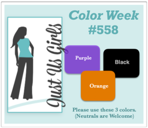
It’s Color Week at Just Us Girls Challenge:

Screen Shot 2020-07-18 at 5.15.50 PM

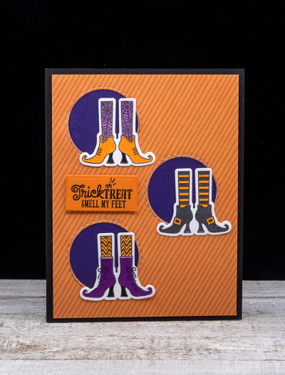
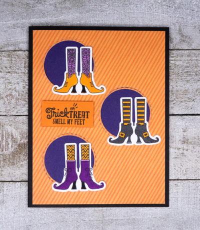
The colors–purple, black, and orange–seemed custom-made for a Halloween card. This time, the design I envisioned ended up looking exactly as I imagined it. 

Colors

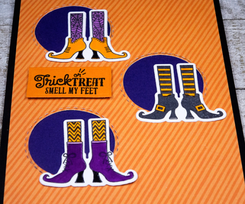
I started by stamping and coloring with Copic markers the three sets of witches’ feet in purple, black, and orange. The stamps and coordinating die are from a Hero Arts set “Witch Feet.” After diecutting the feet, I die cut three circles with Simon Says “Stitched Circle” dies in a piece of orange patterned paper from an old American Crafts 6X6 paper pad. I adhered that to a piece of purple cardstock and trimmed both to leave a narrow border on the black card base.

ColorsClose

I arranged all three sets of witches’ shoes in front of the die cut circles. 

ColorsFlat

The sentiment is from a Make-It-Market kit from Papertrey Ink, “Halloween Pin-ups,” and couldn’t be more perfect! I die cut that with a Pinkfresh Studio, “Worthy Frames.”

I haven’t decided yet how many Halloween cards I’ll be making this year. My three granddaughters seem perfectly happy to share a card, but Caleb and Hannah definitely want cards of their own. Here’s the first one, and I have a second one in mind for a challenge that popped up on my radar a couple days ago. We’ll see how time and inspiration work out this year! 


Color Hues #4

  • by

Color Hue Logo!

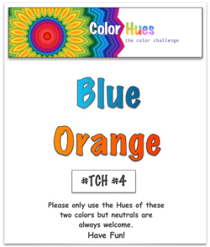
It’s time for the fourth Color Hues Challenge, and the colors this week are:

Color Hues Badge #4 jpg

This is a favorite color combination for me, and I actually made two cards. The first one is the one you’ll find on the Color Hues Challenge blog.

Blue-Orange

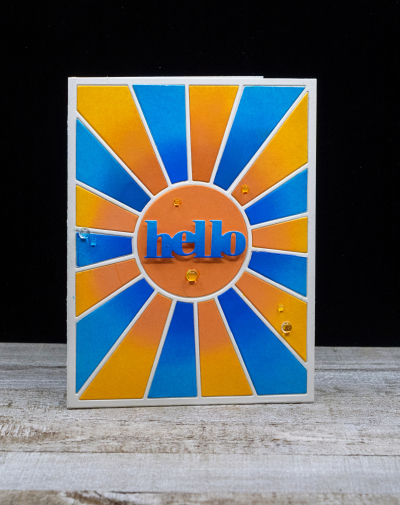
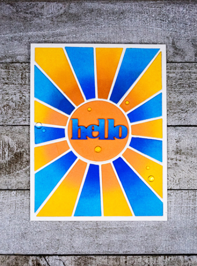
I started by ink blending two pieces of cardstock with Distress Inks—Salty Ocean and Blueprint—for the blues, and Carved Pumpkin and Spiced Marmalade for the oranges. I used the darker colors toward the center. Then I die cut both pieces with Pinkfresh Studio’s “Pop-out Sunburst” die, and pieced the card together.

Blue-OrangeFlat

I did a bit of ombré ink blending on a scrap of cardstock, and die cut the greeting from Simon Says “Bold Hello,” adding it to a circle of orange die cut with the Pinkfresh Studio die. A few Rainstones from Papertrey Ink finished off the card.

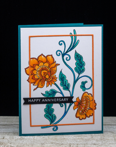
The card above was not the card I started to make. Originally, I planned for a floral image but after coloring it with Copic markers I couldn’t decide on a design for the card. That came somewhat later.

BlueOrangeFloral

In the end, I liked this card as well, so decided I’d share it as an alternative. It also points out that you may choose any number of hues of a given color for the challenge. The image is from Altenew’s “Needlework Motifs” which I colored with Copic markers. 

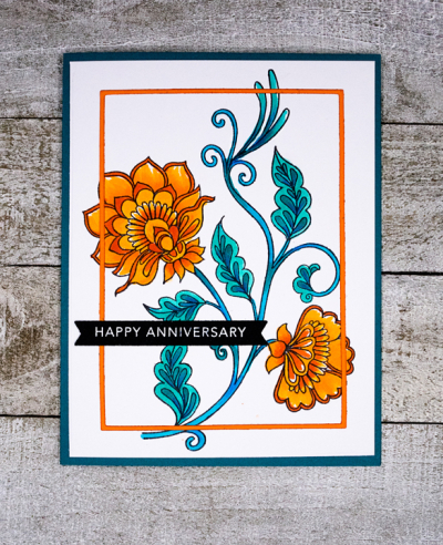
BlueOrangeFloralFlat

I finally wondered what it would look like if I added a thin frame over the focal image, and die cut one from Orange Peel cardstock (Simon Says) with the Simon Says A2 Thin Frames. It wasn’t as difficult to adhere as I thought it might be, and I’m quite happy with the overall look. The sentiment is one from Taylored Expressions “Sentiment Strips.”

Lucie is our fabulous guest designer this week. Hop over to the Color Hues blog to see what she and the rest of the Design Team have come up with . . . and join in the fun!

Birthday Blessings

  • by

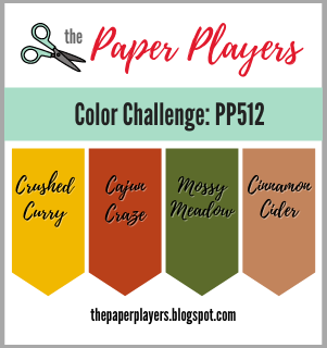
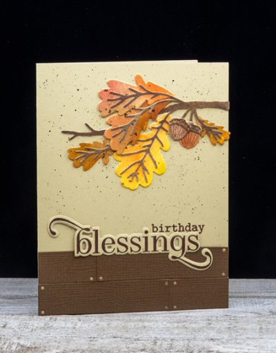
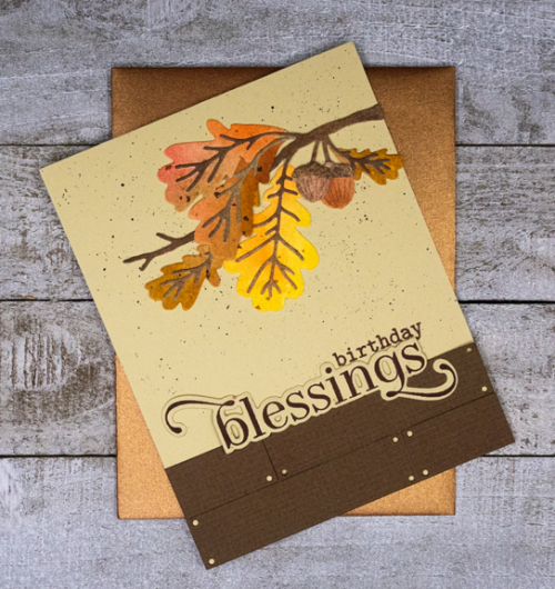
In September, I purchased two dies from The Greetery’s new collection: “Botanic Cuts: Mighty Oak,” and the “Shiplap Builder.” I recently had time to make a fall birthday card (soon to go in the mail) and used the challenge from the Paper Players for my color scheme.

Pp512

There are over 18 names on my October and November birthday and anniversary list. Many of the cards in my stash are too summery, so I’m back to needing some new cards. This one fits the bill.

BDBlessings

The card had a rocky start. I had finished it, and decided it needed a few ink splatters. I’m always a bit apprehensive when I start that process, and there’s good reason why. The splatters were too big and too many, so I carefully disassembled the card and started over! This time I splattered first and with a much smaller paintbrush. Lesson learned, I hope!

BDBlessingsFlat

The sentiment is also from The Greetery: “Blessed Blooms,” which has the same font as an earlier set which I like so much. The dies are awesome, too! The beautiful copper envelope was part of a Simon Says kit. 

It’s another beautiful fall day here! Off to enjoy it.

Just Under the Wire

  • by

The Pinkfresh Studio’s World Card Making Day Challenges close in just a few hours. Luckily, I had time this afternoon to make two more cards. One for the Sympathy Card Challenge, and one for the Thank You Card Challenge. Both use Never Before Used Stuff again so I’ll be linking up to Darnell’s NBUS October Challenge. 

NBUS

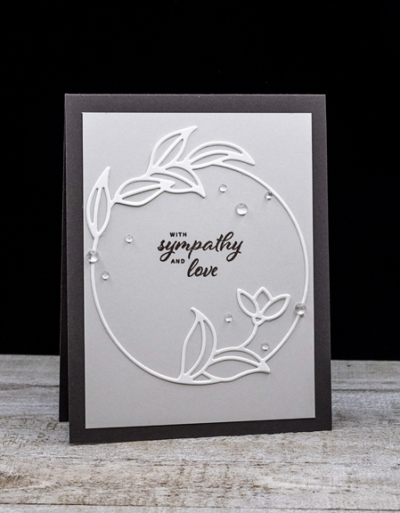
First off, the sympathy card. I like CAS cards with neutral colors for sympathy cards and this definitely fills the bill.

Sympathy

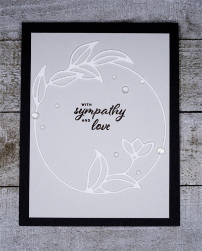
Although I’ve owned the Botanical Circle die for quite some time, I’d never used it before. I had, however, die cut it in several colors, one of them being white. I thought there was just enough contrast with the Soft Stone background, and then layered both on a top-folded card base made from Smoky Shadow. Both cardstocks are from Papertrey Ink.

SympathyFlat

One thing I’ve discovered during these challenges is despite my very lovely collection of Pinkfresh Studio products, I don’t have a lot of sentiments to choose from. This one, however, is perfect and is from their Oval Foliage Wreath stamp set.

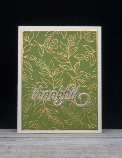
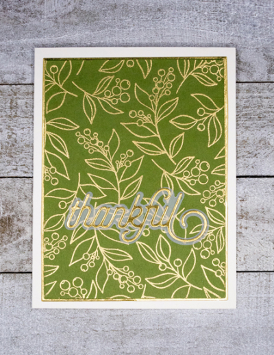
Next up is the first of the Christmas thank you notes. I just purchased the beautiful Winterberry Background stamp, and embossed it in gold on Asparagus cardstock (Gina K).

Thankful

The sentiment is also a product I’ve owned for some time and never used before. I love it, and I’m sure you’ll be seeing it again. It’s the Simon Says “Thankful 2” die.

ThankfulFlat

I die cut the shadow with vellum, and the main sentiment from the same gold cardstock (Michael’s) that I used as a narrow layer on the card. 

It’s a beautiful fall day here, 20° cooler than yesterday, but a lot less wind, and no threat of rain. Here’s hoping for a couple more weeks of decent weather before winter weather appears!

Just Us Girls: Ombre

  • by

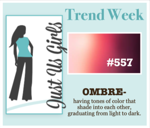
It’s the second week of my Guest Designer gig for the Just Us Girls Challenge which I am really enjoying! This week is Trend Week and the theme is OMBRE.

Screen Shot 2020-06-03 at 5.17.55 PM

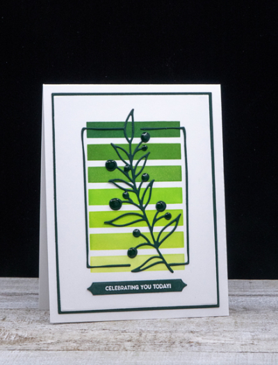
This gave me an opportunity to use a new stencil that arrived not long ago from Simon Says, called “Simple Patterns: Trio” designed by Cathy Zielske. I chose the simple stripes pattern, and used the Pinkfresh Studio ink cube pack called “Over the Hills” along with Concord & 9th’s Evergreen to create an ombre background.

OmbreBlog

Pinkfresh Studio’s “Botanical Branch” was die cut from Pinefeather cardstock (PTI) and layered over the stenciled background. 

OmbreClose

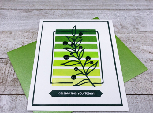
Then I die cut the focal panel and the narrow Pinefeather border with Gina K’s “Master Layout #1” dies and layered them onto a top-folded cardbase. The sentiment from The Greetery’s Sentiment Suite: Birthday was embossed in white on a skinny Pinefeather banner from Papertrey Ink. 

OmbreFlat

The final touch was to add Nuvo Crystal Glaze to each of the berries on the delicate branch for a bit of dimension.

Please hop on over to the JUGS blog to see what the Design Team has to share!


All Things Pinkfresh

  • by

Saturday was World Card Making Day. I didn’t see all the Pinkfresh Studio Challenges until too late to participate. Thankfully the galleries are open until this weekend. I have a lovely collection of Pinkfresh stamps and dies, so Sunday I spent some time with my Pinkfresh stash. I have more I’d like to do, but the week is slipping away from me, through no fault of my own!

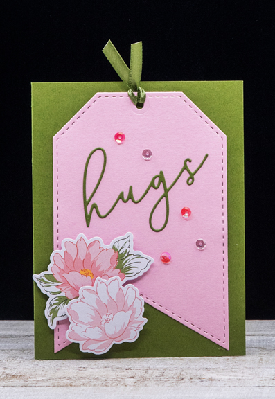
Here’s #1 using a “Shaker Tag” die cut, “Everyday Script” die cut, and two blooms from the “Celebrate Ephemera” pack for Challenge #1: Die Cutting and Challenge #6: No Stamping. The tag is one of several in a set, and it’s one of those Never Used Before Stuff that’s in my Pinkfresh collection. 

Hugs

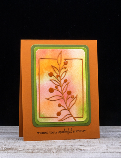
The next card is for Challenge #10: Watercolor. This time I watercolored the background and die cut the beautiful Pinkfresh Studio “Botanical Branch” from some Canyon Clay cardstock. A double layer of green (Asparagus from Gina K and a scrap of green paper from my stash) sets it off from the Canyon Clay card base. The sentiment isn’t PFS, but an oldie and favorite of mine “Wishes Come True” by Papertrey Ink. I added some Nuvo Crystal Glaze to the berries.

WishingYou

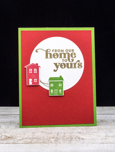
Number three ended up so differently than I imagined, and took way too long given it’s CAS design at the end. I used the new “From Our Home to Yours” stamp and die set. Love the little paths from one house to the other. Bright reds and greens and another Christmas card for the stash. 

FromHome

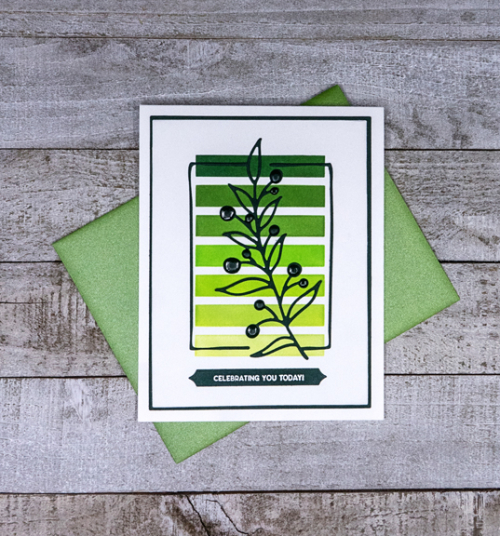
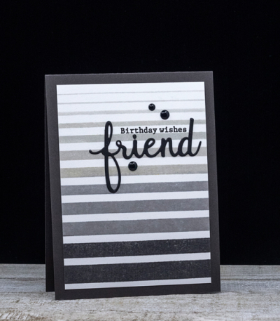
The next card goes into two challenges: #4 – Monochromatic Colors and #5 – Stripes. I got out one of my birthday purchases which I’ve never used before, the “Color Block Gradiating Stripes.” I used the Pinkfresh ink cube set, “Urban Raincoat” for the stripes, and the “Phrase Builder: Hello” die cut for the sentiment.

StripedFriend

Last (for now, at least) another card for the Stripes Challenge and the Clean and Simple Challenge. Again I used the “Gradiating Stripes,” and added a sentiment from the “Hanging Florals” stamp set. The leaves were in my stash, and are from Papertrey Ink’s “Forest Floor: Autumn.”

ThanksLeaves

With any luck, I’ll have a couple more cards made by the weekend when the challenge galleries close. I’m also sending this over to Darnell’s NBUS Challenge.


Guest Designer at Just Us Girls!

  • by

I am thrilled to be the Guest Designer for the month of October at the Just Us Girls Challenge. Ever since I discovered it in August, it’s been a favorite challenge site, so it’s going to be lots of fun to play along as the GD for a month. 

This week’s challenge is:

Screen Shot 2020-06-03 at 5.26.51 PM

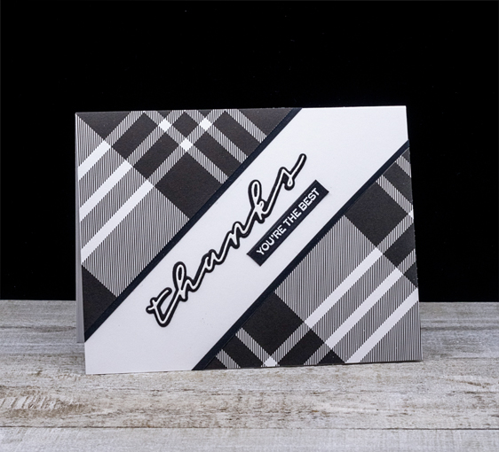
I figured I had lots of plaid patterned papers to choose from, but I was wrong! I had very few, and although my initial idea was to create a Christmas card with a red plaid background, you can see that I didn’t end up there at all. I am, however, really happy with what I found.

PlaidBlog

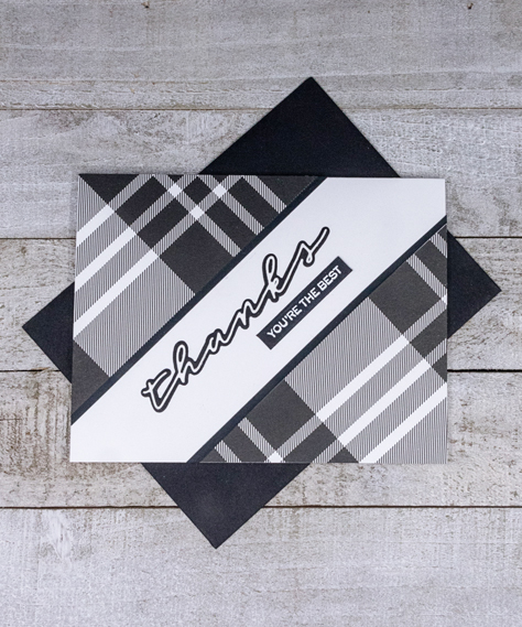
This awesome black and white plaid came from The Stamp Market’s “Color Crush” collection. Once I got the triangles cut out, I added a narrow strip of black cardstock along the edges. 

PlaidFlat

The die cut sentiment is also from The Stamp Market, “Handwritten Hellos,” and despite the very thin die cut word, it’s remarkably easy to attach to the black shadow. The white embossed sentiment is from W+9’s “Handlettered Thanks.” The plaid is so bold that I decided against any embellishments, which will also make the card masculine-friendly.

Do hop over to the Just Us Girls blog to see what the Design Team has come up with!


Color Hues #3

  • by

Color Hue Logo!

It’s time for the third Color Hues Challenge, and the colors this week are:

Color Hues Badge #3

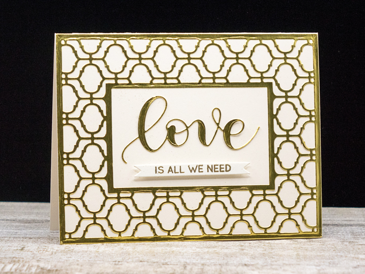
I went fairly glizty on this one. When I was reorganizing I came upon a folder with gold and silver adhesive papers from Papertrey Ink. I thought I’d give them a try.

GoldCream

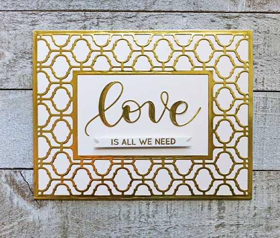
After die cutting this beautiful and ornate “Arabesque Border” from Papertrey, I wondered if I’d be able to adhere onto the cream colored cardstock without wrinkling or tearing. Amazingly, it went on without any difficulty at all.

The sentiment was also a die cut from Simon Says and the stamped sentiment comes from the same set (purchased separately), appropriately titled “Love.” 

GoldCreamFlat

The stamped sentiment was gold embossed on a banner from Neat and Tangled and adhered with some foam tape adding just a bit of dimension to the card. 

I hope you’ll hop over to the Color Hues Challenge and join in the fun, checking out the cards made by my awesome Design Team members and our first guest designer, Ashwini.

Summer Photography Scavenger Hunt Wrap-up

  • by

September is over, so quickly it seemed, and the end of the Summer Photography Scavenger Hunt kindly hosted by Mary-Lou is a wrap! I had just four of the 2o items on the list to find, and two of the alternates. I managed all but one of the alternates—and could have easily captured that one had I thought of it at the time. You can find my first posts here and here. Here are the final finds:

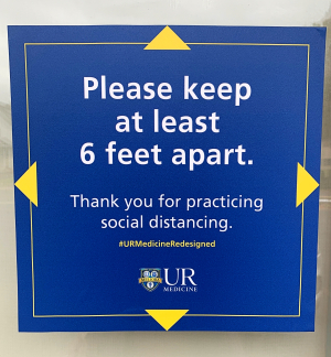
Something that displays a rule – #7:

Rule

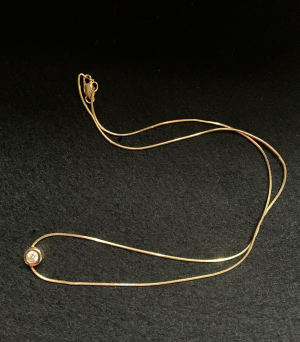
Something inherited – #15:

Necklace

My grandmother’s diamond, reset in a necklace.

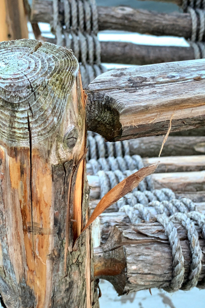
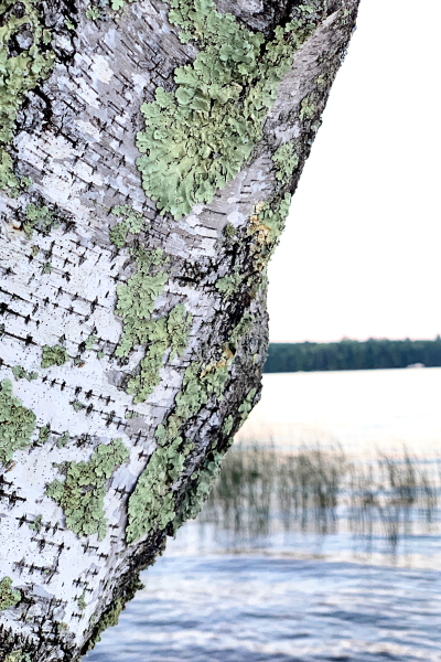
Something with rough texture – #16:

Texture1

Texture2

Two finds for this one, I couldn’t decide which was the better example.

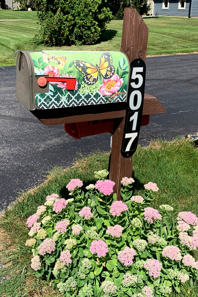
Something with the number 7 in it:

Number 7

The day I was looking for this among mailboxes on a walk in Racine, I didn’t expect to find such a lovely example!

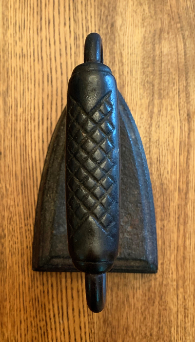
And lastly, Alternate B – something heavier than your shoe:

FlatIron

My great-grandmother’s flat iron which also could have been chosen for #15. I actually use it in my craft room to weight down craft projects after they’ve been glued.

Thanks again, Mary-Lou for a very doable list during the pandemic. It took me longer than usual to get started, and I have to admit it is more fun when there’s a vacation or two during which you can go looking. But, as always, I enjoyed it. 


Time for Champagne

  • by

The current Time Out Challenge is an “inspired by words” challenge:

Time Out Challenge 171

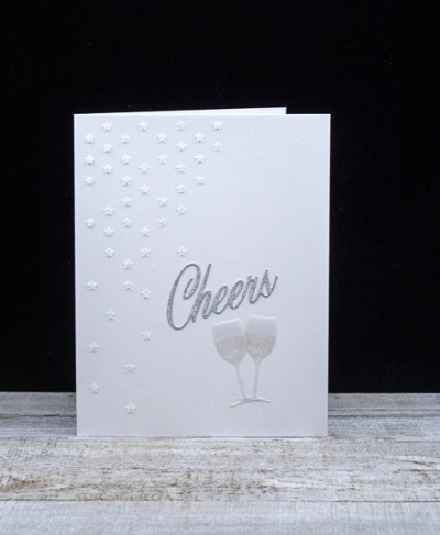
My intent was to make a one layer card, and as you will see, that was a failed attempt. In the process, though, I came up with glittery card I know I’ll be able to use:

Cheers

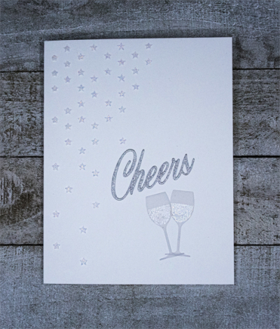
I started by partially stenciling Simon Says “Falling Stars” with some Nuvo Glitter paste. While that dried, I die cut the sentiment and champagne flutes with dies from Papertrey Ink’s “Uncorked” set. I used a pretty silver glitter paper from my scraps folder for the sentiment, and vellum for the glasses.

CheersFlat

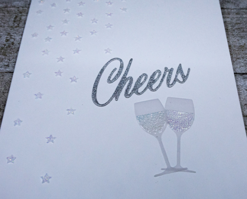
I embossed the champagne in the glasses with Bridal embossing powder, and adhered both to the card base. Here’s a closer look at the Glimmer Paste and the embossing on the glasses: 

CheersClose

There are two one layer challenges out there as well, so I haven’t totally given up on that idea, but I think this may be the only stamp set I have that has glasses. They look good die cut, but the stamp itself is a solid stamp, and I couldn’t find any ink that worked well. We’ll see if something comes up after a better search.


Stars

  • by

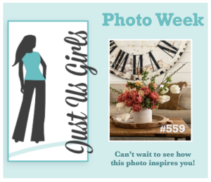
It’s Photo Inspiration week at Just Us Girls Challenge, and I can never resist stars as a subject for a card.

JUGSstars

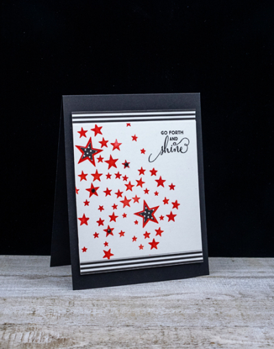
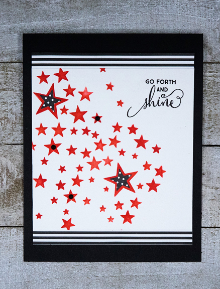
I’m never sure quite how a card will come together. Sometimes it’s quickly, and just as I imagined it. Sometimes it takes a lot of twists and turns and ends up totally differently than I anticipated. This card evolved. I started with the Memory Box stencil and Barn Door Distress Ink.

GoForth

Originally the stencil was the size of a card front, and I tried a variety of things to add the black and white stripes and polka dots from the star banner in the photograph. I finally cut the stencil panel down, added some striped paper from My Favorite Things behind it, and attached it to some fun foam for some dimension before adding it to the black card base. I die cut the little polka-dot stars (Simon Says “Holiday Shapes) from another pack of paper from My Favorite Things, and added them to the larger stars.

GoForthFlat

There are three tiny black rhinestones for some added interest, and several of the stars got a coat of Wink of Stella glitter. Sadly none of the sparkle shows up in the photographs. The sentiment seemed a perfect match for the card and came from the “Sparkle and Shine” set by W+9.

We’re enjoying a very warm Sunday . . . hopefully not the last, but surely the last for the next couple of weeks. Lots of chilly, rainy weather in the forecast. I have a couple of big indoor projects to tackle, so it may just be a good thing, after all.


Just Under the Wire

  • by

I have two cards to share for challenges that end in the next 24-48 hours. The first is The Flower Challenge where the prompt is pink and brown. I love that color combination, and finally had time this afternoon to create a card for it.

TFChallenge#48NBUS

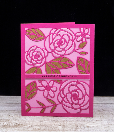
This card will also get entered the NBUS Challenge. I’ve had this “Floral Fun Cover” die from The Stamp Market for months now, and today was the first time I’ve pulled it out. I’m not a huge fan of jigsaw puzzles, but putting this together was certainly reminiscent of trying to find just the right puzzle piece. Had I given it a bit more thought, a different technique would have made it much easier, so I’ll try again with other colors.
PinkBrown

I used two shades of pink–Raspberry Fizz and Lovely Lady by Papertrey Ink, and a pretty brown that I found in my scraps folder. The card quite a bit brighter than my usual style, and I might have preferred a more subtle color combination. I do know, however, that it’s just perfect for one of my friends.
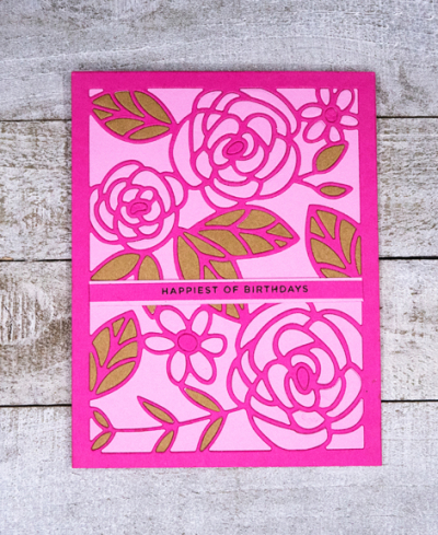
PinkBrownFlat

After running the die cut through with all three colors, the next step was to put the pieces back in where I wanted them. It’s hard to tell, but I chose to inlay only the flowers and leaves, and not the background. The sentiment is also from The Stamp Market, “Tons of Type.”

The next challenge is Less is More, and the challenge this round is Shades of Purple.
428 ColourShades of Purple

For Less is More the card needs to be very CAS. Often folks think that the expanse of white space for a CAS card must be white, but colors are also acceptable, and in this case it’s black. 
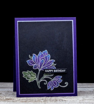
MetallicBD

I love the metallic watercolors on the black cardstock, and the lilac shimmer cardstock border on the deep purple card base really shows it off. The beautiful floral is from Altenew’s “Persian Motif,” and the embossed sentiment is from Sugar Peas “Everyday Sentiments” which I find myself reaching for over and over again. I used the Gina K Master Layout dies to cut the focal image and the thin border before adhering it to the Royal Velvet card base.
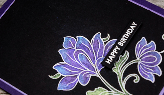
MetallicBDClose

Here’s a closer look at the lovely metallic watercolors. It’s a set I bought after a class at a local stamp store, probably 20 years ago. It was put together by the class instructor so there is no indication of who the manufacturer is. 
Another Die Cut Birthday Card

  • by

I’m back just under the wire, for another entry into Seize the Birthday’s Die Cut challenge.

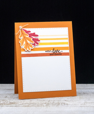
2020-09-10-DiecutsOnly

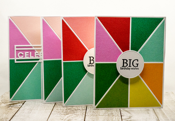
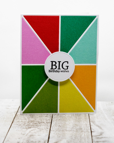
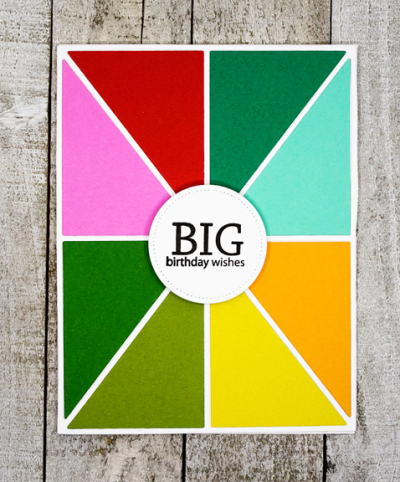
I actually made four variations on the same card. Like yesterday’s entry, these cards went out pretty quickly, and I never got around to posting them on the blog. Although one of them actually uses a die for the greeting, I’m entering one with the optional stamped sentiment to the challenge.

ColorBlockX4

In order to create just one card, I needed to die cut a variety of different colors, leaving me with plenty of choices to create more cards. The die, The Stamp Market’s “Color Block 1,”  appealed to me because I felt like it created cards that worked (depending on the colors used) for both males and females–a win/win in my book since so many of my stamps lean toward female recipients.
BigWishes

All the papers used are also from The Stamp Market, and they are so bright and cheerful.

BigWishesFlat

The die cut circle for the sentiment is from Simon Says “Stitched Circles,” and the greeting which fit perfectly inside is from Papertrey Ink’s “Birthday Bash Sentiments” which I turn to over and over again. 

Hope your week is off to a good start. It’s been very chilly here—good for crafting and organizing, not so good for spending time on the patio. It’s supposed to warm up again for the next week, and I hope to make good use of the warmer weather to get outside again while I can.