Skip to content

Rainbow Colors

  • by

The challenge at Seize the Birthday is Rainbow Colors.

2020-08-13-RainbowColors

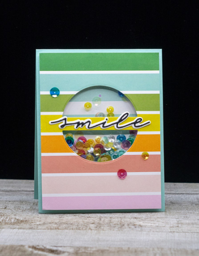
I’ve made a couple cards in the last two days that I’ll be posting for the challenge. The colors in this card say “rainbow” to me, although they aren’t the traditional ones.

Smile

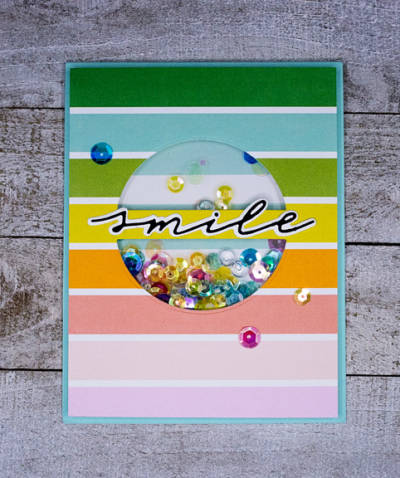
Everything for this card except the sequin mix came from The Stamp Market. A friend and I together an order for the latest release, and this “Word Window Die” was one of the latest products. The rainbow patterned paper is from a much earlier release called “Color Crush.”

SmileFlat

The other new product is the sentiment, one of several words in the “Handwritten Hellos.” Inside the sentiment says “It’s Your Birthday!” Each very thin word has an accompanying shadow die. Love them! The sequins were in my stash, and like most of my sequins, I’m not sure where they came from. 

This is another card for Darnell’s NBUS Challenge–two never before used products!

NBUS

A Gift

  • by

A friend of mine is on the design team for a card-making blog called The 12 Kits of Occasions.  A few years ago, she asked me to be a guest designer when it was her turn to provide the kit for the members of the design team. It was a lot of fun, so when she asked me recently if I’d like an extra kit she’d made for the June posts, I was happy to accept. I have three cards to share (so far) made with elements from the kit with a few supplies from my own stash. That is generally how it works for most members of her team. First up is a birthday card.

BDWishesKit

The beautifully stamped images and the gray/blue card were included in the kit. I added a scalloped oval from Dick Blick and the birthday sentiment.

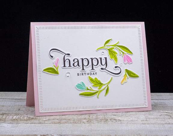
Next up is another birthday card. The die cut greeting and all the florals were included in the kit. These I recognized from The Greetery’s “Birthday Blooms” set which I also own, so I stamped the accompanying sentiment on the card after arranging the elements on a “Crimped Frame,” also from The Greetery.

HBFloralKit

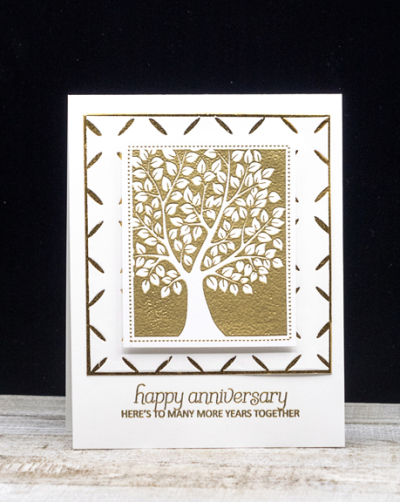
Last is a gorgeous anniversary card. I love the stamped and embossed tree in the kit. My friend also included a variety of stamped and embossed sentiments. They were all for wedding cards. There are no weddings (to my knowledge) coming up, but I always need anniversary cards.

HappyAnniversary

This time I added a paper from my stash already die cut with Simon Says “Diamond Pattern,” and backed it with a piece of gold paper from Michael’s. The sentiment from Clearly Besotted’s “Happy Everything” was embossed in gold.

I still have lots of goodies to play with from the kit!


Celebrating You

  • by

The Wednesday Challenge at Simon Says this week is Midsummer Blues. It’s a bit past mid-summer here, and I’m beginning to feel the blues! I’m definitely not looking forward to the cold weather and having to isolate inside again. I’m trying to make the most of every warm, sunny day—getting out for walks or bike rides, eating our meals on the patio, seeing some friends for patio and porch visits. 

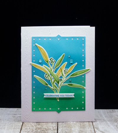
But I do have a pretty card for the Midsummer Blues challenge created almost entirely with products from The Greetery.

Celebrating

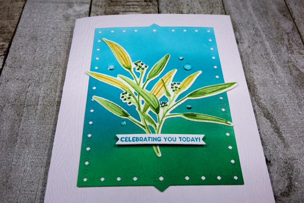
After ink blending a panel, I die cut it with one of the Nordic Frames and adhered it to a card base made with woodgrain paper from Simon Says. Then I stamped a group of images from Signed and Sealed with a Kiss. Betsy Veldman’s layering stamps are among the easiest to use. It’s a technique I’ve yet to master.

CelebratingClose

I die cut the images and arranged them on the frame, adding a banner with a sentiment from The Greetery’s Sentiment Suite: Birthday. The banner die is also from the Sentiment Suite series.

CelebratingFlat

The final touch was to add a few Papertrey Ink clear rainstones.

Wednesdayblog-logo


Just Us Girls: Another Die Cut Window

  • by

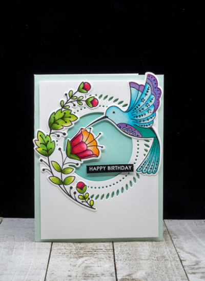
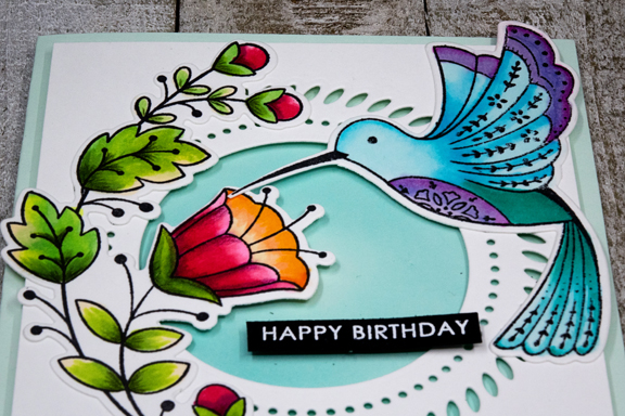
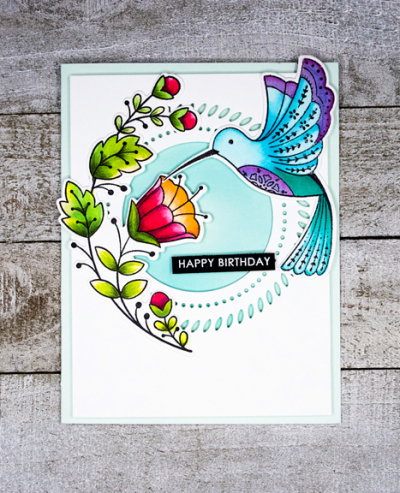
Here’s another card using an image I colored for the #100DayProject. I love this “Folk Hummingbird” stamp by Pinkfresh Studio, and it’s been in my collection for a long time. I don’t know if I was intimidated by it or what, but once I got it out and colored it, I was very glad to have it in my collection.

Hummingbird

The “Braided Circle” die from Pinkfresh is also a favorite of mine. After die cutting it I backed it with some subtly ink blended paper and then adhered ti to a card base with dimensional tape. 

HummingbirdClose

Fortunately, I purchased the dies for these images so I didn’t have to fussy cut them! 

HummingbirdFlat

A simple sentiment strip seemed to work best. Not sure which stamp set I used for it. I keep a supply of already embossed greeting in a little basket, and found this one there.

In addition to the Just Us Girls Challenge, this is another card for Darnell’s NBUS Challenge. So glad to be adding it to the collection of used stamps, and I’m sure you’ll see it again!

JustUsGirls

NBUS


MFT Summer School: Take Three

  • by

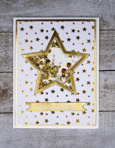
I’m back with the last two assignments from the My Favorite Things Summer School: Day 3: Symmetry and Day 5: White Space. The first card for the Symmetry lesson turned out to be difficult to photograph—far too much shiny metallic, but I’m guessing it will go over well with my granddaughter when she turns nine next month.

SkylarBD

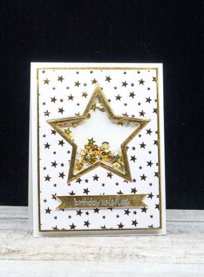
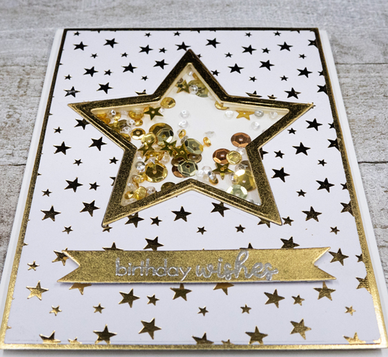
I knew I wanted a star as the focal point so started with two nested heart dies and cut a frame from some gold metallic 12×12 paper that’s been in my stash for a long time. Then I found the metallic gold patterned paper in an old Christmas paper pack by My Mind’s Eye and die cut the larger star from the center of the patterned paper after die cutting it with the smaller Gina K Master Layout die. I laid the frame inside and taped it securely from the back before adding a piece of acetate for the shaker portion of the card.

SkylarBDClose

I filled the shaker with a variety of sequins and tiny stars from at least three different collections. After backing the shaker, I die cut the larger of the frames from the Gina K set in gold and layered the two together.

SkylarBDFlat

Finally I die cut a banner and silver embossed the greeting from Papertrey Ink’s “Ways to Say: Birthday.” That proved to be a challenge. The heat from the heat gun melted the gold paper at the same time it melted the embossing powder. The next try worked just fine—need to be very quick.

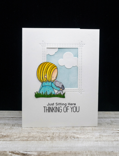
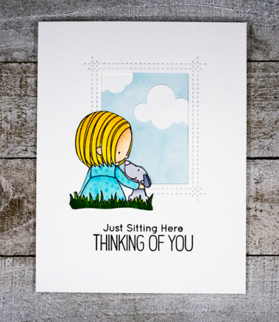
My card for the White Space lesson is a riff on the piece created for the lesson. I recently purchased the “You Have My Heart” stamp from My Favorite Things on a sale day. The little girl reminds me of Hannah, and she’s a dog lover so that made it even better. I’m on a wait list for another set with the same little girl image which can be colored to work with any one of my four granddaughers.

Girl-Dog

I colored the image with Copic markers and fussy cut it out. Then I die cut the window with the “Rectangle Peek-a-Boo” die—one of my favorites! I backed it with a piece of patterned paper from an older paper pack of MFT’s “Watercolor Wash: Brights” and added two die cut clouds from Papertrey Ink.

Girl-DogFlat

The pattern in the little girl’s dress was added by overlaying a small dotted stencil by Simon Says. The Copics bled through the stencil so the polka dots aren’t as even as I would have liked them to be. Too late at that point to start all over! This is clearly a summery setting, but the sentiment came from MFT’s “Polar Bear Pals” which seemed just perfect for the card. And this is another card for Darnell’s NBUS blog. My goal is to use something new as often as possible this month. So far, I’m doing pretty well.

NBUS

Making these cards was a great way to spend a quiet Sunday. And now, I can claim the Graduation Badge:

MFT_SummerSchool2020_GraduationBadge


After all that sitting, however, it didn’t take much for my husband to talk me into a long bike ride along the Erie Canal. 

Summer School At My Favorite Things

  • by

There were five days of Summer School at My Favorite Things. I posted Day 1’s lesson here, and today I have cards for Day 2: Rainbow and Day 4: Ombre.

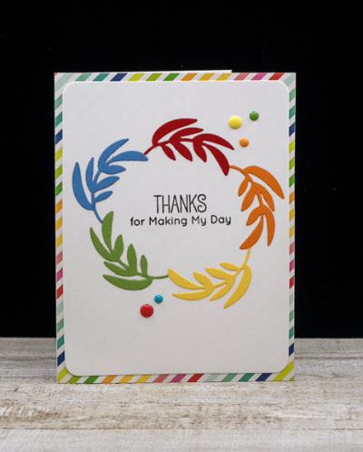
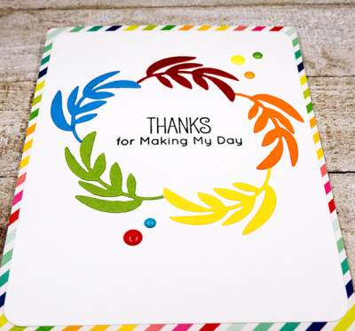
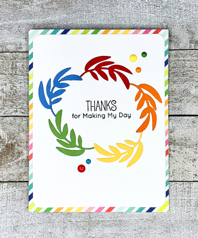
I used a favorite die from last Christmas to create a rainbow wreath. It was fun to transform the die into a summer design.

RainbowWreath

I die cut the wreath from five colors of card stock: Pure Poppy, Orange Zest, Buttercup, New Leaf, and Blueberry Sky. All except Buttercup, which is one of the new Concord & 9th colors, are Papertrey Ink papers. Then I reassembled the wreath on a piece of Neenah card stock. 

RainbowWreathFlat

The sentiment is also from My Favorite Things stamp set “You’re Super.” Then I die cut the panel with a Hero Arts “Rounded Rectangle Infinity” dies. 

RainbowWreathFlat2

Finally I found a piece of patterned paper that repeated the rainbow theme in an old paper pack by Pebbles, “Fun in the Sun.” Finally I added five enamel dots to finish the card.

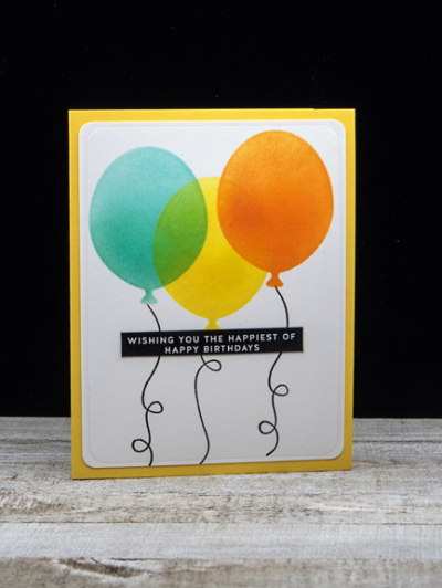
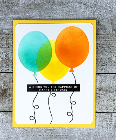
Day 4’s subject was creating a card using ombré coloring. It took me awhile to find a product from My Favorite Things that would work, but then I remembered I had their “Big Balloons” stencil.

OmbreBalloons

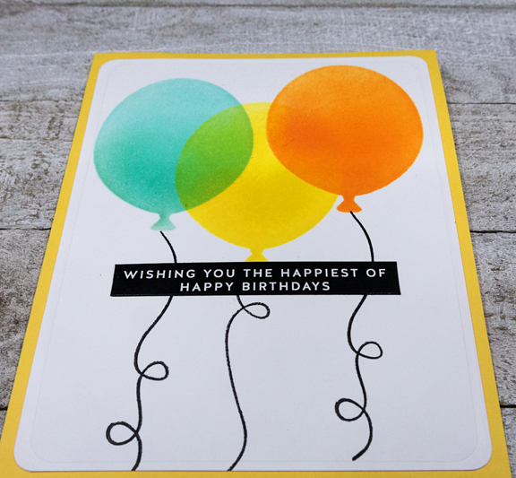
Getting the ombré effect with ink blending wasn’t quite as easy as I expected, but I think it worked out fine in the end. I used the new Concord and 9th inks, Aqua Sky, Buttercup, and Marmalade which are so bright and colorful. The blending brushes didn’t work as well as the old ink blenders which applied the ink with a much softer, smoother look.

OmbreBalloonsClose

It is a bit harder to see the yellow ombré effect on the yellow balloon because of the overlapping blue and orange balloons. I used Papertrey Ink’s “Birthday Balloons” stamps for the strings. What you can see more clearly in this photo is the embossed edge of the white panel created with the Hero Arts “Rounded Rectangles.” It was an accidental happening. I had the die upside down, but when I took it out of the die cutting machine, I rather liked the effect. I pulled out my corner rounder from my scrapbooking days to finish off the panel.

OmbreBalloonsFlat

The sentiment is from one of the Simon Says packs of sentiment strips. So easy to cut out and use. Finally I added the panel to a Buttercup card base. I am loving the Concord and 9th inks and papers. So glad I splurged on the assorted pack (2 sheets of each color) when they were introduced. Now to decide which ones I “need” in full packs. Buttercup is definitely on the list. It’s almost a perfect shade.

I’m also linking this card up with Seize the Birthday, skipping the optional challenge this time, for Anything Goes.

STB-AnythingGoes


A New Challenge

  • by

I found a new card challenge blog this week—as if I need another one—but the current challenge is one of my favorite techniques, so you’ll probably see a couple of cards for it before the time expires. Just Us Girls is looking for cards with die cut windows.

JustUsGirls

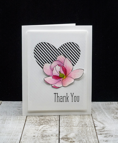
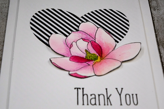
My first share is a card made with one of the images I colored for the #100DayProject. There were several days when I needed a smaller project for coloring and this beautiful magnolia from Altenew’s “Magnolias For Her,” fit the bill. I watercolored it and then fussy cut it out.

MagnoliaHeart

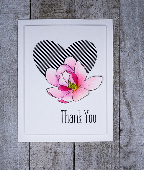
The die cut heart (My Favorite Things) was backed with a piece of black and white diagonally striped paper, also from My Favorite Things. I stamped the sentiment from Papertrey Ink’s “Thank You Kindly” set, and adhered it to a white card base with dimensional tape.

MagnoliaHeartClose

Finally I attached the magnolia to the bottom of the heart.  I love this clean and simple design, and the contrast between the beautiful pinks and the black and white stripes.

MagnoliaHeartFlat

It’s been fun designing some challenge cards this week after focusing on coloring images for so many days lately. 


Summer Scavenger Hunt: Round 2

  • by

I’ve been better about hunting down the items for this year’s Summer Photography Scavenger Hunt. Today is the second link up, kindly provided here by Mary-Lou who generously creates the list as well as a link to others participating.

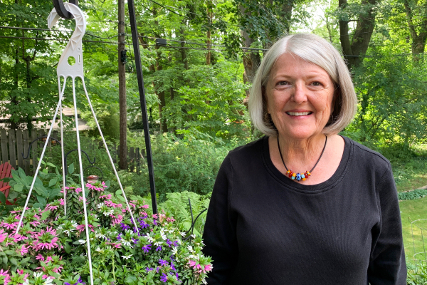
Number 1 on the list was a favorite piece of jewelry. I actually have a collection of favorite pieces, most of which were purchased during travels or were special gifts. This necklace (should have looked to be sure it was centered before the photo was taken) started with a purchase of the beautiful hand-made beads at a craft fair we just happened upon in Spring Green, WI on our cross-country road trip 13 years ago. I added them to a black cord necklace, and have enjoyed them ever since. I was inclined to buy all black and white beads, but the creator talked me into these colorful ones, and I’m so glad I listened to her.

Necklace

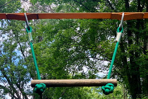
Something with a knot (#2) was found in my son’s backyard as part of the playground equipment they have for the three girls.

Knots

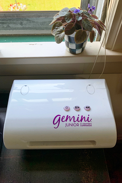
A toy you play with (#4) was easy to find in my craft room.

Toy

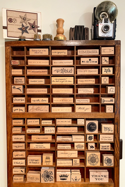
Also found in the craft room was Something You Have More Than One Of (#5). Anyone who knows me will expect the next photo. These are actually among my oldest stamps, and don’t see nearly the use that the newer acrylic ones get. I’ve been stamping for over 25 years, and when I started these were all that were available. They look great, however, as a decoration in the craft room.

Stamps

Something That Starts with the Initial of your Name is #9. I’m using my last name for this one.

IMG_4533ed

Number 10 is Something Smaller Than a Paperclip—another find in the craft room.

Sequins

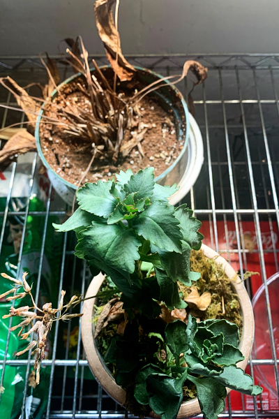
I had to go to the basement to find #10—Something That Needs to be Thrown Away. We have a set of metal shelves which hold plants that need more light that we can give them in the winter. My husband takes excellent care of them, but totally neglects anything that ends up there for the summer. I can’t blame him, however, because he does water all the outside plants nearly every day. It’s hard to see in the photo, but even the bottom portion of the green plant has died. It will be gone before winter comes.

Toss

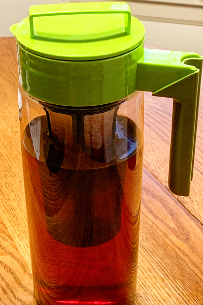
Number 12 is one of my favorite summer single-use items in the kitchen—my iced tea pitcher Hold My Favorite Beverage–and makes it as well. The insert holds tea bags. You pour hot water into the pitcher, insert the holder and the tea steeps on the counter. Then the holder is removed and the tea goes in the fridge. I bought my first one in Oregon when Sarah lived there 9 years ago. Last summer I bought a newer version with a longer holder.

Beverage

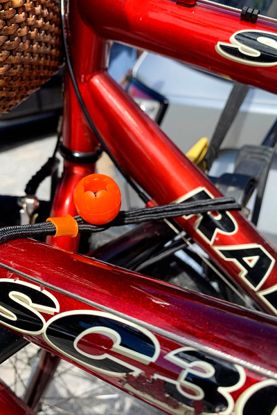
And lastly for this round, #13 – An Elastic in Use. Tracy uses bungie cords to attach our bikes onto the car carrier when we take off to ride bikes on the nearby canal or trail. To get anywhere from our house requires riding on the road. I’m not a fan, so we usually drive to our starting point.

Elastic

I have just four items left on the main list and two of the alternates to find. I ought to be able to finish up by the end of the month, our next link-up. Thanks, as always, to Mary-Lou for hosting!

The Dog Days of Summer and Visual Triangles

  • by

The Card Concept has a new challenge up called The Dog Days of Summer.

TCC138c 080520

And My Favorite Things is sponsoring a  Summer School series. The first lesson focused on using visual triangles in your design. It’s something I think about almost every time I create a card. There are visual triangles in both the cards below, but one seems more apparent to me than the other.

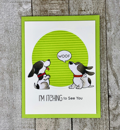
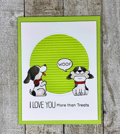
Puppies

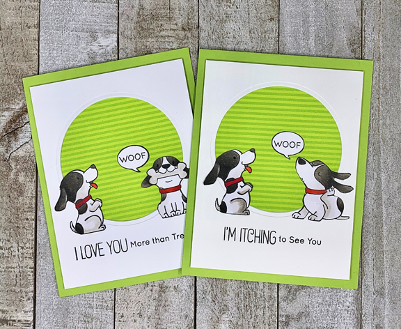
My granddaughter occasionally pretends to be a puppy. These cute puppies from My Favorite Things “Woof Pack” had “her name on them,” so as soon as a sale popped up they were in my basket. I’m a big fan of the sentiments, too, I was told after sending ONE card for both kids that it was no longer a good idea. Hannah, the 3 year old, claimed the card as her own, so this time two cards were sent.

PuppiesCaleb

The two puppies and the speech bubble create a visual triangle. This one seems to be a better example because both dogs are “looking at” the speech bubble. Sometimes it’s the images that create a visual triangl, but often I use embellishments to form one.

PuppiesHannah

I die cut the circle with a Spellbinders circle die and backed it with patterned paper from Sunny Studios, The pups were colored with Copic markers.

If it’s a “Dog’s Life,” these cuties seem to have it pretty good.

Five in Five: August

  • by

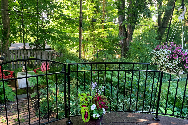
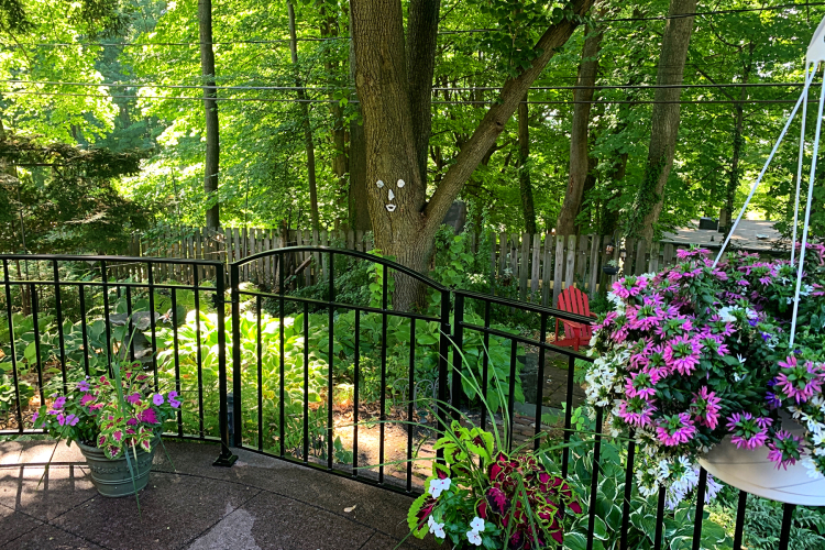
When we moved into our house 35 years ago, the patio was surrounded by an evergreen hedge. It provided some privacy, but more importantly it protected folks from falling off the edge of the patio. That might not seem particularly important except our house is built on a hill and our lower yard is a long stairway away. Children and unsteady adults might step off the edge and then tumble some distance before stopping,

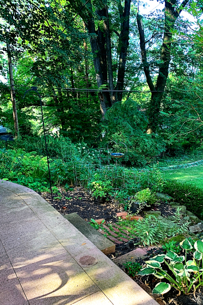
This year the hedge finally had seen the end of its time. The last several years it’s been less and less attractive, and this year it had become an eyesore. Matt, our landscape artist son, could not come up with any plantings he thought would provide the needed protection and thrive in our very shady back yard. So we took some of our travel money that had been saved for the two big (aborted) trips this year, and had a wrought iron railing installed. Truthfully, I wasn’t sure what I’d think of it, but I love it. Here’s a photo (not part of the 5 photos in 5 minutes for Sandie’s monthly meme) taken after the bushes were removed.

IMG_4462ed

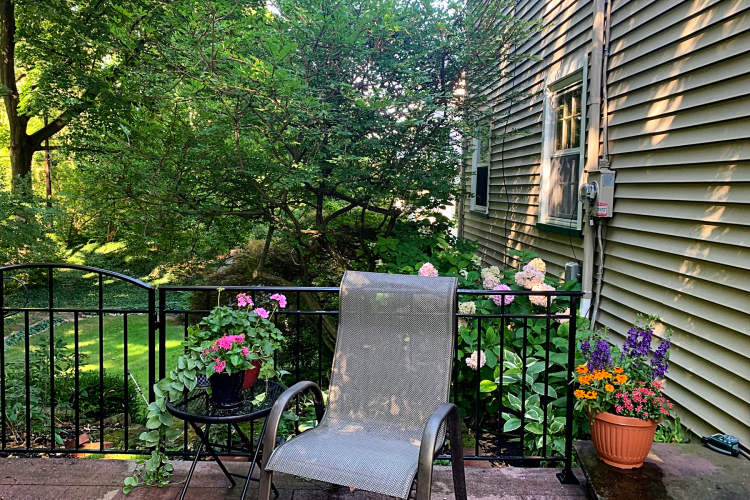
This fall the area you see to the left of the first steps will need to be landscaped, We’re planning to move a large group of  peonies to a sunnier spot in the yard and redo this area. Following are the five photos taken early in the morning showing the new railing,

IMG_4560ed

Here you can see our lower yard. The little shed is ours and our property line goes back to the tree on the far left.

IMG_4559ed

Moving to the right from the previous photo, you see one of two gates installed. This one takes you to a series of stone steps down to the lower yard. Our next major expense is to have the stairs and the stone walls on both sides rebuilt. We had
hoped to have that done last year, but we are still looking for a qualified mason to do the work.

IMG_4561ed

To the left of the first photo is the second gate which leads to the lower patio which Tracy completed two years ago.
You can see the fire pit covered up in front of our two red Adirondack chairs.

IMG_4556ed

Another view of the shade gardens and the second gate.

IMG_4562ed

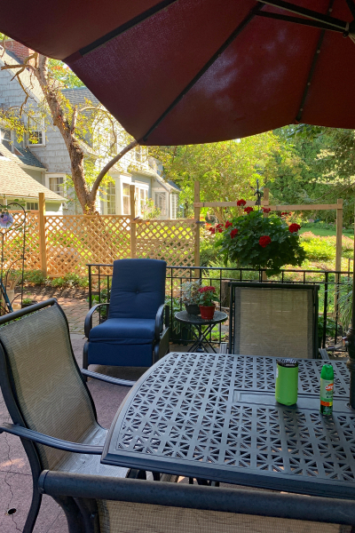
And finally, the view toward our neighbor’s home, and a peek at the fence Tracy is building along the property line. It replaces six or seven straggly arborvitae that had foliage only on the top. We have a lot more light on the east side of the house since they’ve been removed. The other advantage (we hope) is that it will keep the deer from crossing through the backyards. It’s a work in progress. Eventually all the posts will be evened out and we’ll add solar lights to the tops of them. We’ve just added several lovely solar lights in the shade garden and on the patio and they add a lot of ambiance at night.

I was afraid that the railing would make us feel closed in, but it actually has had the reverse effect. It feels more open–we can see through the railings, but couldn’t see through the bushes! In addition the furniture can be set against the railing so there’s actually more room on the patio.

Joining in with Sandie for her monthly meme, 5 in 5.


Altenew July Challenge

  • by

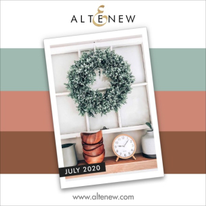
I love my Altenew stamps and dies, and every month I think I’ll join in their monthly challenge, but I think this might be a first. When I saw July’s inspiration, I knew just what I wanted to do.

Inspiration-Challenge-Graphics_SQ-Option-2

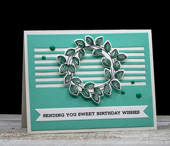
Then I saw August’s inspiration photo, and I thought I’d blown it once again. But, to my surprise, the July challenge is still open, so I made sure to get the card made. My inspiration came from the beautiful wreath, but I also loved how it was hung on the white window frame. I didn’t have a die that cut a window, so I used the Skinny Stripes: Horizontal die by My Favorite Things. Bonus: that’s another NBUS item in my stash, so my goal of using unused products gets another win.

AltenewWreath

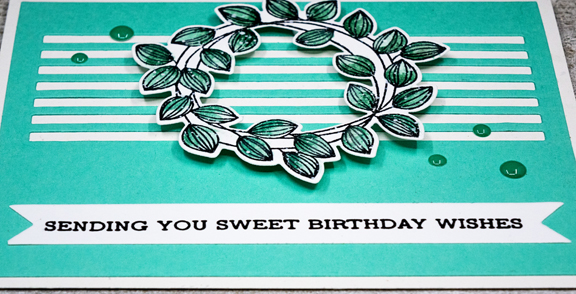
The wreath comes from one of my most used Altenew stamp sets, Weekend Doodles. I watercolored the leaves with Daniel Smith watercolors and splattered a bit of white gouache on it before die cutting it. 

AltenewWreathClose

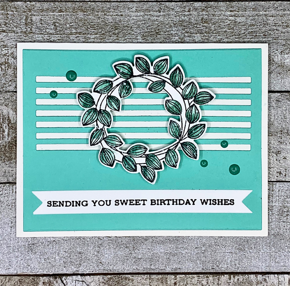
The sentiment is from Altenew’s Sentiment strips which I stamped on a banner die cut. 

AltenewWreathFlat

Although a bit brighter, The Stamp Market’s Teal cardstock seemed a good match for the inspiration color, and having matching enamel dots was a bonus. 

Good-bye July, Hello August

  • by

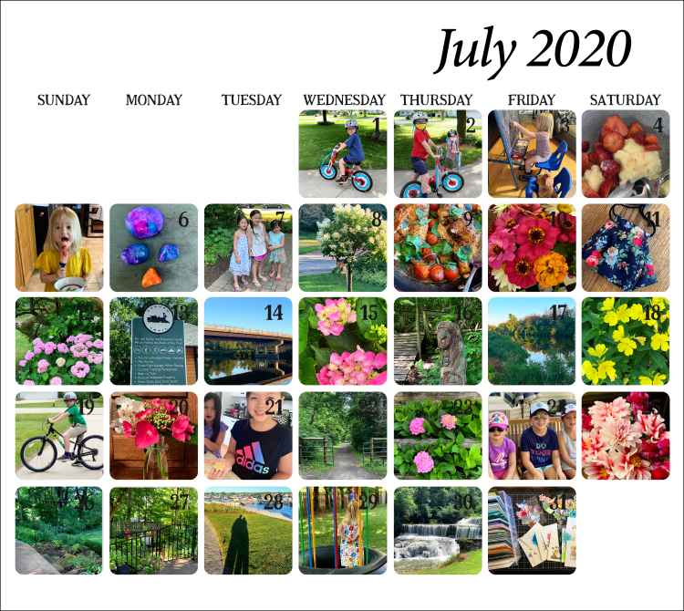
It’s time for the One Little Word recap for July. July was the first month I really didn’t track my progress. I’ll chalk it up to being away the first week of July so my routines didn’t get established. The truth is, however, that July was the month last year that I more or less gave up on my OLW and just let it go. We’re halfway through the year and it’s been a tough one in so many ways, but I’m still COMMITED to working on the projects I set out for myself in January. Not all of them are calling to me right now, but there are enough to keep me going. Here’s July in pictures:
July2020Collage

There are a couple of photos of grandchildren sent to me—Caleb on his new 8-speed bicycle (#19). His dad says he can’t keep up with him any more; he’s way too fast! The three little girls on a bench after they’d been berry picking (#24), and Hannah in her “hiding” place for hide-and-seek (#29). Sarah says Caleb is such a good big brother, he pretends that he can’t see her for awhile. On the 6th, you can see the rocks Caleb, Hannah, and I painted with alcohol inks. They came out great and it wasn’t anywhere as near messy as I expected it to be. On the 21st, Skylar and Ella came to bake sugar cookies. That was a first for me in the summer, but they disappeared as quickly as they do in December. The photo on the 26th shows our patio without the almost “dead” hedge that has surrounded it since we moved in 35 years ago. The 27th shows the new railing that was installed that day. Our patio sits at the top of a hill, and there needs to be some protection against folks stumbling or running off it and tumbling down the hill. I wasn’t sure what I’d think of it, but I really love it. We have a much better view, and the patio actually seems bigger since some of the furniture can be placed right against the railing. I’ll have more photos later. There are photos from our walks and bike rides, and the 31st shows some of the cards and images I colored over 115 days.

I did finish the #100DayProject and continued coloring every day until the 30th in order to finish the second of the 30 Day Coloring Challenges that ended on July 3oth. Even more amazing to me than the completing the project was that almost all the projects were posted on Instagram—something I rarely did, but expect to continue to do on a less frequent basis. 

I made NO progress on purging the photos in my Photo Library, so that’s high on the list for August. Also on the list is to get back on track with daily walking which fell by the wayside with the travel. By mid-June we’d walked a minimum of 2 miles every day for 57 days. Then we left for Wisconsin, and although we walked while we were there we definitely got out of the daily habit, and I’ve found it hard to get back to it. The goal for August is 5 days a week—6 would be better! On the crafting side, my goal this month is to use new stamps and dies that have piled up as I worked on coloring projects. I’m off to a good start already finishing two cards this week with unused (though one was hardly new) stamps and dies. 

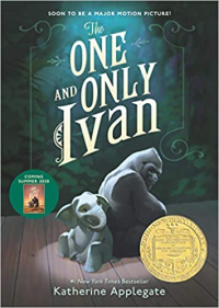
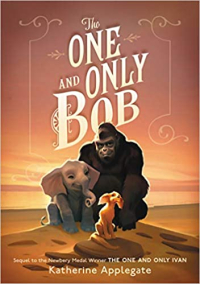
Reading was not a problem. I read the five books I set out to read, and read two longer books to Caleb over Zoom. I counted them because I loved both novels, as did Caleb. Tomorrow we start Harriet the Spy. It’s his request, and I hope I like it more this time than I did the last time I tried to read it. Unlike June, I enjoyed all of the books I read in July.
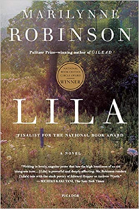
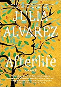
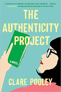
Lila Afterlife Authenticity Tenderland
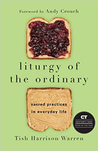
Liturgy Ivan Bob

The Authenticity Project was just for fun. It and Liturgy of the Ordinary were part of The Unread Shelf Project. I also went through those shelves with a new question to ask: If I saw this book in a bookstore, would I purchase it? The answer for 12 of them was “no,” and they’re in a bag to donate to the library once they begin to accept donations. I’m guessing that won’t happen until the pandemic is truly over. Fortunately, you can now pick up books curbside by appointment, and just this week you may enter the library after signing a document and getting your temperature taken. 

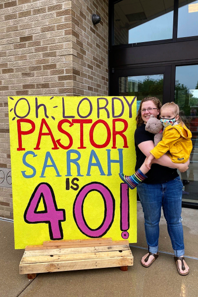
So now it’s August, and today is Sarah’s 40th birthday. I wonder if she’s as surprised by that fact as I am. Her congregation held a birthday car parade yesterday afternoon through the church parking lot. (FYI: Sarah was wearing a mask for the parade, but took it off for this photo.) Someone made a huge sign, and it was delivered to their front yard this morning. They had a beautiful stained glass window hanging made for her, and brought a cake over as well. When we had our FaceTime call, the house had been decorated by Dad and the kids, so it was as festive an occasion as possible during the pandemic.
IMG_4581ed

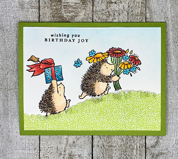
Her birthday card this year featured hedgehogs (a favorite of hers) but I also thought the kids would like it as well. These are about as cute as you can find. I love them rushing up the hill with gifts.
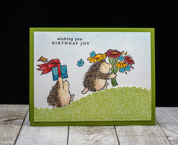
HedgiesBD

It’s easier to see the “grass” in this photo. I can’t remember the last time I pulled out my fringe scissors, but I’m glad they’ve survived the multiple purges since I bought them years ago.
HedgiesBDFlat


Your Light Shines

  • by

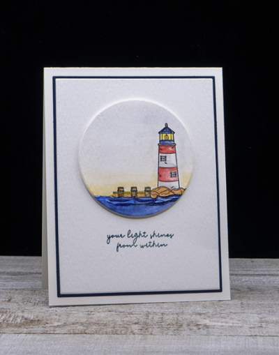
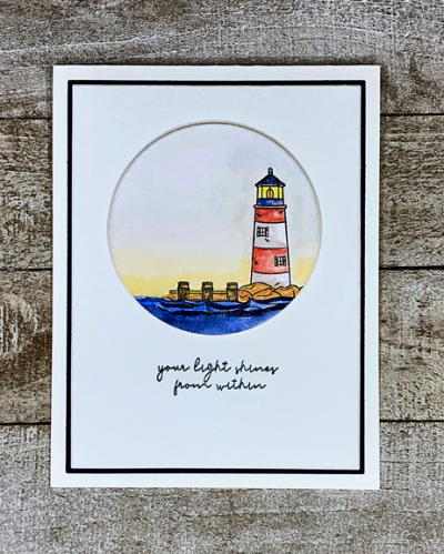
There are two new challenges, both for Clean and Simple cards, that inspired me to pull out a never-before-used stamp set from Simon Says “Your Light.” The first is CAS on Friday where the challenge is SUMMER. The second is CAS Mix Up and the challenge there is Watercolor/Beach.

CAS Mix Up August 2020

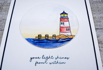
This lighthouse image reminds me of two lighthouses on Nantucket. One, the Brant Point Lighthouse, sits on the beach as you approach the island, so the setting is similar to the stamp. The other is the Sankaty Lighthouse which has a very similar shape, and I watercolored it in red and white to resemble the Sankaty Lighthouse. This is the first summer my daughter-in-law has missed a summer vacation in Nantucket since she was a little girl. Thanks to her and her family, we’ve enjoyed several vacations there over the last few years. It represents summer for sure, and spending time on its multiple beaches is one of the great pleasures of a vacation there. 

Light

After watercoloring the image with Daniel Smith watercolors, I die cut it with an Essentials by Ellen circle. I die cut another piece of watercolor paper with the smaller Gina K Master Layout die, and a piece of Dark Indigo paper with the larger of those dies.

LightFlat

I adhered both layers to a cream colored card base, after stamping the sentiment in Dark Indigo ink. The focal image was adhered with dimensional tape. It’s odd that in the flat layout, the focal image looks inlaid rather than bumped up!

LightClose

I decided to leave it all very CAS–no embellishments, no additional images. I’m adding this to the NBUS blog as well–glad to have this set out of the Never Been Used Stuff category.

2 small USE THIS ONE NBUS participants badge with URL


Two Cards, Three Challenges

  • by

And the cards–as well as the two main challenges–couldn’t be more different. The first is the new Less is More Challenge: Summer Flowers.

425 Theme Summer Flowers

Although I’ve been to the Gina K Designs retail store a few times when I’ve visited Sarah in Wisconsin, I didn’t really follow her until recently. When I saw her most recent kit offer, I was intrigued, but held off too long and ended up on a wait list. The kit finally came in and about a week ago, it arrived in the mail. I am so impressed not only with the quality but the quantity of product in the kit. This is my first card using one of three stamp sets and I already have plans for both of the other sets. Hopefully, they’ll see some love this weekend. 

GinaKThankYou

This beautiful flower is from “Best Flowers,” which also include two larger blossoms and leaves which can be cut with the included dies. This is such an enjoyable flower to color, and you’ll probably see it in a variety of colors in the future. The sentiment is from a second stamp set included in the kit, “Hands of Love.” The font is different than any other I own, and one I know I’ll use frequently.

GinaKThankYouFlat

I also order the “Master Layout” dies, and have used them for the last several cards I’ve made (soon to come to the blog!) They die cut the focal image and then the 1/16″ mat perfectly. 

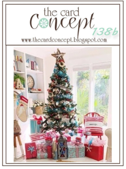
The second challenge is The Card Concept’s “Christmas in July.” I’m happy to be in the season of summer flowers, but I know Christmas will be here before you know it.

TCC138b 072220

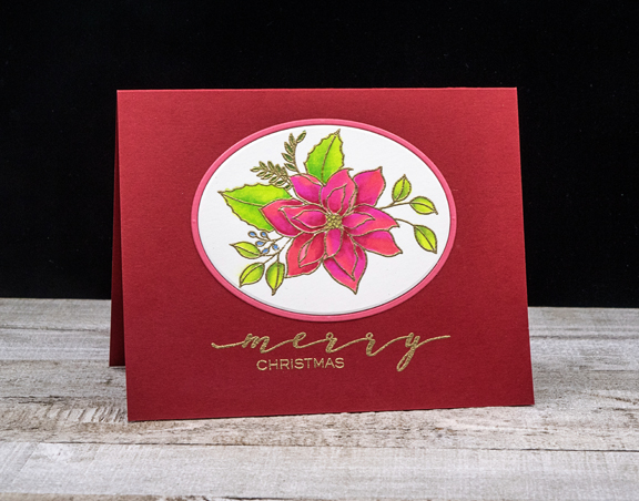
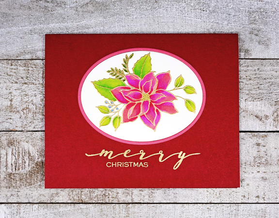
This one gave me an opportunity to use another new stamp set, appropriately named “Poinsettia.” This one is by Waffleflower, and it includes enough designs to make multiple holiday cards.

Poinsettia

I also used some of the new cardstock from Concord & 9th–Cranberry and Honeysuckle, and the beautiful oval and frame die cut with Ellen Hutson’s “Essential Ovals.”

PoinsettiaFlat

After embossing the design in gold, I carefully colored the floral with Copic markers. I’ve read that you must be very careful because embossing powder can ruin the tips of Copic markers. Luckily, I haven’t had an issue with it yet. The “Merry” sentiment  (I love the font) came from the “Poinsettia” set, and the “Christmas” from W+9’s “Hand Lettered Holiday” set. (Finding that required me to pull out all my Christmas stamps. I considered keeping them out, but although I hope to make a few more cards with this new set, I’m not ready to think about mass producing any cards quite yet.)

One of the requirements for The Card Concept Challenge is to identify your style. In thiscase, I’d call it “Clean and Layered.” 

And since both cards use Never Before Used Stuff, I’m entering one in the new challenge which starts today.

We’re off in a few minutes to go on a bike ride. Later tonight, rain is forecast and likely to extend into Monday. It’s hot and sunny now.


Freshly Made Sketches

  • by

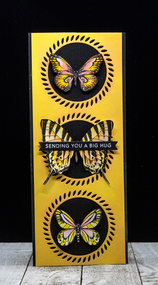
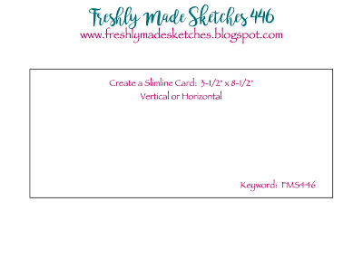
This week’s challenge at Freshly Made Sketches is pretty wide open—make a slimline card. I made my first slimline card earlier this month. Slimline cards are the rage right now, and I have just two dies for them. The first card used the Lawn Fawn Lift the Flap die and today’s card uses a beautiful die from Pinkfresh Studio.

Slimline

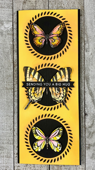
I started out by ink blending some Distress Inks on white card stock and then die cut it with the Braided Circle die. The butterflies from the Simon Says “Beautiful Butterflies” were colored with Copic markers. This was the set for the June Card Kit, and it’s going to see a lot of use. It includes six beautiful butterfly images and twelve sentiments in a variety of lovely fonts. 
SlimlineFlat

For this card, however, I opted for a sentiment strip from Taylored Expressions. I fussy cut the butterflies since I don’t have the dies. On the black card stock behind them, I scored three vertical lines which I could not get to show up in a photograph. I’m off to see what other ideas have shown up for the challenge.

FMS Final 446-001