Skip to content

Happy Halloween!

  • by

It’s Halloween, and I can’t think of a better place to be than with grandchildren who are SO excited about going Trick or Treating! Sarah and her family moved to a fabulous neighborhood with lots of kids. Both Caleb and Hannah have good friends just down the street. I’ve shared a couple of Halloween cards here and here, but made five more for the grandchildren. We gave the three girls their cards and Halloween gifts before we left.

I made four different cards, creating two of the same for Hannah and Ella. It’s thanks to my crafty friends that I had a huge pile of die cuts to choose from when it came time to create the cards.
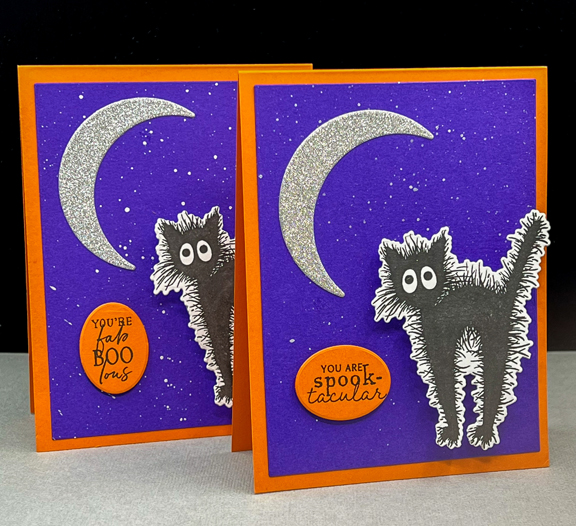
BooCat2

Aside from the sentiments the cards are just the same—Royal Purple (Simon Says) cardstock splattered with silver metallic paint and layered onto a cardbase of Orange Zest (PTI). The silver glitter paper is several years old and came from a cute shop in Milwaukee. I used a clear glitter pen to add glitter to the cats which you can see better here. The cat and the moon are from PTI’s “Boo Black Cat” set. 
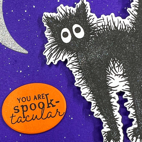
BooCatClose

I also wanted all the cards to have some kind of interactive feature. The cats have a wobbler behind them. Try as I might, I never got a very good photo, but when Ella opened her card at home she “wobbled” the card, and I got a better photo,
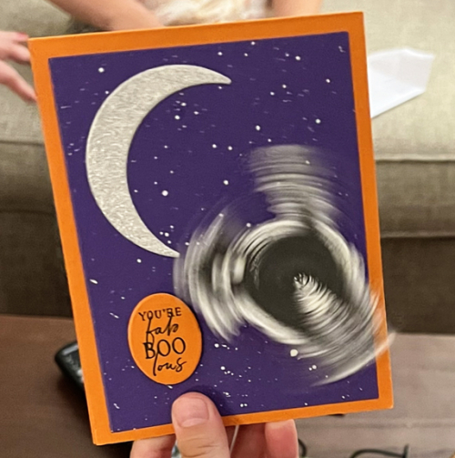
BooCatAction

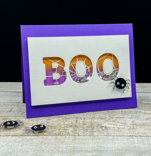
Next up is Maddy’s shaker card. 

Boo

I started by ink blending the Pretty Pink Posh “Spider Web” stencil on Bristol paper. I die cut the letters with the Pinkfresh Studio “Adore” alphabet, backing it with acetate and filling it with a variety of sequins and tiny stars.
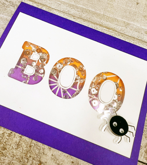
BooClose

I found the cute spider sticker from “la petites” at Hobby Lobby. 

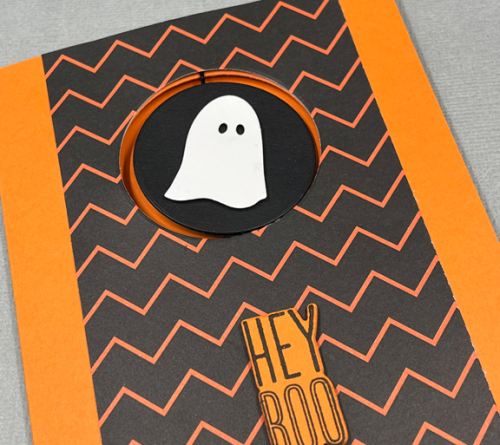
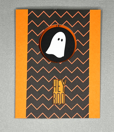
Skylar’s card was a spinner card. I made this one twice trying to get the spinner to work effectively. I now know what kind of thread I need to make it work even better than it did. 
SpinnerFlat

SpinnerClose

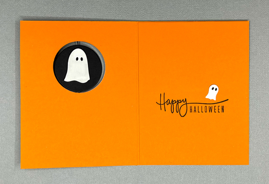
Putting a greeting inside the card proved to be tricky, too, since I didn’t want it to show through the opening for the spinner piece. In the end, it worked out really well. The ghosts are die cuts from Poppy Stamps and the greeting from The Stamp Market’s “Halloween” set. The patterned paper is from an old 6X6 pad by American Craft. 
SpinnerInside

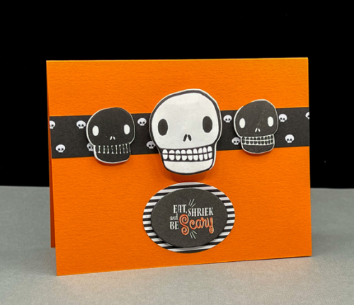
Last, but not least, is Caleb’s card which I thought would appeal to a nine year old boy.
Ghoul

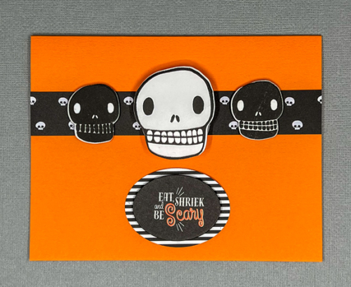
The center ghoul on the card is mounted on the card with a large Wobbler like the black cat  cards above, There’s a narrow strip of patterned paper from the same paper pad behind the three ghouls from Papertrey Ink’s “Grins and Ghouls.” 
GhoulFlat

I found the perfect sentiment in an old Papertrey Ink Make-it Market kit, “Halloween Pin-ups” which was die cut with an Essential Oval by Ellen Hutson. A slightly larger oval from My Favorite Things “Black and White Stripes” served as a mat.

Yesterday, one set of neighbors arrived to carve pumpkins on the back porch so we have a set of jack-o-lanterns to decorate the front porch tonight. It’s going to be a chilly evening for Trick 0r Treating, but thankfully, it’s not raining or snowing!

Hope you have a great Hallow’s Eve!
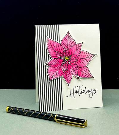


Happy Holidays

  • by

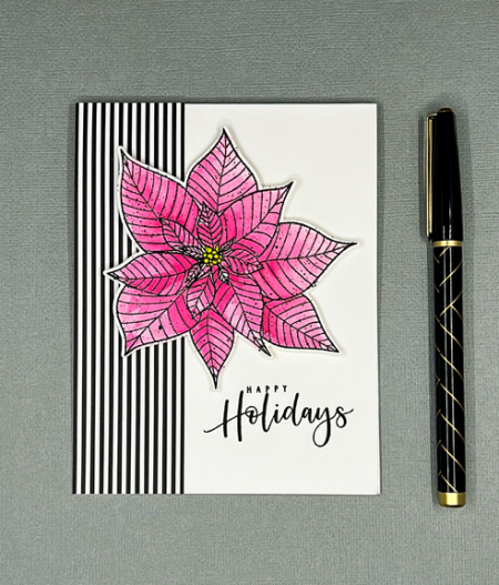
I’ve been slowing chipping away at the number of holiday cards I want to make. I have one to share today with one of my favorite poinsettia stamps from Altenew: “Modern Poinsettia.” I posted another holiday card with the same poinsettia here. 

PoinsettiaHH

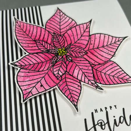
I stamped the poinsettia on hot press watercolor paper. Although it does not have as much texture as cold press paper, it does require two stampings to get a clear image. Thanks to the MISTI, that’s easy to do. The next step was to watercolor the floral and die cut it with the accompanying die.

PoinsettiaHHClose2

After I die cut it, I decided it would benefit from a few black splatters. It’s taken me far too long to finally master the art of splattering, but I’m no longer afraid I’ll ruin the whole thing!

PoinsettiaHHFlat

I added a wide strip of black and white patterned paper from My Favorite Things to the left side of the card before adding the poinsettia with dimensional tape. The beautiful greeting is from the Colorado Crafts “Slimline Poinsettia” stamp. I’m using three of those greeting repeatedly this year on my cards.

I’m sending this off to two challenges: Addicted to Stamps and More: Christmas, and Happy Little Stampers Christmas: Anything Goes.

Addicted HLS Christmas

I’m also adding this to a new (to me) site: Falling for the Holidays Blog Hop, sponsored by the Build Your Stash Holiday Cardmakers.

Falling for the Holidays {BYSHC} Hop graphic


With Sympathy

  • by

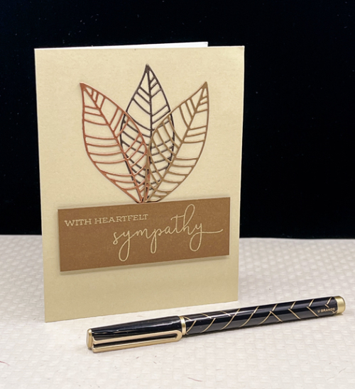
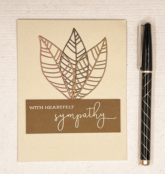
Sympathy cards are never anyone’s favorite card to create, and I’m a firm believer that CAS and subdued colors are the best bet. I recently acquired the wonderful “Leaf Mix” dies by Altenew, and I think they might become a “go to” set for just this kind of card.

Sympathy

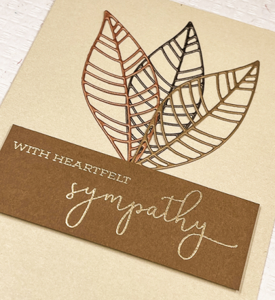
This was a pretty quick and easy card to assemble since I had earlier die cut multiple leaves from four different metallic papers. I chose a gold, bronze, and brown leaf and carefully glued them to the front of a ready-made card by Memory Box. I love these cards because they are white inside which make them good for writing notes of condolence. 

SympathyClose

This lovely sentiment is from Papertrey Ink’s “Warm Regards” set which hasn’t seem much love for awhile. It was gold embossed on a piece of Cocoa Bean cardstock and added to the card with a layer of dimensional tape. 

SympathyFlat

The card is for one of our dearest friends. Her mother-in-law passed away recently. Ruth lived a long life. She was 99 years old and outlived her husband and both her sons. That just shouldn’t happen to anyone. The last several years were difficult, so it’s good to know she’s no longer struggling.

There was a beautiful memorial service this weekend. Ruth was the oldest of 10 children and grew up on a farm in Massachusetts. Her youngest sister who is in her early eighties was able to attend, and spoke so warmly of her older sister, who she saw as a second mother. Ruth was a phenomenal quilter, and both Sarah and I are recipients of one of her beautiful quilts, all done by hand.

I’m entering this in the CAS on Friday Challenge where one of the options is Autumn. This card definitely has an autumn feel to it.


Eek!!!

  • by

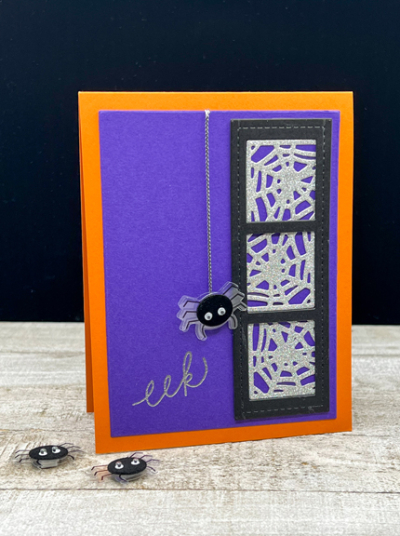
Halloween card making is finally complete, and over the next week I’ll be sharing the cards I made. This one is for my mother-in-law who has always loved Halloween. In the days when she ran a very successful bed and breakfast, she often closed it over Halloween weekend to entertain her grandchildren with games, hide and seek, and lots of Halloween treats. 

Eek

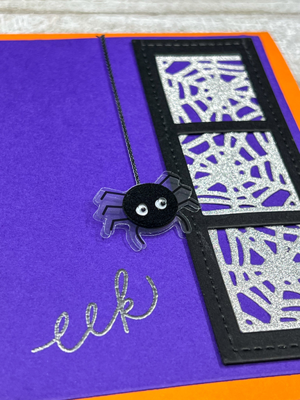
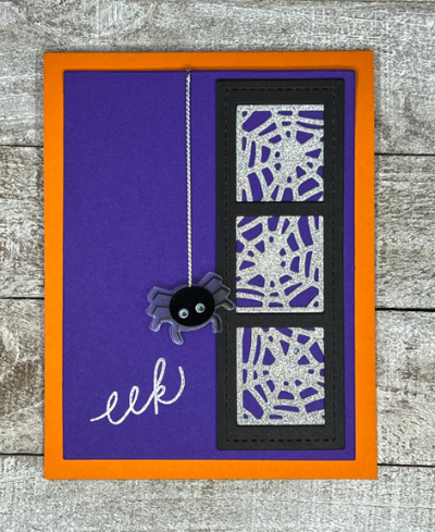
The design of this card was cased from a winner at The Paper Players Challenge several weeks ago. The original card was a fabulous example of a CAS card. I went a bit fancier with mine. I die cut the Pretty Pink Posh “Stitched Film Strip” from black paper and the Papertrey Ink “Corner Adorner: August” from silver glitter paper. Then I backed the opening in the frame with pieces from the die cut web.

EekClose

I layered that on a bright purple paper and embossed the sentiment from The Stamp Market’s “Halloween” in silver. The cute spider (is any spider cute?) came from Hobby Lobby.

EekFlat

It all went on a bright orange cardbase. I never used much purple and orange together in past years, but this year, it’s been a favorite combination. I’m throwing this in the ring at the Simon Says Wednesday Challenge which is Spooky/Halloween.

Wednesdayblog-logo


Botanical Print: Take Two

  • by

I have a second botanical print for the CAS Mix-Up Challenge before it ends.

October 2021

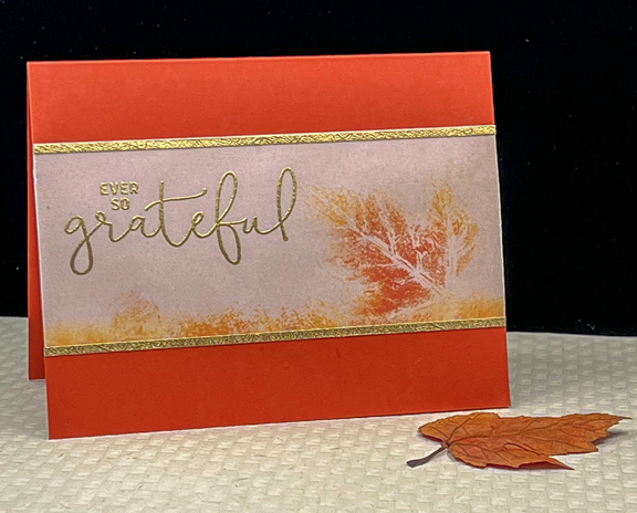
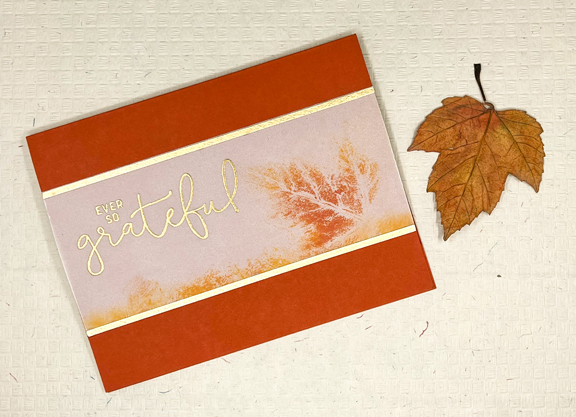
As I was cleaning off my desk Wednesday night, I saw this vellum piece that I had printed with the same Distress Oxide inks and the same leaf as I used for my first botanical print here. It wasn’t what I was looking for the first time, but I decided I really did like it and decided to see what I could do with it. I’m quite happy with the result.

Grateful

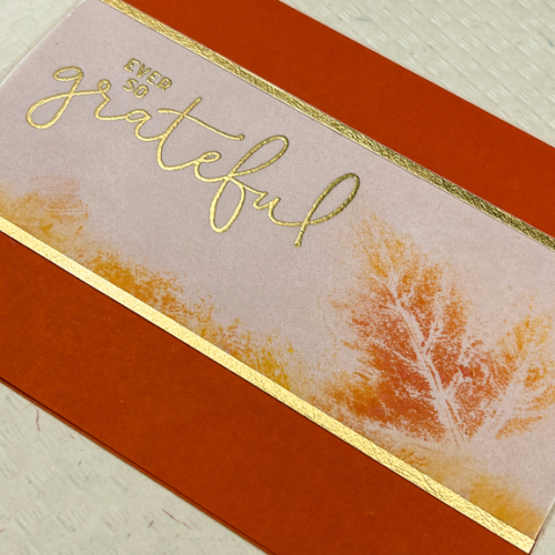
I cut the vellum piece and then added two very narrow gold metallic strips to the top and the bottom so I would have a place to adhere it to the card. 

GratefulClose

Before adding the vellum to the Terra Cotta card base, I stamped this lovely sentiment from Concord and 9th’s “Hey, Bestie.” The font is so elegant. 

GratefulFlat

I might like this “after-thought” card better than the original. I wish every card I made came together so easily!

It’s been a crazy busy week, and the weekend looks no different. I’m still hoping to squeeze in some crafting, and hopefully, showing up here again before too long.

World Card Making Day Challenge

  • by

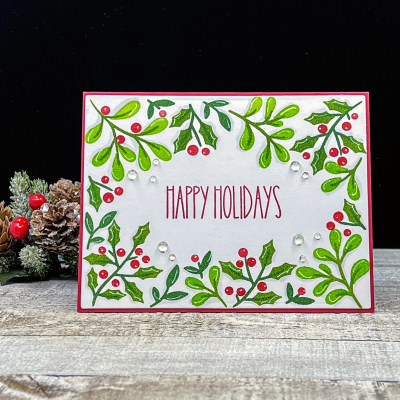
On World Card Making Day, October 2nd, I was busy crafting, but I wasn’t paying much attention to the many challenges available. After the fact, I saw the Pinkfresh Studio World Card Making Day Challenge which closes tonight. For most of the intervening days, a lovely new stencil from Pinkfresh Studio, “Holiday Botanical Background,” has been laying on my desk waiting for some attention. Finally, on the last night the challenge is live, here is the card.

Holidays

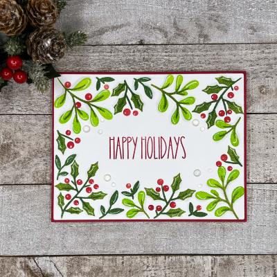
It’s a four-step stencil and very easy to line up. I used two Pinkfresh green inks and one Altenew green ink on the leaves and Pinkfresh’s “Candy Apple” for the berries. The sentiment is from a new stamp set by Waffle Flower, “Cozy Holiday Sentiments.” I like the simply graphic font, and it was the perfect size for the opening in the center of the card.

HolidaysFlat

I die cut the stenciled panel with the largest of Spellbinders “A2 Matting Basics” dies and added it to a red cardbase. Then I added some subtle shadows with a very light gray Copic marker and some highlights with a white gel pen. The only embellishments are some  Droplets from The Stamp Market. 

Happy to have another Christmas card added to the stash and happy to have finally put these lovely products to use!

Fall and Christmas

  • by

It’s that time of year when I’m creating autumn cards for birthdays and anniversaries, and Christmas cards since I know I’ll need a LOT of them very soon! Today I have two cards–one of each–for two challenges. 

First off, a very interesting challenge on the CAS Mix-Up site. They’re looking for a botanical print (from a real leaf or plant) as well as some stamping and/or die cutting.

October 2021

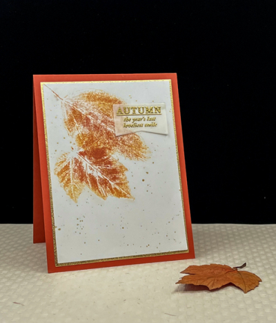
I found a few pretty leaves on a walk a day or so again, and it’s taken two days to get the print made and the card assembled. It’s not often I have very busy weeks with lots of commitments, but this is one of them. 

LeafPrint2

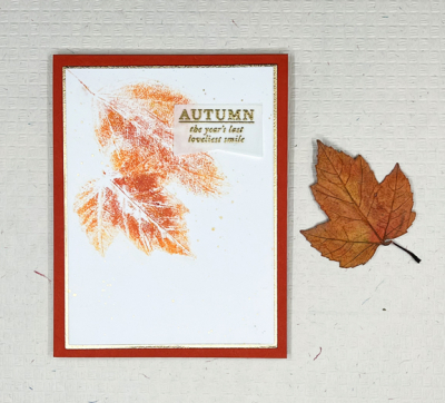
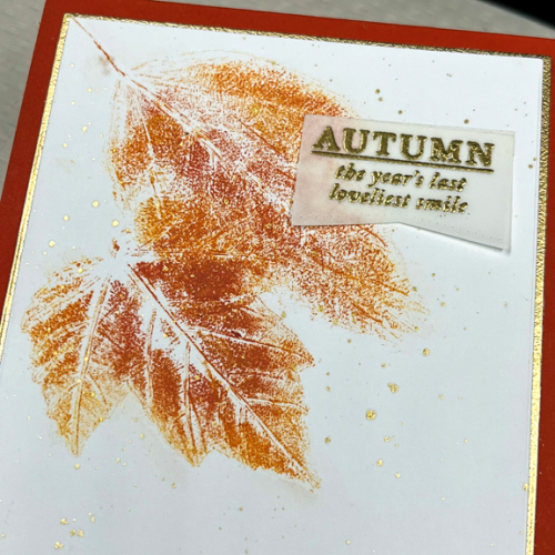
I colored two leaves with Distress Oxide inks (Crackling Campfire and Carved Pumpkin) and then pressed them into cardstock. I found that using my fingers to press down on the leaves worked the best. I’m very happy with the way they turned out. 

LeafPrintFlat

The gold embossed sentiment on vellum is from a tiny stamp set by Gossamer Blue. It harkens back to my scrapbooking days. I added some gold splatters and a narrow gold mat (thanks to the Gina K “Master Layouts 1 dies).

LeafPrintClose

The next card is for the Jingle Bells Pink Challenge. As you might guess this is a Christmas challenge, and if I’ve ever entered it, it’s been at least a year. 

Pink xmas placard copy

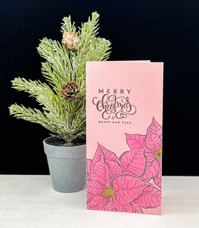
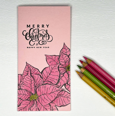
It’s been a long time since I pulled out my Polychromos colored pencils, but this turned out to be a pretty meditative task. 

PinkPoinsettia

This is a mini slimline card. The poinsettias are from Colorado Crafts “Slimline Poinsettia” set and the sentiment is from Gina K’s “Holiday Tapestry” set. 

PinkPoinsettiaFlat

I decided on no embellishments for this one. It’s not often I end up with a one-layer card! 

Color Hues #28

  • by

A new Color Hues Challenge is live. Nancy chose Red and Kraft for this round.

Color Hues #28.009

It’s not a color combo I typically use for Christmas, but I love the way this ended up.

RedKraft

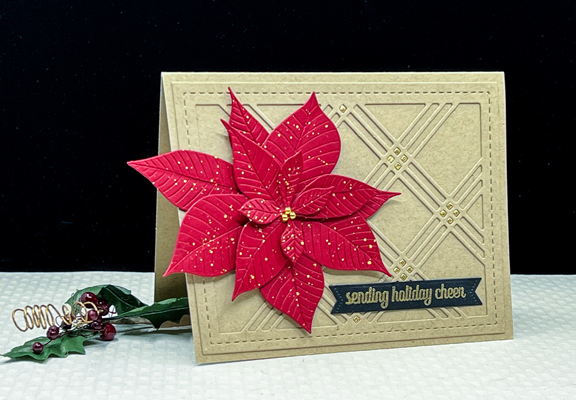
It’s really past time to start thinking about Christmas cards so I used this opportunity to create one using two dies I’ve never put to use. I purchased Altenew’s “Poinsettia 3D Die Set” last year at the end of the season after all my Christmas cards were made. The Waffle Flower “Triple Line Diamond Panel” die is newer, but it’s been in the stash for a couple of months.

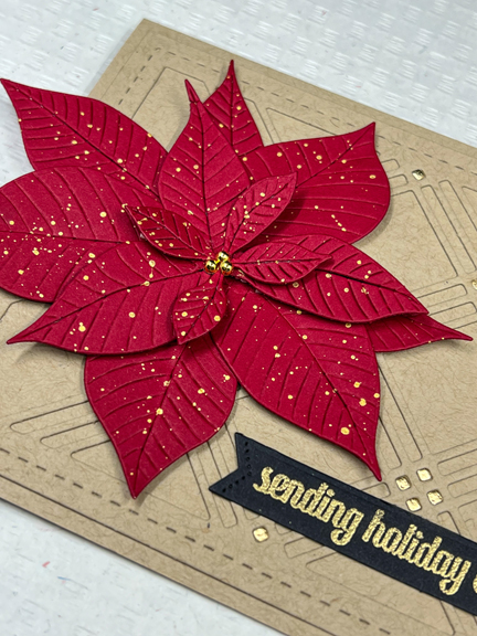
I die cut the “Triple Line Diamond” panel from Kraft cardstock (Papertrey Ink) and added it to the card base. It needed a festive touch, so I die cut a second panel from gold and inlaid the tiny squares. Sadly, the poinsettia covers up quite a few of them. The bonus is that I’m left with a lovely gold panel you’re likely to see soon.

RedKraftClose2

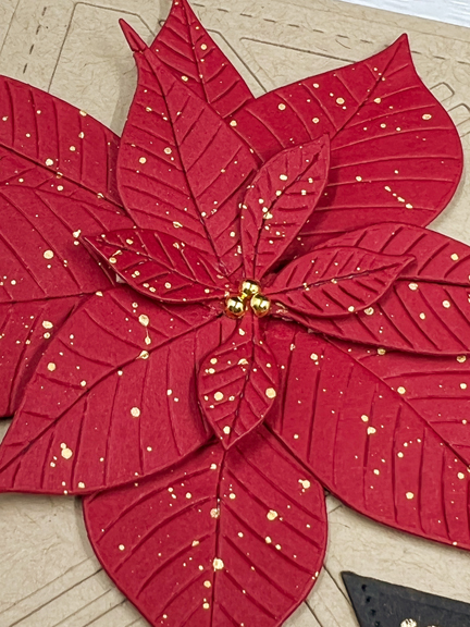
The poinsettia was die cut from red cardstock (Concord and 9th) and splattered with gold watercolors from Gansi Tambi’s “Starry Colors.” I added some dimensional tape under some of the bracts of the poinsettia.

RedKraftClose

The sentiment from The Greetery’s “Sentiment Suite: Christmas” was gold embossed and die cut with one of the “Sentiment Suite Basic” dies. Instead of using the tiny die from the poinsettia set for the center, I chose some gold pearls from The Paper Studio.

I hope you’ll hop over to the Color Hues Challenge and join in the fun, checking out the cards made by my awesome Design Team members and our Guest Designer, Ma-Mi.

Nancy

Hannelie

Cindy

Julie

 Sheri

Kristie

Lindsey

 Tracey


Celebrate!

  • by

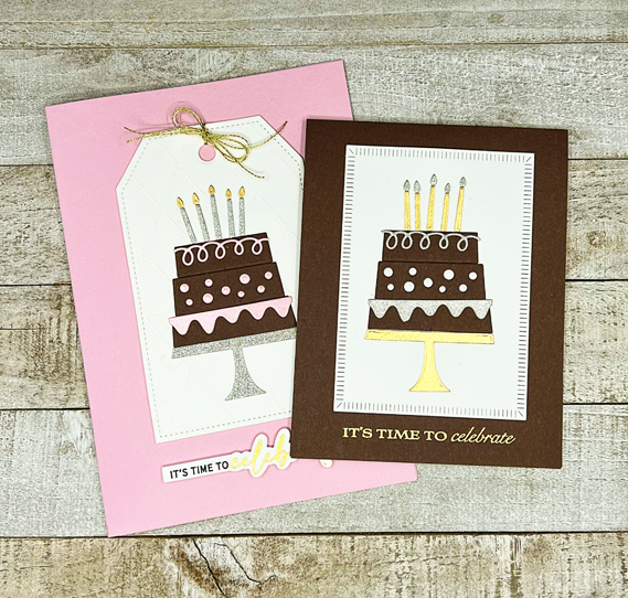
There are two celebratory challenges running right now, and I pulled out a die I’ve never used to create a couple of birthday cards for them. AAA Card Challenges is celebrating their 200th challenge (Congrats! That’s a lot of challenges!), and Seize the Birthday is asking for cakes! I was happy to oblige.

#200 2021-09-30-Cakes

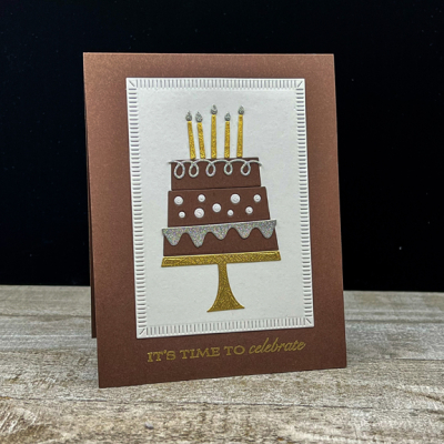
I wanted to use pink with chocolate cake for one of my cards but also die cut some portions of the cakes in metallic and shimmer papers, being unsure of what I’d want in the way of decorations. In the end I had enough pieces to create two cards–one definitely feminine and another that could work for both men and women. 

TwoCakes

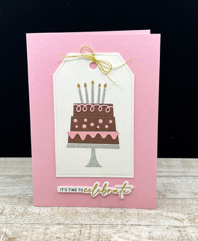
I started with a pre-embossed piece I found in my collection of ready-to-use pieces and die cut it with one of the tags in Gina K’s “Tag Trio.” It turned out to be a perfect size for the cake, but I ended up deciding it required a 5X7 format which I don’t typically make. 

PinkCake

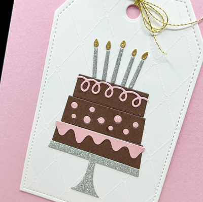
You can see the white embossed pattern on the tag. I have no idea what I used to create that piece, but I’d like to locate it. The fun cake is My Favorite Things “Birthday Cake” die, and although I’ve never used it before, it must already be retired as I couldn’t find it on the MFT site. 

PinkCakeClose

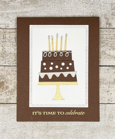
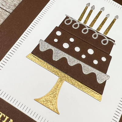
For the second cake, I chose one of The Greetery’s “Crimped Frames.” I love the gold and silver with the chocolate cake.

ChocolateCake

The only change for the second card was to emboss the sentiment from Papertrey Ink’s “Banner Sentiments” in gold.

ChocolateCakeFlat

On both cards, I inlaid the circles on one layer of the cake. On the pink card, I used the same pink shimmer paper as the other “frosting” layers. On this card, I had some white shimmer circles and liked those better than either of the glittery decorations.

ChocolateCakeClose

It’s always a good idea to have a few birthday cards in my stash. And I’m quite sure I’ll find just the right recipients for these. I’m also sending these cards to the October NBUS Challenge. I’m so relieved to have finally gotten around to using this fun die. It certainly won’t be the last time!

NBUS


A Christmas Poinsettia

  • by

Along with Halloween cards, I finished a few Christmas cards last weekend as well. There’s now a small stash, but it certainly needs to grow by leaps and bounds by the end of next month! This card was made with two challenges in mind. One of my favorite challenges (which I’ve neglected recently) is The Flower Challenge. They are celebrating their 5th birthday, and I wanted to be sure to celebrate with them. The challenge calls for Using a Shape. The second challenge is a Christmas challenge. I ought to participate in these all year long, but I seem to wait until the time is drawing near. The CAS Christmas Challenge calls for Red & Gray.

FC5thBirthdaybutton CAS Christmas October 2021

It’s a color combination I like, so I set out to create a Christmas card with a flower, on a shape, using red and gray. I’m pretty happy with the outcome:

RedPoinsettia

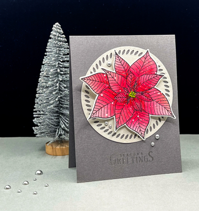
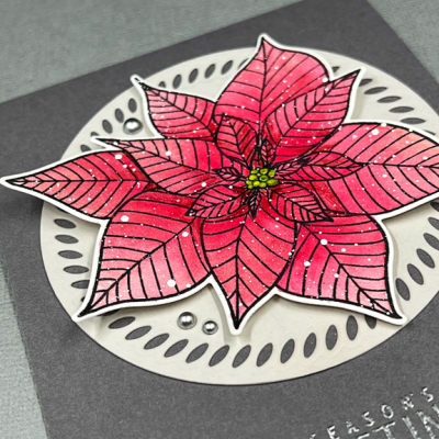
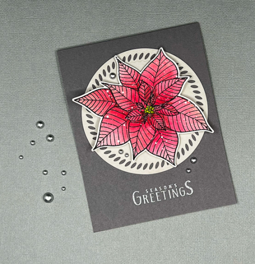
The poinsettia is one of my favorites, Altenew’s “Modern Poinsettia.” I watercolored it with The Stamp Market watercolors. I struggle with those sometimes, but I slowed down and finished this over two days, letting the previous coats dry completely. After finishing it, I splattered it with white ink.

RedPoinsettiaClose

It’s hard to tell in the photo, but the “Braided Circle” die from Pinkfresh Studio was cut from light gray cardstock which looks more cream in the photo than it does IRL. 

RedPoinsettiaFlat

The circle and poinsettia were layered onto a dark gray card base. I used a few small pieces of dimensional tape behind the leaves of the poinsettia. According to Google, poinsettias do not have petals, just leaves which are different colors given the amount of light they’ve had. Technically, they’re called bracts. The flowers are actually the small centers of the poinsettia which I colored in a yellow green. They are one of two favorite holiday flowers, the other being cyclamens which are available all year, but were always a Christmas gift from my father when he was alive.

The sentiment, embossed in silver, is from a Colorado Craft set I ordered at the end of last year and have never used, “Slimline Poinsettias.” I’ve yet to stamp or color the beautiful flowers in that set, but I used all three of the accompanying sentiments this weekend while I was crafting Christmas cards. I think you’ll see them on lots of cards. The fonts are really lovely, and they’re universal holiday greetings. The final touch was to add a few silver pearls from Trinity Stamps.

Hocus Pocus

  • by

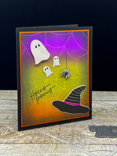
Saturday was World Cardmaking Day, and although there were no posts from me here or on Instagram, I was busy crafting on Saturday and Sunday. Many of the cards I finished may end up with blog reading friends, so I won’t post those until they’ve been received. Some others were Halloween cards, and I’m not sure who’s getting what. I do know who’s getting this Halloween card, and I’m pretty sure she isn’t reading my blog regularly. I’m entering it in two Halloween challenges today, though, so I’ll take my chances.

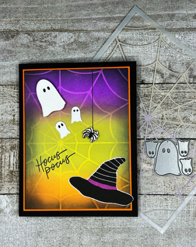
For once, I didn’t have anything other than the ink blending background in mind when I began. I used Wilted Violet, Twisted Citron, Carved Pumpkin and Spiced Marmalade for the ink blending, adding in some Black Soot around the edges.  Once that was done, I decided I wanted to add the Pretty Pink Posh “Spider Web” stencil to the mix, and added some more Distress Oxide inks over the top.

HocusPocus

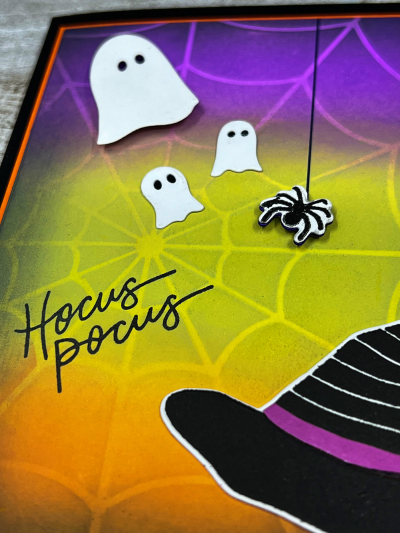
When that was finished, I started looking through my Halloween stamps and dies. I recently purchased a set from The Stamp Market, “Happy Halloween,” and used the witch’s hat, the spider, and the sentiment from that set.

HocusPocusClose

The three ghosts are from a Poppy Stamps die set I purchased years ago. I popped the largest of the ghosts and the spider up with dimensional tape after drawing a line with a permanent marker for the spider to crawl down.

HocusPocusFlat

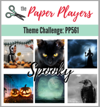
I love the glow of the ink blended background. I’m entering this in two challenges: Just Us Girls:  Halloween, and The Paper Players:  Spooky.

JUGS Pp561

Summer Photography Scavenger Hunt: Final Link-up

  • by

I don’t often post twice in one day, but today the new Color Hues Challenge went up, and it’s also the final link-up to the Summer Photography Scavenger Hunt, kindly hosted by Mary-Lou. You can find my previous link-ups here and here. I managed to find all the items on the list as well as two of the alternates. No excuse for not having a photo of a local landmark; it just fell off my radar.

So here are the final photos.

Breakfast

A Breakfast of Champions 

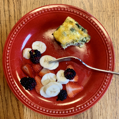
Not sure this qualifies as a breakfast of a champion, but it’s reliably my breakfast of choice: a No-carb egg bake that I make, cut in squares, and freeze with a selection of fruit.

TimeofDay2

Favorite Time of Day

I love evening, especially when we’re near the water and can capture the sunset. I’m quite sure we regularly have lovely sunsets in Rochester, but to capture them I need to be in the right place at the right time, which rarely happens. This was taken at Big Twin Lake in Michigan in August.

Clouds

Head in the Clouds (and in the water!)

WindowView

Window Views

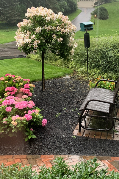
I had several window views, but decided on this one: the view from my craft room looking out at our front yard.

MarieKondoMoment

Your Marie Kondo Moment

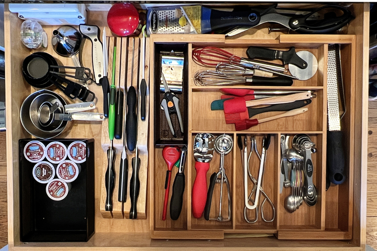
Sadly, I neglected to take a Before photo, but I’m proud to say that this photo was taken just this week, and the drawer was organized in early August. I think I finally came up with a system that works! Needless to say, there were a few items that left the house all together, and a few put away to see how often we really need them (Haven’t pulled any out yet.)

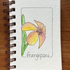
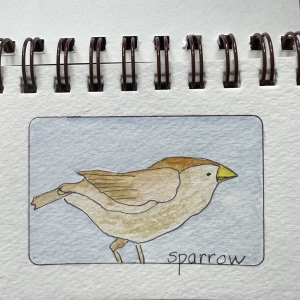
Doodle1 Doodle2

Your Best Doodle Art

I have a tiny sketchbook where I randomly choose things to draw and watercolor. I’ve gone through and created a frame on each page with a credit card which gives you an idea of its size.

Exit

An Exit

I’m quite sure if I’d been more attentive, I could have found a more creative response to this prompt, but it didn’t happen. I was alert enough to capture this in Traverse City, Michigan during the last day of our trip in August.

From the 80's

Decades of Sharing

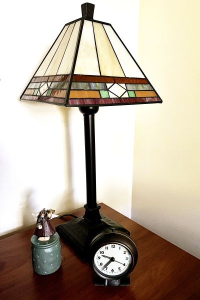
Interestingly, this was the most difficult prompt for me. I can only be sure that these items are from the 80’s because all three moved with us from our previous house. We’ve lived in this house for 36 years now. (That seems totally amazing to me.)

And finally, my most beautiful landscape of the season. In fact, it’s not my favorite photo from the summer, but it’s one of the few that truly quality as a landscape–a result I’ll chalk up to the pandemic, and not much travel this summer. The cloud photo above might suffice as well. This view of Seneca Lake from the Boundary Breaks Winery was the last capture for the scavenger hunt, taken just last Saturday.

Landscape

Thanks, again, Mary-Lou for compiling the list and encouraging me to be on the lookout for opportunities to capture a slice of our lives.


Color Hues #27

  • by

We have the perfect color combo for the first of October’s Color Hues Challenge:  Orange and Green. There’s still a lot of green on the trees here, but each day we see a bit more color. I know there are lots of folks who are not a fan of orange, but it ranks up there in my top five color choices.

Color Hues #27-Anim_

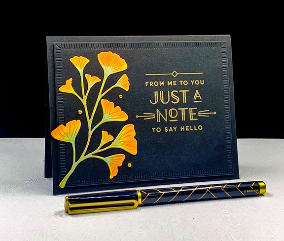
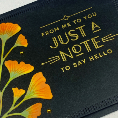
 I recently acquired The Greetery’s “Botanic-cut: Ginkgo” dies, and couldn’t wait to put them to use. I also used the new Greetery sentiment set: “Everyday Labels.” I love the font and the art-deco appeal of these sentiments. 

OrangeGreen2

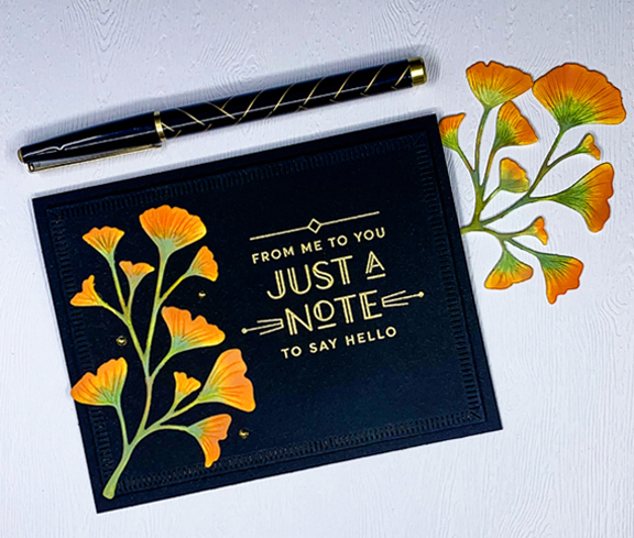
After die cutting the Gingko leaves, I used Spiced Marmalade, Carved Pumpkin, and Bundled Sage Distress Oxide inks to blend color onto the stems and leaves. I followed up with some Polychromos colored pencils for some detail.

OrangeGreen2Close

I die cut the largest of the “Crimped Frames” (also The Greetery) from black cardstock, embossed the sentiment in gold, and added the Ginkgo leaves.

OrangeGreen2Flat

I added three small gold pearls as a final accent after adding the framed piece with dimensional adhesive to a black card base.

I hope you’ll hop over to the Color Hues Challenge and join in the fun, checking out the cards made by my awesome Design Team members and the two Guest Designers, Jacinda and Marcia – the winners of the birthday challenge.

Nancy

Hannelie

Cindy

Julie

 Sheri

Kristie

Lindsey

Tracey


Celebrate: Autumn Challenges

  • by

I’m back with another CAS Autumn themed card. 

CH27

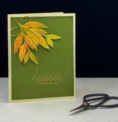
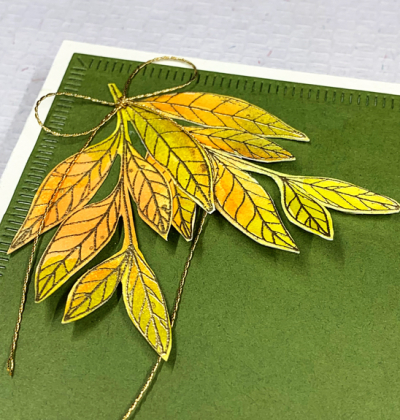
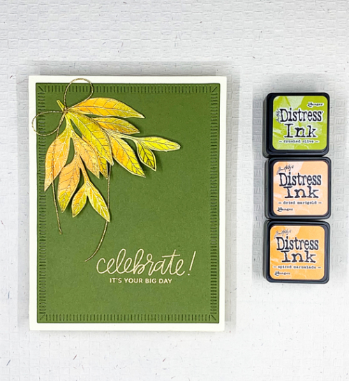
More leaves, this time from Papertrey Ink’s “Lovely Leaves” which has not had anywhere near enough love! I smooshed Distress Inks in Crushed Olive, Dried Marigold, and Spiced Marmelade on my glass mat, added a spritz of water and then laid down a piece of watercolor paper. Once it dried, I gold embossed the leaves and fussy cut them out.
CH27Close

The colors weren’t quite as bright as I wanted so I used a small paintbrush and added a bit more of the oranges to the leaves.  I used my well-loved “Crimped Frames” from The Greetery to die cut a piece of Gina K’s Asparagus cardstock. It’s become my favorite green. The sentiment from Pretty Pink Posh was embossed in gold in the lower right corner and I arranged the leaves in the upper right corner, leaving plenty of open space. I added thin gold bow and attached it to a cream card base. 

CH27Flat2

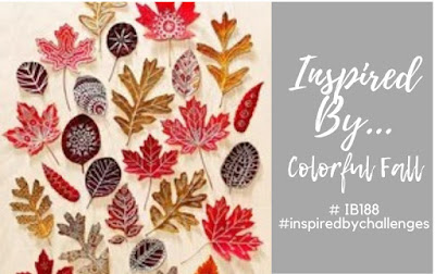
This is my first entry to the Addicted to CAS Challenge: Autumn, and my second entry into the Inspired By . . . Colorful Fall Challenge.

CAS Inspired By IB188 Colorful Fall August 23

A Perfect Saturday

  • by

Yesterday we made a trip to the Finger Lakes. It was clear and quite chilly when we left the house around 7:00. Our first stop was at the Mennonite market in Seneca Falls where we picked up our favorite brand of bacon, some pork chops, green beans, two blocks of cheese, and a 50# bag of bird seed. We had packed a cooler for the meats and cheese and headed to Ithaca to the Farmer’s Market.

On our way we stopped at Taughannock Falls to take a few photos. I have a new phone and wanted to try the camera. Most of these photos have had no editing other than being cropped to an appropriate size to print if I ever want to do that. It’s quite a bit better than my previous one which was three generations old.

IMG_0018ed

IMG_0013ed

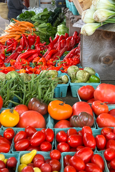
It was our first trip to the Ithaca market since the pandemic began, and like many things, was a bit diminished. My biggest disappointment was the disappearance of my favorite bakery. Nonetheless, there were still gorgeous vegetables and flowers, and I did find a delicious cranberry orange scone for a mid-morning snack.

IMG_0035ed

IMG_0037ed

The market sits right at the end of Cayuga Lake, and the rowers were out in force on this beautiful morning. Both Cornell and Ithaca College have rowing teams as does the high school so I’m not sure who was out practicing.

IMG_0028ed

IMG_0032ed

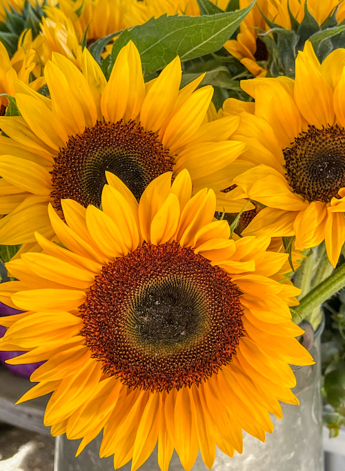
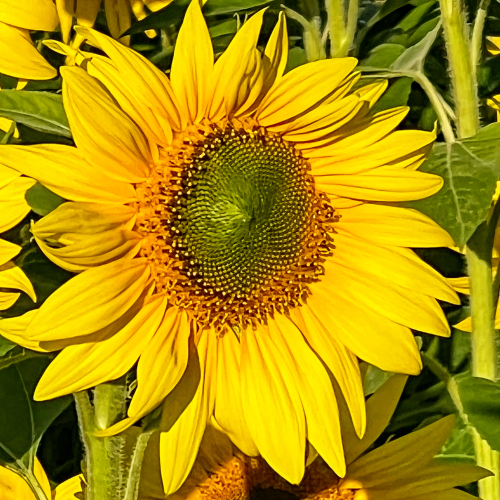
In addition to the sunflowers at the market, we found these on one of the rural roads we travel on the Finger Lakes.

IMG_0003ed

IMG_0006ed

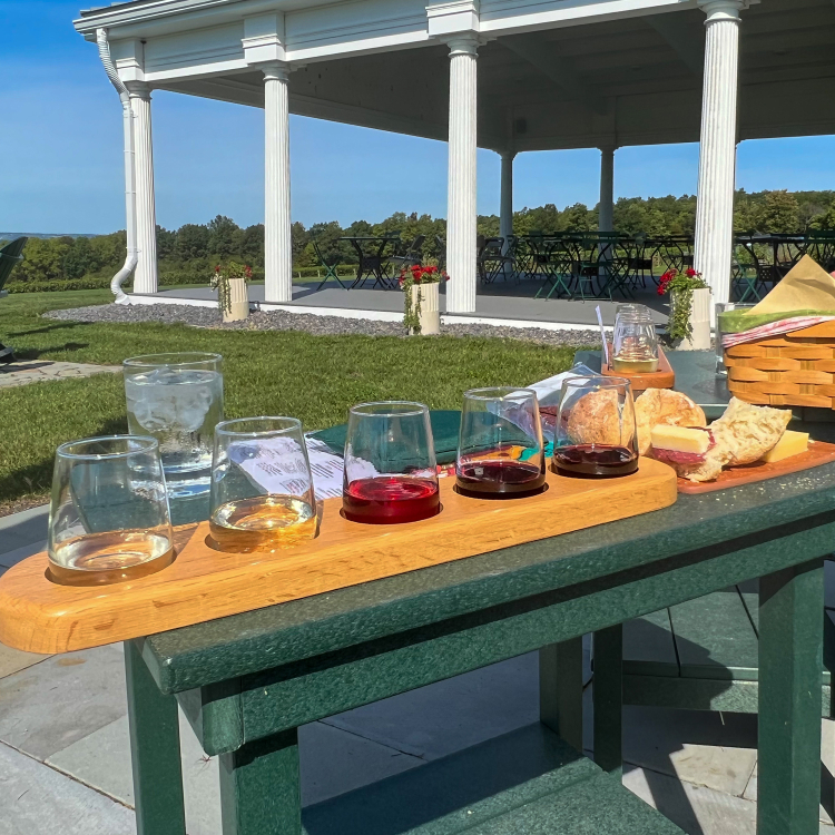
The primary reason for the trip was to pick up our fall allotment of wine at Boundary Breaks where we are members of the wine club. Not only do they make wonderful wine, the views are among the best on Seneca Lake.

IMG_0047ed

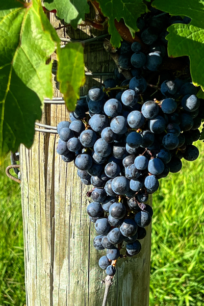
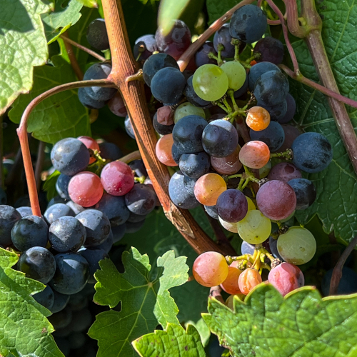
Although some of the grapes have been picked, there are still many left on the vines waiting for just the right time to harvest.

IMG_0041ed

IMG_0040ed

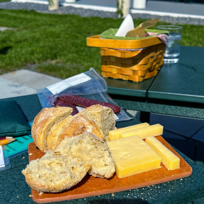
We arrived right at lunch time and enjoyed a wine tasting while we sat overlooking the lake.

IMG_0054ed

IMG_0055ed

But that was not the end of the day! After arriving home around 2:00, we had just enough time to rest up before heading off to our granddaughter, Skylar’s, 10th birthday dinner. Skylar asked for a pajama party, but we were all assured it was an optional requirement. Even Ella, the seven year old, decided against it.
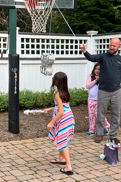
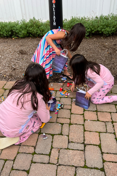
As always there was a piñata to break open.

IMG_0060ed

IMG_0071ed

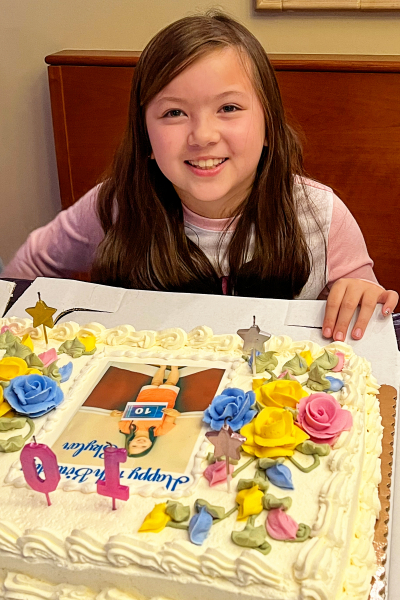
Then there were gifts to open and a delicious dinner ordered from Skylar’s favorite Korean restaurant. (The dumplings are amazing!) And finally cake.

IMG_0102ed

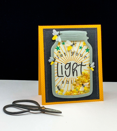
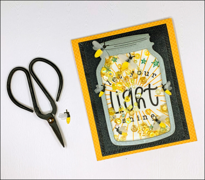
If you’ve made it this far, thanks for hanging in there. I thought I’d share her birthday card as well. One night in August the girls arrived for dinner and needed to head home earlier than usual since they had been allowed to stay up late the night before to catch fireflies in a jar. I had recently purchased a couple of fun stamps and dies from The Greetery so knew exactly what I wanted to create.

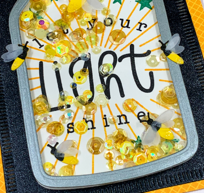
Light

Shaker cards are usually a hit and this one was so much fun to make.

LightClose

I originally had three fireflies inside the jar, but the sequins kept getting stuck on their vellum wings, so I took the card apart and redid the stamping inside, moving all but one firefly to the outside of the jar.

LightFlat

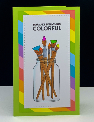
The sentiment is just perfect for a new fifth grader. Skylar had expressed an interest in Copic markers from watching some You Tube videos. I was pretty sure she didn’t want Copics, so I did some research while we were in Wisconsin. But instead of guessing what might work, I gave her another card last night with a promise of art supplies.

Colorful

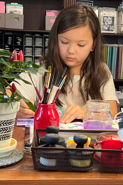
Today Skylar came over to play with my art supplies for a couple of hours. She tried out the Copics, the Tomboys, some watercolor markers, and some pan watercolors. In the end we ordered a set of alcohol markers that are less fussy than Copics and less expensive so she was able to get a good selection of colors. I gave her a few stamp sets, an ink pad, and a sketch book from my stash so she’ll have some things to play with when the markers arrive later this week.

IMG_0108ed

It’s been quite the lovely weekend! Hope yours was good as well.