Skip to content

Watercolor Challenges

  • by

There are more card challenges on the internet than you can count, and I keep coming up with new ones that I want to try. Recently, I found a series of challenges by Happy Little Stampers. One thing I like about all their challenges is they run for a month. Their watercolor challenge for January is “Anything Goes.” The CAS Mix-Up Challenge is for “Splatters” combined with one other mixed media element, in this case, watercolor.

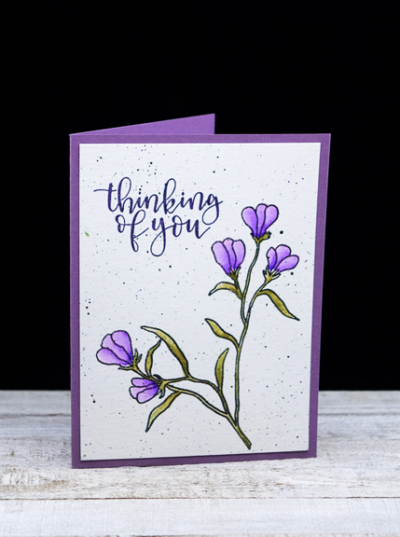
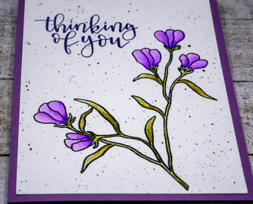
I actually have two cards to share. A weekend or so ago, I sat down with a pile of already colored, die cut, and stamped elements to create a group of Thinking of You cards which I badly needed. Both of the focal images for these cards were already stamped, splattered, and watercolored. I just needed to add sentiments and assemble the cards.

PurpleFlowers

The flowers are from the Waffle Flower “Bouquet Builder” set, and watercolored with Zig Clean Color Markers

PurpleFlowersClose

After watercoloring the flowers, I added some black, purple, and green splatters. The sentiment is an old favorite from Papertrey Ink, “Penned Elegance.” I added the panel to a Plum Pudding card base.

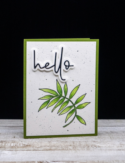
The next card features a botanical from the same Waffle Flower set.

HelloLeaf

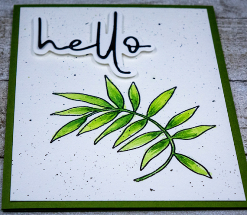
This was watercolored with Altenew’s 36 pan watercolor set, and highlighted with some Polychromos colored pencils.

HelloLeafClose

The sentiment was die cut and assembled by a friend who gave me an envelope with a variety of the die cut sentiments from Papertrey Ink’s “Frame It Out: Wishes.” I love the modern font. The card base for this card is Gina K’s Asparagus cardstock which has become a favorite. 

I’ll be linking these up with:

HLSWatercolor

CASJanuary 2021


Color Hues #10

  • by

Times flies, and here we are with the tenth Color Hues challenge:

Color Hues Badge #10

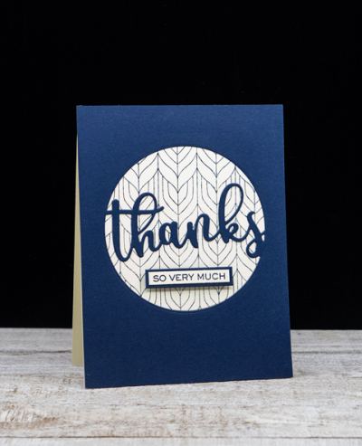
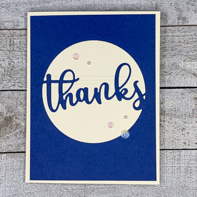
One of my intentions for this year, is to make sure I’m using all the stamps and dies I have accumulated since the pandemic started! One of the dies is the “Altenew Circled Greetings.” I have all four of them, but today I used “Thanks.” I’ll start with the card I posted on the Color Hues Challenge post.

NavyCream1

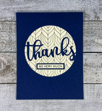
You can see that the die creates a wonderful focal point for an A2 card. I backed the open circle with a piece of cream cardstock on which I’d stamped with another new purchase, My Favorite Things “Peacock Pattern Background” in Dark Indigo ink.

NavyCream1Flat

I used a stamp from W+9’s “Hand Lettered Thanks” for the small sentiment strip, and bordered it with a bit of the dark navy cardstock. The front panel was then added to a cream colored card base which is perfect for writing a thank you note.

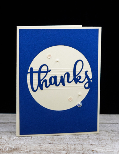
The second card is very similar, but I chose to dry emboss a series of narrow score lines on the cream card base before adding the navy panel which I trimmed down to expose a narrow cream border.

NavyCream2

This time I chose a brighter hue of navy cardstock that has a subtle texture to it.

NavyCream2Flat

I added a few sequins and pearls from Lucy’s Cards: “Pearl Necklace” collection.

Hop over to the Color Hues blog to see what the rest of the Design Team and our Guest Designer, Julie,  have come up with . . . and join in the fun!

 Nancy

Hannelie

Cindy

Julie

Sheri

Kristie

Lindsey


Warm Wishes

  • by

The stamped images for this card have been lying on my desk since before Christmas. I realized sometime in December that I owned no snowmen stamps and ordered a couple sets from My Favorite Things during a sale. I knew exactly what I wanted to do with these cute snowmen and MFT provided not one, but two, challenges that fit this card. First, the MFT Birthday Challenge which is Winter Wonderland, and the MFT Outside the Box Challenge: Winter Scenes. Everything I used for this card also goes to the NBUS Challenge.

I’ve been immersed in a Sketchbook Design course with Liz Steel. Her courses are always loaded with content, and this has been no exception. But I’ve started a new sketchbook, and have a few pages started. I’ve found all my fountain pens, and although I thought I had them all working again, I’ve discovered that most of them are going to require a thorough cleaning before I can count on them. All that to say, stamping and card making has taken a backseat in my schedule.

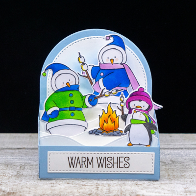
It’s not often that a card comes out just the way I imagined it, but this one comes pretty close.

WarmWishes

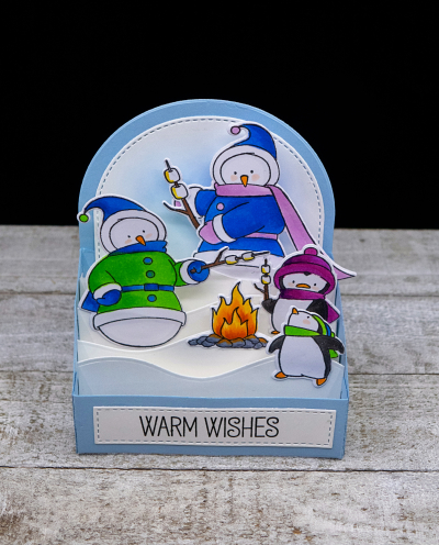
I constructed the box with Spring Rain cardstock. I don’t own the Outside the Box snow drift dies, but created my own with the Ellen Hutson “Landscapes” die. When I purchased those, I thought they might work for a variety of cards and so far, they’ve been great. I used some Distress Oxide ink to create a bit of blue sky on the back side of the box.

WarmWishesTilted

All the stamped images were colored with Copic markers and then die cut. Before adding them to the snow drifts, I added the stitched panel with the sentiment (also from the “Toasty Greetings” set). 

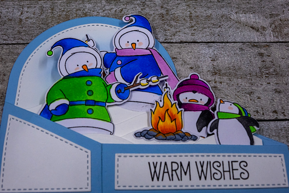
WarmWishesClosed

Here you can see that the card folds so that it fits into an A2 envelope. You can also see the stitched side panels. I’m off to link up with these challenges:

Birthdayproject

OutsidetheBoxChallenge_BlogHeader

NBUS


Just Us Girls: Trend Week

  • by

I had every intention of joining Just Us Girls last week where the challenge was “Hello,” but the weekly challenges frequently get away from me. This week’s challenge is to Use a Stencil.

JUGS

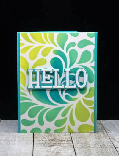
It definitely is a trending technique, and I’m glad to be joining in this week with a card that also uses a large HELLO sentiment.

HelloStencil

I love Altenew’s “Flowing Drops” stencil and used Distress Oxides inks to create the blue/green background. I trimmed the sides enough so the Hawaiian Shores card base would create a narrow border. 

HelloStencilFlat

The sentiment is from The Stamp Market’s “Paper Hugs” set. I die cut it with white and layered it on the shadow die cut with Hawaiian Shores, and popped it up with some dimensional tape.

I’m also entering this in the Happy Little Stampers Stencil Challenge. I just recently happened up the Happy Little Stampers who seem to have monthly challenges for a variety of techniques/products. I’m much more likely to be on time with monthly challenges! 

HLS Stencils


Time Out Challenge

  • by

Time Out has more than one meaning this afternoon after the assault on the Capitol yesterday. The horrific event will be haunting us for months (and years), and there are many, many questions that need to be answered. Although I do try to stay away from discussing political events on this blog, but this can’t be ignored. I’m not one that watches television during the day, so I actually discovered what was happening in Washington when an international blogging friend emailed me to be sure we were safe—knowing that we were miles away. As it turns out there were demonstrations in other cities, but fortunately, not here.

But the Time Out I’m referring to is a card challenge:

Time Out Challenge 178

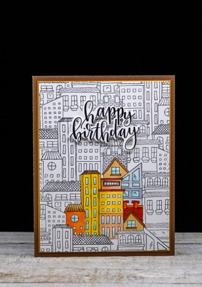
Last night after the Congress was able to resume and as I was listening to their discussions of the objections to the Electoral College votes, I decided I needed to find something to do at the same time. This My Favorite Things “City Block Background” had already been stamped, and I decided to do some spotlight coloring. Needing a masculine birthday card, I thought this might be a fun, albeit a bit unusual, one.

HBCityscape

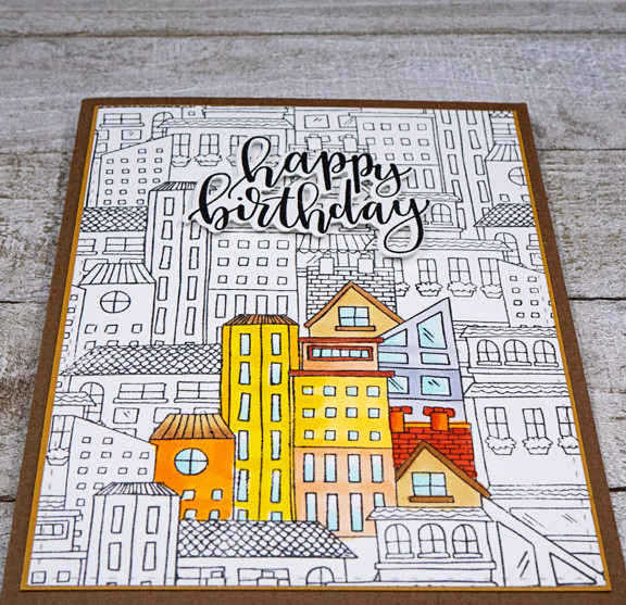
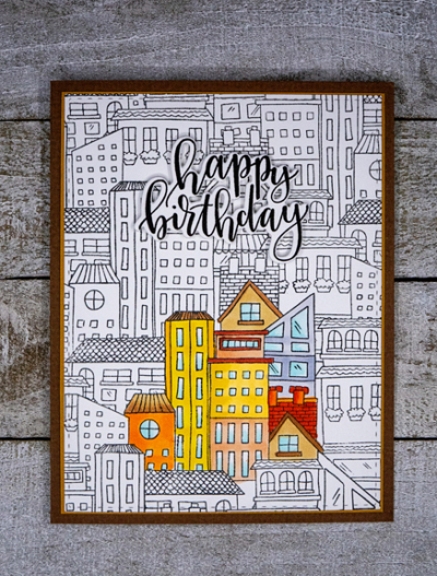
I picked just a few of the buildings in the center of the panel to color with Copic markers.  After finishing the coloring, I used one of Simon Says “Stitched Rectangles” to die cut the panel, and added it to a very thin border of Honey Nut cardstock. The brown card base is one I’ve had in my stash for years.

HBCityScapeClose

Trying to decide on a sentiment was the next problem. I have a box of pre-stamped and die cut sentiments, and found that this one, “Penned Elegance” by Papertrey Ink, worked quite well.

HBCityscapeFlat

I backed the sentiment with thin strips of dimensional tape to lift it up and give it some space from the black and white background. I ended up making a second version (nearly identical) this morning. I think the card’s charming, and I hope my buddies do too. 

Just a note: some photos haven’t been showing recently. According to Typepad, it’s an error on their end and should repair itself with time. If not, I’ll be sending them a message and they will retrieve it. So annoying.

The Flower Challenge: Embossing

  • by

TFChallenge#52

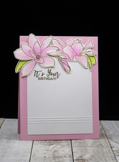
I’ll bet I’m not alone when I say that watching my friend heat emboss a sentiment on a card over 25 years ago was the impetus to hop in the car and go to the local stamp store to buy some supplies. I still have a couple of the wooden stamps I bought that day, and just replaced my heat gun in May when a friend gave me an Amazon gift card for my birthday. It’s been a favorite technique ever since so The Flower Challenge had me looking through the cards I hadn’t posted. This card which has already been received by my friend (so can now be shared) has both heat embossing in gold, and dry embossing along the bottom portion of the card.

PinkMagnolias

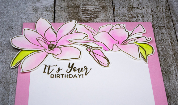
The beautiful magnolias are from Altenew’s “Magnolias for You” set. I embossed them in gold on Bristol and watercolored them with the Altenew 36 pan watercolor set. 

PinkMagnoliasClose

I had to fussy cut the flowers and leaves since I don’t own the dies, and then arranged them at the top of the white panel. The sentiment, also gold embossed, is from The Greetery’s “Sentiment Suite: Birthday” set which gets a lot of use. I decided the card was just too CAS (is that possible?), so added three lines of dry embossing with my stylus on the bottom portion. That was added that to a top folded card in Lovely Lady (PTI.)

I’m in the midst of trying to keep up with two online classes, so crafting time has been at a premium. Today’s personal challenge is to get two masculine birthday cards created.

One Little Word for 2021

  • by

This is the 11th year I’ve chosen a word to guide my intentions for the year. Most of them have served me well–some better than others. This year nothing came quickly to mind, but before I went hunting for a word (which I’ve needed to do occasionally in the past), EXPLORE popped out at me, and I knew immediately it was the word for me this year.
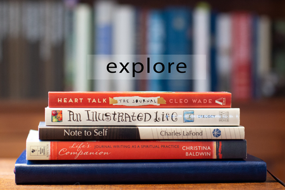
Explore

Exploration is curiosity put into action. Don Walsh

This quote pretty well defines what I’m hoping for by choosing this word. Let’s hope by the end of 2021, the first definition in the dictionary also holds true:

1. travel in or through (an unfamiliar country or area) to learn about or familiarize oneself with it.

There are so many things (and places) I want to explore. Some of the things I want to explore from home are prayer practices, new card making techniques, journal writing, sketching and sketchbook design, photography (more intentional, using my Canon and Sony cameras as well as my iPhone), and writing a Rule of Life. The books I chose for the photograph above cover some of those topics. Missing from the pile is The Adventures of Seeing which I loaned to a church friend over a year ago. I’ve have sent an email to see if I can retrieve it to use for a potential photography project. Heart Talk and Life’s Companion are for exploring more intentional and meaningful journaling, and Note to Self is about writing a Rule of Life. I’ve also found information about that on Tsh Oxenreider’s siteAn Illustrated Life has been on my shelf (and perused) for several years. That and Liz Steel’s new class “Sketchbook Design” will help me explore sketching again. The book on the bottom is a new journal I’ve invested in that provides a two-page spread for organizing your day, writing your morning and evening gratitudes and summarizing the day. At the end of each week, there’s a reflection page that includes a habit tracker. I’ve been looking for several years for the “perfect” journal. This may not be it, but it’s the closest I’ve found. The drawback is that it’s a three month journal and costs more than most year-long ones. If it works, it will be worth it to me. By the end of March I should have a good idea. 

My biggest take-away from last year’s OLW, COMMIT, was that setting monthly intentions from a broader list worked much better for me. Eventually I got to more of the items on my lists than I had in the past, Each month will include a reading goal, an organizational/purging goal, and a group of habits to track. For January, it’s 1) establish a morning routine of reading (firmly in place,) journaling, and meditation/prayer; 2) complete four books including one from The Unread Shelf Project–a project from 2020 that I’m continuing; 3) begin a weekly sketchbook page reflecting joys and gratitude, and 4) begin to work my way through my stamp/die collection, actually using them before deciding which ones to keep and which ones to give away or donate. I’m guessing that February’s goals will look much the same with different books, perhaps a change in habits to track, and once the sketchbook class has ended, a new creative goal. I’m feeling pretty flexible and willing to change things up until they feel right. 

So here’s to 2021. I’m guessing the next few months will be difficult ones. Observing safety routines will be more important than ever as others get frustrated and give up on the isolation requirements. A vaccine for folks my age may be available by March, and I hope that’s not an overly optimistic prediction. And I’m hoping my OLW project will help keep me entertained and busy here at home!
Color Hues #9

  • by

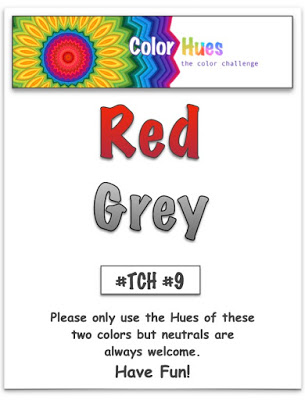
Happy New Year and Welcome 2021! I imagine most of us are more than happy to put 2020 behind us, and hoping for a much better year ahead despite knowing that we still have some dark days ahead. For me, crafting has been the one way I can put aside all the fears and anxieties of the times for a few hours. I hope it does the same for you.  And the Color Hues Challenge is here to help. I love this round’s color choices:

Color Hues #9

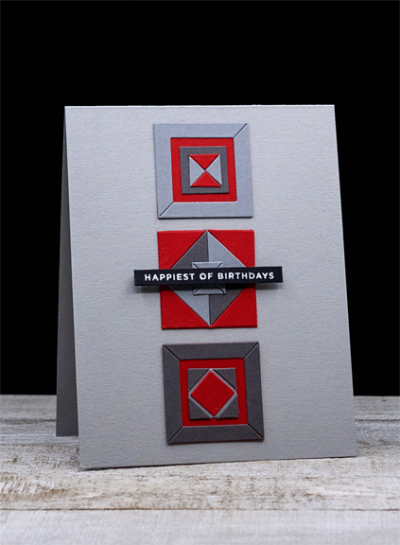
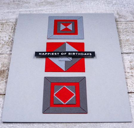
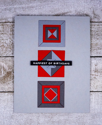
I’m a fan of Laura Bassen’s graphic cards, and when she designed and released some graphic dies for Simon Says this winter, I picked up the “Geometric Builders: Squares.” Putting the squares together is a bit like doing a jigsaw puzzle. It’s not something I do quickly, but I enjoyed the challenge. And I have a lot of pieces left to play with to make one or more additional cards.

Red:Gray

I used three shade of gray from Simon Says: Fog, Smoke, and Slate, and my favorite red from Papertrey Ink: Pure Poppy. I love the clean and simple design of the card, and think it will make a great masculine birthday greeting.

Red:GrayClose

The sentiment from The Stamp Market, “Tons of Type,” was embossed in white on black cardstock, and bumped up with some dimensional tape.

Red:GrayFlat

You may well see a similar design in a future Color Hues Challenge as this set is perfect for a two color challenge. Now check what our Design Team and Guest Designer have for you at the Color Hues Challenge.

Marcia, Guest Designer

Nancy

Hannelie

Cindy

Julie

Sheri

Kristie

Lindsey

Pull out some reds and grays, and join in the fun! I’ll be back tomorrow to share my One Little Word for 2021.