Skip to content

All About You

  • by

I’ve been sidelined for awhile following some (not serious) surgery, lots of church commitments, and getting ready for a road trip to Wisconsin. I managed to get a few cards made, and some of them photographed, but writing blog posts just didn’t happen. Now we’re visiting Sarah and her family for a week so I finally have time to share some cards while the grandchildren are in school. Hopefully there will be a flurry of posts this week. There’s also a stack of cards waiting to be photographed when I get home, and quite a few more I’m hoping to create once I get back into a regular routine.

First off a card for the Pinkfresh Studio World Cardmaking Day, Addicted to Stamps and More: Die Cuts and/or Stencil, and The Flower Challenge: Use a Sentiment.

1022-WCMD-BlogChallenge_1024x1024 Small AddictedFC6thBirthdaybutton

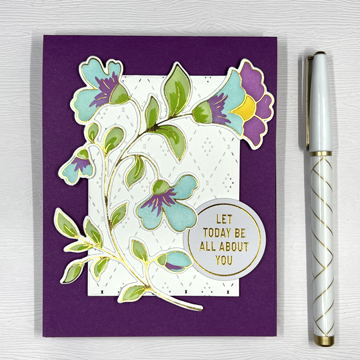
It’s a birthday card created with all Pinkfresh Studio products to help The Flower Challenge celebrate their 6th birthday. It uses two dies as well for the Addicted to Stamps and More challenge.

AboutYouFlat

I started with the hot foil plate from Pinkfresh Studio called “Folk Floral Stem,” and used the coordinating stencils to color it. After die cutting the floral, I added it to the Pinkfresh “Stitched Diamond” coverplate,t rimmed down before adding it to a deep purple card base.

AllAboutYouClose

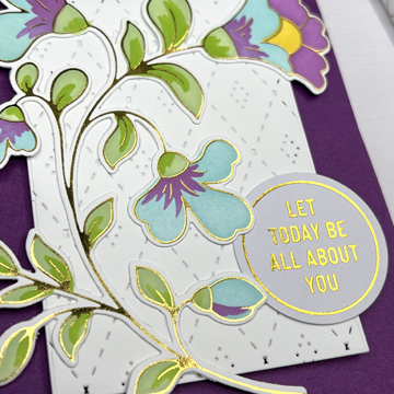
The sentiment is also from Pinkfresh Studio from their Foiled Sentiments collections. I’m a huge fan of the premade foiled sentiments that look so good with the hot foiled designs. 

Thanks for being here, I expect to be back soon!

Color Hues #51

  • by

We have another pretty fall color combination for you this round at Color Hues: Orange and Green. When this post goes live I’ll be visiting with my daughter in Wisconsin, and expect to see lots of green and orange foliage on the trip there and back. 

CH #51 Orange and Green.001

And foliage is what I chose when designing this card.

OrangeGreenFlat2
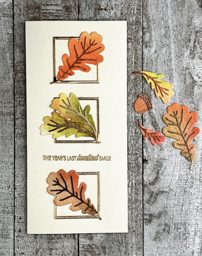
I die cut some leaves from the Greetery’s Botanicut “Mighty Oak” set and applied some green and orange Distress Inks with daubers. Once that was done, I die cut three small squares from gold metallic paper with Ellen Hustson’s “Essential Squares,” using only the frames and arranged them on an ivory mini slimline card base before tucking in the leaves.

OrangeGreenClose

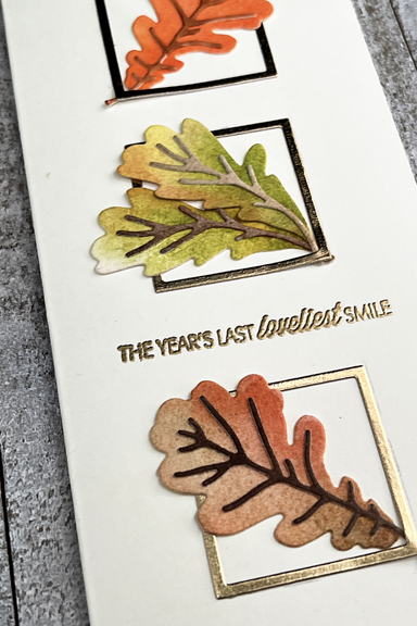
The sentiment, embossed in gold, is from the Papertrey Ink “Monthly Moments: September” set—one that’s been in my collection since early in my scrapbooking days. 

I hope this color combination inspires you to create a few fall-themed cards–birthdays, Thanksgiving, even Halloween, perhaps. Be sure to check out the inspiration on the Color Hues blog by the Design Team and our guest.


Fall Baskets

  • by

These cards are a departure from my more often Clean and Simple cards, but I fell in love with the Pretty Pink Posh “Fall Basket” when it was released last month. I have some ideas for more CAS versions, but here are my layered up cards.

Pumpkins

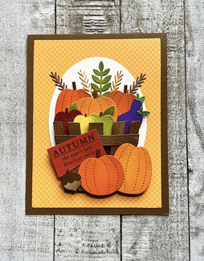
I really filled up this basket with pumpkins, apples, eggplant and some foliage. Dimensional tape on the front of the basket allowed me to put the veggies inside. The patterned paper is a favorite from Sunny Studios–Gingham Jewel Tones, and I die cut an oval from cream card stock as a backdrop for the basket.

PumpkinsClose

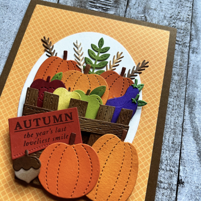
The Sentiment Suite tag from The Greetery was already stamped with a sentiment from Gossamer Blue–a scrapbook company I frequented in my scrapbook days. All the veggies were die cut from scraps in my scrap basket. I added some Distress Inks on most of them with a finger dauber.

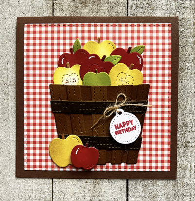
I had a lot of apples left over, and decided to do a square card with a basket of apples.

Apples

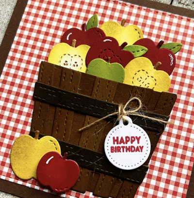
This time I chose a more traditional gingham pattern from My Favorite Things “Tiny Checks.” The tag here is also from the same Greetery set and stamped with one of the sentiments from “Sentiment Suite: Birthday.”

ApplesClose

I layered the two basket pieces together without dimensional tape here, and it does make for a flatter card, more easily mailed.

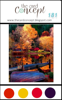
Just Us Girls Challenge is asking you to use your scraps: done! The Card Concept and The Paper Players have Autumn themed challenges, so I’ll be adding the first card to those since the colors were inspired by the challenges. The Card Concept asks that you define the style of your card. Reading their definitions, the first card is Clean and Layered (clean lines, many layers, patterned papers . . .)  And, once again, I’m sending this to NBUS--it’s my first time using these dies.

JUGS TCC181 100522 Pp611 NBUS


Arched Birthday Greetings

  • by

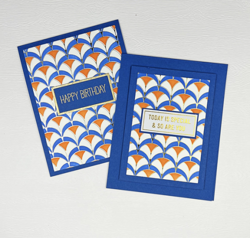
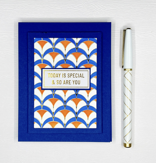
I needed two birthday cards, and found two panels I had already foiled with the Pinkfresh Studio Geo Arches hot foil plate. I’ve never used the accompanying stencils before and decided on a bright and happy color combination: orange and blue. 

ArchesX2

For the first card I made, I used almost the whole stencil, but for the second card, I cut it much smaller to layer it a bit. My husband prefers the first one, I rather like the second one. 

Arches1

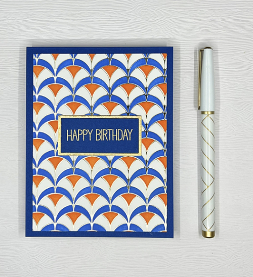
I used just two of the three stencils, choosing to leave one section white. On my last trip to the Paper Source, I picked up a pack of the Royal Blue cardstock which turned out to the the perfect match.

Arches1Close

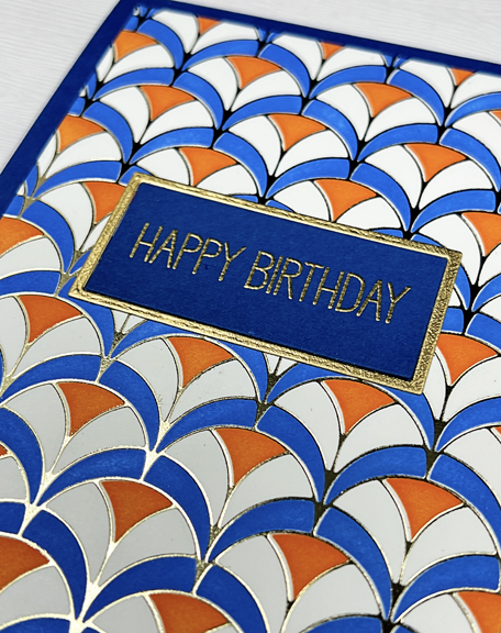
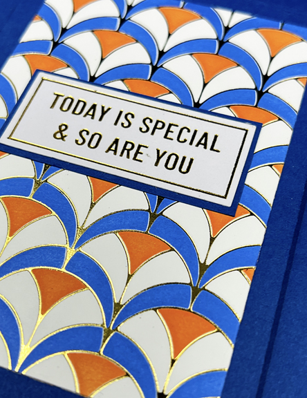
I gold embossed the sentiment from My Favorite Things in gold, and die cut it with Ellen Hutson’s Essential Rectangles twice–once in blue and once in gold for the frame.

Arches2

I used the Spellbinder’s A2 Matting Basics to die cut the stenciled panel and the Royal Blue panel before layering them on the card base. 

Arches2Close

The sentiment is a pre-made foiled sentiment from Pinkfresh Studio. 

There are three challenges for this card: The Pinkfresh World Card Making Challenge is open until October 20th, Inkspirational is looking for Stencils, and AAA Birthday for Favorite Technique. Layering stencils have risen right to the top of favorite techniques for me, and Pinkfresh has the best of them. I’m also sending this to Darnell’s NBUS site since this is the first time I’ve used these layering stencils.

1022-WCMD-BlogChallenge_1024x1024 copy 8 OCT 22 #42faveImage NBUS


World Card Making Day

  • by

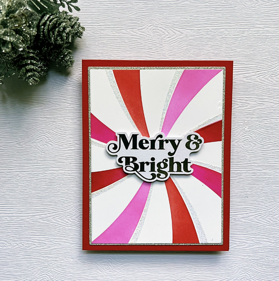
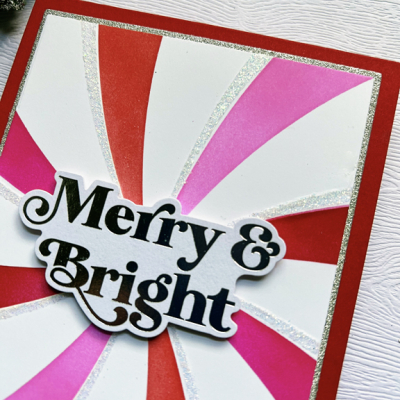
Saturday was World Card Making Day, but many cardmakers extended it to include the whole weekend.  I managed to find time to play with a new stencil from Pinkfresh Studio that was released recently as part of their holiday release. What I like about it is its versatility. I made both a holiday card and a birthday card. 

Merry&Bright

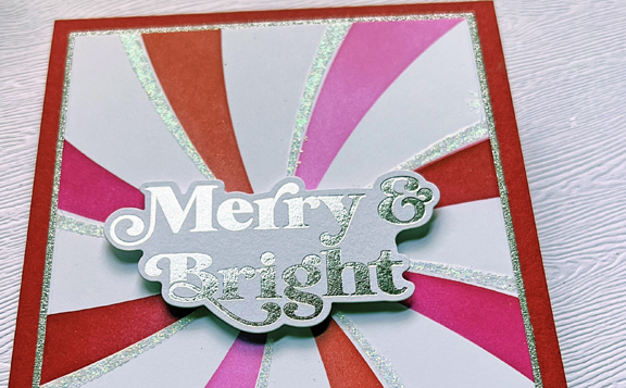
The stencil is called Swirl Background. In this case I used two shades of red and two shades of pink as well as a coat of Nuvo Glimmer Paste to add a dash of sparkle.

Merry&BrightClose

I die cut the stenciled portion with the smaller of the dies in Gina K’s Master Layout #1 set and a piece of silver glitter paper I purchased in Milwaukee several years ago with the larger die for a narrow border before adding them to a red card base. Although I photographed the card twice in different lights, the red is not quite as bright here as it is in real life.

Merry&BrightGlittery

The sentiment, also from Pinkfresh Studio, is one of their preprinted ones for the holidays. The set comes with the sentiments printed in silver and gold. 

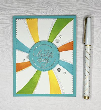
The second card was done in brighter colors for a birthday card.

HBSwirl

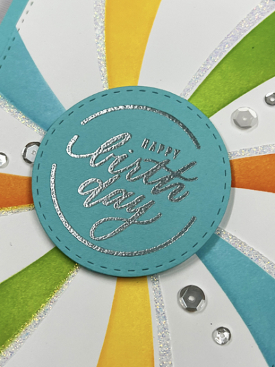
Same stencil, but a different vibe. Again, the colors are dulled out a bit by the photograph. Not sure what the current problem is. The photo below is more accurate.

HBSwirlClose

The sentiment here is also new, from Simon Says Stamptember release–Circle Sayings. Lots of different sentiments in this set for a variety of occasions. I added a few sequins to the this card for additional sparkle.

I’m entering these in two challenges: Pinkfresh Studio’s World Cardmaking Challenge, and Inkspirational where the challenge is stencils. 

1022-WCMD-BlogChallenge_1024x1024 copy 8 OCT 22


Color Hues #50

  • by

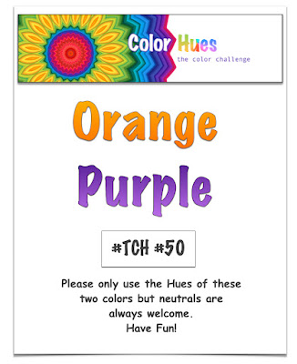
Carol chose the new colors for this round at Color Hues, and in my opinion, it is just perfect for Halloween.

Color Hues #50 Orange and Purple.001

Although the card didn’t end up the way I envisioned it, I had so much fun creating it, and the end result is so much better than what I first envisioned.

OrangePurple

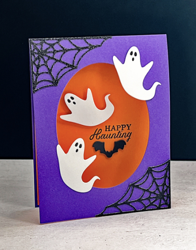
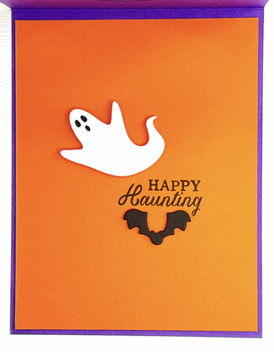
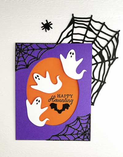
I pulled out Royal Purple (Simon Says) and Orange Zest (Papertrey Ink) for the card. After die cutting an oval into the front of the top folded purple card, I added a piece of orange to the inside of the card. Then I added the spider webs in glittery black cardstock which were die cut last fall with a friend’s die. The “Scary Ghosts” are from Poppy Stamps, and I backed their eyes with a scrap of black cardstock. The ghost on the inside of the card is adhered with dimensional tape and the others were adhered to the front of the card, partially floating as ghosts are apt to do.

OrangePurpleClose

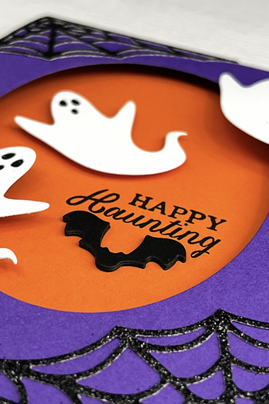
The sentiment is from Hero Arts, “Witch Feet” set, and the bat is die cut with one of the images from Spellbinders “Spooky Boo” which I cut three times and layered for some more dimension. Here’s a look at the inside of the card.

OrangePurpleInside

So, one Halloween card down, and four to go! 

OrangePurpleFlat

Not everyone on the Design Team thought “Halloween” when the colors were announced, so be sure to hop over to the Color Hues blog and take a look at all the inspiration. We’d love to have you play along!


Summer Photography Scavenger Hunt 2022: Final Link-up

  • by

It’s time for the final posting for this summer’s photography scavenger hunt. Just this morning, I captured my last photo for the Summer Photography Scavenger Hunt kindly organized by Mary-Lou at Patio Postcards. My previous finds are here.

For some of the prompts, I have multiple photos to choose from. Instead of choosing just one, I’m posting them all and letting you choose which one ought to be the “winner.”

I had prompt #3 on my mind while we were traveling in Scotland, and have multiple photos–many of which I like. 
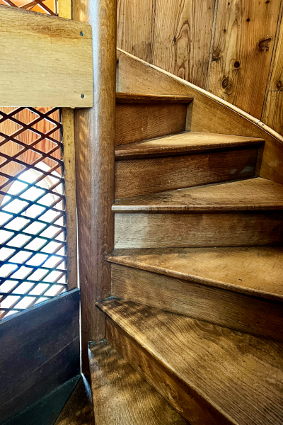
Stairs2

Stairs3

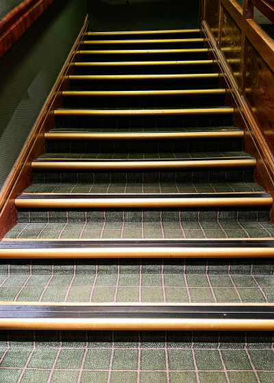
I loved the plaid carpet going up these stairs in one of our hotels.
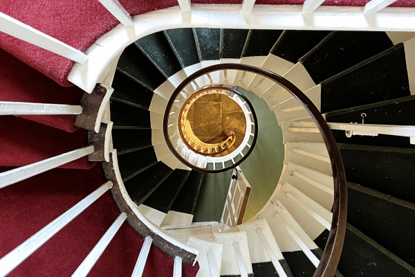
Stairs4

Looking down at a spiral staircase carpeted in a variety of colors.
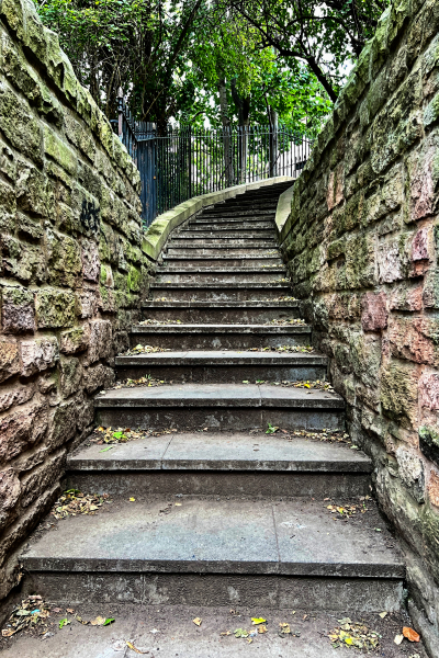
Stairs5

Our first day in Scotland we walked over 7 miles out to Leith. These stone stairs were on our path.

Stairs7

I’m counting two items with this photos #3 Stairs and #4 Faceless Selfie:
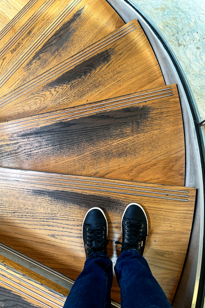
Stairs1FacelessSelfie2

Taken on our last day in Scotland.

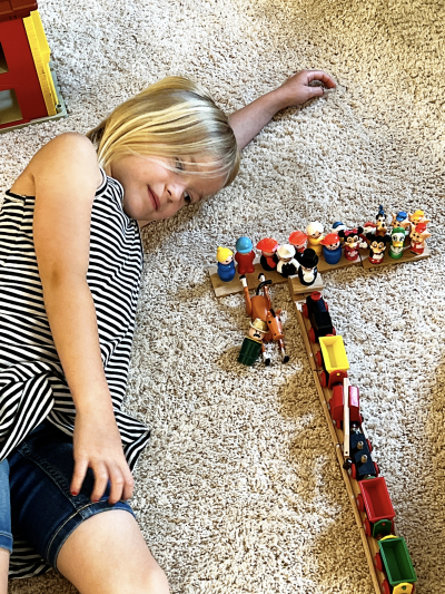
This was one of those happenstance photos. I took it when Hannah was visiting us and playing with our very old Fisher Price “people.” Only later did I see the “t” for #5 Looks Like a Number or a Letter.
LooksLikeALetter

Our hotel in Oban, Scotland was on #6 A Corner:
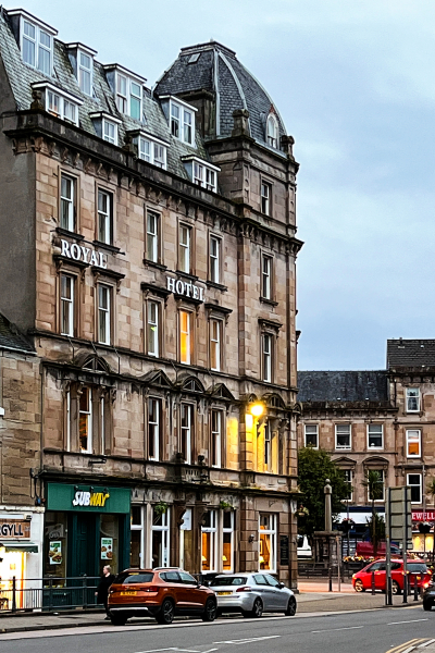
ACorner

There were several contenders for #8 Sipping On, but I chose one from our week on Chautauqua Lake when we ate at the Ellicottville Brewery.
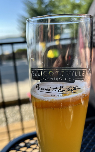
SippingOn

Try as I might, I could not come up with anything original for #9 Shapes Shape When Wet. My grandchildren get these “toys” that grow in water, but that’s changing size, not shape, so here it is–spaghetti.
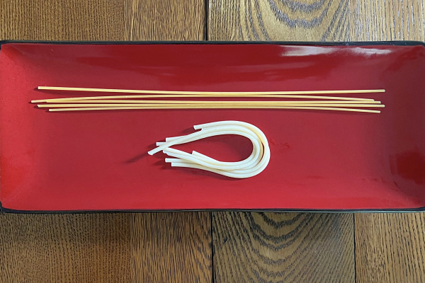
ChangesShape

When we were in Edinburgh the Fringe Festival was in full swing. The Royal Mile was mobbed every day and there were street performers and hawkers all about. This one captured #10 OMG, The Shoes:
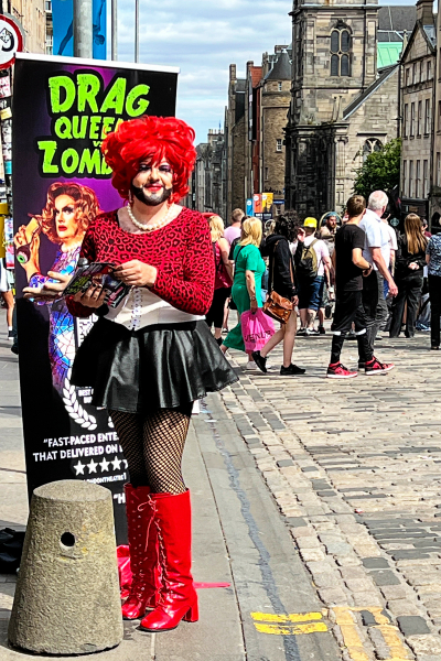
OMGTheShoes

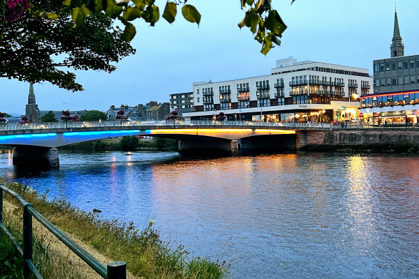
I had a photo for #22 Yellow and Blue Together for my first link-up, but this one was so much better. This is a bridge in Inverness, lit to honor the people of Ukraine.
YellowBlue2

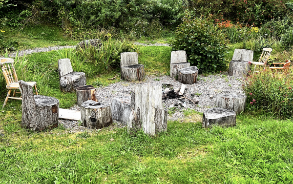
When I was hunting for a good spot to photograph the lighthouse on the Isle of Skye under the bridge, I found this:  #13 All Gone, Empty.
AllGone:Empty

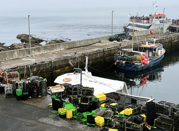
And these empty fishing cages and crates in the harbor of John O’Groats in northern Scotland, near the ferry to the Orkney Islands.
AllGone:Empty2

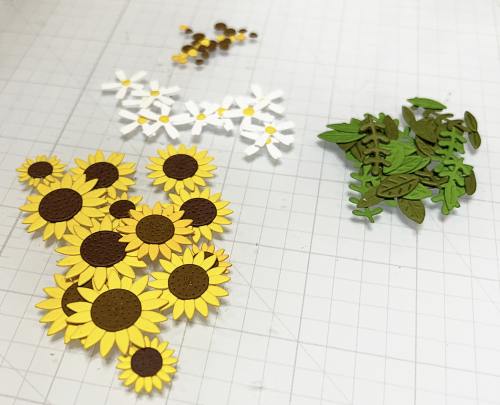
Here are some Left Overs (#14) from a card making session. Here’s the card.
Leftovers

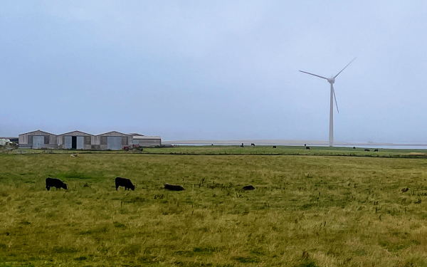
Both of my photos for #15 Wind Power were taken from our coach as we drove through Scotland.
Windpower1

Windpower2

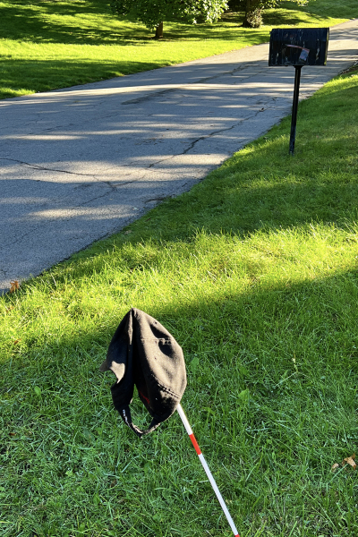
Out Of Place, #17, was the hardest one for me. I was talking about this hunt this morning with a friend when all of a sudden I realized I had the perfect photo right next door. Over a week ago, our neighbor put someone’s hat on a pole at the end of his driveway. Our street is a popular one with walkers–it’s a dead end, and has quite a steep hill just beyond our house. Whoever lost their hat, hasn’t been walking here for awhile.
OutOfPlace

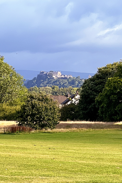
I also had a photo last time for #18 In The Distance, but found a much better contender:  Stirling Castle taken from the Bannockburn Memorial.
InTheDistance2

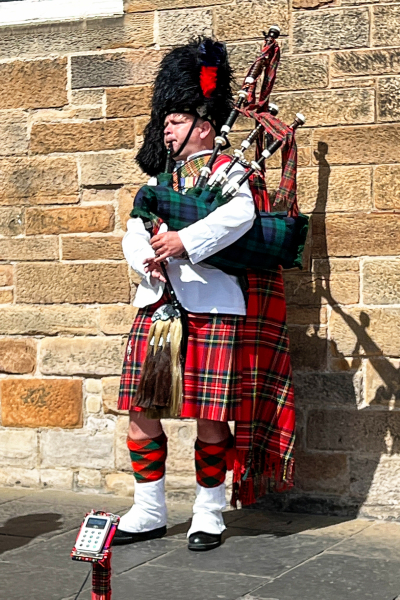
Culture, Yours or Another, #19, was a no brainer after being in Scotland for two weeks. I have several photos of bagpipers, but this one on the streets of Edinburgh captures it best.
AnotherCulture1

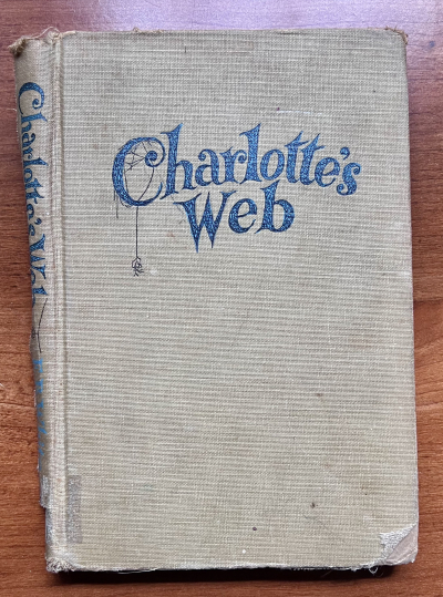
I recently found a woman who might be able to restore my first edition copy of Charlotte’s Web. This book definitely Invokes a Childhood Memory, #21, of being read aloud from early childhood to until I was well into my 40’s when my father asked me if he could read a short story to me while I ironed. 
InvokesChildhoodMemory

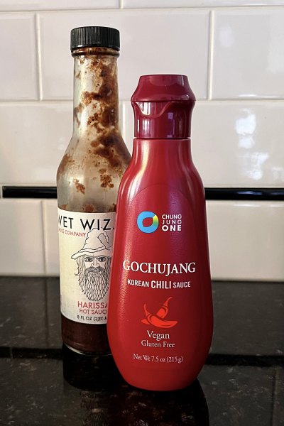
Add, 1-2 To Change the Taste, #22, presented several options, but I chose two hot sauces which definitely change the taste. The Wet Wizard one is produced by a company owned by our nephew’s wife. The Korean chili paste is called for in several Asian recipes we like. I have a couple other hot sauces as well despite the fact that we’re not huge fans of very spicy foods.
Addtochange

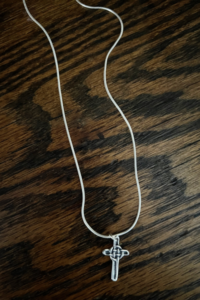
Alt A is Recent Purchase. I didn’t have much in mind when we left for Scotland, but I did know I wanted to purchase a cross on Iona. This one was made on the island, and I’m happy to have found it.
RecentPurchase

I posted a sunset for Alt. B in the previous link-up

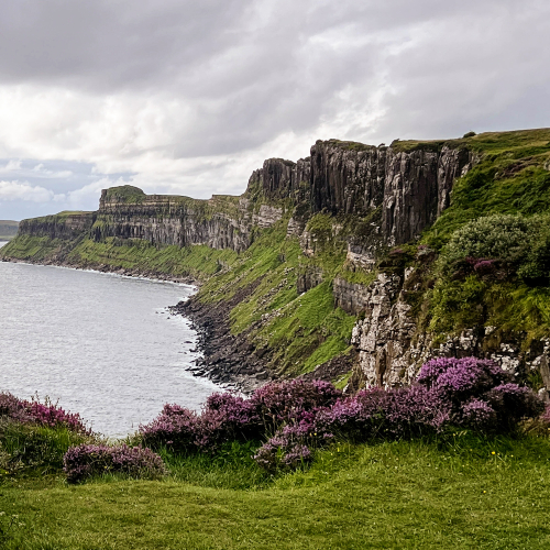
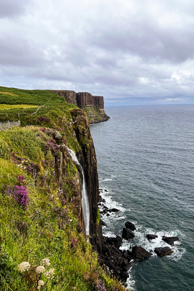
My choice for Alt. C: Free Choice, is a photo of Kilt Rocks on the Isle of Skye, possibly the most beautiful place we saw.
IMG_5746ed

And looking behind me from the same location:
IMG_5743ed

So that’s a wrap! A week ago, I wasn’t sure I’d have them all, but it came together at the last possible moment. Thanks, Mary-Lou for the list! I always enjoy it.


Christmas 52 Card Throwdown

  • by

I’m honored to be the Guest Designer at the Christmas 25 Card Throwdown Challenge this time around. The challenge is their Technique Challenge, and it is a bit of a challenge since I don’t often made pop-up cards. 

9 TECH

As usual, I tried a couple different things and had a pop-up card I thought I’d share, but then I tried something totally different which I like so much better! I turned to My Favorite Things, “Present Time.” One of the things I particularly like about this set was how well two of the sentiments worked for the outside and inside of the card. 

Don'tPeek

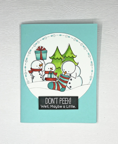
I used the largest of The Greetery’s Nordic Circles for the front of the card. I started by coloring all the snowmen and the trees with Copic markers and die cutting them. I used three of the snowmen for the front and arranged them behind two snowdrifts die cut with Papertrey Ink’s “In the Meadow–Snow and Hill” dies. The white embossed sentiment is adhered with some dimensional tape.

Don'tPeekInside

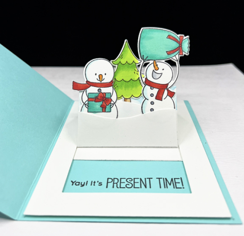
I love the inside sentiment–finally!–the presents can be opened! These happy snowmen and the tree were arranged behind some snowdrifts as well. When the snowmen are popped up, the inside sentiment appears. I’m quite sure this card would appeal to any one of my five grandchildren, but I think I’ll need four more interactive cards if one of them gets this one.

Thanks to the DT at Christmas 52 Throwdown for the opportunity to guest with them. It’s been a lot of fun.

Tic Tac Toe Challenge – Guest Designer

  • by

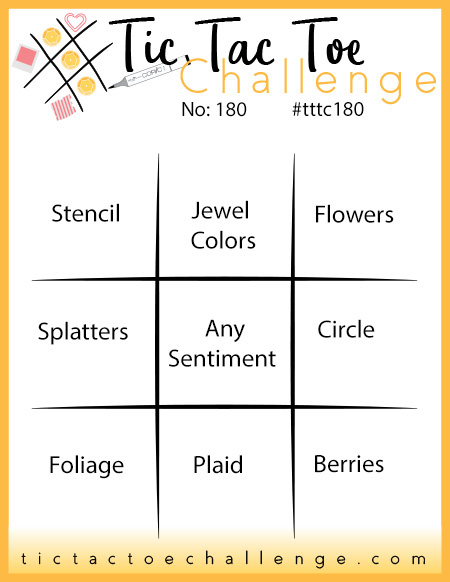
I’m delighted to be the Guest Designer for this week’s Tic Tac Toe Challenge. Here’s the board for the challenge:

Tttc-challenge-board -180

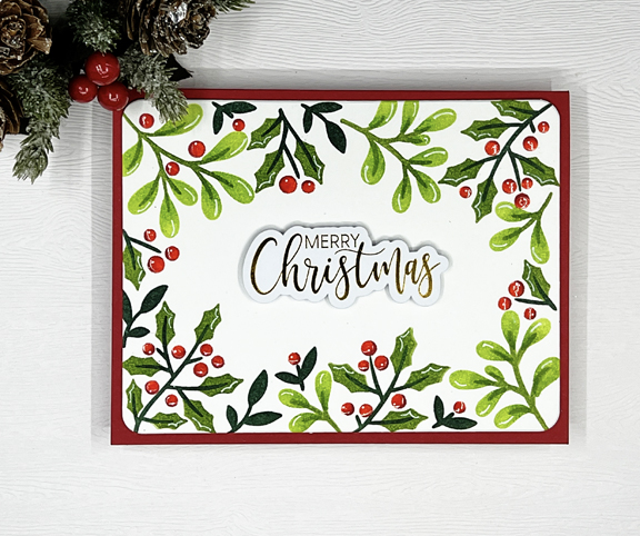
I chose the diagonal from top left: Stencil, Any Sentiment, Berries. I had the perfect stencil for this: Pinkfresh Studio’s  “Holiday Botanical Background.” I actually made three versions of the card before I arrived at this one, my favorite:

TTTC2

I used four different green inks for the leaves and holly: PFS Fresh Pear, Key Lime, and Olive. The darkest green was Papertrey Ink’s Pinefeather. For the red berries I used PFS Berrylicious and added a touch of Candy Apple. After stenciling, I die cut the panel with one of the nested dies in Hero Arts “Infinity Rounded Rectangles,” and layered it onto a red card base.

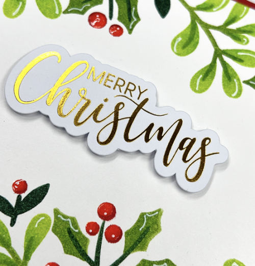
TTTC2Close

Neither photo truly shows the pretty shine and dimension of the translucent Glaze that I added to the berries. The last touch was to take a white gel pen and add some details to the berries and the leaves. In fact, the photo almost makes it look like some of the gel pen was streaked across the berries–not! that’s the reflection from the light. The beautiful sentiment is from Waffle Flower–a premade foiled sentiment from the set “Essential Christmas.” I purchased two sets in gold and two in silver–one of the best investments for holiday cardmaking I’ve made so far this year.

Thanks so much to the TTTC team for choosing my card as a Designer’s Pick and the honor of guesting for this challenge!

Color Hues #49

  • by

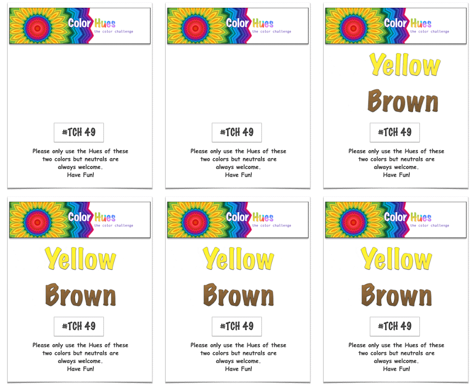
Tracey has given us the lovely Yellow and Brown color combination for the next Color Hues Challenge.

CH #49 Yellow and Brown Anim.

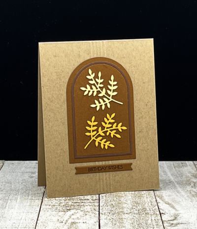
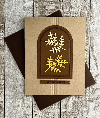
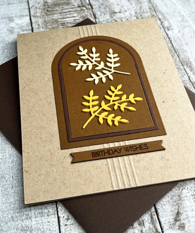
I started out with a general idea of where I wanted to go, but as is often the case, the final card is somewhat different. I started with a Classic Kraft card base, and played around with some different design ideas as well as some different die cut leaves and sprigs. I ended up with the Essential Arches dies by Ellen Hutson. I love that they cut both an arch and a frame. By die cutting them in two colors, you get a perfect set of arches with a darker frame.

YellowBrown

I used Papertrey Ink papers for all of the die cuts:  Cocoa Bean and Dark Chocolate for the arches and sentiment banner.

YellowBrownFlat

The “Leafy Sprig” by Poppy Stamps is one that’s been in my die collection for years. I originally thought I’d have a cluster of them, perhaps tied with twine, but ended up preferring just two, one from Lemon Tart and one from Summer Sunrise. 

YellowBrownClose

The sentiment is from my favorite Pink & Main set: Special Day, stamped in Dark Chocolate ink on a Cocoa Bean banner die cut with My Favorite Things, Itty Bitty Strips die. I thought about adding some embellishment, but decided on a set of five scored lines behind the focal image and the sentiment. 

I’m sending this one over to the current Addicted to Stamps and More Challenge: Birthdays. 

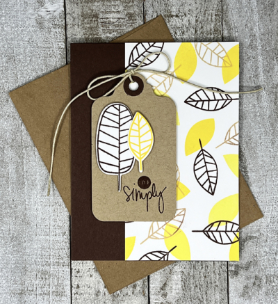
This was actually the second card I made the challenge. I like the first one as well, but it was an almost complete CASE of one Debby Hughes made several years ago when the stamp set, “One With Nature” was released by Simon Says, so I decided to make a second card for the Color Hues blog. Here’s the original:

LeavesFlat

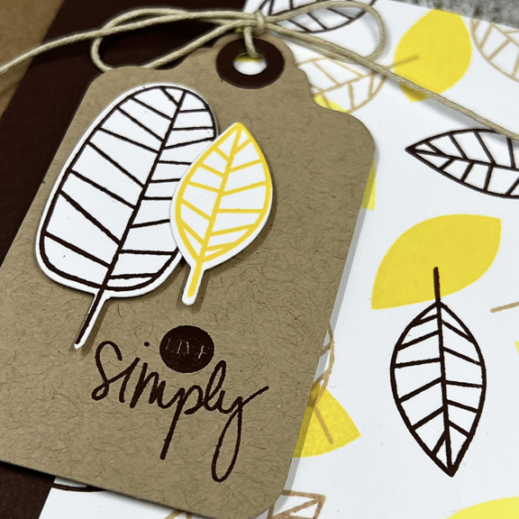
This one was a lot of fun to make. I layered the solid and open leaves in two colors of yellow and brown on white cardstock, and then cut it down for the card. The side panel is cut from Dark Chocolate cardstock.

LeavesClose

Then I added the tag with two die cut leaves and a sentiment from Gossamer Blue that was included in a scrapbook kit years ago. 

Be sure to hop over to the Color Hues blog to see all the creative takes on this color combo by the Design Team and our two guests this time around.


Sunflowers with “A Freshly Made Sketch”

  • by

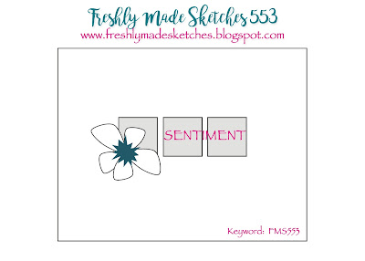
If you’ve followed my blog for long, you know I’m a fan of Clean and Simple cards. One of my favorite designers of CAS cards is Cécile Ribon. It’s her turn to design the sketch for Freshly Made Sketches, and I just had to play along.

FMS Final 553-001

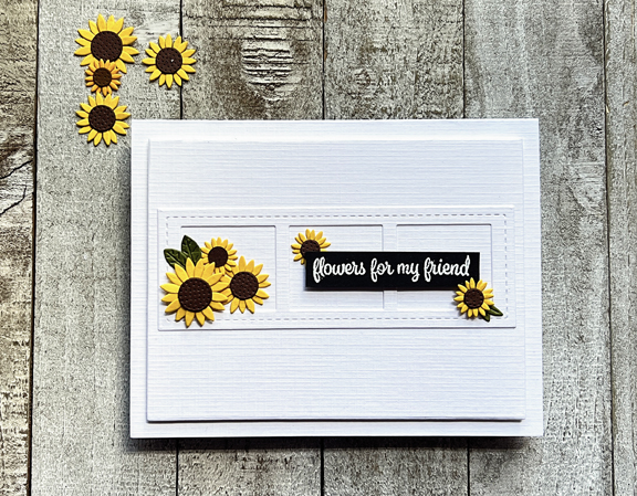
As soon as I saw the sketch, I thought of a die, “Stitched Film Strip,” from Pretty Pink Posh that would work perfectly. I still had an envelope of sunflowers left from my first go with the My Favorite Things kit, “Sending Sunflowers,” so I pulled those out next.

Sunflowers

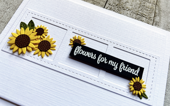
I chose Fresh Snow Linen cardstock from Papertrey Ink and die cut a panel from Gina K’s “Master Layout #1.” I added the frame and then had to find a sentiment. This one from Simon Says, ” Best Friend Ever” seemed just right and I embossed it in white on black cardstock and trimmed it out. All that was left to do was arrange the sentiment and the sunflowers. I popped up the sentiment and two of the sunflowers with dimensional tape and added a piece of foam for some dimension to the main panel before adding it to the card 

SunflowersClose

It’s been so nice to have real crafty time the last few days, and it looks like there’s some more time before the week is out. I’ll be back tomorrow with the new Color Hues Challenge.


A CAS Sympathy Card

  • by

I found two challenges this week, both CAS challenges which I thought I could combine easily. First the AAA Cards Challenge which is asking for a one layer sympathy card. I was pretty successful with my last one layer card (it won the challenge) so I thought I’d try another one layer card again. I combined it with the Less is More Challenge which is looking for black and white.

AAA

Less
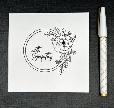
I chose a lovely floral frame from Simon Says “Mandy’s Flowers” which was one of the sets in their monthly kits a few years ago, and stamped it on a square cardbase. A sentiment from Gina K’s “Natural Silhouettes” fit inside the frame perfectly.

Black&White

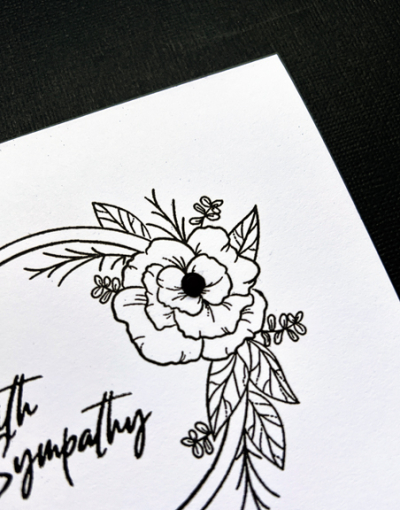
The only embellishment was to add a black rhinestone to the center of the flower.

Black&WhiteClose

 A very simple card, but perfect for the occasion.


A Test Run (Or Walk, as the case may be)

  • by

Tracy and I took a day trip to the Finger Lakes last Saturday. It was a three-day weekend here in the States, so heading to Watkins Glen wasn’t probably the best idea ever, but I have a new camera and a new pair of hiking shoes that I wanted to test out. It was crowded, but we had a good time. We parked at the top of the gorge, walked to the bottom and then hiked up to the top.

When we were in Scotland, I saw a tiny Sony compact camera with a 200mm zoom lens. I was intrigued. I loved my Sony which “died” several years ago. The Panasonic that replaced it has never been a favorite. After doing a lot of research, I went to the local camera shop to see what they had to say. They had nothing but great things to say about the new Sony, and let me play with it for awhile. The next day I took my Panasonic and my mirrorless camera (which I never quite mastered) and traded them to help offset the cost of the Sony. The Sony is really tiny, but I have small hands, and the controls are familiar to me and easy to use. I’m already a fan, and never again will I be hauling a big camera around when we’re traveling. Here are some photos from our hike, and a close-up from a winery we visited after lunch. It will take some more experimenting, but I’m happy with the first run.

DSC00009ed

DSC00008ed

Looking down at the glen from the top of the gorge.

DSC00013ed

DSC00019ed

DSC00026ed

DSC00028ed

DSC00034ed

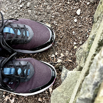
So I’m quite happy with the camera, and also with the new hikers.

IMG_6285ed

It was the first time I’d worn them and I had no discomfort whatsoever. With two bunions and other feet problems, they are definitely keepers! I like the looks of them, and they’re water resistant which was another requirement. 

We’re having wonderful weather this weekend, after four straight days of rain. My brother is here for a long overdue visit. Dane, Matt, and Tracy golfed today, and we had a lovely dinner at a favorite restaurant downtown on a patio overlooking the river. Tomorrow we’re off to a favorite Mexican restaurant for lunch, a visit to a winery, and then dinner here with Matt and his family.


A Festive Celebration

  • by

The current Time Out Challenge: Festive spurred me on to create a card for two of our best friends who will be celebrating their fiftieth wedding anniversary early next month. 

Festive

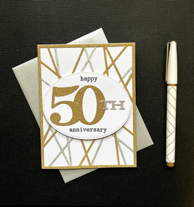
Unlike many cards, this one turned out pretty much the way I envisioned it. The background of the card is a CASE of a card created by one of the most creative card makers I know, Hannelie, who created this card for the Color Hues #30 Challenge. I pinned the day I saw it, and bought the Altenew die, “String Panel,” shortly afterwards. It’s the first time I’ve used it, but it definitely won’t be the last. 
50thFlat

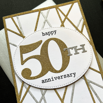
I die cut the string panel twice–one in gold glitter paper and once with silver glitter paper and arranged them on a white card base, rotating the gold one on top of the silver panel. I wanted a big bold 50 and Papertrey Ink’s “By the Number” which I’ve had for years (and love) fit the bill perfectly. I stamped the rest of the sentiment with words from another oldie by goodie, Winnie and Walter’s “The Big, The Bold, and The Happy.” After arranging it on a pierced oval by My Favorite Things, I adhered it with dimensional tape. 

50thClose

Since the “String Panel” die is being used for the first time, I’m sending it to the September NBUS gallery as well.

NBUS

Sunflowers

  • by

We bought a wonderful pot of sunflowers for our patio last week, and overnight some animal ate every leaf! Such a disappointment, although I did cut all the flowers and brought them inside. These sunflowers won’t get eaten.

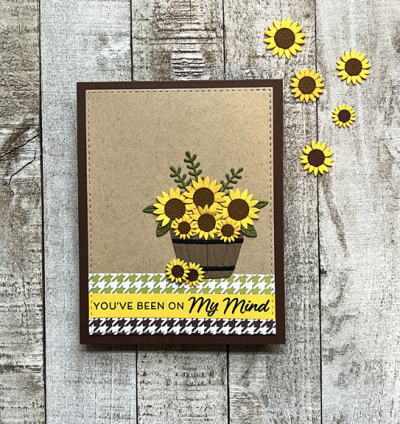
It’s a Word Challenge at Just Us Girls this week. The word is BASKET and it came at the perfect time. I couldn’t pass up My Favorite Thing’s latest kit: “Sending Sunflowers,” and it had just arrived.

WordWeek

I decided to use the sketch at this week’s Freshly Made Sketches, (linked here if you’re interested in the sketch), but missed the deadline by just a few minutes! It’s so annoying when I let that happen. But, the challenge at CAS on Friday is stripes, and I think this works there as well.

SunflowersFlat

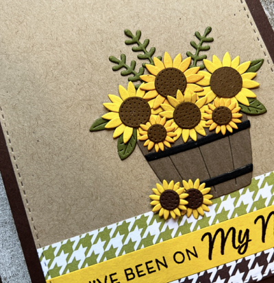
When my friend, Michelle, receives new dies, she cuts out lots and lots and assembles them. That’s not usually my style, but this time I did make a lot more than I needed for this card, so you’re sure to see a few more sunflowers before September ends. The MFT kits are a wonderful value, and this one came with two sets of dies, a sentiment stamp set, as well as a patterned paper pad with houndstooth papers (see above!) I used a Stitched Rectangle from Simon Says, but otherwise everything except the kraft cardstock came with the kit. There’s also a mason jar and a cute watering can in one of the die sets. The kit has already sold out, so I’m glad I didn’t wait.
SunflowersClose

It’s a sign of my age, probably, but I’m in need of new Thinking of You cards. I had a nice stash of them, but I’m down to the last couple. This is a start.