Skip to content

Happy Mother’s Day

  • by

Today is Mother’s Day in the States, and I have one last card to share. 

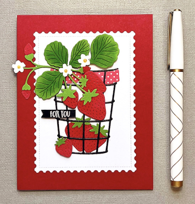
While we were in Hawaii, I got an order from The Greetery which included the earlier released Bontani-cut Strawberries. The Postal Frame was also in that order. A friend had die cut a few of them for me, and I knew they’d be a useful addition to my collection of frames.

StrawberriesFlat

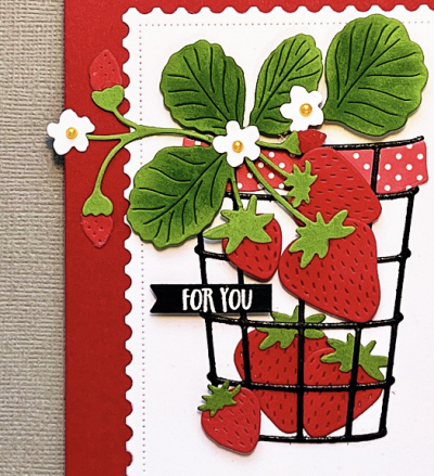
With the exception of the tiny sentiment, everything is die cut. I die cut the strawberries and leaves from colored cardstock and added some shading with blending brushes and Distress Oxide inks. 

StrawberriesClose

I added a small yellow pearl to the center of the sweet little blossoms. The berry basket is from The Greetery as well–one of their Market Baskets, and the patterned paper insert for the basket was from my scrap file. 

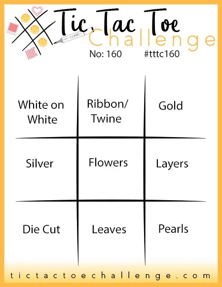
I’m entering this in the current TicTacToe Challenge, where I used the bottom row across: Die Cut, Leaves, Pearls.

Tttc-challenge-board-160

I’m also sending this to NBUS since I’ve never used my strawberries dies before.

NBUS


Cards to Share

  • by

This blog post has been a long time coming. I intended to get these cards posted in two separate posts early this week. My desktop computer, however, has been giving me problems for the last several weeks. Apps weren’t syncing the way they should, and one of the photo editing apps I use wasn’t working at all. Tracy is very good with computers, but even he has been baffled by the problems. Finally today, he cleared the whole computer and reinstalled everything.

Here are four of the Mother’s Day cards I made.  Two of them ended up in the mail. We had planned brunch here on Sunday, but on Tuesday evening Matt and two of the girls tested positive for Covid, and when we tested the next morning, I was also positive. With both vaccinations and both boosters, it tells you just how contagious the new variant is. I would have never tested for Covid as the symptoms seemed like a bad day for allergies. Tracy, Betsy, and Skylar all continue to test negative. So random, really. Ella was the sickest, and it was her symptoms that prompted the testing. Everyone is doing fine now. 

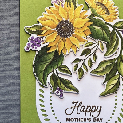
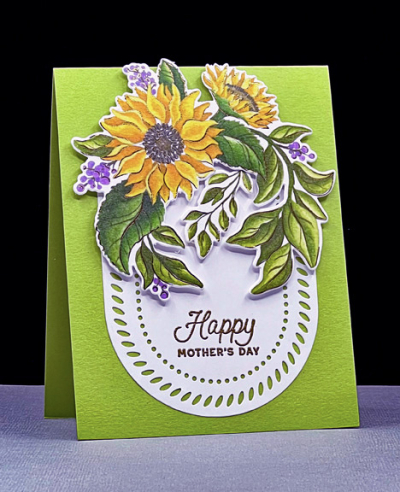
All four cards were created with Pinkfresh Studio’s Washi tape and die sets. The sunflowers were part of a fundraiser for Ukraine early in the war. All the proceeds were donated to those serving mothers and children uprooted by the fighting.
Sunflowers1

The oval die is Pinkfresh Studio’s “Braided Tag” and I embossed the sentiments from Papertrey Ink’s “Simple Stems” in gold. The Washi tape is also edged in gold. 


Sunflower1Flat  Sunflower1Close

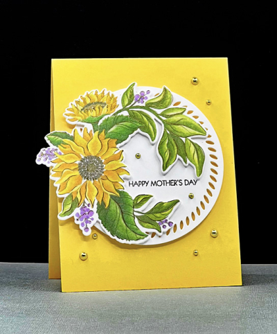
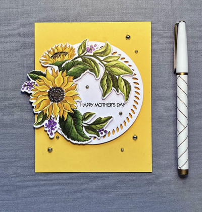
This card uses the same Washi tape, but I arranged the floral on a Pinkfresh Studio “Braided Circle.” The sentiment is from Pink and Main’s “Special Day.”
Sunflowers2

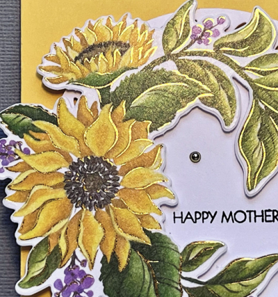
Finally, the gold edges of the Washi tape show up here in the close-up. It’s really beautiful in person.
Sunflower2Flat Sunflower2Close

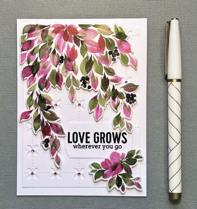
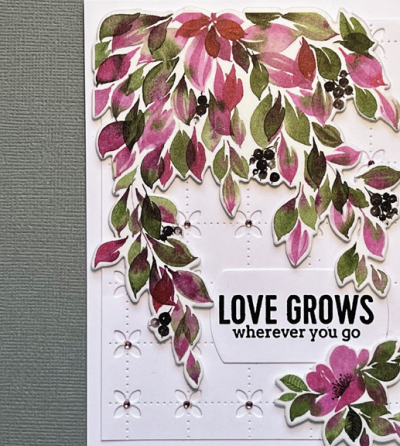
I used the Pinkfresh “Into the Meadow” Washi tape for the next two cards.

MDMeadow

I already had a die cut panel of the Pinkfresh “Floral Grid” coverplate and I trimmed it down and layered it on a white card base. After adhering the florals with dimensional tape, I added tiny pink gems to the centers of the florals. The sentiment from Pinkfresh’s “Always Uplifting” was stamped on one of the PFS “Basic Frames”
MDMeadowFlat MDMeadowClose

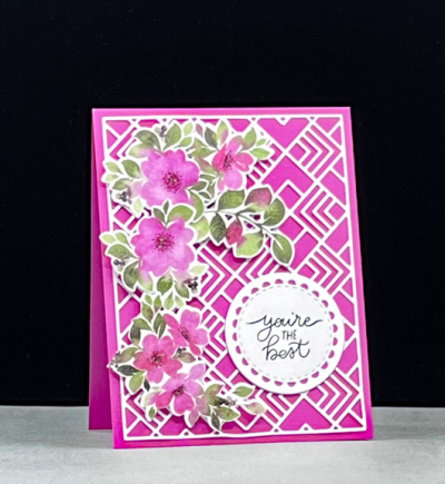
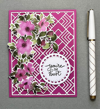
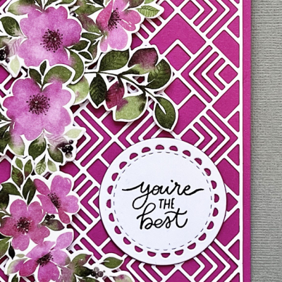
The next card turned out to be my favorite. I laid the white die cut “Geo Tiles” coverplate on the bright pink cardstock and immediately thought of an elaborate trestle. 
MDPink

After arranging the florals, I die us a Reverse Confetti “Lacy Scalloped Circle” and stamped the sentiment from The Stamp Market’s “Fresh Cut” stamp set.
MDPinkFlat MDPinkClose

I’m entering this card in The Card Concept Challenge: How Does Your Garden Grow.
TCC174 042722


Color Hues #40

  • by

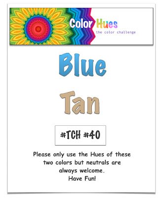
Hard to believe there have been 40 challenges now at the Color Hues Challenge! Carol has chosen the colors for the next round:

CH #40-Blue and Tan.001 (1)

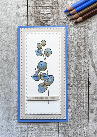
It’s a lovely color combination, but I struggled this time to come up with an idea for a card. I finally settled on a design from an old favorite from Simon Says, “Be Kind,” and pulled out my Polychromos colored pencils. I used some Stonehenge paper made for colored pencils for the leaves, and then discovered a pad of colored Stonehenge that had the perfect shade of tan.

BlueTanFlat

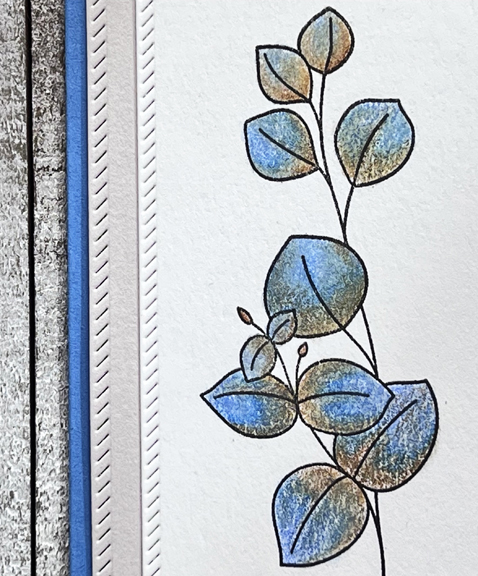
The blue card base is actually a lighter blue than it appears in the photo. Try as I might I couldn’t get the color quite right; so strange since all the rest of the colors are quite accurate. After coloring the image, I die cut it and the tan mat with Pinkfresh Studio’s “Mini Slimline Essentials.” The sentiment is from Sugar Peas “Everyday Sentiments” and is die cut with My Favorite Things “Itty Bitty Strips,” which is proving to be a very handy set of dies.

BlueTanClose

The Design Team and our Guest Designer, Shawna, have a wide variety of wonderful cards to showcase this color combination, so hop over to take a look. And please join in!


Signs of Spring

  • by

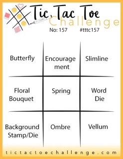
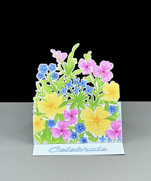
There are finally enough signs of spring here to take hope, although today is once again breezy and rainy. I made this bright floral easel card a week ago, thinking I had plenty of time for the two challenges in mind. But actually, the Tic Tac Toe challenge closes today at noon, so I’m just sneaking it in at the last minute.

Tttc-challenge-board-157 Small 2022-04-14-SignsOfSpring

I chose the middle row across: Floral Bouquet, Spring, and Word Die for my inspiration. The Seize the Birthday inspiration is clear!

SpringMixEasel

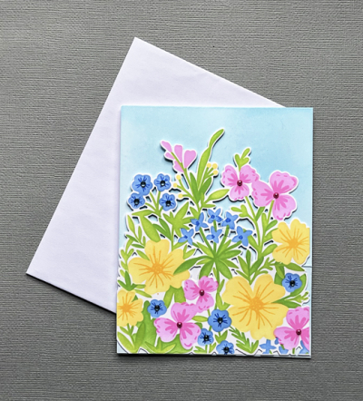
I don’t have a lot of success with layering stamps, but layering stencils work just fine, so this wonderful bouquet of flowers called “Spring Mix” was a sure purchase for me during the last Greetery release. I used an assortment of Pinkfresh Studio inks to blend the colors. Then there is a set of stamps to use to create the centers of each flower. The possibilities are endless and there will be another of these cards to share very soon. The sentiment was die cut with a Pinkfresh Studio die. When Betsy did the intro video for this set, she created an easel card. I hadn’t made one in years, and it was so easy that I’m sure that will show up again as well.

SpringMixFlat

This card went in the mail yesterday to a good friend who’s celebrating her 70th birthday. She’s one of two friends who planned a trip to New York City for my 70th birthday. We’re not going to NYC for their birthdays but we’ve scheduled a lunch in early May to plan some kind of get-away.


Happy Easter!

  • by

It’s a cold one this year, but there’s much to celebrate. After visiting the girls this morning, we attended in-person Easter services at church for the first time in two years. The beautiful music with timpani and brass is always so special, and just didn’t have the same impact the past two years when viewing it on YouTube! This afternoon we’re off to my nephew’s to celebrate Easter with Tracy’s family. His cousin and her daughter are joining us this year so there’ll be eleven of us for a late lunch.

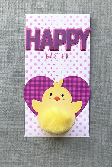
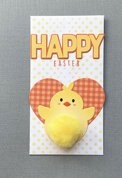
Here are the Easter cards I made for the five grandchildren. I’m only showing three of the five, two were duplicates. They went in the mail last week to Caleb and Hannah in Wisconsin.

EasterChickes3

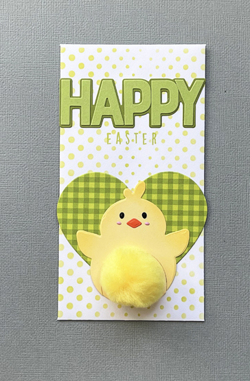
These Easter chicks were featured on Simon Says last year. I’m not sure if they were part of a kit originally, but I purchased the chickie die cut and large yellow pom-poms separately. 

EasterChickGreen

The hearts were cut from Sunny Studio patterned paper and adhered to mini-slimline envelopes which I stenciled with one of three stencils from The Trinity Stamps “Lots of Dots.”

EasterChickPurple

The HAPPY die cut and shadow are from Reverse Confetti as well as the Easter stamp.

EasterChickYellow

All five grandchildren are very likely to have plenty of candy in their Easter baskets, and they certainly do not need any little toys, so I put some money in the slimline envelope. I know that at least some of them are saving money for something special, and none of them will be disappointed with some cash.

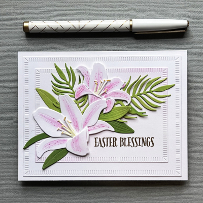
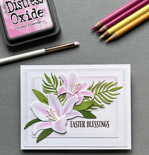
Lastly, I made a special Easter card for my mother-in-law. I spent an afternoon with two crafty friends this week, and one of them kindly loaned me several stamp and die sets to play with. The Greetery Botani-cuts are always wonderful, and I was delighted to have time to play with the Lily and the Palm dies. I die cut multiples of them, so I’ll be able to create some other cards as well.

EasterLilyFlat2

Stargazer Lilies are my very favorite so that’s what I started with. I used a new shader tool by Waffle Flower to add some Flamingo Kitsch Distress Ink to each petal and then used colored pencils for some detail. I opted to cut the palms and leaves from two shades of green cardstock.

EasterLiliesTools

Although you can’t tell from the photographs, the sentiment from Papertrey Ink was embossed in gold. The design of the card is a copy of one Keeway created for the release of these dies, and uses two Crimped Frames from The Greetery. 

If you celebrate, I hope you have a blessed Easter!

Color Hues #39

  • by

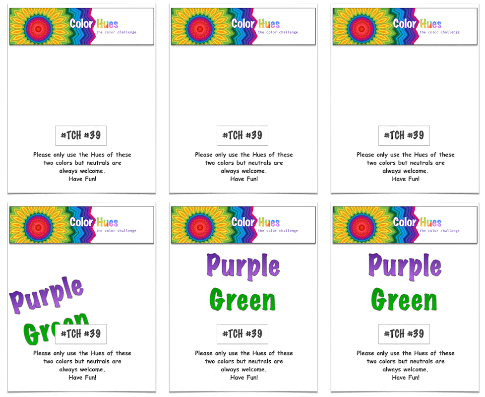
Tracey has chose great spring colors for this round of the Color Hues Challenge

CH #39 Anim.

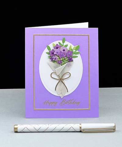
The day my Spellbinders “Bouquet of Flowers” arrived, I knew exactly what I wanted to do for this challenge.

PurpleGreen

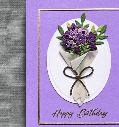
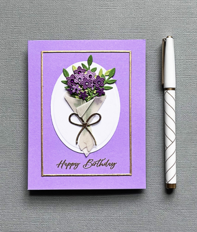
I started with pre-made Memory Box card in a lovely shade of purple, and pulled out Memory Box’s pad “Vibrant Violet Collection.” I chose three hues of purple from the pad as well as scraps of New Leaf and Green Parakeet from Papertrey Ink and set about die cutting groups of florals and leaves. The colors in this closer look appear darker than they do in real life.

PurpleGreenClose

I used a heavy piece of vellum for the floral wrap and some metallic gold for the bow. I already had the die cut oval in my stash and arranged the florals in the wrap, added the bow and adhered it to the oval. When I laid the oval on the purple card base, it definitely needed something else, so I pulled out one of Simon Says “A2 Thin Frames” and die cut it with the same gold paper as the bow.
PurpleGreenFlat

Before gluing all the components on the card base, I gold embossed the greeting from The Greeetery’s “Sentiment Suite: Birthdays.” 

I’m sure you’ll find lots of inspiration from the Design Team on the Color Hues blog, so hop on over and please join the card making party!

I’m entering this in the Happy Little Stampers: Dies where the challenge is Anything Goes.
HLS Dies


On Trend: Alcohol Ink and Foiling

  • by

We’ve been home from a fabulous trip to Hawaii and San Francisco for about four days now, and I’m still adjusting to the differences in time as well as the environment. All but one of our days were warm and sunny. Everything was green and flowers were gorgeous both in Hawaii and San Fran. Here, not so much. There have been snow flurries two days, and the daffodils are just starting to bloom. It’s supposed to warm up again, but only for a few days. I am spoiled!

It will take awhile to edit all the photos we took, but eventually I’ll have a few posts about the trip. I did post a few photos every day on Instagram, so you can hop over there for a preview if you’d like.

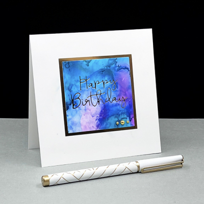
I finally got to the crafting desk this afternoon will a challenge from Just Us Girls on my mind. It’s Trend Week there and they are looking for foiling on alcohol inked backgrounds. I knew I had a small stash of alcohol ink backgrounds, but wasn’t at all sure whether the Glimmer Foiling machine would like alcohol inks. It took two tries, but the second one worked beautifully.

FoiledBD

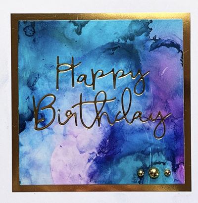
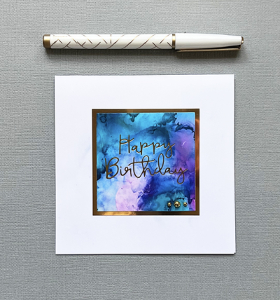
I die cut the alcohol ink piece with an Ellen Hutson Essential Squares die and then a slightly larger one with gold mirror cardstock. The foiling plate for the sentiment was one that arrived with my Glimmer machine and is a NBUS! You can see the glimmer a bit better here:

FoiledBDClose

I decided it didn’t need a lot of embellishment, but I like the three shiny gold pearls on the righthand corner.

FoiledBDFlat

This is going, of course, to the Just Us Girls Challenge, but also to Addicted To Stamps and More (Make Your Mark) and the Simon Says Wednesday Challenge (Happy Birthday.) And off to the April NBUS Challenge as well.

JUGSMakeYourMarkWednesdayblog-logoNBUS


Birthday Bear

  • by

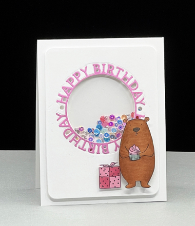
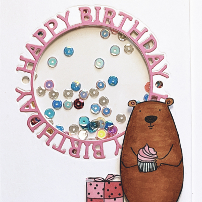
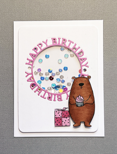
Today is the birthday of a very sweet little girl who is turning five. Before we left on vacation, I gave the card to her “Nana” who will give it and a gift to her during the birthday celebration. 

BDBear

Having granddaughters this age, I was pretty sure a shaker card would be a hit! I did learn (the hard way) that to give a shaker card to a three year old is a big mistake. They are more interested in gettin at the sequins that just shaking them. 

BDBearClose

I die cut the sentiment circle from Simon Says three times, twice in white, and once in pink and layered them so there would be some definition around the shaker.

BDBearFlat

The bear, his cupcake, and the present are all from Ellen Hutson and colored with Copic markers. I’m throwing this in the ring at Addicted to Stamps and More where the theme is “Make Your Mark,” and at AAABirthday where the challenge is “Critters.
Today’s the last day of our epic trip. We’ll be in airports and airplanes for the better part of the day tomorrow, but home in time for bed. I’ve got lots of crafty ideas once I get back to the crafting desk.


Color Hues #38

  • by

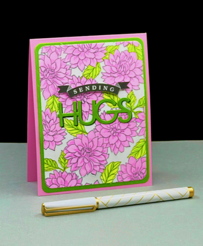
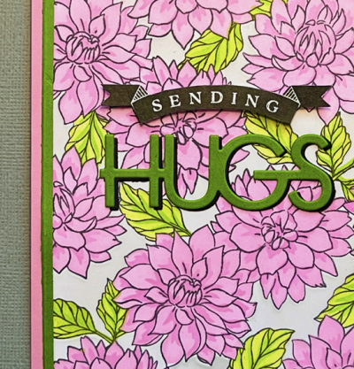
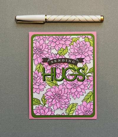
Sheri’s choice of Pink and Green for the Color Hues Challenge gave me the perfect opportunity to try out one of my stamp and stencil combinations that I won from Pinkfresh Studio.

CH #38 Anim.

The “Darling Dahlias” background stamp is gorgeous, and the five piece stencil makes coloring it so much easier (and faster) than coloring with Copic markers or colored pencils.

PinkGreen

I own quite a few of the mini ink pad sets from Pinkfresh, but almost no full sized pads. For stenciling, the small pads work nicely, and I chose two pinks for the flowers: “Sparkling Rose” and “Bubble Gum.” The leaves were stenciled with “Key Lime” and “Grassy Knoll.” There’s also a stencil for coloring in the background. Initially, I thought I might leave it white, but ended up with a very light gray.

PinkGreenClose

Once the panel was stenciled, I die cut it with one of Hero Arts “Rounded Rectangles,” framing it with the next size in green. I used both the stamps and the dies from Papertery Ink’s “Sending Hugs” for the sentiment. The green die cut letters seemed a bit lost on the colorful background, but a shadow layer in black really helped and tied in the banner sentiment which had been stamped in black and fussy cut. I put some dimensional tape behind the banner.

PinkGreenFlat

April 1st rarely brings spring to western New York, so creating your own flowers is a great substitute until it finally warms up enough for things to flower in the yard. Wherever you live, I hope you’ll find time to create some Pink and Green goodness and send it on to our Color Hues gallery. And don’t forget to check in on the blog to see what the DT and our two Guest Designers, Trina and Carol have created. 

Nancy

Hannelie

Cindy

Carol

Julie

Sheri

Kristie

Lindsey

Tracey

 Once again, I’m sending this card over to Darnell’s NBUS Challenge. It’s taken me several months to get to this stamp and stencil set, and I still have products I haven’t used from my big win.

NBUS

Don’t Forget to Write

  • by

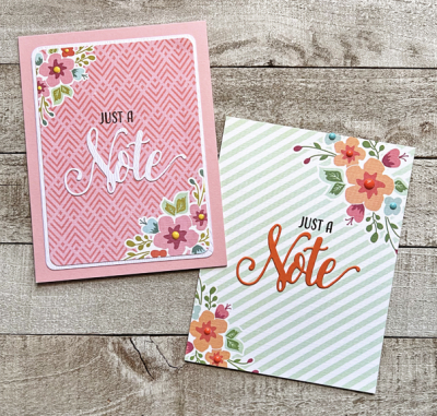
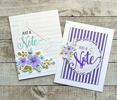
Years ago I purchased my first large stamping kit from Papertrey Ink called “Don’t F0rget to Write. It was packed with preprinted card fronts, preprinted florals with accompanying dies, and a stamp set with dies. I have all the components in a cute red paper “suitcase” sitting on top of one of my bookcases. And I just never think about what’s up there. Last week I was in need of some “thinking of you” cards and pulled it down. In just one afternoon, I had eight cards–seven “thinking of you” cards and one birthday card. I took some of my inspiration from the Papertrey Ink Design Team at the time the kit was released, but once I got going most of the cards just came together without much thought.

The first two cards use preprinted card fronts. One of them I cut down with a rounded rectangle die and then used the next larger die to cut a white mat. The “note” is one of several word dies included in the kit, and the “just a” is part of the stamp set. I added some Nuvo Drops to the centers of the flowers, and added them to card fronts.

Pink&Green

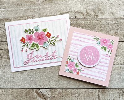
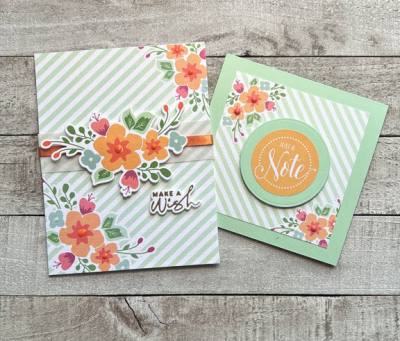
These two used preprinted cardstock with and without florals. The floral cluster on the left card was die cut from a sheets of florals. I added more Nuvo Drops to the florals and die cut the sentiment from Papertrey Ink’s “Scripted” dies. On the right, the sentiment is actually a sticker. I die cut a white circle as a mat and adhered it with dimensional tape. Some of the preprinted patterns are on squares, and there’s a die that cuts a lovely scalloped card that I didn’t use this time around. The floral centers are white pearls this time.

PinkX2

The next set use the purple papers. The design of the left card is a CASE from Kay Miller. The lovely die cut frame is also part of the kit. For the card on the right I used a piece of Bitty Big striped paper in Amethyst Allure. I filled the circular frame with a white circle cut with Ellen Hutson’s Essential Circles dies and added the die cut florals. The sentiment is just the same as the first cards, and I added a few rainstones as embellishment. These floral centers were filled with enamel dots.

PurpleX2

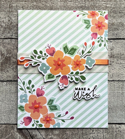
Lastly the green combos. The birthday card on the left is one of my favorites although it’s a bit fussier than the rest. I added a floral cluster die cut that matched the florals on the printed paper. I cut a vellum strip and added a piece of Paper Source ribbon to it before adding the cluster with dimensional tape. The sentiment is from a group I had foiled a week or so earlier from Spellbinders. On the right, another smaller square note card which needs no explanation, since all the elements are explained above. 

GreenX2

Here’s a closer look at the birthday card.

OrangeMakeAWish

I have another Papertrey Ink kit that’s looking for some attention soon, but it will be awhile. We’ll be on vacation when this post is published, and although I have another post scheduled for the first of April, it’s likely to be very quiet here for the next two weeks.


Magnolia Ballerina

  • by

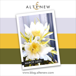
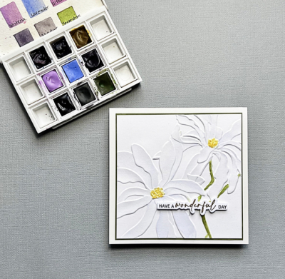
As soon as I saw the Altenew “Magnolia Ballerina” I knew I would find a home for it. When Ellen Hutson had a sale a week or so ago on all Altenew products, I put the embossing folder (and the accompanying stamp set) in the cart. I’m not disappointed. Altenew’s 3-D embossing folders are just gorgeous. I ran this one through my die cutter with watercolor paper, and with the March Altenew Challenge in mind. Here’s the inspiration photo. It’s definitely a CASE of Therese at Lost in Paper with a change in orientation, size, and sentiment.

Inspiration-Challenge-2022-03-SQ-Opt-2

Watercoloring a white flower on white paper is, needless to say, a bit of a challenge. Looking at the light purple in the color triad, I used the lavender in my Daniel Smith palette. The palette is not one I use too often, but it included all three of the colors in the challenge, and required no mixing. It’s hard to see the watercolor on the petals, but I think that’s the point.

MagnoliaFlat

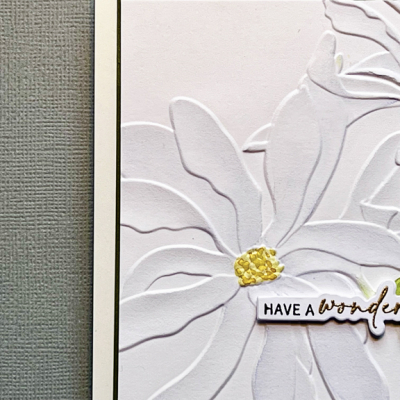
The embossing folder is larger than a standard card, so this was cut down considerably to make a square card. You can see the folder here.

MagnoliaClose

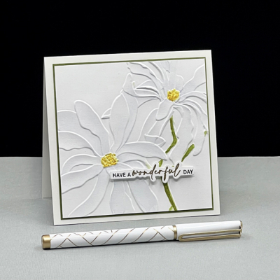
The sentiment is from The Ton’s “Easy Expressions: Birthday.” I keep a collection of these sentiments ready to go in a small basket, and it’s amazing how often they work.

Magnolia

After cutting the image down, I cut a very narrow mat from Gina K Asparagus cardstock, and added it to a card made with Simon Says “Ivory” cardstock. Some time ago I read that Ivory almost always is a good match for watercolor paper, which I’ve found to be true.

In addition to the March Altenew Challenge I’m entering this in the new Paper Players Challenge for CAS Blooms. Despite the large image, this fits my definition of CAS since the majority of the image is white.

Pp583


You’re the Best!

  • by

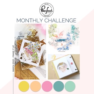
I’m on a mission to get cards created for the challenges I’ve been thinking about all month. Today’s card is for the Pinkfresh Studio Monthly Challenge, and the emphasis is on frames. In addition there is a color palette to use as well.

MonthlyChallenge-Mar22 (1) Small

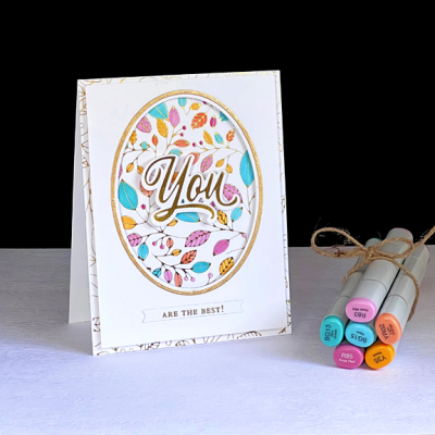
I knew right away I wanted to use one of my new hot foiling plates, and it’s thanks to two big wins at Pinkfresh Studio that I have the foiling plates to design with! “Lush Vines” is one of my favorites. Although I’ve foiled previously, I’ve never tried to color with Copic markers on the Hammermill paper I use for foiling. Turns out it’s easy as can be.

PFS

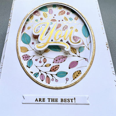
The first step was to create the oval frame with one of Ellen Hutson’s Essential Ovals. After marking where it would go, I colored jus the parts of the design that would show through the frame. Once that was done I die cut the next largest oval in gold and adhered just the frame around the oval. Then I attached that piece to the foiled piece with dimensional tape.

PFSClose

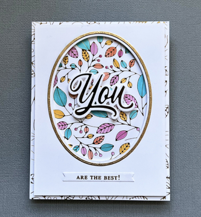
Up to that point everything was going as planned, but I hadn’t decided on a sentiment. It was clear that part of the sentiment needed to go on top of the oval and I had a collection of Pinkfresh “Brushed Sentiments” already foiled. The “You” fit in perfectly, and I finished the sentiment with a phrase from Altenew’s “Build a Flower: Magnolia” which I embossed in gold and cut with an “Itty Bitty Strip” from My Favorite Things.

PFSFlat

There have times recently when the finished card is totally unlike my original vision, but this time it’s just about perfect!


Color Hues #37

  • by

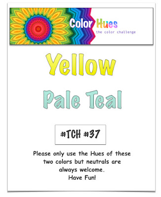
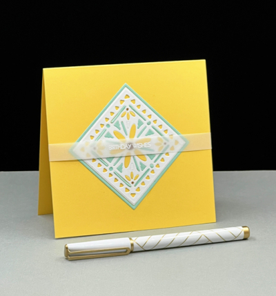
One thing I love about the Color Hues Challenge is the challenge to use colors I would never think to use. Nancy’s choice of Yellow and Pale Teal would never occur to me, but as it often turns out, I’m a new fan. In fact, I ended up with two quite different cards.

CH #37.017

The card I started out to make ended up being the second card I created. I just couldn’t get the elements to come together, so abandoned the multiple pieces and went on to make my signature CAS card,

YellowTeal1

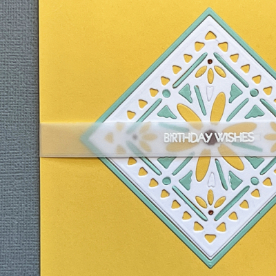
I started out with the “Shape Shifter Square #4” by Papertrey Ink. The entire design includes another frame with a more intricate design which I eliminated,  using an Ellen Hutson “Essential Squares” die to cut it off for a cleaner look. I die cut it three times: once in white, once in yellow (Papertrey’s Harvest Gold), and once in pale teal (Concord & 9th’s Sea Glass). I punched out all the die cuts in the white image, and inlaid them with yellow and pale teal. I used a neutral brown on the centers of the four small daisies.

YellowTeal1Close

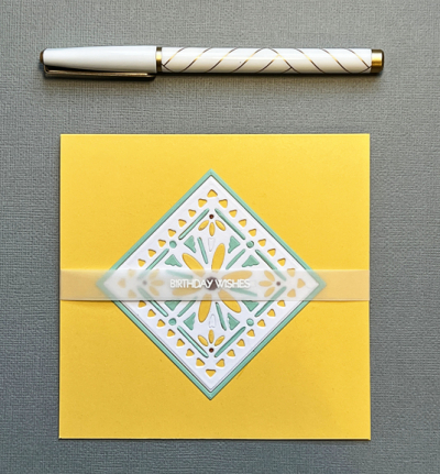
I left the outermost border empty so the yellow card base would show through. It also adds a bit of dimension to the design. Deciding on the sentiment took while, but I decided on a white embossed greeting on vellum which doesn’t detract from the design.

YellowTeal1Flat

When I sat down the next day at my desk, I saw all the pieces for the first card I intended to make. A new day made all the difference. The “Lovely Layers” set from Papertrey Ink has always been a favorite and that’s where I had started. Arranging it the second day came pretty easily. Who’s to understand the creative process? And in the end, I chose this one to post on the challenge site.

YellowTeal2

Layering the Lovely Layers pieces on a “Crimped Circle” from The Greetery worked well. Then I decided to use my new “Detail Petal Plate” from Simon Says for a subtle background. 

YellowTeal2Close

I used my favorite Gina K Design “Master Layout #1” dies to cut that panel as well as one from the soft teal to create a narrow border. The sentiment also comes from a favorite set from Pink and Main: “Special Day” which I embossed in white and die cut with Papertrey Ink’s “Skinny Mini Banners.”

YellowTeal2Flat

I hope you’ll end up finding this combination inspiring as well, and join us at Color Hues. Be sure to take a look at all the wonderful creations by the Design Team as well as our Guest Designer, Kerry.

Nancy

Hannelie

Cindy

Carol

Julie

Sheri

Kristie

Lindsey

 Tracey

I’m determined to use new products as often as I can, so I’m sending the second card over to Darnell’s NBUS Challenge.

NBUS


Celebrate

  • by

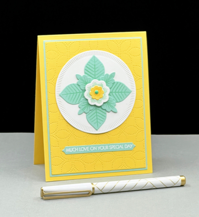
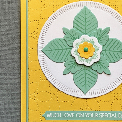
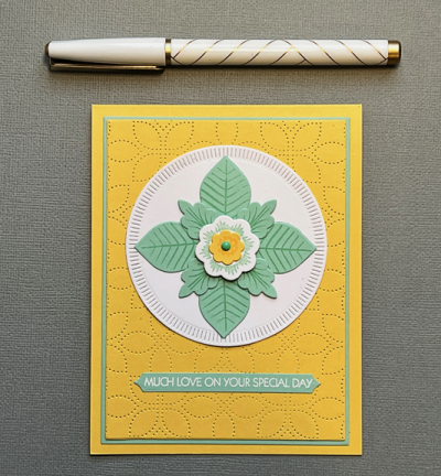
I keep a running list of current card challenges that I follow regularly. Just Us Girls is one of my favorites, but because it is a one week challenge, I often miss the opportunity to play along. When I saw the current challenge was their Trend Week and Embossing folders was the challenge, I wanted to find time to create a card for it.

JUGS

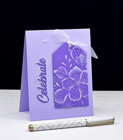
I’ve done a pretty good job recently of using products that have been in my collection for awhile, but never used. There was only one embossing folder that hadn’t seen the light of day, and it was Altenew’s  “Decorative Florals.” 

CelebrateTag

The embossing folder is a large one with multiple blooms. I started out with a card that used the whole embossing folder, but switched gears after my husband (who rarely has a suggestion) felt that the foiled sentiment and gold embellishments detracted from the beautiful embossed flowers. 

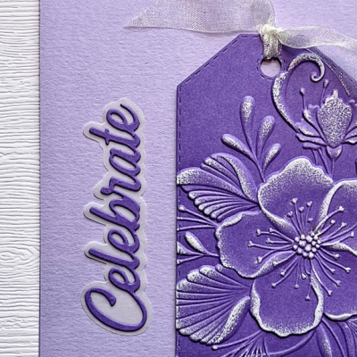
CelebrateTagClose

I switched then to a tag, embossing it with only one of the florals. Then I lightly tapped a white pigment ink pad over the embossed elements. I used this technique for the first time last year on a Christmas card and loved it, and I like it here as well

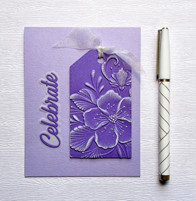
CelebrateTagFlat

The trick then was to decide how to add the sentiment, and I chose a Pinkfresh Studio die cut from their “Scripted Greetings,” using some vellum for the shadow die. I’m adding this to the NBUS Challenge since my embossing folder fits the category perfectly.

NBUS

I have two more challenges I’d like to enter this week. We’ll see how the time goes. Tomorrow I’ll be back with the new Color Hues Challenge which features some wonderful spring colors.


Mirrored Triangles

  • by

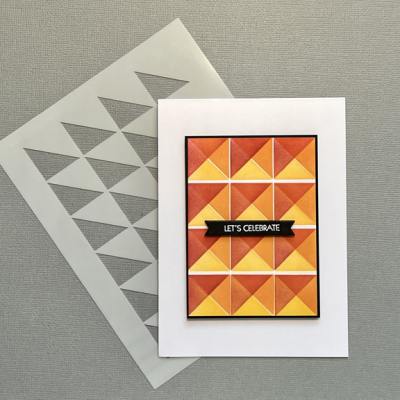
Pinkfresh Studio’s “Mirrored Triangles” offers multiple design options. I had my first opportunity to play with it this week, and know I’ll be returning to it with different color combinations, and different configurations. 

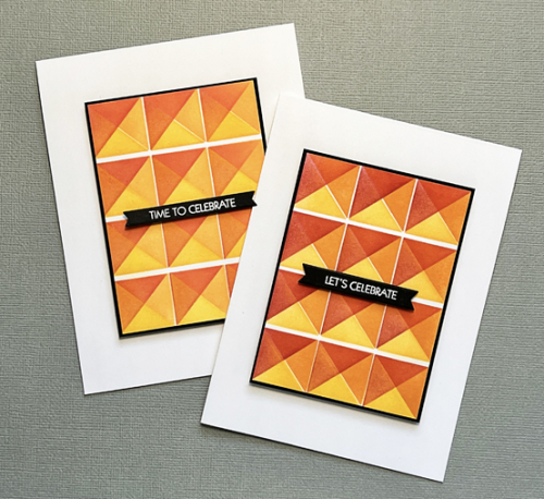
StenciledX2

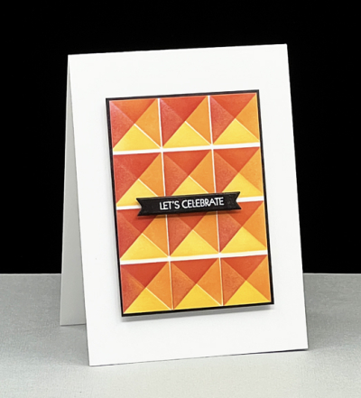
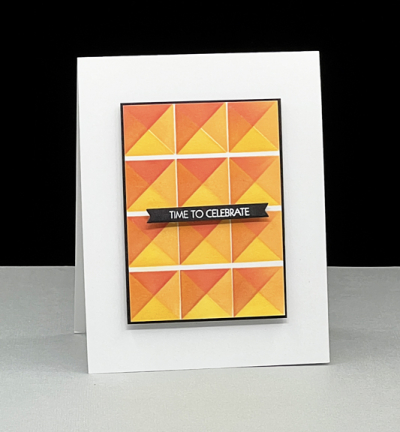
Although my first idea was to create an ombre effect, I ended up cutting the design in half and using the two sections for separate cards. For sure, it created a much more CAS design which I like a lot. 

Stenciled1

As you can see in the photo above, the design is created with just one stencil that you rotate for each new color.

Stenciled1Up

After cutting the stenciled design in half I cut two very narrow borders of black and mounted the piece on a white card with dimensional foam.

Stenciled2Up

A simple banner (MFT’s “Itty Bitty Strips”} with a white embossed sentiment was all the cards needed. Two cards for the stash with guys in mind!

I’m sending these off to three challenges:

AddictedHLSNBUS