Skip to content

Springtime Hello

  • by

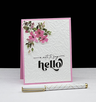
About 90% of the snow in our front yard has melted, and there are a couple of buds on the hydrangeas, but according to the meteorologist winter is not gone! Not that I expect it to be in early March. Yesterday we were nearly blown off the sidewalk with gusts of winds clocked at 60mph, but the record high temperature of 73° was a very welcome change. The Paper Players has a springtime challenge, and I had time to play yesterday. I needed a note for a new church member and this fit the bill. 

Hello

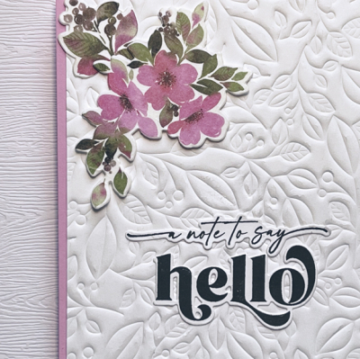
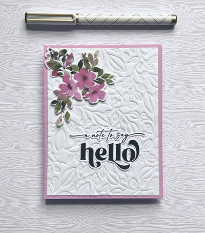
I started by using the Pinkfresh Studio hot foiling plate, “Lush Vine” to emboss a piece of white cardstock. I love the result! Then I finally broke out the Pinkfresh “In the Meadow” Washi tape and accompanying die. I now have a lovely pile of blooms die cut and used two of them on the card.

HelloClose

The two-piece sentiment is from The Greetery’s “Opposites Attract.” 

HelloFlat

In addition to The Paper Players, I’m adding this to the Addicted to Stamps and More gallery where “Any Occasion” is the challenge, and to NBUS for using the Washi tape.

Pp581 AddictedNBUS

Prayers and Cards for Ukraine & A Double Challenge

  • by

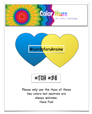
Nancy, the creator of Color Hues, asked the Design Team if we’d like to create a card using the colors of the Ukrainian flag. This week has been so horrific—loss of life, lives scattered as mothers and children flee leaving behind their husbands to take up arms against the unprovoked aggression by Russian forces. There’s so little that any of us can do except pray and hope for a quick resolution of the fighting, so I was happy to design a card as one way to show solidarity with the Ukrainian people. The intent is to flood Instagram and FaceBook with cards for the Ukrainians. Our regularly scheduled challenge hosted by Lindsey is just below this new challenge. Cardmakers can enter cards for either challenge during the next two weeks.

Cards For Ukraine! .001

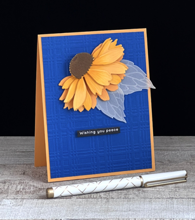
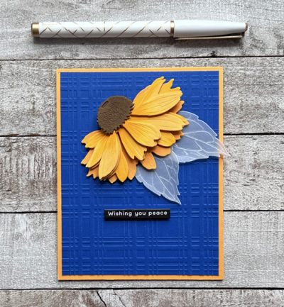
Here’s my card:

Coneflower

I had to wait quite awhile before the Honey Bee “Coneflower” die came back into stock. When I finally purchased it, I was in the midst of holiday creating, so this was a wonderful opportunity to pull it out. It’s a multi-layered floral, and I used a bit of dimensional tape that added even more dimension to the card.

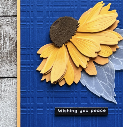
ConeflowerClose

I also used a new embossing folder, “Plaid Company,” from Spellbinders which arrived with a few hot foil plates right after Christmas. Color Hues is a two-color challenge, but neutrals are allowed so I took the liberty of adding a brown center to the coneflower, but chose to die cut the leaves from vellum. The lines in the die are much more apparent when using vellum.

ConeflowerFlat

I knew I wanted a sentiment that included the word “peace.” This is part of a longer sentiment from one of Simon Says reverse sentiment sets for Christmas. I die cut it with another new product, “Itty Bitty Strips,” which is going to see a lot of use! I hope you’ll join us in the challenge to support Ukraine, and also in the very apt color challenge chose by Lindsey below.

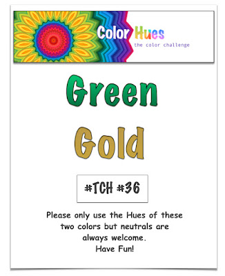
Lindsey’s colors for this round at Color Hues are just perfect for St. Patrick’s Day. If that doesn’t appeal to you, check out the cards the Design Team and our Guest Designer have created.

CH #36.001

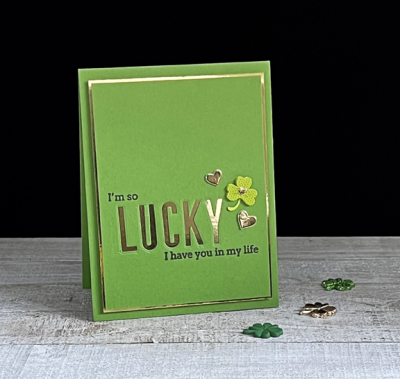
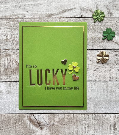
Since my husband’s birthday falls on St. Patrick’s Day, I’ve taken the theme but created a birthday card for him.

GoldGreen

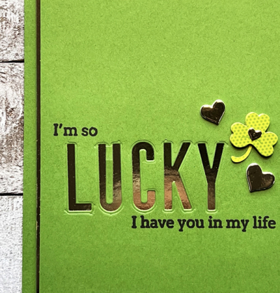
Paper Source’s Clover cardstock is the perfect St. Patty’s Day green, and I combined it with some gold mirror cardstock that I love but is often a challenge to photograph. I used Pinkfresh Studio’s “Headliner Alphabet” and die cut them from the green panel. When that panel was adhered to the gold mirror cardstock it shines right through. 

GreenGoldClose

I had to cut apart a sentiment from Pinkfresh Studio’s “Simply Sentiments: Thank You” to create the phrase I wanted.

GreenGoldFlat

I don’t own a shamrock paper punch but found a set of stickers in my stash and chose the one with a tiny heart on it. I added two other gold hearts from Simon Says “Holiday Shapes that I use frequently to finish the embelllishment.

Although you can find all the DT’s cards on the Color Hues Challenge blog, you can find the details for their cards here, as well as that of Julie P. who is our wonderful Guest Designer this round.

Nancy

Hannelie

Cindy

Carol

Julie

Sheri

Kristie

Lindsey

Tracey

I’m posting the first card in Darnell’s NBUS Challenge. I outdid myself with using new products—one of my goals for 2022.

NBUS


Freshly Made Sketches & More

  • by

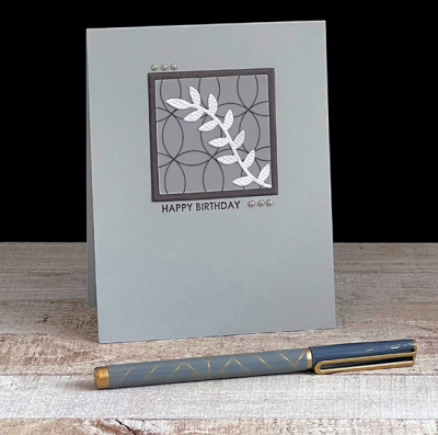
There are often times when my blog is quiet for quite a few days in a row. It is unusual, however, for me to post twice in one day. My son’s birthday post was scheduled over the weekend, and I had hoped to find time on the weekend to create a card for the current sketch at Freshly Made Sketches. I’m a huge fan of Cécile’s designs, so didn’t want to miss this opportunity to take on one of her sketches. The challenge closes later today, so I’m getting this in just under the wire! I’m also adding this to the galleries for Addicted to Stamps and More and Time Out Challenge where “birthday” is the prompt.

FMS Final 524-001AddictedTimeOut

I started by hunting for some specialty papers I’ve had for years, but I know I didn’t see them when I did my huge January reorganization and purge. That left just a couple of places to look, but I didn’t find them. In the process, however, I found this beautiful piece of vellum.

FMS2

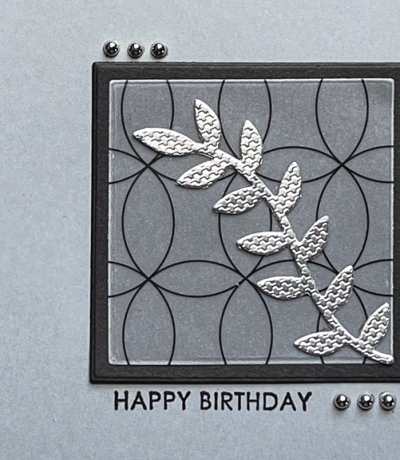
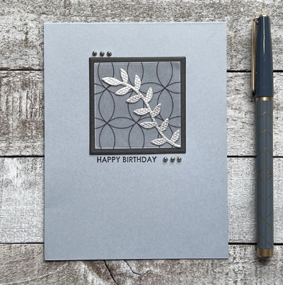
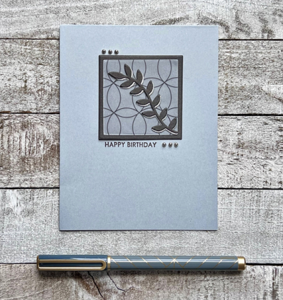
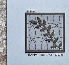
I die cut the vellum with one of Ellen Hutson’s Essential Rectanges, and using the next biggest one cut apiece of dark gray cardstock from my scrap folder. I already had the silver diecut in the envelope with My Favorite Things “Leafy Greens.”

FMSClose

I added them to a card base made with Concord and 9th’s Dove cardstock. All that was left was to stamp the sentiment from Sugar Pea’s “Everyday Sentiments” and add the silver pearls.

FMSFlat

My hope today is to get even more time for crafting. I have a couple errands to run this morning, and then should have plenty of time to get back to the crafting desk. I have a stack of hot foil plates I want to play with. I recently won a second big prize from Pinkfresh Studio, and they sent me four beautiful foiling plates and a die cut. The luck involved with these wins is just amazing as they are a random pick from all the comments left on blog posts or YouTube videos. Given how popular Pinkfresh Studio is it’s amazing to have won two big prizes in just four months, but I am very grateful!

Edited to add: When I came back to my desk this afternoon, the card above was laying there, and it just felt like something was a little “off” about it. I die cut a second vine from another scrap of dark brown cardstock, and layered it so the silver became a shadow. I’m much happier with this version!

FMS-R

Here’s a closer look:

FMS-RClose

Too late to change it for the challenges, but I’m happier!

Happy Birthday, Matt!

  • by

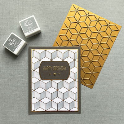
Today is my son’s birthday, and I had a lot of fun creating his card this year. He’s a fan of graphic designs so I’m pretty sure he’ll enjoy this card. Although I’ve been an incredibly lucky winner with Pinkfresh Studio in the last several months, this is a hot foil plate I purchased along with the coloring stencil knowing I’d get a lot of mileage from it.

MattBD

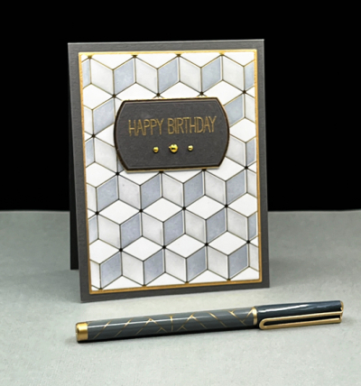
I used gold to hot foil this fabulous “Geo Blocks” design on white paper. I gave a bit of thought to leaving it as is, but am very happy I changed my mind and used the stencil to add two shades of gray to the blocks.

MattClose

I die cut the stenciled pattern and a gold border with the Gina K Designs “Master Layout #1). That die set has turned out to be a staple for me. Then I added both to a dark gray card base.

MattFlat

I wanted a sentiment with a simple font and chose this one from My Favorite Things “Greetings Galore.” I used one of Pinkfresh Studio “Basic Label Frames” and embossed the greeting in gold, adding three matte gold pearls for some embellishment.

I’ll be posting this in Just Add Ink where the challenge is to use two of three items on a list. I chose texture and layers. It’s also going to the Time Out Challenge where they are celebrating their 8th birthday. And, finally, it’s off to Darnell’s NBUS challenge since this is the first time I’ve used that wonderful hot foil plate.

Just Add TimeOutNBUS

Snowflakes

  • by

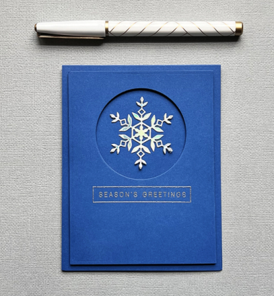
Actually there is only ONE snowflake on my card, but it’s a perfect morning for this post since we got another 4 inches of snow overnight with more promised during the day. I’m much more in the mood for flowers and sunshine, but Addicted to CAS has “Snowflake” as the challenge and Perfectly CAS wants “Metallic.” Since one of my intentions for 2022 is to get Christmas cards made in advance, I was happy to oblige.

Addicted Perfectly

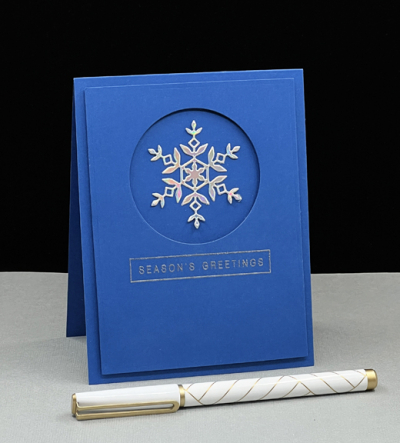
I started with a clear picture in my mind for the card design, and once I found a new pack of Paper Source Royal cardstock and a sheet of Tonic Mirror Holo Waves the card came together pretty quickly.

Snowflake

Both the snowflake die cut (Simon Says “Kate”) and the sentiment (Simon Says “Holiday Greetings: Mix 1) are old favorites.

SnowflakeClose

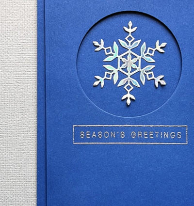
The Royal blue paper is new to me, and although the Mirror Holo Wave has been in my stash for quite some time, I’ve never used it before either. You can get a bit of the metallic glow from the photos, but it’s much better in person.

SnowflakeFlat

I do have hopes of die cutting some florals before the weekend is over, but there’s a long list of non-crafty tasks that need to be done as well. Hope your safe and warm wherever you are!

Color Hues #35

  • by

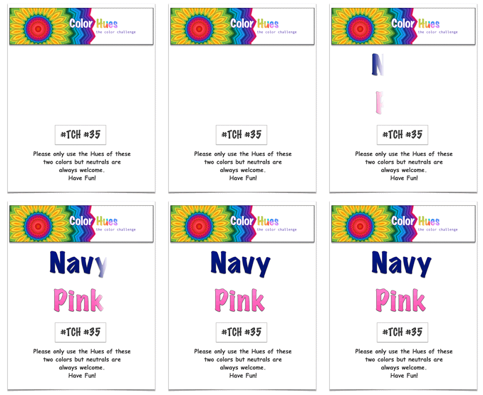
Valentine’s Day has come and gone, but Kristie has a great new color combo for you for the 35th Color Hues Challenge.

Color Hues #35-Anim.

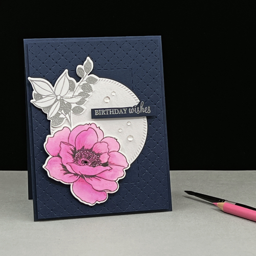
My card was inspire by this beautiful design by Betty Wright. If you click through to it, you’ll see how I was inspired.

CH35

Not long ago, Ardyth Percy-Robb had a great post on thinking about how to transform an inspiration piece into a new creation. In my case, I used the same “Border Bling: Tinstitch” die from Papertrey Ink that Betty used and added a circular die cut behind my floral. From there, my card takes a different path.

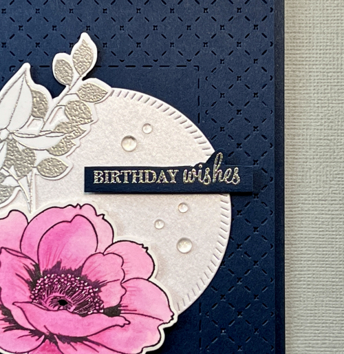
CH35Close

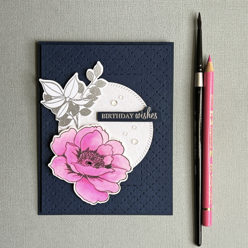
I chose a dark navy cardstock from Concord & 9th, “Midnight,” for both the card base and the Tinstitch border. I have just one floral, from Altenew’s “Wallpaper Art,” which I watercolored with the Altenew 36 pan watercolors. As some of you know, I recently participated in a wonderful online watercolor class where I was using professional grade watercolors. Although I do love the beautiful pinks in the Altenew set, the watercolors themselves were more difficult to work with. I added some texture and shading with a Polychromos colored pencil as well. 

CH35Flat

The leaves embossed in silver are also from “Wallpaper Art,” and the die cut circle, cut from a piece of white shimmer card stock, is from Pinkfresh Studio’s, “Diagonal Stitched Circles.” The sentiment, also embossed in silver, is from Papertrey Ink’s “Wishes Come True,” a long time favorite of mine. Finally, I added a few rainstones to the die cut circle.

I hope you’ll hop over to the Color Hues Challenge and join in the fun, checking out the cards made by my awesome Design Team members, and our Guest Designer, Rosemary.

Nancy

Hannelie

Cindy

Julie

 Sheri

Kristie

Lindsey

Tracey

Happy Valentine’s Day!

  • by

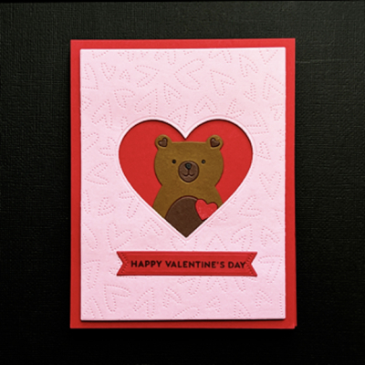
I have just one last valentine to share today. It’s almost entirely made with die cuts of one kind or another.

Maddy

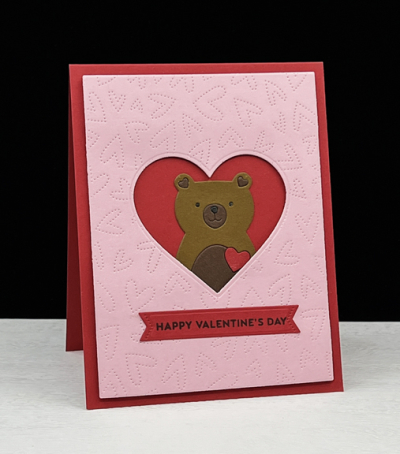
I started with a pink panel die cut with the Honey Bee “Fluttering Hearts Pierced Cover Plate.”  I die cut a heart from that panel with one of the Hero Arts “Infinity Hearts” dies, and adhered a layer of dimensional tape before layering it on a red card.

MaddyClose

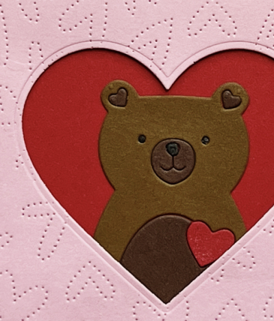
Then I carefully tucked in the little bear that I had die cut and assembled from Simon Says ” Love Bear.”

MaddyFlat

The sentiment was stamped and die cut with the “Sentiment Suite: Love” and die from The Greetery.

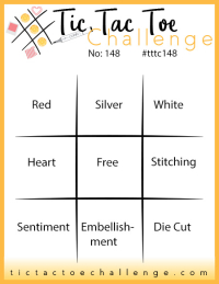
Somehow I missed the current TicTacToe Challenge with my earlier valentines, but not this time. I chose the diagonal: red, free, diecut. This will be my second card entered into the Addicted to CAS: Hearts challenge, and I’m also entering it in the Happy Little Stampers Dies challenge.

Tttc-challenge-board-148
Addicted
HLSDies

More Valentine Love

  • by

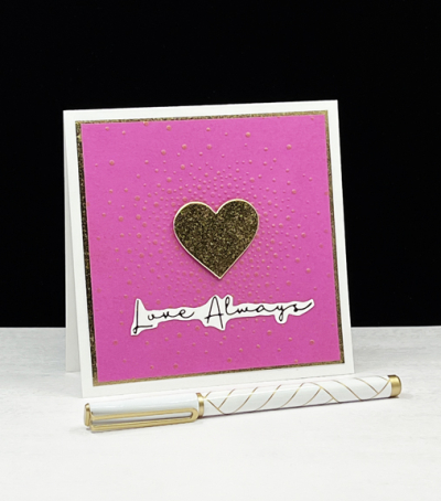
There are still a few valentines to share.  Today I have two with similar sentiments, but a bit different in style. The first is a very CAS valentine.

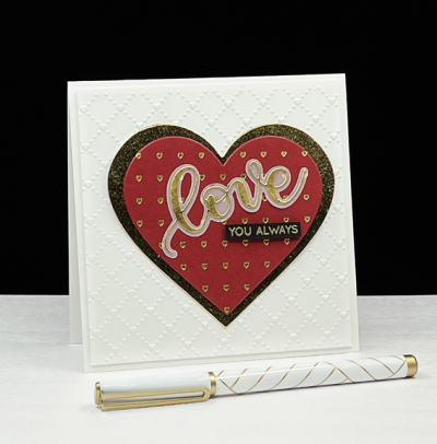
LoveAlways

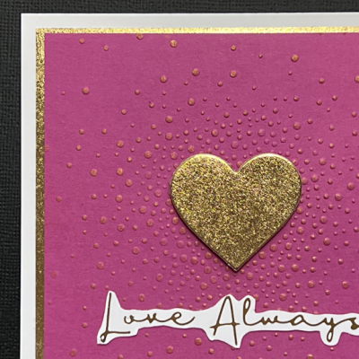
Several years ago, I purchased an embossing folder from Alexandra Renke which I’ve used occasionally. I pulled it out for this valentine and you can see all the lovely detail below. The happy fuschia cardtock is from The Stamp Market.

Love AlwaysClose

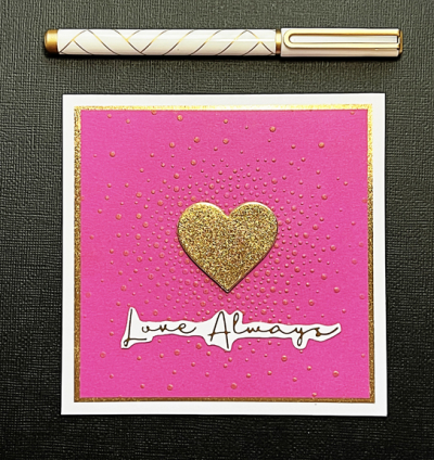
Behind the gold heart is a debossed heart which I opted to cover with this pretty metallic gold one. I lightly swiped a gold ink pad over the raised dots that radiate out from the heart which gives them a little sparkle and also highlights them.

LoveAlwaysFlat

After trimming the panel down, I backed it with the same metallic gold paper. The sentiment from Spellbinder’s “Essential Foiled Sentiments” was foiled in gold on white cardstock. It’s the first time I’ve used that foiling plate, and I do like the font.

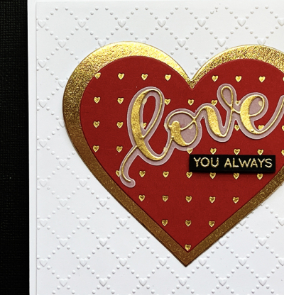
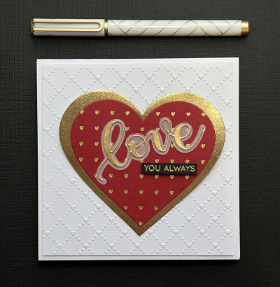
Foiling takes center stage on the next valentine. I used (once again) the “Heart Grid” by Pinkfresh Studio, but cut the panel down with a heart from Hero Arts “Infinity Hearts.” They are also a new purchase and one I’ve used over and over creating valentines this year. 

LoveYou

I also used the infinity heart dies to cut the next largest heart in gold metallic paper. I layered them on to a white panel embossed with the Sunny Studio’s “Quilted Hearts” embossing folder. 

LoveYouClose

The die cut love, shadow, and sub sentiment are from an older set by Simon Says Stamps appropriately named “Love.” The gold metallic paper from Hobby Lobby is a perfect match for the gold foil from Spellbinders as is the Brutus Monroe “Gilded” embossing powder.

LoveYouFlat

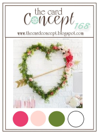
I’m entering a few challenges with these cards. First off, Addicted to CAS where the challenge is Hearts. Then the first card in The Card Concept where both the color pink and the heart were the inspiration for their “Love is in the Air” challenge. It definitely fits their category “Clean and Simple.” Then both cards are off to Simon Says Wednesday Challenge where the challenge is “Emboss It!”

Addicted TCC168 020222 Wednesdayblog-logo

Lots of Shiny Hearts!

  • by

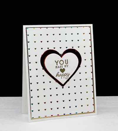
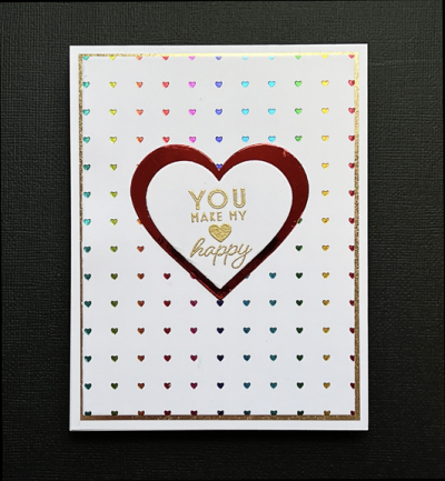
My new Spellbinder’s Glimmer machine is proving to be a lot of fun—and occasionally a source of frustration. There definitely is a learning curve, but I did get some good results when making valentines. I have two more valentines to share. I used the Pinkfresh Studio hot foiling plate, Heart Grid on both of them. 

First up, a valentine with colorful shiny hearts:

Skylar

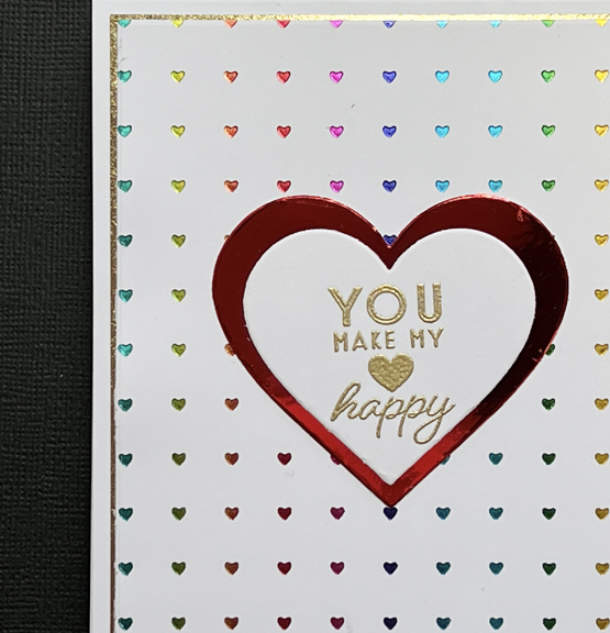
The “Hearts Grid” was foiled with rainbow stripes foil. It’s so tricky to photograph shiny things, but it’s much easier to see in the next photo. I love all those colorful hearts!

SkylarClose

After foiling the background I layered it on a thin piece of gold metallic paper. The sentiment from Papertrey Ink’s “Just Sentiments: Valentines” was embossed in gold and die cut with a Hero Art’s “Infinity Hearts” die. I die cut the next largest heart from red metallic paper, ending up with a totally shiny valentine.

SkylarFlat

i’m entering this card in the February Pinkfresh Studio Challenge where the theme is Love, and I think I have all the colors covered with the rainbow hearts. 

MonthlyChallenge-BlogTop_523e5379-812f-4596-b8b4-86989ba482da_1024x1024

Next up is a card using the same hot foiling plate, but with a bit of a different vibe.

LotsLove

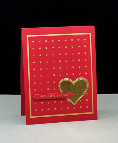
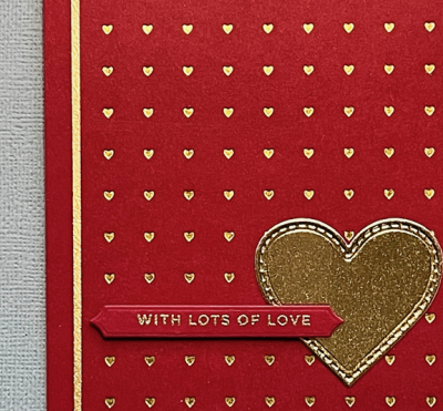
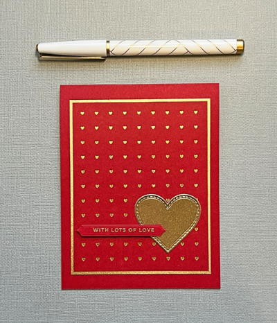
This time I foiled gold hearts onto red paper. I’ve been watching a series of live videos from Pinkfresh Studios which have been so helpful! One of the keys to foiling on colored cardstock is to find very smooth paper. This red from Paper Source worked perfectly. 

LotsLoveClose

The gold heart was cut with a My Favorite Things “Stitched Heart” die, and the sentiment from The Stamp Market’s “Tons of Type” was embossed in gold and die cut with a “Skinny Banner” die from Papertrey Ink.

LotsLoveFlat

I’m entering both cards in a new-to-me challenge: Festive Friday. There is a list of adjectives and you must include at least three in your card. For card #1 it’s sparkle, romantic sentiment, and heart.  For #2 it’s red, sparkle and heart. 

Festive-Friday-0102challenge-card


Valentine Love

  • by

Although I have mixed feelings about the weather in February, I do enjoy designing and making valentines. Not surprisingly, there are multiple challenges focused on love and valentines. I have two valentines to share today that are going to The Paper Players Challenge: Love and Friendship and the Happy Little Stampers: Dies.

Pp577 HLSDies

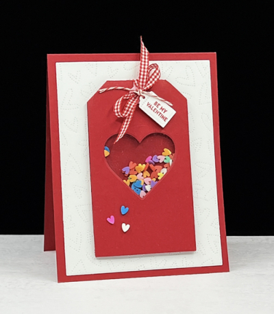
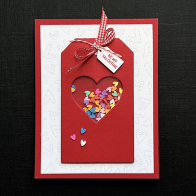
Both cards are tucked into some valentine bags with a variety of goodies for Caleb and Hannah. We’ll be on our way to visit them this weekend, and it will be fun to celebrate Valentine’s Day with them. I’m not sure that’s ever happened before. First off, the valentine for Hannah using a new-to-me Pinkfresh Studio’s “Foldable Shaker Tag.” It comes with both a circle and a square to die cut the window, but I substituted a heart die cut from Hero Art’s “Infinity Hearts.”

Hannah

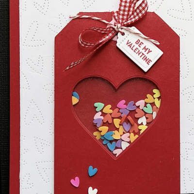
Putting the shaker together was super simple and I filled it with Gina K’s little clay hearts in multiple colors, adding three to the outside of the tag for a little embellishment.  I tied a little red gingham bow to the top with a sentiment and tag from The Greetery’s “Sentiment Suite: Love.”

HannahClose

I die cut the Honey Bee “Fluttering Hearts Pierced Cover Plate” in white and added to a red card.

HannahFlat

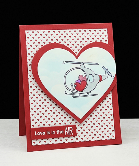
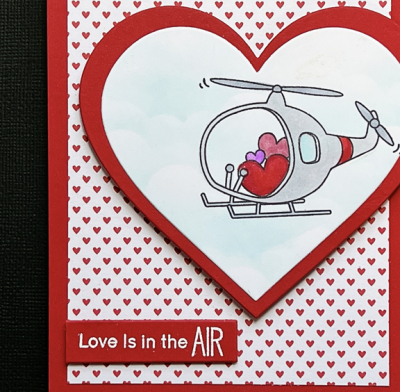
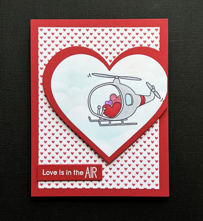
Next up is a card for Caleb, my only grandson. It took me awhile to settle on an image for his valentine, but decided on the helicopter filled with hearts from Simon Says “Faraway Hugs” set. I used the My Favorite Things “Clouds” stencil to create a background for the helicopter which I colored with Copic markers.

LoveAir

Then I die cut it with a large heart from the Hero Arts “Infinity Hearts” die and then die cut the next largest heart with red and layered them.

LoveAirClose

The patterned paper is very old, cut from a 12×12 pieces of patterned paper from American Crafts, saved from my scrapbooking days. The sentiment is from My Favorite Things “Up in the Air,” embossed in white on red and trimmed out. None of the photos show it, but I also added some glitter pen to the three hearts in the helicopter.

Love AirFlat

I’m also entering Hannah’s card in Darnell’s NBUS (Never-Before-Used-Schtuff) Challenge.

NBUS


Color Hues #34

  • by

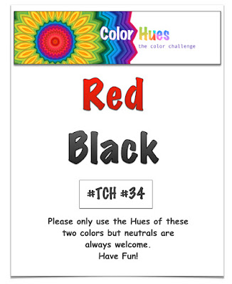
It’s my turn to be the hostess at The Color Hues Challenge. I chose Red and Black.

Color Hues #34-Red and Black.015

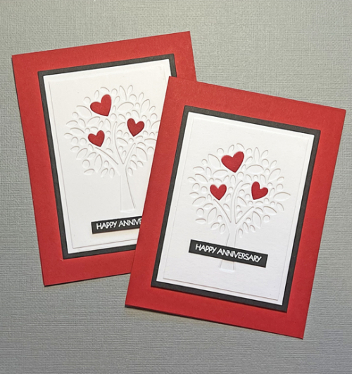
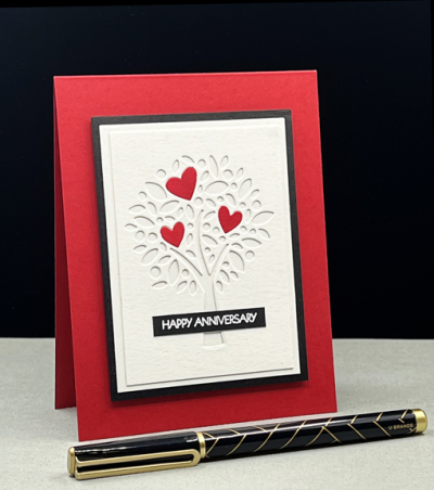
Since Red and Pink has already appeared as a challenge, I thought Red and Black would also work for Valentine’s Day which isn’t all that far away. Valentine’s Day was my father’s favorite holiday, and I have continued his tradition of sending a gift to the members of my family which means a fair number of valentine cards as well. Much to my surprise, I ended up making an anniversary card since I had not one, but two anniversaries coming up. 

RedBlackX2

The card would certainly work for Valentine’s Day as well.

RedBlack

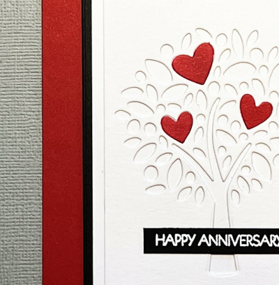
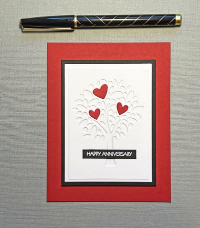
This is another of my pre-holiday purchases from My Favorite Things during a site-wide sale. I love this “Heart Tree,” and think it has many possibilities. This time I took just the three largest hearts from the die and colored them with Copic markers before inlaying them onto the tree. 

RedBlackClose

There are two white mats and a narrow black one, all layered on a red card base.

RedBlackFlat

The sentiment, embossed in white on a scrap of black card stock is from Pink and Main’s “Special Day” sentiment set—one I turn to over and over. 

Be sure to check out the fabulous card by the Design Team, and our Guest Designer,  Michal,  and join with a card of your own!

Nancy

Hannelie

Cindy

Carol

Julie

 Sheri

Kristie

Lindsey

Tracey

Happy Birthday!

  • by

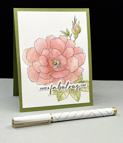
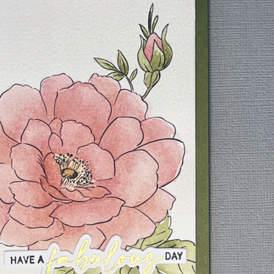
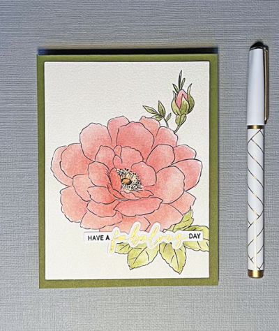
I’m celebrating the birthday today of one of my longest and best friends. Her birthday was last week, but we weren’t able to get together. This morning, we’re sharing a take-out breakfast at her home. Since she periodically visits my blog (but never comments!) I decided not to post her card until today. The main image of her card was actually one of my birthday presents a year ago. It comes from the Altenew Watercolor Coloring book.

MaryBD

This floral provided me with an opportunity to do some mixing of colors using both some new Winsor & Newton watercolors and some Daniel Smith watercolors. When I was immersed in Sarah Simon’s watercolor class, I purchased a few small tubes of Winsor & Newton watercolors. I had previously tried to mix this color with my yellows from Daniel Smith, but I could never get the peachy color I wanted. The Yellow Ochre is just enough different to easily mix it.

MaryBDClose

I’ve also learned to walk away and let the watercolors dry before adding a new layer. Being someone who is used to completing a card in one session, it takes more patience than I usually exhibit!

MaryBDFlat

After attaching the panel to a green card base, I added the sentiment from The Ton – “Easy Expressions: Birthday.” I considered adding a few pearls, but decided to leave it very CAS.

I’m sending this off to two challenges: Seize the Birthday: Anything Goes and Happy Little Stampers: Watercolor.

STB-AnythingGoes HLSWatercolor


Abstract Designs

  • by

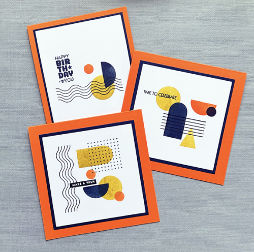
 A week or so ago Ellen Hutson posted an Instagram reel using her “Stay Cool” stamp set. Since I had yet to use mine, I pulled it out and created three abstract cards intended for guys on my January birthday card list. (They’re all in the mail now.) This is a bit of a departure for me, but I quite like them.

AbstractX3

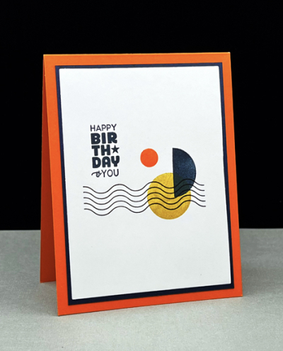
I used the same color combination on all three cards, varying the designs and the sentiments. All three were matted in Dark Indigo (Papertrey Ink) cardstock. The first card is a standard A2 card created with Concord and 9th’s Marmalade cardstock. The sentiment is from The Greetery’s “Sentiment Suite: Birthday,” a set I use over and over again.

AbstractHB

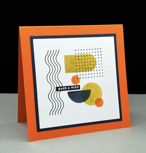
The other two designs looked better in a square format and I used the same cardstock as the base for them as well. The sentiment for this one is from Simon Says Stamp’s “Tiny Words.”

AbstractWish

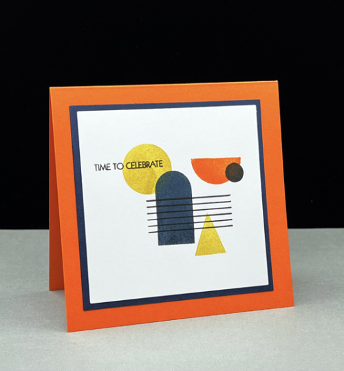
I think this one is my favorite, and it’s sentiment is one from Pink and Main’s “Special Day.” I’m throwing this in the ring at Addicted to Stamps and More where the challenge is “Make Your Mark.”

AbstractCelebrate

Addicted

My card making these last few days has been derailed by a massive overhaul of my craft closet. I didn’t take before photos, but there’s been a major transformation. I have half an empty shelf, everything has been moved to clear containers that I can see into, and all the containers are labeled. I had so much! ribbon and much of it is in bags to take to the charity craft shop. I did take a basket filled with ribbon to the basement where I wrap gifts because I’m much more apt to use it on a present. Nonetheless, I did keep all my Papertrey Ink ribbon which coordinates with their cardstock and their inks. Aside from a fresh, new look, the best part of the project is knowing exactly what I do have and what ought to be used. Next up are the drawers in the two units under the shelves. Those I can tackle at a slower pace, one drawer at a time. But it’s good to have one of my 2022 intentions well on its way to being completed.

Foiling and a First Valentine

  • by

For Christmas I received a Spellbinder’s Hot Glimmer foiling machine. I knew it would be under the tree, so during sales events after Thanksgiving and Christmas I purchased a few foiling plates (all 50% off). Then I won the grand prize at Pinkfresh Studios which included several more. Traveling right after Christmas and devoting a lot of time when we returned to the watercolor class, it took me until this week to break out the machine. I’d seen some very helpful videos on Jennifer McGuire’s blog*, but I’d also read on Instagram and elsewhere that the foiling process could have a rather steep learning curve. Luckily, the first two foiling projects were a success which resulted in the valentine below. Afterwards, I tried a couple other plates that didn’t turn out so well, so I think it will be a process with mixed results for awhile.

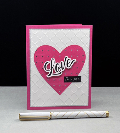
Love

The foiling is much easier to see here:

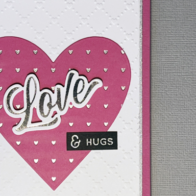
Loveclose

I foiled a piece of Raspberry Fizz cardstock with silver foil using the Pinkfresh Studio “Heart Grid” foiling plate and die cut it with one of MFT’s “Nested Hearts.” The foiled sentiment is one from Pinkfresh Studio’s “Brush Sentiments.” That set includes the foiling plate, the stamp set, a die, and a stencil you can use to color the dies. Lots of options and I would never have spent the money to purchase them all. Truthfully, when I saw the release I thought the sentiments would all be larger than I would like, so I wouldn’t have any of them had I not won the whole release. I see now that they will get quite a bit of use. 

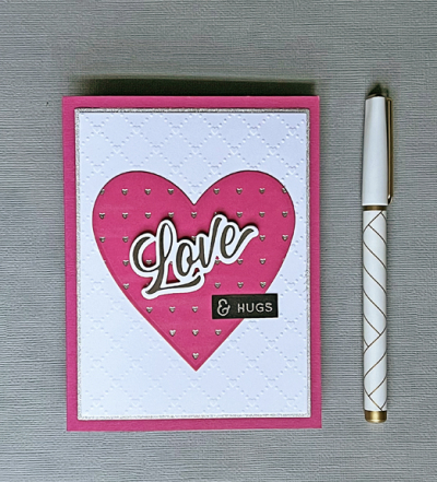
LoveFlat

I used the Sunny Studio ” Quilted Hearts” embossing folder for the background and a piece of silver glitter paper to frame it. To save on the glitter paper, I cut it the size I needed, and then die cut the middle of it with a smaller rectangle die and put that piece in my metallic paper folder. The small sentiment is from an old Simon Says stamp set “Love” which I use frequently. 

I’m sending this off to two challenges: Time Out’s: In Love and Happy Little Stampers Dies: Anything Goes

Timeout205 HLSDies

*If you’re a cardmaker and aren’t aware of Jennifer McGuire’s site, she provides wonderful videos showcasing all kinds of techniques as well as process videos. I rely on her advice for so many things.


OLW: Balance

  • by

Happiness is not a matter of intensity but 
of balance and order and rhythm and harmony.
Thomas Merton

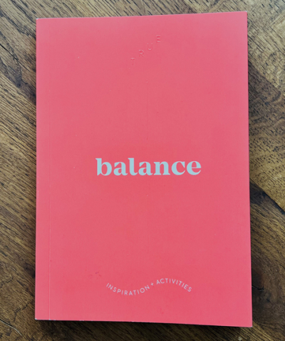
This post has been percolating for several weeks now, and the middle of January is quickly slipping by so it’s time to take a look at my OLW for 2022.  I had no trouble finding my word this year. In August we were in a lovely gift shop in Traverse City, MI and I spotted a series of books with single word titles. The one that jumped out at me was Balance, and I was pretty sure that described what I needed in my life. Interestingly, it turned out to be a repeat of the word I chose exactly 10 years ago. Time to revisit it again.
Balance

I’m prone to going all in on a project and by the time I’m done, I’ve let lots of other creative pursuits fall to the wayside. A blogging friend has decided to choose a word quarterly, and I’m wondering if that’s not also a way to balance the things you hope to do. I’ve just begun Atomic Habits after hearing references to it all over. I’m only a couple of chapters in, but already one of the big take-aways is that setting goals doesn’t help you create habits; it’s the process that changes who you are. And that change is what you’re really after. 

When I started thinking about balance I was looking for ways to incorporate learning, practice, and self-reflection into my days. I recognize that it’s an ongoing process. It’s the day-to-day, moment-to-moment choices you make for yourself. Creating balance means understanding that you can’t do it all.

So I’m going to practice balance—staying open to opportunities and reminding myself of the things that bring me joy.When we returned home from visiting Sarah and her family, I downloaded a Habit Tracker and laid out some of the things I’d like to pay attention to this year. I’m quite sure the list will change from month to month, but it’s already helping me find time for things that might fall off my radar. Although I divided some of them into weekly and monthly categories, that’s not really working the way I wanted. For example, this month I want to explore some possible photography projects, but I don’t expect to start working on one until next month. The one very important omission on the Habit Tracker is a list of all the things I do without thinking: household chores, errands, meal planning, volunteer work several times a week, and work for my three church committees. But, in fact, I’m looking for balance in my creative time. 

As I often do, I’ve made lists of ideas for things I’d like to do, and truthfully, most years by the summer I’ve stopped going back to the lists to review them. I think my friend’s idea to look at the OLW quarterly is a great idea. Although I’ve enrolled in Ali Edward’s OLW class a couple of times, doing a deep dive into it each month was really overload for me. 

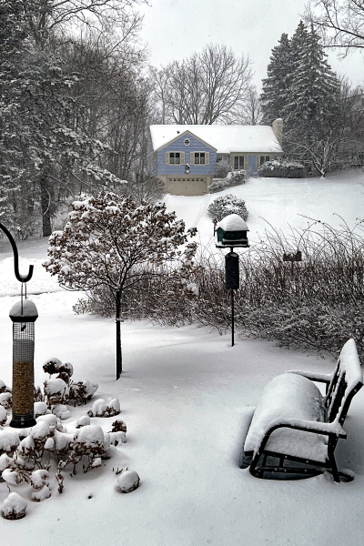
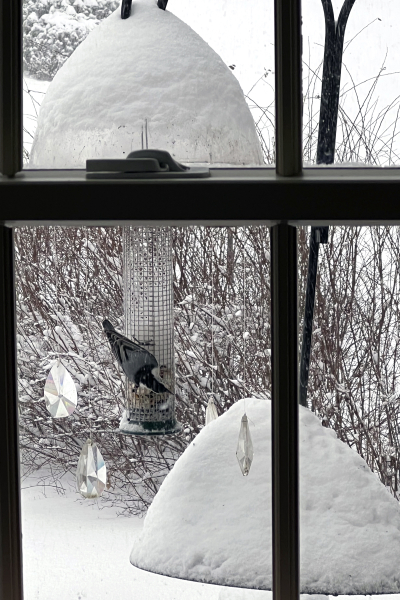
As a “reward” for sticking with me for a very word-heavy post, here’s a look at a cute little nuthatch at our feeder this morning, and a broader look at the landscape outside our kitchen window. By noon we had well over a foot of snow. Tracy went out to do the driveway this afternoon (fortunately neither of us had any reason to leave the house), and just as he finished our snow blower quit working. He did the sidewalk by hand, but our long and steep driveway requires a machine. Matt’s coming over tomorrow with his truck to get it to the service provider. 
IMG_1592ed

IMG_1594ed

If you choose a word for the year, I’d love to hear about it.