Skip to content

Variations on a Theme

  • by

I was inspired by several challenges to pull out four different hydrangea stamps to create a few cards. I have three finished, and it turned out to be a rather educational experience. The biggest challenge was completely my doing. I intended to watercolor the images, but when I stamped them I used Neenah 80#. It actually turned out alright but I’ll wait on the last challenge until I redo the stamp with watercolor paper. All the images were cut with my Cut-N-Scan which I purchased over the winter holidays. It has proven to be a great purchase. I don’t own any of these dies and the Cut-N-Scan actually does a better job than I sometimes do with a manufactured die. I was unaware of the Cut-N-Scan until I started watching videos using the Silhouette and the Cricut. The Cut-N-Scan is very user friendly, and although I’ve yet to explore all the possibilities with it, I’m quite happy with it’s scan and cut abilities. I can do sentiments as well as images. In this case, I die cut all the images before watercoloring them. 

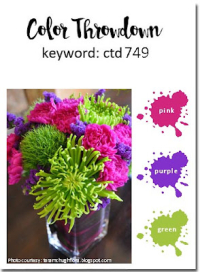
The next challenge was finding appropriate colors. I stuck to the current colors on the Color Throwdown Challenge: pink, purple, and green. I was also interested in playing along with Just Us Girls where the challenge is Pastels. The colors for the Color Throwdown Challenge are much more vibrant, so I toned it down for the JUGS Challenge. I’m also sending one of these to Triple B: Birds, Butterflies, and Blooms

749 pink purple  green 0628 JUGS # 686 July1-triple b

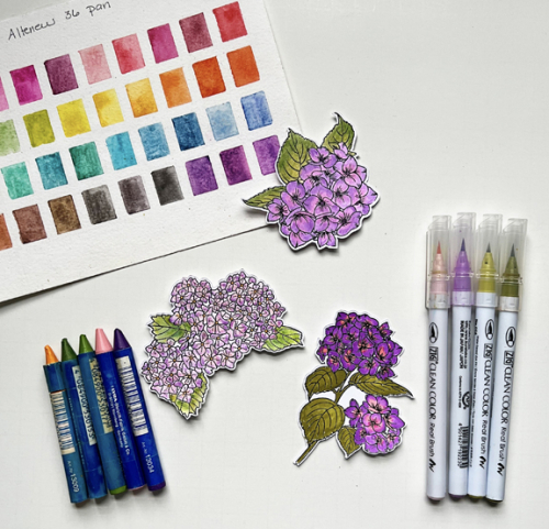
In order to come up with some different pinks and purples, I used three different mediums. I often use the Altenew 36 Pan watercolor set as well as my Zig Watercolor markers, but this time I also pulled out a set of Lyra Aquacolor crayons which I’ve probably owned for 20+ years. I can’t remember the last time I used them. It’s easy to see how different the colors are in each example.
ColorMediums

So, finally, here are the cards!

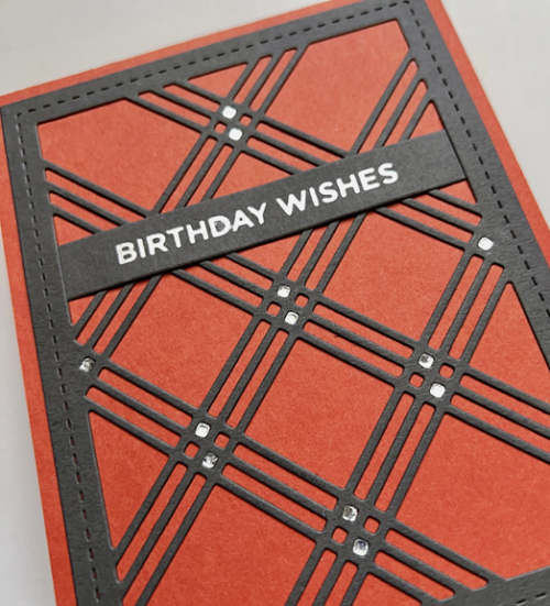
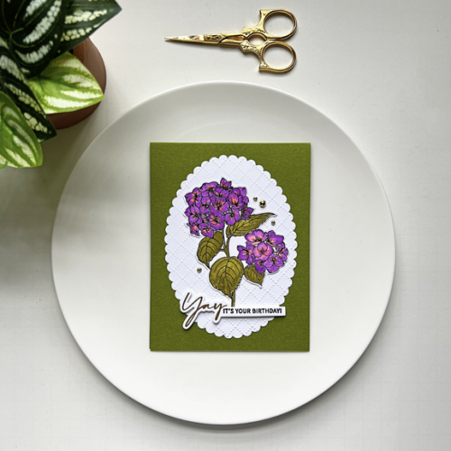
For Color Throwdown I used the Gina K  Heartfelt Hydrangea and The Ton’s Easy Expressions: Birthday. I used the Zig Watercolor markers. The label on the pink markers says “light pink” but it is surely glowing against the purple.
YayBD

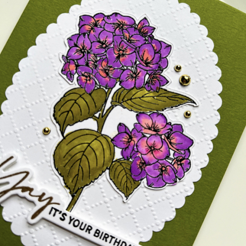
I used a Dick Blick premade scalloped oval that I embossed with the Dotted Lattice embossing folder from Taylored Expressions. I used some dimensional tape on the sentiment and added a few gold pearls.
YayClose

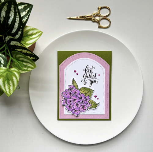
The pastels for the JUGS challenge were done with the Altenew 36 pan watercolor set. To deepen the colors a bit, I applied one light coat, let it dry and then added a second coat of watercolor. I mounted it on two Reverse Confette Pierced Rounded Top dies and used a beautiful sentiment from Gina K’s Sweet Sentiments.
BestWishes

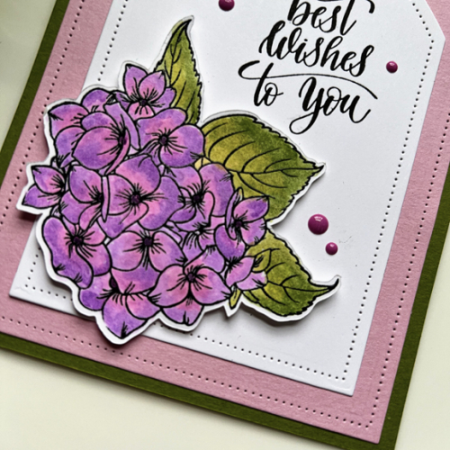
The only embellishment were a few purplish pink enamel dots. I also used some dimensional tape to pop up the floral arrangement.
BestWishesClose

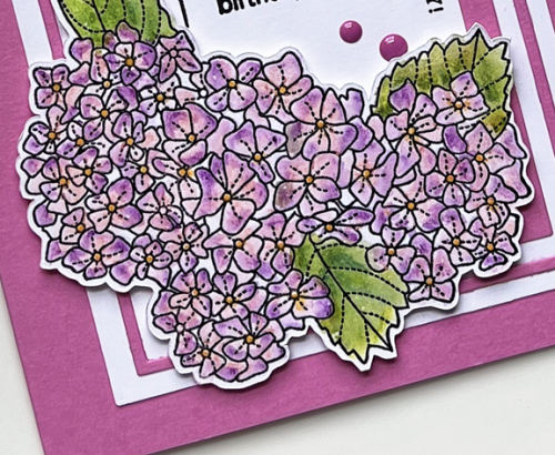
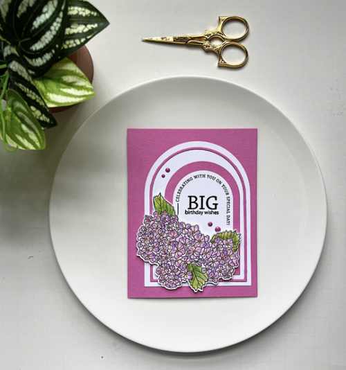
Finally, the hydrangeas colored with the Lyra Aquacolor crayons. Several months ago, I added The Greetery’s Arched Sentiments to my order. I already owned Ellen Hutson’s Essential Arches and wondered if The Greetery’s sentiments would work with them. Indeed, they do, and this is their inaugural debut! I stamped a birthday greeting from The Greetery’s Sentiment Suite: Birthday set in the middle of the arch and then added a series of arches and frames before adding the flowers.

BigWishes

I found the florals in a very old Papertrey Ink set, Friendship Jar: Summer Fillers. I’ve always loved the Friendship Jar sets, but it’s been a long time since the summer fillers made an appearance, and I’m quite sure I’ve never used the hydrangeas. This one is off to the Triple B Challenge.
BigWishesClose

Well, that was one long post, and if you made it to the end, thanks for sticking with me!
Congrats!

  • by

My daughter-in-law’s niece just graduated from American University in just three years. Being unable to attend classes in person the first two years, she actually was able to manage enough extra credits to finish a year early. We’re all very proud of her accomplishments, and equally glad that she’s decided to do graduate work here at the University of Rochester.

Her card is very definitely a Clean and Simple one, but rather elegant, too, I think. I’m also a believer that the Clean and Simple space does not need to be white. 

Graduation

I started by die cutting the sentiment from Penny Black in the Enchanted Evening cardstock by Papertrey Ink. I repeated the die cut with shiny gold cardstock and inlaid it before adding a narrow gold border.  

GraduationClose

I added it to a white card base and then attached the motorboard 3-D sticker that I luckily found in my stash. 

I’m sending this off to three challenges: Less is More: Anything Goes, Addicted to CAS: Celebration, and Addicted to Stamps and More: Any Occasion.

Less AddictedCAS Any Occasion


Color Hues #67

  • by

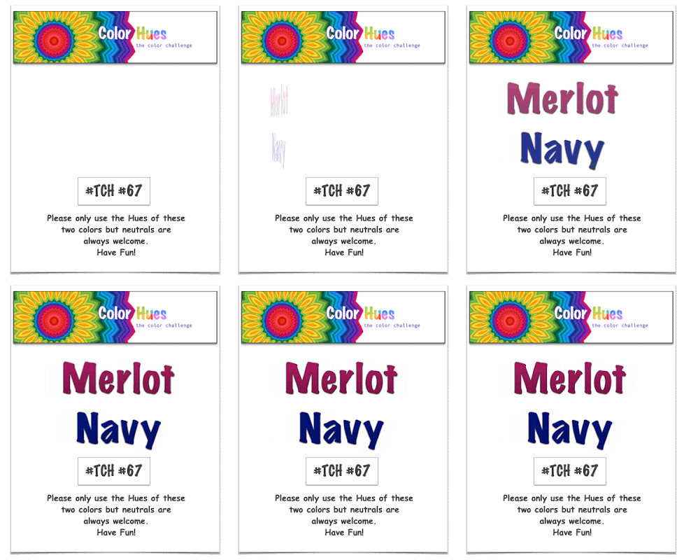
Marcia is our hostess at Color Hues this week, and she’s chose a rich color combination:

CH #67 Merlot and Navy Anim.

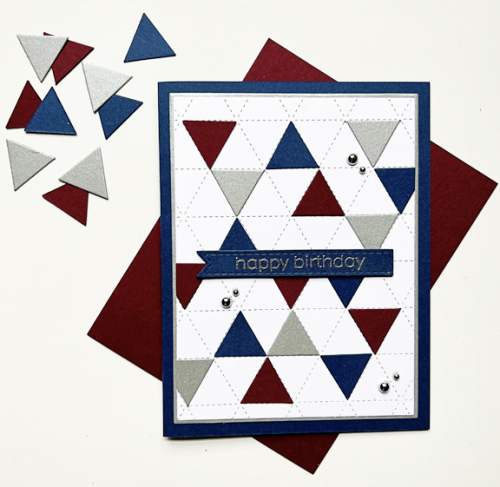
When planning this card I had two objectives: use a new-to-me but never used product (I have far too many of these) and create a masculine birthday card.

CH67

The closest paper I had is a bit deeper merlot than in the challenge logo and is from Paper Source. The navy cardstock is Concord & 9th’s Midnight paper. I was rather disappointed the last time I ordered it to discover it’s now a brighter navy than the previously released Midnight which was the darkest navy I owned. The wonderful Concord & 4th Triangle Background was the starting place. I die cut the small triangles from the merlot and navy cardstock as well as some silver shimmer paper from Paper Source.

CH67Close

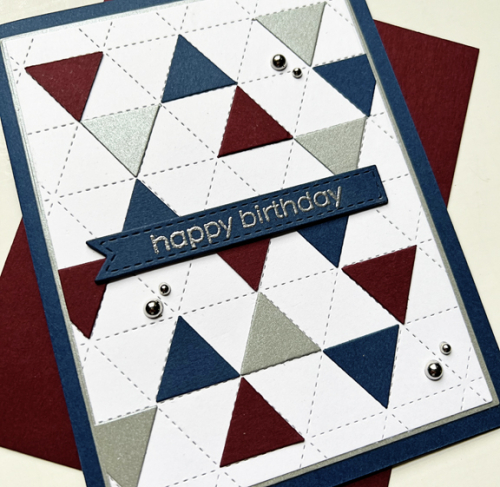
This angle shows the shimmer a bit better. I embossed the sentiment from The Greetery and die cut it with one of Simon Says Stitched Banners, and stacked it up with three additional banners die cut from navy. That piece had been die cut with the smaller rectangle from Gina K’s Master Layout #1, and I layered it on a larger rectangle from the silver before adding it to the navy card base. I debated about using the silver pearls, but think they are just fine even for a masculine card. 

I’m sure you’ll find lots of inspiration from the Design Team and our Guest Designer at the Color Hues blog, and I hope you’ll add your take on these colors to our gallery during the next two weeks. 

I’ll be sending this off to the new July NBUS since I’m happy to have another Never Before Used Stuff off that list!

NBUS

Morning Glories

  • by

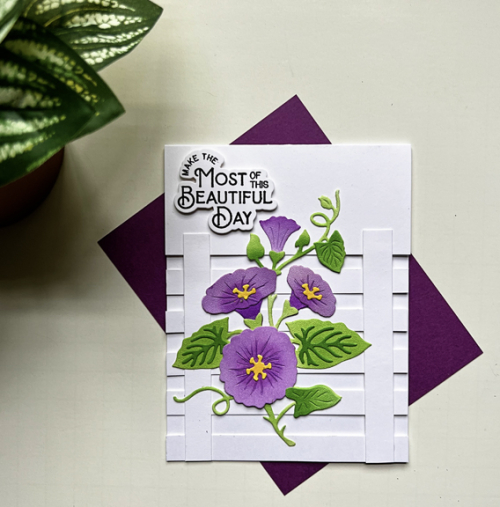
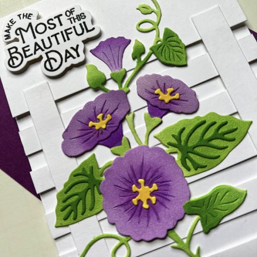
Last week a friend loaned me The Greetery’s  Botanic-cut: Morning Glories. I had a lot of fun ink blending the flowers and assembling them. I ended up making three sets of them, and die cut a couple more from white for later. I chose the purple ones for today’s card knowing that would work for the Double D Color Challenge. You can use one of more of the colors in the Inspiration Board.

June - Color

I also decided to give the trellis card design a try. I originally saw it on Bibi Cameron’s blog, but since then several card makers have used the design as well. Everyone’s is just a bit different. 

Trellis

Cutting the strips off the card front is the first challenge. I used five as shown in Bibi’s blog, but I think next time I’d try four instead.

TrellisClose

Luckily, I had a die cut sentiment from Pinkfresh Studio’s Farm Fresh stamp and die set which fit on the top section perfectly. Most of the cards I’ve seen elsewhere have stamped their sentiments on one or more of the slats on the trellis. Although I didn’t photograph the card standing up, it does stand up easily and looks great.

In addition to the Double D Challenge, I’m sending this on the Simon Says Wednesday Challenge: Anything Goes, and to the Triple B Challenge: Birds, Butterflies and Blooms where using their Inspiration Board is totally optional as long as you use 1-3 birds, butterflies and blooms. It’s my first time playing along with the Triple B Challenge and I opted not to use the Inspiration Board this time around.

A Favorite Flower

  • by

I had just enough time yesterday to pull out two new products from The Greetery to create a card for The Flower Challenge. The prompt this time is “Use Your Favorite Flower,” and the link closes later today. 

TFChallenge#81

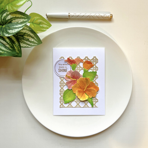
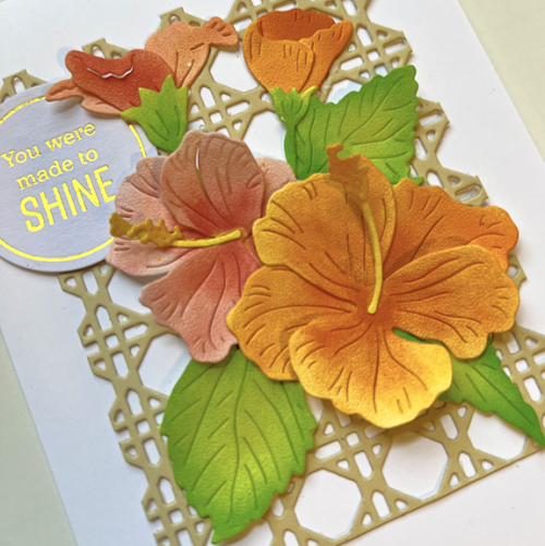
I have lots of faves, but the hibiscus is right on top of the list. Typically in the summer I have one in a pot on my patio. This year I wasn’t able to find one the right color and also the right size, so I’ll have to settle for now for the new Botani-cut, Hibiscus, from The Greetery. 

Hibiscus

I must say I’m quite impressed with how easily these dies are to assemble. I die cut them from Spellbinders white Specialty Flower cardstock. It has an interesting texture, but is very easily shaped to produce more 3-D like flowers. After die cutting them, I used some Pinkfresh Studio inks to ink blend each of the pieces and then assembled each flower. The background is also one of the new products from The Greetery–the Woven Cane Background die. I must say die cutting this makes quite a mess, but I knew I’d love it. We have several caned chairs that I inherited from my great-aunt’s home which I love.  

HibiscusClose

I added the Woven Cane Background to a white card base and then arranged the florals. The foiled circle sentiment is from one of the Pinkfresh Studio collections of premade sentiments and fit perfectly tucked in with the flowers. 

This is also another entry to Darnell’s NBUS June Challenge! I’m doing a better than average job of using new (or old and unused) products.
NBUS


Card Challenges

  • by

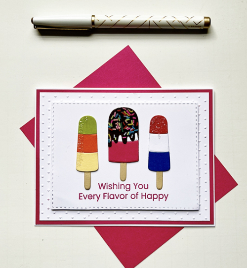
As you know, I enjoy playing along with different card challenges. It’s not often, however, when the challenges align with my need for specific cards. Usually I add the card I’ve made for a challenge in my box of cards “to send” without anyone particularly in mind. This week, however, there were challenges for three cards I needed to make. First off, Maddy’s birthday card. Her birthday isn’t until July 7th, but Matt and his family left for a three week vacation yesterday so we celebrated here before they left. I made a very summery birthday card which fits for Addicted to Stamps: Birthdays and The Four Seasons Challenge: Summer.

MaddyBD

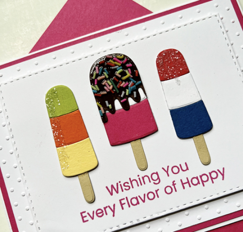
I’ve had these popsicles dies from My Favorite Things since last summer, and this is the first time I’ve put them to use. I added clay sprinkles to the middle one, and some glittery sugar to the other two.

MaddyBDClose

I had a harder time deciding how to design the card but settled on an old dotted embossing folder by Cuttlebug and a Stitched Rectangle (Simon Says) layered on a Raspberry Fizz card base. The sentiment is also from My Favorite Things, Every Flavor of Happy. This card is also going to Darnell’s June NBUS for never before used stamps and dies!

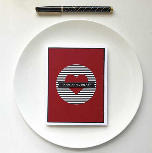
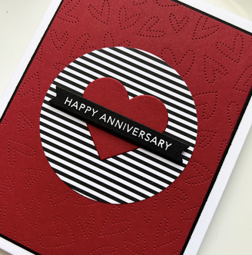
Next up is an anniversary card for dear friends. CAS on Friday’s current challenge is Love–just perfect. 

RickMarcy

This card came together quickly thanks to a box filled with envelopes of already die cut or stamped elements. I already had the red embossed panel (Honey Bee Pierced Fluttering Hearts) with the circle cut out of it, and the sentiment banner, so it was just a matter of finding a piece of black and white striped paper (My Favorite Things) and die cutting a red heart. I used my Gina K Master Layout 1 dies to create the layers for the white card base.

RickMarcyClose

I like this card enough that I’ll probably use the design again.

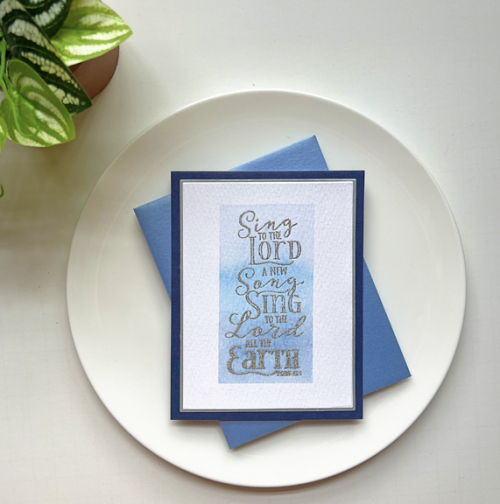
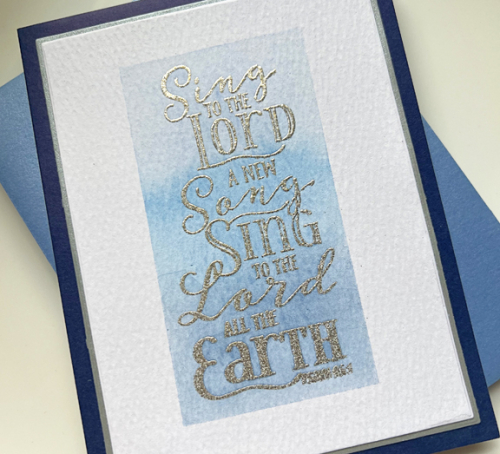
Finally, Shopping Your Stash has an interesting challenge right now called Sentimentally Yours. They’re looking for cards where the sentiment is the focus. Our beloved Music Director and organist at our church is retiring at the end of June. I thought this older Papertrey Ink stamp, Year of the Psalms: February was perfect for my note of appreciation and thanks.

Psalm

After embossing the sentiment in silver on watercolor paper, I taped off the edges and watercolored an ombré panel in blue. I layered that with a thin border and added it to a navy card by Memory Box which has a white interior perfect for writing a note.

PsalmClose

There are a couple more challenges out there that match my card needs, so I’ll be back in a day or two with some other offerings. 

Father’s Day

  • by

It’s Father’s Day in the US, and I always make cards for three special men in my life: my husband, my son, and my son-in-law. I posted my son-in-law’s card earlier so I could enter it in a couple of challenges. You can see it here.

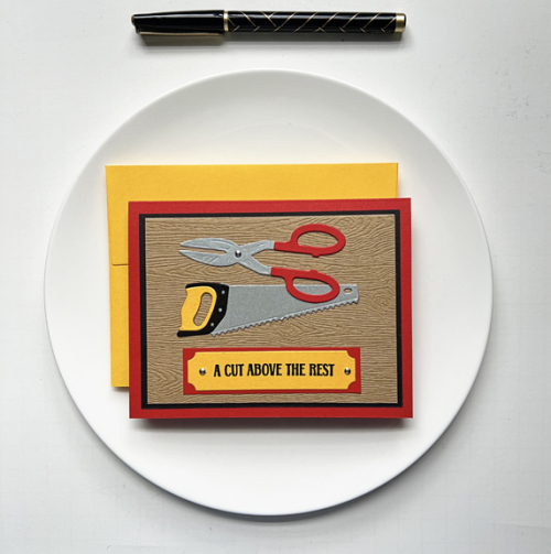
Tracy’s card uses the same Spellbinder’s set All the Tools as well as the stamp set A Cut Above. 

CutAbove

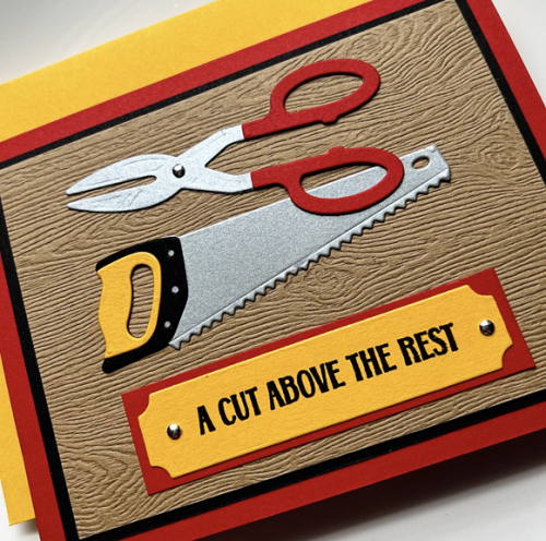
For Tracy’s card I started with a piece of Ellen Hutson’s woodgrain paper. After assembling the tools I added them to the woodgrain panel along with the sentiment. The stamp set comes with a die for the sentiments which I used, adding a couple of nailheads to it and backing it with some red cardstock. I used some black cardstock to add a narrow border before adding it to a red card base. 

CutAboveClose

These tools from the Spellbinder’s set were so much fun to put together and the little details are amazing. There was a small indent on the scissors, so I added a third nailhead which made them even more realistic.

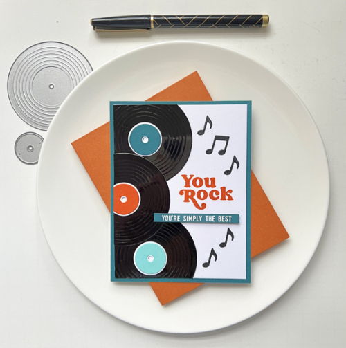
Matt’s card also used a new stamp and die set that I ordered before our trip, Concord & 9th’s Greatest Hits. 

YouRock

He’s always been a huge fan of music so these record dies were impossible to resist. And one can never have too many stamps and dies for masculine cards. I die cut the records from black glossy cardstock. I cased the arrangement from a card created by Carissa Wiley for Concord & 9th.

YouRockClose

This is another set where the details make such a difference. The grooves on the records are so cool and the label dies take me right back to the days of records and record players. (Both of which Matt took with him some years ago!)

It’s been a pretty quiet day. After church we picked up a new hydrangea we’d ordered and found a farm market with fantastic fresh strawberries so strawberry shortcake is on the menu later. We had a great Facetime call with Sarah, Adam, and the kids tonight, and will celebrate with Matt tomorrow night. Tracy’s been absorbed with the US Open golf tournament so he’s perfectly happy to sit back and relax.

The Shopping Your Stash Challenge: Let’s Hear It For the Boys is still open so I’ll be sending these along. I’m also sending Tracy’s card to the Simon Says Wednesday Challenge: Lots of Layers, and Matt’s card to NBUS (another set out of the unused basket!)


Color Hues #66

  • by

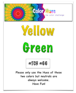
I’m the hostess this round for Color Hues, and I’ve chosen two colors specifically so I could play with a wonderful Spellbinders die set that a friend loaned me. These colors definitely say SUMMER to me, and we’re finally seeing the warm temperatures and sunshine.

CH #66 Yellow and Green .001

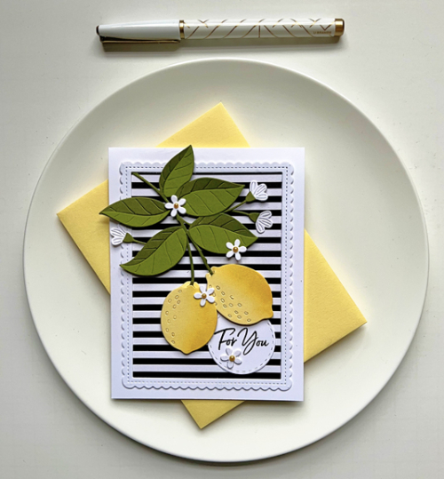
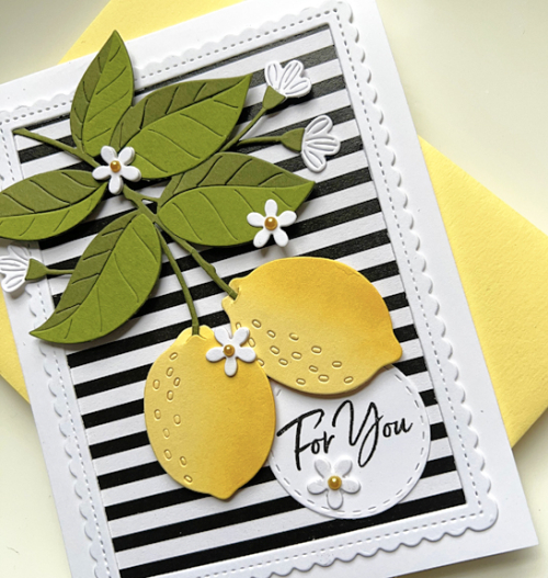
This die set of lemons and pretty white flowers makes such a happy card. I chose a sentiment that can be used for a variety of occasions, so it could easily be sent as a birthday card or a encouragement card.

CH66

Papertrey Ink’s Lemon Tart was the perfect color (and name!) for the lemons. For the leaves I chose Gina K’s Asparagus and The Stamp Market’s Leafy. One of the things I particularly like about these dies is all the detail that they add. I did do a bit of ink blending to add more dimension to the lemons and added tiny yellow pearls to the flowers.

CH66Close

I backed the pretty stitched scalloped frame with some black and white striped paper from My Favorite Things. The sentiment from Waffle Flower was stamped on a Stitched Circle from Simon Says.

Please hop over to the Color Hues blog to see what our Design Team and our fabulous Guest Designer, Michele Ferguson, have created with this color combo. It’s sure to inspire you, and I hope you’ll add your cards to our gallery in the next two weeks!

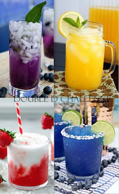
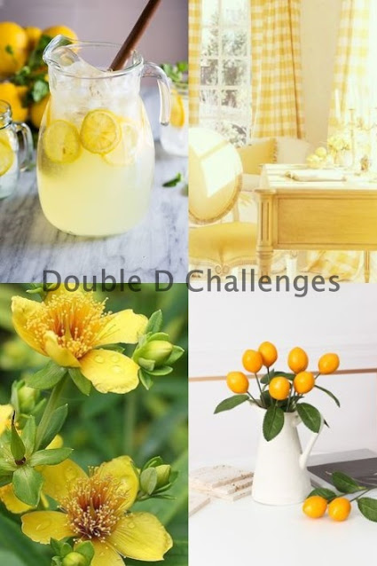
I’m throwing my card into the ring at the Double D Challenge: Lemon-Ade and the Yellow Challenge.

DD yel23

Summer Vibes

  • by

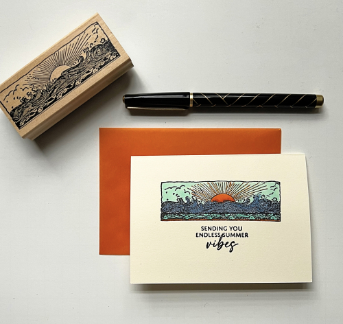
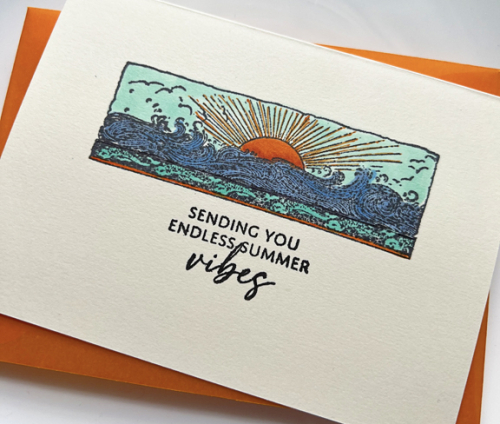
It’s Woodblock Wednesday for June. I missed May’s posting so I wanted to be sure to join in this time. I chose a very old wooden stamp by Stamp Francisco, that I’m pretty sure I purchased when we took our kids to California 27 years ago. I planned the route around stamp stores and came home with quite a nice collection. In addition to Woodblock Wednesday, the AAA Cards Challenge is Everything Beach, and Addicted to CAS is One Layer. This card satisfies all three challenges.

SummerVibes3

I stamped the image on a premade A4 Ivory card from The Paper Source, and colored it with Copic markers. To color the sun’s rays and the tiny border at the bottom of the stamp, I used Staedtler Triplus Fineliner. I bought a set of these many years ago, and I’m amazed at how long they’ve lasted.

SummerVibesClose

The sentiment is a newer one from Papertrey Ink’s Just Sentiments: Summer. Another oldie, but goodie, is the orange vellum envelope which I purchased from Impress Stamps when I was in Seattle many years ago.

Featured-woodblock-Wednesday-graphic-copy-1
AAA242
OneLayer

All the Tools

  • by

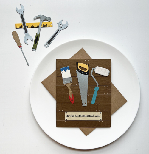
When I saw the challenges at The Paper Players and Shopping Your Stash, I knew exactly what I wanted to make–my first Father’s Day card. Both challenges are looking for masculine cards. I purchased the Spellbinders All the Tools die set and the accompanying stamp set, A Cut Above, because I have three men in the family for whom tools are important. This one is for my son-in-law and the sentiment couldn’t be more perfect. My daughter started out with the woodworking tools and projects many years ago, but in the last couple of years, she’s ceded the hobby over to her husband who has definitely upgraded the tools she had.

AllTheTools

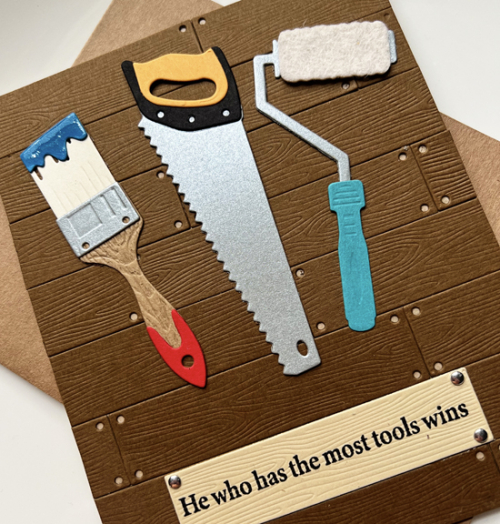
I loved putting together the tools for this card and will definitely be using it again. There are so many good sentiments in the stamp set. It can be used for a number of occassions. I started the card by die cutting multiple shiplap dies from The Greetery and adhered them to a kraft card base. I like how the kraft color peeks through the tiny holes in the shiplap die. 

AllTheToolsClose

I used a variety of cardstock from my scrap folders for the tools, adding Nuvo Glaze to the paint brush and die cutting the roller for the paint roller from felt. I won’t be posting this on Instagram until Father’s Day since my son-in-law is apt to see it there. Along with The Paper Players and Shopping Your Stash, I’m sending this off to NBUS as this is the first time I’ve used the Spellbinders sets.

Pp643NBUS

Spring Sprays

  • by

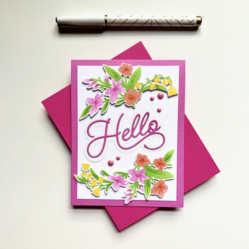
Technically, it’s still Spring, but the last week has felt a lot more like mid-summer. Today a fresh breeze has blown in, and it’s much cooler. Right before we left on our trip, I received an order from The Greetery that included a stencil and die set called Spring Sprays. I created the card and got it photographed, but didn’t have time to post it. The challenge at Double D is Flowers as is the challenge at Stencil Fun, so here’s the perfect opportunity to share the card.

FloralHello

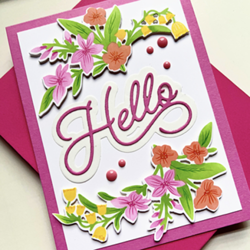
I used a variety of Pinkfresh Studio inks to color the florals with the stencil and added some detail with colored pencils. The die cut clusters were added to a white panel with some dimensional tape and then to a bright pink card base.

FloralHelloClose

The lovely die cut sentiment, Scripty Hello, is also from The Greetery. Just five pink enamel dots finished it off.

It’s been a whirlwind since we returned. I’m heavily involved in two big church events–one this Sunday and then another on the 11th. This is also the week of the Walker family cottage on Honeoye Lake, so we’ll be driving back and forth almost every day this week. I have a list of projects I want to create, so I’m hoping to sneak a few minutes at the crafting desk each morning. 

Color Hues #65

  • by

We arrived home 0n Monday from a fabulous tour of Portugal and Spain. I’ll have lots more to share in a week or so. The tour lived up to all our expectations–and more. This post was written before we left. I’m anxious to get back to the crafting table, but it will probably be another day or two. Today is the first of June and time for the new Color Hues Challenge.

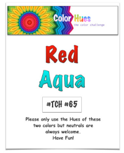
Red and Aqua are such a happy combination, and Jules is our hostess at Color Hues this round.

CH #65 Red and Aqua.001

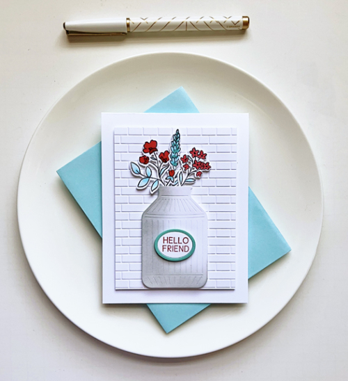
I’ve chosen a Pinkfresh Studio Suite of products, Farm Fresh, for this challenge. It was another of the products we received as part of the Create and Connect even in February, and one of my favorites.  

CH65R

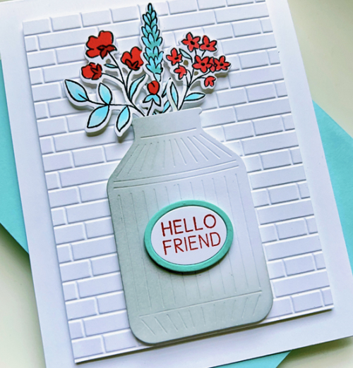
Despite several layers all with dimensional tape, it’s quite a CAS card. I chose to color the flowers with Copic markers rather than the accompanying stencils. The card photographed darker than it really is, and even photo editing didn’t quite fix it. There’s definitely more shading in those florals than is shown here. I used an embossing folder from Taylored Expressions, Subway Tiles, to create a backdrop for the milk can full of flowers.

CH65Close

I added some shading in gray to the milk can and die cut two ovals from white and aqua papers for the sentiment which also is included in the Farm Fresh set. I briefly toyed with the idea to layer the focal images on either an aqua or a red card base, but decided the clean look of white was much better.

Please hop over to the Color Hues blog to see what the Design Team and our Guest designer have in store for you! Then help us fill the gallery with your Red and Aqua creations!

Color Hues #64

  • by

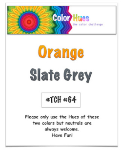
Julie has chosen a color combination I have always loved for this round of the Color Hues Challenge: Orange and Slate Gray. I have multiple orange sweaters which look great with gray, and a couple of very lovely gray and orange print scarves. 

CH #64 Orange and Slate Grey.001

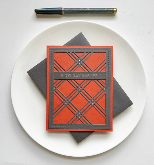
The cardstocks I chose for this were Simon Says Slate (perfect name!) and Gina K’s Tomato Soup, which is a darker hue of orange than the graphic above. One great thing about this two color challenge is the “hues” part of our name which allows for quite a bit of variation in color. 

ColorHues64

I’m trying to focus on using different techniques for the Color Hues challenges. Two challenges ago, I had a floral that was stamped and colored with stencils, and the last challenge was a geometric hot foil plate colored with stencils. This time it’s another graphic design but with Waffle Flower’s Triple Line Diamond Panel which I die cut from the gray paper. It was layered on a top folded orange card. Next up was to choose a sentiment, and after much deliberation, I chose a sentiment from Spellbinders hot foil plate: Everyday Sentiments II which was foiled in silver and die cut with one of Simon Says Sentiment Labels.

ColorHues64Close

Instead of adding embellishments. I die cut a portion of the panel again in metallic silver paper and inlaid some of the diamonds to coordinate with the silver foiled sentiment.

I hope you’ll jump over to the Color Hues blog and see what the rest of the Design Team and our Guest Designer have created, and join in the fun with your orange and gray cards!

When you read this, I’ll be about halfway through a tour of Portugal and Spain! Before the pandemic we took a tour with the same company to Morocco, and I was so tired at the end of the day, I had no energy for the internet so I’m anticipating a break from technology while we’re away. I know there won’t be any action here on the blog, but I may try to upload some photos to my Instagram account. 

Pretty Pastels

  • by

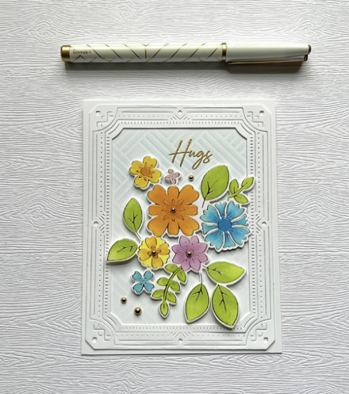
After days of cold, damp days, we’re finally experiencing some sunny spring weather. The Flower Challenge is looking for “Pretty Pastels” and although I won’t have much blooming in my yard for several more weeks, I was motivated to produce a very “springy” card.

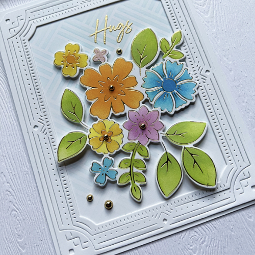
The beautiful hot foil plate, Simplest Gestures, from Pinkfresh Studio is one of my favorite bouquets of flowers. I foiled it in gold and used a variety of Pinkfresh Studio inks with the accompanying stencils to color it, and then die cut it.

Hugs

A design technique I learned during the Create and Connect event in February was to use another stencil in the background. This time I used the My Favorite Things Basket Weave stencil with a very pale blue ink. The sentiment from Pinkfresh Studio was embossed in gold on the stenciled panel. I added the Pinkfresh Deco Frame to that and then added the bouquet with some dimensional tape.

HugsClose

The final touch was to add a very gold pearls. 

My mid-May Color Hues post is ready to go live on May 16th, but that’s about it for the rest of the month. We’re off exploring and although I hope to post a few photos on Instagram, I don’t expect to be on the internet. I’ll be catching up with you at the end of the month.


Sending Hugs

  • by

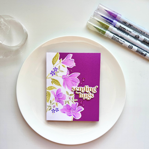
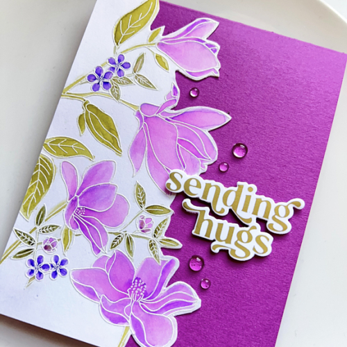
Creating an inventory of my crafting supplies has multiple benefits. I know what I have, and I know where it is. But in addition, I “find” things I’ve forgotten about. This beautiful Floral Focus from My Favorite Things is one of them. I embossed it in white on Altenew watercolor paper and colored it with my Zig Watercolor markers. Every time I get out the watercolors I remember how much I enjoy it. I need to do it more often. 

SendingHugs

When I finished the watercolors, I fussy cut the right side of the design and added it to this lovely purple/red cardstock which I can’t identify. The sentiment from Pinkfresh Studio’s Perfect Sentiments was hot foiled in gold. I added a few clear “rain drops” and called it done.

SendingHugsClose

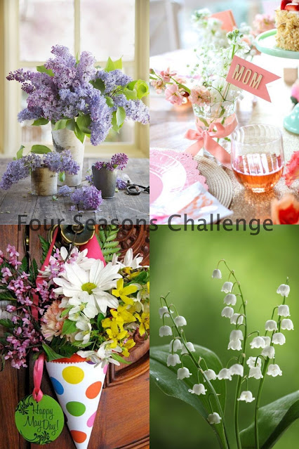
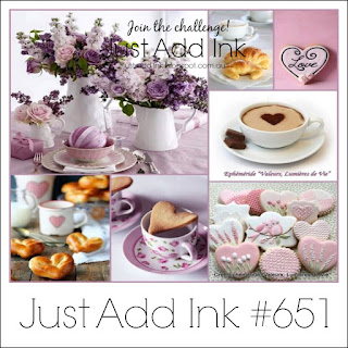
I’m entering this in the Four Seasons Challenge: Spring and the Just Add Ink Challenge. Both challenges have a beautiful inspiration board with some lovely purple florals, although my purple is a different hue. Hope it doesn’t matter.

FS Spring 23cJUstAddInk#651