Skip to content

Garden Goodness

  • by

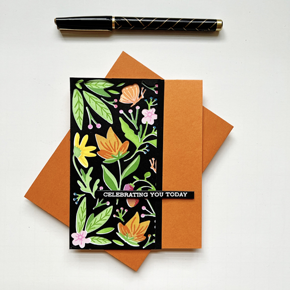
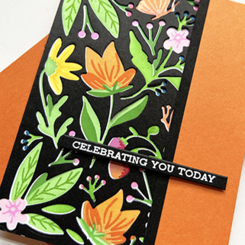
The Greetery’s Garden Goodness suite of products has been sitting in my box of “need to use” products for nearly a year. I had tried to use it as soon as it arrived, but discovered I had two of one of the stencils and was missing one. Betsy, in typical customer service excellence, mailed me the stencil I didn’t have. Although the transaction really didn’t take very long, I was into something else, and never got back to it. Finally this week, I put it to use.

The card that I ended up with was definitely NOT the card I had in mind when I started but I do like it quite a bit. I first stenciled the whole panel with a variety of Pinkfresh Studio inks. The I used the die cut on a piece of black cardstock and used the negative to lay over the stenciled piece.

CelebrateYou

I had a slight problem with the overlay and when I tried to correct it I made a mess of one side of the piece. The solution was to cut the piece down. After adhering it to an orange card base, I added a narrow strip of black cardstock to the edge.

CelebrateYouClose

The sentiment, from Altenew’s Sentiment Strips II, was already embossed on black cardstock which I found easily since I had just reorganized how I keep pre-stamped or foiled sentiments. Little by little, I’m reorganizing and/or inventorying most of my supplies.

I’m sending this off to the Stencil Fun Challenge where the option is Flowers and to Addicted to Stamps and More where the challenge is Stencils or Die Cuts.

Addicted


Birthday Balloons

  • by

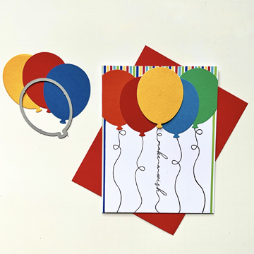
Both Seize the Birthday Challenge and AAA Birthday Challenge are calling for balloons. I needed two birthday cards for kids this month so I pulled out a die set for one, and a favorite stamp set for the other.

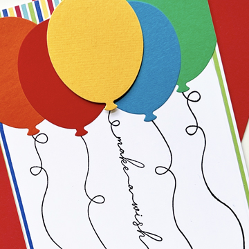
For the first card I die cut some brightly colored balloons with one of the dies from Simon Says Balloons, all cut from scraps.

Finlay

Once I knew where I wanted the balloons, I stamped some strings from Papertrey Ink Birthday Balloons and Birthday Strings and then attached the balloons. Before adding them to the card front I adhered a piece of striped paper with many of the same colors in the balloons. I think this might be from a My Favorite Things paper pad, but it was filed away under stripes in my 6X6 patterned paper box.

FinlayClose

It’s interesting that the orange balloon appears a bit more red in the photo than IRL. If I’d thought of that possibility I wouldn’t have put them next to one another.

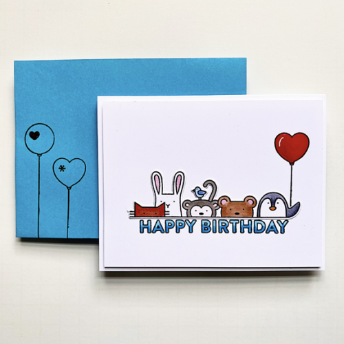
I love the critters on the next card, and added a heart-shaped balloon for the penguin to hold.

Rowen

All the critters were colored with Copic markers as well as the sentiment where I used two shades of blue for an ombre effect. I also added two balloons to the front of the envelope.

RowencClose

The final touch was adding some Nuvo Crystal glaze to the balloon for some dimension and shine.

04-27-BalloonsAAA#49

Color Hues #63

  • by

Hannelie is our hostess for the May Day Color Hues challenge. It’s a bright and vibrant combo, and I cased myself this time around.

CH # 63 HOt Pink and Cyan.001

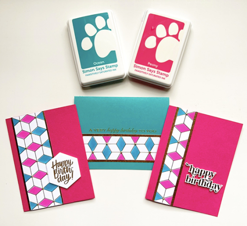
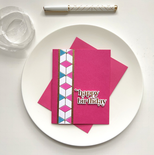
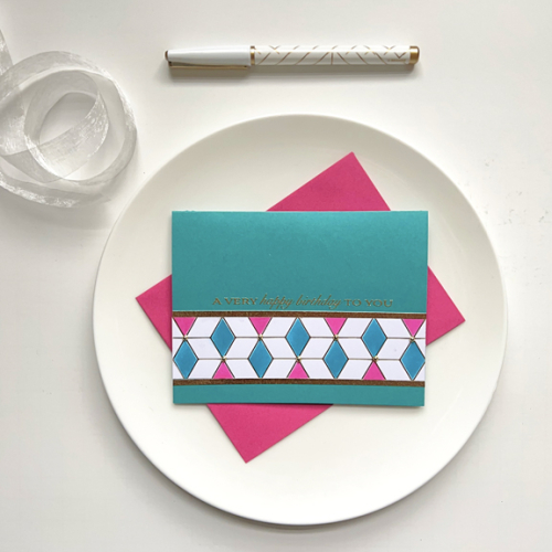
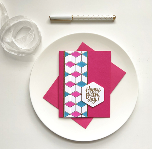
In February I created a set of masculine cards using one hot foiled panel of Geo Blocks by Pinkfresh Studio. For those cards I used only one stencil and one color of ink to create the pattern. This time I used the same stencil but alternated colors–using Simon Says Positively Saturated Inks in Peony and Ocean. They were a good match for the two cardstock papers I that were closest to hot pink and cyan: Concord & 9th’s Oceanside and Paper Source’s Fuschia. Just by changing colors, the cards are much more feminine. 

CH63X3

CH63-1

CH63-2

CH63-3

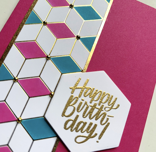
After cutting the hot foil panel in three pieces I added them to the card fronts with narrow strips of gold paper. The sentiments are exactly the same as I used on the earlier set. From the top:  a hot foiled sentiment from Pinkfresh Studio’s Wonderful Words, a gold embossed sentiment from Papertrey Ink’s Banner Sentiments, and a gold embossed sentiment stamped and then die cut with Simon Says Hexagon Greetings. I did add some dimensional tape to the back of the hexagon greeting. 

CH63Close

It’s easier to see the gold embossing and hot foiling as well as the gold pearls that were add to all three of the cards.

Please join us in the next two weeks and add some bright and happy pink and cyan cards to our gallery. For inspiration, be sure to check the Color Hues Blog to see what the Design Team and our Guest Designer, Kristin,  have created.


Curved Florals

  • by

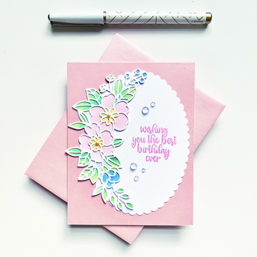
One of my most recent purchases was the Gina K Curved Floral stencil and die set. I set out to see how different combinations might work. I started with light colors, using Pinkfresh Studio inks for all the stenciling. For the first two cards, I stenciled first and then used the outline die cut to place over the stenciling.

For the light colored stencil, I chose a white die cut and placed the curved floral on a scalloped oval I found at Dick Blick’s several years ago.

PinkCurvedFloral

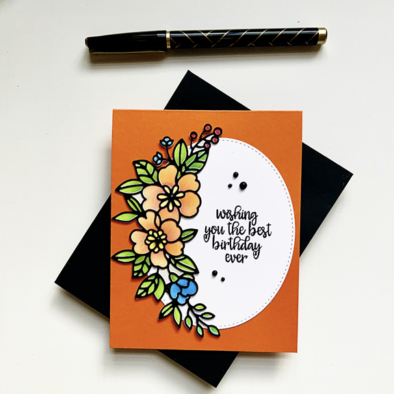
The sentiment is also from Gina K’s Wreath Builder set. I used that sentiment on the second card as well, choosing brighter colors and a black die cut.

OrangeCurvedFloral

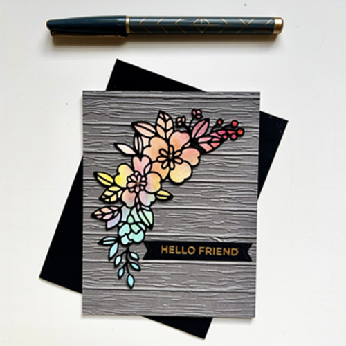
The last card doesn’t use stenciling at all. I die cut the solid die cut from a piece of patterned paper—Altenew’s Gel Printing, and used some light shading with a small brush to highlight a few spots in the centers of the flowers. I found a dark gray panel using the Altenew Deck Planks 3-D embossing folder in my box of precut panels, and was surprised at how much I liked it. Definitely a different look.

GrayCurvedFloral

The sentiment here was one I had foiled earlier from Spellbinder’s Everyday Sentiments II, and was die cut with a banner die from The Greetery.

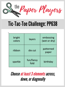
I’m adding my brightly colored florals to the Paper Players Challenge. It’s a fun Tic Tac Toe challenge and I chose bright colors, die cut, and birthday running diagonally from left to right. I’m also adding one of the cards to Seize the Birthday Challenge—no topping, but I do expect to be back with one for the balloon topping soon.

Pp638 STB-AnythingGoes

Woodblock Wednesday

  • by

It’s the April Woodblock Wednesday, and I had time this afternoon to put together a card.

Featured-woodblock-Wednesday-graphic-copy-1

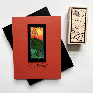
I love this challenge because it encourages me to look back through the wooden stamps I chose to keep. I wonder now how many I sold or gave away, I’d be glad to have back again. This Memory Box stamp has always been a favorite. I love it’s artsy look.

WoodblockWednesday

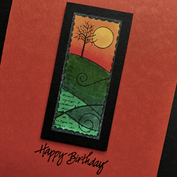
After coloring the image with Copic markers, I trimmed it down and mounted it on a piece of black cardstock and then onto the card base with some dimensional tape.

WoodblockClose2

The sentiment is also a woodblock stamp. It’s so old I can no longer read the name of the company, but it was made in Redwood City, CA.

I’m in the process of making and addressing 17 birthday and anniversary cards that need to be mailed in May, so I’m happy to have another birthday card in the stash.

Many Thanks

  • by

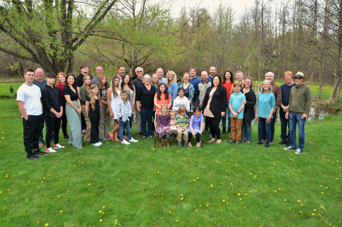
I’m basically in recovery mode after a very busy and emotional weekend. My MIL’s memorial service was on Friday. It was a beautiful service and brought the entire family to Rochester—all 38 of us from six different states, including, of course, Sarah and her family. Sarah was the liturgist for the service, and it was wonderful to see her participating in a service in the church where she grew up and was ordained.  We had a dinner Friday night and gathered together Saturday at the Air B&B my brother-in-law rented for his immediate family of thirteen. We hired a professional photographer who did a fabulous job of capturing every possible family configuration! She sent us over 100 photos. Here’s one taken of the whole group. It was supposed to be a very rainy day, but the rain held off until late afternoon allowing for photos outside and lots of running and playing by the kids.

DSC_0589 copy

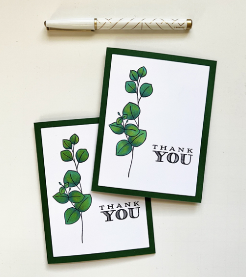
These two cards were made last week prior to the memorial service to thank our pastor and organist for their participation in the memorial service.

LeavesX2

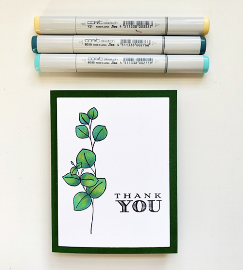
I pulled out one of my all time favorite Simon Says stamp sets, Be Kind. After stamping the leaves on white cardstock I colored them with Copic markers, using two blue markers that I blended with a yellow marker. I’m really pleased with how it worked.

LeavesCopics

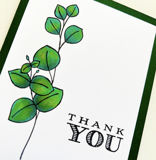
LeavesClose

The sentiment is from another favorite set, Thank You Kindly, by Papertrey Ink.

These cards fit two Clean and Simple Challenges open now:  Less Is More: Anything Goes and Addicted to Stamps and More: Any Occasion.

Less Addicted


Catching Up

  • by

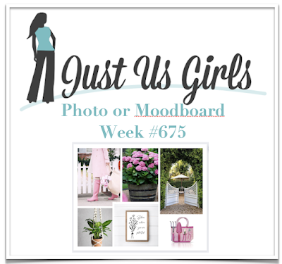
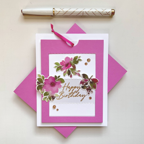
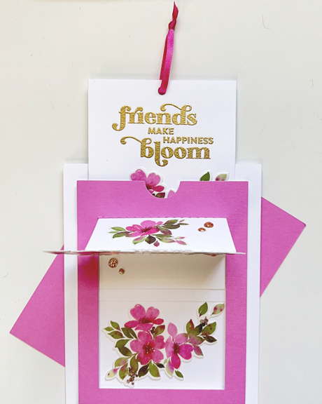
It’s been hard to find time to get back to crafting, but I finally made one of the last two cards from the February Create and Connect event. It’s an interactive slider card, and the dies make creating it so easy. The class event used a new Washi tape suite called Fruitalicious, but I opted to use a floral Washi tape suite, In the Meadow, that I already owned. The pink flowers were inspired by the Just Us Girls Moodboard this week. I haven’t had a chance to play along since February when I was Guest Designer for a month, and I’ve missed playing along with their fun challenges. 

JUGS #675

Here’s the card (almost) flat. It does easily fit into an A2 envelope.

SliderBD

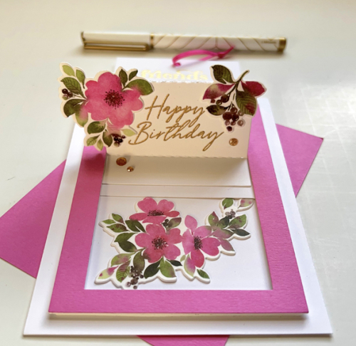
When you pull the tab, a second message emerges from the top, and another set of florals is revealed behind.

SliderBD2

Here’s the message that pulls up:

SliderBDUp

I made this card for one of my best friends, and knew she’d love the pretty florals. The sentiments are also from Pinkfresh Studio: Friendship Blooms, and Beyond Happy.

I’m also sending this off to Seize the Birthday: Anything Goes. This is another challenge I’ve missed playing along with. I keep forgetting that you always have the option to use any kind of birthday card!

STB-AnythingGoes


Color Hues #62

  • by

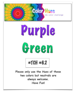
Cindy has chosen a great color combination for this round of Color Hues: Purple and Green.

CH # 62 Purple and Green.001

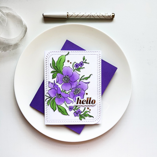
I couldn’t resist the chance to break out Pinkfresh Studio’s Nothing But the Best stamp, stencil, and die set. It was part of the package that I received for the February Create and Connect event. We used watercolors in class, but I chose the stencils this time. 

CH62

Over time I’ve acquired a few sets of Simon Says Pawsitively Saturated Inks which are fabulous for ink blending and come in set of three. I used the two lighter shades for the large flowers and then the darkest shade for the centers of the small flowers. The centers were colored with a gray Copic marker, and I added some dimension with a black Glaze pen.

CH62Close

After die cutting them, I arranged the florals on the large Rounded Braided Rectangle that was also included in our kit, but was made available during the March release. The gold foiled sentiment and Gold Glitter Drops are also from Pinkfresh Studio.

I hope you’ll check out all the amazing cards created by our Guest Designer, Amanda, and the Design Team on the Color Hues blog, and then add your own creative take to the gallery. 

March Roadtrip

  • by

Before the month slips away, I’ve promised some folks some photographs of our March Roadtrip. We were gone three weeks and traveled first to Wisconsin to see Sarah and her family (I took almost no photos!), then on our way to the Florida Panhandle we stopped for brief visits in Indianapolis, IN, Nashville, TN, and Montgomery, AL. After two nights on the Panhandle we joined friends on Longboat Key for several days. On the way home, there were stops in Savannah, GA (no time to explore, but we’ve been there several times), Roanoke Island, NC, Richmond, VA and Pittsburgh, PA. 

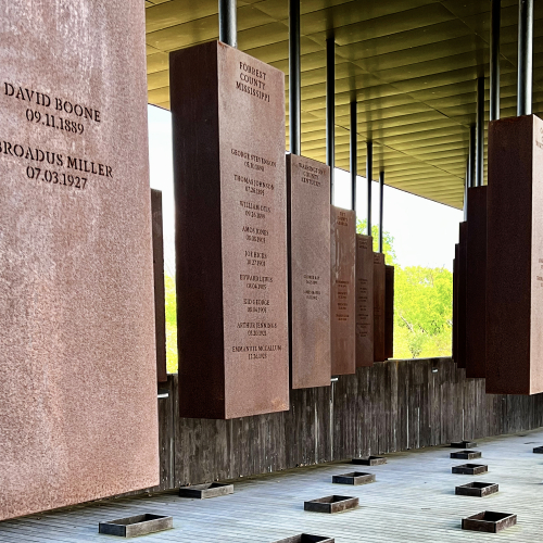
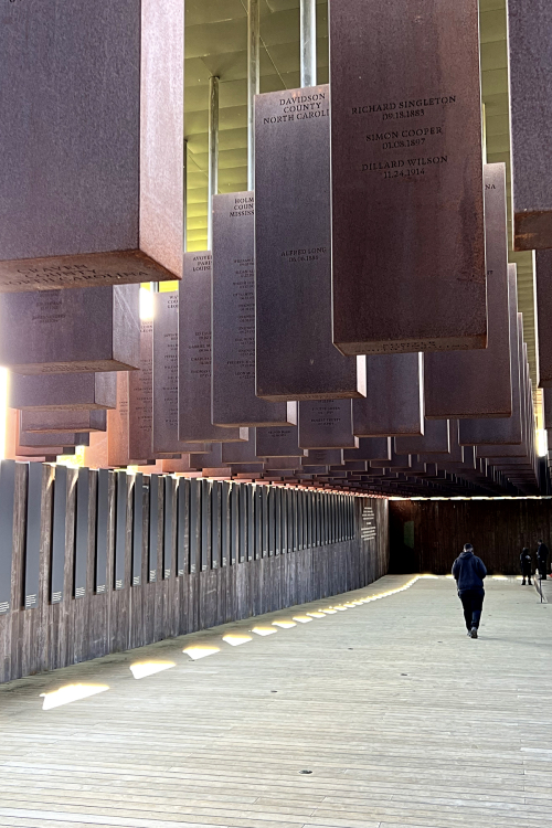
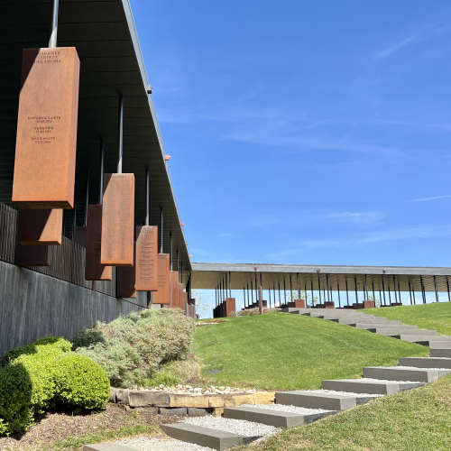
Two stops proved to be the highlights. The first was in Montgomery where we visited the Legacy Museum and National Monument for Peace and Justice. It was a sobering and moving experience. Both were organized and developed by Bryan Stevenson’s Equal Justice Initiative. If you haven’t read Just Mercy or seen the movie of the same name, I can highly recommend both. You can read more about the organization here. The Legacy Museum does not allow photographs inside. We spend 1 1/2 hours there and barely touched the surface of what is presented. More information here.

The second highlight was not in the least somber. We had been told about the Phipp’s Conservatory in Pittsburgh, but had no idea we’d be so lucky to arrive during their annual Flower Show. We were able to get timed tickets, and I took more photos here than on the rest of the trip combined. I’ll be back soon with a blog post devoted to flowers.

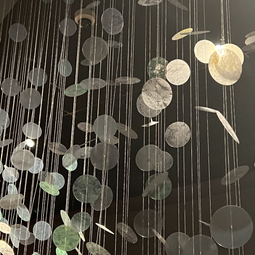
The Eiteljorg Museum is devoted to Native American art. It’s a lovely museum. We had an excellent lunch in their cafe, and here are two of my favorite photos.
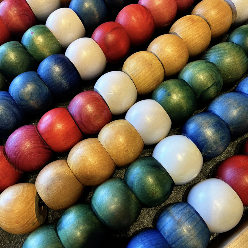
IMG_8163

IMG_8169ed

A year or two before the pandemic, we spent a few days in Nashville, and enjoyed it. This time we, once again, headed right to Parnassus, a wonderful bookstore owned by Ann Patchett and a friend of hers. We both left with new books in hand, two of which I read while on our trip. Pineapple Street is a light read and just perfect for a road trip. Still Pictures: On Photograph and Memory is a memoir based on family photographs by Janet Malcolm. It probably isn’t everyone’s “cup of tea,” but I loved it. I have a terrible memory of my childhood which was certainly a happy one, but I do think I could take some photos and write a brief essay about it which would make a great project for the winter months. No photos there, but I do have a couple of the main drag in downtown Nashville, taken on our way to the Ryman Auditorium where we saw Margo Price in concert.

IMG_8190ed

IMG_8204ed

Oh, and we had the best dessert of the trip at Hampton Social. Their version of banana cream pie (Tracy’s favorite) was served on a hot waffle with a huge mound of whipped cream.
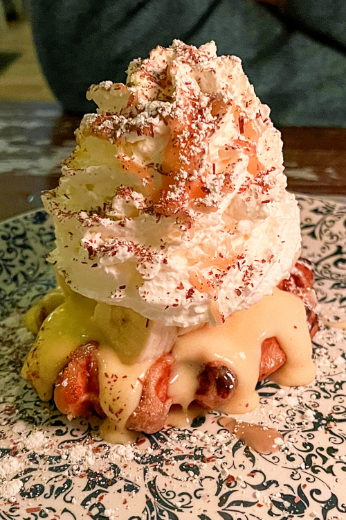
IMG_8198ed

Here are some photos of the National Monument for Peace and Justice. It’s a powerful statement of the cruelty directed to Black Americans. Each large rectangular block lists the names (if known) and the date of the lynchings by county in every state. Some counties had so many lynchings the font was tiny and there were two columns of names. This racially motivated and sanctioned terror prompted millions of Black Americans to migrate to the northern states. 
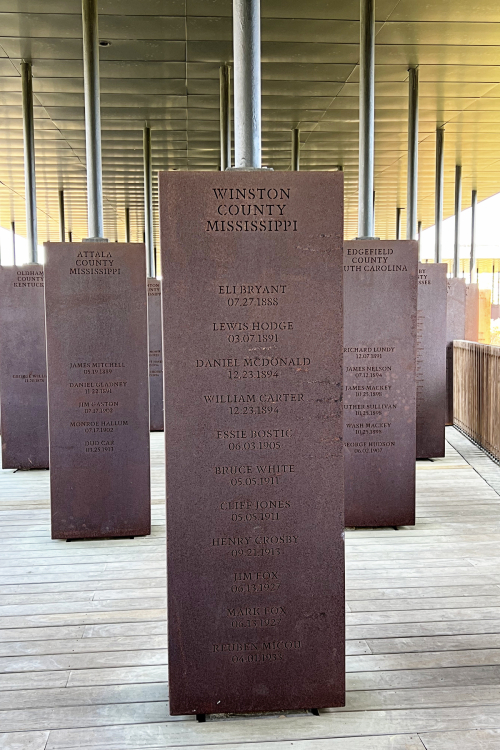
IMG_8216ed

IMG_8219ed

IMG_8220ed

IMG_8227ed

For quite a few years I’ve read about a “charming” town on the Florida Panhandle. In fact, in our opinion, there aren’t any charming towns on the Panhandle. It’s basically a long road filled with condominiums and rentals with “locked” beaches. You can only get on the beach in the populated areas if you have a code from the place where you are staying. We were not staying at any high end rental, so this is the only photo I got of the beaches.
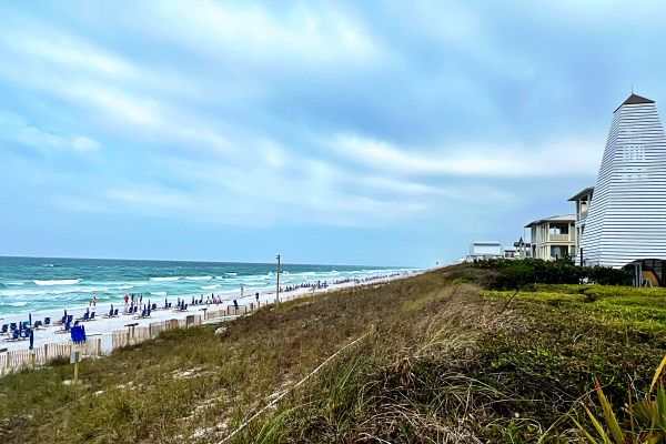
IMG_8236ed

We did find some nice places to eat, and we spent our full day there exploring the different areas (I wouldn’t call them towns, but that’s what it looks like on a map.) We wouldn’t choose to return.

Longboat Key, on the other hand, is lovely and we spent five days with our friends there. Before the pandemic we rented a place there for two weeks several times with our friends. They now rent for two full months, which we are not interested in doing. But we do love visiting!
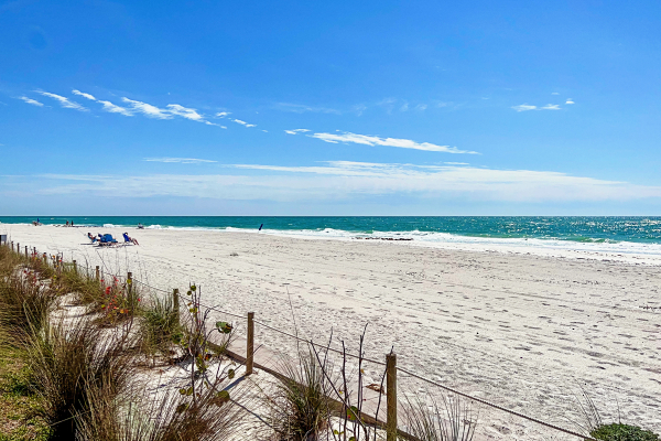
IMG_8280ed

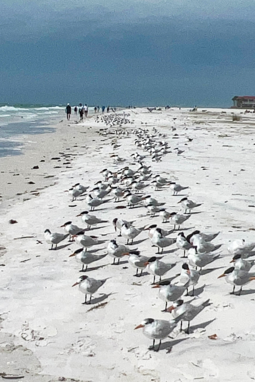
The beach on Longboat certainly is a contrast from the one above this!
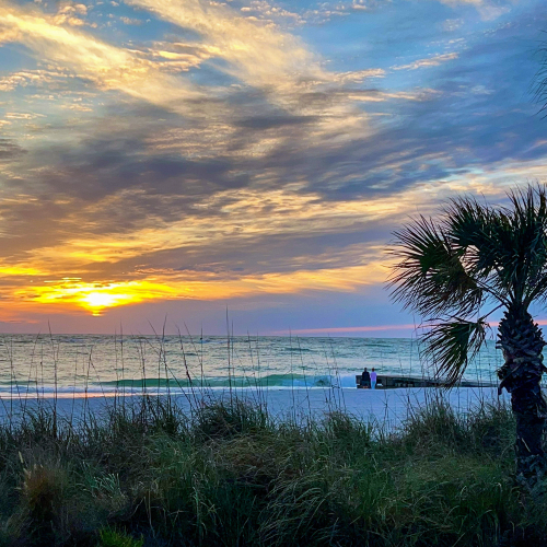
IMG_8304ed

IMG_8306ed

There are more birds than people on the beach.
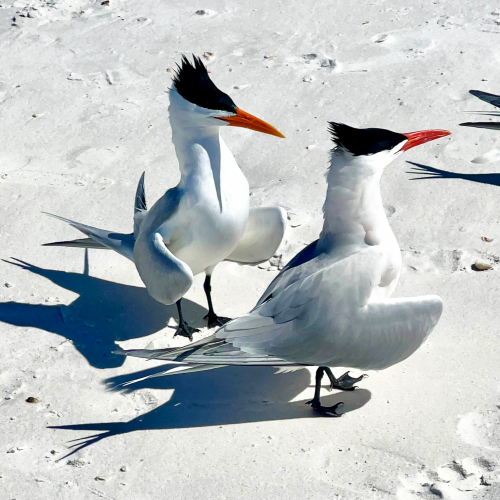
IMG_8332ed

IMG_8394ed

Another highlight of our time on Longboat was an opportunity to meet in person two women I know through Instagram and the Color Hues Design team.
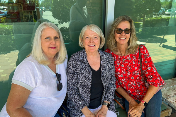
IMG_8277ed

Our first stop on the way home was Savannah. We paid for all our hotels with points we’ve accumulated so when we could, we booked rooms with a view.
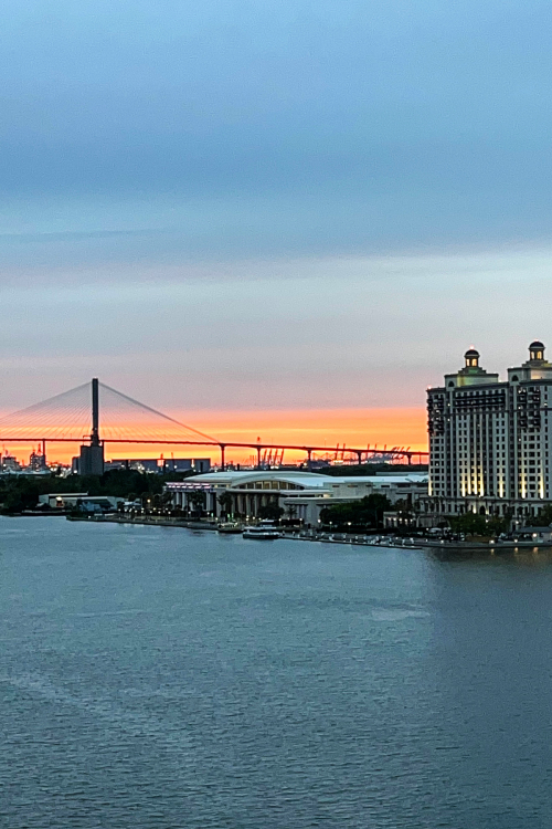
IMG_8412ed

We were right on the River Walk, and walked the length of it which was a great thing to do after being in the car all day.

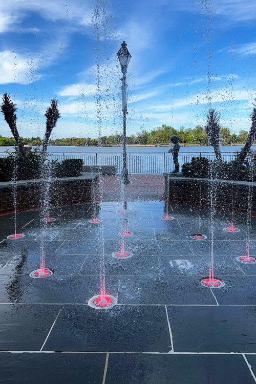
IMG_8405ed

IMG_8407ed

Our next stop was in Raleigh and visited the Duke Chapel and Gardens.

IMG_8437ed

IMG_8440ed

I gave Tracy a book, Blue Highways, for Christmas and our stop on Roanoke Island was a result of curiosity raised by the book. Once again, I took few photos, but this one was taken near the restaurant where we had lunch.
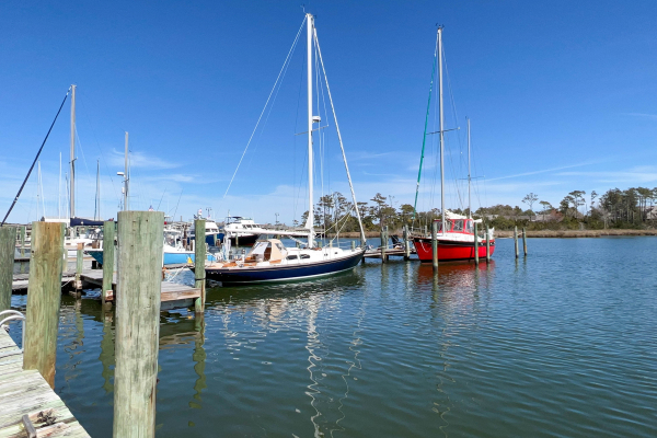
IMG_8445ed

We arrived in Richmond, VA too late to do more than find a place for dinner, and the rest of the photos from the trip are of Phipp’s Conservatory Flower Show. I’ll try not to overwhelm you with photos from that in a later blog post.


New Arrival

  • by

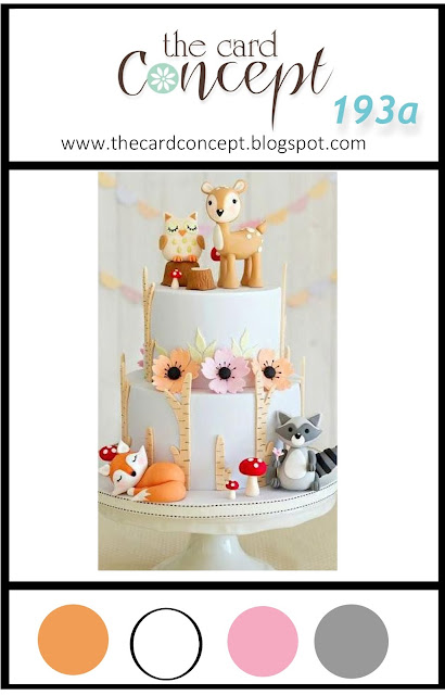
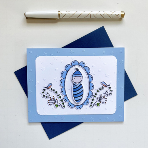
I’m attending a baby shower for a friend’s daughter on Saturday, so the Card Concept Challenge: New Arrival was so timely.

TCC193a 041223

The expected baby is a boy, so I took my inspiration from the theme rather than the colors. I decided against a sentiment on the front of my Clean and Simple card.

BabyShower

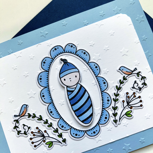
I embossed both the card front and the white layer with Spellbinder’s Star Gazer embossing folder. The images are from Waffle Flower’s Little One Baby set which I colored with Copics and then die cut. I added some dimensional tape behind the baby.

BabyShowerClose

We’re having unusually warm weather with lots of sunshine. Even though it won’t last quite yet, it’s such a welcome change. I’ve managed a bit of crafting between packing and then unpacking all the items on a built-in desk in my office/craft room. The painting is done for that portion of the project, and I took the opportunity to organize and purge my book collections on photography, watercolor, sketching. There are two big bags ready to donate to our library. Like working on the inventory of my stamps and dies (still ongoing), one of the biggest bonuses to this kind of organizing is knowing (once again) what I have! 

Easter Bunnies

  • by

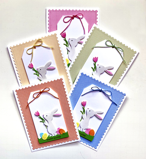
There’s a lot going on here, including some painting in my craft room/office which is complicating my efforts to get some serious card making done. Some of it I can’t share for awhile, but two of these Easter bunnies are now on their way to Wisconsin, and the rest will be hand delivered on Sunday.

5Bunnies

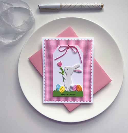
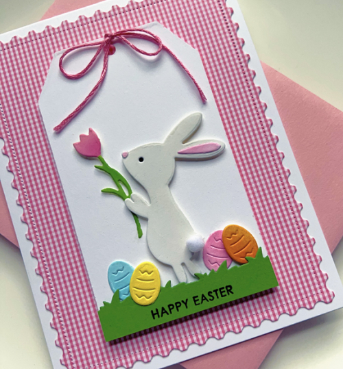
I’m trying to get away one more year with giving each of the grandchildren the same card with different colored backgrounds. Next year, there will be two in middle school, and I may have to find some more sophisticated images. Nonetheless, I love this new Bunny Kisses die cut that was part of the most recent release from The Greetery.

PinkBunnyFull

I die cut all the pieces from white cardstock, and then ink blended each piece with Distress Oxide inks. They were arranged on one of the Tag Team Duo tags also from The Greetery. The grass was die cut with one of  the Simon Says dies in the collection Box Card Borders. Three of the bunnies got a tiny pom-pom added for the tail. I decided against that for the two that needed to be mailed.

PinkBunny

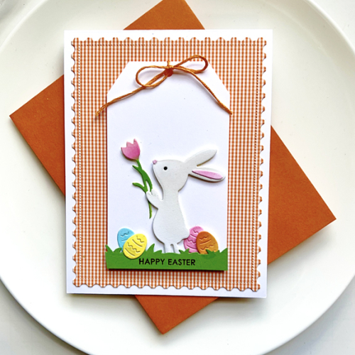
The patterned paper backgrounds from very old AMuse papers were die cut with The Greetery Postal Frame die.

OrangeBunnyClose

Here’s a bunny without the pom-pom tail. The sentiment is from Sugar Peas Everyday Sentiments.

As you might expect there are quite a few challenges calling for Easter/Spring cards. One of these is headed to: 

Colorful Options: Pastels (some of these definitely qualify) or Rainbow
The Four Seasons: Anything Spring
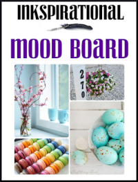
Inkspirational with a Moodboard for Spring and Easter
NBUS – This is the first run for Bunny Kisses

We’re expecting rain and very warm temperatures today, then chilly again through the Easter weekend. I hope the long range forecast is accurate which call for temps in the 50’s and 60’s for the week after Easter. I’m so ready for some green to show up!


Color Hues #61

  • by

It’s April first, and there’s no fooling around here! I’m back to share the next Color Hues Challenge chosen by Stef:

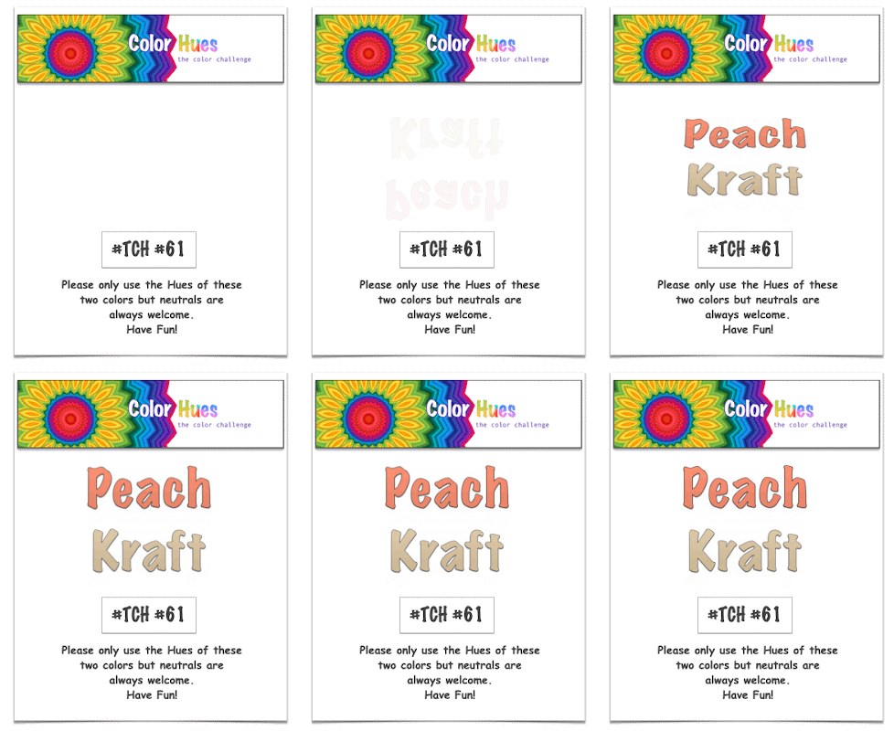
Color Hues #61 Peach and Kraft Anim.

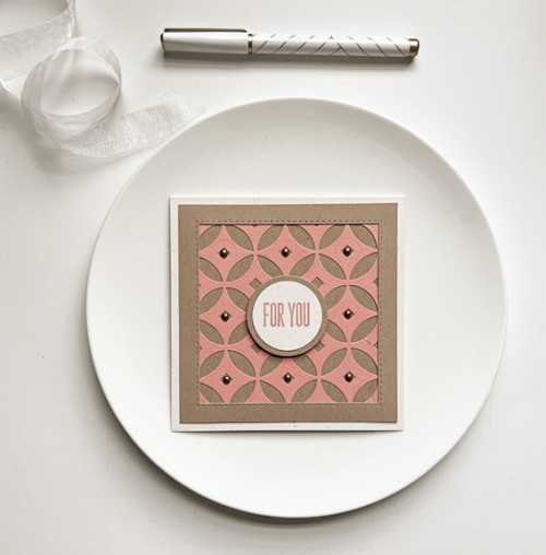
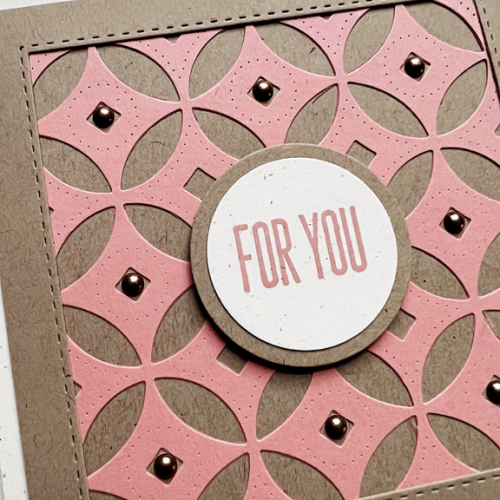
One of the things I love most about this challenge is working with color combinations I would never think of myself. This is one of them, and I turned to a new favorite coverplate of mine,  Decorative Circles by Papertrey Ink. I waited a long time for this to be back in stock, and it was worth the wait. It covers an A2 sized card, but this time I cut it down to create a square card.

CH61

My best match for peach cardstock was Concord & 9th’s Grapefruit which I paired with Classic Kraft and Rustic Cream, both by Papertrey Ink. I created a frame using Simon Says “Stitched Squares” die.

CH61Close

I wanted a simple sentiment on a circle die to coordinate with the coverplate, so used Ellen Hutson’s Essential Circles die. The sentiment is from Waffle Flower’s Classic Sentiments. Finally I added some Pinkfresh Studio Metallic Enamel Dots to the center of each circle. 

Please hop over to the Color Hues blog to see what our Design Team has created with this color combo. It’s sure to inspire you, and I hope you’ll add your cards to our gallery in the next two weeks!

Woodblock Wednesday

  • by

I’m flying right under the radar for this challenge. We’ve been on the road for three weeks, and it’s taken me a day or two to get to the crafting table. Then when I got there, it took awhile to get a card I was happy enough with to post. We were still on the road on Wednesday when the Woodblock Wednesday challenge went live.

Featured-woodblock-Wednesday-graphic-copy-1

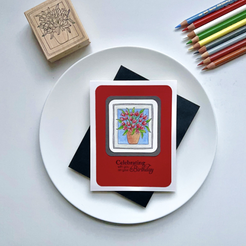
I love this wooden stamp from Lockhart Stamps. It’s many years old, but I don’t remember where I purchased it. The tulips are one of the earliest signs of spring, so it seemed like a good choice.

Tulips

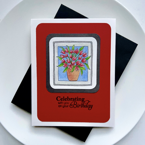
Since the image is so small, I decided to get out my colored pencils. It took two tries to get an image I liked, but when I photographed it, I decided it still needed work, and got out the Gambol and a stump to even out the background and the frame. I realized that the tulips needed more contrast, so for the second try I used a white pencil to color all the flowers before adding the red. For the leaves, I started with a yellow pencil and then added the green.

TulipsClose

The sentiment is from a very old (but not wooden) stamp set by Papertrey Ink, Delightful Dahlias:  Additions. I used a paper punch to round the corners of the stamped image as well as the red layer.

I’m also sending this to the Seize the Birthday: Things in a Garden and Inkspirational: Easter/Spring.

03-23-ThingsInAGardenInkspirational#286


Color Hues #60

  • by

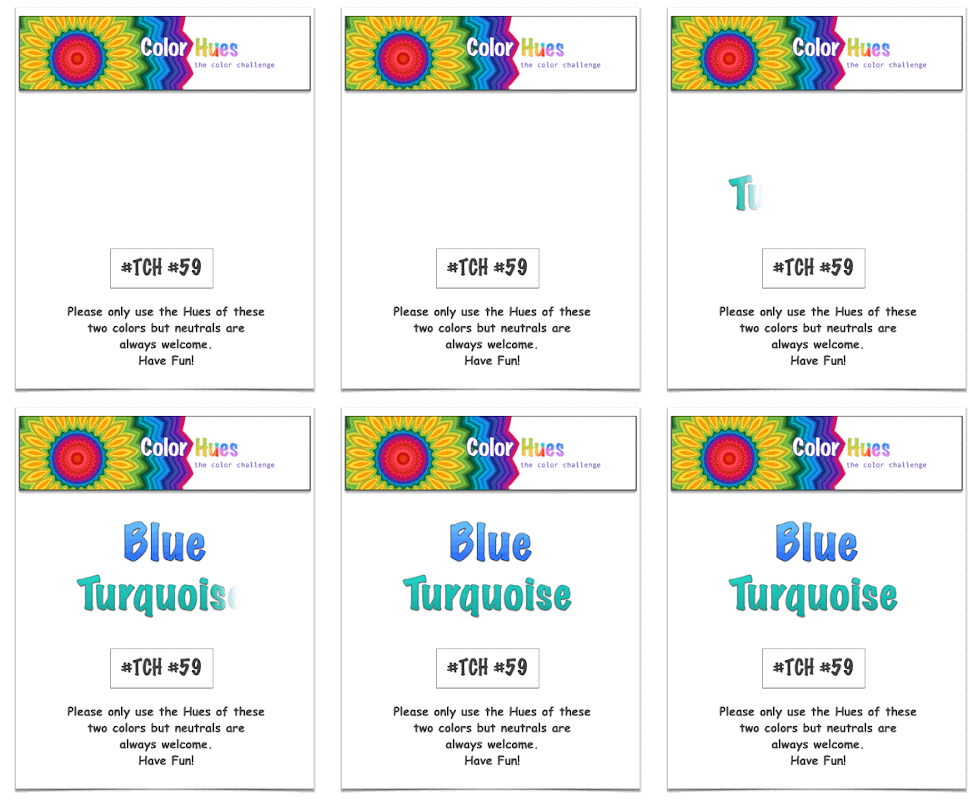
It’s hard to beat a prettier combination that Blue and Turquoise. There are so many way to go with this set of Color Hues chosen by Marcia.

CH #59 Anim.

It will be no surprise to you that I went the Clean and Simple route and chose die cuts once again.

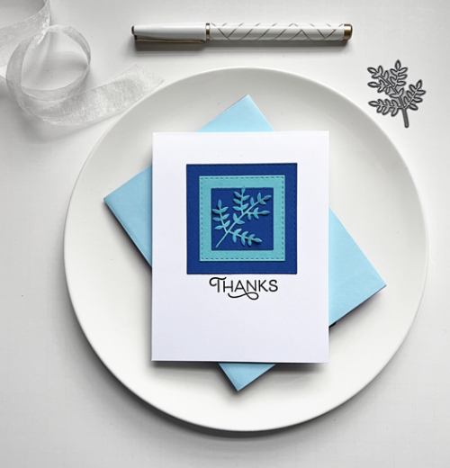
CH59BlueTurquoise

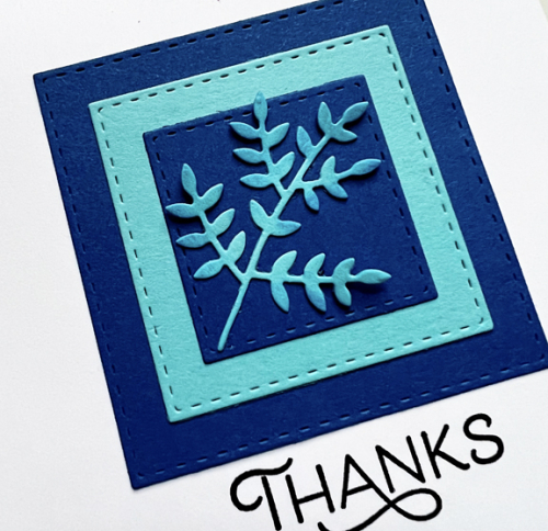
I started by die cutting a stitched square by Simon Says from Paper Source’s Royal cardstock. I first discovered this cardstock last fall, and used it for one of my favorite Christmas cards. I then layered two more stitched squares from turquoise paper (from my scrap file) and another from the Royal cardstock. I die cut Poppy Stamps’ “Leaf Sprig” from the turquoise and adhered it to the square.

CH59Close

I ink blended a bit of blue ink on some of the leaves, but I’m not sure I really love that. I do like the pretty sentiment from The Greetery’s Spring Mix stamp set. 

I hope you’ll hop right over to the Color Hues Challenge and check out the great cards created the Design Team. We’d love to see the gallery filled with your pretty Blue and Turquoise creations!


The Flower Challenge: Die Cuts or Stencils

  • by

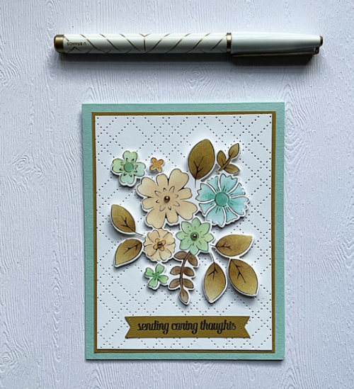
Or both, I hope. I used a favorite Pinkfresh Studio floral hot foil plate, coordinating coloring stencil, and die to create a card today for the current Flower Challenge.

TFChallenge#78A

As much as I like coloring with Copic markers, coloring with stencils is quite a bit quicker, and there’s not much room for error.

CaringThoughts

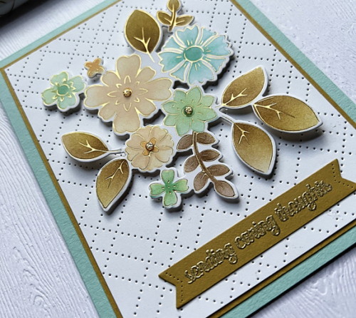
I chose a very different color palette this time: aqua blue and shades of browns, but I quite like it. I foiled the image in gold, then colored it with stencils before using the die to cut it out. 

CaringThoughtsClose

It’s quite easy to add a bit of dimension with the stencils by using a heavier touch with the color to the base of the leaves or the centers of the flowers. I also added three gold pearls to the centers of three flowers.The florals and sentiment which I gold embossed and die cut to create the banner were arranged on a diamond cover plate, with a thin brown border on a beautiful piece of textured aqua paper that I found in my stash. The sentiment and banner die are by The Greetery.

This is a great challenge, and I’m sure I’ll be back with some other entries before it closes.