Skip to content

Crafty Weekend: Part 1

  • by

Last weekend I spent two days immersed in card making with Pinkfresh Studio. There were six classes with two hour videos for each, as well as printed instructions for “Make & Takes” for each set of products. I didn’t deviate much from the instructors’ card designs, but I thought over the next week or so, I’d share some of the cards I created during the event. All the products were created especially for these classes, although many of them will eventually be released for purchase. I definitely had my favorites, but with one possible exception, you’ll see lots more of these products.

First off, Nothing But the Best. This set was the focus of a two-hour class on watercolor technique. Before the classes began, I created the Make & Take. All the instructions and sample card designs for the Make & Takes as well as the class instructions were sent ahead of time in a lovely booklet. There were also lists of card bases and die cuts to prepare as homework for each class which enabled you to keep up during the class instruction.
Yay

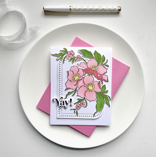
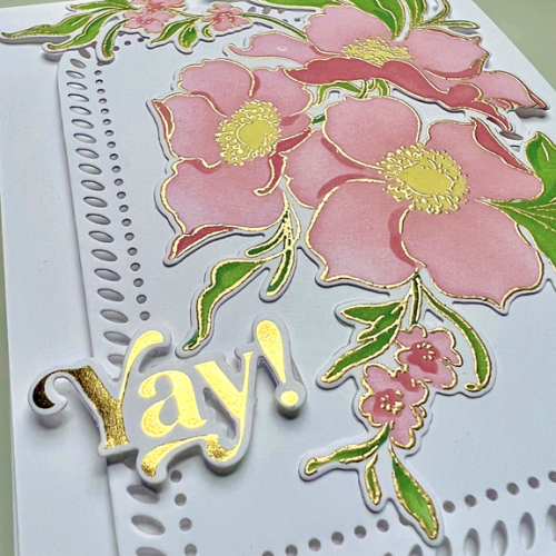
For the Make & Take, I used layering stencils instead of watercoloring. I followed the card design, but my coloring was more vibrant that those suggested. 
YayClose

All the participants received a packet of pre-foiled sentiments. The one used in the sample covered a large portion of the floral design so I chose a simpler, smaller one knowing it could easily be used for a birthday or another celebration. The lovely Rounded and Braided Rectangle (in three sizes) was used over and over in the card designs, and is one of my favorite products. 

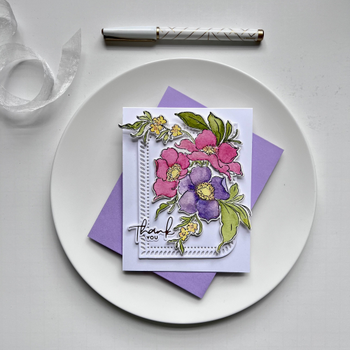
The two-hour class time for this set was spent learning about watercoloring: mixing colors, finding the right water/paint ratio, and layering watercolors. It reminded me of how much I enjoy that medium, but don’t use it often enough. 
Watercolor

There was no assembly of the card as part of the class, and I used the same design I used for the Make & Take which I preferred to the suggested design. For this card, I used a foiled sentiment from Spellbinders.
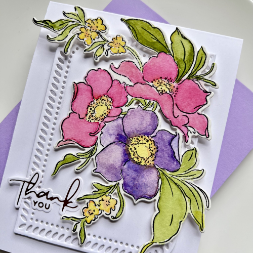
WatercolorClose

We completed a second watercolor panel, but I wasn’t happy enough with it to create a card. I’ll definitely return to this again!
Guest Designer at Tic Tac Toe

  • by

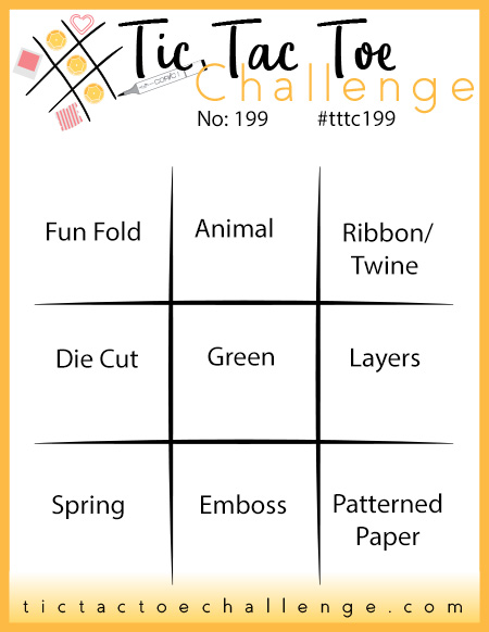
In November, my entry into the Tic Tac Toe Challenge was the Designer’s Pick, and today is my turn at guesting with them. As soon as I saw the new Tic Tac Toe board, I knew I had a perfect opportunity to create a birthday card for my husband.

Tttc-challenge-board -199

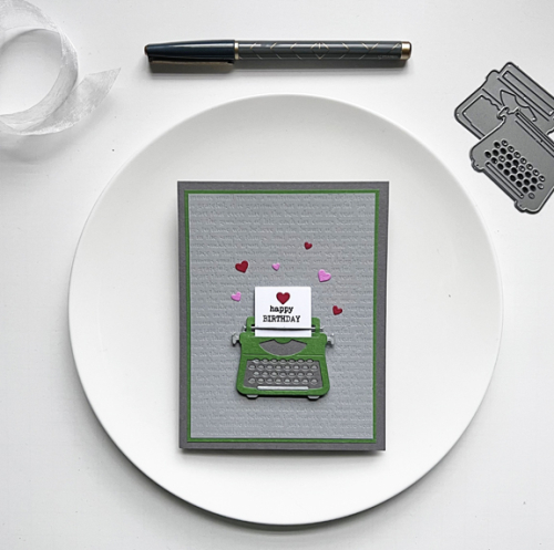
Tracy was born on St. Patrick’s Day, so the middle row (Die Cut, Green, and Layers) worked perfectly. I had already settled on the die and stamp set I wanted to use before I saw this board, but it worked out perfectly.

TOW

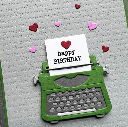
I’ve owned this You’re My Type from Sugar Pea Designs for several years. A friend borrowed it once and made a card, but I’d never used it before. I die cut the typewriter in three colors: green, gray, and matte silver. 

TOWClose

After assembling the typewriter and message, I remembered an old Impression Plate, Book Plate, by Papertrey Ink. You can see the typewriter style words embossed on the light gray layer. I opted for a narrow green border before adding the main panel to a darker gray card base. The hearts were added to coordinate with the inside greeting:

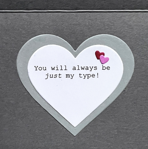
TOWInside

The stamp set didn’t come with quite the message I wanted so I used the computer to generate the sentiment which I die cut with Hero Arts Infinity Heart dies.

There are lots of ways to play Tic Tac Toe this time, and I hope you’ll join it. 

Color Hues #59

  • by

Carol has chosen the perfect color combination for our early March Color Hues Challenge: Green and Gold. Typically, I’d jump right in with a St. Patrick’s Day card, but this time I had other ideas.

Ch # 60 Anim.

I received a lovely gift certificate to Pinkfresh Studio from my son and his family for Christmas. I ordered just one design (plus the stencil) from the December release, and thought it would be a great one for this color combination.

CH60GreenGold

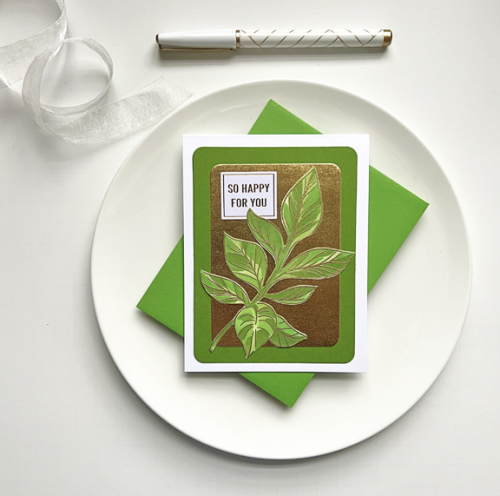
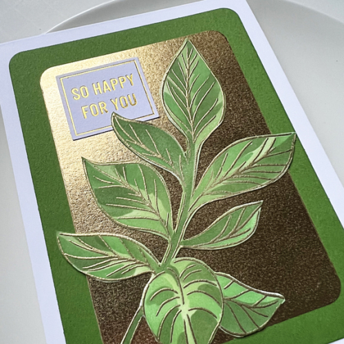
This Detailed Leaf  is so lovely, and I’ve seen it stenciled in a wide variety of colors, but I used my trio of green inks from Simon Says Pawsitively Saturated Ink which ink blends beautifully. The leaf was embossed in gold before adding the stenciling, and I fussy cut it since I didn’t purchase the die. 

CH60Close

When I went to my file of scrap metallic papers, I found this gold metallic that had already been die cut with Hero Arts Rounded Rectangles which was the perfect size. After layering the leaf on the gold, and then on the bright green card base, I found a perfectly-sized sentiment in the Pinkfresh Studio “Die Cut Sentiments” I purchased last year. So much luck!

I hope you’ll join us at Color Hues and fill up the gallery with Green and Gold. Hop over now to see what our Guest Designer and the Design Team have prepared for your inspiration. I love the diversity of the cards that show up month after month on the Color Hues blog!

Just Us Girls Challenge 668

  • by

Time usually goes by quickly for me, but it seems amazing that today is my last post as the February Guest Designer for Just Us Girls. It’s been a real pleasure, and I received such a warm welcome from their Design Team. The last challenge of the month is a Clean and Simple Challenge asking for coloring.

JUGS #668

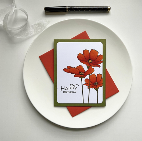
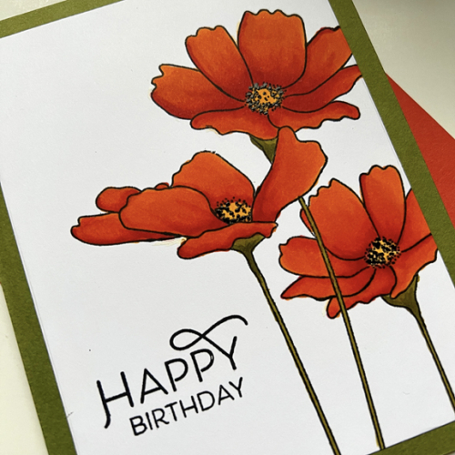
And that’s right up my alley! The only decision was what to choose. Another of the stamps I discovered as I was working on an inventory of my stamps was Flowers in Bloom from My Favorite Things. I love these poppies, and it’s been a long time since I colored them. They lend themselves beautifully to a CAS design.

JUGS#4Poppies

I love poppies and especially the red/orange ones that grow in the George Eastman gardens during the summer. We don’t get enough sunshine for poppies in our yard, but I’ve photographed the ones at the Eastman Garden multiple times. 

JUGS#4PoppiesClose

I pulled out my Copics for this one, and I’m very happy with the results. I added some black gel pen to the stamens which give just the slightest bit of dimension. The beautiful sentiment is from The Greetery’s Spring Mix. All that was needed was adhering it to a card base created with Gina K’s Asparagus cardstock—another favorite of mine.

I’m quite sure there will be a lot of great inspiration from the Just Us Girls Design team. This is really a very open challenge–so many ways to interpret it. I hope you’ll find just the right thing and join in the fun. Thanks again to the JUGS team for inviting me to play along this month! I’ve had a great time.

I’m also entering this in the CAS on Friday Challenge: Flowers.


Three for One

  • by

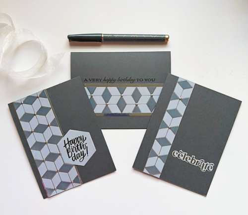
I spent a morning hot foiling some backgrounds last week, and ended up cutting one of them into pieces and creating three masculine cards. I wish I’d thought of this before!

3for1

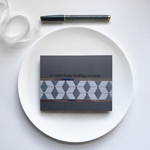
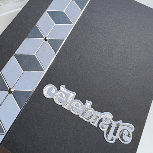
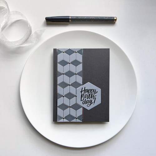
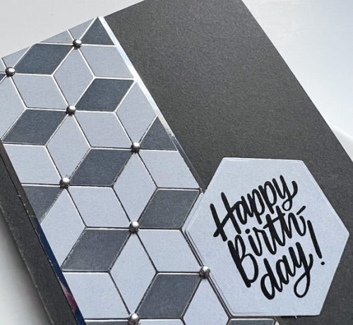
I hot foiled the Pinkfresh Studio Geo Blocks on Concord & 9th’s Dove gray cardstock. The cardstock is so smooth, the hot foiling is perfect every time. I only used one of the three coordinating stencils to add a darker gray to the panel. I liked the overall look, but thought it might be divided as well, and I do like all three versions.

VeryHappyBD

VeryHappyBDClose

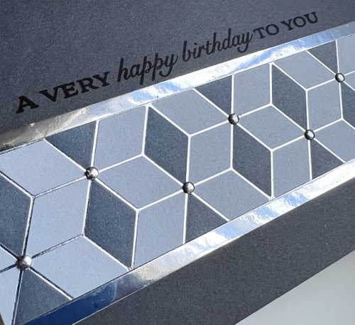
The sentiment for this card is from Papertrey Ink’s Banner Sentiments. I used a shiny silver border for the hot foiled piece and some silver nailheads as an accent.

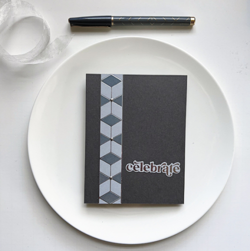
The second card is a top-folded card and very Clean & Simple:

Celebrate2

Celebrate2Close

The sentiment was also hot foiled with Pinkfresh Studio’s Wonderful Words hot foil plate–one of my purchases with a Christmas gift card.

Just by chance, I happened to find Simon Says Hexagon Greeting and die. Who would have guessed the hexagon was an exact fit to the hot foiled design?

HexagonHB

HexagonHBClose

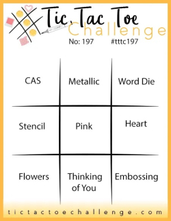
More metallic nailheads here as well. I think they’re a perfect embellishment for masculine cards. I need all three of these for birthdays in March so it was a very productive crafting session. I’m sending one of these off to Time Out: Anything Birthday and the CAS one to Tic Tac Toe Challenge (top row across: CAS, Metallic, and Word Die,) hoping that the die cut stamped sentiment counts for the last element.

Badge TO Challenge 232 TTTC-197 copy

Just Us Girls Challenge 667

  • by

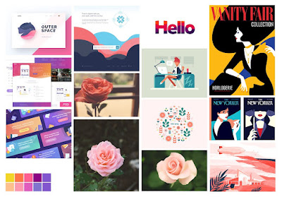
It’s already the third week of February and the third challenge of the month for Just Us Girls. This time it’s a Moodboard and there are so many ways to find inspiration here.

Photo or MoodboardJUGSHello

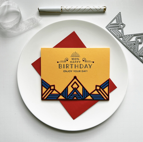
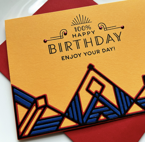
I asked for a bigger photo, so I thought you might like one, too. I was immediately draw to the upper right-hand photo of the Vanity Fair magazine cover. I love the bright yellow, red, and blue color combination and the Art Deco feel of the design. One of my favorite Pinkfresh Studio dies is the  Gatsby die set, so I set off to use that die with the same color combination.

JUGS#3

Gina K’s “Red Hot” cardstock, “Royal” by Paper Source, and Summer Sunrise by Papertrey Ink were good matches. There’s also a lot of black in the magazine cover, so I stamped the greeting in black and added black to the border design as well. The Greetery’s Everyday Labels also has the Art Deco feel to it, and fit perfectly in the open space. My son’s birthday is later this month, and he’ll appreciate the design.

JUGS#3Close

The border was die cut once in red, black and blue and pieced together. The only embellishment were the red metallic nail heads which fit perfectly on the sentiment.

Truly, this has to be one of the most versatile Moodboards I’ve ever seen. I think I could have created multiple, and very different, cards using it. But I’m pretty sure, I’ll come back to this design again. I’ll be checking the JUGS gallery to see what you and others have found inspirational as well. And do check to see what the Design Team has come up with already! 


Color Hues #58

  • by

It’s happened twice now, blog posts scheduled to go up at a specified date have either refused to go up (and needed to be rewritten) or in the case of today’s posts, simply disappeared. I know I wrote it because I had to have a link for it to go up on the Color Hues Blog today. Ah, well. 

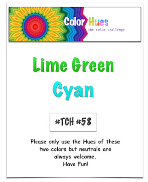
Tracey has a fabulous color combination for us today: Lime Green and Cyan.

CH #58 Lime Green and Cyan.001

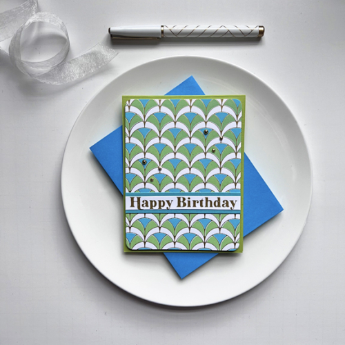
I returned to a favorite hot foil plate for this one—Pinkfresh Studio’s Geo Arches and the accompanying stencil.

CH58

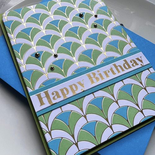
I used just two of the three stencils, and love the way it came out. I added some Pinkfresh Metallic Gold Pearls as an embellishment and a hot foiled sentiment from Spellbinders, Essential Glimmer Sentiments. I used the matte gold foil for the first time.

CH58Maybe

This is a rather odd angle for the photograph, but you can see both the foiled design as well as the foiled sentiment.

I hope you’ll hop over to the Color Hues Blog and take a look at the fabulous cards from our guest, Linda Snodgrass, and the Design Team. Please help us fill up the gallery with your Lime Green and Cyan creations!

New Floral

  • by

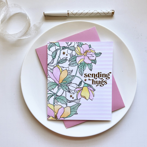
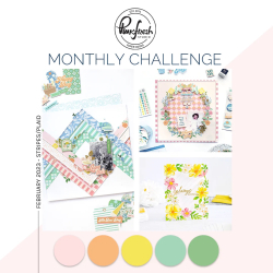
I used the last of my generous gift certificate from Christmas to purchase the Magnolia Pattern cling stamp and stencil from Pinkfresh Studio. It’s such an interesting stamp and stencil combination because only parts of the pattern are to be colored in, although you could color all the images with Copics or colored pencils. I loved the projects I saw during the release, and am looking forward to playing with the stencil using a variety of colors. This time I stuck with the colors of the February Pinkfresh Challenge. It also calls for stripes or plaid, and I opted for stripes.

PFSHugs

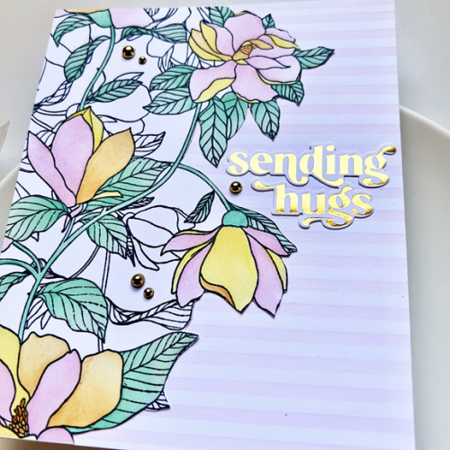
The whole stamp creates a 6X6 inch panel which you would have to cut down for an A2 sized card. Because I wanted to incorporate some subtle stripes, I fussy cut the image and then trimmed off the excess after I placed it on the card. The stenciling was done with Altenew’s Classy Stripes stencil with Ballet Slippers ink which was also used on the flowers.

PFSHugsClose

I chose a gold foiled sentiment from the Wonderful Words collection from Pinkfresh. The hot foil plate was also a purchase thanks to my son and his family. When I photographed the closer look, I managed to get the foiled sentiment to show appropriately, but not the Gold Metallic Pearls from Pinkfresh which do match the foiled sentiment.

Every month I aim to enter the Pinkfresh Studio Challenge, but it’s more “missed” than “hit,” so I’m happy to have this completed well before the challenge ends. I’m also entering it The Flower Challenge: Use Your Latest Stamps or Dies. And, of course to Darnell’s NBUS!

MonthlyChallenge-Feb23TFChallenge#77NBUS

Happy Valentine’s Day

  • by

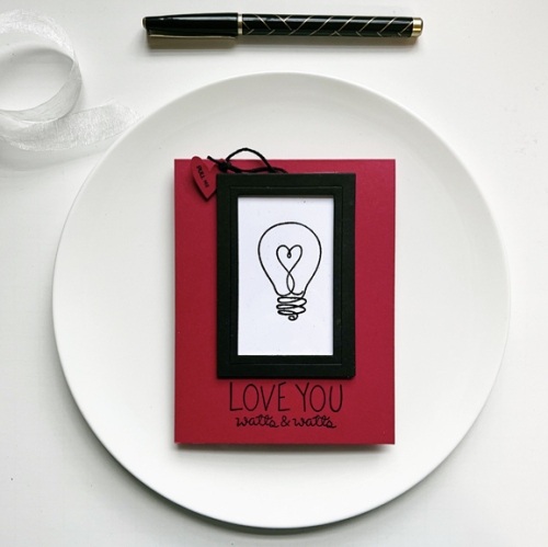
I saved a couple of valentines to share on Valentine’s Day. First off, my valentine for Caleb. I wanted to try a technique that I’ve seen online, and it worked well. I don’t know if it has a special name. The front of the valentine is very plain.

Watt1

I love the lightbulb with the heart from a very old Simon Says set Watts Up.  The punny sentiment which I thought Caleb would enjoy is also from an older Simon Says set, Light Me Up.

WattPull

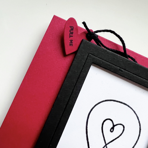
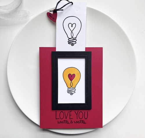
There’s a little heart “pull me” tag, and when you do, the colored light bulb is revealed.

Watt2

The frame is from the My Favorite Things A2 Rectangle Frames set. I’ve never separated the dies in that set, so when you die cut them all, you get the wider frame and a narrower one between. For this card I put one of the narrow pieces as well as the regular frame together as neither was quite wide enough to let the slider go in and out easily.

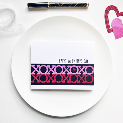
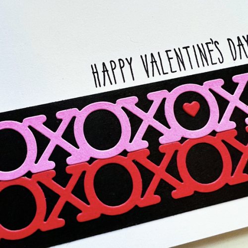
Another purchase from my win at Simon Says was the XOXO Border die. I die cut it twice, once in red and once in pink, added them to a black border and another quick and easy valentine was created.

XOXO

The tiny red heart was die cut with Hero Arts Infinity Hearts and the sentiment is from Papertrey Ink’s Keep It Simple: Valentine.

XOXOClose

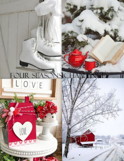
This card is off to two different challenges: The Four Seasons Challenge where the moodboard includes a valentine, and Simon Says Wednesday Challenge where the challenge is “Fun With Dies.”

4SeasonsMood Board

Valentines Part II

  • by

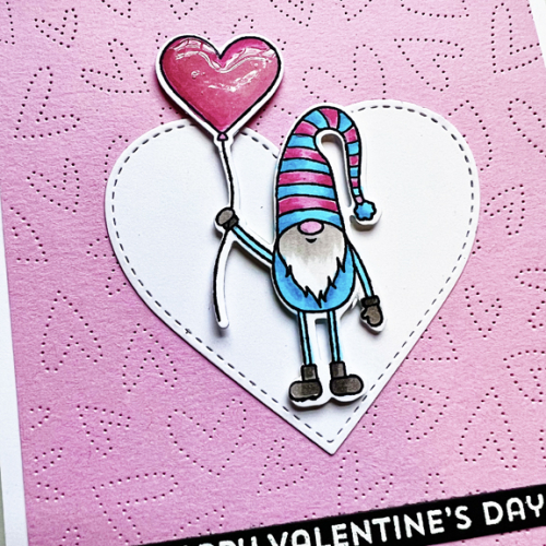
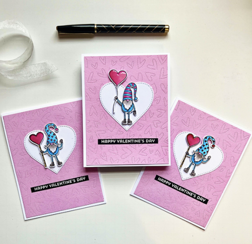
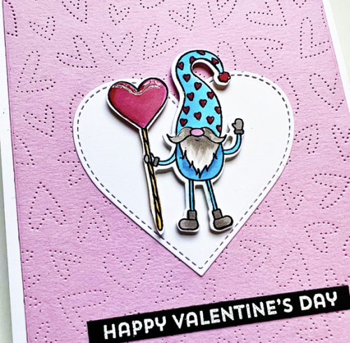
When I first saw the cute gnomes in My Favorite Things Love You Gnome Matter What I knew I wanted to use it for some of my grandchildren’s valentines. Before I even thought about the design, I stamped three different images (three times), colored them with Copic markers, and die cut them. I thought I’d use all three images on the front of the valentine, and I spent well over an hour trying to do just that. As you can see, I ended up with just one gnome—a CAS valentine—no surprise!

3Gnomes

There were two images of gnomes standing with hearts. I used the Honey Bee Fluttering Hearts Pierced Coverplate once again as a background, and added a simple white stitched heart from My Favorite Things. The little gnomes were added with dimensional tape.

GnomeClose

The sentiment, embossed in white, is from My Favorite Things Bitty Hugs and Kisses.

Gnome2Close

I added Nuvo Crystal Glaze to each of the hearts for additional dimension and a little shine. 

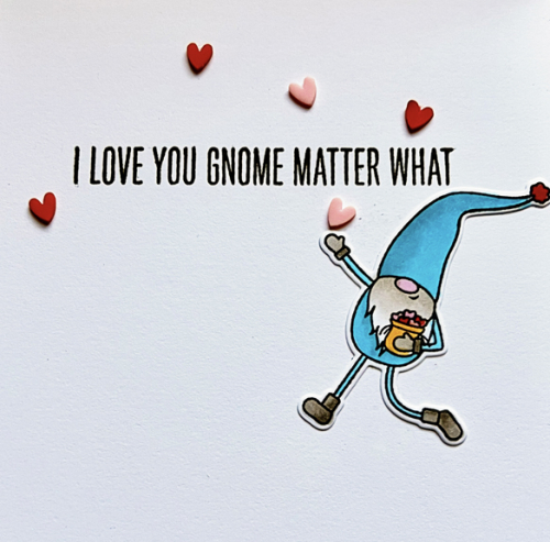
Not wanting to let the other gnomes go unused, I added a gnome to the inside of the card as well.

InsideGnomie

I love this little gnome running along throwing hearts in the air. I’ve had these tiny plastic hearts from Buttons Galore in my stash for several years and they worked perfectly!

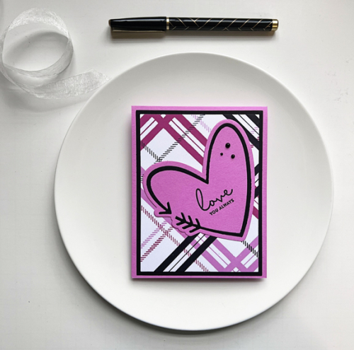
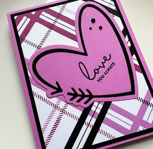
The next valentine also uses supplies from my stash. Quite some time ago, I purchased Concord and 9th’s Plaid Turnabout stamp. I had stamped a panel with pink, red, and black a few weeks ago, and didn’t have a plan for it at the time. To the rescue came The Greetery’s Heart Arrow once again. It was the only item I ordered from their last release, and I’ve certainly put it to good use this month. 

PlaidHeart

The sentiment is from Simon Says Love You Greetings. I won a $25 gift certificate during a recent blog hop, and this sentiment set was one of the purchases. 

PlaidHeartClose

As a final touch I added three black pearls to the heart. 

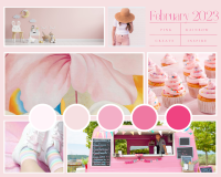
Colorful Options is looking for PINK this month, and I’m putting a second card in the Double D Hearts Challenge as well. I’m also linking up to Shopping Our Stash: Love is in the Air.

Feb2023Blog1DD hearts 23SOS-plain badge-300px

Just Us Girls Challenge #666

  • by

It’s Week 2 for February and Word Week at Just Us Girls, and it’s a fun one.

Word Week #666

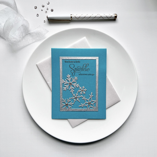
I have quite a list of birthdays on my February calendar, and one is a friend who does, indeed, “leave a little sparkle wherever [she] goes!”

Sparkle

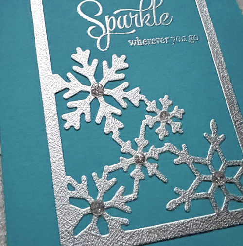
This wonderful Snowflake Corner Frame from Poppy Stamps is a new purchase. I die cut it in multiple sparkly and glittery papers, but loved this one which was a bit more subtle, but so beautiful and matched the silver embossing powder perfectly.

SparkleClose2

That “perfect for this prompt” sentiment from Papertrey Ink was embossed in silver on the teal card base. All that was left to do was add some gorgeous Pinkfresh Studio Champagne Glitter Drops to the centers of the snowflakes.

There are so many occasions that call for a bit of sparkle, I’m sure you’ll be inspired to join us at Just Us Girls this week.

Valentines, Part I

  • by

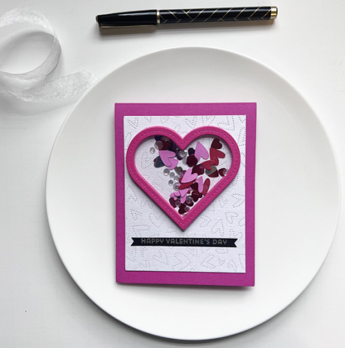
There’s still one valentine I want to make, but I have all I need with a few left over. Not surprisingly there are a variety of challenges looking for heart-inspired cards. First up for me is a shaker card I made for Hannah.

Shaker

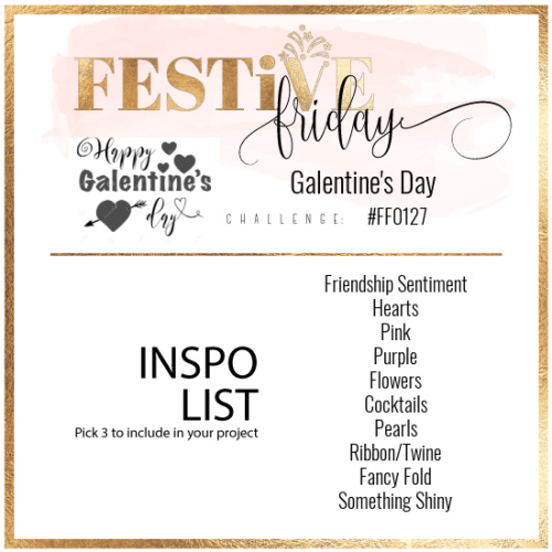
This valentine is off to Festive Friday where I chose “pink, hearts, and something shiny!” I love the Honey Bee Fluttering Hearts Pierced Coverplate and used it on several valentines this year. This one was run through the die cutter with white shimmer cardstock from Papertrey Ink—much prettier than I can capture in a photograph!

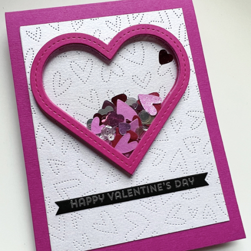
ShakerClose

I glued five Stitched Heart Frames from Papertrey Ink to create the shaker and filled it with some die cut hearts left over from the Honey Bee Fluttering Hearts Coverplate (some of which I coated with a glitter pen,) some shiny confetti hearts, and some clear sequins. The sentiment is from My Favorite Things Bitty Hugs and Kisses.

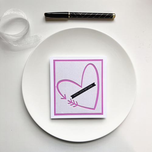
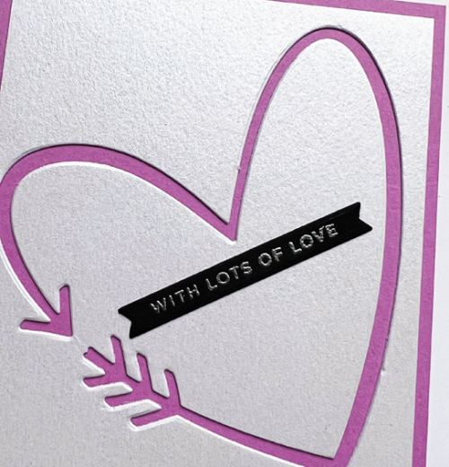
The next card was inspired by the negative die cut created for this card.  When I die cut the arrow (The Greetery’s Heart Arrow) from the white shimmer cardstock, the negative created a perfect square card. I die cut the arrow from bright pink cardstock, inlaid it, added a narrow pink border, and layered them on a white card base.

ShimmerHeart

The sentiment, embossed in silver on black cardstock is from The Stamp Market’s Tons of Type. 

ShimmerClose

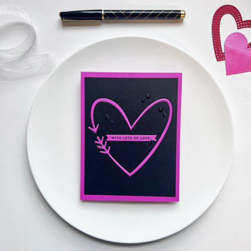
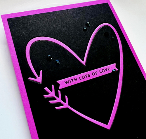
Die cutting the bright pink arrow left me with another negative, and I went rather dramatic with a black background.

BlackPink

This one definitely needed some sparkle, so I added some black jewels from Pinkfresh Studio and used the same sentiment as the last valentine.

BlackPinkClose

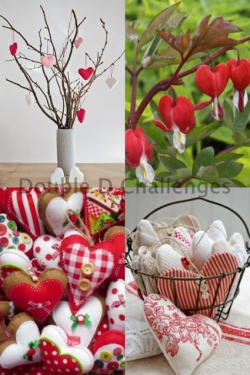
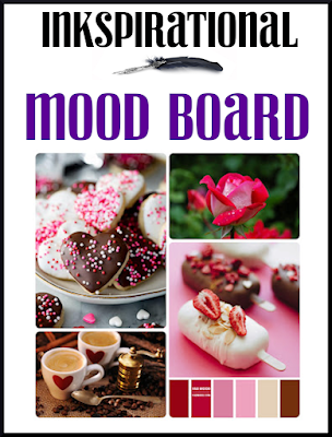
I’m off to link up these to Inkspirational with a great Moodboard, Festive Friday where I picked pink, heart, and shiny, and the Double D Challenge: Hearts.

Inkspirational#282FestiveFridayDD hearts 23


A Song in the Air

  • by

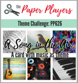
The Paper Players challenge this week is “A Song in the Air.”

Pp626

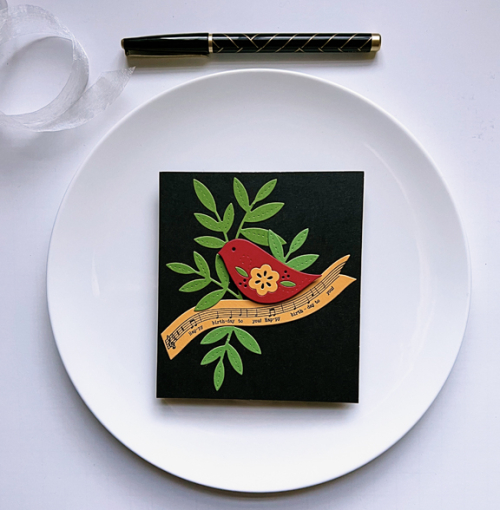
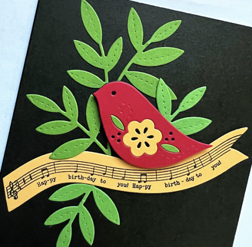
There are many interpretations for this challenge, but as I was working on creating an inventory of my stamps last week I came upon an older Papertrey Ink set called Songbirds. As soon as I saw this challenge, I knew I’d pull out this set which has always been a favorite. 

Songbirds

There are several options for the “song” stamped on the banner. Always in need of birthday cards, I chose “Happy Birthday to You.” The rest of the card is created with the dies from the set.

SongbirdsClose

Many of the dies have stitched details, and I inlaid the flower and leaves on the red bird. I love the bright colors against the black card. The card came together quickly once I decided on the color palette. 

Seize the Birthday: Candles

  • by

I’m on a blogging roll here. It’s either feast of famine. Hopefully, I’ll get a regular schedule going here soon. But I’m back today with another card for Seize the Birthday. This time with the topping: Candles, as well as Just Add Ink Challenge: Choose Two–candles, cake, celebration. I used candles for a birthday celebration card.

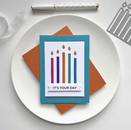
01-26-Candles #638

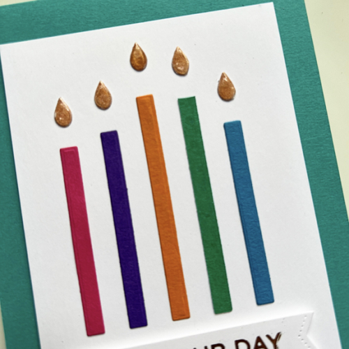
Like the earlier card for Seize the Birthday, this one came together quickly thanks to another My Favorite Things die: Happy Birthday Candles. I have used this one before and I had a little bag filled with colorful candes I’d already die cut as well as the flames that had had Glossy Accents applied to them. It was just a matter of deciding which five candles to use. I used a template I had saved from the die to place the candles in a straight row and equally spaced.

BDCandles

The sentiment is a hot foiled one from Spellbinders  Everyday Sentiment. I die cut it with a banner die from The Greetery that has stitched ends. 

BDCandlesClose

It’s good to have a few birthday cards tucked away as there are six birthdays on my birthday calendar for February and eight in March!

Just Us Girls Challenge #665

  • by

It is such a pleasure to be asked to Guest Design with the Just Us Girls Challenge for the month of February. I love their rotating weekly challenges, and it’s long been a favorite of mine.

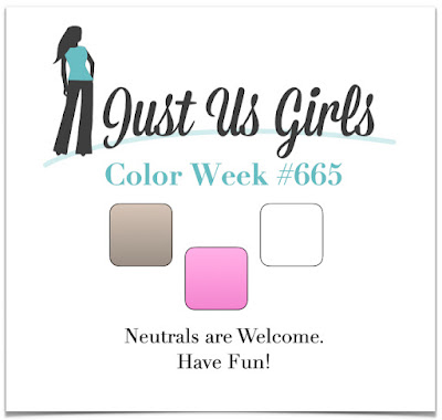
The first week is a color challenge-pink, white, and kraft.

Color Week #665

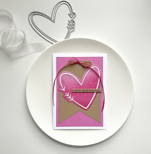
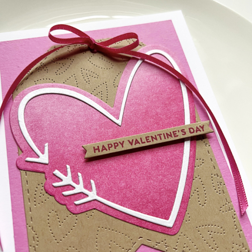
This was a perfect opportunity to make a valentine, and I had just received The Greetery’s new Heart and Arrow die which I love. It’s a large die, and luckily had this large tag from Pinkfresh Studio’s Essential Tags. After die cutting the tag, I ran it though again with Honey Bee’s Fluttering Hearts Pierced Coverplate, which is much easier to see in the second photo.

JUGS1Valentine

I die cut the heart from a piece of Bristol cardstock that I ink blended with the Simon Says Pawsitvely Saturated Ink trio in pink. The arrow was die cut from some white shimmer cardstock from Papertrey Ink. Then it was all layered onto a panel of Party Pink cardstock from The Stamp Market and then onto a white card base. A pretty pink ribbon and the stamped sentiment from The Greenery’s Sentiment Suite: Love finished it off.

JUGS1ValentineClose

I hope you’ll hop over to the JUGS blog and join in the fun! I’ll see you again next Saturday for the new challenge.
Joining in at Inkspirational where their Moodboard is all things valentine!
Inkspirational#282