Skip to content

CAS Birthday

  • by

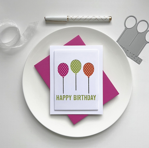
Just Us Girls is looking for Clean and Simple Birthday cards this week. I’m always in need of birthday cards, so found some time yesterday to make this card:

HBBalloons

Edited to add, I found time to make the card, but neglected to get it posted on JUGS before the noon closing time! It’s not the first time, I’ve written the post a day early, and then neglect to get it linked. So annoying! At least it made it to the other challenges.

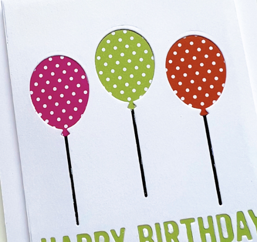
I’m in the process of creating spreadsheets to inventory all my craft supplies. It’s not as tedious as I expected and easy to do if I’m watching a television show at the same time. This week I went through three drawers of card stock and patterned paper, and reacquainted myself with Papertrey Ink’s Bitty Big line of patterned papers. This die from My Favorite Things, Happy Birthday Balloons, creates a CAS card in one run through the die cutting machine. It’s another one of those dies that I’ve had for a long time, and never used. The three balloons were backed with Raspberry Fizz, Green Parakeet, and Orange Zest Bitty Big papers, and one large stripe of the Green Parakeet papers backed the sentiment.

HBBalloonsClose

In addition to Just Us Girls, I’m adding this to Seize the Birthday (no topping), and to Darnell’s NBUS Challenge.

Just Us Girls #664.001 STB-AnythingGoesNBUS


Guest Designer for Time Out

  • by

TO GD Badge

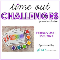
Thanks to the honor of winning one of the December challenges at Time Out, I’ve been invited to be a Guest Designer for the current challenge. It’s being sponsored by Gina K, and the challenge is to CASE the Designer. Here’s the card we’re to CASE.

T  231

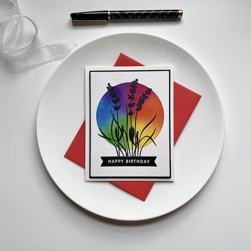
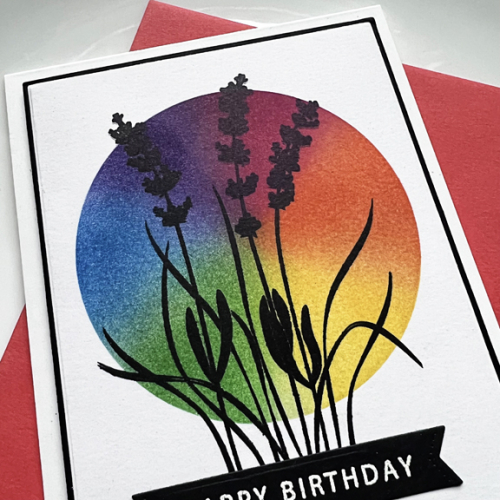
I’ve seen a couple of definitions for CASE: 1) Copy And Share Everything or 2) Copy and Selectively Edit. I think for the majority of card makers, it’s the second definition that’s usually followed. I thought there were several elements that needed to be included: the rainbow ink blending, a floral on top, and a black border. I decided to change up the ink blending and used a circle stencil from Taylored Expressions to do my rainbow ink blending. I will say it took me three or four tries before I had one I liked. 

TimeOut

I also changed up the color of the floral, choosing a silhouette from Gina K’s Friendly Silhouette set—one that I had yet to use! I also used the Gina K Master Layout 1 to die cut the focal panel and the narrow black border. The sentiment is also from the same stamp set, die cut with a banner die from The Greetery.

TimeOutClose

I’m really anxious to see what the Design Team at Time Out has created, and I’ll be watching the gallery as well. I hope you’ll take a look, too, and join in the fun!

I’m also sending this to Darnell’s NBUS Challenge since the stamp is one that’s never been used, and also to Colorful Options where rainbow cards are always welcomed.

NBUSColorful Options Website Badge


A Woodblock Valentine

  • by

After a rather quiet time here, today there are two posts. The new Color Hues Challenge is up and you can see that here. But it’s also Woodblock Wednesday, and since I made a valentine, I’m also sending this to the Time Out Challenge where the quote is love-focused and to Shopping Your Stash: Love is in the Air.

Featured-woodblock-Wednesday-graphic-copy-1 TimeOut

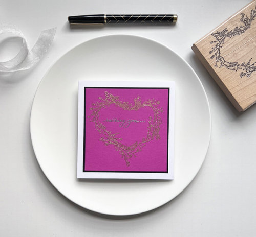
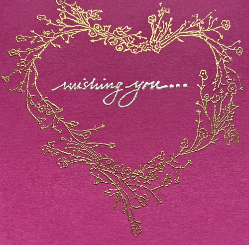
I was happy to see that I still had a great wooden stamp that was perfect for a valentine. It’s from Annette Watkins, and the date on the stamp is 1992 which gives you an idea of how old it is! 

WoodblockValentine

The gold and silver embossing on the bright fuchsia cardstock doesn’t show up particularly well in the photo above. Here’s a better view:

 Close2

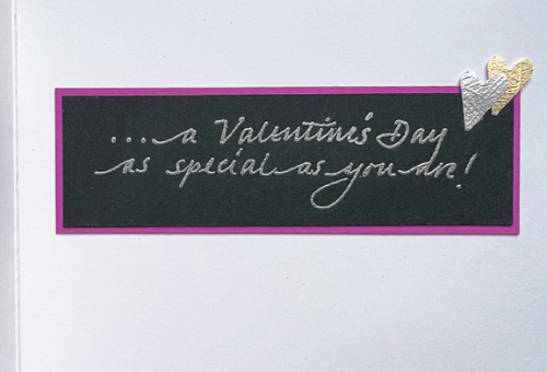
I used my favorite Impress sentiment sent again, here’s the inside:

WoodblockValentineInside

I’ll be back tomorrow. One of the things that’s kept me occupied in the craft room are some guest designer opportunities, and one will go live tomorrow.


Color Hues #57

  • by

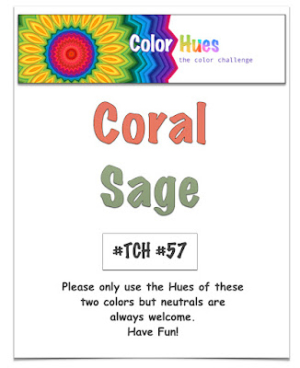
One of our new Design Team members, Jules, chose this round’s colors. It’s not one I would have thought of, but it makes a lovely floral.

CH # 57 Coral and Sage.001

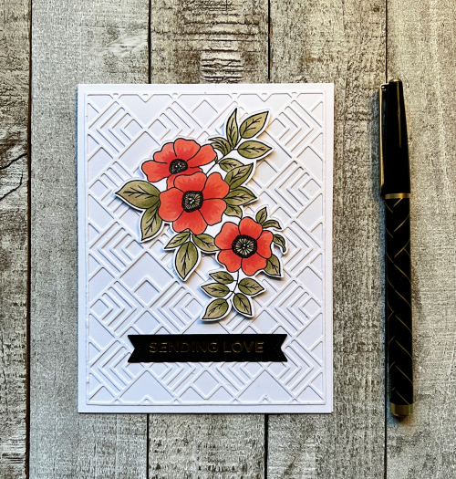
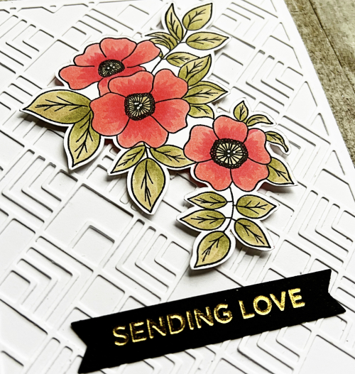
Initially, I wanted to create a card with a more geometric or patterned feel, but you can see I ended up with a floral from Simon Says Best Friend Ever stamp set. I pulled out some coral and sage cardstock and matched the Copic markers to that before coloring, using two markers on the leaves and two on the petals. 

CH57R

For the background, I chose Pinkfresh Studio’s  Deco Tiles coverplate which I love–especially when it’s tone on tone. And it helped satisfy my desire for some geometric design in the card. In the photo below you can see the pretty gold foiling from the Spellbinder’s hot foil plate Everyday Sentiments.

CH57Close

Making the card wasn’t a struggle, but photographing was a whole other story. Trying to get the light right for the foiled sentiment did change the light on the rest of the card as well. I finally had to just settle for what you see. 

I hope you’ll join our two Guest Designers and the Design Team at Color Hues during the next two weeks. 


Welcome Little One

  • by

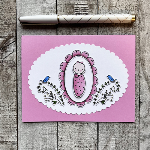
I’ve been busy creating, but most of what’s been completed can’t be shared for awhile. This card, however, went in the mail about a week ago to the proud parents of a new little girl.

Nora

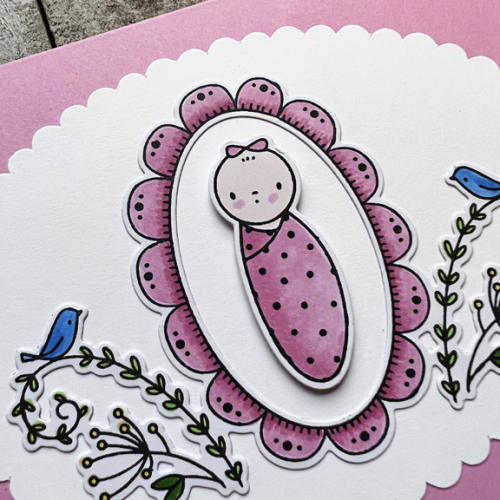
When I borrowed this wonderful Waffle Flower’s Little One Baby set, from a friend, I stamped a number of the images so it was easy to pull a few of them out and color them with Copic markers. This is one of my all-time favorite baby sets. With just a change of colors and baby images you can produce a darling card with almost no effort. The scalloped oval was also in my stash. Several years ago I picked up a package of these at Dick Blick, and this might be the first time I’ve ever used one.

NoraClose

Nearly every card I make has a sentiment on the front, but this time I couldn’t find anything that didn’t take away from the main image. The subject is pretty clear, and I stamped a longer welcome message on the inside which I didn’t think to photograph. 

I’m sending this over to the Inkspirational Challenge where the Word Prompt is: New And/Or Welcome.

#281


Seize the Birthday

  • by

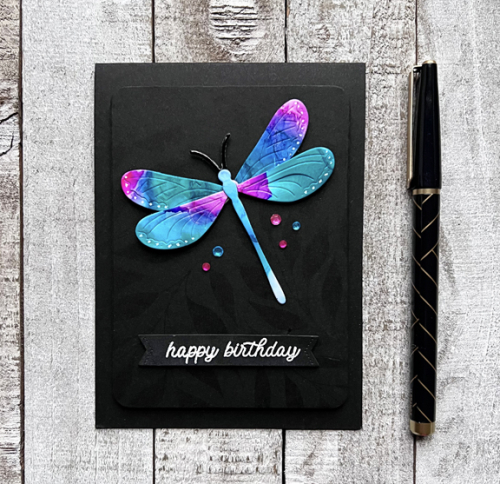
You’d think I’d be entering a card in every one of Seize the Birthday’s challenges, and I should since in addition to The Topper, you can submit any birthday card. It’s getting it on the list that seems to be the problem. This time I’m submitting a birthday card that was specifically created for The Topper: Winged Things.

01-12-WingedThings

I keep a box of purchased, but unused, products, and one of them was the Jumbo Curiosity Dragonfly by The Greetery. I knew at once that this was my opportunity, and I’m quite sure I won’t have any difficulty finding a recipient for the card.

Dragonfly

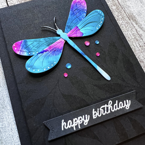
Luckily I found some alcohol ink panels I created a long time ago and thought that this pink, blue, and aqua one would be perfect for the dragonfly. You can barely see the background on the focal point panel in the above photo, but it’s more clearer at the bottom of the panel in the next photo. I initially tried embossing it in clear, but it wasn’t very nice, so instead I stamped the Simon Says  Bold Leaves background stamp in black on black. I wasn’t sure that would work, but it’s lovely IRL.

DragonflyClose

I added some foam behind the dragonfly panel and behind its wings for some dimension. The sentiment and the die cut banner are from The Greetery as well. The final touch was to add some gems which luckily matched the dragonfly’s wings perfectly.

I’ll also be adding this at NBUS since this is the dragonfly’s inaugural appearance!

NBUS

We’ve had one day of sunshine in the last week, but the forecast for now shows no more sun until February 1st. I certainly hope the meteorologists are wrong!

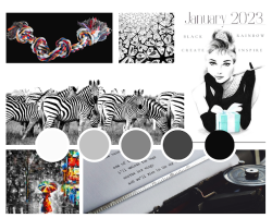
Edited:  I received a lovely invitation in the comments to submit this card to another challenge: Color Options where the prompt is BLACK! It’s a new challenge for me, but I’m happy to oblige. They have a fabulous mood board:

Black and White Themed Mood Brand Board


Color Hues #56

  • by

Sheri has chosen two colors that are perfect for Valentine’s Day for this Color Hues Challenge. Although I gave thought to other occasions for which this color combination would work (and there are plenty!), I went with the obvious. 

Color Hues #56 Pink and Red .001

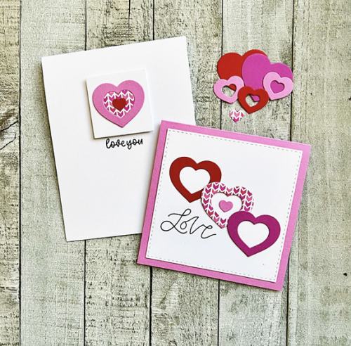
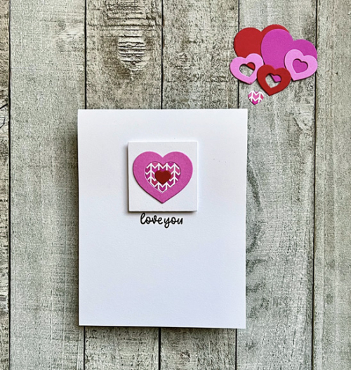
I ended up with two cards created with one die—one totally minimalist card and one CAS card. I die cut one of the heart designs from Simon Says Geometric Builders: Hearts four times: once in red, twice in different shades of pink, and once from a cute piece of patterned paper I found in my stash. I also die cut some whole hearts to use as a base if needed.

CH56X2

My husband wasn’t terribly fond of the minimalist card, but I’m perfectly happy with it. 

CH56

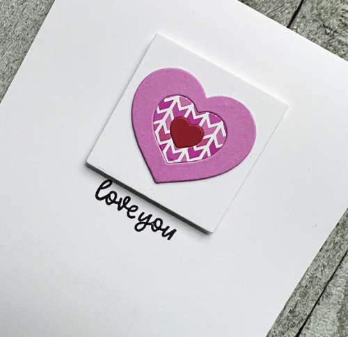
The sentiment is from Waffle Flower’s Classic Sentiments. I layered the heart onto a small square cut with an Ellen Hutson’s Essential Squares die and added it to the card base with some dimensional tape.

Ch56Close

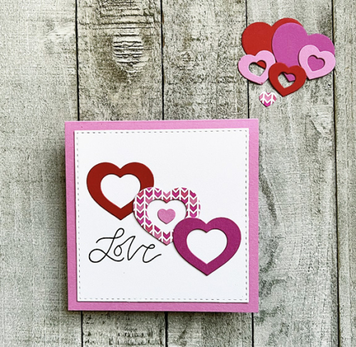
The second card using pieces left over from the first design, and a square format worked best for this card.


LoveCH56

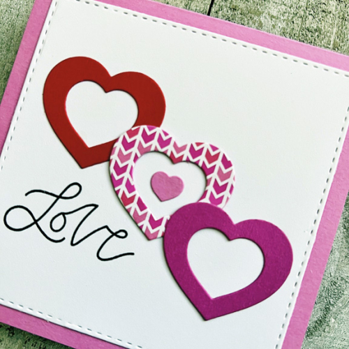
I layered the Stitched Square by Simon Says onto a pretty pink card base. This sentiment is from Papertrey Ink’s Just Sentiments: Valentine set.

LoveClose

Whether it’s a valentine or a card for another occasion, I hope you’ll join our Guest Designer and the Design Team at the Color Hues blog and fill up the gallery with wonderful cards!

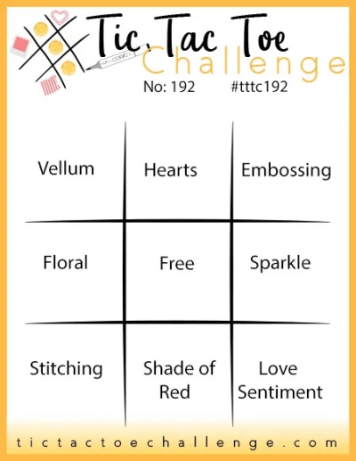
It turns out that other challenges have valentines on their mind as well. So I’ll be joining in with the TicTacToe Challenge where the middle row down is Hearts, Free, Shade of Red. And Just Us Girls where HEART is the word for word week there.

TTTC-192JUGS

Woodblock Wednesday

  • by

Obviously, I’m a little late to the party, but fortunately Amy has left the link open until Monday. I missed adding the date to my calendar, but really want to participate each month so I can put some of my favorite wooden stamps to use again. This month Amy has collaborated with Ann of Impress Stamps. Many, many years ago on my first trip to Seattle, I happened upon Impress Stamps in a high end mall near our hotel. I made several visits there in the four days we were in Seattle, just overwhelmed with the number of stamps and the fabulous samples displayed in the store.

My last trip to Impress was in September of 2019 when we were in Washington and Oregon for my nephew’s wedding. We flew in and out of Seattle, and the very first stop, after picking up our rental car, was Impress Stamps. By that time, the store in the mall had closed, but the same wonderful vibe existed in the new-to-me store. Over the intervening years, I’ve ordered from their online store, and am always impressed (yes, I did that on purpose) with the quality of their products and their customer service. All of the stores have now closed, but fortunately, the online store is still in business.

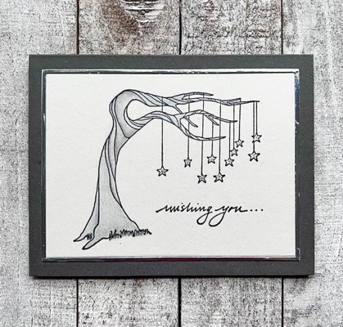
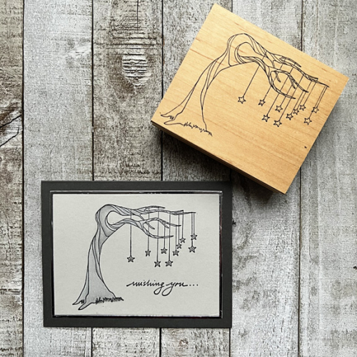
This month’s card uses a larger wooden stamp from Rubbermoon as well as my all-time favorite sentiment sets from Impress. I have five different inside sentiments to finish the “wishing you . . .” 

WishingWithStamp

Wishing2

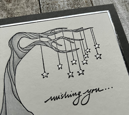
Although I didn’t photograph it, the inside reads “a birthday full of delightful surprises.” After stamping the image on a piece of light gray cardstock, I pulled out my Polychromo pencils to color it. (I certainly didn’t have any Copic markers in the early days!) I filled in the stars with a Signo silver pen and added a dot of Gelly Roll Clear Star to the center of each star.

WishingClose

I used one of the Ellen Hutson Essential Rectangles to die cut the main image and then used the same die again on silver mirror cardstock to create the frame around it. I think this is a pretty gender neutral card and I’m happy to have it in my stash.

Woodblock-Wednesday-graphic

Belated Birthday Wishes

  • by

Although his card (hopefully) arrived in the mail on time, we missed our nephew’s 51st birthday while we were away. I fully intended to write this blog post so it would go up on the appointed day, but I basically took a holiday from the internet while we were visiting with Sarah and her family. 

I started with a vague idea of what kind of card I wanted to create. Interestingly, it came together quickly, but is quite different from my first vision of it but perhaps better than the first idea!

MarcBD

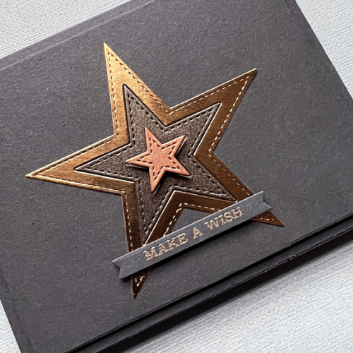
I started out with a piece of Smoky Shadow cardstock from Papertrey Ink and some scraps of metallic cardstock from my files. Three of the Stitched Star Stax from My Favorite Things worked perfectly together. I laid the two largest stars together and bumped up the smallest one with some dimensional tape.

MarcBDClose

The sentiment from Altenew’s Sentiment Strips was embossed with rose gold embossing powder and die cut with MFT’s Itty Bitty Strips.  I cut down the main panel and added dimension to it before adding to the card base. 

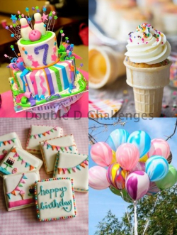
I’m adding this to two current challenges. It’s a CAS card so it’s off to AAA Birthday: Anything Goes as well as to Double D who is celebrating their 7th birthday this round. Double D has a wonderful mood board, but I’m counting on “Anything Goes” to mean it doesn’t have to directly link back to the mood board.

AAA#45 DD bd 23

We had a great trip to Wisconsin–a perfect mixture of stay home, read, and play games; do fun things (like a puppet show in Milwaukee); and a chance to be with Sarah and Adam’s friends both for New Year’s Eve and an open house early the next week. I’m glad to be home, but there’s a LONG list of projects sitting in front of me for the next few months.

Color Throwdown Guest Designer

  • by

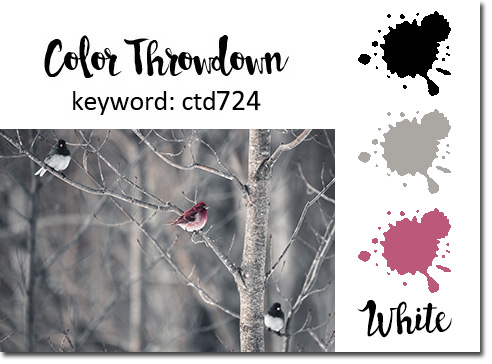
I’m delighted to be the Guest Designer for the new Color Throwdown Challenge. I was the lucky winner there earlier in December, and was invited to create a card for the current Color Throwdown Challenge. 

ColorThrowdown

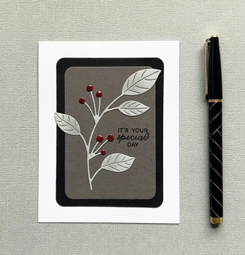
I love this color combination and had several Ideas for creating my card. In the end, I went my usual Clean and Simple route, and am pleased with the results. I think this design has potential for many different occasions.

ColorThrowdown

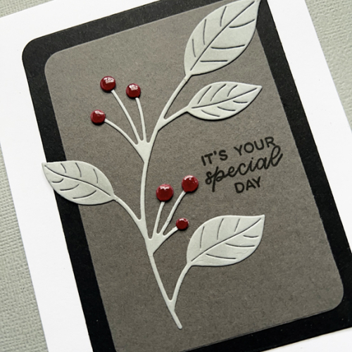
Choosing the Etched Berry Branch by Simon Says was the starting point. After die cutting the branch in a very light gray, I die cut it again using a magenta cardstock and used just the berries which I fussy cut and added to the gray branch. 

ColorThrowdownClose

The branch was added to a light gray layer die cut with Hero Arts Infinity Rounded Rectangles and then to a slightly larger black panel. They were then added to the white card base. The sentiment, from Ellen Hutson Cake, was stamped in black, and as a final touch I added some Nuvo Crystal Glaze to the berries. 

I hope you’ll hop over to the Color Throwdown Challenge, and check out the wonderful inspiration by the Design Team, and then join in the fun!

Best of 2022 and Looking Ahead

  • by

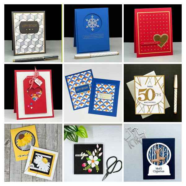
There’s a Top Nine app that’s popular on Instagram. The app will identify the nine most “liked” photos on your feed for the year. I ran it, but many that were chosen were not my favorites. Cathy Zielske created a grid for anyone who wanted to create their own, so I used her grid to identify my favorite cards of the year. No surprise to me that many of them involve hot foil plates or die cutting!
Top9_2022

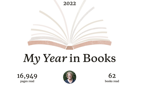
Yesterday, I set up my book journal for 2023, and looked over the stats from 2022. I met the goal I set at Goodreads plus 2.
YearInBooks

It was an interesting mix of reading. Almost 3/4 of them were written by female authors. The 62 books were divided almost evenly between fiction and non-fiction, and my favorite ten books for the year divided evenly between fiction and nonfiction as well. Fifty-three of them were print books; the rest were evenly divided between audible and Kindle versions.  I owned about half of the books I read, and the others were evenly divided between books borrowed from my daughter and books borrowed from the library. What surprised me the most was the amount of fiction I read. In 2021, I read almost twice as much non-fiction as fiction. And most of the fiction this year was contemporary or speculative fiction. 

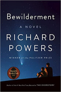
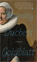
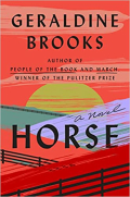
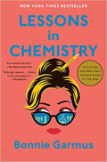
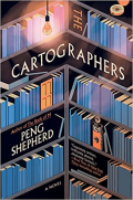
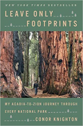
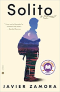
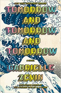
So here are my ten favorite books from 2022. They are ones I’ve thought about long after I finished reading them and/or just thoroughly enjoyed. 
AtomicHabits Bewilderment Duchess Horse Lessons

Cartographers2 Leave2 PreciousDays Solito2 Tomorrow2

I’ve downsized my reading goal for 2023 to 52–one a week. I may do better than that, but one thing I learned this year is that it’s hard to meet a goal that requires more than four books a month when we’re traveling. And traveling is something we hope to continue to do this year. 

I gave serious thought to not choosing a One Little Word this year–something I’ve done annually since 2011. But in the end, I’m taking a cue from Mary-Lou of Patio Postcards who chose her words quarterly last year. The last several years, choosing One Little Word helped me focus my energies and intentions for the first part of the year, but by summer I was rarely paying any attention at all to it. In November last year I revived my word (Balance) so I ended the year a bit more focused than I had been since August. Once again, traveling always throws me off!

For the first quarter, I’ve chosen Gratitude. I spent the month of November working through photography prompts for Picture Plenty, and started a gratitude journal again. I’d like to establish a habit of paying attention to the small blessings of each day and writing them down. Last year, I finally established a routine of doing spiritual reading/prayer each morning, and I’d like to have an evening routine for recording gratitude.

I’m also setting intentions for each month instead of for the year. For months when we’ll be traveling, I can set some limited goals. And honestly, there are projects I’ve been trying to complete for several years, and I keep pushing them off to the side. If I work on them month by month perhaps they’ll get completed. Under each of four categories—Crafting, Reading, Photography, and Home, I’ve listed one-four things I’d like to accomplish in January. (I’m not ignoring Wellness, but our gym routine and healthy eating patterns are pretty well established so I don’t think I need any particular focus there.) The January plan may be too ambitious, but by evaluating my intentions monthly, I’m hoping all my projects will stay on my radar and get completed by the end of the year!


Color Hues 55

  • by

Happy New Year! And what could be a better way to start than with a new Color Hues Challenge? Nancy has chosen the colors for this round of the Color Hues Challenge. It’s an elegant combination, and I decided I wanted to gold emboss a floral design and do some watercoloring. I don’t think I used watercolors for any of my Christmas cards this year. Here are her colors:
Color Hues #55 Anim.

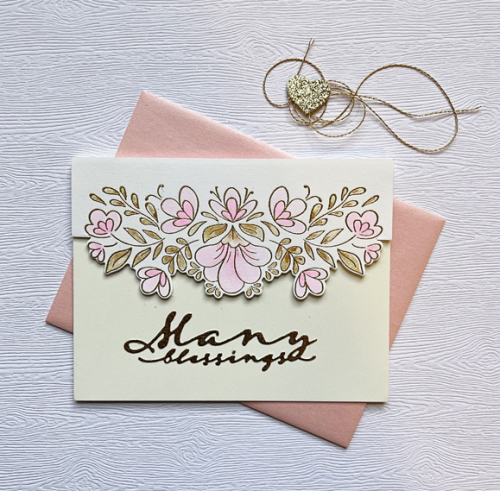
In just a few months I will need a wedding card for a dear friend so I chose the Pinkfresh Studio Charming Floral Border to watercolor.

ManyBlessings

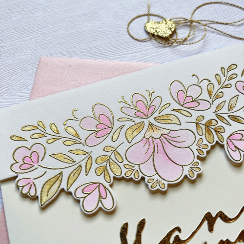
I used the Altenew 36 pan watercolors (one hue of pink watered down for the lighter color) and two colors of gold from the Gansai Tambi Starry Colors metallic watercolor set.

ManyBlessingsClose

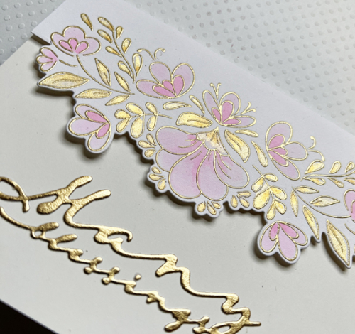
BlessingsClose2

It’s easy to see the pretty metallic sheen in these photos. It’s the first time I’ve ever tried partial die cutting, but it worked perfectly.  The sentiment was die cut from gold metallic paper with one of Papertrey Ink’s Scripted dies. The inside sentiment reads “on your wedding day.” (The watercolor paper by Altenew and the Ivory (Simon Says) card base appear to match much better in real life than in the photograph.)

You’ll be able to find much more inspiration on the Color Hues blog by the Design Team and our Guest Designer. Although we were sad to say good-bye to Kristie Goulet in December, we’re excited to have Jules Peddicord, Marci Hill, and Stef Perry join our Design Team. You’ll be thrilled by all their creations!