Skip to content

Color Hues #93

  • by

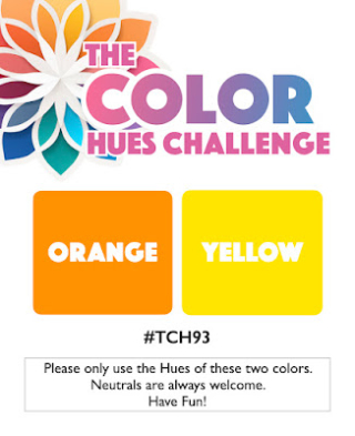
Tracey has chose perfect summer colors for the new Color Hues Challenge.

Ch #93 Orange and Yellow.001

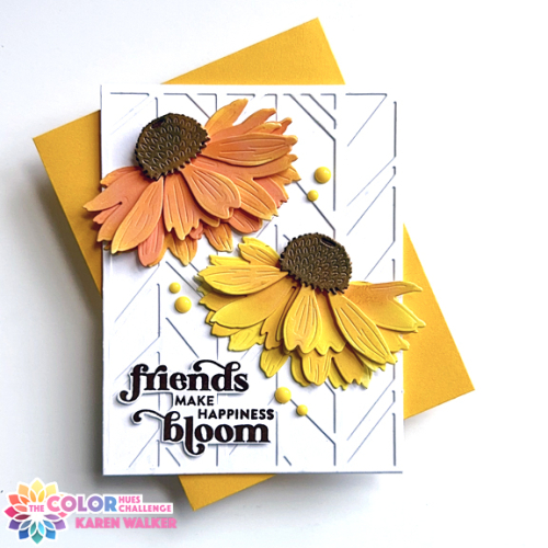
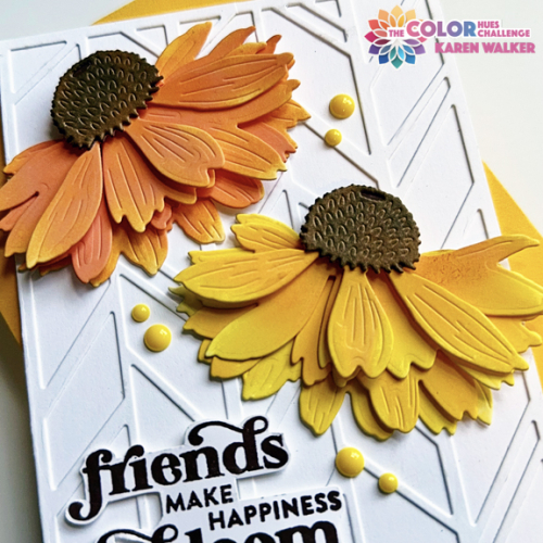
I pulled out an old favorite for some bright and cheerful Coneflowers by Honey Bee. The layers and size of the florals make a big impact on an A2 sized card.

ColorHues93

Catherine Pooler’s Chic Chevron coverplate made a good background for the florals. I added a sentiment stamped in dark brown and fussy cut from Pinkfresh Studio’s Friendship Blooms stamp set. 

ColorHues93Close

The colors in the photos are quite a bright as they are in real life–a too frequent result of living in an old house with limited light. I added a few yellow enamel dots was the only embellishment. 

I hope you’ll join us at the Color Hues Challenge. The gallery is open until August 29th so there’s lots of time to create with us! 


Pinkfresh Studio August Challenge

  • by

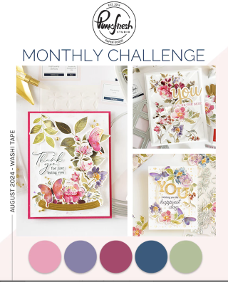
I was excited to see the theme of the Pinkfresh Studio Challenge this month: Washi tape. I immediately knew what I wanted to use, but had to wait until my friend received the card before posting it.

PFS

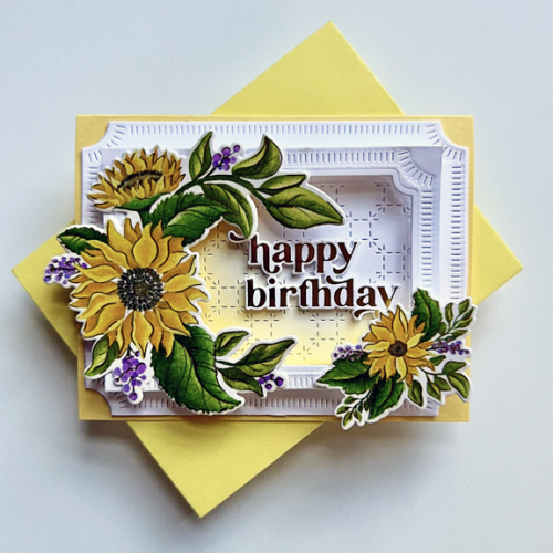
I hadn’t pulled out the beautiful, gold enhanced Pinkfresh Studio Washi tape, Sunflowers, in a very long time. They are perfect for a summer birthday. I used a card design I learned from Anett Gelencsér during the Create & Connect event held in February. It creates a middle portion that “pops up” when the card is released from the envelope.

Sunflowers

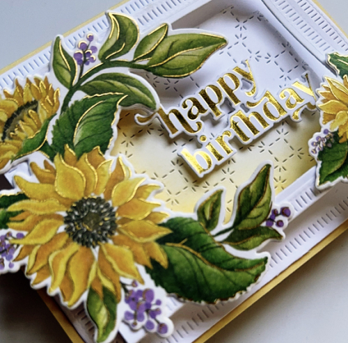
To create the card, we used two of the Notched Corner Frame dies as well as the Stitched Octagons coverplate. I did some light yellow ink blending on the coverplate die and chose two dies from the washi tape collection to decorate the frame. You can see the dimension better in the photo below.

SunflowerClose

The sentiment is also from Pinkfresh, Perfect Sentiments, hot-foiled in gold. 

I have more Pinkfresh Studio washi tape, but my crafting time for August is just about up, so another entry is probably unlikely. We’re off to Michigan this weekend with our daughter and her family, and then to visit with friends we met on our tour of Portugal and Spain last year.  So many ideas, so little time!


Harvest Mice

  • by

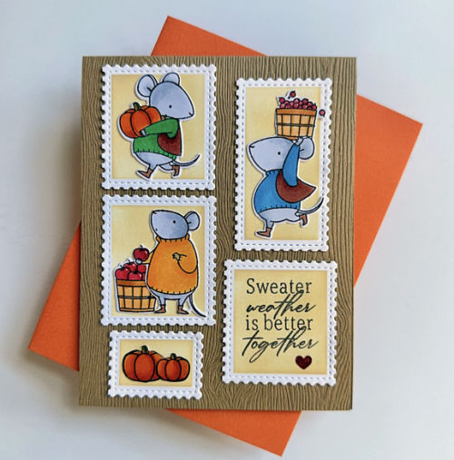
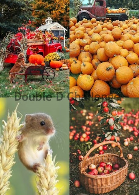
The Double D Challenge theme is Harvest, and it was the perfect opportunity to pull out a My Favorite Things which I have owned (and never used) for so long that it is no longer available to purchase! I love these little mice so I’m not sure why they were so neglected.

HarvestMouse

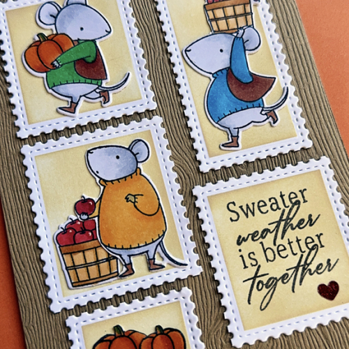
I wanted to use the Waffle Flower Postage set again, so used the Postage Collage Coloring Stencil to color the background. I cut the stamps apart, and then set out to stamp, color, and die cut the cute little mice with their haul of pumpkins and apples. I placed the die cuts in four of the postage stamps, and arranged them on a woodgrain card (Simon Says.)

HarvestMouseClose

The sentiment from Papertrey Ink’s Happy Fall is generic enough that I could use this for a fall birthday or even a fall anniversary. The little heart on the sentiment stamp is a red glittery sticker. 

This card is off to Double D as well as Darnell’s NBUS challenge.

Cards DD harvest 24  NBUS


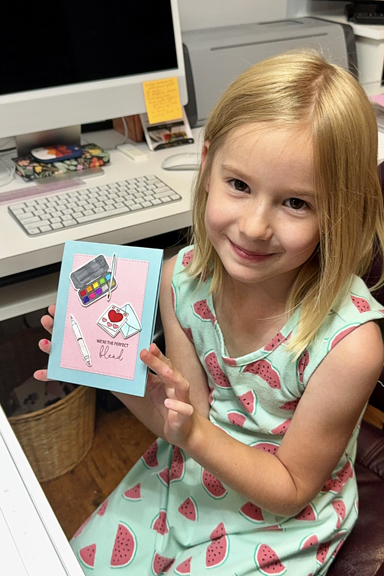
I have a crafting companion today, who worked very hard to create this card for her cousin who like crafting as much as she does. Here’s Hannah with her card.

HannahWithCard

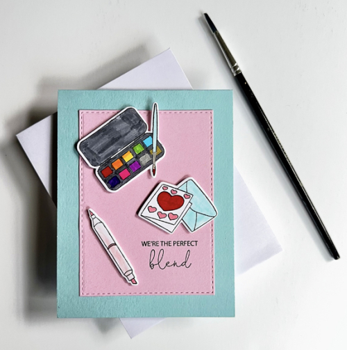
I had made a card for one of her birthday gifts that featured crafting supplies so that’s what she wanted. She was pleased to see that I had a new (another NBUS) set by Gina K, Crafty Notes, and picked out the images she wanted to stamp. It took her no time to master the MISTI and she carefully colored the crafty tools with Tombow markers. She definitely wanted them to be “bumped out.” 

HannahCard

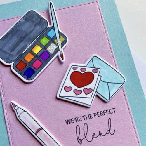
When Hannah arrived from Wisconsin on Saturday she brought her watercolors with her and has created several wonderful paintings. After she colored the card and envelope, she noted that she was coloring the marker with one of the colors she used on the card. I think she’s got this!

HannahClose

We’re sending this off to NBUS as well. 


Summer Fence Line

  • by

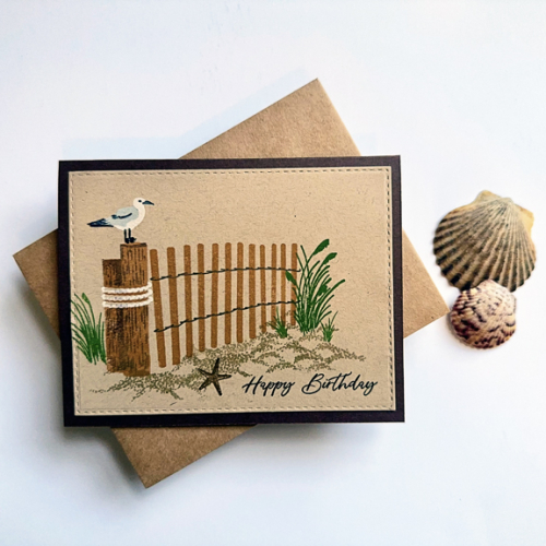
I pulled this stamp set out of the “Summer” box to decide whether I wanted to keep it or not. It’s been years since I used it. I found a design on Pinterest for inspiration, and set about creating a card. I’m usually not a fan nor particularly adept at using layering stamps or scene building. But I’m pretty happy with this (almost) one layer card. The stamp set went back in the box. 

FenceLine

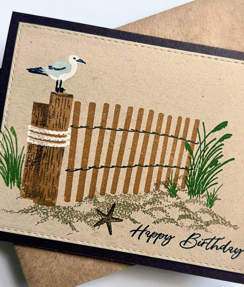
The scenery stamp is Summer Fence Line by Papertrey Ink. The sentiment is from The Greetery’s Sentiment Suite: Birthday, always a favorite.

FenceLineClose

I die cut the panel with Simon Says Stamps Stitched Rectangles and layered it on a dark brown card base. 

I’m sending this off to the Paper Players where the challenge is: Beach Time, to Time Out: It’s Always Summer Somewhere; and The Four Seasons: Anything Goes Summer.

PP701TimeOut269August 2024 Summer


Color Hues #92

  • by

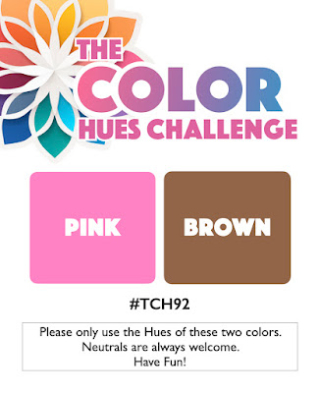
Another month has flown by, and we’re at the top of August already: time for a new Color Hues Challenge. Stef has chosen:

CH #92-Pink and Brown.001

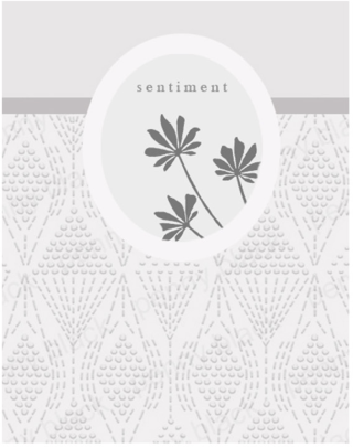
Last month, Jill Foster for Penny Black presented ten videos in a series call “Permission to Play.” Each video featured a different layout design, and I chose the layout from the second video.

Screenshot 2024-07-15 at 11.16.27 AM

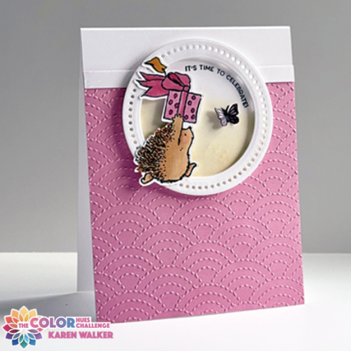
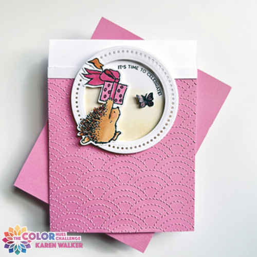
You’ll quickly realize I made one major change, using a circle frame rather than an oval. Much to my surprise, I didn’t have any decorative oval frames, and no circle ones that I was happy with either. I ended up creating my own using one design from Pinkfresh Studio’s Braided Circles and using one of the Ellen Hutson Essential Circles.

Hedgie

I’ve always love Penny Black’s hedgie images, but only own one set. This cute critter rushing off with his package is from the Critter Delight set, and is one I’ve owned for a long time. Jill Foster used watercolors for all the images in her 10 video series, but I chose Copic markers for this guy.  After adding some ink blending to the background circle, I added the frame with dimensional tape.

HedgieFlat

The sentiment from The Greetery’s Inflated Sentiments was curved to fit inside the frame (and doesn’t look as close to the frame IRL.) I added a small butterfly (an embellishment used by Jill on several of her cards.) I didn’t have a small die so fussy cut this one from an older Papertrey Ink set, Life is Beautiful. 

There’s lots to see at the Color Hues Blog so hop over and take a look at the creative designs by the Design Team. 

Pinkfresh Studio Challenge: Geometric

  • by

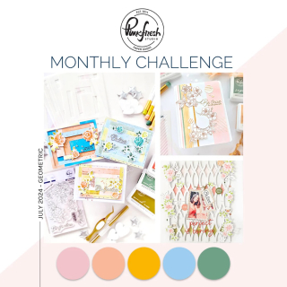
The Pinkfresh Studio Challenge this month is Geometric. There’s a lovely inspiration board, but fortunately you can use the photo, the colors, or the theme. I definitely went with the theme.

MonthlyChallenge-July24 copy

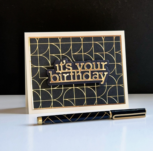
The PFS geometric stamps and hot foil plates are some of my favorites. I reach for them time and time again, and especially when making cards for guys. This one fits the bill.

AbstractBDUp

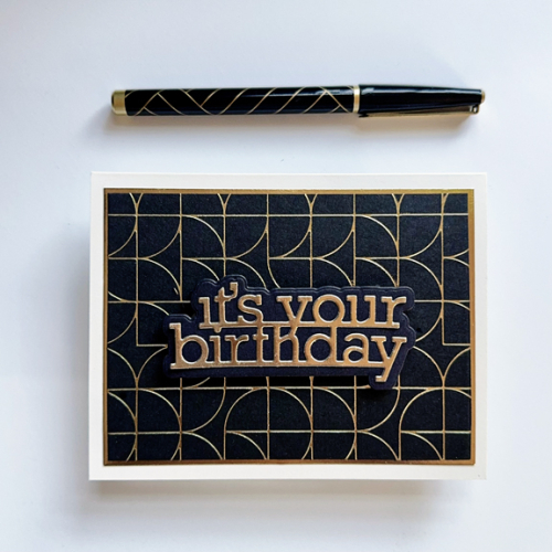
This time I foiled the Quadrant Backdrop in gold on black cardstock. It really packs a punch, I think. The sentiment is Simon Says It’s Your Birthday, cut from gold metallic cardstock.

AbstractBD

Aside from a narrow gold metallic frame, this card didn’t need any embellishment.  In addition to the Pinkfresh Challenge, this card is off to Inkspirational: Use products from 2 or more companies, and Addicted to Stamps and More: Birthdays. 

 #320ASM-Birthdays badge

Beautiful Day

  • by

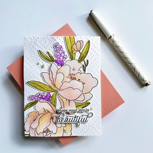
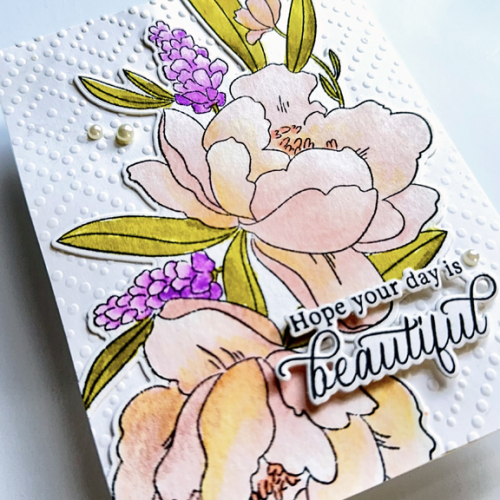
Altenew recently issued two large floral stamps drawn by Sarah Simon of the Mint Gardener. A few years ago, I took a drawing and watercoloring class with her online, and I love her book, Modern Watercolor Botanicals.

Despite my best intentions not to purchase any new stamps, I caved on these. Yesterday I found the time to watercolor the first set, Peony and Lilac Swag. 

Peony

This floral is just a part of the whole image. There are a variety of ways to position parts of the florals on an A2 card base, and eventually I want to try a 5X7 card. I used my Zig Watercolor Brushes this time. I tried an earlier image with the Altenew 36 pan watercolors, but they weren’t transparent enough for me. Next time, I’ll go back to my Daniel Smith watercolors which take more time.

PeonyClose

I die cut the floral and added it to a panel I embossed with Spellbinders, Dazzling Dots embossing folder. The sentiment is from a Pinkfresh Studio set, Best Thing. After debating it for awhile, I ended up added three pearls as embellishment. 

This week’s Simon Says Wednesday Challenge is Beautiful Blooms, using Altenew stamps so this is a perfect fit! I’m also sending it to the Flower Challenge: Make a Birthday Card and AAA Birthday: Fabulous Flowers.

Wednesdayblog-logo2024-7 - July - Birthday-001#63 July


Woodblock Wednesday: July

  • by

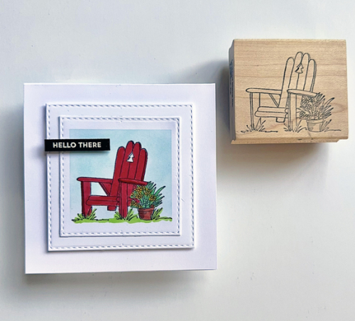
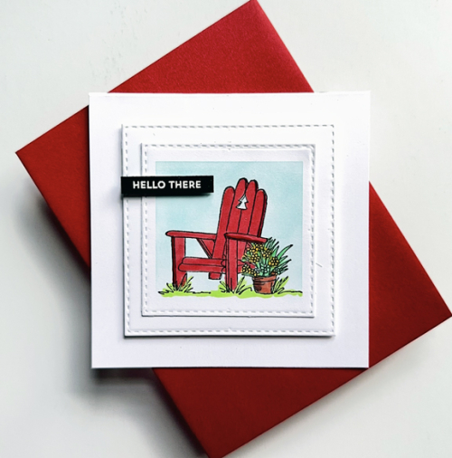
July is definitely flying by. I did think that time would slow down a bit now that we’re home for several weeks, but not so. I chose another woodblock stamp from the Lockhart Stamp Co. for July’s Woodblock Wednesday. This bright red Adirondack chair reminds me of the red chairs we encountered in random places throughout the Canadian Rocky Mountains National Parks when we visited. After we returned we bought our own red Adirondack chairs. 

WWJuly

I used a Taylored Expressions Masking Stencil to create the blue background. The image was colored with Copic markers, and then die cut with Simon Says Stitched Rectangles. I added a second square and with dimensional tape added it to a square card.

WWJuly2

The sentiment is from a My Favorite Things set: Itty Bitty Basics embossed in white and die cut with MFT’s Itty Bitty Strips. In addition to Woodblock Wednesday, I’m sending this to the Four Seasons Blog: Summer and Shop Your Stash, also Summer.

Featured-woodblock-Wednesday-graphic-copy-14 Seasons Blog BadgeSOS-plain badge-300px

Most Beautiful Day

  • by

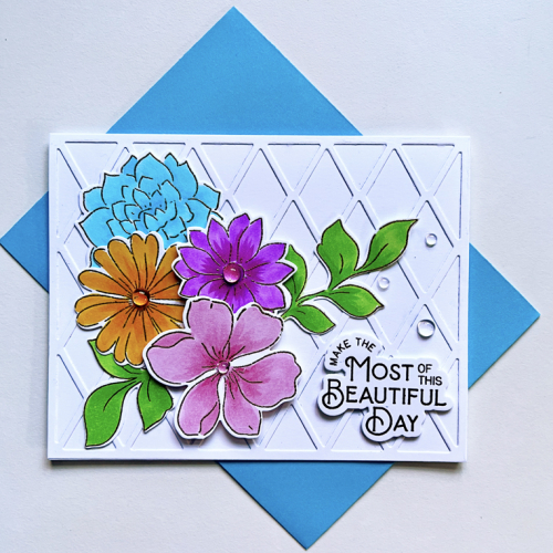
I have a card for the AAA Card Challenge: Fabulous Flowers.

#63 July

The card is a variation of a card Lea Lawson and Heather Hoffman taught in a one time class last fall.

MostFlat

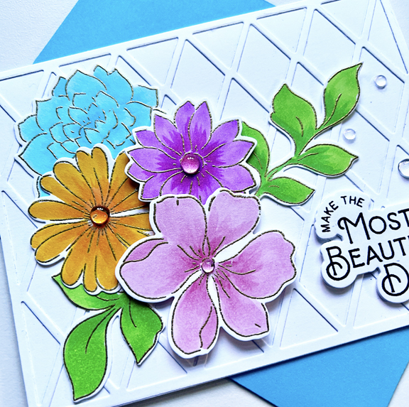
The flowers are from the Brighter Day set by Pinkfresh, colored with Copic markers and then die cut with the accompanying dies. The background was created with the cover plate, Harlequin by Papertrey Ink. The sentiment is also from Pinkfresh–the Farm Fresh stamp set. 

MostClose

These bright and happy flowers remind me of this time of year when we have bright and beautiful flowers in the garden and in vases in the house. It’s probably my favorite time of the year.  

In addition to the AAA Card Challenge, I’m sending this off to Triple B: All about Birds, Blooms, and Butterflies.

Triple B Challenge Badge


Postal Cards

  • by

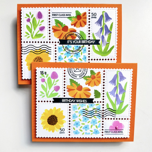
It took awhile before my WaffleFlower Postage stencils and dies arrived, and then even longer for me to get them out of the NBUS box. I created all three a week ago, but waited to post until now since one of them needed to arrive at its destination before they showed up on the blog. Two are almost identical because I needed two birthday cards.

FloralPostageX2

These are die cut with the main postal die and stenciled with the Wild Flower Collage stencil. The stamps are from the Postage Collage stamp. Both greetings are from Pink & Main’s Special Day stamps.

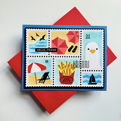
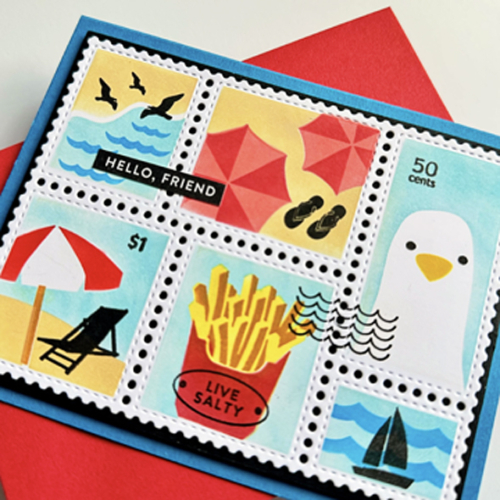
I hesitated before purchasing the Beach Days Postage Collage stencils, but I couldn’t resist. The images are so much fun, and I don’t own anything like them. 

BeachPostage

I used both the Beach Days and the Postage Collage stamps sets after stenciling the backgrounds.

BeachPostageClose

The sentiment came from Simon Says Stronger Together stamp set.

There are still a couple of challenges looking for summertime cards so this one is off to the Time Out Challenge: On Vacation and the Shopping Our Stash Challenge: Summer. We’ll be off to a lake vacation in August, and I’m looking forward to a week of sunshine (we hope) and water fun. 

Edited to add: Also posted at Darnell’s NBUS! (I was sweetly reminded by Darnell that I needed to get these in the gallery!

Color Hues #91

  • by

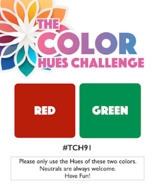
Sheri’s pick for this Color Hues Challenge came at a great time for me. Red and Green called out Christmas, and my stash of Christmas cards is very small. 

CH #91 Red and Green.001

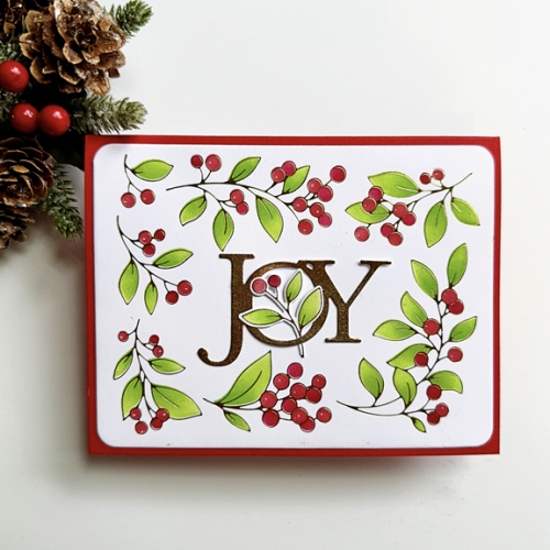
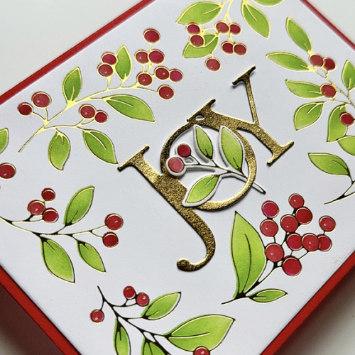
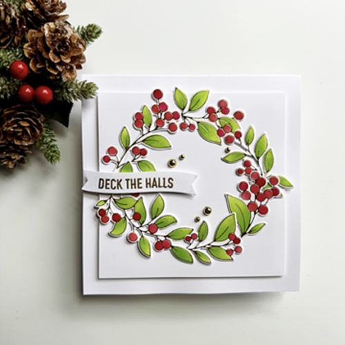
In keeping with my goal of using NBUS, I pulled out Pinkfresh Studio’s hot foil plate, stencil, and die cut for the Winter Berries Frame purchased months ago and went to town. The first card is my fave and the one I posted on the Color Hues Challenge site, but there are four more cards as well. I challenged myself to try a different design for each of the cards. 

JOY

This is the only card where I didn’t use the die. I’ve always love the Savvy Joy die cut and use it almost every Christmas. I used the stencil and two shades of green and red to color the berries. I stenciled enough panels for all the cards first, and actually have quite a few left over.

JOYClose

The closer view shows the beautiful hot foil and the pretty gold sentiment.

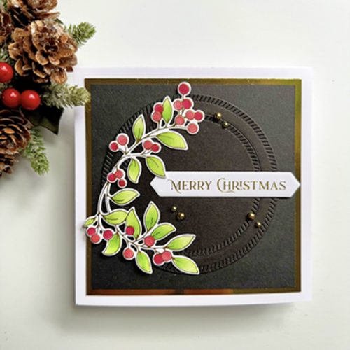
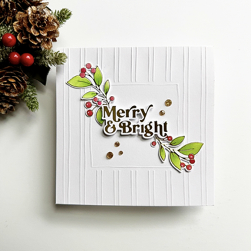
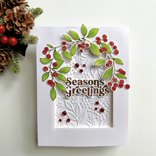
For the rest of the cards, I’ll just list the additional products used for the card.

MerryChristmas

black & gold mirror cardstock, Pinkfresh Studio Diagonal Stitched Circles, Spellbinders Betterpress Fancy Sentiment Strip & die (foiled in gold), PFS gold pearls

MerryBright

a premade embossed square card, PFS Perfect Sentiments: Holiday (foiled in gold), PFS Gold Glitter dots

SeasonsGreetings

Gina K embossing folder Tapestry, Ellen Hutson Essential Arches die, PFS Perfect Sentiments: Holiday, PFS scarlet clear drops

DeckTheHalls

PFS Basic Banners: Christmas, The Paper Studio gold pearls 

It’s not just Christmas on the Color Hues Challenge board although I’m not the only one to add to their stash of holiday cards. Please hop over and take a look at the great designs of our Guest Designer, Rosemary, and our Design Team. 

Some of these cards are off to two additional challenges: Addicted to Stamps and More: Christmas, the Christmas Kickstart Challenge: Festive Frames (which I’d better continue to play with!) and NBUS for the berry frame.


Christmas badge
#Kickstart88NBUS

Strawberry Season

  • by

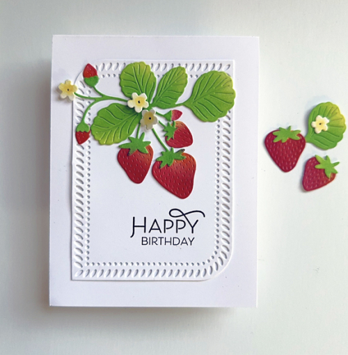
Strawberry season is one of my favorites. (Peach season comes close behind.) The strawberries didn’t last as long in Western New York this year due to a week of exceptionally high temperatures. Nonetheless, I pulled out The Greetery’s Botani-Cuts: Strawberries to make several birthday cards (all identical). 

Strawberries

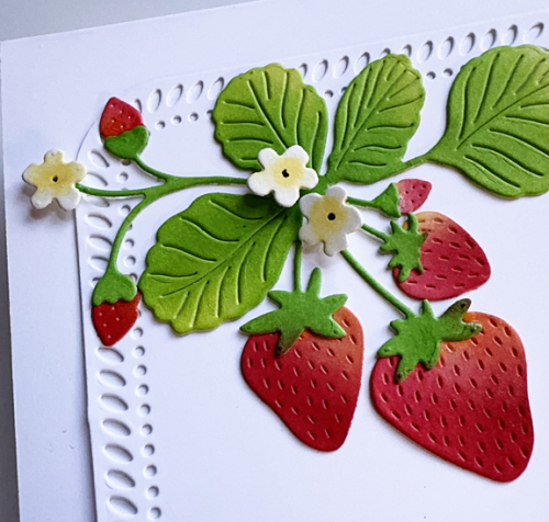
It’s a very CAS design. I started with the strawberry die cuts in white, coloring them with a variety of Pinkfresh Studio inks and finger daubers. Betsy Veldman of The Greetery often uses finger daubers, and I’m becoming a fan. Much quicker in this case than using a blending brush. Once that was completed, I die cut a Pinkfresh Studio Rounded Braided Rectangle from white and arranged the strawberries on it.

StrawberriesClose

I added very small pieces of dimensional tape to the pretty blossoms, and stamped the sentiment from The Greetery’s Print Shop: Spring Mix before adding it to a white cardbase.

The Inspired By Challenge is Strawberries, so this is headed their way as well as to the Simply Clean and Simple Challenge.

IB296straw SCS blog header

Awesome!

  • by

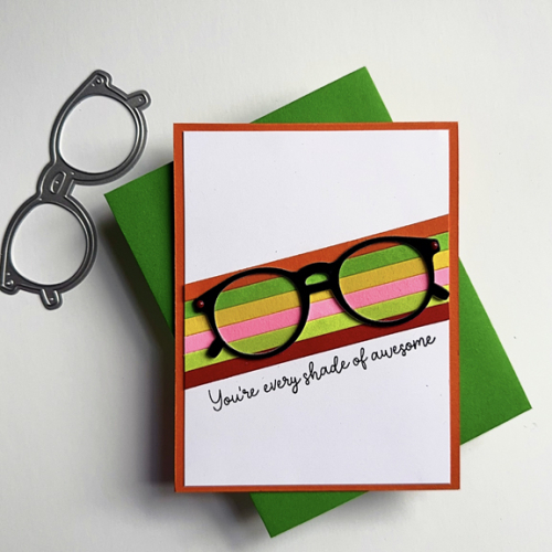
Just a quick post to share a card I made for a friend who has left her current job. I volunteered for the organization for many years, chairing a committee for seven year where she was the staff support. Over those years, we’ve become good friends, and I created this card for her with a note inside to celebrate her many accomplishments.

Shades

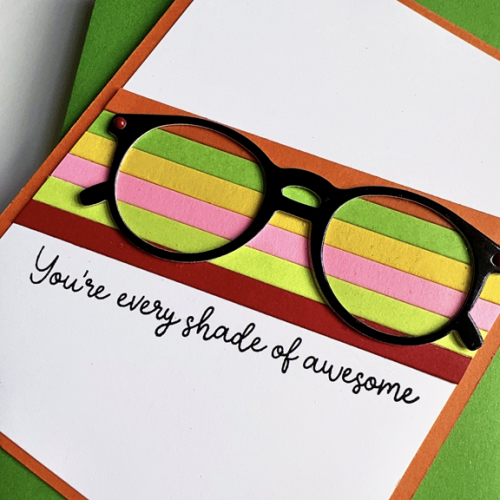
The card design is a CASE of several cards I found on Pinterest. I started by die cutting strips of colorful papers with The Stamp Market 1/4 inch Quick Strips, and adhering them diagonally in the center of the card. 

ShadesClose

I die cut the glasses from Concord & 9th’s Spectacular Shades from glossy black cardstock. I added some acetate behing the lenses (hard to see in the photo, but it adds a bit of realism to the glasses.) I added the panel to a cardbase made from Concord & 9th’s Marmelade. 

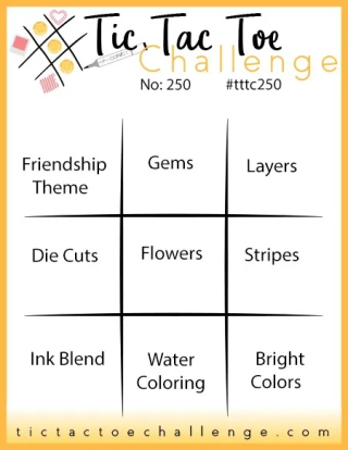
This is off to the current TicTacToe Challenge where I used the right hand column: Layers, Stripes, Bright Colors. 

Tttc-challenge-board-250-copy copy

Color Hues #90

  • by

It will already be July when this post goes live, and I guess I shouldn’t be too surprised. We spent a week going to Wisconsin, flying with our 12 year old grandson to Washington, D.C. for a few days, driving home, and then a week of commuting between home and a cottage on Conesus Lake Tracy’s family had rented. I was glad to be home for a week before we leave again for Chautuaqua Institute. We’ve been there before but never just the two of us. It’s sure to be relaxing, inspiring, and informative. This week’s theme is Artificial Intelligence. 

Nancy, our fabulous leader at Color Hues, has chose a wonderful color combination: 
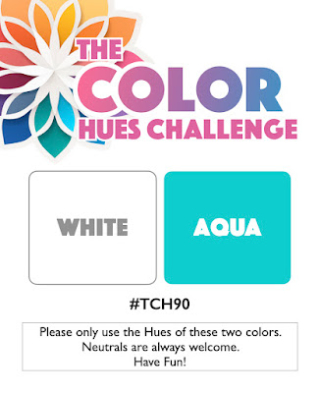
CH #90 White and Aqua.001

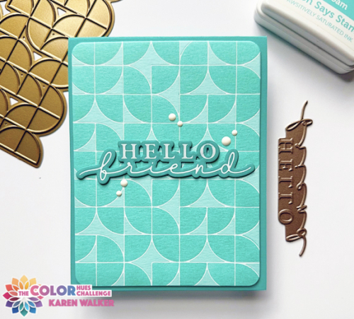
I knew almost at once what I wanted to try. Some time ago I purchased Matte White foil from Spellbinders and wanted to try it out on aqua cardstock. Concord & 9th’s cardstock foils beautifully, and their Aqua Sky cardstock was the perfect color. It’s not often a card ends up looking exactly as I imagined it, but this one did.
CH#90_2

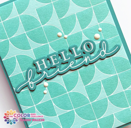
I chose an old favorite from Pinkfresh Studio, Quadrant Backdrop and ink blended it with the coordinating stencils with Simon Says Sea Foam ink. I chose Concord & 9th’s Oceanside for the cardbase and sentiment. I love Waffle Flower’s Hey There” sentiments, and this one fit perfectly.
CH90_2Close

I added a piece of dimensional foam behind the main panel, and stacked three of the sentiments together for a bit more dimension. Adding some white enamel dots was the final touch.

Edited to add: In my attempt to work through my NBUS box, I created a second Aqua and White card with a new-to-me stencil, Frosty Lace. By the name, I’m thinking it was meant to be a winter-themed stencil but it looks like it could be a sea foam stencil as well.
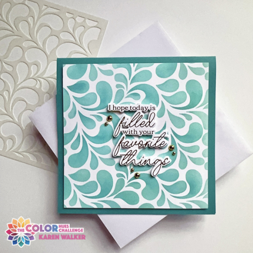
CH90jpg

Like my first card, I used Concord and 9th cardstocks and Simon Says inks to ink blend, primarily Seafoam again, adding some Surf ink to add some dimension. I decided to cut the piece down to a square card. 
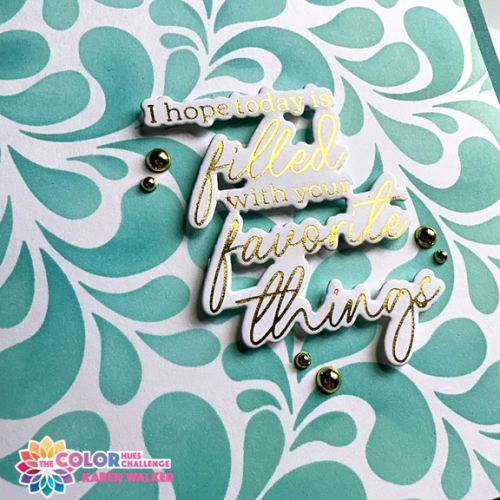
CH80Close

This time I used a gold foiled sentiment from Pinkfresh Studio’s Favorite Things Betterpress plate, and added some gold pearls to finish it off.

As always, you’ll find lots of inspiration from our guest, Nance, and the Design Team on the Color Hues Blog. Please join us in the gallery!

I’m sending the second card off to Just Us Girls: Anything Goes Stencils and to Darnell’s new July NBUS gallery.
733 STENCILNBUS

Birthday Star

  • by

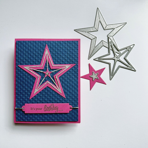
As soon as I saw the new challenge at Seize the Birthday: Add a Star, I knew I wanted to finally pull out The Greetery’s Rustic Star dies. I used just the large set this time, but have some good ideas for the smaller one as well. I went with a pink and blue color combo because two of my granddaughters have birthdays coming up, and frankly I could give this to either of them.

Unlike the last card I made for a challenge I didn’t have any preconceived ideas about this one. I die cut the start from bright pink and silver glitter paper and then hunted for a sentiment set that would work. Papertrey Ink’s Sparkle and Shine had just what I wanted. The next decision was finding an embossing folder for the background. Lifestyle Craft’s tiny star folder was perfect. 

StarBD

Once I had embossed the sentiment for the front of the card, I pulled out another NBUS product, Spellbinder’s Sentiment Labels. Instead of using the die cut to slip through the label, I pulled out some silver cord. I used some dimensional foam behind the embossed panel, and added two narrow strips to the label so it would lay flat after the cord was inserted. Once I had the star adhered, I found a tiny rhinestone star in my stash for the center. 

Sparkle

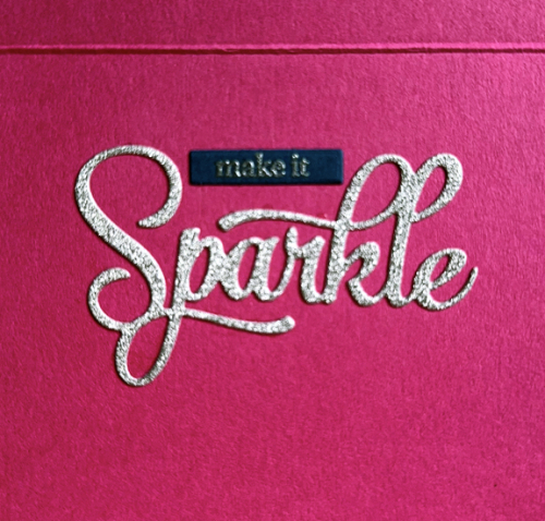
Sparkle and Shine also includes two large sentiment die cuts. I chose Sparkle for the inside sentiment, embossing the sub-sentiment in silver on blue paper. I couldn’t decide whether to add some rhinestone stars to the inside, so I’ll wait to make that decision until it’s time to give the card away.
In addition to Seize the Birthday, there are some other open challenges that are perfect for this card: Double D: Reach for the Stars, Can You Handle the Pressure (must use an embossing folder), and NBUS–two more NBUS products put to use!

06-27-AddAStarStar collageHandleThePressure NBUS