Skip to content

Woodblock Wednesday: Just Ducky

  • by

It’s the last Wednesday in January (how can that be?) so it’s Woodblock Wednesday hosted by Amy Tsuruta

Featured-woodblock-Wednesday-graphic-copy-1

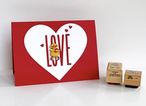
Since Valentine’s Day is not far off, I wanted to find a woodblock stamp I haven’t used (in forever!) for this month’s challenge. I came upon this funky looking duck, (Just Ducky by Mostly Animals stamps) holding a heart and decided he’d be fun to play with. Actually, the stamp is quite small so he proved to be a little challenging. This is what I came up with:
WWJan

It’s ironic in a way that the card is actually bigger than an A2 card. It measured 6 1/4 X 4 1/2. It’s an odd size, but I have a set of ready made card bases from Bearly Arts that I used as a template. I needed a big heart for The Stamp Market’s  Skinny Upper Case Alphabet.  I stamp the duck, colored him with Copic markers and fussy cut him.
WWClose

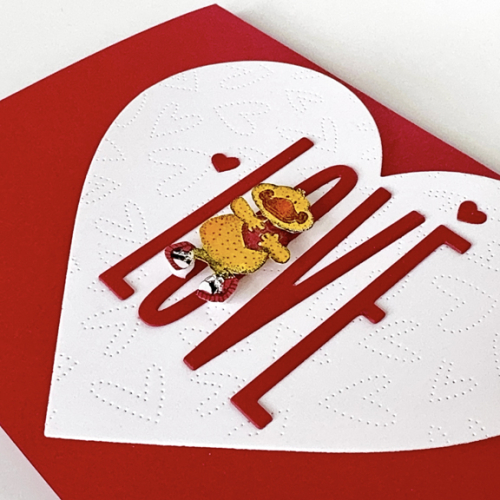
I die cut the largest heart from Hero Arts, Infinity Hearts, and used Honey Bee’s Fluttering Hearts Pierced Coverplate to add some interest and texture. Next I stacked two of each letter and adhered them to the heart before adding it to the card base. Finally, I put some dimensional tape on the little ducky to make him stand out a bit. Three of the tiniest hearts from the Hero Art set finished off the front of the card.

I wanted another woodblock stamp for the inside sentiment. The first one I pulled out was damaged and left a thin white line across part of the sentiment. That was a first, but there was another contender, Be Mine by Fun Stamps, 1989.

WWInsideWstamps

I die cut two more hearts, and ran the smaller through with the Honey Bee coverplate, stamped the sentiment and added some dimensional tape to it. Finally, one more tiny red heart!

Thanks for stopping by! I hope it’s warm and toasty where you are–in or out. Definitely in here. We’re experiencing one cold snap after another.
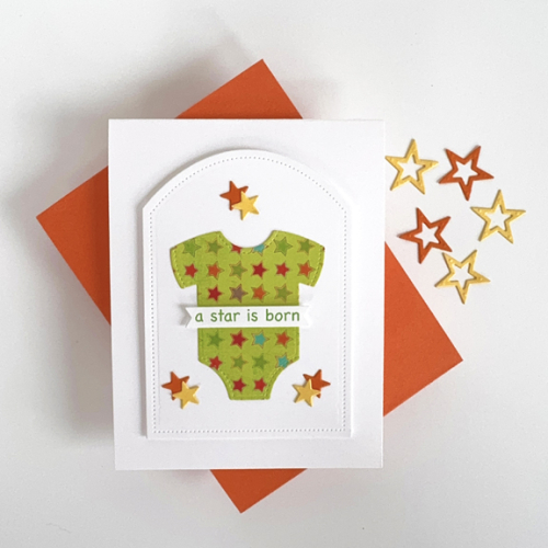
A Star is Born

  • by

Our next door neighbors have just have their first child, and they are, of course, overjoyed. I wanted to be sure to have a card and gift ready to take when they are up to a visit. I found the onesie in an envelope of die cuts I made when I borrowed Concord & 9th’s Bitty Banners from a friend. I loved the patterned paper I used, and knew I had a wooden stamp that read “A Star is Born.” The wooden stamp was too large, so I created the sentiment on the computer and die cut it with one of the dies in The Greetery’s Pretext Banners.

StarisBorn

The inspiration for the design came from a Clean and Simple challenge where they wanted a center focus. By the time I finished, I decided the card didn’t meet the challenge requirements, but it does it does work for two other challenges which I’ll link below.  I die cut several stitched shapes and ended up with one of the the Reverse Confetti Pierced Round Top dies. The stars were cut with Ellen Hutson’s Essential Stars. I added dimension behind the Pierced Rounded die as well as behind the sentiment banner. It will be hand delivered so I don’t need to worry about putting it in the mail. I do think this is a very Clean and Simple card, but I did lose the center focus in the end.

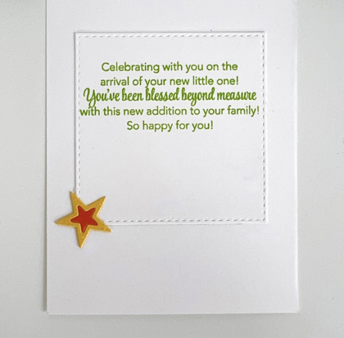
Here’s a look at the inside of the card. The sentiment is from Papertrey Ink’s Tucked In: Baby stamp set which I stamped on a Simon Says Stitched Square.

StarInside

I’m sending this off to A Cut Above Challenge–almost all die cuts, once again, and also to Addicted to Stamps and More: Any Occasion.

CutAbove300 ATSM_AnyOccasion

Love Letters

  • by

Once again, I’m coming to The Paper Players Challenge right at the end of the challenge. I had a terrific trip over the weekend, and our group flew home from Jacksonville Sunday just ahead of the big winter storm and snow. Being away, however, always throws me a bit off course. But I knew as soon as I saw this prompt I wanted to play along. 

PP721

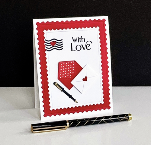
I’ve had The Greetery’s Sent With Love dies for well over a year, and although I have die cut and assembled many pieces of it, they’ve never made it onto a card. I knew this time exactly where I wanted to go, and I only needed to cut the liner for the open envelope. 

PPMail

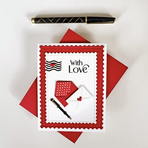
I die cut two panels from The Greetery’s Postal Frames as well as the postmark die. The postmark is attached to a circle on the die. Once I had the part I wanted adhered to the card, I snipped off the circle. The envelopes and pen are from Sent With Love. I added a bit of dimensional tape to the back of the white envelope.

PPMailFlat

The sentiment from The Greetery’s Tagged Elegance was stamped directly on the white panel in black. I added another tiny heart to the postmark and called it done.

In addition to The Paper Players, I’m adding this to the gallery at A Cut Above which always includes an Anything Goes Challenge, and NBUS since I finally have put the Sent With Love dies to use!

CutAbove300  NBUS

Penny Black Birthday Card

  • by

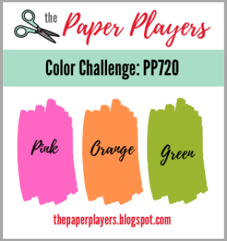
It is now a very unusual day as this is my third post. As I wrote in the previous post, I’m due at the airport tomorrow at 5:15 am, so there’s no hope of posting it tomorrow. This is a card specifically created for two challenges: The Paper Players Color Challenge, and Seize the Birthday with the topping: Something New. 

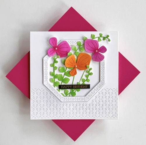
I had some money to spend at Simon Says that needed to be spent by the end of last year. I could have purchased just one Penny Black die, but I ordered three. I’m quite sure all three will get regular use: All in One Hexagon, Flower Family, and Ascending. So that’s the Something New for Seize the Birthday. The colors at The Paper Players were so bright and cheerful, I really wanted to play along. Fortunately, my to-do list didn’t take as long as I expected, so I had a bit of crafting time. I ink blended the greenery and flowers, using two shades of all three colors. 

PBHB

I love the texture in the Hexagon cover plate. The frame cuts at the same time, but separately, and I die cut three and stacked them for some dimension. After tucking the greenery and flowers in the frame, I carefully added some dimensional tape behind the flowers, and glued selected leaves. The sentiment is another of Memory Box’s Black Greeting Tabs. They so often look just right. 

Pp720 01-09-UseSomethingNew


Flies in the Air

  • by

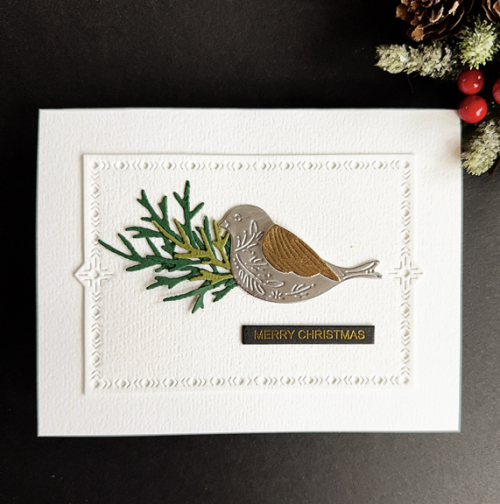
It’s not often that I post twice in a day, but I have a few Christmas cards I haven’t shared, and this one is perfect for the AAA Card Challenge: CAS; optional Flies in the Air.

281

The Greetery’s Nordic Bird was a must-have in November when Betsy released the new products for Christmas. I combined it with The Greetery’s Nordic Frames, a long time favorite and some sprigs from The Greetery’s Botani-cut: Juniper.

NordicBird

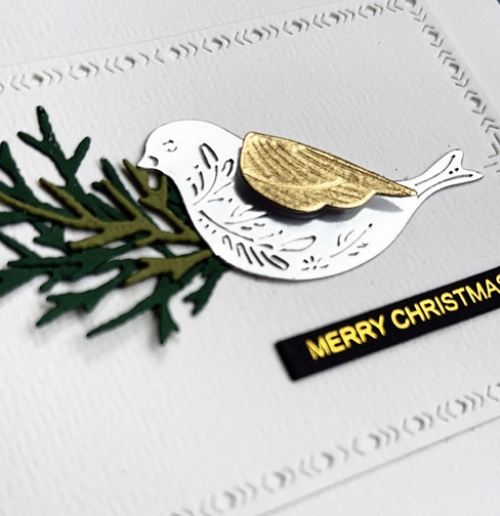
The card base and frame were cut from Bazzi’s Orange Peel cardstock. I found a stack of it recently, and remembered how much I liked the texture. The bird is die cut from metallic silver with a gold metallic wing which you can see better in the closer view below.

NordicBirdClose

Once again, I chose one of Memory Box’s Black Greeting Tabs which are a gift to CAS designs. 

I’m off to Georgia very early tomorrow morning with a group from our church for the weekend conference, Southern Lights. Tracy has to get my friend, Cathy, and I to the airport by 5:15 tomorrow morning. It’s been awhile since I had to get up so early!


Color Hues 102

  • by

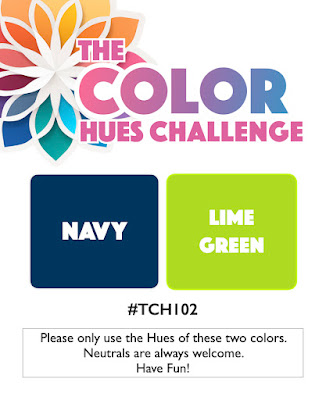
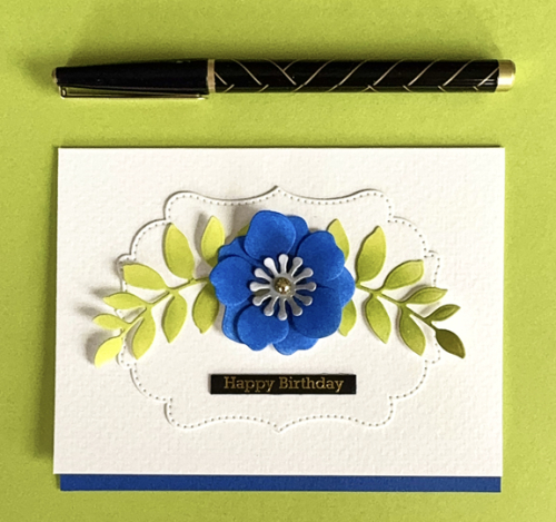
Stef has chose the new colors for the mid-January Color Hues Challenge:

CH #102-Navy and Lime Green.001

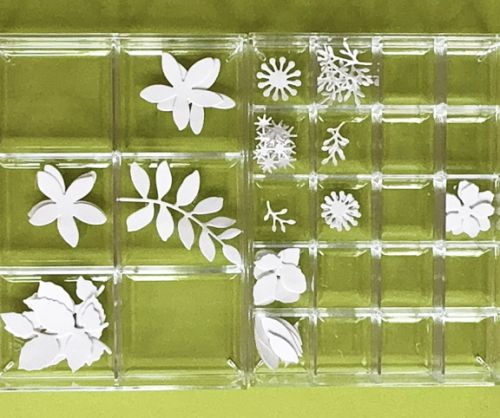
Typically when I see a color combo like this one I reach for one of my geometric stamp or die sets. I really wanted to branch out this time and have an Altenew collection I’ve been wanting to use for months. I rarely purchase one of Altenew’s kits, but I had some points to use and fell in love with the Craft Your Life Project Kit: Chocolate Flowers. It includes a Zero-Waste die cut, layering stencils, a background stamp set with sentiments, and a 3-D embossing folder. I die cut the Zero-Waste flowers and leaves from white cardstock with no firm idea of what I wanted to do with it. 

CH102

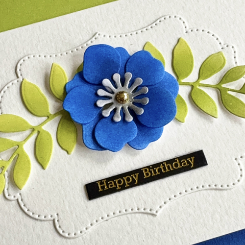
I started by choosing two navy inks (Pinkfresh Studio Sapphire and Stargazer) and two lime inks (Papertrey Ink Limeade Ice and Green Parakeet) and set about ink blending some of the flowers and leaves. After coloring the ones you see above, I already had an ideas for the card. I added a center die cut ink blended with Honey Bee’s Metallic Silver ink and put the flower together. While we were away, I purchased some Artpop Watercolor paper at Dick Blicks specifically for using as card bases. When I was creating some card bases, I miscalculated on one and ended up with a narrow edge that extended beyond the card.

The Pinkfresh Studio Fancy Dotted Frames looked to be a great base for the flowers and the leaves, and I was happy with how they fit on the frame which I added to the card base. I die cut a narrow strip of blue paper for contrast at the bottom of the card.

CH102Close

The sentiment is from Memory Box and is one of their Black Greeting Tabs–this set is all birthday greetings. Because the lettering is gold, I added a PFS gold pearl to the center of the flower.

I took a photo of the leftovers from the Zero-Waste Die Cut so you can see how much restraint I used to get a CAS card! You’re certainly going to see more cards soon! (I love these small divided acrylic boxes from The Container Store. They stack and I also have one with just two compartments for larger dies. The work great to sort the die cuts as you cut them as well as when you are ink blending and assembling the pieces.

CHLeftovers

I hope you’ll join us for this new challenge. You’ll (as usual) find lots of inspiration from the Design Team as well as our Guest Designer, Esther Asbury. I’ll be adding this to the gallery at A Cut Above where die cuts are always the main event.


Cards for Guys

  • by

Yesterday Tracy was skiing with my granddaughters so after church I had the afternoon to craft away. I needed three masculine card for birthdays at the end of this month. I made two of the first card, and then a separate one since I didn’t want to send the same card to my brother-in-law and his son-in-law. Not that they see one another’s cards, but it also gave me a chance to make a card for the Color Throwdown Challenge. 

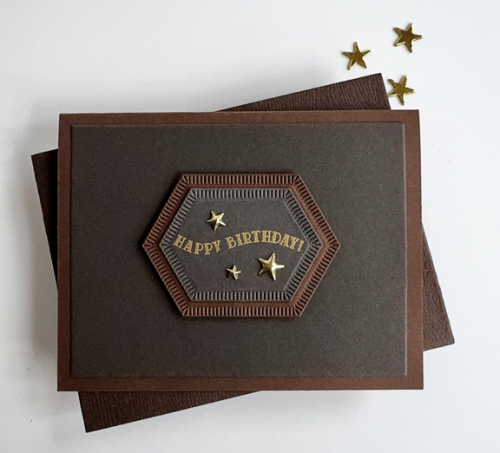
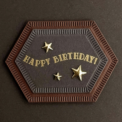
The first card started from the bottom up—I had pinned a card with these colors a long time ago. It’s a technique I don’t think I’ve ever tried. I die cut the dark gray panel and added it to a dark brown card base. Then I pulled out Pinkfresh Studio’s Nested Hexagons Blanket Stitch and die cut two. That proved to be the perfect place for a sentiment.

StarBD

I embossed a gold sentiment from an old Papertrey Ink set: Scene It Celebration. Three gold 3-D stars finished it off. I like this design, and think I’ll use it again for masculine cards.

StarBDClose

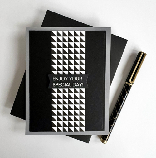
The second card is another CAS design. The Color Throwdown Challenge is to use black, white, and gray. I layered the black panel onto a gray card, and added a strip of patterned paper from My Favorite Things Black and White Basics paper pad.

BWG

The sentiment is white embossed and die cut with the Altenew One-Go Birthday Greetings.

Both cards are off to The Just Us Girls Challenge where the call is for masculine cards. And the second one is off to The Color Throwdown Challenge which ends this evening.

757 JUGS Word 824 black  white  grey 010125


Time To Party

  • by

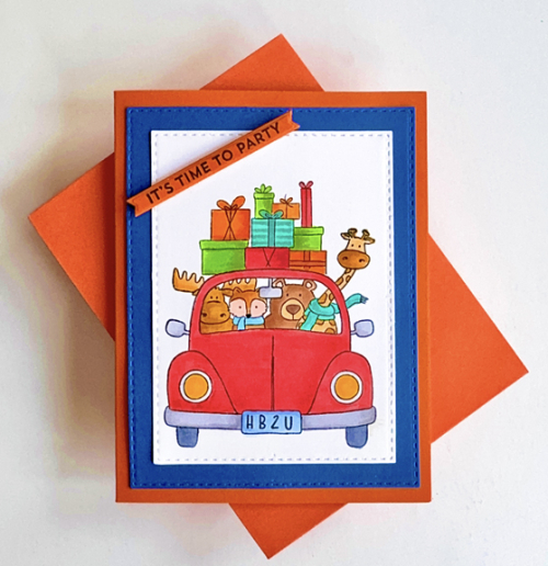
Time got away from me again, and I needed a birthday card for a two-year old quickly. Luckily, I had the Jane’s Doodle stamp set, Greetings.  The little boy is fond of cars, and I’m guessing he’ll be happy with all the animals piled in on their way to his party.

It has been awhile since I did any coloring with Copics, but it was a great thing to do while I watched the Cotton Bowl. I’m a big Ohio State fan, stemming back to my childhood when we were lucky enough to attend games there on a regular basis. I was happy to finish the card, and equally happy that my team won the game. 

Party

Once the coloring was done, I die cut the panel with Simon Says Stitched Rectangles as well as a mat in bright blue. Adding them to a bright orange card base made for a colorful card. I’m not sure any two year old will spend much time with any of his cards, but it might hold his attention for a minute or two. 

PartyClose

The sentiment is from MFT Bitty Birthday Blessings. After stamping it on orange cardstock, I die cut it with the MFT Itty Bitty Strips die. 

I’m sending this off to the Seize the Birthday Challenge. The optional challenge is Somthing New. I hope to be back again using something new, but this time it will be Anything Goes! It’s also off to Addicted to Stamps and More where Birthdays is the current call and my last entry to Double D’s Birthday or Anniversary Challenge (It’s their 9th! birthday.)

01-09-UseSomethingNewBirthdays badgeDouble D


Happy Anniversary

  • by

I spent most of yesterday on paperwork and unpacking and organizing cardstock. Before we left for Wisconsin, I emptied a large carton that I had hauled to the basement while my craft room was renovated. It had been sitting there for over a year. Almost everything in it was 12X12 paper I had accumulated while I was scrapbooking. I went through it piece by piece, pulled out the papers I thought I could use for card making, and took the rest to the crafting charity shop. I had a lovely pile of papers, many of which I had totally forgotten about, so while we were at Sarah’s I cut them all down to 8 1/2 X 11 and sorted them into three categories. They’re filed in three plastic boxes on the bookshelf behind my desk where I’m very likely to find them when I need them. 

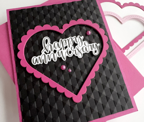
Last night when I finished the sorting and organizing, I found the pieces to a card I never finished before we left. It’s just perfect for another entry to the Double D Challenge: Birthday or Anniversary. Since lots of die cuts were involved, I’ll be adding it to A Cut Above where Anything Goes. 

Double DCutAbove300

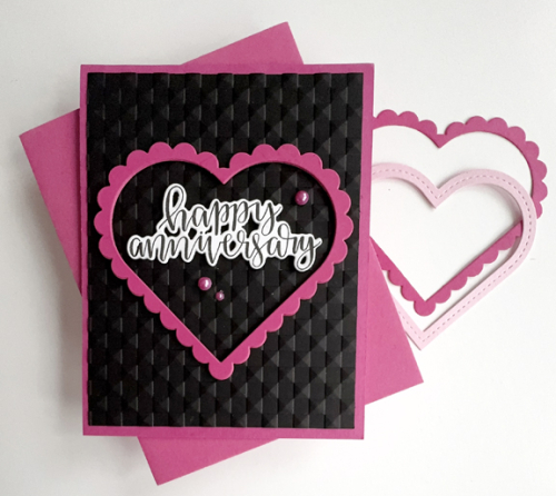
It’s another CAS card–but brighter with more contrast than most of my cards. I love the hot pink against the black. The frame were cut at a friend’s house several years ago. They’re by Papertrey Ink, but I couldn’t find them in the shop so they may be retired. I stacked three of them together for some dimension as well as the stamped and die cut sentiment before adding them to the black panel which was embossed with Altenew’s 3D Checkered Squares embossing folder. It all went on a Raspberry Fizz (PTI) card base.

PinkAnniversary

The sentiment is also from an older Papertrey Ink set, Penned Elegance, and die cut with the accompanying die. The set is so old that it’s a solid die, and it took me awhile to remember how to get a good cut. The newer open dies are so much easier. It’s a reminder of how much the industry has changed since I started stamping over 3o years ago when all the stamps were wooden (or unmounted!) and embossing was the revelation that got many of us going.  The final touch was a few bright pink pearls.

PinkAnniversaryClose

Thanks for visiting. I hope your week is off to a good start.


Winter Birthday

  • by

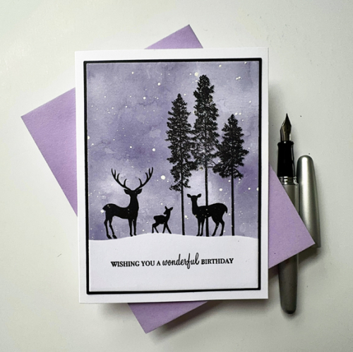
My nephew celebrates a birthday in early January. The occasion was an opportunity to put my Simon Says/Gina K Designs Stay Cozy stamp set to good use again. Early in December, I used the set to create two cards-one for my brother-in-law and one for my brother. This version came together quickly after finding the background piece in my stash. 
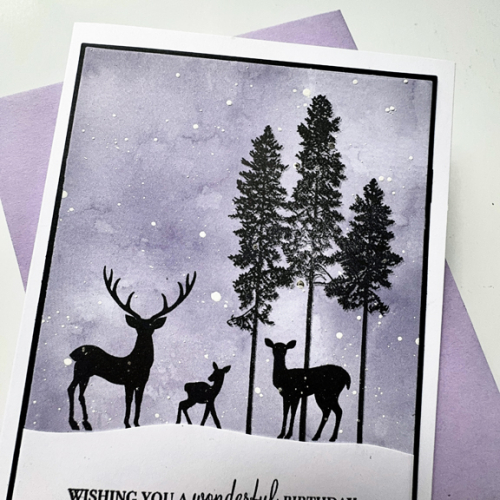
MarcBD

After stamping the silhouettes on the background piece, I die cut it with Gina K’s Master Layout #1 which has become indispensable in my craft room. Then I cut a snowbank to add to the bottom of the panel and stamped my sentiment from Papertrey Ink’s Wishes Come True. 

MarcBDclose

Using the Master Layout #1 again, I die cut a narrow black mat and added the panel to a white card base. 

The AAA Birthday Challenge: Winter came along at just the right time. As did the Double D Challenge: Birthday or Anniversary. Diane and Darlene are celebrating 9 years for the Double D Challenge–Congrats to them! I’ll be adding this card to both galleries. 

AAABD#69Dd 9th1-tile

Color Hues #101

  • by

Sheri is the hostess for our first Color Hues Challenge of 2025. She chose Red and Kraft, and it was a perfect combination for putting two of my very recent purchases to work.

CH #101 Red and Kraft.001

I couldn’t resist ordering the Frosty Buds (and a few other goodies) from The Greetery’s November release. Betsy always has a nice sale for this release, and she ships her products very quickly. I also ordered Pinkfresh Studio’s Nested Hexagons Blanket Stitch from Simon Says Black Friday sale. 

CH101

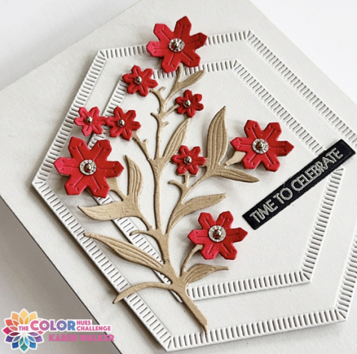
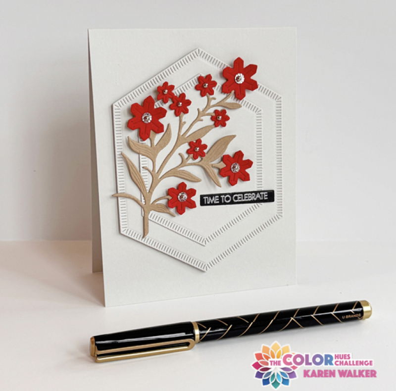
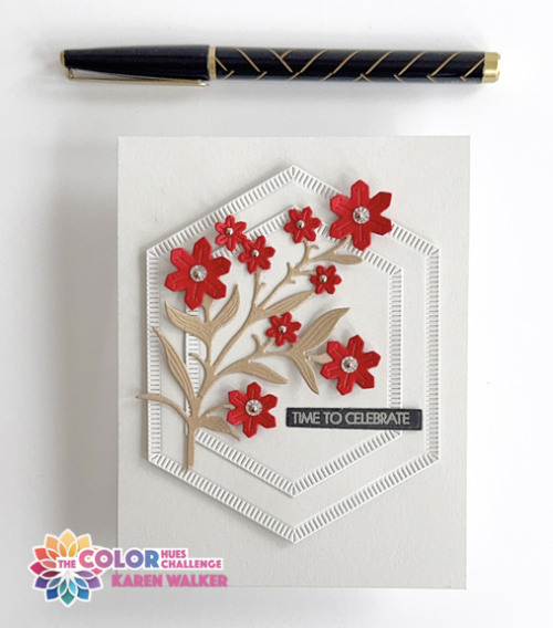
I die cut the two hexagons and created the card base from Papertrey Ink’s Soft Stone paper which is a very pale grey. The Frosty Buds were die cut from pretty red cardstock in my scrap box and the branch from kraft cardstock.

CH101Flat

Deciding on the centers of the buds took a bit of trial and error. I first tried crystals from the Crystal Sequin Mix offered in The Greetery’s November release. It ended up looking too busy, so I settled for four of the crystals with tiny silver pearls in the centers of the crystals and just the pearls for the smaller buds. 
CH101Close

I silver embossed the sentiment from Pink & Main’s Special Day sentiments and trimmed it down. I fluffed up the florals and the leaves a bit for some dimension, and also added dimensional foam between the largest hexagon and the card base. “Time to Celebrate” is one of my favorite sentiments because the card is suitable for a variety of occasions. 

I hope you’ll join us in the gallery to start off another year of inspirational color combinations! The Design Team and Guest Designer, Stephanie Severin, have some great inspiration waiting for you on the blog. 

Thanks for visiting. Here’s to a Healthy and Happy New Year!