Skip to content

Woodblock Wednesday: February Edition

  • by

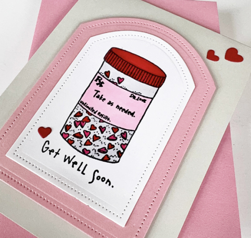
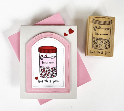
When I recently needed a get well card, I went to my wooden stamps and came up with this cute one. I can’t read the company’s name, but it came from St. Louis, and one of the dates on it is 1994. 

WWGetWell

I was in the midst of making valentines, so stuck to the same colors: pink and red. I used Copic markers for the lid on the pill box, but used my red Staedtler triplus fineliner to color in the heart-shaped pills. I die cut the image with Reverse Confetti’s Pierced Round Top die and then die cut the next size in pink, and added it to a gray card base.

WWGetWellClose

I added three little red hearts die cut with Hero Arts Infinity Hearts and The Greetery’s Cupid’s Arrow.

I’ll be soaking up the sun in Aruba when this post goes live, but hopefully, will get it linked up to the Woodblock Wednesday post on Amy’s blog.

Featured-woodblock-Wednesday-graphic-copy-1

Breezy Blossoms

  • by

The night before we left for vacation, I actually found time to put together two cards. After using the Betterpress, the Breezy Blossoms were then colored using the accompanying stencils. This was all done so long ago that I don’t remember a thing about it. After die cutting them, I put them in a little plastic bag and stuck them in my “Work on This” box. I had dumped them on my desk, and before cleaning up to leave, I sat down and figured out two ways to use them.

BreezyMint

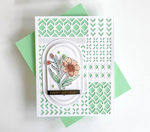
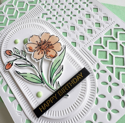
This card uses a NBUS coverplate, Modern Design Blocks. It came as part of the August 2024 Pinkfresh Create and Connect event. I never seem to get to all the class cards, let alone the Make & Takes, but eventually I get around to using the products. I layered it on a mint card base, and then die cut two Nested Elongated Balnket Stitched Ovals, also by Pinkfresh.

BreezyMintClose

I layered just one stem of the Breezy Blossoms, added a sentiment with a Memory Box Black Tab Birthday greeting, and three enamel dots. 

BreezyCoral

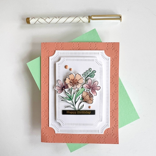
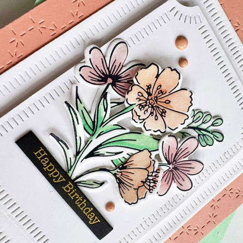
This card also uses a cover plate that came with a Create and Connect event, the Stitched Octagon Cover Plate. Concord and 9th’s Grapefruit cardstock was a great match for one of the inks I used coloring the florals. This card uses a number of different stems grouped together.

BreezyCoralClose

I die cut two of the Pinkfresh Notched Corner Frames, bumping the top one up with some dimensional foam. Another Black Tab greeting and some enamel dots.

I’m sending these off to The Neglected Stuff Challenge blog as well as NBUS – these are a perfect fit! I’m also adding them to the February Pinkfresh Challenge where Anything Goes, and Seize the Birthday without the Topping

NeglectedStuffNBUSMonthlyChallenge-Feb25-TransparentTreasuresSTB-AnythingGoes


Just a Note

  • by

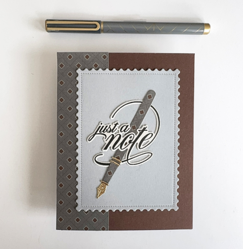
I’m CASEing myself with this card. It’s the same general design as my previous cards with an addition of a strip of patterned paper from Papertrey Ink’s Three Piece Suit paper pad which has been in my stash for years. I needed a masculine card for a note of encouragement, and luckily, The Paper Players are looking for CAS Masculine cards. 

NoteTedd

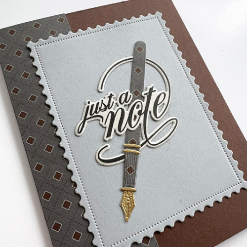
With the exception of the patterned paper, all the dies used are from The Greetery: The pen (Pen Pal), the postal background (Postal Frames), and the sentiment (Scripted Sentiments.) 

TeddNoteClose

When the Pen Pal dies were introduced, Betsy showcased some of them with patterned and stamped papers, so I gave that a try which I quite like. 

In addition to the Paper Players, this is also off to the Word Power Challenge where the sentiment should take center stage. 

Copy of pp554  WordPowerChallenge Badge

Pink Magolia

  • by

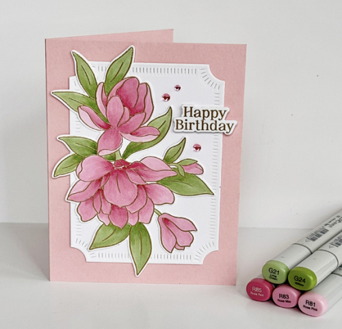
I recently won a very generous gift card at Pinkfresh Studios. I’ve been saving the lovely gift certificate I received for Christmas, but I had no trouble spending the money I won! Most of the order were for things that had been on my wish list for quite some time, but I also purchased the stamp and die, Magnificent Magolia, from a recent release. Once I was done making valentines, I was anxious to get it out for a play date. 

PinkMagnolia

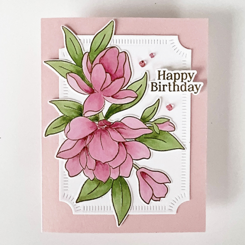
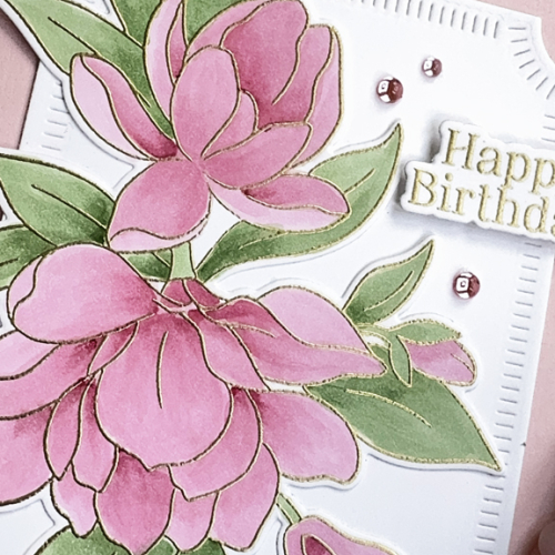
The first step was to emboss the image in gold. Then I chose a group of three pink Copic markers and two green markers. I considered two different dies for the background, but settled on the Notched Corner Frames which I die cut in white after die cutting the magnolias. Both were added to a pink card base.

PinkMagnoliaFlat

The sentiment came from another, older, Pinkfresh floral set, Nothing But the Best. I had forgotten this lovely birthday sentiment which also included a die. It, too, was gold embossed, and I added three Clear Drops in Blush from Pinkfresh.

PinkMagnoliaClose

Looking out my window it’s hard to imagine that magnolias will be blooming in a few months. We’ve gotten several inches of snow every day for the last several days. Around noon today, the sun came out, but the wind is so cold it feels like -7°. Our snowblower “died” yesterday, so Tracy has had to shovel our long and steep driveway. We cancelled a meeting scheduled meeting here to night, as there is no easy parking on our street if the snow is piled up. Fortunately, if all goes well, we’ll be headed toward warmer climes this coming weekend. 

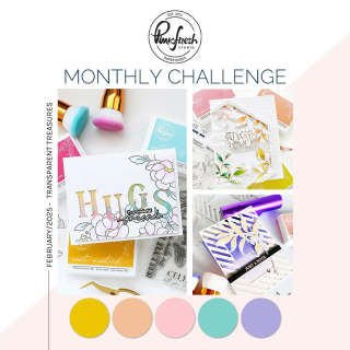
Pinkfresh has changed their monthly challenge so “anything goes,” I always think I’ll get an entry in, and I should, since I have a very large selection of Pinkfresh products. So this is off to the Pinkfresh February challenge.

MonthlyChallenge-Feb25-TransparentTreasures

I chose pink for the magnolias since The Flower Challenge is looking for pink, and a birthday sentiment so I could play along with Seize the Birthday, without the topping this round. It’s also off to Darnell’s NBUS, and follows along with her I.D.E.A.S. which this week is embossing. 

2025 - 99 February-001STB-AnythingGoes        NBUS


Color Hues #104

  • by

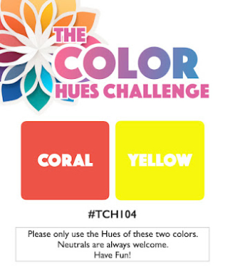
Mid-February, and here in Western New York, we’re in need of some fresh, bright colors. Bonnie has chosen a perfect combo for the next Color Hues Challenge: Coral and Yellow.

CH #104 Coral and Yellow.001

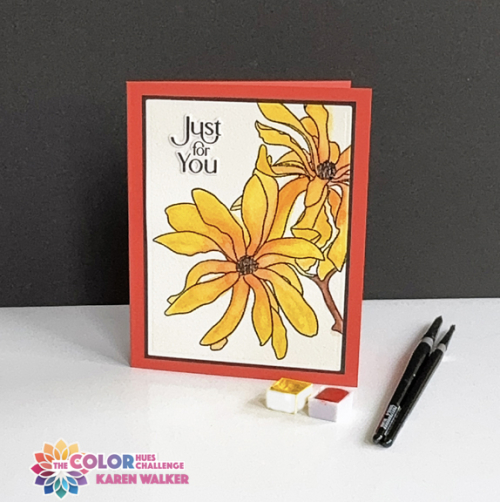
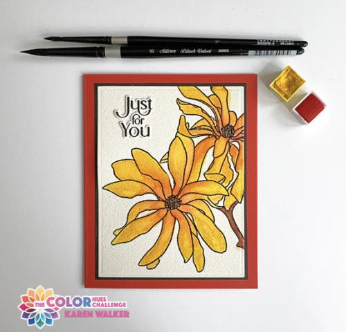
Frequently, I turn to orange in my card making, but I rarely think about coral. I did some searches on the internet to be comfortable with the difference between orange and coral–they are very close! Then I wanted to find an image to watercolor. I thought I could blend the coral and yellow for a floral, so chose Altenew’s Magnolia Ballerina. We live just a block away from a fabulous park which has a large collection of magnolias. There are two yellow magnolia trees, but I must admit I took some liberties with the brightness of my hue, and with the coral centers-a bit of creative license!

CH104

I stamped the design on Arches 140# watercolor paper, and embossed it with clear embossing powder. I found two watercolors in my collection that worked well: Lemon from Altenew’s 36 Pan Watercolor Set. and Coral Reef from The Stamp Market’s Color Crush Watercolor Palette Pans. I used two shades of brown watercolor from the Altenew set for the centers. 

CH104Flat

The sentiment from The Greetery’s Tagged Elegance was stamped on Arches watercolor paper and die cut with the accompanying die. I’m determined to get to all the NBUS dies and stamps in my box, and the dies for this set were purchased during the Christmas release last year but it’s the first time I’ve used them.  A simple black border attached to a card base created with Gina K’s Coral Reef cardstock finished the card. I did try some coral and clear embellishments but they all seemed too busy.

I hope you’ll join us! As always, you’ll find lots of inspiration from the Design Team and our Guest Designer, Teresa. The challenge will be live until February 27th. 

You’re Doggone Great!

  • by

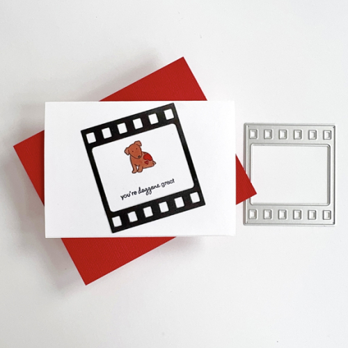
I have one last valentine to share before the holiday arrives. Each Tuesday and Thursday I work with a group of five first graders who are enrolled in a Spanish speaking class at a nearby elementary school. Nearly all the instruction is in Spanish, and I do not speak nor do I understand Spanish. It turns out that I don’t need those skills since my job is to help them read in English. All five have good verbal skills in English so communicating is not a problem. Progress with reading English is slow, but they never seem to lack interest or enthusiasm for the process. It’s the second year I’ve worked in this class, and it’s been a wonderful volunteer experience. 

I have a lot of cute valentine images, but they all use a play on words that I didn’t think my first graders would get. Explaining “doggone” good won’t be too hard.

Doggone

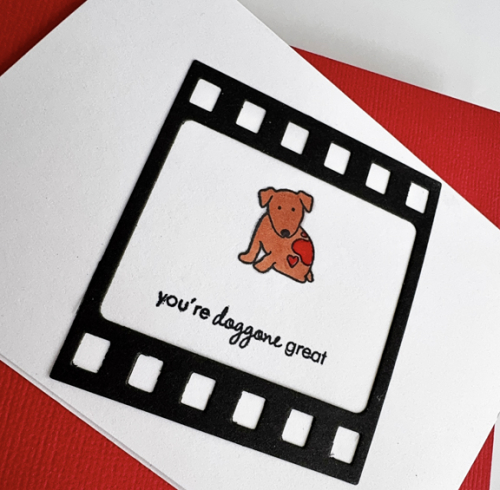
This valentine uses one of my oldest stamps sets, Papertrey Ink’s Tiny Treats and one of my newest dies, Altenew’s Picture Perfect. 

DoggoneClose

Luckily I found a set of five Paper Source A4 cards and envelopes which made this an easy valentine to put together. I colored the puppy with a Copic marker and used a red Staedtler triplus fineliner for the hearts. 

I’m adding this to Darnell’s February NBUS gallery since I’ve now put the Altenew frame to good use.

NBUS


A Mailbox Filled with Hearts

  • by

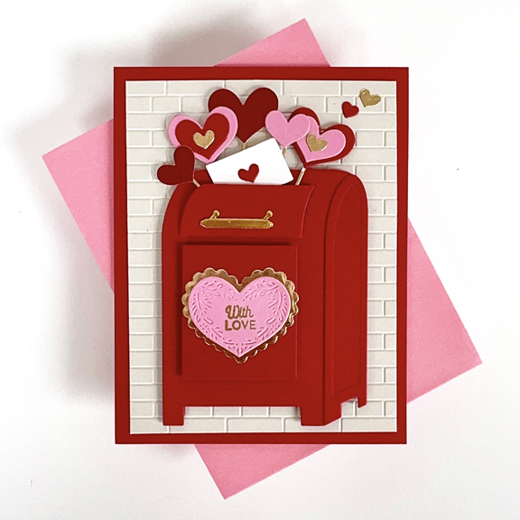
I’ve really had a fun time this year creating valentines. I originally bought this Spellbinder die, Parcel and Post, to create a valentine. I’ve used it for several occasions, but this might be the first time it’s shown up as a valentine.

HeartMailbox

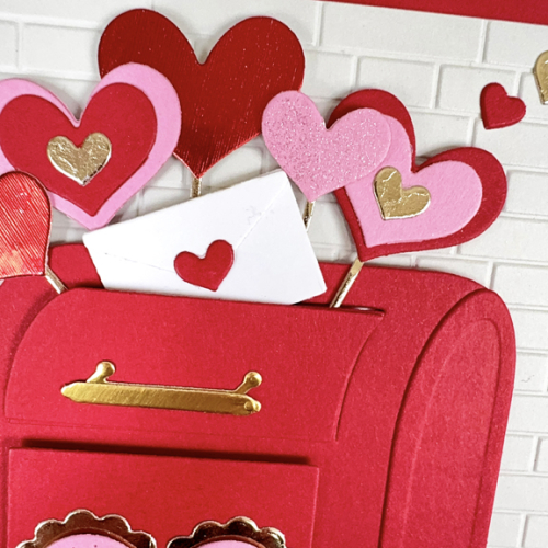
I already had a red mailbox in the folder that I had die cut earlier. Once I assembled it, I looked through my embossing folders for a good background and chose Taylored Expressions’ Subway Tiles.  I used the smallest of The Greetery’s Nordic Hearts for the front of the mailbox bordered with a gold metallic scalloped “frame.” The sentiment embossed in gold is from The Greetery, Sentiment Suite: Love.

HeartmailboxClose

Then it was just a matter of diecutting hearts from a variety of papers, adding a bit of glitter to one, and assembling the letter going in the mailbox. 

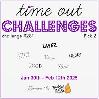
This valentine is off to the Time Out Challenge. It’s a pick two and I actually used three: layer, heart, love. It’s my third, and last, entry into the Just Us Girls: Use a Heart Die–there are several here. 

Badge TO Challenge 281 Pick 2 Newton's Nook (1)761 JUGS DIe


Long Story Short

  • by

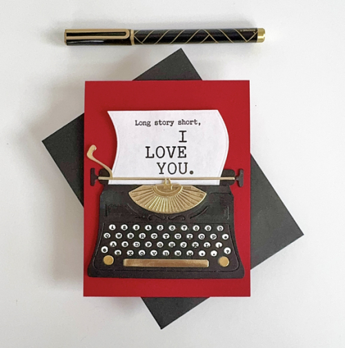
Tracy gave me the Vintage Type die by The Greetery for Christmas. I thought it would be a good idea to use it to create my valentine for him. 

LongStory

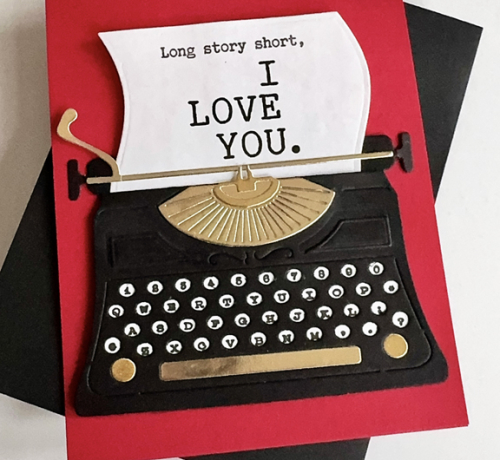
I had borrowed a friend’s die a year or so again, so putting this together went pretty quickly. The sentiment is also from The Greetery, Just My Type. It’s a great set, and there were several ways to combine sentiments. I’m a fan of this one. Here’s a closer look:

LongStoryClose

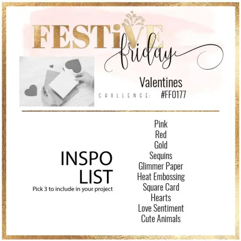
I’m sending this off to Festive Friday where I used Red, Gold, and a Love Sentiment. It’s also off to the Colorful Options Challenge. It’s been awhile since I’ve played along with them. 

Festive-Friday-0177-challenge-card.jpg Colorful Options February 2025

Nordic Heart

  • by

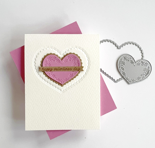
I definitely misspoke in my last post. I did, indeed, buy two other die sets in January–both from The Greetery. Nordic Hearts was part of their recent release. I’m using it today for another valentine, but it will be in rotation all year since it’s perfect for anniversaries as well as thinking of you cards. The Cupid’s Arrow die feels more like a valentine purchase, but elements of that die will also work for other occasions. I made a valentine for my grandson with Cupid’s Arrow, but put it in the mail without taking a photo of it. 

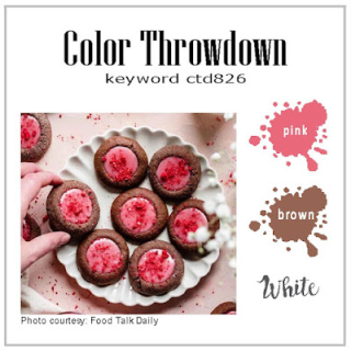
This valentine (I made two of them) are off to friends, both of whom are wrestling with health issues. I chose the colors from The Color Throwdown Challenge: pink, brown, and white. I chose to use watercolor paper for texture on the card base. It’s not a pure white but I hope it counts. 

NordicHeart

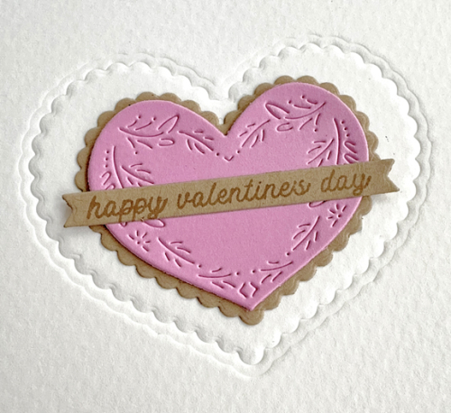
I used the border die from the largest of the three hearts in the set to dry emboss the front of the card. Then I die cut the mid-size heart and border from kraft and pink cardstock. I love the delicate design on the heart. 

NordicHeartClose

The sentiment is also from The Greetery, Sentiment Suite: Valentine, stamped in pink on kraft and die cut with My Favorite Things Itty Bitty Strips. 

In addition to The Color Throwdown, I’m sending this off to CAS on Friday: Valentine and a second entry to Just Us Girls: Use a Heart Die. 

826 pink  brown  white 020525 Fan Friday761 JUGS DIe

Mix and Match Hearts

  • by

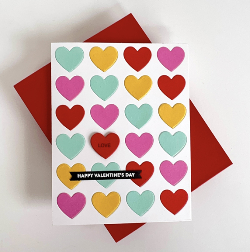
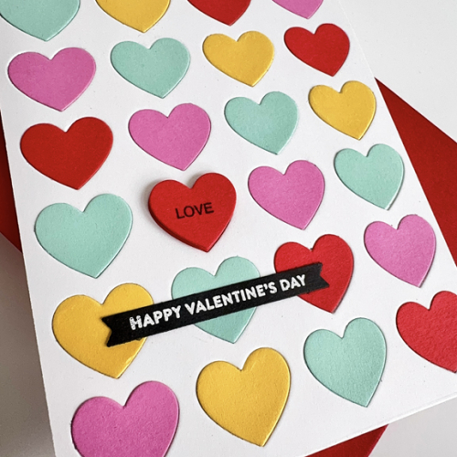
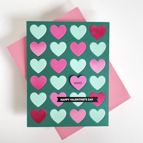
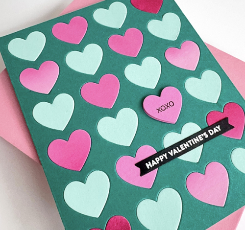
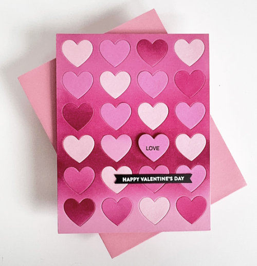
The only purchase I made for valentines this year was Concord and 9th’s Mix and Match Hearts. I started out die cutting many different colors of hearts which gave me a nice collection of not only hearts, but the frames for them as well. I played around with different layouts but ended up making three of the same design, but differing colors, for my three granddaughters here in Rochester. 

MultiHearts

MultiHeartsClose

It takes awhile to inlay all the hearts, but it’s worth the time. There is an accompanying stamp set which adds words to the hearts. I tried using multiple words, but ended up liking one heart with a word, layered with some dimensional tape. 

TealHearts

TealHeartsClose

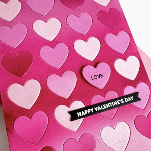
You might notice a few pink hearts with some ink blending. I found a panel I had ink blended some time ago, and used it as one of the panels, and of course, got an array of ink blended hearts as well. You can see that panel in the last of the three valentines.

PinkHearts

PinkHeartsClose

The sentiment on all three cards is from Simon Says Love You Greetings which I die cut with My Favorite Things Itty Bitty Strips. 

Not surprisingly, there are multiple card challenges looking for hearts and valentines. These are off to four of them:

First up, Just Us Girls is looking for Heart Dies (plenty of those here!) I’m also sending these to Double D where the challenge is Hearts and to A Cut Above where Anything Goes with a Die Cut. And last, but certainly not least, it’s off to Darnell’s NBUS. For a change it didn’t take me long to put this die to use.

761 JUGS DIe Double D CutAbove300NBUS


Color Hues 103

  • by

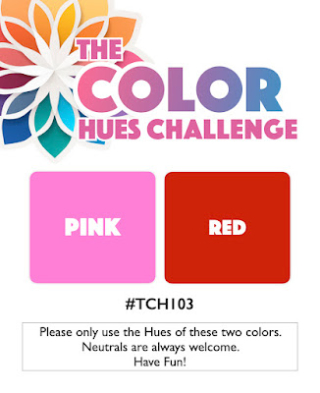
Our February 1st Color Hues Challenge is an exciting collaboration with the Inkspirational Challenge as well. They are joining us with Tracey’s great color combination of Pink and Red. I’ll let Carol, our creative Design Team member and the designer/behind-the-scenes organizer of Inkspirational Challenges fill you in on all the details.
CH #103 Pink and Red.001Inkspirational Collaboration

Carol here. The design team gals and I at Inkspirational are delighted to participate in this first-time collaboration with Color Hues. Creating with Red and Pink – a combination open to such a wide range of hues, as well as occasions/events – makes us even more happy! Hopefully, you’ll find our team’s contributions as inspiring as those created by the team here.

This collaboration serves two key goals: to increase the exposure of both challenges to players who may/may not know about them and to offer YOU a chance to share your projects in two galleries. If you link up here, please be sure to hop over to Inkspirational to link with us there. We’re hoping for an outstanding number of entries over the course of the two week run of both challenges.

A wee bit about Inkspirational Challenge, in general:

We’re a two-week challenge that features a rotation of: Word Prompt, Designer’s Choice, Mood Board, Clean and Simple, Use Stencils and Seasonal. We’re pleased to have a strong group of participants who embrace our challenges with enthusiasm and creativity on a regular basis. We look forward to introducing them to Color Hues and hope they’ll add this engaging challenge to their crafting repertoires.

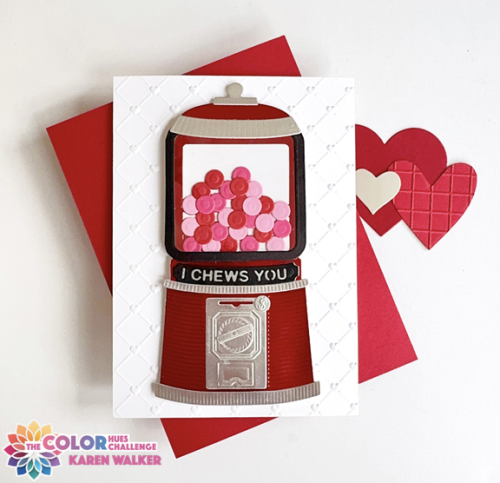
This was the perfect opportunity for me to create another valentine. When we were visiting Wisconsin in November, my granddaughter and I ended up having a conversation about gumball machines. I have no recollection of how that conversation came about, but when we returned for our Christmas celebration I brought along my NBUS Spellbiner die, Pop-up 3-D Vignette Bubble Gum Machine. I purchased it awhile ago during a clearance sale. Hannah and I never got around to actually making a card, so using it for her valentine was a no-brainer. 
CH103Flat

I chose red metallic cardstock for the machine, and silver metallic for the trim. All the gum balls are cut from paper scraps in my stash. There’s a piece of acetate behind the black frame for the window, and although it doesn’t show, the bottom of the silver piece lifts up as if to let out the gumballs. I layered the sentiment, die cut from black, on silver. 

The gumball machine is larger than an A2 card base. This card is 6X41/2. I used a premade card from Bearly Arts as a guide for the measurements.  Spellbinder’s 3-D Cross My Heart Embossing Folder which is s 5.5X8.5 inches was the perfect background–needed (and appropriate) texture, but white on white so it didn’t distract from main event. I layered the gumball machine with dimensional tape before adding it to the card base.
CH103Inside

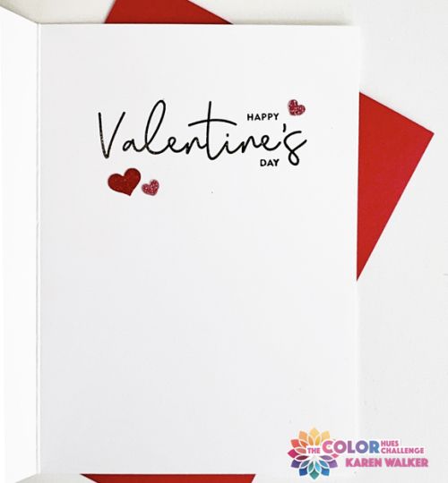
The sentiment on the inside is also a NBUS product purchase after Valentine’s Day last year–Simon Say’s Love You Greetings. I added three glittery heart stickers.

Whether it’s valentines or another occasion, I hope you’ll find a reason to play along with the Design Team and  Trina Pham, our Guest Designer. Be sure to link your creations with the Inkspirational Challenge as well. It’s a fun two-fer! This card is off to Darnell’s NBUS as well!

NBUS