Skip to content

Spring Flowers

  • by

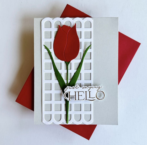
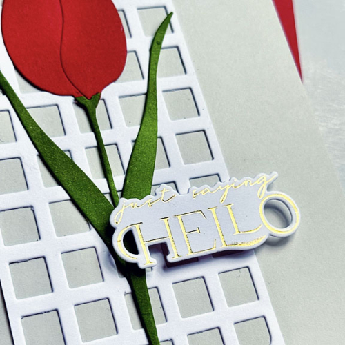
Before we left home for our trip to Europe I was determined to put my new Penny Black Tulip Bloom to use. I’m posting from my brother’s in the Hudson Valley tonight. We’ll drive to JFK tomorrow to fly to Amsterdam, and my post is just in time to enter the card in The Flower Challenge: Spring Colors which closes in about an hour. It was also inspired by the Double D Challenge: Springtime Flowers. I have some birthday cards to share as well, but I’m not sure I’ll get them posted while we’re gone. 
Tulip

I kept the design clean and simple, and used another new product, Pinkfresh Studio’s Scalloped Grid which I cut down for a smaller panel. The tulip was cut from cardstock scraps and ink blended with some red ink which, sadly, does not show well in the photograph.
TulipClose

The sentiment was foiled in gold with the Pinkfresh Here for You sentiments. 

In addition to The Flower Challenge and the Double D Challenge, I’m sending this off to A Cut Above–it’s my last of three entries for April.

2025 - 101 April-001 Double D  CutAbove300

My post for the May 1 Color Hues Challenge is ready to post, so be sure to stop by for that! 
 

Easter Bunnies: Part 2

  • by

Happy Easter if you celebrate! Ours is a quiet one–church and a visit to our granddaughters who arrived home yesterday from a week in Florida. They’ll all be tired and getting ready for school to resume, so it will most likely be a quick visit to drop off our Easter cards and a small gift for each of them.

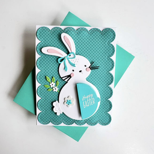
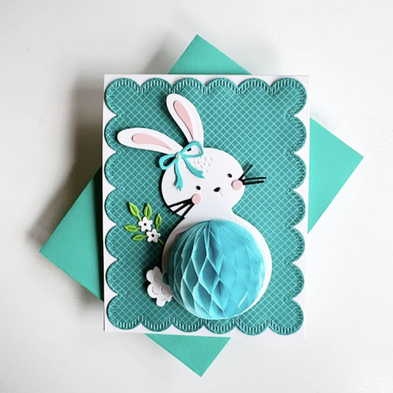
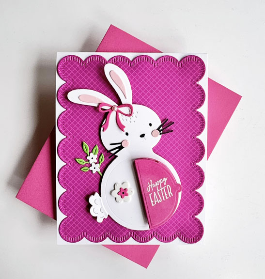
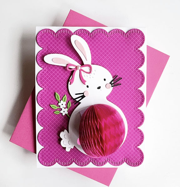
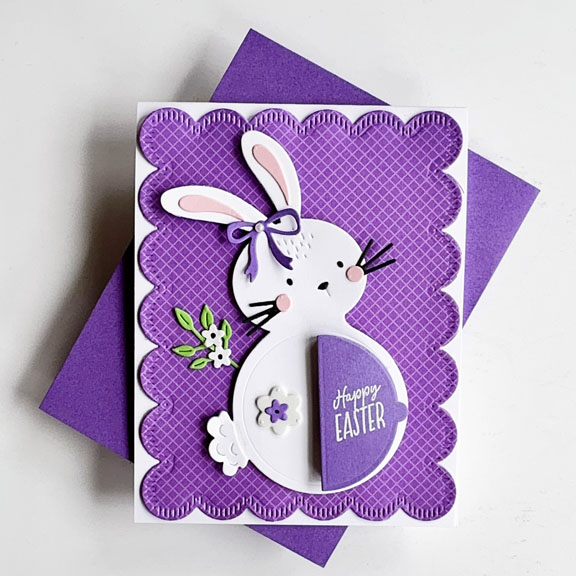
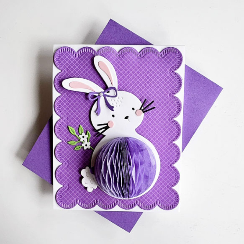
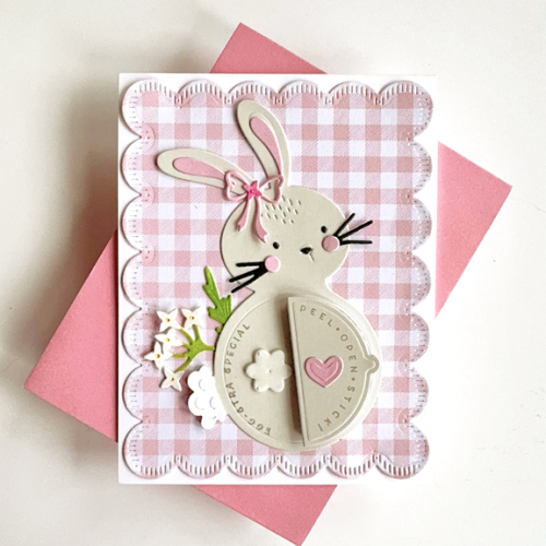
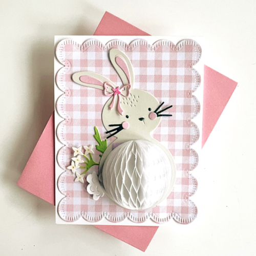
All three cards are the same design, just different colors. I might never have come up with this colorful design had it not been for a comment on my blog from Diane Hover which sent me off to her blog to see her Hey, Honeycomb Bunny from The Greetery. I had kept to more realistic colors for my first two bunnies, but really these colorful bunnies are just perfect for the girls. I chose the honeycomb balls first, then searched through my patterned papers and came upon Sunny Studio’s Gingham Jewel Tones which had wonderful matches.

Once I had the colors and the patterned papers all three came together nicely. I die cut the patterned paper with my friend’s Stitched Scallops from The Greetery. The Hey, Honeycomb Bunny and all the rest of the dies are from The Greetery as well. The little florals are from the Winter Medley collection, and the little bows were die cut from the Diamond Ribbons die. I didn’t bother to stamp and emboss the “directions” for opening the honeycombs since the girls are already familiar with the routine. 

Here they are with the honeycombs closed and then open. Keeping them open is a challenge!

TealBunny

TealBunnyOpen

PinkBunny

PinkBunnyOpen

PurpleBunny

PurpleBunnyOpen

And that’s a wrap for Easter this year. I’ve got several birthday cards to share that also use the Hey, Honeycomb products. They work so well for kids, although I did make one I think will go to an adult. No reason not to spread joy to everyone!

There are still some challenges around where one of these bunnies would fit in the gallery: AAA Colorful with a beautiful colorboard, Shopping Our Stash: Hippity Hop. and A Cut Above where they are always looking for die cut images. 

#15  CutAbove300


More Charming Floral Borders

  • by

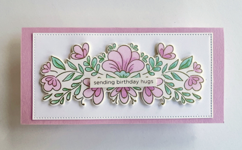
As promised on Wednesday, here are the two cards that didn’t make the cut for the Color Hues Challenge: Lilac and Aqua. The first card was put aside once I realized the “lilac” ink I had used was actually more pink than lilac. I turned this one into a mini-slimline, adding the Pinkfresh Studio Charming Floral Border to a stitched rectangle from Gina K’s Master Layout #7, using some dimensional tape. The sentiment is from The Stamp Market Foiled Card Phrases. It’s always good to have another birthday card in your stash.

FloralBorderMini

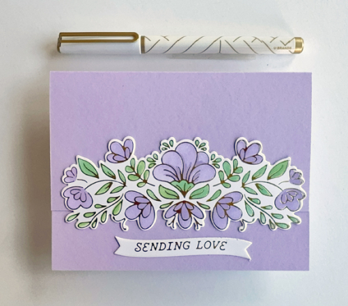
The second card has to be eliminated from the challenge when I used a stencil brush that still had significant green on it. No way could it be called aqua.

SendingLove

It’s hard to see, but I cut the top of the card off and layered the Charming Floral Border over it. The sentiment from Spellbinder’s Curved Everyday Sentiments is on the bottom of the inside of the card. This has already gone in the mail for my brother-in-law and sister-in-law’s anniversary.

The first card is off to Seize the Birthday Challenge: Layer it, and both cards are off to The Flower Challenge: Spring Colors and the Pinkfresh Studio April Challenge: Floral Frenzy.

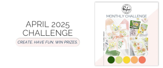
04-10-LayerIt2025 - 101 April-001. MonthlyChallenge-April25-FloralFrenzy-Banner_876908ef-2427-4452-9438-fb635cc1ab39_1100x copy

Color Hues #108

  • by

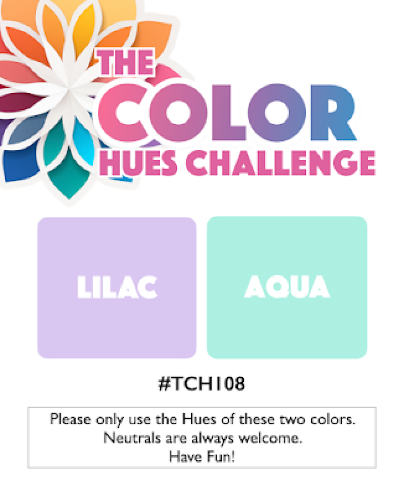
It’s mid-April and time for a new Color Hues Challenge. Nancy, our fabulous leader, has chose Lilac and Aqua. It’s such a beautiful, soft color combination.

Ch #108-Lilac and Aqua.001

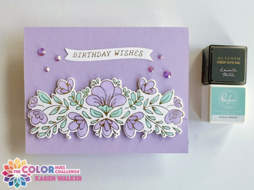
The biggest problem I had with this challenge was finding the “correct” lilac ink. Although the first ink I used had “lilac” in its name, it was entirely too pink. I tested several more before finding an older Altenew in called Lavender Fields. It was a great pastel purple.

CH108jpg

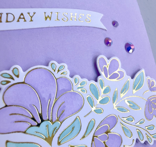
As I did for the last challenge, I chose an older Pinkfresh Studio product. This time the Charming Floral Border with accompanying stencils and die. I used just one ink for each color, starting with a light hand and adding the highlights with a firmer hand. After finishing the coloring, I die cut the border. Then using Papertrey Ink’s Lilac Grace cardstock, I did a partial die cut on the card base with the border die, adding the floral border on top. The foiled sentiment banner, Curved Everyday Sentiments, is by Spellbinders.

CH108Close

The closer view gives you a peek at the beautiful foiling as well as the perfect match jewels from the Pinkfresh collection of Essential Jewels as a final embellishment.

In the next day or so, I’ll post the two additional cards I made while working on this challenge–the pink one and another “fail” when I used a stencil brush that wasn’t clean enough so instead of aqua, I had green! But it’s nice to have a couple additional cards in my stash.

It’s time now for you to hop over to the Color Hues Blog and check out the great designs and creativity from our talented Guest Designer, Caroline, and the Design Team. I hope you’ll join us in the gallery.

I’m sending this off to the April Pinkfresh Studio Challenge: Floral Frenzy.

MonthlyChallenge-April25-FloralFrenzy-Banner_876908ef-2427-4452-9438-fb635cc1ab39_1100x copy


Easter Bunnies: Part 1

  • by

Two of my Easter cards needed to be in the mail yesterday. Since my grandchildren definitely do not read my blog, I thought I’d share them while some of the Easter challenges are live. These cards are proof that I don’t always take weeks, months, and sometimes a year to use the products I love enough to order. These Honeycomb Bunnies from The Greetery were irresitable in last month’s release. I have to restrain myself from buying all the different varieties in the Honeycomb line.

First off is Hannah’s card. I borrowed a friend’s Stitched Scallops die, also from The Greetery and found a My Favorite Things pack of gingham papers, Gingham Galore, to use as the background. The bunny was die cut from my palest gray cardstock, Soft Stone, from Papertrey Ink. All the detail pieces came from my scrap boxes. I used stamps from the Honeycomb Basics as well as Honeycomb Spring. 

PinkBunny

I added a spring from The Greetery’s Wildflower Mix for the embellishment. The tail was die cut twice from white and the top on raised up a bit for dimension. Here’s the bunny with the honeycomb opened up.

Pink bunny Open

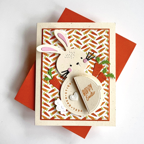
I struggle with holiday cards for my 13 year old grandson, who is now taller than I am. But I went ahead and made another version of the same bunny for him. When I made the Honeycomb Penguins for Christmas, he ended up putting it on his dresser which I took for a sign that it was fine with him. I intend to ask him after Easter what he thought of the card. 

OrangeBunny

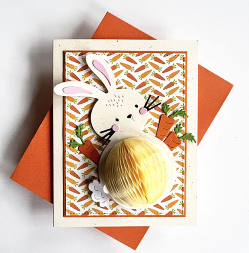
The patterned paper was in an envelope with Easter die cuts and left-overs from previous Easters. I suspect it’s left over from my scrapbooking days. The die cut carrots were die cut at my friend’s house a year or two ago, and I’m not sure who made them. I was, however, delighted to find those in the envelope as well. This bunny was die cut from Papertrey Ink’s Rustic Cream cardstock. I added some dimension behind this bunny since the background was so busy. I did cut the patterned paper and the narrow orange frame with Gina K’s Master Layout #2.

Orange BunnyOpen2

The honeycomb on this bunny isn’t as bright yellow in real life.

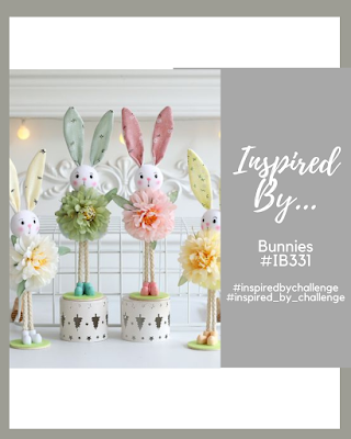
Several of the Easter/Bunny challenges are also CAS challenges. Neither of these come close to being CAS. The Fourseason Challenge: Anything Spring and the Inspired By: Bunnies Challenge are super appropriate. The Four Seasons has a beautiful moodboard, but I didn’t add it here–there were no bunnies, but I saw some bunnies already in the gallery. I’m also sending this to Darnell’s I.D.E.A.S. gallery (this week is dies) and to her NBUS Gallery these bunnies are new but never used before!

IBBunnies


Flower Shoppes

  • by

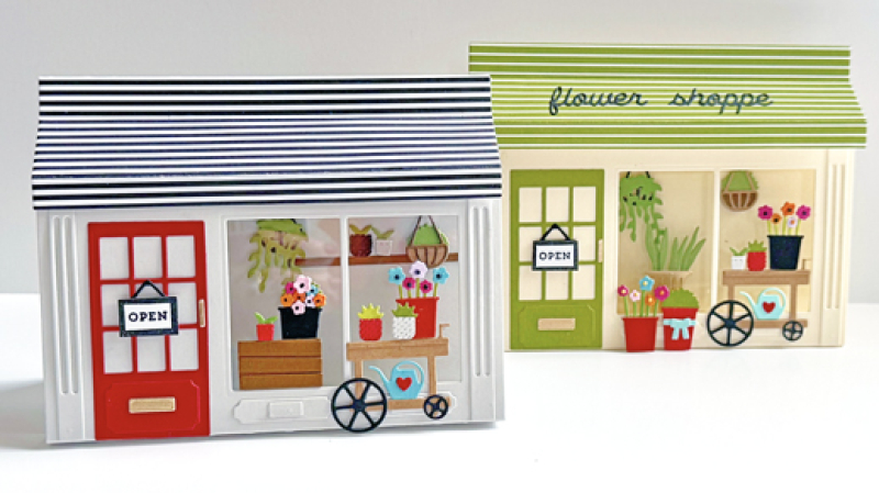
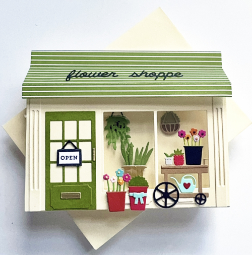
I had lunch today with two of my best friends, both of whom have April birthdays. Their birthday cards were in my mind when I asked for the Flower Shoppe dies from Concord & 9th for Christmas. 

TwoShoppes

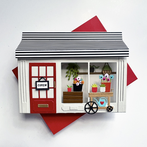
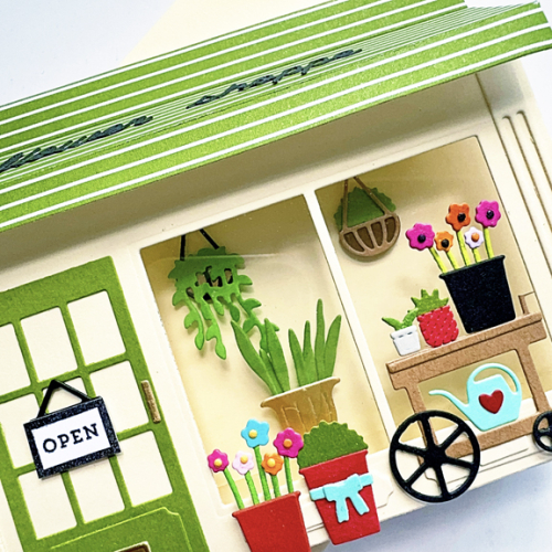
I started putting together the flower pots, cart, and hanging plants when I was in Racine in March. I ended up needing more, but it was a good head start. After assembling the pop-up shoppe with Concord and 9th’s Window Shoppe die, I added the acetate behind the windows, the architectural details, and the door. 

GrayShoppe

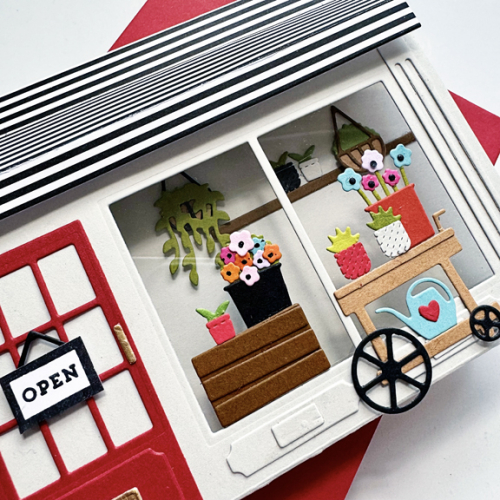
Getting the hanging pots, shelf and florals inside the shoppe would have been easier if I had added them before assembling the shoppe itself. But it was easier to know what I wanted back there, and a nice pair of straight tweezers made it pretty easy. Everything else was glued to the front of the shop.

GrayShoppeClose

I wanted the two cards to be somewhat different, so chose a different color for the shoppe and the awning. The “flower shoppe” sign dies looked fine on the green awning, but got lost on the black and white one.

GreenShoppe

I changed up some of the flowers, adding a tall plant in a gold pot from the Window Shoppe die, and a second hanging plant instead of a shelf. 

GreenShopClose_9026

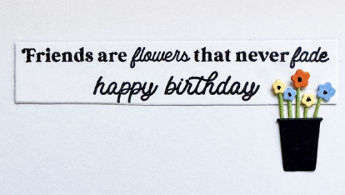
Both cards had the same inside message. 

FlowerShoppeSenitment

Last year I created a Fashion Boutique for one of my granddaughtes. I love that the shoppes fold up and fit into an A2 envelope, and I love all the tiny details that are included in both the Fashion Boutique dies as well as these floral dies. Before I ever made one of these shoppe, I purchased the Book Shoppe dies and used it for a card for my grandson. Next on my list is to create a book shoppe. 

I’m sending these off to A Cut Above: Anything Goes.

 CutAbove300

Abstract Sunset

  • by

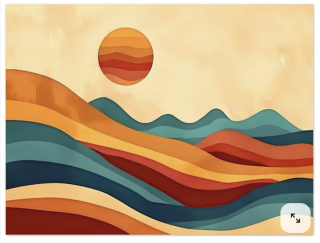
Right before the latest Color Hues Challenge went live, I discovered this canvas from an Etsy shop:

Sunset Screenshot

Had I seen it earlier, I’m pretty sure I would have made this card:

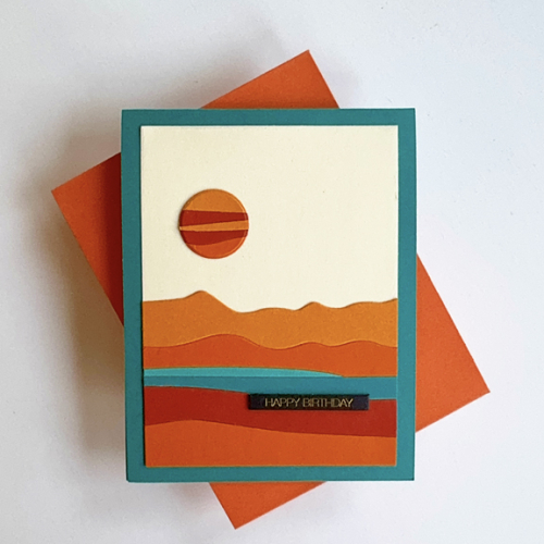
Sunset

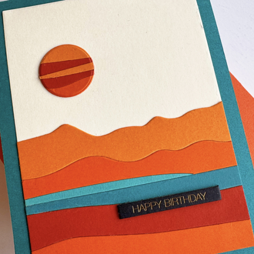
But it didn’t take me long to get to it since I needed another masculine birthday card. (In fact, I need several, so hopefully I’ll be back soon with more.) I knew as soon as I saw the inspiration piece that I had the perfect die from Ellen Hutson, Abstract Sunset. After die cutting the pieces from multiple cardstocks, I pieced them back together on a cream rectangle cut with Ellen Hutson’s Essential Rectangles.

SunsetClose

Then I pieced together some oranges, and die cut the sun. I ended up using one of Ellen Hutson’s Essential Circles, since the circle die in the Abstract Sunset was smaller than I wanted. Once again the gold foiled Black Tabs from Memory Box was the perfect sentiment. 

This is off to the Just Us Girls Challenge where they want die cuts, but no flowers, and the Wednesday Simon Says Challenge: Birthday Cards.

769 JUGS DieWednesdayblog-logo


Color Hues #107

  • by

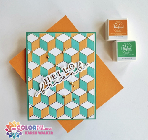
It’s April Fool’s Day. It was one of my least favorite days as a teacher of 5th graders who delighted in trying to do you in and usually succeeded at some mischief. Today, however, April 1st means a new Color Hues Challenge, and it’s a good one. Jules chose Orange (one of my faves) and Teal. It’s a great combination, and not one I’ve used very often. 

CH #107-Orange and Teal.001

I pulled out an old favorite hot foil plate from Pinkfresh Studio, Geo Blocks and it’s accompanying stencil. I don’t think I’ve ever used all three stencils because I love the way it looks with some white space. 

CH107

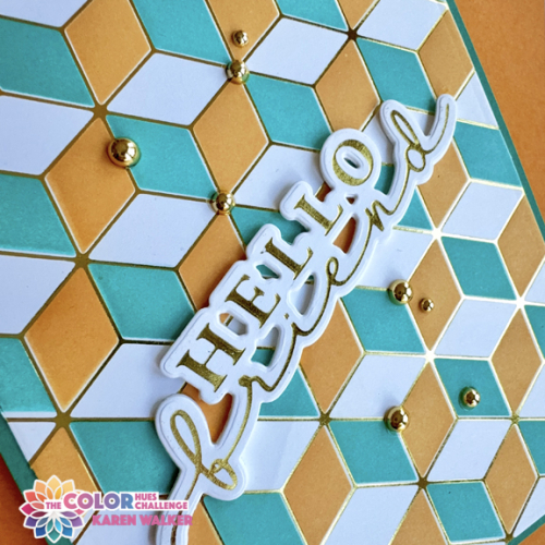
This time I decided to use a larger hot foiled sentiment from Waffle Flower, Hey, There.  I liked it placed on the diagonal which is not something I often do. 

CH107Close

This gives you a better look at the shiny gold foil. It took me awhile to figure out where I wanted to add some gold pearls, but I’m happy with the final decision.

As always, you’ll find lots of inspiration on the Color Hues blog by our wonderful Guest Designer, Renate, as well as the fabulous Design Team! I hope you’ll come join us!

My schedule has been crazy recently, and although I’ve been crafting, there hasn’t been much that could be shared just yet. I don’t usually let two weeks go by without blogging, but I hope to remedy that this week. The Women’s NCAA March Madness schedule hasn’t helped much. I’m a huge fan of women’s college basketball and watch a lot more television during the tournament. The only consolation to the increased TV time, is that while I watched the games, I finished two big organizing and cleaning out projects in my craft room that have been on the to-do list for far too long.