Skip to content

Festive Friday: World Chocolate Day

  • by

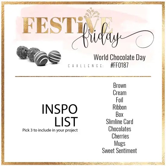
The concept behind the Festive Friday Challenge is an interesting one. Each challenge focuses on an individual festivity or holiday. Recent challenges have been World Pet Memorial Day and Father’s Day. The challenge team then lists a variety of elements inspired by the event. I follow the challenge, but don’t often have a great idea that would incorporate three of the elements (the minimum). The current challenge, however, spoke to me right away. It is World Chocolate Day! What could be better? And Altenew’s Chocolate Flowers kit was just what I needed.
Festive-Friday-0187-challenge-card

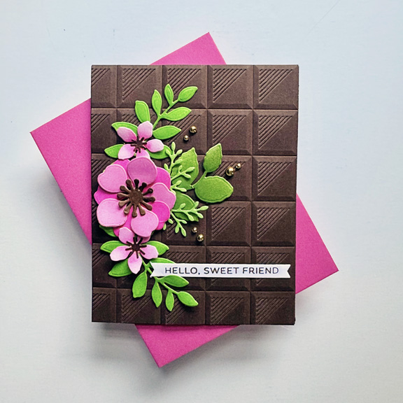
I finished this card a few days ago, but have held off posting it until the last minute of the challenge because the card is on it’s way to a fellow card maker. I hope she opens the card before she sees it on the blog. The three elements I incorporated in the card are: chocolate (the background), brown, and a sweet sentiment.
ChocolateFlowers

I die cut all the flowers and leaves from white cardstock and ink blended them with a varieety of Simon Says Pawsitively Saturated Inks. I love pink and brown together and wanted a bright vibe to the card so used some vibrant pinks and greens.
ChocolateFlowersClose

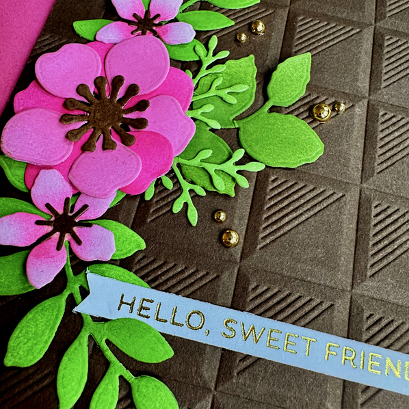
The sentiment strip from Spellbinder’s Always and Forever sentiment set was hot foiled in gold. Not sure why I got such a blue tint to the sentiment strip in this photograph but it’s too late to fuss with it. I added a few of Pinkfresh Studio’s gold pearls as an embellishment and to accent the gold foiled sentiment. 

I am a huge fan of chocolate as is my husband. We have three granddaughters who live near us and two of the three don’t like chocolate at all! We just can’t understand it. 


Woodblock Wednesday: June 2025

  • by

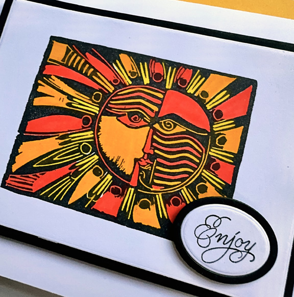
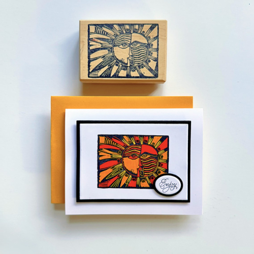
I had a rather grand plan for this card which would have combined a couple of challenges. Although the technique worked, the end result was disppointing, and I moved on. We, like many, have been experiencing very hot weather–over 90° for two days with high humidity. Today’s in the mid 80’s, but it doesn’t feel much cooler. This wood block stamp, Too Much Sun, seemed like the perfect choice. The stamp company name is so faint that I’m not sure who the manufacturer was.
 
WWSun
 
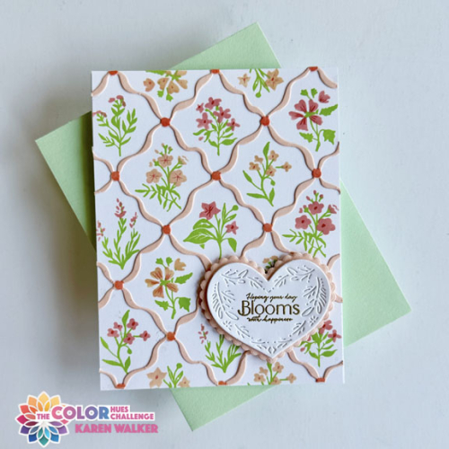
I got the darkest impression with Altenew’s Obsidian ink, so I chose Tombow markers for coloring it. I used just three: a light yellow, a yellow orange, and a red orange. I matted the image with black and used dimensional tape to add it to the white card base. 
 
WWSunClose
 
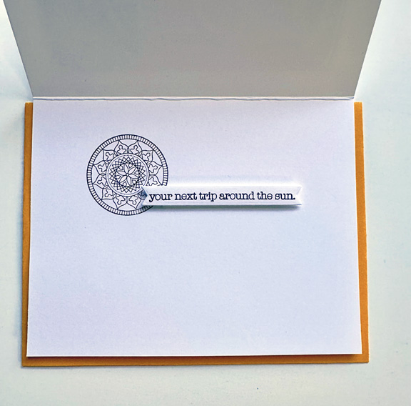
The sentiment from Papertrey Ink’s Sun and Moon is a two part sentiment. I wasn’t crazy about the font for Enjoy, but couldn’t find anything in my sentiment collection that worked any better. I die cut the sentiment and the mat with Ellen Hutson’s Essential Ovals. The second part of the sentiment was just perfect:
 
WWSunInside
 
I stamped the medallion with black ink, and then die cut the sentiment with the Banner Dies from The Greetery. 
 
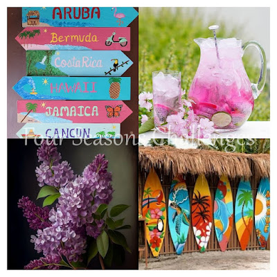
In addition to Woodblock Wednesday, I sending this to the Four Seasons Challenge: Summer.
 
Featured-woodblock-Wednesday-graphic-copy-1June Mood Board
 

Brushstroke Stamping

  • by

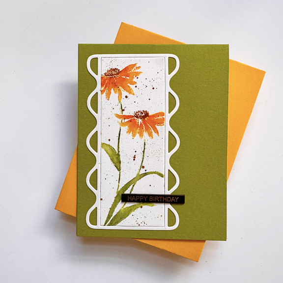
The Penny Black videos showcase not only their stamps and dies, but a variety of techniques. They caused me to get out my watercolors here, and today’s card takes me back to the days of woodblock stamps where I used Tombow markers directly on the stamps, then misting them lightly with water to create a watercolor look. I have a couple older Penny Black “slapstick/ Cling” stamps, but this newer one is a much simpler design. 

PBDaisies

The Curvature frames are another of my more recent purchases. This is the middle-sized one and I used the interior, cut from Bristol Smooth paper and put it in my MISTI to stamp. This is a great improvement over the woodblock stamps where restamping was impossible. I used the Tombow markers as well as a waterbrush to even out the stamping and to blend the different colors of ink. I should have done some ink blending before stamping the image, but I didn’t think of it, so just added some splatters. My friend, Bonnie, made a beautiful card, and she was able to do the wash after the stamping. I wasn’t so brave! 

Nearly all Jill Foster’s card bases are the same color as the paper on which she stamps. That makes for a very clean and simple card. I like this particular image much better on a green card base, but I think it’s still pretty CAS. 

I’m sending this off to the Penny Black Saturday Challenge--my second entry this month. It’s also going to NBUS--another first run for both the stamp and the frame.

PennyBlackChallengeNBUS

Watercoloring with Penny Black

  • by

For months now, I’ve been watching videos by Jill Foster for Penny Black. Although I had a few products from Penny Black purchased years ago, I’ve added a few more over that last few months. I’ve used some of the frames before, but pulled out two  new images for a bit of watercoloring. Jill uses re-inkers for Distress Inks as her watercolors. I have just a few of those, but I have many different watercolor sets to choose from. For these I used both Altenew’s 36 pan watercolors as well as a few of the Zig Clean Color brush markers. It had been quite awhile since I had done any watercoloring, and it took a few tries before I got a handle on it again.

SpringFlowers

This card uses one of two images in the Penny Black stamp set, Perch. The title of that set doesn’t make much sense for this image, but the second image features a darling bird perched on a flower pot. The beautiful frame is one from the Classy Frames set which I borrowed from a friend. I lightly ink blended the interior die cut before stamping the sentiment from Pinkfresh Studio: You Are My Rainbow. 

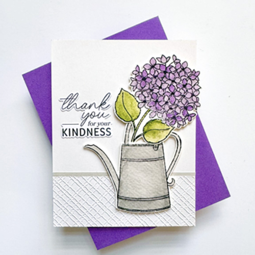
The second card uses a set (stamps and die) from Penny Black’s new Flower of the Month series. The minute I saw it, I knew I wanted both the hydrangea and the watering can. We have multiple hydrangeas in both our front yard and around our patio. They are among my most favorite flowers. They are beautiful outdoors and last a long time when I bring them in for a flower arrangement. 

Hydrangea

This card design is one of Jill Foster’s many designs with both embossing folders and images. This uses Penny Black’s Texture embossing folder. I added a thin strip of light gray paper as a border. The sentiment is from Pinkfresh Studio’s Extra Special Sentiments.

I’m sending the first card off to the Penny Black Saturday Challenge: Anything Goes, and the second card is off to The Flower Challenge that wants dry or wet embossing. Both will show up on Darnell’s NBUS blog since it’s the first run for both images, and for the embossing folder as well.

PennyBlackChallenge2025 - 103 June-001NBUS

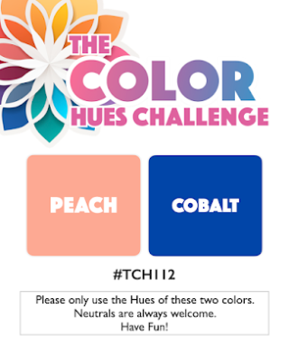
Color Hues #112

  • by

Mid-June already? I so love the warm weather that I wish summer didn’t fly by so quickly. One consolation: there’s a new color combination on the Color Hues blog, and Stef chose a delightful new combination. Another color combo I would never have thought of, but I enjoyed the challenge.

CH #112-Peach and Cobalt.001

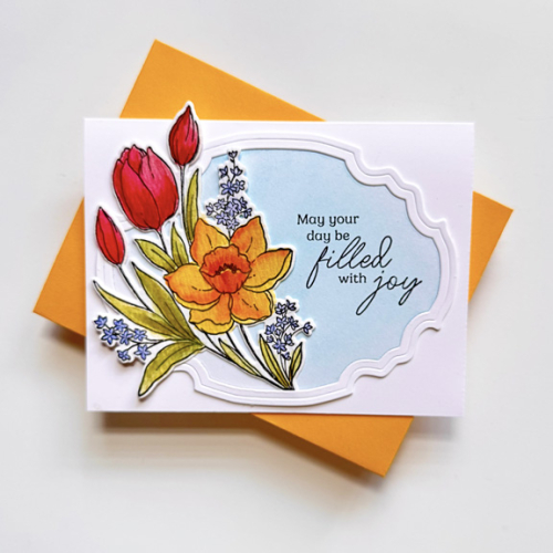
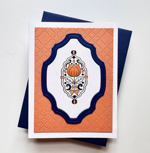
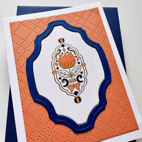
The first place I look for inspiration is in my box of NBUS (Never Before Used Stuff). This time I came across an Altenew mini-stamp, Tulip Motif, that I loved, and knew it would fit right in one of the new Penny Black Classy frames. I actually borrowed the frames from a friend when I created this card, but I now own the set. 

CH112

I started by embossing the image in gold. Sadly, the gold embossing doesn’t show up well in either photo. Coloring it was a bit of a challenge because it’s so small. I used a combination of Tombow and Copic markers and there were a couple images that hit the circular file before I finished. The cobalt frame was die cut three times and stacked for some dimension. I used The Stamp Market’s Pierced Plaid Cover Plate to add some texture to the peach background.

CH112Close

I decided not to add a sentiment this time. There didn’t seem to be a natural place for one, and the inside sentiment will determine how the card is used–a birthday, a thank you, or a thinking of you–all work with this design.

As always, hop over to the Color Hues Challenge blog for some inspiration. It’s fun to see how many ways a color combination can inspire someone. The Design Team and our Guest Designer, Teresa S., aced this one! 

This goes off to the NBUS blog since the Tulip Motif saw it’s first run today.

NBUS

Happy Father’s Day

  • by

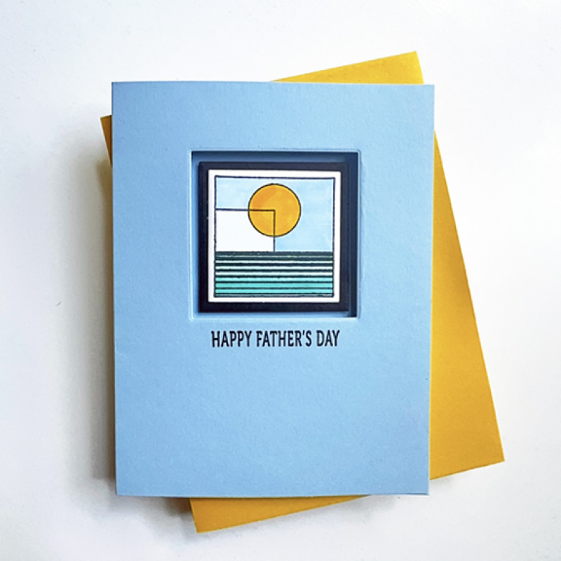
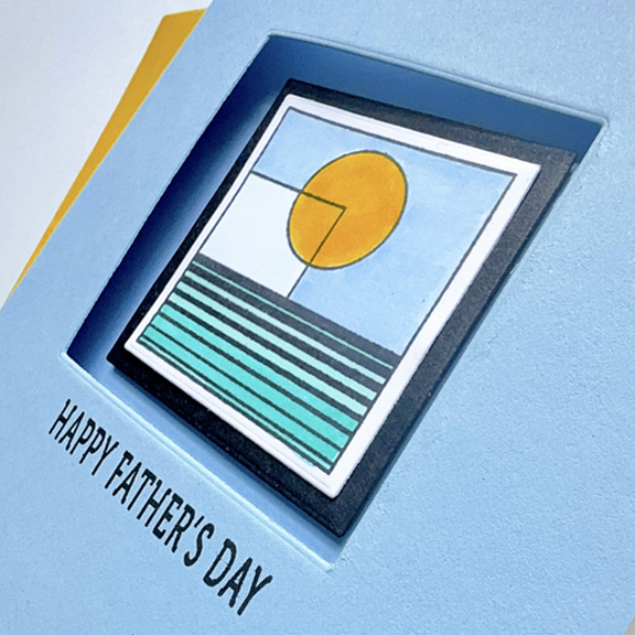
It’s frequently a dilemma to know what to design for a Father’s Day card. This year I leafed through the Designs category in my stamp collection and came upon an old favorite from Uniko, Bauhaus Blocks. There are five different stamp designs, and when I looked through my Pinterest Board I found this beautifully colored design by Bev Brown, the creator of Uniko Designs. I definitely CASED her color choices, but decided to focus on just this one block.

Father'sDay

After coloring the image I die cut it with a narrow white border, then added a narrow black border with Ellen Hutson’s Essential Squares. I used the larger square to cut a window from the front of the card, and then added the design block with dimensional tape to the inside of the card. 

FathersDayClose

The sun is shining and after an extremely hectic and busy week, we’re happy to have a day free of any commitments. Matt, Betsy and the girls will stop by later, and we’re sure to FaceTime with Sarah and her family, but otherwise it’s a low key day. 

This CAS card is off to Addicted to CAS: Water, CAS on Friday: Summer as well as the Four Seasons Challenge–also Summern (Anything Goes.)

Water  June Mood Board


Special Graduation

  • by

Tonight is high school graduation for a very special young lady. I first met Serena when she was in fourth grade when I was volunteering in an after-school program. In sixth grade she received a scholarship for a private girls’ school where all her hard work and perseverance paid off. In the fall, she’ll be off to Geneseo for college. I’m one of many who are so very proud of all she’s accomplished. 

Serena

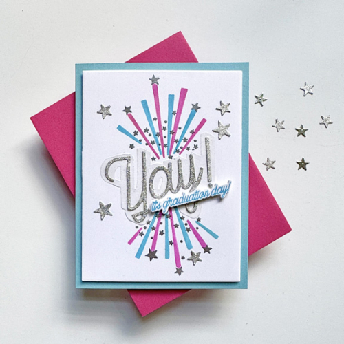
This is my second graduation card this spring, and both were created using the same products: The Greetery’s Yay! suite of products–stamps, stencils, and dies. I chose light blue (the color of the graduates’ robes and added the bright pink to create a feminine card with lots of silver glittery accents.

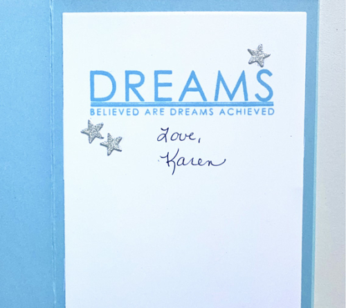
Here’s a peek at the inside. The Papertrey Ink, For the Graduate, had the perfect sentiment. I usually take a photo before I sign the card, but this time I forgot. Because I forgot I brightened this photo a bit more since the shadows were getting deep by the time I remembered. 

SerenaInside

I’m sending this to the gallery at Addicted to Stamps and More where the challenge is: Any Occasion.

Addicted


Celebrate 3!

  • by

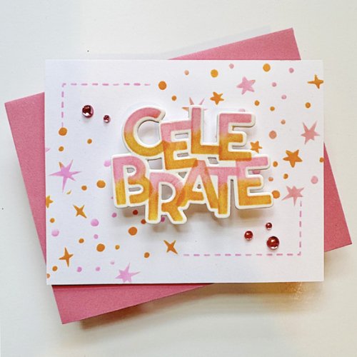
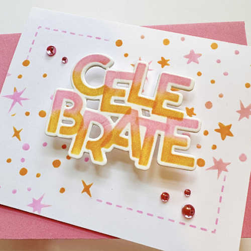
Little by little, I’m finding time to create the cards I liked from the Online Card Class: Celebrate. This one uses a design from Kristina Werner, but has a different different look and feel. Kristina used colored cardstock with a monochrome pattern using stamps. Mine is a white card, and I used the stencils from the class for the pattern. Her sentiment was many colored, and I limited mine to the pink and orange I used for the stencil. She had an additional sentiment. I added some clear pink drops from Pinkfresh Studio. 

Wobbler

The sentiment is attached to the card front with a wobbler. When you touch the sentiment it vibrates back and forth. It’s fun, and I tried to capture a video of it, but I needed at least four hands to get it right! Definitely not my forte. Like the pattern, the sentiment was also stenciled as was the “stitched” corners which are from a brand new stencil by Krsitina Werner and Concord & 9th, Finishing Touches. Once I saw her use it during one of the classes, I ordered one myself. I think it will get a lot of use–there are three large stencils with a variety of patterns. 

WobblerClose

This is off to Word Power (where I should have also sent my earlier card!) and to AAA Birthday: No Stamping. Everything here was stenciled. It’s also off to NBUS. Even though I did used the sentiment die cut earlier, I’ve never used the stencils for the sentiment or the patterns. 

Word Power AAA-BD#74NBUS


Celebrate 2!

  • by

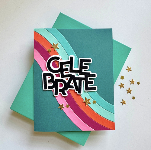
I have another card to share from the Online Card Class Celebrate! This was a Laura Bassen design which I love, but I have to admit, it didn’t come together quickly. First off, it took me forever to find the colors of cardstock I wanted. It ended up that I used cardstock from Concord & 9th, Paper Source, Papertrey Ink, and Gina K. Then I struggled with the wavy dies which required multiple die cuts. But I do love the way it came out.

Celebrate

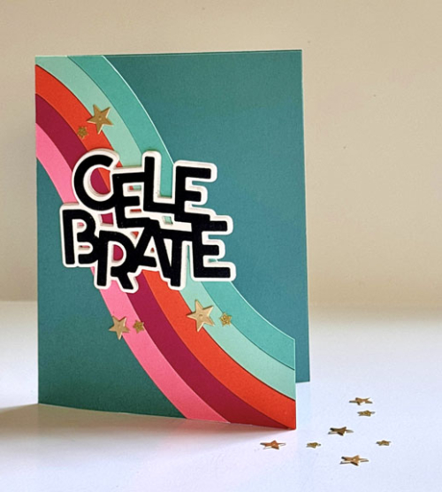
Kristina did a wonderful job designing the waves from the Sparkle Wave dies. Each one is numbered so you know the order in which to assemble them. My problem was that I misread the 2 and the 5 which looked similar, and I had to recut them more than once to get the color order I wanted. Then although it looks very straight forward, putting the waves together was another issue. I’m pretty sure the next time I create one of these cards it will go much faster. 

CelebrateUp

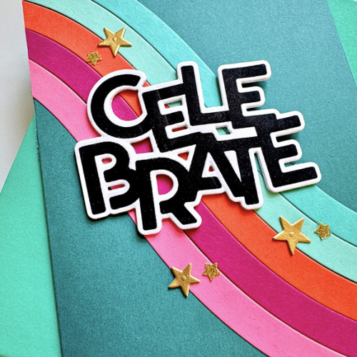
You can see here that the card front is cut away. That worked wonderfully, and it’s a fun element. The sentiment was stamped and die cut from the Celebrate stamp set, and layered four times for dimension. 

CelebrateClose

There are stars and a variety of other shaped dies in the Sparkle Wave Die set, but these stars were already in a little triangle dish on my desk, left-over from this graduation card.  This card is off to Inkspirational where the challenge is Celebrate (perfect!) as well as NBUS.

#celebrate342 NBUS

Color Hues #111

  • by

Sheri is the hostess for the June 1 Color Hues Challenge. She chose Coral and Green:

CH #111 Coral and Green.001

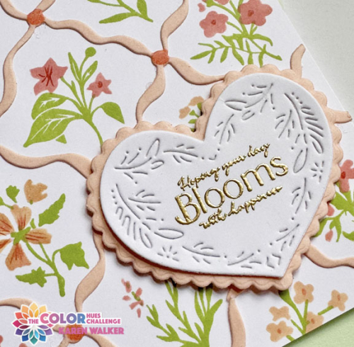
The last time we had coral as one of the challenge colors I spent a lot of time being sure I understood exactly what “coral” looked like. This time I knew which inks and papers would work well, and chose a relatively new stamp and stencil set from The Greetery, Bitty Botanicals. I’ve always felt a bit challenged by layering stamp sets, but a stamp and stencil pairing was a breeze. The greenery is stamped, and then the flowers are stenciled. Lining them up was easy. 

CH111

I used two hues of coral ink for the flowers: Pinkfresh Studio’s Coral Reef and Passion Fruit. Then I die cut the Diamond Ribbon from Concord and 9th’s Grapefruit cardstock and added some details with the darker coral ink to the connectors with the accompanying stencil. I love how it all works together so beautifully.
CH111Close

I decided on The Greetery’s Nordic Heart die cut for the sentiment, cutting the larger scalloped heart from the Grapefruit cardstock. I was delight to find that the gold embossed sentiment from The Greetery’s Bloom and Grow Sentiments fit perfectly on the heart.

For lots more inspiration from our Guest Designer, Barbara, and the Design Team, head over to the Color Hues blog. Then join in, and I’ll look for your card in the gallery! 

This is headed for Darnell’s NBUS. All the products except for the Nordic Heart are having their debut today!

NBUS