The inspiration for Papertrey Ink’s June Blog Hop was a photo, sketch, and color challenge. This was the way Nicole described it:
You can choose to work with any of the ideas above or use other components of the inspiration photo to jump start your creation. Have fun with it and challenge yourself to work outside of your comfort zone!
I created three cards, using each of the sketches, and combined one of the sketches with one of the downloadable color combinations. In my ongoing attempt to use stamps that haven’t seen enough (or any) love, each card uses at least one stamp or die that I’ve never used before.
Here’s the first sketch and the color inspiration.
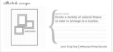
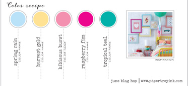
And my interpretation:
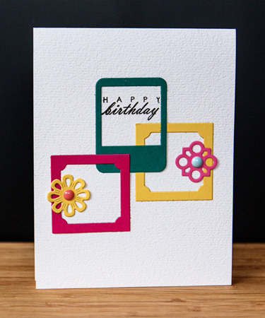
This color combination is definitely not in my comfort zone (nor is trying to combine five different colors on one card.) I began by die cutting frames from Framed Out #1 and Framed Out #12 as well as a collection of flowers from Button Stacks II. (The Button Stacks II dies are my unused item.) I took a little liberty with the sketch and stamped the sentiment from “Fillable Frame #4 inside one of the frames. The Spring Rain color was added with the enamel dot from MME. The rest of the colors were die cut from the corresponding paper in the inspiration piece.
For the second card I used a sketch, but choose my own colors from a pile of scraps laying on my desk waiting to be filed into the scrap paper folders.
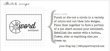
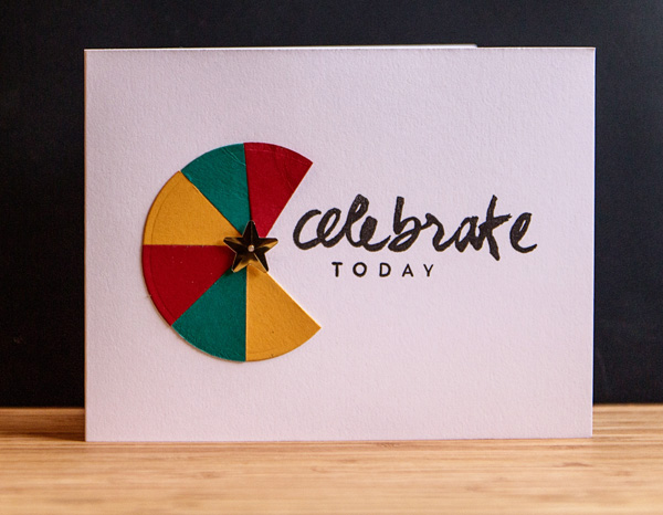
I used a Nestability Small Circles die to cut the circles from Pure Poppy, Tropical Teal, and Summer Sunrise. The star is from Impress, and the sentiment is from another unused (but new) stamp set “Wet Paint II.”
The last card is my personal favorite (CAS design), and a masculine one, to boot! I used this sketch:
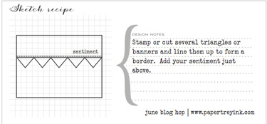
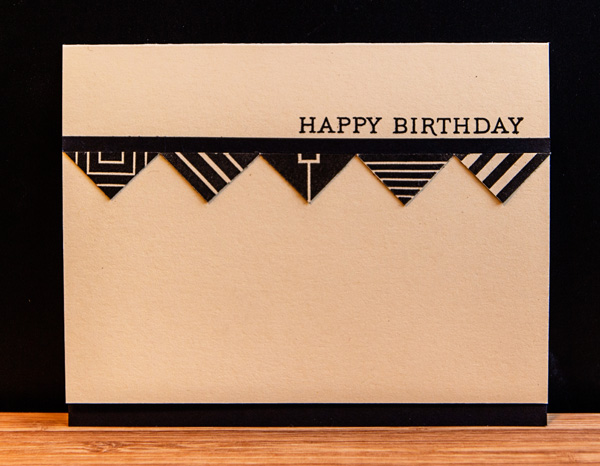
I started by stamping a variety of the”Square Prints” designs on Fine Linen cardstock. I’ve owned the “Square Prints” set since it came out, and don’t believe I’ve ever used it. Liked it when I bought it, and I still do. I cut each square on the diagonal and mounted the resulting triangles under a thin strip of True Black cardstock. The sentiment is from “Botanical Prints.”
I’m linking up all three cards to the Simon Says Monday Challenge to use products we ought to use more often. True, true, true.

I was hoping to link up to the blog post this morning, but either TypePad or my internet service were being disagreeable. So now I’m off to check out the inspiration linked here.
Love the sweet and simple frame design on the first card! All of these are great!
Love the last one.
Fun cards. I love the masculine colors.
I’m so drawn to your first card! It is simple and sweet and I think it is amazing! : )
Patti
I really like that celebrate card. The font is lovely and the colour wheel is so pretty.
great cards!!!
All beautiful cards!
Oh, these are all wonderful!
What great cards! You’ve been busy girl!
What wonderfully unique cards you’ve created! I was so interested to see how you used those die cuts and was totally impressed with the final results! You’ve made me look at my die cuts through new and inspired eyes! I think your take on the sketches was clever– you followed the sketches, but you made each card unique and your very own through the creative tweaks you gave them. I especially liked how you even pulled off a very successful masculine card! Those can be tricky! You did a wonderful job on these and it was so enjoyable to see your projects. Thank you so much for sharing these with us here at the Simon Says Stamp Monday Challenge Blog!
I love that first card – you did great with that color palette.
Rinda
Comments are closed.