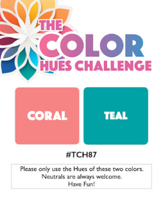
The new Color Hues Challenge is live. It took me awhile to come up with an idea for this color combo chosen by Jules:

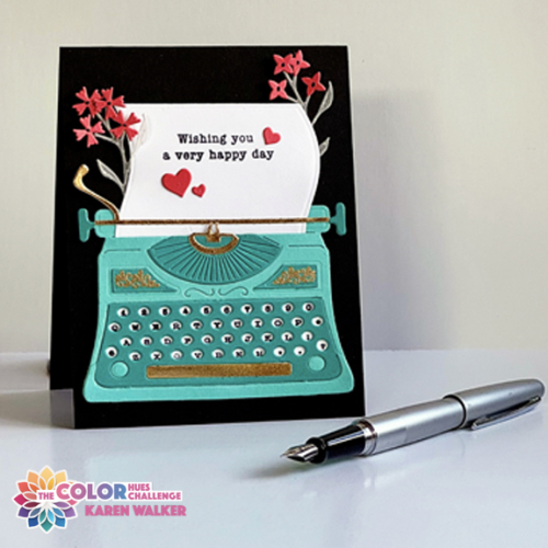
The obvious choice was florals, but I really wanted to stretch myself to come up with a different theme. Thanks to my friend, Kelly Schirmer, who loaned me the necessary die and stamps I got just what I wanted–a very cool typewriter. (The only typewrite die I own is very tiny, and would not have made much of a statement.)

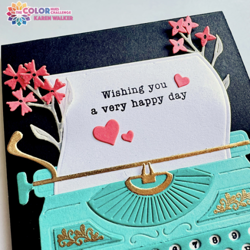
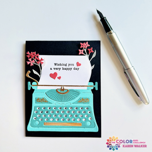
The fabulous typewriter dies & stamps are from The Greetery, Vintage Type. I die cut the pieces from two hues of teal, adding some gold accents and embossing. The florals (which I own) are also from The Greetery, Wildflower Mix. The blooms were die cut from coral cardstock, and the stems and leaves from a dotted vellum purchased years ago from Papertrey Ink. The accompanying stamps from Vintage Type are for the flourishes on the typewriter, and for the letters and numbers on the keyboard.

I wanted a sentiment with a typewriter font, and found one on display in a printer’s drawer that hangs in my craftroom. It’s a wooden stamp by Hero Arts, and I had to stamp it multiple times on the cute paper die that comes out of the typewriter. It makes me even more appreciative of acrylic stamps and my MISTI.

The only embellishment were three hearts die cut in coral with Simon Says Holiday Shapes. Once I added the typewriter to the black card base, I put some dimensional squares behind the paper, and tiny bits of black dimensional adhesive to a few of the flowers.
There is, as always, lots of inspiration for this color combo on the Color Hues blog. Take a look, and then join us.
This a certainly a different take on the colours Karen but it looks great, it reminds me of a typewriter my Mum used to use! It looks a bit fiddly to put together but it was sure worth the effort. 🙂
I want a real life teal typewriter, just like this one! Totally smitten with your fabulous ‘different’ take on the colours!
hugs~carol
What a FUN card Karen and the challenge colors work so perfectly with the typewriter and flowers…LOVE this card!! Had to chuckle about your sentiment…I have a few woodblock stamps still and I always struggle to get them stamped straight! I too have been spoiled by the clear stamps! But anyway, it looks like your perseverance paid off and it all looks perfect to me! Awesome card my friend!! Hugs. :0)
FABULOUS!!!
Gorgeous -gorgeous- ALL the design teams are cards are so inspiring!!
I played along too -Thanks for sharing your creativity!!
-Kimberly W
Oh I like the typewriter die set. The blue & black together are a stunning colour combo.
Love the direction you took with our colors, Karen! Love your addition of the florals and the hearts on the paper too. Great card!
I’m glad you did a mostly non-floral card, Karen, it is absolutely fabulous! It’s the direction I started to go but didn’t,obviously lol! Having the black background just makes that awesome typewriter pop, along with the touches of gold and your addition of the pretty coral wildflowers. Love this!
You did it! You came up with a non-floral design that shows off these colors with flair! I love the cool typewriter, it’s size makes it the perfect focal point. Love how you decorated it so sweetly with the flowers and hearts. Fabulous, Karen!
It’s a nice colour combo and the card has come out great … as if it’d be anything but!
Karen as I mentioned on IG this is such a fun card. The typewriter is fabulous in teal and reminds me of the typewriter we had at home in the days before electric typewriters and computers! Think of the click clack–lol! Love everything about this card!
Comments are closed.