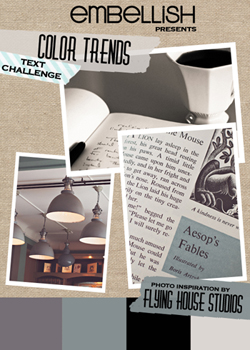
It’s not often that I combine challenges, but this week’s Make-It Monday at Papertrey Ink was to create a sympathy card, and the color/text challenge at Embellish seemed like a good color combination. I wouldn’t have interpreted the one color as Ocean Tides, but one of the designers listed it as one of the colors and it’s clearly used on the designer cards at Embellish.

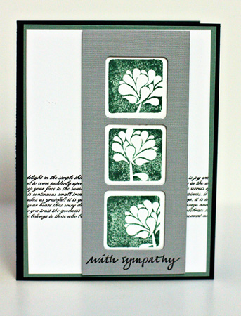
It’s been awhile since I inked up Take Three: Summer. I love these simple, but elegant, floral designs and they seemed appropriate for a sympathy card.

Except for the sentiment (Savvy Stamps) and the scrap of gray card stock, everything is by Papertrey Ink. I stamped one strip of Background Basics: Text Style in black and the three floral designs in Ocean Tides. The gray die cut panel is attached with dimensional tape. Then I adhered it to a mat of Ocean Tides before adhering it to the card base.
It is a lovely interpretation Karen 🙂
Dr Zhivago, the musical, was written especially for a Melbourne singer, Anthony Warlow, he stole the show. We took Mum for her birthday – which was late last year but when the tickets were released – it was her absolute favourite movie, she did feel it focused on the war too much. The choral sections were outstanding, as was the Dr, however we all felt the relationship between Lara and Yurii was not what it could have been. However, it was a lovely afternoon out and that is the best part if you ask me 🙂
This is such a graceful sympathy card, Karen. So glad you joined us for the Embellish Color Trends Challenge!
I agree with you,Karen….those stamps are perfect for a sympathy card….always difficult to choose an appropriate image.
I think the text is a great layer for this card.
Beautiful. That “ribbon” of text is perfect! So glad to see you in the gallery!
Beautiful card – I always like “woodcut” looking stamps. I’m really enjoying catching up on blogs tonight – so much fun stuff to see.
Rinda
Comments are closed.