The new Color Hues colors chosen by Steph are just perfect for summer. There are so many directions these colors could take you. My choice turned out to be quite different than I originally thought when I first saw the new colors.
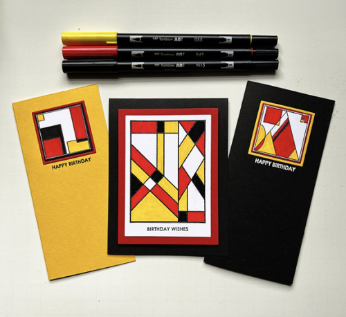
Earlier this summer, I saw some wonderful cards by Uniko. I just love the graphic design and think it will work especially well for both masculine and feminine cards as well as for a variety of occasions. Using them continues my streak of using new or unused stamps for my Color Hues cards. This is the fifth month in a row. 🙂
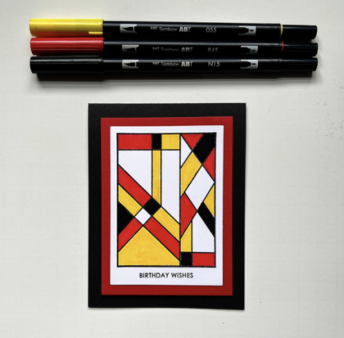
I do have to say that coloring the center card using Uniko’s Background Blocks Arts Decoratifs turned out to be a challenge. The red Copic marker bled every time I tried to use it, even when I embossed the stamp so I switched to Tombow markers and that red marker bled out of the lines once, too. I finally managed to get a clean coloring, and I do think it was worth the effort.
My original idea for the card, however, was to use some of the smaller designs from the Bauhaus Blocks set. There are four different designs, and I tried using three of them on a card but couldn’t find an arrangement I liked, so I went Clean and Simple—always a good decision. The layers on all three cards were cut with Ellen Hutson’s Essential Rectangles. Her Essential Shape dies are some of my most used dies.
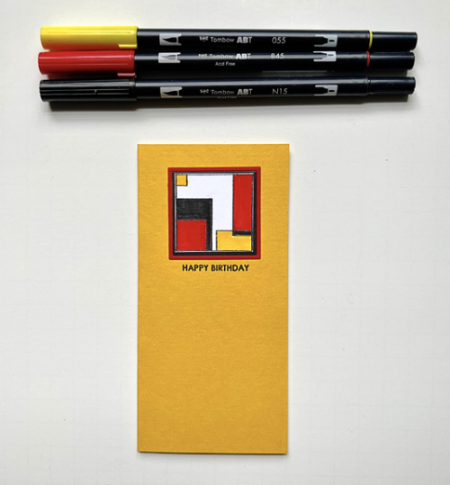
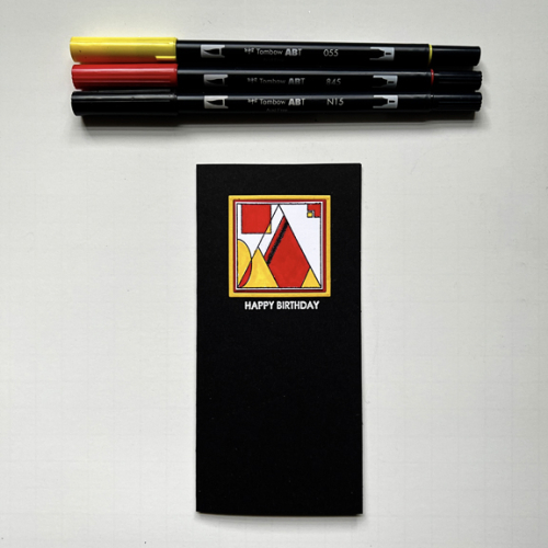
All three sentiments are from Sugar Peas Everyday Sentiments.
Be sure to check out the great designs by our Guest Designer, Annette, and my fabulous team members at the Color Hues blog, and join us with your Red and Yellow cards!
I finally got to go to Fallingwater (Frank Lloyd Wright) about a year ago and these cards make me want to visit again! Such perfection; LOVE LOVE LOVE!
Great job with these Uniko designs Karen. I’ve found that red Copics can be a real pain for bleeding and staining, but the your marker colouring looks great, so well done for persevering! 🙂
I love these cards! Your cards are dynamic and CAS. I’ve found that Copics bleed less if I place my panel on top of another piece of card stock. It’s helped me a lot to do this. The Uniko stamps feature so many of the designs I grew up with. My mom never had florals, i.e. sheets, towels, dishes. Our dinner plates I can recreate with some of the Uniko stamps.
Interesting design on your cards – very retro stylish. Your colouring is perfection itself.
Amazing cards, Karen! Good for you for continuing the trend of using your new products and beautifully! The inking is fabulously clean and the graphic shapes are stunning.
Love your graphic cards, Karen and it sounds like the coloring gave you quite a fit. All in all great results in the end and totally worth it as you said. I love each one equally!
You inspire me with every card, Karen. This one is absolutely gorgeous, the graphic designs are spectacular, as is your coloring (despite the leaky reds – so frustrating)! The thing I find can be challenging is finding the right mix of colors, or none, within the pattern. You master that with every card! Love this!
How frustrating that the markers bled but the end result is superb Karen! The bold red and yellow colourway looks amazing on these graphic images. Vicky x
Karen I love everything about these amazing bold and graphic designs! Red Copic is absolutely the mot difficult range of colours to use without bleeding. Using the Tombows instead was a perfect correction. Love these Karen, the contrast is amazing!
The colors work perfectly with your wonderful graphic stampings!
I love the modern feel to these!!! And WTG using NBUS stuff for our challenges!!!
Glad you were able to overcome the battle-of-the-red-markers, Karen. Your graphic, modern trio of cards are striking and eye-catching. Awesome showcase of red and yellow!
hugs~carol
Comments are closed.