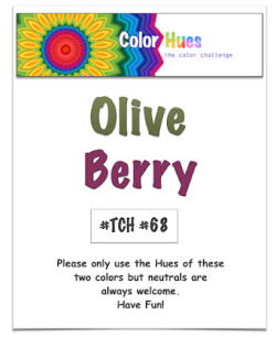
Our newest Color Hues challenge is up, and it’s another great combination: Olive and Berry.

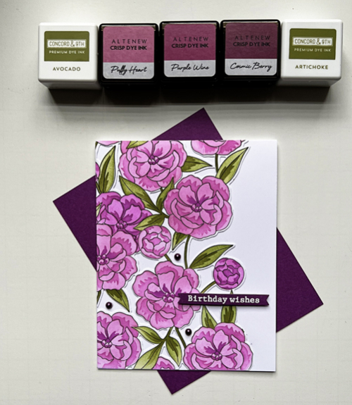
At first I wasn’t sure a lighter berry color would work, but truly, Color Hues is named that way so that different hues of the basic color can be used. In the end I chose three Altenew inks that were designed to go together with the darkest one named Cosmic Berry. Finding olive inks was easy as Concord and 9th has a great combo.

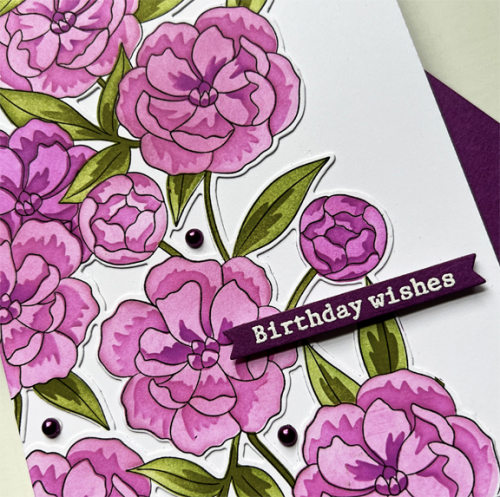
Keeping with my determination to use new stamps, I broke out one of my newest purchases, Pinkfresh Studio’s Pretty Blossoms. It’s a full card rubber stamp with coloring stencils and a very interesting die that cuts out all the spaces between the flowers. It’s easier to see with a closer view.

I love the layering stencils and the variation in color you can create in a relatively brief time.
The sentiment is also from the Pinkfresh, from the Floral Vase set. “Beet” cardstock by Paper Source was a great match for the darkest color in the floral so I embossed the sentiment in white and die cut it with the Itty Bitty Banner die from My Favorite Things. Luckily I had some beautiful berry pearls in my stash which finished the card.
There’s a wonderful variety of cards (as usual) from the Color Hues Design Team and our special Guest Designer, Bonnie. After checking out the inspiration there, I hope you’ll come and join us!
Karen, you couldn’t have chosen a more wonderful set for this color combo! I love it in these shades of berry and olive! I think I NEED the BEET!!
=]
GORGEOUS card. I’m another one that needs beet in her paper stash along with the two greens from Concord & 9th.
Every time you post something from Pink Fresh, I feel the need to go shopping. This is just wonderful, Karen! Your colors are just the perfect tone I was thinking of and then the execution is a ten! I love the sentiment done in Berry too! Awesome job!
Your pretty blooms remind me of cottage pinks with their shades of pink and flashes of darker colour. They’re highly scented so I can just imagine the clove scent that would hang around in the summer heat.
You certainly made that set look amazing!!!! This is just gorgeous Karen!
Beautiful flowers, Karen! The colors blend together beautifully! I love how the dies cut all around the flowers!
That sounds like a really neat bundle – I especially love the idea of a rubber stamp and a matching die that cuts intricately. The colors worked beautifully – the berry combo was one I considered using as well and the stenciling worked perfectly with those colors. Gorgeous card, Karen!
Your work with this bundle is amazing, Karen! Your colors shine beautifully on the gorgeous blooms, and I am so inspired by the pretty details. A big WOW from me!
Gorgeous card Karen, the stencil is amazing. So sorry I’m so late to comment. xo
Comments are closed.