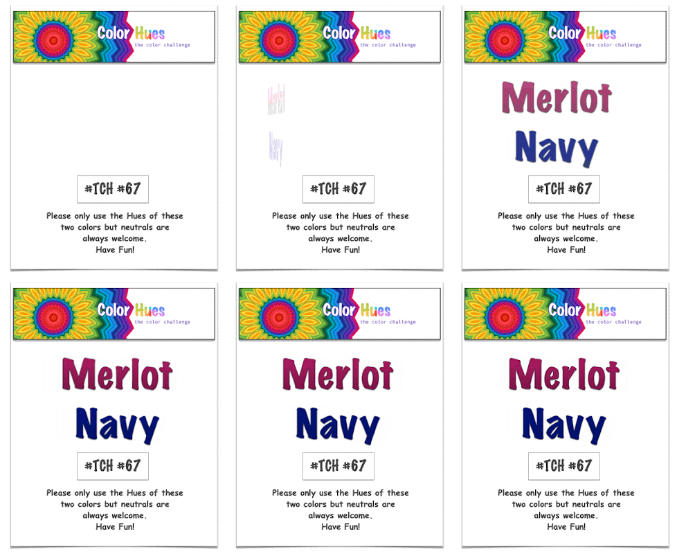
Marcia is our hostess at Color Hues this week, and she’s chose a rich color combination:

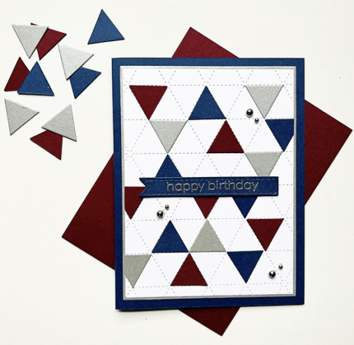
When planning this card I had two objectives: use a new-to-me but never used product (I have far too many of these) and create a masculine birthday card.

The closest paper I had is a bit deeper merlot than in the challenge logo and is from Paper Source. The navy cardstock is Concord & 9th’s Midnight paper. I was rather disappointed the last time I ordered it to discover it’s now a brighter navy than the previously released Midnight which was the darkest navy I owned. The wonderful Concord & 4th Triangle Background was the starting place. I die cut the small triangles from the merlot and navy cardstock as well as some silver shimmer paper from Paper Source.

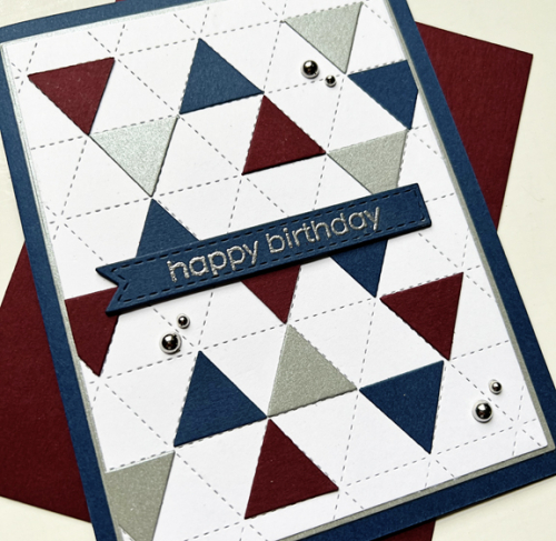
This angle shows the shimmer a bit better. I embossed the sentiment from The Greetery and die cut it with one of Simon Says Stitched Banners, and stacked it up with three additional banners die cut from navy. That piece had been die cut with the smaller rectangle from Gina K’s Master Layout #1, and I layered it on a larger rectangle from the silver before adding it to the navy card base. I debated about using the silver pearls, but think they are just fine even for a masculine card.
I’m sure you’ll find lots of inspiration from the Design Team and our Guest Designer at the Color Hues blog, and I hope you’ll add your take on these colors to our gallery during the next two weeks.
I’ll be sending this off to the new July NBUS since I’m happy to have another Never Before Used Stuff off that list!

You are the graphic guru of the team, Karen! This is perfection at it’s finest! Well done!
The colors work perfectly with this wonderful graphic design! Thank you so much for the lovely comment.
Love your graphic take on the colours Karen and a fab masculine card too. 🙂
Fantastic card, Karen! The colors definitely lend themselves to a masculine card, and using this triangle die set was such a great idea to execute your objectives! Love it!
Oh the patience to cut out all those little triangles & then put them into their appropriate space on the card – well just WOW to that alone. What a great card.
I like what Nancy said about you being the graphic guru, Karen! your creativity shines as you added the silver triangles, the shimmer keeps the masculine vibe but adds a wonderful shimmer. Fabulous card!
Karen this is such a fantastic card, I love the triangle pattern! So chic and ultra modern and perfect for a masculine card! It is frustrating when die lots are different when you reorder a product. A true navy is hard to find!
Totally crushing over your fabulous masculine triangles card, Karen. This die is a newcomer in my collection; hoping to have a chance to give it a play this week. Yes, a ‘true’ navy paper is difficult to find. Fortunately, for my card, I had a wonderful navy ink from The Stamp Market that worked a charm.
~carol
You made a very striking manly card using that die and playing with the colored triangles, Karen, and I love it! I think of these colors as masculine and I love the silver bling, which makes me think of cuff links. Thank you for your get-well wishes. We are seeing tiny improvement every day, but dang, this bug needs to hit the road! Thank you, too, for inspiring everyone at NBUS! Hugs, Darnell
Comments are closed.