Hannelie is our hostess for the May Day Color Hues challenge. It’s a bright and vibrant combo, and I cased myself this time around.
In February I created a set of masculine cards using one hot foiled panel of Geo Blocks by Pinkfresh Studio. For those cards I used only one stencil and one color of ink to create the pattern. This time I used the same stencil but alternated colors–using Simon Says Positively Saturated Inks in Peony and Ocean. They were a good match for the two cardstock papers I that were closest to hot pink and cyan: Concord & 9th’s Oceanside and Paper Source’s Fuschia. Just by changing colors, the cards are much more feminine.
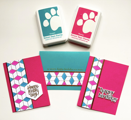
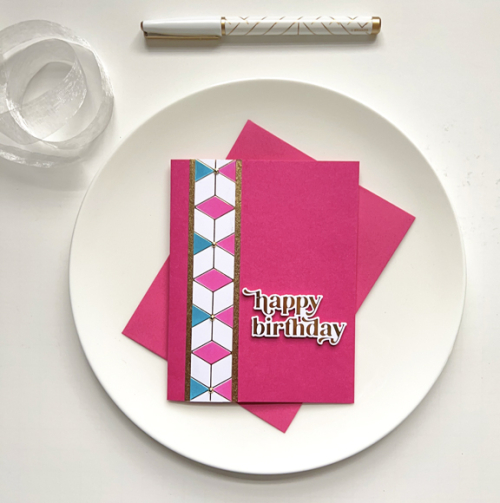
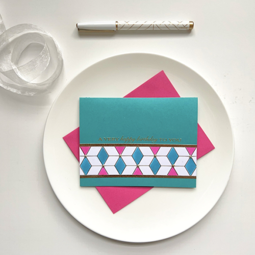
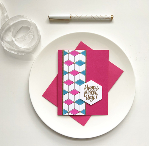
After cutting the hot foil panel in three pieces I added them to the card fronts with narrow strips of gold paper. The sentiments are exactly the same as I used on the earlier set. From the top: a hot foiled sentiment from Pinkfresh Studio’s Wonderful Words, a gold embossed sentiment from Papertrey Ink’s Banner Sentiments, and a gold embossed sentiment stamped and then die cut with Simon Says Hexagon Greetings. I did add some dimensional tape to the back of the hexagon greeting.
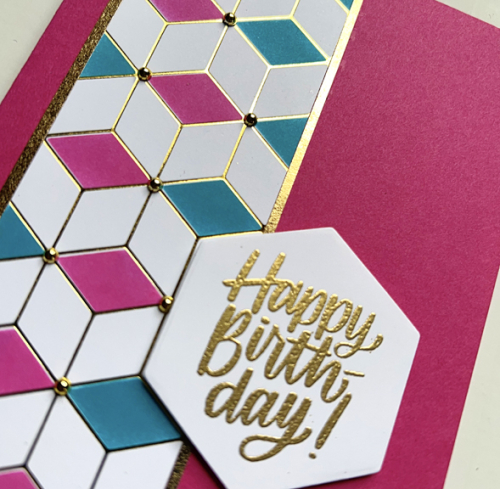
It’s easier to see the gold embossing and hot foiling as well as the gold pearls that were add to all three of the cards.
Please join us in the next two weeks and add some bright and happy pink and cyan cards to our gallery. For inspiration, be sure to check the Color Hues Blog to see what the Design Team and our Guest Designer, Kristin, have created.
WOW WOW WOW! all those cards are stunning. The gold foil really sets them apart from just ink & paper. I really like both those strong colours.
Karen, you have such an eye for CAS and elegant cards. These are lovely as can be. Caseing yourself is always a good idea. Have a wonderful week!
All lovely; the middle one is my fave.
It looks like you succeeded twice this year in creating sophisticated CAS cards!! So pretty in the bright colors and thanks for hints as to color tones.
oooh!!! I love that you took the BOLD approach to color. Wonderful set of cards!
You know I love the design of these cards, Karen, and pairing them with gold makes them so elegant!
Three fab and colourful cards Karen. I’m still resisting the purchase of a hot foil machine but my birthday is coming up so I may drop a hint to the OH!
Gorgeous Karen! I have had this foil plate in and out of my cart, but it needs to go in again. Looks so good in these SSS ink colours. Fabulous that you got three cards out of it. Don’t you just love that C9 Oceanside? The embossing adds just the right final touch!
Hi Karen,
I love the elegance of the gold foiling with the bold colors in your lovely design. C9 Oceanside card stock is in my mailbox at this moment, what a pretty shade of teal! Your cards are stunning! I love the hexagon HBD card best.
You executed the color combo so well.
Apologies for commenting late…again. I need someone to organize me!
A trio of gorgeous geo block cards that fit the colour challenge perfectly! I have yet to dive into hot foil glimmer yet but I tell you, each time I see something stunning – as your cards definitely are – the resistance lessens. Maybe some day I’ll take the plunge…
hugs~carol
Comments are closed.