It’s hard to beat a prettier combination that Blue and Turquoise. There are so many way to go with this set of Color Hues chosen by Marcia.

It will be no surprise to you that I went the Clean and Simple route and chose die cuts once again.

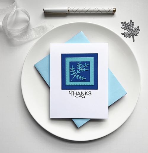
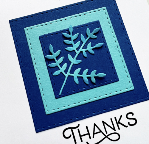
I started by die cutting a stitched square by Simon Says from Paper Source’s Royal cardstock. I first discovered this cardstock last fall, and used it for one of my favorite Christmas cards. I then layered two more stitched squares from turquoise paper (from my scrap file) and another from the Royal cardstock. I die cut Poppy Stamps’ “Leaf Sprig” from the turquoise and adhered it to the square.

I ink blended a bit of blue ink on some of the leaves, but I’m not sure I really love that. I do like the pretty sentiment from The Greetery’s Spring Mix stamp set.
I hope you’ll hop right over to the Color Hues Challenge and check out the great cards created the Design Team. We’d love to see the gallery filled with your pretty Blue and Turquoise creations!
I’m in love with this card, Karen! Your Royal card stock is a gorgeous shade of blue, and I really like the sprig and the sponged details. The sentiment is perfect, can’t wait to see your future creations with the stamp set.
Very classy Karen, I like the little bit of added colour on the sprig, infact I thought you’d used some pretty DP. 🙂
Simple & stylist. I like the script of the sentiment.
Perfectly CAS and classy as most have said. Enjoy that Vitamin C!
I concur! And as Mary-Lou said, the font is lovely.
(I really like the way you have photographed it, as always.)
Karen, I always admire your beautiful CAS cards. I especially love this one with the rich royal blue, the pretty sentiment font and that dainty sprig. I hope you had a great trip – it was fun seeing the three of you together!
Gorgeous CAS card! Love the pretty colors, sprig, and beautiful sentiment!
One can never go wrong with CAS! The bold colors really make this pop!
A elegant, yet simple design that reflects your CAS skills. I’m so glad you shared the Paper Source navy as it’s a nice weight and excellent blue!
You’ve captured my CAS-loving heart with your pretty card. Love the papers; a perfect stage for your sweet leaf sprig.
~carol
Really pretty – and looks almost like a very soft leather. I love the font on that ‘Thank-you’, almost an Art Deco look that’s perfect with the tracery effect.
Blues and whites are always classic. Lovely!
Comments are closed.