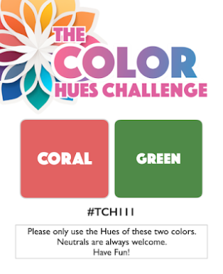
Sheri is the hostess for the June 1 Color Hues Challenge. She chose Coral and Green:

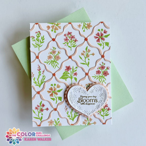
The last time we had coral as one of the challenge colors I spent a lot of time being sure I understood exactly what “coral” looked like. This time I knew which inks and papers would work well, and chose a relatively new stamp and stencil set from The Greetery, Bitty Botanicals. I’ve always felt a bit challenged by layering stamp sets, but a stamp and stencil pairing was a breeze. The greenery is stamped, and then the flowers are stenciled. Lining them up was easy.

I used two hues of coral ink for the flowers: Pinkfresh Studio’s Coral Reef and Passion Fruit. Then I die cut the Diamond Ribbon from Concord and 9th’s Grapefruit cardstock and added some details with the darker coral ink to the connectors with the accompanying stencil. I love how it all works together so beautifully.

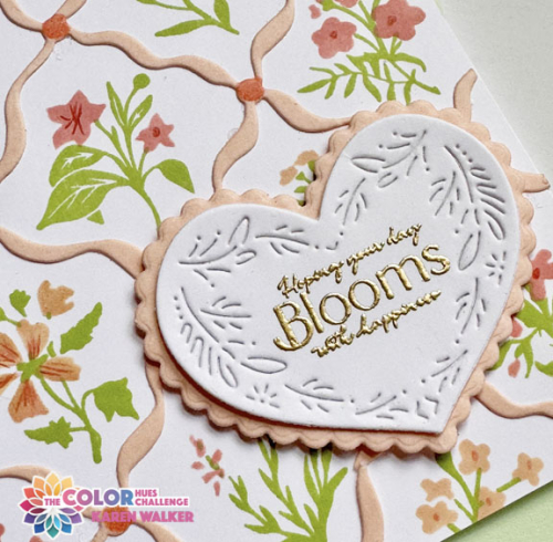
I decided on The Greetery’s Nordic Heart die cut for the sentiment, cutting the larger scalloped heart from the Grapefruit cardstock. I was delight to find that the gold embossed sentiment from The Greetery’s Bloom and Grow Sentiments fit perfectly on the heart.
For lots more inspiration from our Guest Designer, Barbara, and the Design Team, head over to the Color Hues blog. Then join in, and I’ll look for your card in the gallery!
This is headed for Darnell’s NBUS. All the products except for the Nordic Heart are having their debut today!

Your little bouquets are beautiful, Karen! I love the depth of colors from the stenciling and the beautiful ribbon that frames each bouquet! What a beautiful card, my friend!
Your elements really do work together beautifully, Karen! And I love that this design would look fantastic in any number of color hues! You finished your bitty garden perfectly with the textured die-cut heart and gold-embossed bloom sediment! Thank you for inspiring everyone to use their NBUS! Hugs, Darnell
Delicately pretty card – I cannot imagine gluing down the ribbon die … job well done!
What a fab set Karen, the end result of all your stamping, stencilling and die cutting looks so pretty and dainty. Coral is a bit difficult to pin down I agree but the ink companies have made life a tad easier with their naming! 🙂
Absolutely beautiful card Karen! I have had more fun with The Greetery’s Bitty Botanicals set too, and it’s obvious you have too! The color pairing worked beautifully for this set and I adore the use of the Nordic Heart for your sentiment (I will have to remember that one!!)! Lovely, lovely card my friend! Hugs. :0)
I too struggle with some layering stamps but this looks like something I could do and enjoy. The Diamond Ribbon die is very pretty but that sentiment on the heart is really drawing me in. Gorgeous card that someone will adore!
Karen, I adore your card! That set of stencils keeps calling my name – though I did splurge on the die! What was I thinking?
These shades of coral and green were meant for this set!
=]
Lovely as always – it reminds me of vintage wallpaper in a child’s bedroom.
Karen, I love this pretty diamond ribbon die pattern with all of the floral images inside each diamond. Very dainty and beautiful.
Karen, I love all your little framed bouquets. This is a gorgeous – as in incredibly gorgeous – card!
hugs~carol
The dainty flowers inside the ribbon frames makes one delightful card, Karen! And then, I’m swooning over the sentiment in the heart. It’s just a beautiful creation for this challenge!
Karen this is such a beautiful card, the stencilling is so detailed and the sentiment heart so elegant!
Love your diamond ribbon die cut to showcase your lovely little flowers Karen. Fabulous card.
Comments are closed.