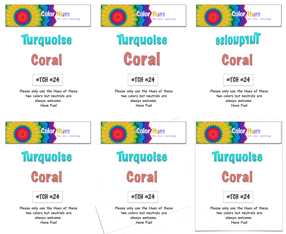
It’s a very vibrant color combo this time around at Color Hues:
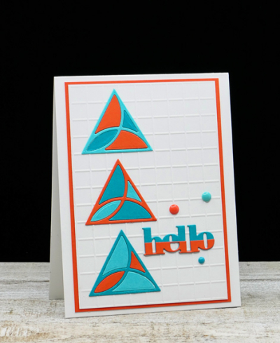
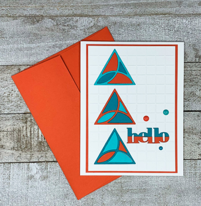
Coral is a tricky color. I “Googled” it to see what shades might come up–some look pretty orange, and my husband thought my choice was definitely orange. I, however, chose a Gina K cardstock called “Coral Reef” so I was able to defend my choice without question! For the turquoise, I chose two papers: Papertrey Ink’s “Hawaiian Shores” and Concord & 9th’s “Oceanside.” I have to thank Kristie Goulet, one of my DT teammates for the inspiration for this card. After seeing several different designs she created with the “Mosaic Tiles” die from Catherine Pooler, I had to order it.
There must be hundreds of possibilities with this die set, and I love that it’s easily customized for males or females.

I dry embossed the background with an Alexandra Renke embossing folder, and die cut three sets of the Mosaic Tiles–one with each color. Then I had to decide which triangles I would use. The one above is one of my favorites, but you’re sure to see this die show up here again and again with different designs.

The sentiment is a Simon Says die that arrived with a kit. I die cut it twice, cutting the coral piece in half to create the half-and-half look. Amazingly, I found three enamel dots–one matching each three of the cardstocks I used to finish the card off.
I hope you’ll take a look at the fantastic designs the DT and our Guest Designer, Linda Snodgrass, have created:
And come join the fun!

That’s a very vibrant combination! Very clever work on the title, and perfect matching with those enamel dots.
That’s lovely, and a perfect “just because” card for a lucky someone!
Wonderful choice of images and design for this colour combination! Soooo pretty!
hugs~carol
I love the geometric dies available right now! They worked so well with your color choices! On my computer your coral looks orange but Gina K must be right!!
I like the blue & coral together & those fancy triangles have so much potential for card making. I like the trellis background (embossing folder).
Love your vibrant mix of tones Karen. You’re right the colours are so different from the softer pastel version, that’s the beauty of the challenge I think! 🙂
Gorgeous use of these dies! I like your choice of vibrant shades of our hues.
Love this color combination. Your triangles look great with these colors. It was so fun to join Color Hues as GD. Thank you.
We are two peas from the same pod! When I am making my graphics for CH I google the color in hopes to get the best shade possible! I chuckled when I read that you did too! This card is amazing, whether Tracy thinks it’s orange or not! LOL ! I love the two color greeting as well! You are such a versatile card designer! Stay well!
Great card & definitely a die that can be used for a variety of cards!
Comments are closed.