I’m the hostess at Color Hues this round, and chose Yellow and Gray for the colors. It’s always been a favorite combination, and as it turns out, it’s the Pantone Color(s) of the Year. Pantone decided to chose a duo rather than a single color this year.

I CASED myself this round, using a design I’ve previously used.

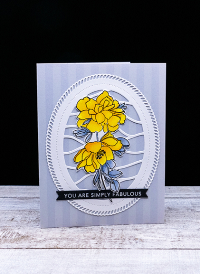
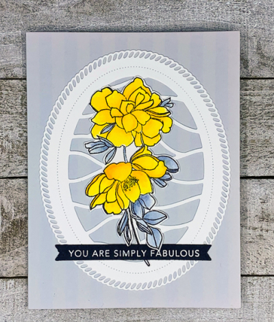
I started with this Memory Box card with subtle gray stripes. I’ve had these in my stash for so long I have no idea where I purchased them originally. Then I die cut a white “Shape Shifter Oval 2” by Papertrey Ink.

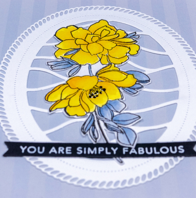
The floral is a favorite of mine from Pinkfresh Studio’s “Keep Going” set. I watercolored it on Altenew Watercolor paper which I like very much. It’s a nice clean white and the watercolors move nicely on it. This time I used my Karin watercolor markers.

I don’t own the accompanying dies, so fussy cut the image and added it to the fancy oval. The sentiment is from Taylored Expressions.
I hope this color combo appeals to you as well, and that you’ll join us at the Color Hues Challenge. Be sure to check out the great designs by my Design Team members, and our Guest Designer, Amy.
Gorgeous card Karen. Great job coloring those pretty flowers and then fussy cutting them. They look fabulous on that die cut oval.
Another beautiful card. I do like that background oval die.
Love the die cut frame for your pretty florals, the background card is the perfect foil. 🙂
I keep coming across these elaborate oval dies and I don’t have anything that pretty in my stash, I may have to rectify that soon. This card is sooooo pretty Karen. Love the addition of the black greeting. Beautiful job and such a great color combo…thank you!
Lovely card Karen. I had a grey and yellow bathroom in one of the first houses I lived in when I got married and always liked the combination.
I have a few Memory Box card bases left in my stash, and wish they still made them! I never had stripes though – and these are delightfully subtle. Your watercolouring of the flowers is gorgeous! Beautiful design.
This card is so pretty with a wonderful design! Those subtle stripes in the background are perfect for that amazing die holding those gorgeous flowers! Beautiful!
I really must try and join in with Color Hues – so many challenges and too little time! I love the DP you’ve used for the background panel. The pretty white frame totally pops against it!
I’ve always liked that oval mat and your pretty bouquet dresses it up nicely! You’re lucky to have the perfect card front for it too.
Your card is so beautiful with wonderful coloring! Thanks for inspiring me to use yellow, which I don’t usually reach for!
I love that oval and the yellow flowers are just gorgeous.
Oh, you must know I love those yellow flowers! 🙂 And this is such a lovely card all around – beautiful!
Those flowers are so beautiful in yellow Karen! The background works brilliantly too – I love the sense of movement those wavy lines add to the card. Vicky x
Comments are closed.