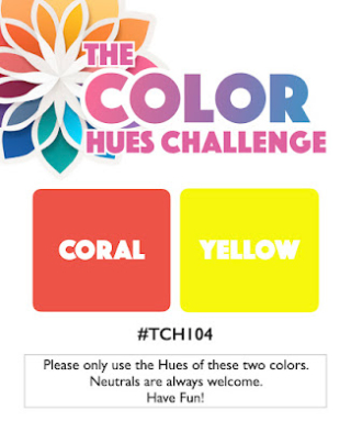
Mid-February, and here in Western New York, we’re in need of some fresh, bright colors. Bonnie has chosen a perfect combo for the next Color Hues Challenge: Coral and Yellow.

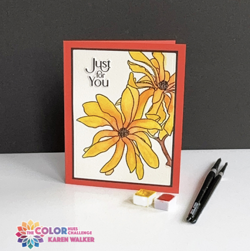
Frequently, I turn to orange in my card making, but I rarely think about coral. I did some searches on the internet to be comfortable with the difference between orange and coral–they are very close! Then I wanted to find an image to watercolor. I thought I could blend the coral and yellow for a floral, so chose Altenew’s Magnolia Ballerina. We live just a block away from a fabulous park which has a large collection of magnolias. There are two yellow magnolia trees, but I must admit I took some liberties with the brightness of my hue, and with the coral centers-a bit of creative license!

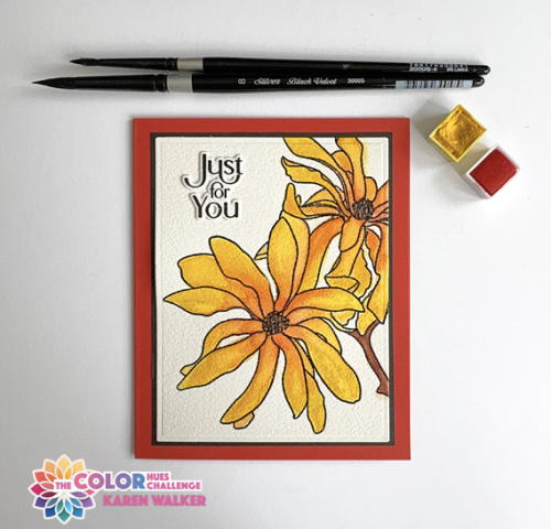
I stamped the design on Arches 140# watercolor paper, and embossed it with clear embossing powder. I found two watercolors in my collection that worked well: Lemon from Altenew’s 36 Pan Watercolor Set. and Coral Reef from The Stamp Market’s Color Crush Watercolor Palette Pans. I used two shades of brown watercolor from the Altenew set for the centers.

The sentiment from The Greetery’s Tagged Elegance was stamped on Arches watercolor paper and die cut with the accompanying die. I’m determined to get to all the NBUS dies and stamps in my box, and the dies for this set were purchased during the Christmas release last year but it’s the first time I’ve used them. A simple black border attached to a card base created with Gina K’s Coral Reef cardstock finished the card. I did try some coral and clear embellishments but they all seemed too busy.
I hope you’ll join us! As always, you’ll find lots of inspiration from the Design Team and our Guest Designer, Teresa. The challenge will be live until February 27th.
Karen, your watercoloured magnolias are ever so pretty; a beautiful way to showcase yellow and coral. The whisper of the black frame adds eye-catching impact. Wonderful inspiration for this colour combination.
hugs~carol
This is really pretty, Karen. I love the added texture that watercolored paper gives to a card. I think you did a wonderful job with the colors and now that you mention it you do use orange often. Is it your biggest paper scraps color too? Mine is green with pink a close second. Have a great week!
Karen your flower is really beautiful and I absolutely love the way that you have watercoloured it in the challenge colours.The thin black border around the focal panel adds so much interest. Always a pleasure to visit your blog.
These magnolias are so pretty, Karen! They are so bright and cheerful and perfect for these dreary days! I love how the narrow black mat really makes the colors pop! And awesome card, my friend!
My magnolia is just white so not a patch on this vibrant watercolour beauty, though it wont be long before the flower buds burst. I keep looking out of the window at the grey skies and see the very slightest hint of white in the buds. The weatherman says higher temps are coming later this week but it will be accompanied rain!:)
A lovely card & I think I’ve seen this stamp used for a pink card 🙂
Your Magnolias are absolutely beautiful Karen, and your water coloring is perfect with the blending of the yellow and coral! Lovely, lovely card my friend!! Hugs. :0)
Those flowers are so pretty watercolored with your mix of paints, Karen! Leaving off embellishments lets those wonderful flowers take center stage. Love this!
Comments are closed.