After the combo red, black, and white, gray might be one of my favorite colors. Strangely enough I don’t often pull that color for cards very often. But this week’s CASology Challenge encouraged me to change that.

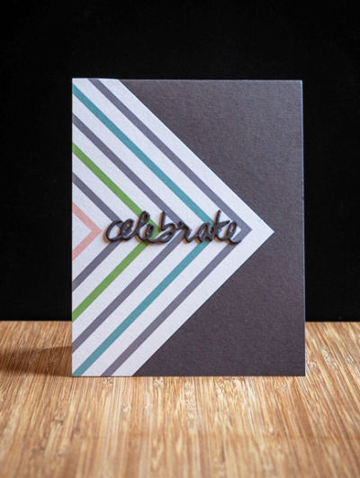
My favorite gray cardstocks are all made by Simon Says. There are three gradations of it, and this time I pulled the darkest of the three: Slate. The patterned paper came from the Pinkfresh Studio “Live More” collection, and both were part of the Simon Says Card Kit from August. (I have three boxes of papers and embellishments from old Simon Says kits, and need to pull them out more often.) The sentiment is from Papertrey Ink’s “Wet Paint II” die collections. I die cut three of them and layered them for some dimension. Couldn’t be a simpler card.

It’s a frigid day here in Western New York, in the teens with an even colder wind chill. A friend treated me to lunch at the Monroe Golf Club. It was decorated beautifully for Christmas, and the food was superb. Home now, snuggled in with a bit of crafting time.
What a lovely card…love the simplicity and dynamism!
Cheers~
Seconded!
Again you just know the right combinations of colour & pattern.
Wow, what a great geometric design! LOve these colors together…fabulous! Thanks for joining us at CASology!
What Judy said!! Gorgeous geometric design!! Perfectly CAS !! Thanks so much for sharing with us at CASology! Anna xo
Love your colour combination with the gray. A great masculine card. So happy you could join in the fun at CASology this week.
Love your sleek, graphic design, Karen. I must check out the SSS grey yardsticks – I love that rich grey! Thanks for playing along with CASology this week!
Hey Karen!! I love that you used a gray card base. Very different and creative. Nicely done. Thank you so much for playing along with CASology this week.
Comments are closed.