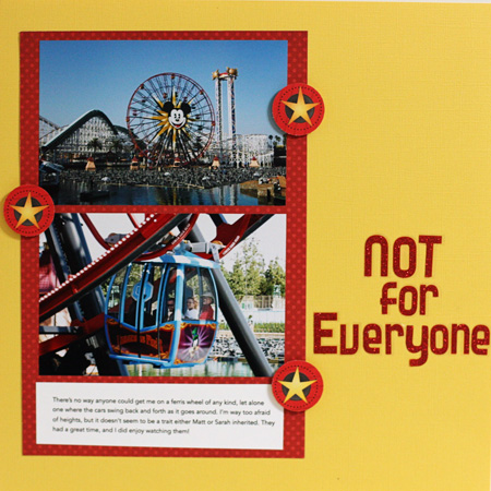
This challenge was to use two 4×6 photos in the layout. Sarah, Matt, & Tracy had a great time at California Adventure Land. Most of the rides weren’t for me as I’m terribly afraid of heights. But I enjoyed sitting in the sun and taking photos of them having a great time on the rides.

Photographing a 12×12 layout is one of the most challenging tasks. No way can I get them perfectly straight. The journaling reads: “There’s no way anyone could get me on a ferris wheel of any kind, let alone one where the cars swing back and forth as it goes around. I’m way too afraid of heights, but it doesn’t seem to be a trait either Matt or Sarah inherited. They had a great time, and I did enjoy watching them!”
Yellow cardstock from stash; red cardstock: BoBunny; Star accents from a Queen & Co. patterned paper; glitter alpha: Colorbok (and they were a real pain to use!)
Love the colors in this one – very Mickey!
Rinda
The bright,primary colours are perfect for the photos…..and totally agree with your title….you wouldn’t get me on one either.
Another great layout, love the brighter colours and your title! ;o)
great energy layout and I agree with you about steering clear of ferris wheels where you swing about
These are wonderful fairground pictures Karen. I’m not a fan of the rides much either and do you know what I really don’t like? Dodgems!
This is such a cute page! Looks like everyone had fun, whatever their choice of activity . . . 😉
Yes, I agree on the difficulty factor of photographin a 12×12 page – you have done well. My probelem at the moment is getting the journaling clear enough as well as the actual layout straight …. more practise!
You have chosen a great colour scheme for these photos, and I wouldn’t go on many rides there either!
Gosh, this is lovely too! (And I can’t photograph 12x12s straight either….!) xx
fun page – love the yellow and red together
Comments are closed.