Skip to content

Online Classes: Take 2

  • by

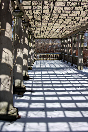
This week’s prompt for Picture Inspiration was to Find Some Rhythm. Tracy shared part of a definition for rhythm with us:  “a harmonious sequence or pattern of masses alternating with voids, of light alternating with shade, of alternating colors, etc.” The words “haromonious” and “pattern” made me think of the staircase in the George Eastman House. My brother-in-law gave me a year’s membership for Christmas so I can go as often as I like this year without any admission fees. It’s quite the lovely gift. I’ve been three times since mid-February. As it turns out I found two shots, one inside and one outside, that seemed to fit the prompt.

Staircase2w

Arborw

I love the patterns of the columns, arbor, and all the shadows. I took a few other photos there I’ll save for another time. One of the things I’m enjoying a lot with this class is working my way through the gallery of photographs posted by members of the class. Talk about inspiration!

Participating in Finding Your Way has proven to be pretty motivating for scrapbooking. I finished three more layouts for the house album. It’s already getting frustrating, however, because I can’t find photos I thought I had! For instance, I have photos of how our first house looked when we moved in, but almost none of how it looked by the time we sold it seven years later. We had a beautiful kitchen put in that house, and I can’t find any photos of it. I’m sure there are negatives of the photos, but I have several boxes of those and no easy way to examine them. Oh well, I’m trying to embrace imperfection, and just get on with it.
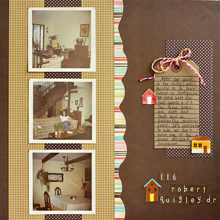
RobertQuigley

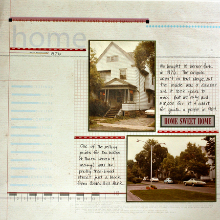
18WernerPk

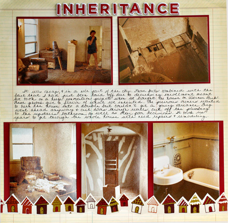
Inheritance

I’m definitely not a fan of my handwriting, but Karen G. is right, it does speed up the process considerably. Now that I’ve started it in this album, I’ll maintain it. The journaling is hard to read so here’s what it says: It was cheap and in a nice part of the city. Those facts combined with the fact that I had just been laid off due to decreasing enrollments meant we took on a huge renovation porject when we bought the house on Werner Park. These photos give a flavor of what we inherited. The previous owners wanted to turn the house into a double but couldn’t get a zoning variance. They went ahead anyway and cut doors through walls, cut off the plumbing to the upstairs bathroom as well as other poor decisions. I took us years to get through the whole house with needed repairs and remodeling.

I’m continuing to enjoy the Silhouette 101 class. It’s nearly over, and I’ve learned everything I hoped to. This week I learned out to use the print and cut feature. I printed some cute tickets on my printer and then ran them through the Silhouette which cut them perfectly. You’ll see them in a project soon, I’m sure.

I’ll be away from the computer for the next few days, but will catch up with your blogs early next week. Have a great weekend.

 

Make-It Monday 5

  • by

Make-itMonday

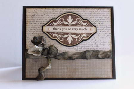
I got to this week’s Papertrey Ink challenge a bit earlier this week. The challenge was to do some distressing on the project. It’s not something I do often. In fact, I have a distressing tool which I used for the first time today! I must say it worked very well, although the distressing around all the edges of the patterned papers doesn’t show up particularly well here.  I also took the opportunity to use one of my new stamp sets: Mat Stack #2 Collection. It’s filled with very elegant designs for the mat stack and a good addition to my stamp collection.

MIMDistress

Quite some time ago, I dyed a lot of seam binding with a variety of mists. I chose the colors for the card based on a piece of the ribbon. I used another piece of the My Mind’s Eye paper from the Mabel collection and one from Basic Grey’s Basic Kraft collection.


Clean and Simple

  • by

FTL130

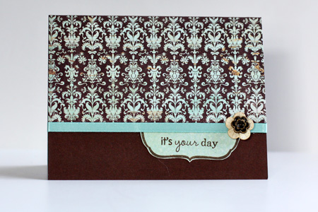
I love the sketches at Clean & Simple, but haven’t had a lot of time to play along for a while. This week’s sketch is a busy cardmaker’s dream. One piece of cardstock, one sheet of patterned paper from a 6 X 6 paper pad (I used both sides of it), a piece of ribbon, two buttons, one Fillable Frame stamp, and two sentiments (one inside and one out). It was finished in about 10 minutes. I love this color combination, too.

C&S

Cardstock: Dark Chocolate (PTI), Patterned Paper: “Mabel” Stella & Rose (My Mind’s Eye); Die: Fillable Frame #8 (PTI); Stamps: Fillable Frames #8 & #5; Buttons: LaDiDah (KI Memories)


Project 64: White

  • by

Project 64

This week’s prompt at Project 64 was white, so I didn’t need to carry a crayon around with me.

Wk9 Feb28_March6_White

Initially I thought I would take photos of my white pitcher collection, but in the end didn’t use them at all. Here’s what I found.

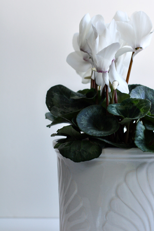
WhiteOnWhiteCyclamenw

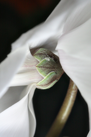
Aside from the leaves this meets Brooke’s additional challenge of white on white which I use frequently. I bought this cyclamen for a friend, but took advantage of it before I gave it away. Here are a couple of close-up shots.

CyclamenSepalsw

InnerCyclamenw

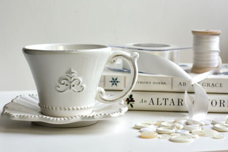
Finally I was inspired to set up a little still life.

WhiteStillLifew

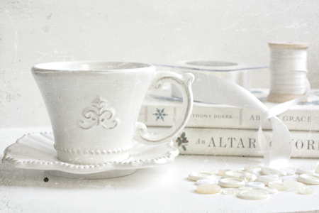
I was happy with this, but added one of Kim Klassen’s textures, Gray Day Slate, with a blending mode of Hard Light at 80%, and this turned out to be my favorite for the week.

WhiteStillLifeGreyDaySlatew

I’ll be submitting this for Sweet Shot Tuesday as well.

Sweetshotbutton


Make-It Monday 4

  • by

This is my second post today. Scroll down for a post on Exploring with Your Camera.

Make-itMonday

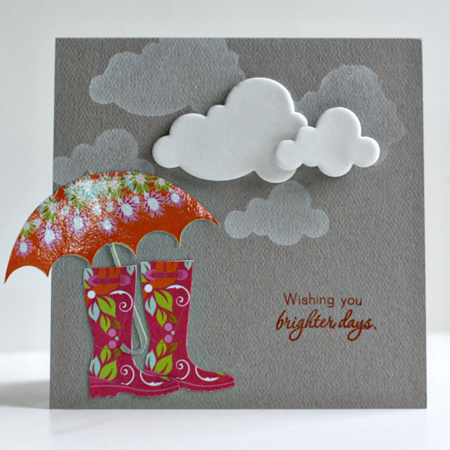
This week’s challenge was to use some fun foam and create your own stamp with a die cut. I had to go buy a piece of fun foam as it’s not something I’ve ever used. I decided to buy white, thinking I might eventually color it with mist or paint. But I knew right away that for this challenge, I’d use the white for clouds. Several years ago, I bought two sheets of paper by Autumn Leaves called “Wellies and Umbrellas, and I’ve always wanted to use the images on a card. With the introduction of “Healing Touch Sentiments” (PTI) a couple of months ago, I had the perfect sentiment for the card.

BrighterDaysMIM2

I’m really pleased with the card, and was amused to have Matt come into the studio and tell me he thought it was one of my best cards. He spent quite a bit of time examining it and asking about the challenge. I used the fun foam to stamp the clouds with Fresh Snow ink (PTI), hand cut the wellies and umbrella, and added the foam clouds. The sentiment is stamped with Pearlescent Rust by Brilliance. They’ve recently become my favorite inks although I’ve owned most of them for years.

Capture the Sky

  • by

ExploringwithCameraButton

A week ago my friend, Kat, posted another of her Exploring with a Camera series on Capturing the Sky. I’ve always been fascinated by the sky so I went through the archives currently on my laptop (many are archived on an external hard drive) to see what I could find. Interestingly, most of the shots were taken with my point and shoot since I always have that in my purse. Here are eight shots of the sky.

LagoonSilhouettew

Actually the sky figures in both the top and bottom of this photo. This was taken with one of my first Canon point and shoots from the deck of our townhouse on Kiawah Island.

Reflection1 copyw

Here the sky is captured in reflection. This was taken with the same camera during a vacation in 2007. I’d like to be there right now!

Sky4w

I took this one from my car one morning; another point and shoot. The sky was so dramatic I pulled over on my way to work.

AtlantaSunsetw

I could never print this photo; there’s a lot of digital noise, but I love the colors on the horizon. I took this as we flew into Atlanta one night.

CABlueSkiesw

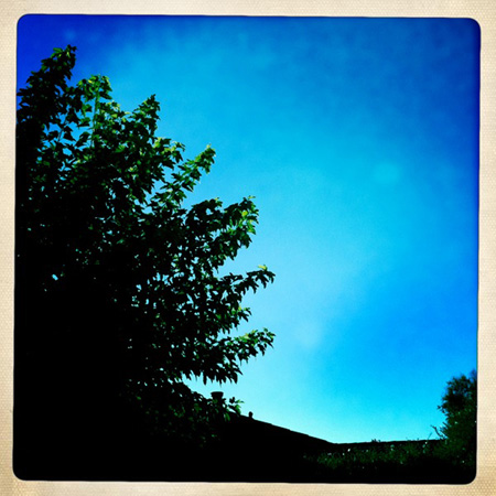
This I took with an iPhone app; probably the Hipstamatic since I’d just gotten my iPhone. This was from Sarah’s patio in California. I’m always looking at the sky there since it’s almost always blue–quite different from the typical gray skies of western New York in the spring.

ConsesusSunrisew

This is one of my favorites. This was taken with my DSLR on a tripod early on Halloween last year at Conesus Lake as the sun came up.

Sunset2Croppedw

And another favorite, also taken with my DSLR on a tripod in the Badlands. I waited a long time that night for this shot, but it was worth it.

What about you? Do you watch the skies?

Online Classes: Take 1

  • by

Despite my intention not to start any new classes, I am in fact taking three. The first is a class at My Creative Classroom on using the Silhouette, and it has been fantastic. I’m learning just what I needed to know and am amazed at the capabilities of this machine. The other two are both at Big Picture Classes. I broke down at the last minute and signed up for Karen Grunberg’s Finding Your Way. I’m already happy with that decision because I’ve decided to use the assignments to work on one of my biggest 2011 FINISH albums. The last is Picture Inspiration because I’m always looking for photography inspiration and conversation. My plate feels too full right now, but I know it will ease up as I get going with each of these.

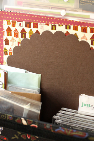
One of Karen’s first assignments was to identify the things you use on your pages so you can focus on making those accessible and stop spending money on things you don’t use. I did that when I moved my studio and did one of my first big purges. But before I started the Home Album I gathered up all the supplies (kraft paper for the basics, patterned papers, stamps, and embellishments) from my stash that I thought I might use. It has really expedited the process.

HomeKit

Here are the first layouts I did for Finding My Way with some Silhouette work as well.

HomeLO

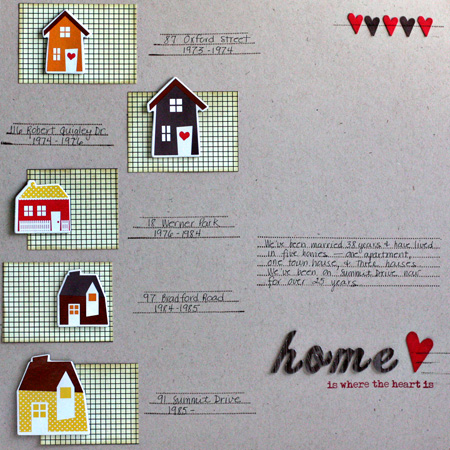
This isn’t the title page which I’ll do later, but it’s an introductory page to the album. I scraplifted it from a layout I saw on Kelly Purkey’s blog a long time ago. I also incorporated journaling stamps and my own handwriting—two things Karen suggests as ways to speed up your scrapbooking process.

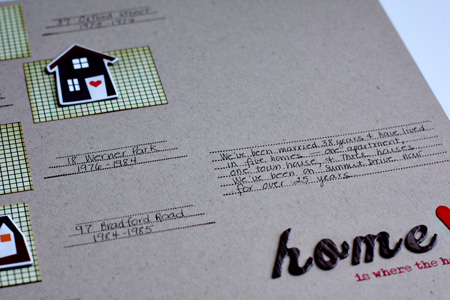
Here’s a close-up of the journaling.

HomeCloseUp

Circa1931

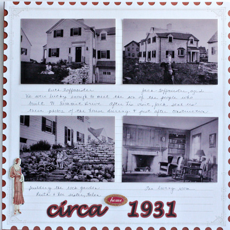
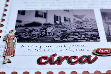
This page shows photos we received after a visit from the man whose family built our house in 1931.  The journaling documents the people in the photos as well as how we came to have them.

CircaCloseUp

One of the things I’ve learned how to do in the Silhouette class how to cut my own titles using the fonts on my computer. This week we learned how to weld the letters of a script font and create a shadow for the title. The chipboard accent is from Cosmo Cricket Circa 1934, which seems appropriate.

The first week’s assignment for Picture Inspiration was to take a self-portrait. I avoid these as often as possible and I didn’t take this until the last day possible. But I’m not unhappy with it and will eventually change my avatar since I finally have a photo that doesn’t use a mirror. I used my tripod and my remote and took it in my studio.

SP_PortraitPerfectw

Team-up Thursday: Everyday Beauty

  • by

Teamup

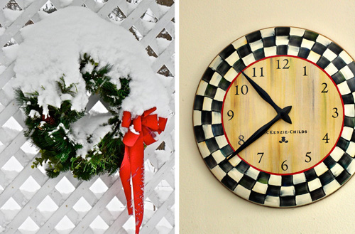
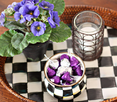
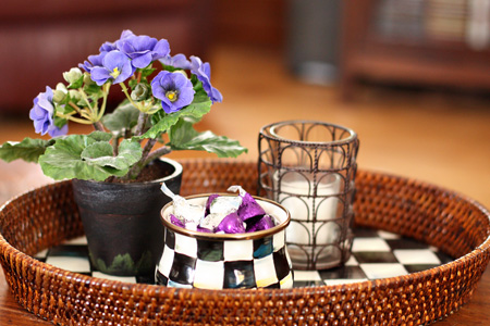
It’s hard to believe it’s Thursday already. The days are flying by! This week’s prompt was Everyday Beauty. I walked around the house and took some photos of things that give me pleasure. (No cameras, since I posted those yesterday.) Nancy sent the photo of the wreath on her deck with the note that, “This beautiful wreath has been on my deck since early Dec. and has looked pretty much like this every day!” We can’t decide if all that snow for three months is a good thing or not! I chose my MacKenzie Child clock for the diptych. It’s the same shape as Nancy’s wreath, and one of my favorite things in my studio. Sarah and Adam gave me a gift certificate for my birthday last year, and I knew exactly what I wanted. You’ll see by the other photos, that I’m a fan of MacKenzie Child as well as black and white checks!

EverydayBeauty

Just for fun, here are the other contenders:

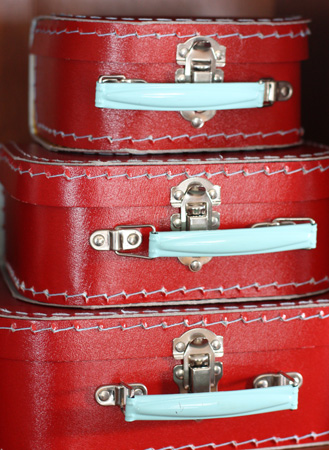
RedSuitcasesw

A stack of red paper suitcases that hold Papertrey ribbons and twill and a collection of Letterpress tags.

HeartBoxesw

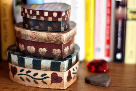
Folk art heart boxes on our bedroom bookshelf.

KitchenShelfw

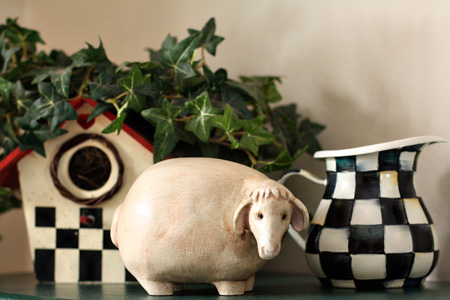
This funky sheep was sent to me by a good friend. I’ve had the birdhouse for ages, and bought the MacKenzie Child cream pitcher about a year ago. If (when) we redo our kitchen black & white tiles are on the wish list.

CoffeeTableTray1w

CoffeeTableTray2w

And two shots of the tray on the coffee table in the living room.


A Local Roadtrip

  • by

Last week was a school vacation in Monroe County, and we had planned a little roadtrip with friends who are still teaching. Unfortunately, they had to cancel, but we decided to head out anyway. Tracy would like to find a new coffee table, so we started at a local furniture store. We found one we like quite a bit, but haven’t made a decision yet. Earlier last week, we found the perfect table, but it is way out of our price range so we’re still on the hunt.

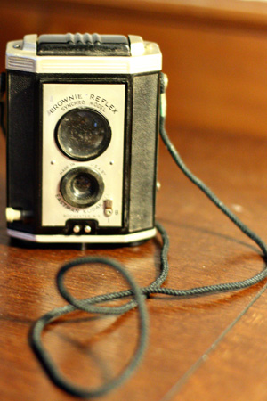
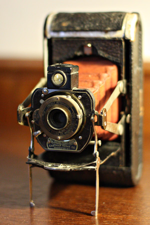
Our destination was Rio Tamatlan, a fabulous Mexican restaurant in nearby Canadaigua. We took the scenic route although it was a gray and cloudy day. There are a lot of antique/vintage stores along Routes 5 & 20. We stopped at one on our way, and I picked up a couple of blue Mason jars to use in my studio to hold twine and buttons. I also found a vintage camera there, still in its box with the manual. I have no idea if any camera I buy has any value or not, and I don’t really care. I purchase one if it’s relatively inexpensive (less than $20–the least expensive one I’ve ever bought was only $3) and I like the way it looks. I’m particuarly attracted to Brownie cameras by Kodak, since those were my first cameras.

BrownieReflexw

Lunch was delicious, as always. I had a combination plate with a tostada, a sope, and two flautas.

ComboPlatew

I brought half of it home, and enjoyed it again the next day.

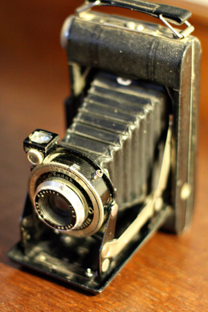
On our way home we stopped at the Ontario Mall Antiques. We’ve driven by it hundreds of times, but never gone in. It’s billed as the largest antique store in New York with over 1000 dealers displaying their wares. You could spend days here and never see it all. I did, however, pick up three more cameras.

Camera1_1w

Another Kodak, according to the tag, from the late 1930s.

Camera2_2w

About the same vintage, and also a Kodak.

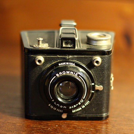
BrownieFlash6w

And a little Brownie Flash. It’s an unusual shape and in very good condition.

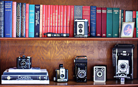
I had already started a shelf for the cameras when we redid the living room shelves. Here’s how it looks now. I put the camera with the red bellows on the media center.

CameraShelvesw

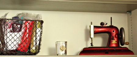
My last find was purely decorative. I walked by this little metal sewing machine and fell in love with it, probably because it’s red. I was pretty sure I could find a spot for it in my studio, and I did. You may see it crop up as a photographic prop some day.

RedSewingMachinew

I love it next to my antique wire basket filled with felt. Recently we’ve spent a lot of time purging and cleaning out, so this little shopping excursion seems to go against the tide. I’m sticking with the theory that you should be surrounded with things you love as well as those things that are useful.


Three Things

  • by

Sweetshotbutton

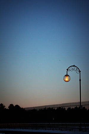
First off, my shot for Sweet Shot Tuesday (and P52). It’s the same shot I used for Team-up Thursday, but it was my favorite of the week.

InTheDistanceSLw

I also like this one, taken the same evening.

ReservoirLightHLEdgeBurn60w

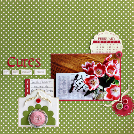
Second, a layout I completed for Shimelle’s 4X6 class on 2Peas, that I also posted on the Scrap-Mart blog. I usually wait until they’ve posted there before I post here.

CuresLO

CuresLOJournaling

I followed the sketch pretty closely and used a lot more product than I usually do on this layout. I made the pocket from two of the dies in the Spellbinder’s Creative Book dies. I used a new Quickutz die for make the rose from Vintage Cream felt that I sprayed with a Perfect Pearls mist. I cut “Cures” from the Calendar cartridge with my Slice, and used embellishments from October Afternoon, Jillibean, Pink Paislee, and a Scrapbook Circle kit. I’m hoping to get the next sketch completed in the next day or two.

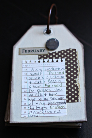
And finally, an update on my One Little Word: FINISH. Here’s the February page in the tag book.

  FebTagBookUpdate

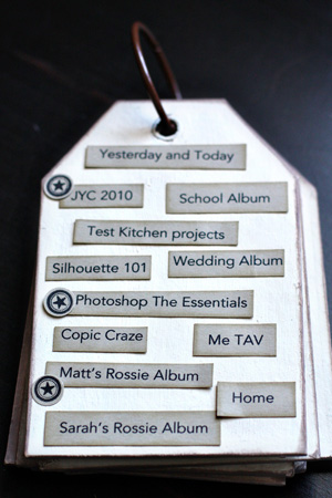
And the record page:

TagBookFebIndex

I’m very pleased with this month’s progress. I finished two big projects (Sarah’s Birthday album which I never listed on this record page, and Matt’s Rossie Album–which I’ll post soon.) I finished all the lessons for Kim Klassens’ Essentials Photoshop class where I finally grasped the concept of layer masks. I’ve been quite successful in using them as well. I’m taking a Silhouette 101 class at My Creative Classroom which has been terrific, and I’m current on all the lessons there. I read one book from my 2010 list and finished our Book Group book as well. Now I’m into Cleopatra:  A Life, which is the Book Group pick for March. I fill out a project card for almost everything I make, and there were 27 of them in the February envelope.

Project 64 and Happy Birthday

  • by

Project 64

Let me tell you how excited I was to see that my photo for indigo was the winner last week on Project 64! Totally unexpected and totally delightful! I had lots to choose from last week, but this week was a different story.

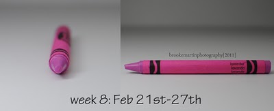
Wk8 Feb21_27_Lavender

This is lavender, although almost no one I’ve talked to this week would give this pinkish crayon that label. When I went to the box of crayons to look for my idea of lavender, I pulled out wisteria. Perhaps purple mountain majesty would be close, or even mauvelous. This seems way too pink, and it’s a strange pink. I’ve carried the crayon around all week again.

As it turns out I was staring at some lavender all week without it registering. Several of the flowers in my Valentine’s Day Bouquet are very close. By the time I realized it the flowers were fading, but I had taken an earlier photo.

ValentineFlowers2w

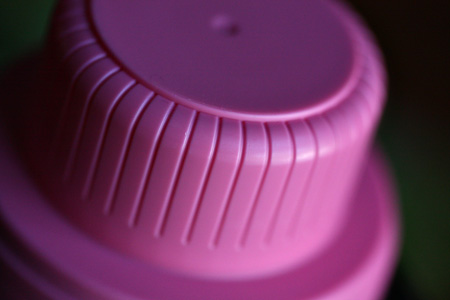
Then Saturday night as we were leaving to go to dinner at friends, I noticed the cap to the Woolite for Dark Clothes.

WooliteCapw

It’s nearly a perfect match. But my favorite is the tulips I bought for the kitchen table. And yes, I held the crayon next to them in the grocery store. I wonder what people think . . .

Tulipw


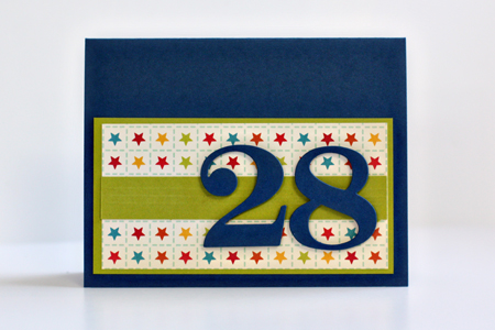
Today is Matt’s birthday. Happy Birthday to one of the kindest, nicest men I know. He’s . . .

MTWBD11

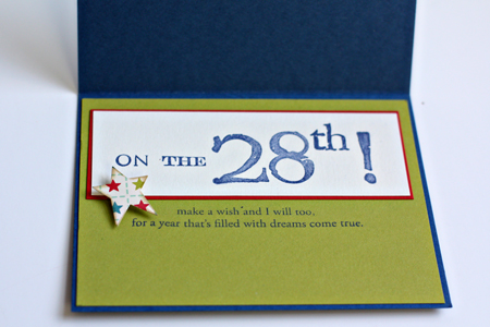
MTWBD11Inside

Cardstock: Simply Chartreuse & Pure Poppy (PTI), navy from stash; patterned paper: “Campfire” (October Afternoon); dies: Numbers (PTI); stamps: Big Birthday Wishes (PTI), Williamsburg Numbers and Punctuation (Technique Tuesday); star punch; Chamomile Tea Dye ink (PTI)


Redo

  • by

I had nearly finished this post, when the internet connection went and everything disappeared. I have to say it doesn’t happen often, but it certainly is frustrating when it does. I’m way behind on my blog reading, and just wanted you to know if I haven’t visited in a while, it’s not disinterest by any means, just a bit too much on my plate right now. I’ve also taken some time out to spend with Tracy. We’ve watched three movies this week on our new TV and spent a day on a local roadtrip—a bit of antique shopping (another post to come) and a wonderful meal at our favorite Mexican restaurant. I hope to catch up by the end of the week. I thought I’d share some photos of our dining room/living room redo.

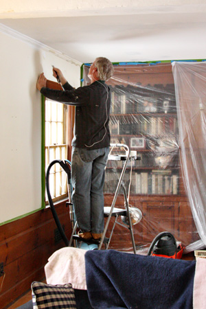
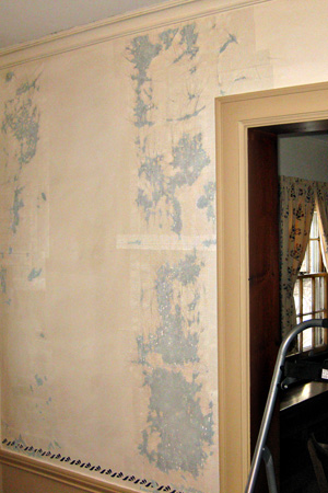
When you live in a house that was built in 1930 the walls are plaster, and about every 10 years or so they begin to crack. So a repainting job that some could do in a weekend took nearly six weeks here. Every crack has to be opened up, filled, taped, spackled, and primed before you can paint.

Scrapingw

It’s a tedious job, but Tracy has done it often enough that he knows exactly what must be done.

Scraped&Tapedw

Here’s a look at one of the dining room walls that has been scraped and some of the cracks taped. This was one of the worst walls, but there weren’t any that didn’t need attention.

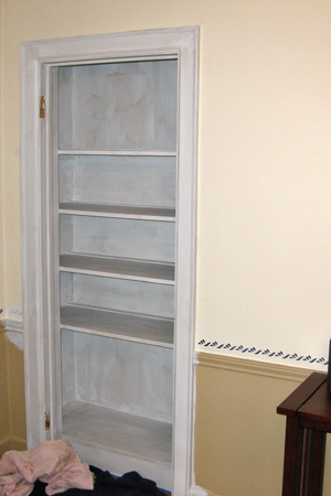
ChinaClosePrimedw

An advantage of an older house, however, are the built-in cupboards and bookcases. This is the china closet in the dining room scraped and primed.

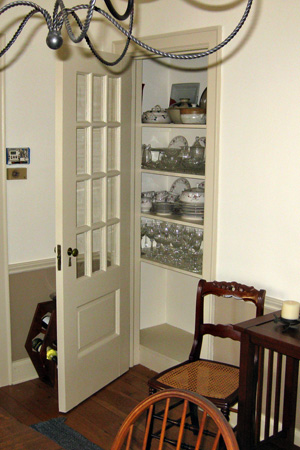
ChinaClosetDonew

And here it is, painted with most of the china back in place.

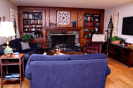
LivingRoomw
There’s no way to tell from this photo, but one of the things I like the best about the living room is the reorganized shelves. We took everything off the shelves, donated over 150 books from six different bookcases in the house, and then placed good hardcover books and reference books in the living room. All the paperbacks are now upstairs. I also took down many photographs and left just a few special family ones. Now there’s a shelf for my vintage cameras which I really like having on display.

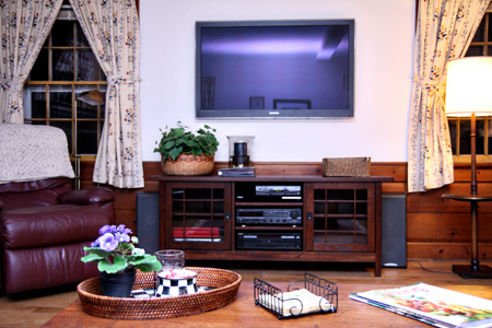
TVWallw

Here’s our concession to the high-tech world. I like it a lot more than I thought I would since I wasn’t sure how it would fit into an older home. The media cabinet is new, as well, and came from Crate and Barrell. We saw it in November when we were in California and didn’t even look locally for one. The older one has been moved upstairs in the den where it looks fantastic. The entertainment center from there was given to the Volunteers of America. So, actually, three rooms got a new look and five bookcases were reorganized.

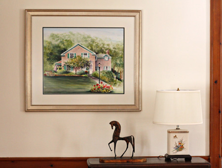
HouseWatercolorw

This is the last addition to the living room. We had a watercolor done of our house by a watercolor artist (Irene MacKenzie) we love in Niagara-on-the-Lake, Ontario. We picked it up in October, but just had it framed and matted a week ago.

Tracy’s taken a week off from the painting, but expects to start again next week on the hallway which is a two-story affair and will require scaffolding. I expect it will take even longer, but we’ll be in the best shape we’ve ever been in here once it’s finished. That project won’t affect our daily routines much. That’s a good thing, but it also means there’s not quite the incentive to get it done. Hope you’ve had a good weekend.
Papertrey February Blog Hop

  • by

Bloghoplogo

This is my second Papertrey Ink post of the day—a bit unexpected. Maybe it’s this:
  Snowblowingw

Or perhaps I’ve just lost track of time, but today is the Papertrey Blog Hop, and I nearly missed it. Fortunately we’re snowed in so I had time to get my card made. The photo above was taken about 9:00 this morning and it has yet to stop snowing. Matt’s been plowing since 7:00 am and says there’s no end in sight.
Here’s this month’s challenge:  

This month we decided to dedicate the Blog Hop to scallops!  We want to see your best use of scallops, of any sort, on a project!  This can include scalloped borders, offset-scallops, stamped scallops,  scalloped mats, scalloped frames, layered scallops, scalloped tags or anything else you can dream up! You can use dies, patterned scissors or even circle punches in a row to achieve your special look.

Here’s my take on it:

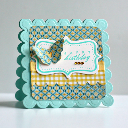
HappyBDBlogHop2.25

I made a shaped card with the large scalloped Nestability dies, then used a piece of MME’s Stella & Rosa patterned paper pad that I picked up yesterday for the mat. It was cut with a square Nestability and then punched on the corners. The checked scalloped (Papertrey small scallop die) border is also from the MME’s collection. I die cut a Fillable Frame #4, stamped the border and message with Brilliance ink, and added the butterfuly from Love Lives Here with a bit of the Harvest Gold twill taped behind the heart. The rhinestones are from Hero Arts.

Make-It Monday 3

  • by


Screen shot 2011-02-25 at 11.01.41 AM

I’m a bit more timely this week with the Papertrey Make-it Monday challenge which called for using Scor-Tape to create glitter strips on the card.

MIMGlitterStrip

Select White cardstock (PTI); Stamps: Make a Wish and Make a Wish Additions (PTI); Brilliance inks; rhinestones by Kaiser Craft.

Team-up Thursday: In the Distance

  • by

We’ve been really busy cleaning, organizing, and purging. The living room and dining room are repainted, the new TV is installed, and we’re really enjoying the new look! It’s meant there hasn’t been much time in the studio except for the photography challenges.

Teamup

This week’s prompt for Team-Up Thursday was “in the distance.” I laughed when I saw Nancy’s photo last night. In Rochester, when there’s a clear day and it’s above freezing, the line at the car wash is always very long. Nancy’s comment read, “In the distance, there will be a clean car!” I took advantage of the clear day as well and drove up to Cobb’s Hill last night after dinner to take a photo of the Rochester skyline “in the distance.”

  DistanceDiptych