Skip to content

Color Hues #49

  • by

Tracey has given us the lovely Yellow and Brown color combination for the next Color Hues Challenge.
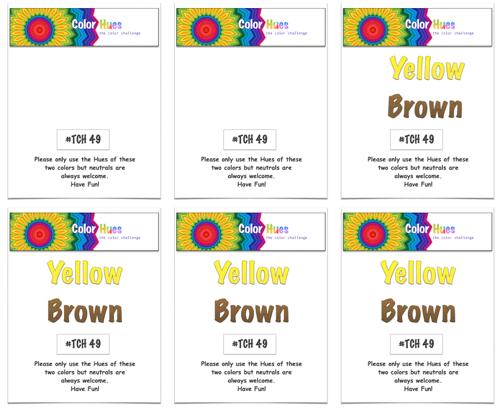
CH #49 Yellow and Brown Anim.

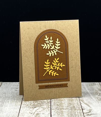
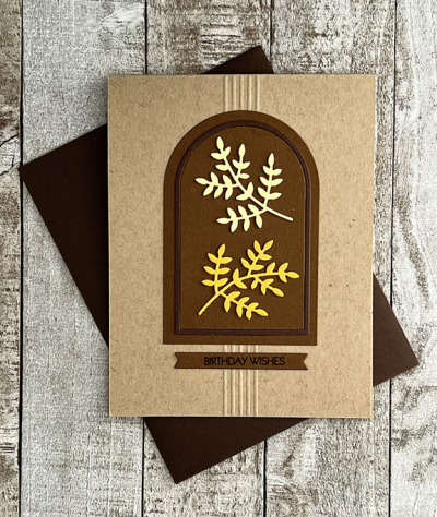
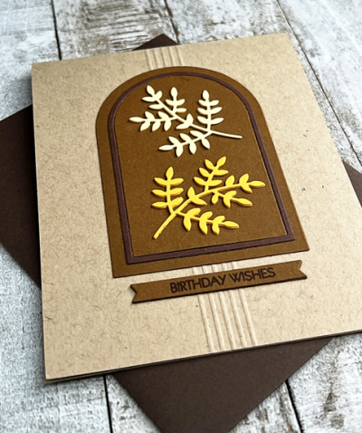
I started out with a general idea of where I wanted to go, but as is often the case, the final card is somewhat different. I started with a Classic Kraft card base, and played around with some different design ideas as well as some different die cut leaves and sprigs. I ended up with the Essential Arches dies by Ellen Hutson. I love that they cut both an arch and a frame. By die cutting them in two colors, you get a perfect set of arches with a darker frame.
YellowBrown

I used Papertrey Ink papers for all of the die cuts:  Cocoa Bean and Dark Chocolate for the arches and sentiment banner.
YellowBrownFlat

The “Leafy Sprig” by Poppy Stamps is one that’s been in my die collection for years. I originally thought I’d have a cluster of them, perhaps tied with twine, but ended up preferring just two, one from Lemon Tart and one from Summer Sunrise. 
YellowBrownClose

The sentiment is from my favorite Pink & Main set: Special Day, stamped in Dark Chocolate ink on a Cocoa Bean banner die cut with My Favorite Things, Itty Bitty Strips die. I thought about adding some embellishment, but decided on a set of five scored lines behind the focal image and the sentiment. 

I’m sending this one over to the current Addicted to Stamps and More Challenge: Birthdays. 

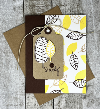
This was actually the second card I made the challenge. I like the first one as well, but it was an almost complete CASE of one Debby Hughes made several years ago when the stamp set, “One With Nature” was released by Simon Says, so I decided to make a second card for the Color Hues blog. Here’s the original:
LeavesFlat

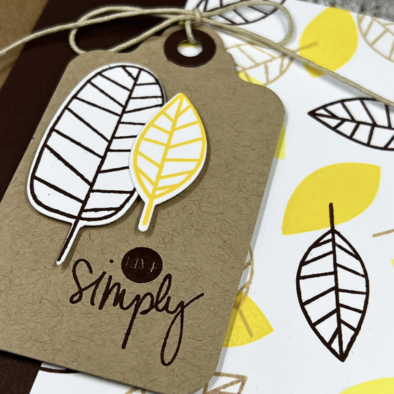
This one was a lot of fun to make. I layered the solid and open leaves in two colors of yellow and brown on white cardstock, and then cut it down for the card. The side panel is cut from Dark Chocolate cardstock.
LeavesClose

Then I added the tag with two die cut leaves and a sentiment from Gossamer Blue that was included in a scrapbook kit years ago. 

Be sure to hop over to the Color Hues blog to see all the creative takes on this color combo by the Design Team and our two guests this time around.
 

Sunflowers with “A Freshly Made Sketch”

  • by

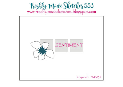
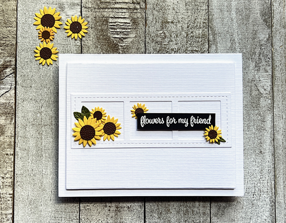
If you’ve followed my blog for long, you know I’m a fan of Clean and Simple cards. One of my favorite designers of CAS cards is Cécile Ribon. It’s her turn to design the sketch for Freshly Made Sketches, and I just had to play along.

FMS Final 553-001

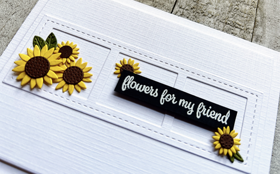
As soon as I saw the sketch, I thought of a die, “Stitched Film Strip,” from Pretty Pink Posh that would work perfectly. I still had an envelope of sunflowers left from my first go with the My Favorite Things kit, “Sending Sunflowers,” so I pulled those out next.

Sunflowers

I chose Fresh Snow Linen cardstock from Papertrey Ink and die cut a panel from Gina K’s “Master Layout #1.” I added the frame and then had to find a sentiment. This one from Simon Says, ” Best Friend Ever” seemed just right and I embossed it in white on black cardstock and trimmed it out. All that was left to do was arrange the sentiment and the sunflowers. I popped up the sentiment and two of the sunflowers with dimensional tape and added a piece of foam for some dimension to the main panel before adding it to the card 

SunflowersClose

It’s been so nice to have real crafty time the last few days, and it looks like there’s some more time before the week is out. I’ll be back tomorrow with the new Color Hues Challenge.


A CAS Sympathy Card

  • by

I found two challenges this week, both CAS challenges which I thought I could combine easily. First the AAA Cards Challenge which is asking for a one layer sympathy card. I was pretty successful with my last one layer card (it won the challenge) so I thought I’d try another one layer card again. I combined it with the Less is More Challenge which is looking for black and white.

AAA

Less
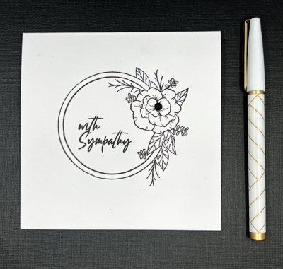
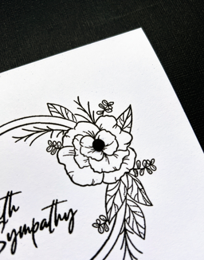
I chose a lovely floral frame from Simon Says “Mandy’s Flowers” which was one of the sets in their monthly kits a few years ago, and stamped it on a square cardbase. A sentiment from Gina K’s “Natural Silhouettes” fit inside the frame perfectly.

Black&White

The only embellishment was to add a black rhinestone to the center of the flower.

Black&WhiteClose

 A very simple card, but perfect for the occasion.


A Festive Celebration

  • by

The current Time Out Challenge: Festive spurred me on to create a card for two of our best friends who will be celebrating their fiftieth wedding anniversary early next month. 

Festive

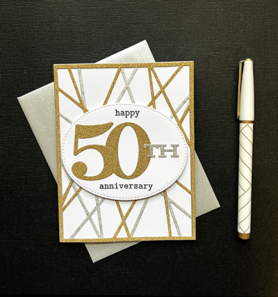
Unlike many cards, this one turned out pretty much the way I envisioned it. The background of the card is a CASE of a card created by one of the most creative card makers I know, Hannelie, who created this card for the Color Hues #30 Challenge. I pinned the day I saw it, and bought the Altenew die, “String Panel,” shortly afterwards. It’s the first time I’ve used it, but it definitely won’t be the last. 

50thFlat

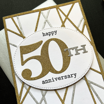
I die cut the string panel twice–one in gold glitter paper and once with silver glitter paper and arranged them on a white card base, rotating the gold one on top of the silver panel. I wanted a big bold 50 and Papertrey Ink’s “By the Number” which I’ve had for years (and love) fit the bill perfectly. I stamped the rest of the sentiment with words from another oldie by goodie, Winnie and Walter’s “The Big, The Bold, and The Happy.” After arranging it on a pierced oval by My Favorite Things, I adhered it with dimensional tape. 

50thClose

Since the “String Panel” die is being used for the first time, I’m sending it to the September NBUS gallery as well.

NBUS

Color Hues #48

  • by

How is it that it’s already September first, and the second birthday for the Color Hues Challenge!?! It’s been so much fun to be part of the creative team at Color Hues, and we have a fun challenge for you. We’ve asked the DT at our sister challenge, Seize the Birthday, to make birthday cards using the great colors Sheri’s chosen: Navy and Lime Green. 

So the change to this challenge is to not only use the Colors below but also to make a birthday card to help us CELEBRATE! 

After you link up a card for this challenge make sure you head on over to Seize the Birthday and link up with them as well!  This challenge and their challenge will be like any other, as each challenge blog will pick its own Winners! Here’s the link for Seize the Birthday.

CH #48 Navy and Lime Green Anim.

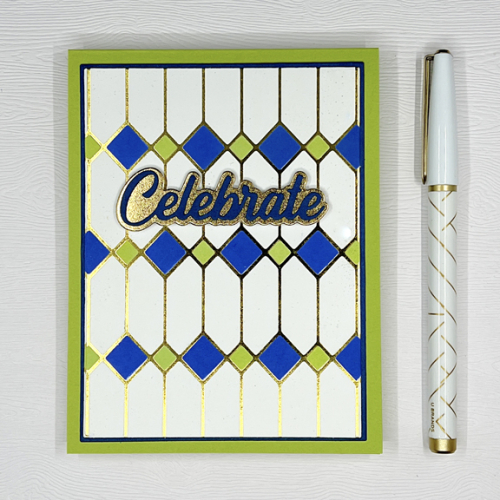
I love this color combination, and thought the Pinkfresh Studio hot foil plate, “Stained Glass” would be just perfect. Thanks to a lovely birthday gift certificate to Pinkfresh, I have the whole suite of products for this set, but used just the hot foil plate and selected parts of the stencils.

NavyLimeGreen

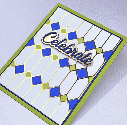
Creating hot foil cards is not as big a challenge as photographing them. No matter how hard you try, the card is much more beautiful in your hand than it is in any photograph. I chose to color just selected sections of this beautiful design, using a bright navy ink from Pinkfresh, and Twisted Citron Distress Oxide for the lime. I die cut the panel with Gina K’s “Master Layout 1” and then the coordinating thin frame from Enchanted Evening (Papertrey Ink) cardstock. Green Parakeet (Papertrey Ink) was a perfect lime.

NavyLimeGreenClose1

I did cut the sentiment from Pinkfresh Studio’s ” Scripted Greetings” and added a gold shadow die behind it. 

I hope you’ll come celebrate our birthday with a card of your own. You can check out all the wonderful cards by the Color Hues Design Team right here. And don’t forget to link up with the Seize the Birthday Challenge, too.

Sending Birthday Hugs

  • by

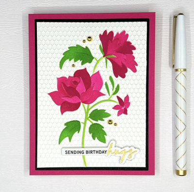
I have a card to share for a couple of challenges. First off, Addicted to CAS: Pink. I debated whether or not this was CAS enough, but in looking at the Design Team’s cards, I think it’s just fine. This is the first embossing folder/stencil combination I’ve ever purchased, and the first time I’ve used it, so I’ll be adding it to the NBUS collection for August.

When I first saw the Altenew “Victorian Lace” Embossing folder with accompanying stencil, I knew right away I wanted to give it a try. I’m not totally pleased with this first attempt, but I know what I want to try next time. I think the stenciling could be a bit more subtle. Although the Altenew stencils work well, they’re not as easy to use as those by Pinkfresh Studio. Now that I’ve tried them, I have a better idea of how to used them.

BDHugs

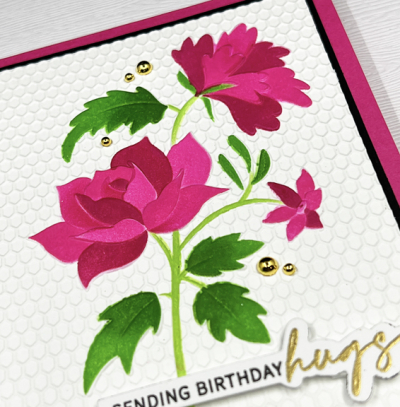
Altenew’s 3-D embossing folders, however, are one of my favorites, and I love that I have a main image and the beautiful textured background with one pass through the die-cutting machine.

BDHugsClose

We’ve been home from our trip for about a week now. I’ve done the first round edit of the 800+ photos the two of us took, and deleted over 300 of them. Now Tracy and I need to go through them and decide which ones we want to share and which ones we’ll keep just for the record. Our goal for sharing is no more than 120 which you can flip through relatively quickly. Those, however, all need captions, so that’s the next big project. 

I’ve also been busy at the crafting table, but much of what’s been created can’t be shared here quite yet. I do have a list of challenges I want to participate in, and my week has opened up a bit. Last week there were multiple committee meetings and appointments–plus jet lag to contend with. Hopefully, this week I can get back to a more regular schedule of creating, reading, and walking every day. It’s hard to believe that August will end in just two more days!

CAS PINK  NBUS


Color Hues #47

  • by

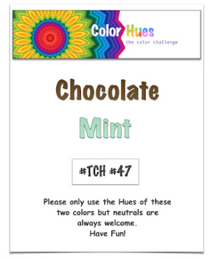
Color Hues has a fun combination for you this time:  Chocolate and Mint.

CH #47 Choc. and Mint.001 Screen Shot 2022-05-07 at 3.02.14 PM

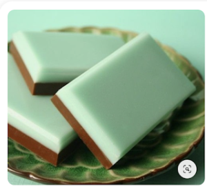
It was the candy mints that inspired me this time around, and like last round, I had a never before used product waiting in the wings to be put on stage.

MintChocolate

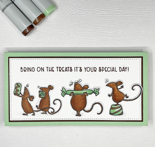
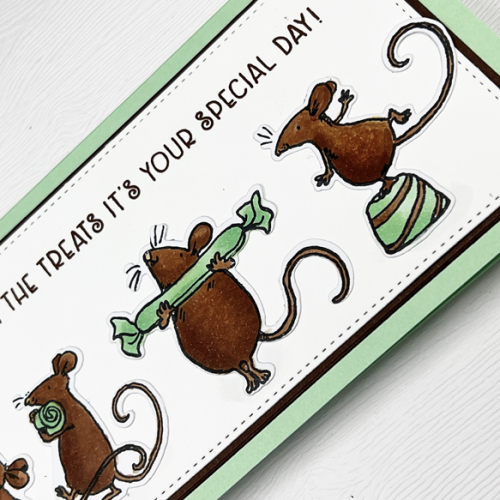
I just love the Anita Jeram stamps from Colorado Craft and don’t use them as much as I should. They’re all filed together in my boxes, and I tend to forget they are there. It was so much fund to color these cute little mice with Copic markers.

ChocolateMintClose1

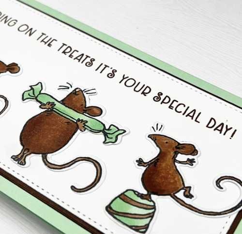
The coordinating die cuts work perfectly and that made it easy to arrange these critters on a white panel die cut with the Gina K “Master Layout 7” dies which create a mini-slimline card.

ChocolateMintClose2

The sentiment is from the “So Sweet Slimline” set from Colorado Craft and was stamped in Dark Chocolate ink. The card base is Papertrey’s Mint Julep.

We’d love to have you come join us in the Color Hues Gallery. Be sure to check out the wonderful variety of cards by the Design Team and Guest Designer.

Seize the Birthday: No Stamping

  • by

I’m a huge fan of die cuts so this no stamping challenge from Seize the Birthday is right up my alley. I have a card that went to one of our male family members a week or so ago, but it’s never made the blog.

2022-08-04-NoStamping

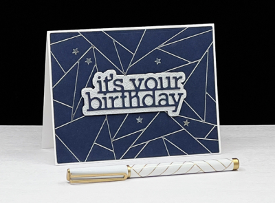
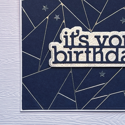
It’s another card that features hot foiling. I’m so happy I got the Glimmer Foiling system for Christmas. I’ve won a fair share of hot foil plates, and foiling plates represent a good portion of the products I’ve purchased since the holidays. This one features the Pinkfresh Studio Abstract Triangles–one of my wins from Pinkfresh.

StarBD

Lots of folks have reported difficulties foiling on colored cardstock but the papers from Paper Source foil beautifully. This Night cardstock is a lovely navy, and I used silver foil.

StarBDClosejpg

The sentiment is a Simon Says’ die, It’s Your Birthday. The words were die cut from the same navy cardstock, and I used a textured silver for the shadow die. The last touch was to add a few sparkly star stickers. 


Less is More: Butterflies

  • by

Butterflies

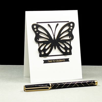
The Less is More Challenge is one I always enjoy, but rarely seem to find time to participate. Last night I had some free time, and decided to play around with some butterflies that were already die cut. 

Butterfly

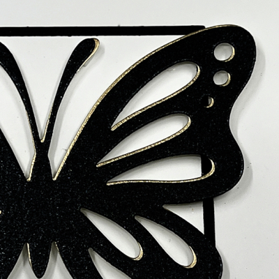
I found both a shimmery black butterfly and a gold metallic butterfly die cut with Papertrey Ink’s Life Is Beautiful set. I used the frame portion of one of Ellen Hutson’s Essential Square die cuts as a backdrop, and offset the two butterflies before adding them to the card.

ButterflyClose

All that was left to do was add a sentiment by Pink and Main from the Special Day set which I embossed in gold on black cardstock and die cut with a My Favorite Things Itty Bitty Strips die. Simple and definitely CAS!

I’m also entering this in the brand new challenge at Addicted to Stamps and More: Die Cuts and Stencils.

Addicted

Summer Findings

  • by

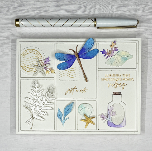
For a very long time I’ve wanted to use The Greetery “Curio Divider” and “Curio: Summer Findings” which I purchased at the end of last summer. I decided on using my metallic watercolors with a few stamped images as well as the die cuts.  I must admit this took awhile, but I totally enjoyed watercoloring the different elements, and deciding on the arrangement.

BluePurple

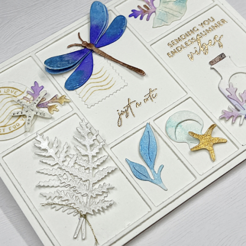
I chose a couple of sentiments to include. One is from The Greetery’s ” Pretty Postmarks” and the other from Papertrey Ink’s “Just Sentiments: Summer.” Both were embossed in Rose Gold. The other stamps both stamped in a light brown are also from the “Pretty Postmarks” set as is the die with the postmarks on it. I created a pseudo shaker with the pretty bottle, glueing the Rock Candy Glitter behind the acetate on the bottle.

BluePurpleClose1

It’s easier to see the shine of the metallic paints in this photo. The two starfish are actually stickers I found in my collection and painted with the metallic paints. Both the starfish are attached with some dimensional tape, and I tucked a tiny piece behind one of the blue leaves. 

BluePurpleClose2

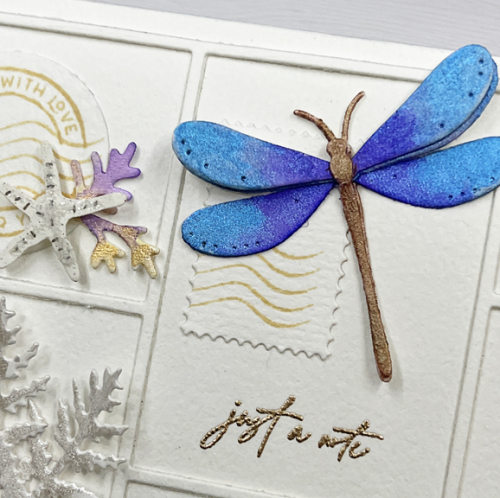
There wasn’t a rich purple color in my metallic watercolor set, but I found a jar of Radiant Pearls that was just perfect for this gorgeous dragonfly. 

I’m entering this in two challenges: Addicted to Stamps and More: Any Occasion and Fusion: Beach Tiers as well as a last minute entry to the July NBUS.

I’m adding this to two challenges: Addicted 220721 Beach Tiers-001NBUS

I’m hoping I’ll have time this week to create a few more summer themed cards. We’re (hopefully) off to Scotland on Saturday for a two week tour that was scheduled for 2020 and paid for in 2019. We’re going with good friends who are flying out of Washington, D.C. We’re flying from Toronto. Given all the travel woes I’ve read about we’ll all be grateful to meet up in Edinburgh. We scheduled our arrivals for the day before the tour starts so we do have a little wiggle room. Hopefully I’ll have a couple of blog posts scheduled to post while we are away, but I don’t intend to publish any directly from Scotland. If I do post photos, it will be on Instagram. You can find my profile here.

Happy Anniversary to Us!

  • by

It’s our 49th anniversary today—hard to believe, but true. Tracy spent the morning on the golf course, and I had lunch with a friend. We’re going out to dinner out in a bit, but that’s the only celebrating for today since a week from Saturday we’ll (hopefully) be on our way to Scotland with friends for a two-week tour that was originally scheduled for 2020. It’s not often that I go 10 days without a blog post. It’s taken me awhile to settle in after our two weeks with Sarah and her family, both here and at Chautauqua Lake. Crafting as definitely taken a back seat, and although I’m busy getting some future posts ready, there won’t be a lot of crafting in August either. 

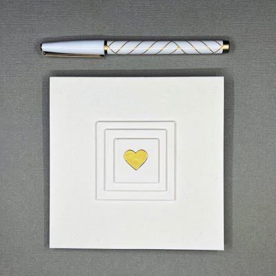
I did make a very CAS anniversary card for Tracy. There’s no sentiment on the outside. I tried (and failed) to get a photo of the inside sentiment which reads, “Love you with all my heart.” Indeed.

OneHeart

OneHeartClose

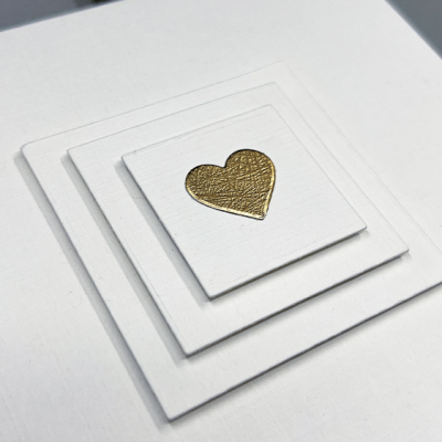
The card base and all the layers are die cut from Fresh Snow Linen card stock. I cut a series of squares with Ellen Huston’s Essential Squares and added a gold metallic heart cut with Hero Arts Infinity Hearts. 

Since we’re celebrating our anniversary, I thought I’d take the time to share a few family photos from the last two weeks. If there’s anything we’re most proud of it’s our kids and grandkids. First off some photos from Chautauqua Lake. The cottage there was the smallest we’ve ever shared, but we made it work, and there was a lovely covered patio overlooking the lake. Like some of the Finger Lakes, Chautauqua Lake is a bit murky due to seaweed. The best swimming was in the middle of the lake, off the boat we rented for several of the days we were there. 

IMG_4478ed

Here’s Hannah, ready to go! She would have been in the lake every minute if she’d had a choice.

IMG_4564ed

IMG_4665ed

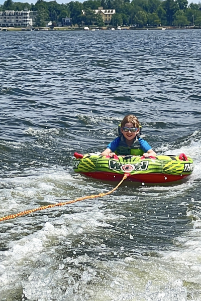
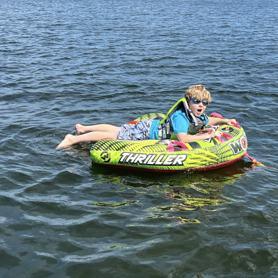
And Caleb would have gone tubing every single day if we’d had a boat for the whole week!

IMG_4502ed

IMG_4746ed

IMG_4671ed

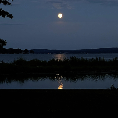
Watching the sunset (and the moon rise) was right up my alley!

Once we got back to Rochester, it was cousin time. It’s always so wonderful to watch the five cousins reconnect in just a few minutes each summer. 

IMG_4842ed

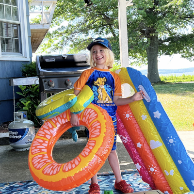
It was really hot while Sarah and her family were here. Matt and Betsy have a blow-up waterslide that cooled everyone off in a hurry!

IMG_4854ed

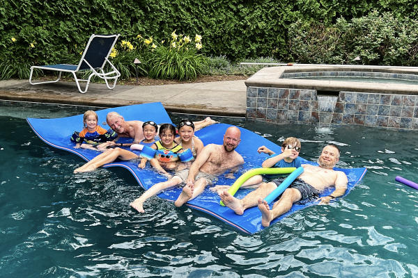
Better yet, Betsy’s dad has a fabulous pool in his backyard. Here are the dads, the kids, and Grandpa floating along.

IMG_4923ed

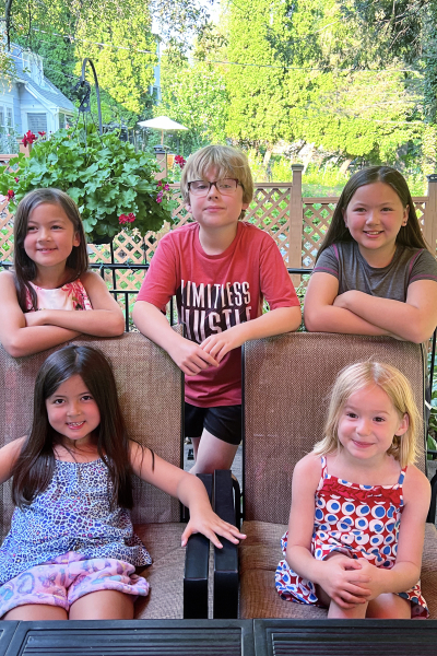
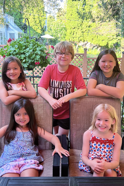
One big change this year, is the willingness of the kids to let Grandma get a photo of all of them. This was the last night with dinner at our house.

IMG_4925 2ed

And another one, because I couldn’t decide.
Back row: Ella 7, Caleb 10, Skylar (almost) 11
Front row: Maddy 6 and Hannah 5

I know it’s REALLY HOT for many folks right now. I hope you’re able to find a cool place to hang out. It’s warm here, but not oppressive for which I am grateful.


Seize the Birthday!

  • by

The blog’s been pretty quiet recently, but we’ve returned from our week on Chautauqua Lake, and I’ve got just enough time to enter a couple of cards made for some guys in the family using the current challenge at Seize the Birthday: Metallic!

2022-07-07-Metallic

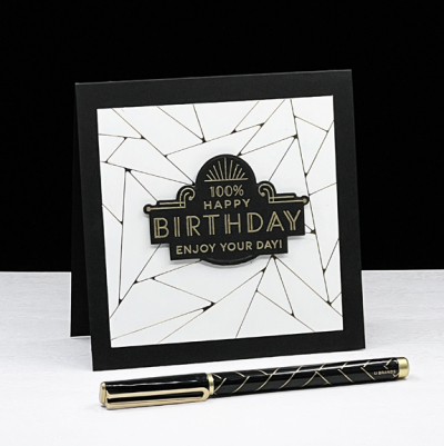
Having a hot foil machine has definitely increased my production of cards with metallic shine. I particularly like the many geometric designs that can be used for backgrounds. They’re great for masculine cards.

100%

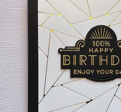
This one uses the Art Deco hot foil plate from Pinkfresh Studio, foiled in gold. I die cut it with a square die from the Essentials line by Ellen Hutson and added it to a black card base.

100%Close

The gold embossed sentiment from The Greetery’s Everyday Labels is one of my favorites.

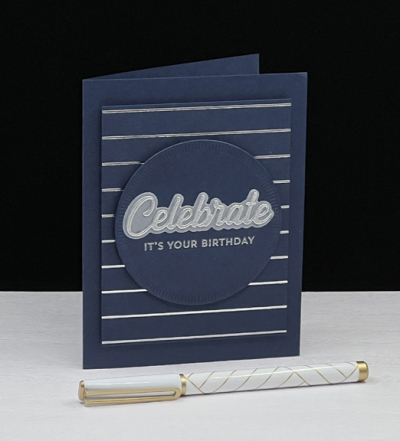
Next up is a navy and silver foiled card using Spellbinder’s Skinny Stripes Background.

CelebrateNavy

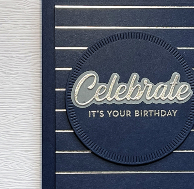
Foiling on colored cardstock can be a problem, but I’ve found that the cardstock from The Paper Source is quite smooth and foils easily. 

CelebrateNavyClose

The sentiment die cut in silver and layered onto a vellum shadow die is also from Pinkfresh and layered onto a Crimped Circle Die from The Greetery. 

My daughter and her family came home with us to spend a few more day visiting with family before heading back to Wisconsin. It’s the first rainy day we’ve had in quite some time. Needed not only by the plants and flowers but all of us as well!

Color Hues #45

  • by

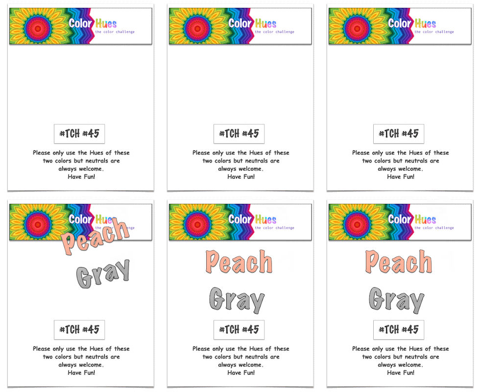
Welcome to the next round of the Color Hues Challenge. Kristie is our hostess this time around, and she chose Peach and Gray.

CH #45- Peach and Gray Anim

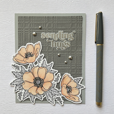
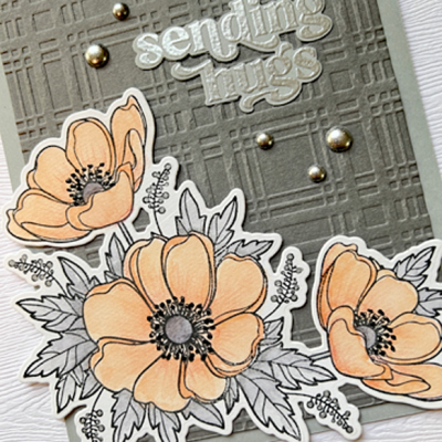
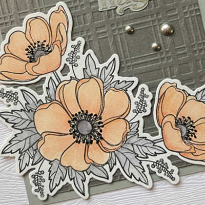
When I first saw the color combination for this Color Hues Challenge, I immediately thought of watercolored florals. I chose a favorite of mine, Honey Bee’s “Winter Anemone.” I didn’t let the “winter” in the title discourage me because I think these are beautiful any time of the year.

PeachGray2

I used Karin Watercolor Brush markers for the florals, and added some more detail with Polychromos pencils for the florals and a black Glaze pen to add some dimension to the stamens.

PeachGrayClose

Once the florals were die cut, I chose two shades of gray cardstock. I embossed the darker panel with a new Spellbinders embossing folder, “Plaid Company.” The sentiment was embossed in silver from the Pinkfresh Studio “Perfect Sentiments” set.

PeachGrayDetail

The last touch was the addition of a few silver metallic pearls.

As always, you’ll find a wonderfully diverse set of cards using Peach and Gray at the Color Hues Challenge, created by the Design Team as well as our two Guest Designers this round Caroline and Joyce.

I’m adding this one to the July NBUS Challenge–another new product used!

NBUS

Precious & An Unexpected Holiday

  • by

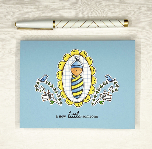
There was wonderful news at a recent extended family gathering–a baby boy is expected this winter! It’s a long hoped for event, and I wanted to send a card of congratulations.

Baby

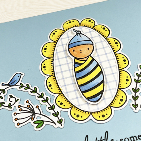
The sweet images are from Waffle Flower’s “Little One Baby,” which I borrowed from a friend for this card. I colored the images with Copic markers and used the coordinating dies to cut them out. I paper pieced the grid pattern from a scrap of patterned paper in my bin.

BabyClose

I forgot to photograph the inside before I sent this off, but it says “is on the way,” from another borrowed stamp by Lawn Fawn. I liked these images so much I stamped and die cut a bunch to save for the next time I need a baby card—which admittedly, isn’t very often.

This is off to two challenges: Inkspirational: Precious, and Addicted to CAS: Grid.

25 JUNE 22       Grid

As I said in my last post, we had quite the weekend. We had planned to spend this week driving back and forth to a cottage on Canandaigua Lake to spend time with Tracy’s family and a few friends. Just before we arrived at the cottage on Saturday, we received a phone call saying Tracy’s sister had been scammed and the cottage was not rented to us! We were planning to celebrate the 4th with a boat ride to watch the fireworks on the lake, celebrate my mother-in-law’s 93rd birthday on the 5th, and enjoy gorgeous views of the lake. In addition to renting the cottage, my sister-in-law plans all the meals for the week, and buys most of the food in advance with any average of 10 people at every dinner. 
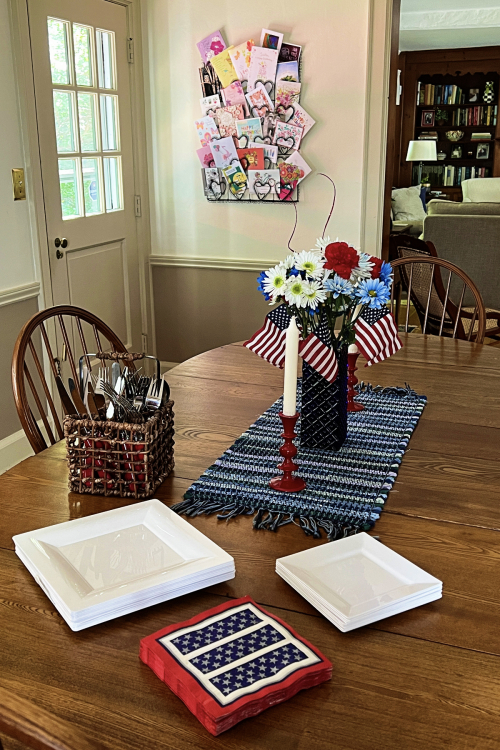
After talking with the sheriff it became clear that there is very little recourse to such scams. It’s not an unusual scam and the perpetrators are most likely not even in the country. We decided to make the best of a bad situation and are in the process of rotating dinners among the three houses where my mother-in-law can navigate with a wheelchair. So the 4th was celebrated at our house. We had a wonderful time despite no lake views and no fireworks.

IMG_4399ed

I should have waited until the table was filled with food before taking the photo!

IMG_4404ed

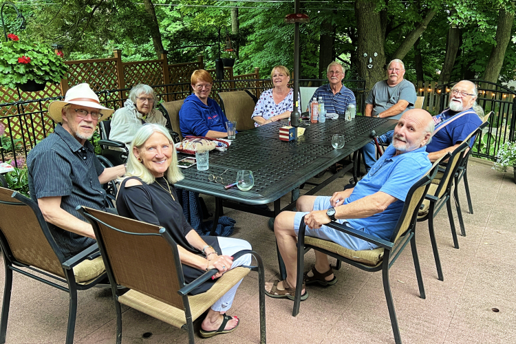
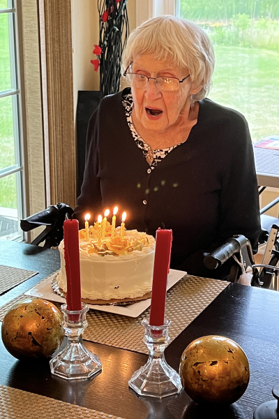
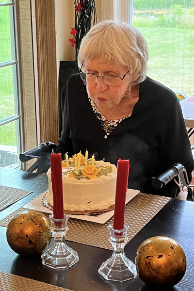
Last night we celebrated Ellie’s birthday at her condominium with grilled oysters, steak, baked potatoes, green beans, salads, and a chocolate cake.

IMG_4406ed    IMG_4407ed

It certainly wasn’t what we expected, but we’re having a lovely week at home.


Many Thanks

  • by

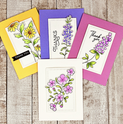
I have a set of thank you note cards I created with Pinkfresh Studio’s Beautiful Blooms I’d like to share before one of the challenges closes. 

4Notecards

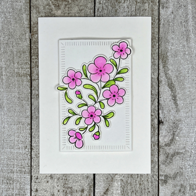
I decided to leave off the sentiment on the white notecard. I liked it just the way it was and knew writing a thank you note inside didn’t really require a sentiment on the front. 
WhiteNoteCard

All four notecards are A4. The smallest of The Greetery’s Crimped Frames is the perfect size for that. The Pinkfresh die set for Beautiful Blooms stamps and cuts three floral images at once which I love. I stamped and cut multiples of them so I have a nice stash for a quick card when I need one.

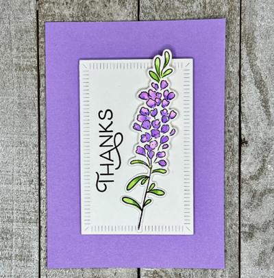
PurpleNoteCard

The sentiment here is from The Greetery’s Spring Mix and uses one of my favorite fonts. 

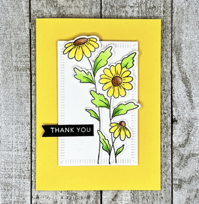
YellowNoteCard

This sentiment was one in my prestamped basket, and I’m not 100% sure where it’s from. The banner die is from My Favorite Things.

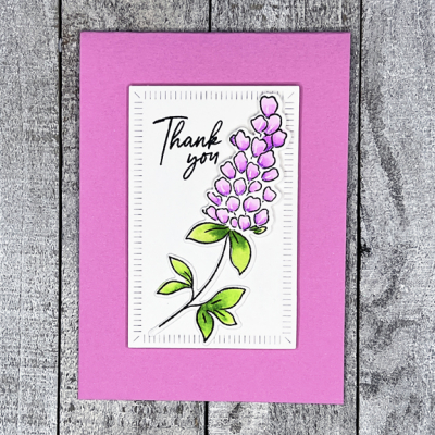
PinkNotecard2

Finally, this sentiment is also from Pinkfresh Studio’s Beautiful Blooms. All the flowers were watercolored with Zig watercolor brushes.

I’m getting these in just under the wire at CAS on Friday where the challenge is Thank You, to the new Flower Challenge: Clean and Simple, and to Happy Little Stampers Watercolor: Anything Goes. 

TFChallenge#70HLS image


We had quite the holiday weekend, but it’s a long story, and I’ll be back tomorrow with that  and another card to share.