Skip to content

Easter Bunnies: Part 1

  • by

Two of my Easter cards needed to be in the mail yesterday. Since my grandchildren definitely do not read my blog, I thought I’d share them while some of the Easter challenges are live. These cards are proof that I don’t always take weeks, months, and sometimes a year to use the products I love enough to order. These Honeycomb Bunnies from The Greetery were irresitable in last month’s release. I have to restrain myself from buying all the different varieties in the Honeycomb line.

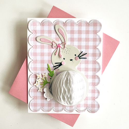
First off is Hannah’s card. I borrowed a friend’s Stitched Scallops die, also from The Greetery and found a My Favorite Things pack of gingham papers, Gingham Galore, to use as the background. The bunny was die cut from my palest gray cardstock, Soft Stone, from Papertrey Ink. All the detail pieces came from my scrap boxes. I used stamps from the Honeycomb Basics as well as Honeycomb Spring. 
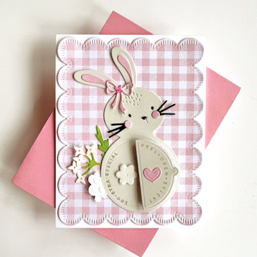
PinkBunny

I added a spring from The Greetery’s Wildflower Mix for the embellishment. The tail was die cut twice from white and the top on raised up a bit for dimension. Here’s the bunny with the honeycomb opened up.
Pink bunny Open

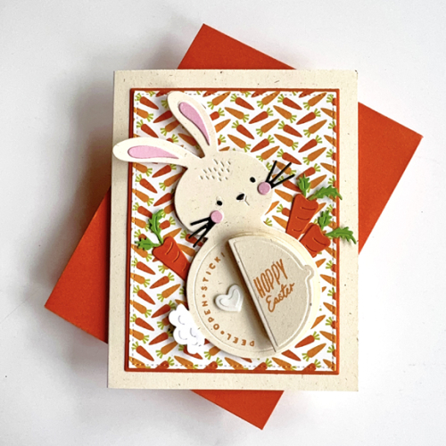
I struggle with holiday cards for my 13 year old grandson, who is now taller than I am. But I went ahead and made another version of the same bunny for him. When I made the Honeycomb Penguins for Christmas, he ended up putting it on his dresser which I took for a sign that it was fine with him. I intend to ask him after Easter what he thought of the card. 
OrangeBunny

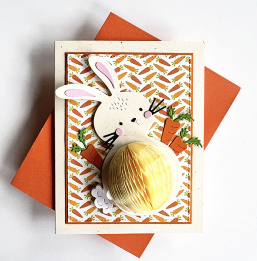
The patterned paper was in an envelope with Easter die cuts and left-overs from previous Easters. I suspect it’s left over from my scrapbooking days. The die cut carrots were die cut at my friend’s house a year or two ago, and I’m not sure who made them. I was, however, delighted to find those in the envelope as well. This bunny was die cut from Papertrey Ink’s Rustic Cream cardstock. I added some dimension behind this bunny since the background was so busy. I did cut the patterned paper and the narrow orange frame with Gina K’s Master Layout #2.
Orange BunnyOpen2

The honeycomb on this bunny isn’t as bright yellow in real life.

Several of the Easter/Bunny challenges are also CAS challenges. Neither of these come close to being CAS. The Fourseason Challenge: Anything Spring and the Inspired By: Bunnies Challenge are super appropriate. The Four Seasons has a beautiful moodboard, but I didn’t add it here–there were no bunnies, but I saw some bunnies already in the gallery. I’m also sending this to Darnell’s I.D.E.A.S. gallery (this week is dies) and to her NBUS Gallery these bunnies are new but never used before!
IBBunnies


Flower Shoppes

  • by

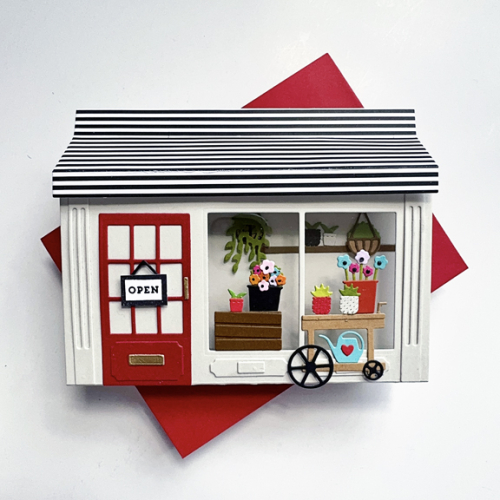
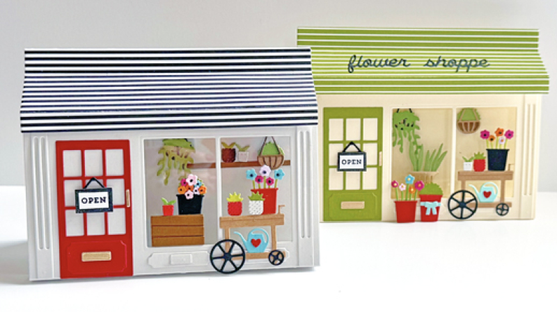
I had lunch today with two of my best friends, both of whom have April birthdays. Their birthday cards were in my mind when I asked for the Flower Shoppe dies from Concord & 9th for Christmas. 

TwoShoppes

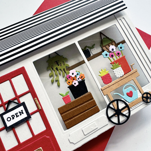
I started putting together the flower pots, cart, and hanging plants when I was in Racine in March. I ended up needing more, but it was a good head start. After assembling the pop-up shoppe with Concord and 9th’s Window Shoppe die, I added the acetate behind the windows, the architectural details, and the door. 

GrayShoppe

Getting the hanging pots, shelf and florals inside the shoppe would have been easier if I had added them before assembling the shoppe itself. But it was easier to know what I wanted back there, and a nice pair of straight tweezers made it pretty easy. Everything else was glued to the front of the shop.

GrayShoppeClose

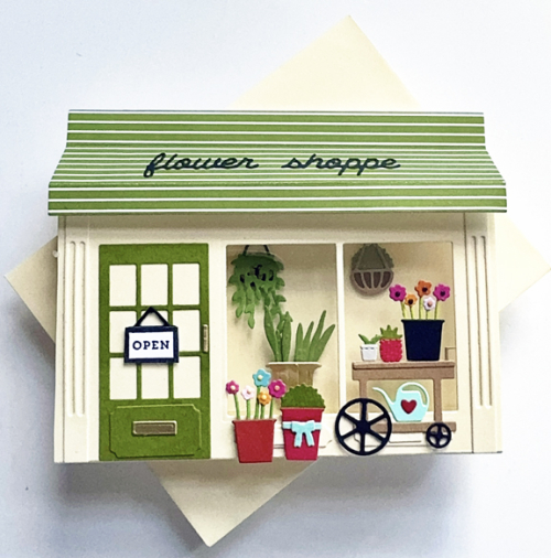
I wanted the two cards to be somewhat different, so chose a different color for the shoppe and the awning. The “flower shoppe” sign dies looked fine on the green awning, but got lost on the black and white one.

GreenShoppe

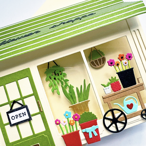
I changed up some of the flowers, adding a tall plant in a gold pot from the Window Shoppe die, and a second hanging plant instead of a shelf. 

GreenShopClose_9026

Both cards had the same inside message. 

FlowerShoppeSenitment

Last year I created a Fashion Boutique for one of my granddaughtes. I love that the shoppes fold up and fit into an A2 envelope, and I love all the tiny details that are included in both the Fashion Boutique dies as well as these floral dies. Before I ever made one of these shoppe, I purchased the Book Shoppe dies and used it for a card for my grandson. Next on my list is to create a book shoppe. 

I’m sending these off to A Cut Above: Anything Goes.

 CutAbove300

Abstract Sunset

  • by

Right before the latest Color Hues Challenge went live, I discovered this canvas from an Etsy shop:

Sunset Screenshot

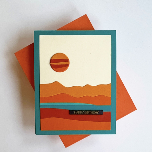
Had I seen it earlier, I’m pretty sure I would have made this card:

Sunset

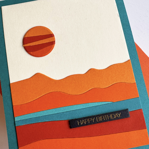
But it didn’t take me long to get to it since I needed another masculine birthday card. (In fact, I need several, so hopefully I’ll be back soon with more.) I knew as soon as I saw the inspiration piece that I had the perfect die from Ellen Hutson, Abstract Sunset. After die cutting the pieces from multiple cardstocks, I pieced them back together on a cream rectangle cut with Ellen Hutson’s Essential Rectangles.

SunsetClose

Then I pieced together some oranges, and die cut the sun. I ended up using one of Ellen Hutson’s Essential Circles, since the circle die in the Abstract Sunset was smaller than I wanted. Once again the gold foiled Black Tabs from Memory Box was the perfect sentiment. 

This is off to the Just Us Girls Challenge where they want die cuts, but no flowers, and the Wednesday Simon Says Challenge: Birthday Cards.

769 JUGS DieWednesdayblog-logo


Color Hues #107

  • by

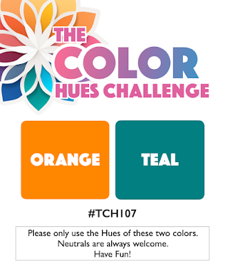
It’s April Fool’s Day. It was one of my least favorite days as a teacher of 5th graders who delighted in trying to do you in and usually succeeded at some mischief. Today, however, April 1st means a new Color Hues Challenge, and it’s a good one. Jules chose Orange (one of my faves) and Teal. It’s a great combination, and not one I’ve used very often. 

CH #107-Orange and Teal.001

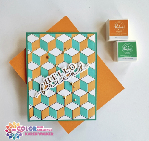
I pulled out an old favorite hot foil plate from Pinkfresh Studio, Geo Blocks and it’s accompanying stencil. I don’t think I’ve ever used all three stencils because I love the way it looks with some white space. 

CH107

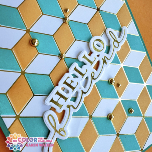
This time I decided to use a larger hot foiled sentiment from Waffle Flower, Hey, There.  I liked it placed on the diagonal which is not something I often do. 

CH107Close

This gives you a better look at the shiny gold foil. It took me awhile to figure out where I wanted to add some gold pearls, but I’m happy with the final decision.

As always, you’ll find lots of inspiration on the Color Hues blog by our wonderful Guest Designer, Renate, as well as the fabulous Design Team! I hope you’ll come join us!
My schedule has been crazy recently, and although I’ve been crafting, there hasn’t been much that could be shared just yet. I don’t usually let two weeks go by without blogging, but I hope to remedy that this week. The Women’s NCAA March Madness schedule hasn’t helped much. I’m a huge fan of women’s college basketball and watch a lot more television during the tournament. The only consolation to the increased TV time, is that while I watched the games, I finished two big organizing and cleaning out projects in my craft room that have been on the to-do list for far too long. 


A New Masculine Birthday Card

  • by

We’re in Wisconsin for a few days. It’s always good to be visiting family, but Sunday was a rude awakening–snow, ending up with nearly 2″ of the white stuff. Meanwhile, back in Rochester it was 60°+.

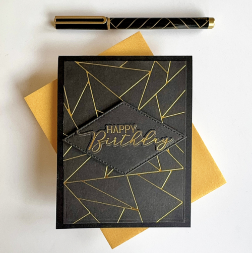
The day before we left, I squeezed in a little time to make a birthday card for my brother-in-law. The main foiled pattern, Pinkfresh Studio’s Abstract Triangles, had already been foiled, so it was pretty quick and easy once I settled on the design. 

HBTom

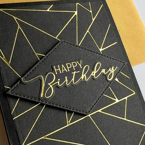
I did manage to put another NBUS die to use: My Favorite Things: Stitched Diamond STAX. Recently, I spent some time hot foiling lots of sentiments, so the Happy Birthday from Spellbinders, You Are Everything, was also ready to add to the diamond die cut. 

HBTomClose

I love this design–elegant, but simple, and another great card for a guy. I’m quite sure I’ll use the design again. No additional embellishment was needed. 

The card is off to three challenges and Darnell’s NBUS site. AAA Birthday Challenge is looking for Masculine Cards, Addicted to Stamps and More: Birthday Cards, and I’ll add it to Seize the Birthday’s Anything Goes category. 

AAA#71  Addicted  STB-AnythingGoesNBUS


Lemons and Limes for CH #106

  • by

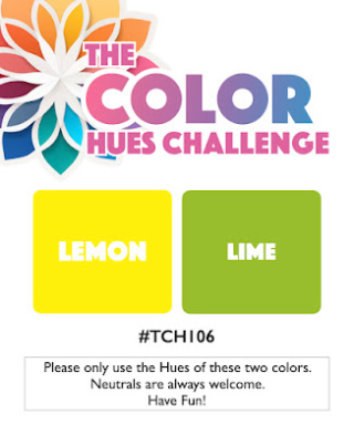
As soon as I saw Julie’s pick for the current Color Hues Challenge,

CH # 106-Lemon and Lime.001

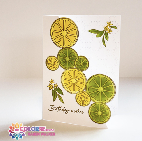
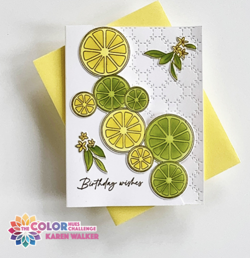
I knew I had exactly the right stamp, stencil and die set. A year ago February, I participated in Pinkfresh Studio’s Create & Connect event. As usual, I never finished all the cards but I hadn’t forgotten the Citrus Twist set which I never used during the course. This card is a CASE of Anett Gelencsér’s Make and Take for that class. 

CH106

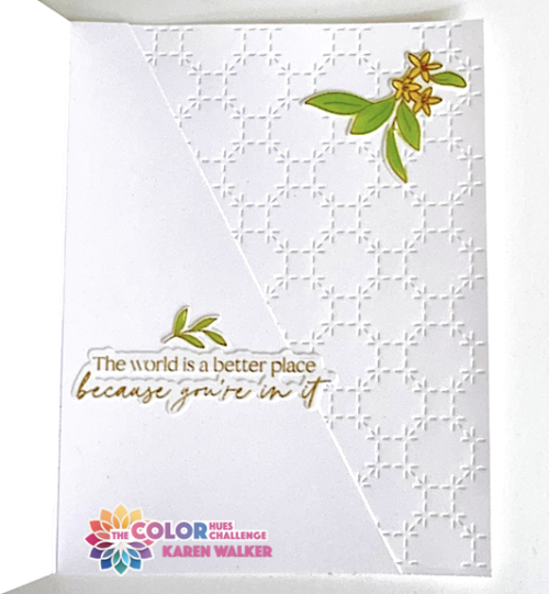
Her card used a partial die cut technique, but I opted to just cut a diagonal slice from the card front which I was able to use on the inside for the sentiment. I then attached the die cut slices to the front of the card.  Anett used the same coverplate, Stitched Octagons, but she used it on the front of the card, and I opted for the inside.

H106Flat

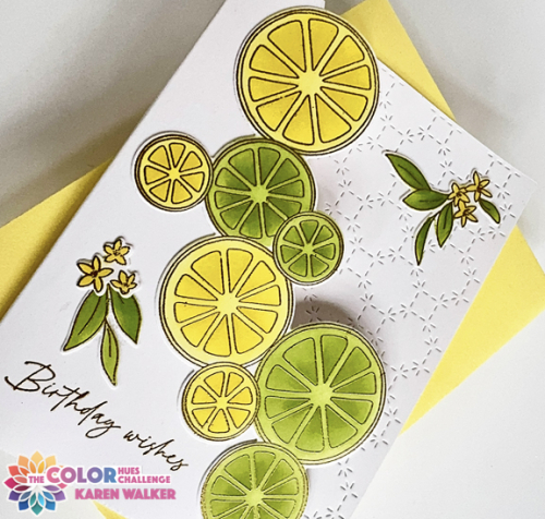
The stamp was embossed in gold as is the sentiment from Honey Bee’s Be Still stamps. I added some of the additional flowers and leaves included in the set that are die cut separately with the same die for the citrus slices. This card turned out to be difficult to photograph and the gold embossing will have to be imagined by the viewer (probably due primarily to the gray days that extend in western New York through March–and sometimes into April.)

H106Close

I attached the diagonal piece from the card front to the inside of the card so I’d have a good place for the sentiment.

CH106Inside

This sentiment and die are also from Be Still by Honey Bee.

This color combo is a great antidote to gloomy days. Regardless of where you live, I hope you’ll find yellow and green to be inspirational colors and join us in the gallery at Color Hues! You’ll find lots of inspiration from the Design Team and our very special Guest Designer, Michele

I’m sending this card to the AAA Colorful Challenge, where the colorboard is yellows and green. Once again, this card is off to NBUS as well as a relatively new challenge Neglected Stuff since I’ve had the stamps and dies for over a year, and have finally found the perfect use for them!

#14   NBUS  NeglectedStuff 

Exotic Blooms

  • by

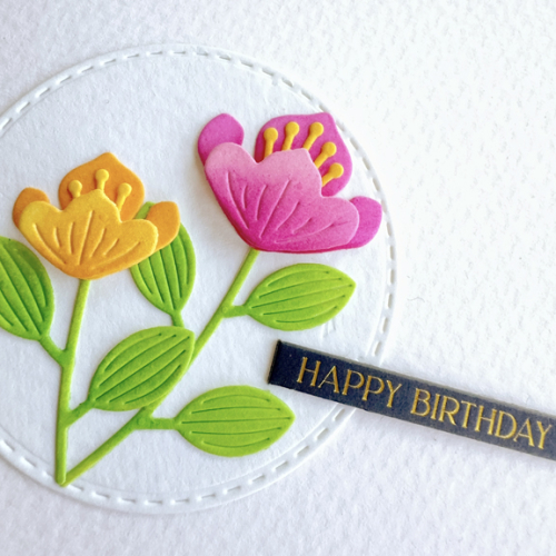
I have two cards to share, both inspired by current challenges which also gave me an opportunity to move one more item out of my NBUS box. The pretty little blooms were perfect for these challenges, all of which are among my favorite challenges. First off was Just Us Girls where it’s Die Week and they want a birthday card. Seize the Birthday wants “no stamping,” and The Flower Challenge (they’re celebrating their 100th challenge!!) wants a circle in the design. Here’s my answer to these three challenges. 

BrightExoticBlooms

I started by die cutting Simon Says Exotic Blooms from watercolor paper as well as a Simon Says Stitched Circles die. I used finger daubers to color the florals, picking bright and happy hues to celebrate some of the first warm days we’ve had recently. They just make me happy. It’s hard to tell but I very lightly ink blended a pale blue onto the circle before adding the flowers. Since no stamping is allowed, I pulled out my fave Memory Box Black Tab Sentiments. 

BrightClose

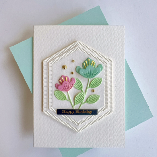
I had another set of die cut florals, and remembered that The Paper Players are looking for pastel colors. The flowers are the same, but the design is different.

PastelExoticBlooms

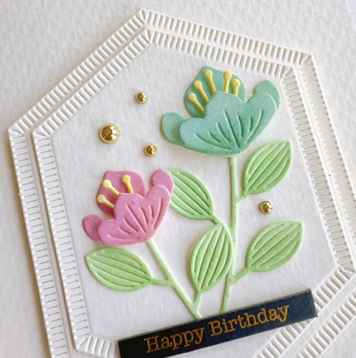
Once again I used the watercolor paper. I love the texture it gives to CAS cards. This time I die cut two of Pinkfresh Studio’s Nested Hexagon Blanket Stitched dies and layered them before adding the florals which I again colored with finger daubers. I thought this card needed a little something so I added three small gold pearls, and another Black Tab birthday greeting in a different font.

PastelsClose

This card is also off to Seize the Birthday  and Just Us Girls as well as The Paper Players.

765 JUGS Die02-27-NoStamping2025 - 100 March-001PP728 


Songbirds

  • by

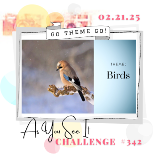
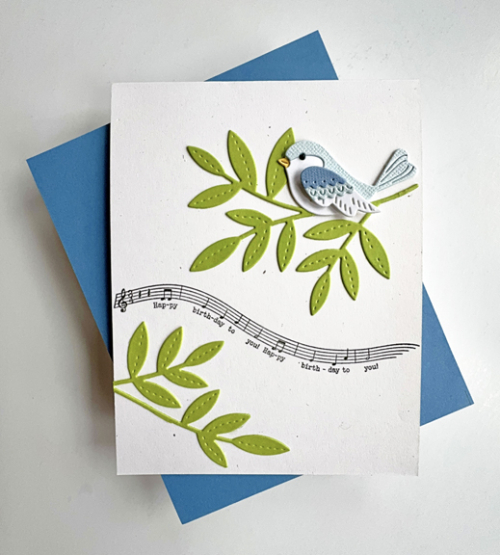
It’s unusual for me to post twice in a day, but here is a set of three cards that, once again, came out of my “Work on This” box. This particular set of products have been sitting around for quite some time, but when I saw the As You See It Challenge for Birds, I knew it was time to get a move on. Having been away, I’m just posting these under the wire since the challenge closes in just a few hours.

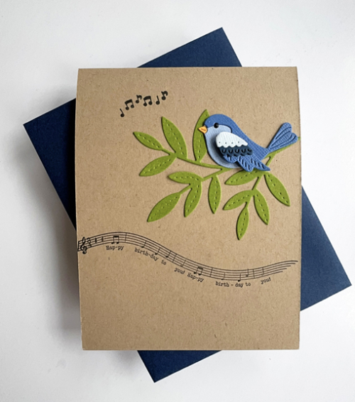
The project idea began months ago when a friend gifted me with three charming die cut birds all assembled. I put them in a wooden bowl and pulled out Paper Trey Ink’s Songbirds stamp and die set, a long-time favorite. The three birds were created with a gradient of blues, so I chose a different card base for each of them.

Songbird1

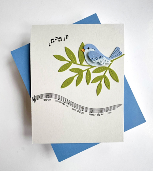
This was the lightest of the three birds, so I chose Papertrey Ink’s Rustic White cardstock for the base. This card has a slightly different design than the other two. When I initially added the die cut branch, I glued it in the wrong place, so had to start all over. I had already put the MISTI away, so had to reposition the stamps. The musical stamp ended up being higher than the others, so I added a second branch to the bottom. I might like this design a bit better, but it was the last one I put together.

Songbird2

For the second card, I chose Papertrey Ink’s Soft Stone, another favorite of mine. I added a few musical notes at the top of the card from My Favorite Things, Strike Up the Band.

Songbird3

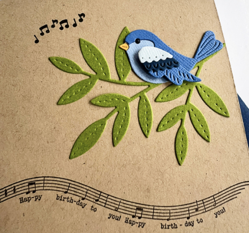
 This combination of the darkest bird on the kraft cardbase ended up being my favorite. One of the things I like about these cards is that they are pretty generic birthday card. I’d feel comfortable ending them to guys or girls. One close up so you can see how darling these birds are. 

Songbird3Close

In addition to As You See It, I’m sending this off to A Cut Above challenge as well.

Challenge #342 CutAbove300


Spring Blossoms

  • by

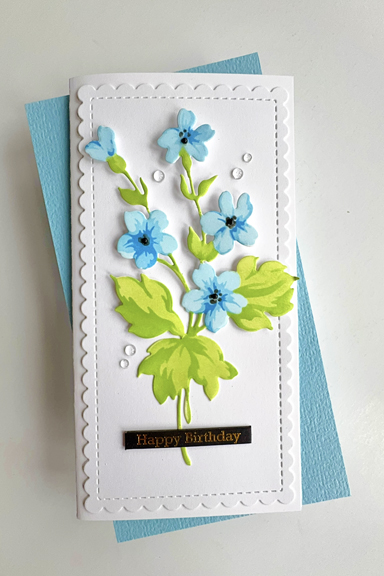
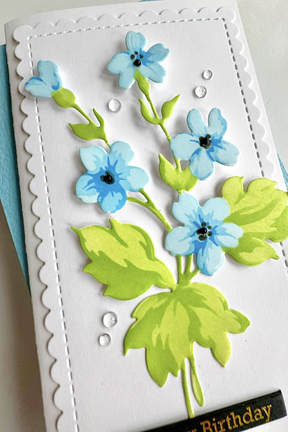
A couple of challenges motivated me to move another project out of my “Work on This” box which utilizes a NBUS product, the Hill Blossoms stencils and dies by Altenew. I don’t find using Altenew stencils to be as intuitive as those by Pinkfresh Studio, but once I got them placed correctly, they were very easy to color. I used my new one inch blending brushes from Pinkfresh, and they are truly a game changer. 

Blossoms

I ended up making a mini-slimline card when I found the stitched and scalloped die cut in my box of premade treasures. I must have die cut them at a friend’s house, since I don’t own any dies quite like this one. 

BlossomsClose

The sentiment is, once again, a Memory Box black tab. They work well on so many cards! I added some very tiny black pearls to the centers of the flowers, and then some clear drops as a final accent. 

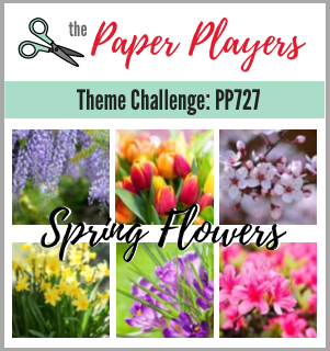
The challenges that inspired me were The Paper Players looking for Spring Flowers, Just Us Girls: Anything Goes: Stencils, and Neglected Stuff (this stencil has been in my box for months!). It’s also off to Darnell’s NBUS, and will link it up to her I.D.E.A.S. since this is the week for Ink (not a challenge per se.)

PP727 764 JUGS StencilNeglectedStuffNBUS


Color Hues #105

  • by

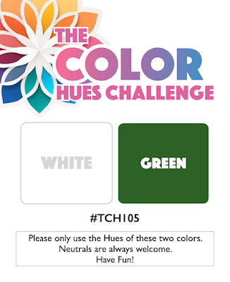
The new Color Hues Challenge is live, and Carol has chosen another good one:White and Green.

CH #105-White and Green.001

They are perfect colors for St. Patrick’s Day, and since it’s also my husband’s birthday, I wanted to find a design would work for both. I ended up with a two-fer which is always a good thing.

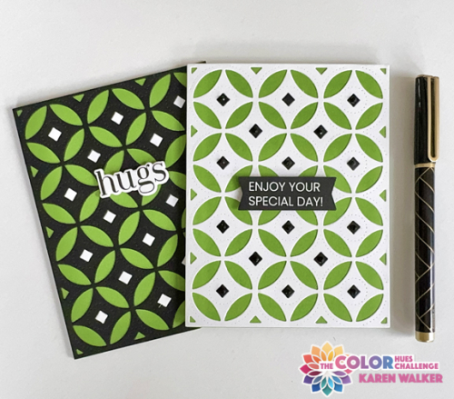
CH105Both

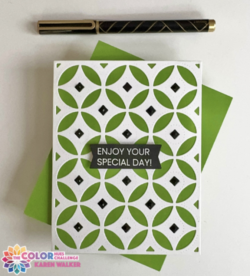
The first card I created is the one on the right. I started with the white die cut from Papertrey Ink, Decorative Circles Coverplate, which has always been a favorite. I layered it on a card base of New Leaf (a very shamrock-like color) and inlayed the black diamonds. 

CH105White

I also added some black gems to the center of each diamond, but they’re almost impossible to see in the photo. The sentiment is from Altenew’s One-Go Birthday Greetings embossed in white on black cardstock. 

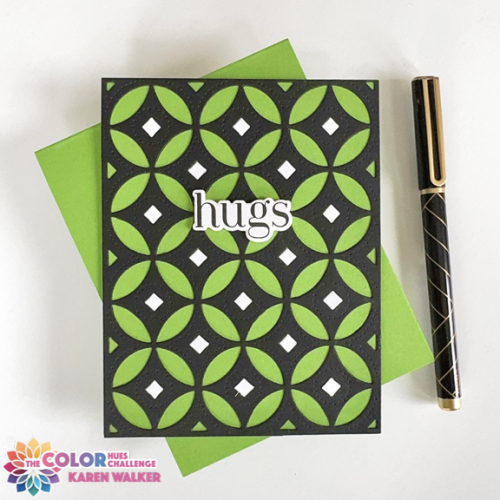
Having die cut a second panel of the coverplate in black for the diamonds above, I realized I could reverse the colors and ended up with this card:

CH105Green

For the sentiment here, I used a new stamp and die set from Spellbinders (their February Stamp & Die Club pick). After stamping and die cutting the sentiment, I die cut three more to stack for some dimension. This card will go to my husband. The inside birthday sentiment also comes from this set.

The white version is already in an envelope to go to a good friend who’s birthday is next week.

Be sure to check out all the inspiration on the Color Hues Blog from the Design Team and our very talented Guest Designer, Nance.

I’m sending this off to Darnell’s NBUS March gallery. This is the second time recently when I’ve used a new stamp and die in a timely manner! 

NBUS   

Woodblock Wednesday: February Edition

  • by

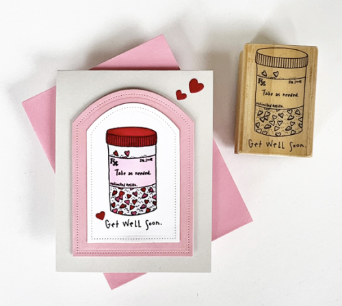
When I recently needed a get well card, I went to my wooden stamps and came up with this cute one. I can’t read the company’s name, but it came from St. Louis, and one of the dates on it is 1994. 

WWGetWell

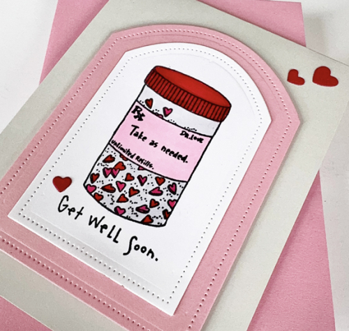
I was in the midst of making valentines, so stuck to the same colors: pink and red. I used Copic markers for the lid on the pill box, but used my red Staedtler triplus fineliner to color in the heart-shaped pills. I die cut the image with Reverse Confetti’s Pierced Round Top die and then die cut the next size in pink, and added it to a gray card base.

WWGetWellClose

I added three little red hearts die cut with Hero Arts Infinity Hearts and The Greetery’s Cupid’s Arrow.

I’ll be soaking up the sun in Aruba when this post goes live, but hopefully, will get it linked up to the Woodblock Wednesday post on Amy’s blog.

Featured-woodblock-Wednesday-graphic-copy-1

Breezy Blossoms

  • by

The night before we left for vacation, I actually found time to put together two cards. After using the Betterpress, the Breezy Blossoms were then colored using the accompanying stencils. This was all done so long ago that I don’t remember a thing about it. After die cutting them, I put them in a little plastic bag and stuck them in my “Work on This” box. I had dumped them on my desk, and before cleaning up to leave, I sat down and figured out two ways to use them.

BreezyMint

This card uses a NBUS coverplate, Modern Design Blocks. It came as part of the August 2024 Pinkfresh Create and Connect event. I never seem to get to all the class cards, let alone the Make & Takes, but eventually I get around to using the products. I layered it on a mint card base, and then die cut two Nested Elongated Balnket Stitched Ovals, also by Pinkfresh.

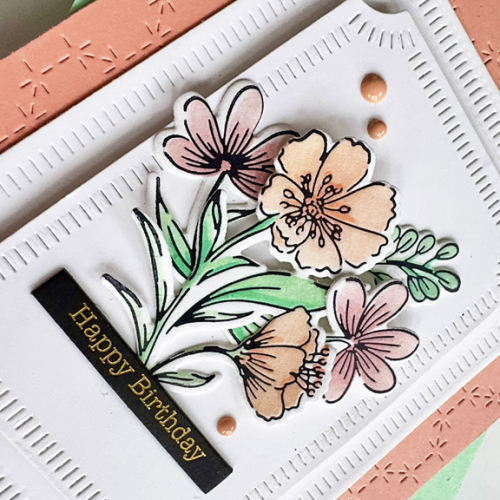
BreezyMintClose

I layered just one stem of the Breezy Blossoms, added a sentiment with a Memory Box Black Tab Birthday greeting, and three enamel dots. 

BreezyCoral

This card also uses a cover plate that came with a Create and Connect event, the Stitched Octagon Cover Plate. Concord and 9th’s Grapefruit cardstock was a great match for one of the inks I used coloring the florals. This card uses a number of different stems grouped together.

BreezyCoralClose

I die cut two of the Pinkfresh Notched Corner Frames, bumping the top one up with some dimensional foam. Another Black Tab greeting and some enamel dots.

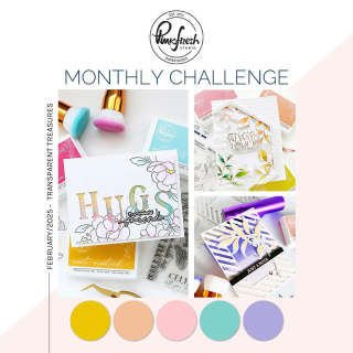
I’m sending these off to The Neglected Stuff Challenge blog as well as NBUS – these are a perfect fit! I’m also adding them to the February Pinkfresh Challenge where Anything Goes, and Seize the Birthday without the Topping

NeglectedStuffNBUSMonthlyChallenge-Feb25-TransparentTreasuresSTB-AnythingGoes


Just a Note

  • by

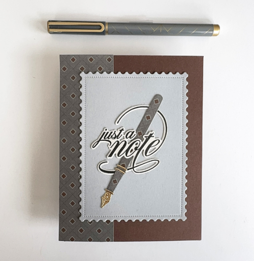
I’m CASEing myself with this card. It’s the same general design as my previous cards with an addition of a strip of patterned paper from Papertrey Ink’s Three Piece Suit paper pad which has been in my stash for years. I needed a masculine card for a note of encouragement, and luckily, The Paper Players are looking for CAS Masculine cards. 

NoteTedd

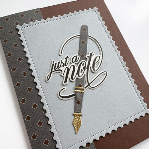
With the exception of the patterned paper, all the dies used are from The Greetery: The pen (Pen Pal), the postal background (Postal Frames), and the sentiment (Scripted Sentiments.) 

TeddNoteClose

When the Pen Pal dies were introduced, Betsy showcased some of them with patterned and stamped papers, so I gave that a try which I quite like. 

In addition to the Paper Players, this is also off to the Word Power Challenge where the sentiment should take center stage. 

Copy of pp554  WordPowerChallenge Badge

Pink Magolia

  • by

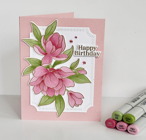
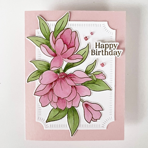
I recently won a very generous gift card at Pinkfresh Studios. I’ve been saving the lovely gift certificate I received for Christmas, but I had no trouble spending the money I won! Most of the order were for things that had been on my wish list for quite some time, but I also purchased the stamp and die, Magnificent Magolia, from a recent release. Once I was done making valentines, I was anxious to get it out for a play date. 

PinkMagnolia

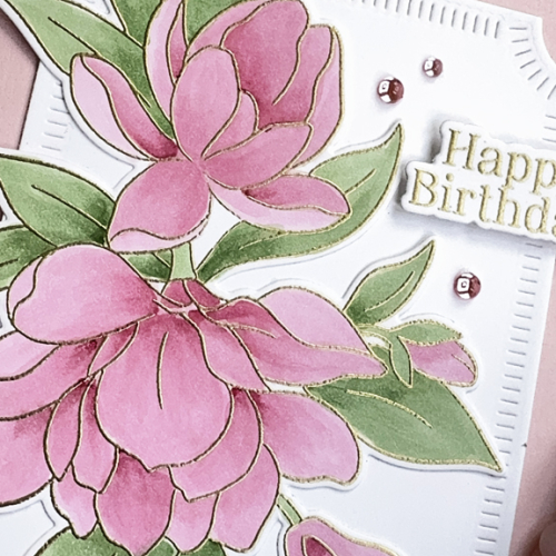
The first step was to emboss the image in gold. Then I chose a group of three pink Copic markers and two green markers. I considered two different dies for the background, but settled on the Notched Corner Frames which I die cut in white after die cutting the magnolias. Both were added to a pink card base.

PinkMagnoliaFlat

The sentiment came from another, older, Pinkfresh floral set, Nothing But the Best. I had forgotten this lovely birthday sentiment which also included a die. It, too, was gold embossed, and I added three Clear Drops in Blush from Pinkfresh.

PinkMagnoliaClose

Looking out my window it’s hard to imagine that magnolias will be blooming in a few months. We’ve gotten several inches of snow every day for the last several days. Around noon today, the sun came out, but the wind is so cold it feels like -7°. Our snowblower “died” yesterday, so Tracy has had to shovel our long and steep driveway. We cancelled a meeting scheduled meeting here to night, as there is no easy parking on our street if the snow is piled up. Fortunately, if all goes well, we’ll be headed toward warmer climes this coming weekend. 

Pinkfresh has changed their monthly challenge so “anything goes,” I always think I’ll get an entry in, and I should, since I have a very large selection of Pinkfresh products. So this is off to the Pinkfresh February challenge.

MonthlyChallenge-Feb25-TransparentTreasures

I chose pink for the magnolias since The Flower Challenge is looking for pink, and a birthday sentiment so I could play along with Seize the Birthday, without the topping this round. It’s also off to Darnell’s NBUS, and follows along with her I.D.E.A.S. which this week is embossing. 

2025 - 99 February-001STB-AnythingGoes        NBUS


You’re Doggone Great!

  • by

I have one last valentine to share before the holiday arrives. Each Tuesday and Thursday I work with a group of five first graders who are enrolled in a Spanish speaking class at a nearby elementary school. Nearly all the instruction is in Spanish, and I do not speak nor do I understand Spanish. It turns out that I don’t need those skills since my job is to help them read in English. All five have good verbal skills in English so communicating is not a problem. Progress with reading English is slow, but they never seem to lack interest or enthusiasm for the process. It’s the second year I’ve worked in this class, and it’s been a wonderful volunteer experience. 

I have a lot of cute valentine images, but they all use a play on words that I didn’t think my first graders would get. Explaining “doggone” good won’t be too hard.

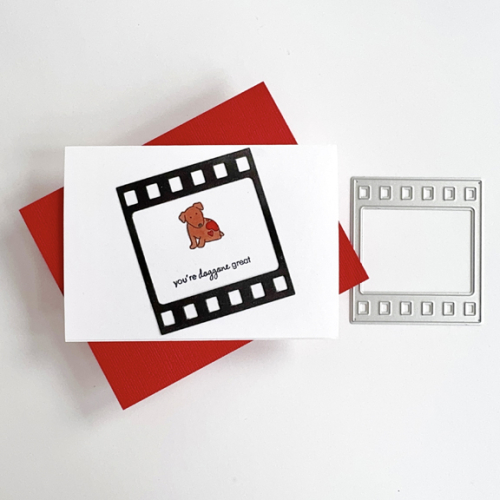
Doggone

This valentine uses one of my oldest stamps sets, Papertrey Ink’s Tiny Treats and one of my newest dies, Altenew’s Picture Perfect. 

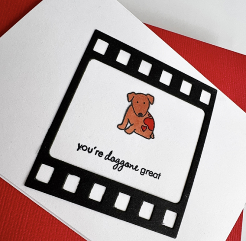
DoggoneClose

Luckily I found a set of five Paper Source A4 cards and envelopes which made this an easy valentine to put together. I colored the puppy with a Copic marker and used a red Staedtler triplus fineliner for the hearts. 

I’m adding this to Darnell’s February NBUS gallery since I’ve now put the Altenew frame to good use.

NBUS