Skip to content

Crafty Friends and CASe This Sketch

  • by

The February Simon Says Card kit arrived on Thursday. Thanks to the fourth cancellation of a volunteer commitment in one week, I had time to play again. By bedtime, I had created three cards. I’m waiting until today to post the first of them, in hopes it has reached its recipient. Since it’s for a sketch challenge I need to get it posted.

When I first saw this design at CASe This Sketch it appeared too challenging, but once I laid eyes on the design team’s creations I decided I give it a try.

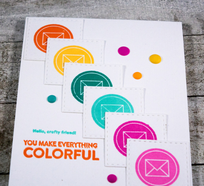
CTS_256

Initially I thought I’d use some patterned paper for the background, but once I die cut and stamped the seven pieces, I realized it would be far too busy. I am a fan of white on white and with the bright colors I think it works. I did move the sentiment to the left-hand corner where it fit perfectly.

Colorful

I added a few matte enamel dots as a finishing touch. It’s a fun stamp set, and perfect for sending off to some crafty friends of mine. Here’s a closer look.

ColorfulClose

This is such an unusual design, and the DT for this challenge came up with some brilliant ideas. You can check them out right here.


The Card Concept: Rustic Blooms

  • by

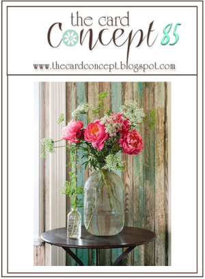
I’m back with a card for another challenge—this time The Card Concept: Rustic Blooms.

TCC85 0124

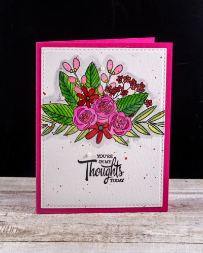
These beautiful pink flowers reminded me of the Simon Says “Floral Bliss” bouquet I used not long ago. This time I watercolored the whole image in pinks and reds.

PinkThoughts

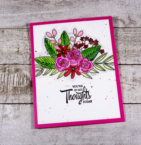
When I finished, I decided to add a few dark pink splatters. I’ve been known to ruin an entire card trying this technique, but this time I pulled it off. I die cut the Tim Holtz watercolor panel with Simon Says “Stitched Rectangle,” and adhered it to a Raspberry Fizz card (PTI).

PinkThoughtsFlat

The sentiment is from Papertrey’s “It’s the Thought.” Finally, a few white pearls finished it off.

One of the challenges in entering a card at The Card Concept is deciding which category the card falls in. Nine out of ten times my cards usually land in the “Clean and Simple” category. Not so much this time. I’m guessing the best bet is “Classy and Elegant.” If you have time to check them out, I’d love to know how you’d categorize this one. 

Celebrate! A Time Out Challenge

  • by

The current challenge at Time Out uses this quote:

Timeout gift quote

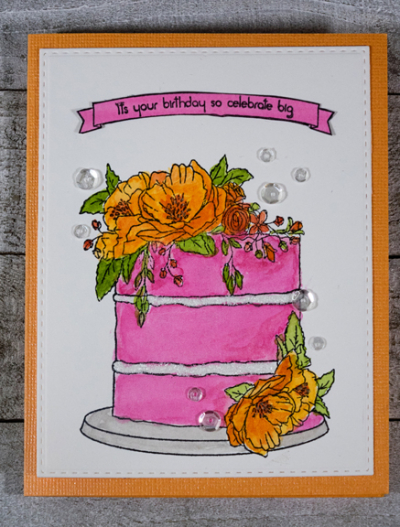
It’s one of my favorite quotes, and the perfect inspiration for a birthday card I needed to make for one of my favorite young ladies who will soon be 16. I’ve used the “Celebrate It” for my inspiration.

I’ve had this stunning image from Concord and 9th (“Happy Day”) for a long time, but this is the first time I’ve used it. I stamped it in black on Tim Holtz watercolor card and got out my Daniel Smith watercolors. 

NadiaFlat

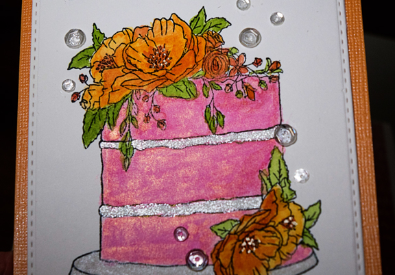
I have an iridescent silver which I mixed with the bright pink which gives it a pretty glimmer. I added some Glitter Glue to the frosting as well.

NadiaClose1

I die cut the image with one of the Simon Says “Stitched Rectangles” and mounted it on a piece of sparkly textured cardstock I found in my stash. (I have no idea where it came from!) The final touch was to add a few sequins. We’re going to be out of town for the birthday party, but I’m leaving the card with her mom. I hope she likes it.

You’ll find other celebratory cards right here at the Time Out Challenges blog.


Janurary 2018 Papertrey Ink Blog Hop (And Make It Monday)

  • by

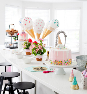
Very unusual, but this is the second post of the day because today is the monthly blog hop hosted by Papertrey Ink. I wasn’t sure I’d find the time to participate, but then a meeting I had yesterday had to be rescheduled, and the afternoon opened up. I have two cards to share. Only one can be posted for the blog hop, but the other I’ll post for the Make It Monday challenge which was to create a shadow sentiment. Both cards started, however, with the gorgeous inspiration piece posted for the blog hop.
PTIIce-Cream-Social-Birthday-Party

For the first card, I focused on the pink floral arrangements on the table. I was also influenced by the design Lizzie Jones used on her card for Make It Monday.
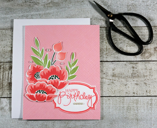
Gran'sGarden

I chose “Gran’s Garden” for the card. It’s a stamp set I don’t use often enough. The frame for the sentiment is an old favorite, “Fillable Frames 10,” and the sentiment is from another favorite and well-used set “Birthday Bash Sentiments.:
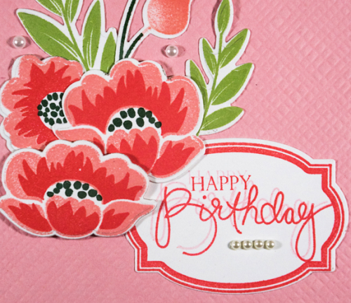
Gran'sGardenClose

Here you can see the shadow sentiment. I tried a variety of things before I settled on second generation stamping to create the shadow. If you’re unfamiliar with that term it means I stamped the original sentiment, then moved the stamp just a bit, and stamped it again without cleaning off the stamp. You can also see the embossed background created with the Papertrey Ink “Rustic Burlap” Impression Plate.

I thought this would be the only card I created, and that I would post it on both challenges, but still having some time to play, I pulled out a stamp set I purchased on a whim. It’s a $5 set meant to work with a larger set of paper doll kinds of stamps called “Dress Up Dolls: Birthday.” I thought the images would go well with a variety of animal stamp sets I use when creating cards for my grandchildren. The new technique for me was to create a background of randomly stamped images. I’ve seen a variety of these recently, most often on Yana Smakula’s blog.

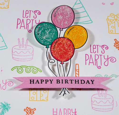
She suggested that solid images would work best for this technique, but I’m pretty happy with the way the outline images worked here. It makes for a bit cleaner look, which I always like. Rather than a large center-stage sentiment, I opted to die cut the balloons from the set for the focal image.
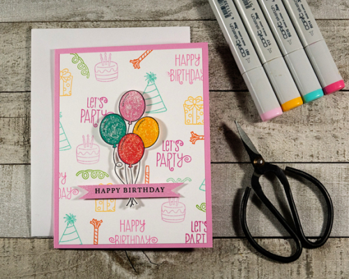
PartyBalloons

I did take Yana’s suggestion to assign each stamp a given color which I took from the inspiration photo, as well as the birthday party theme shown in the inspiration piece. Since there were so many tiny images I laid out the stamps on the ink pads I used. I took the photo after dark with my iPhone, but thought I’d share it.
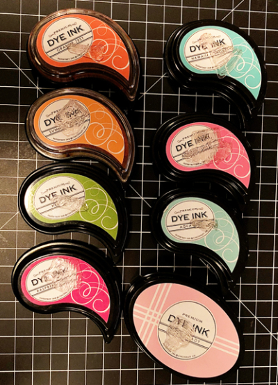
InkPads

I chose four Copic markers to color the balloons, but decided they needed a coating of Glitter Glue as well. Glitter Glue always darkens the colors so the darker pink ended up looking more red that I would have liked. I mounted the balloons with dimensional adhesive, and finally decided to add a sentiment to the focal image. It came from the “Initial Sentiments: Birthday” set.
PartyBalloonsClose

It’s a bit easier to see the glitter here as well as the glitter added to the sentiment banner with a Spectrum Noir clear glitter pen. 

So I’ll post the top card to the Make It Monday challenge, and this one to today’s blog hop. It was a lot of fun to try a couple new techniques, and I was delighted to have an afternoon to play! 
 

Winter Cards

  • by

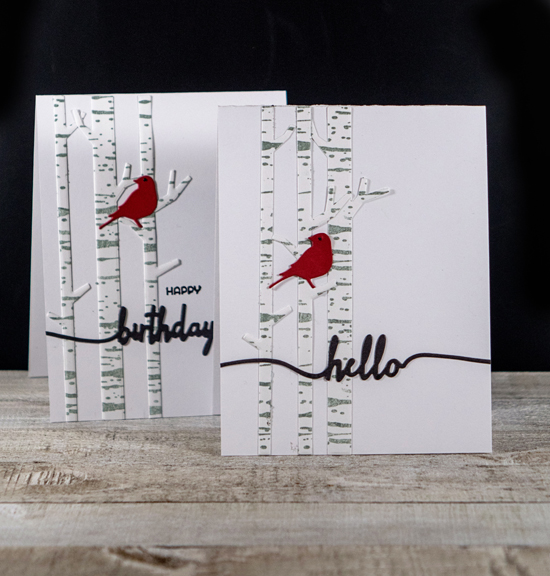
I needed two cards—one for a young lady (18) who had just had a heart transplant (very successful, thankfully) and another for a winter birthday. I thought I’d pull out a new die (MFT’s “Solid Birch Trees”) and a new stamp (PTI’s “Background Basics: Birch”). It’s a perfect combination for a winter-themed card.

BirchX2

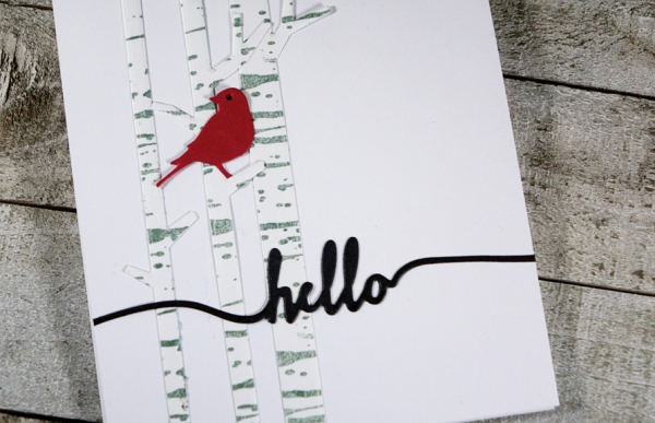
I die cut the trees from white cardstock and stamped them with the background stamp in Soft Stone. The little red bird is an older die from Memory Box, “Goldfinch.” Finding the right sentiments took the longest time. I originally thought I’d stamp a message on the right side of the card, but ended up liking these two Papertrey Ink dies from “Swoosh” better which I die cut from True Black.

BirchbarkHello 

The last touch was to had a tiny drop of black Nuvo Crystak Drops for the eye of the bird. It’s nice when a design works well for two such different occasions. 


The Flower Challenge: Spotlight Stamping

  • by

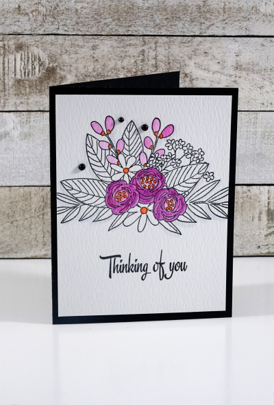
The Flower Challenge is new to me, and so is the current challenge: spotlight stamping where you selectively color just part of an image. I needed an encouragement card, and thought this would be a good time to try it out.

TFChallenge#16

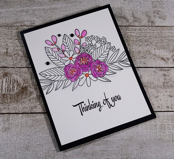
I chose one of my favorite stamp sets from the Simon Says Card Kits. “Floral Bliss” from the June 2017 kit has such a gorgeous floral bouquet. I stamped it with India Ink Black on Tim Holtz watercolor paper and got out my Inktense watercolor pencils.

SelectiveColoring2

The sentiment is from Papertrey Ink’s “It’s the Thought.” I chose to color the three main flowers and the two sprays above in pinks with orange accents. I thought a bit more orange was in order so I color just the centers of the daisies.  The final touch was to add three black pearls by Amuse.

SelectiveColoringFlat

I’m quite sure I wouldn’t have give this technique any thought without the challenge, but I’m quite happy with it in the end. Check out how others approached the challenge right here


Time Out Challenge: Thankful

  • by

I’ve had more than the usual amount of time to create this weekend. The photos at the end of the post will explain it pretty well. Along with some birthday cards and Valentines which I can’t post for awhile, I have a set of thank you cards to enter at the Time Out Challenge: Thankful. It’s their 100th challenge which is quite an accomplishment.

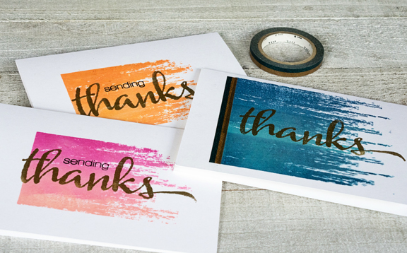
Thankful

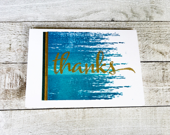
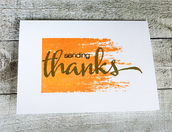
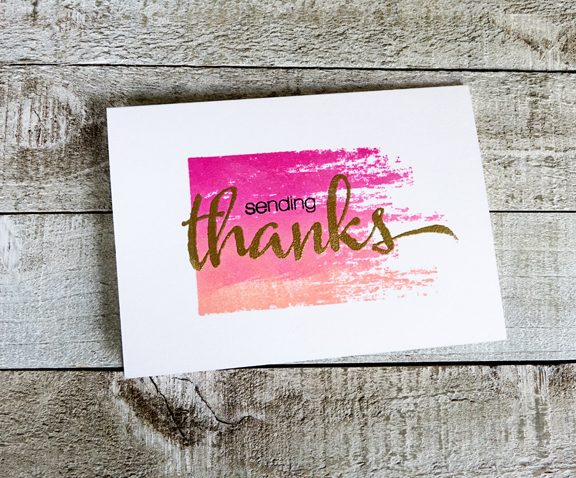
I pulled out two oldies—Papertrey’s “Brushed Off” and Winnie and Walter’s “The Big, The Bold, and You.” Just by changing the colors of the ink I came up with three quite different feeling cards. I used Hero Art’s Ombre pads, which I do have a bit of trouble with. Some look a lot more ombre than others.

3Thanks

I did add a strip of washi tape down the side of one of the cards.

ThanksBlue

ThanksOrange

ThanksPink

On Friday, our temperature reached 50°. We’d seen warmer temps on Thursday as well, and almost all the snow had melted by the end of the day on Friday.

IMG_7763ed

About 8:00 Friday night, the snow began and didn’t let up until mid-day on Saturday. Tracy was down and out with some kind of bug, so Matt came over in the afternoon to snow plow our driveway and sidewalks. He took a yardstick and measured 13 1/2 inches in our front yard.

IMG_7773ed

Needless to say, I was home for the day—and most of today as well. Hope it’s warmer and less snowy where you are! Off to check out the inspiration at Time Out Challenges.
 

Fusion Card Challenge: Mail Call

  • by

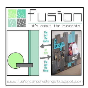
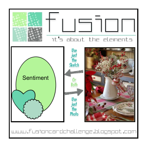
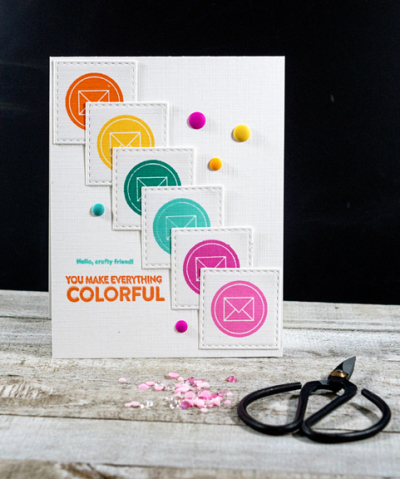
I’m excited to be the guest of Michelle Leon for the first Fusion Card Challenge of 2018: Mail Call. The inspiration piece at Fusion always has two parts:  a photograph and a sketch. You can opt to use one or both. The Design Team has lots of inspiration for you right here. Each designer has invited a friend as a guest so there’s twice the inspiration this time around. Be sure to check it out!

 Fusion Challenge for January

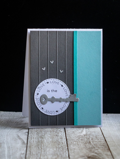
I decided to use both the photograph and the sketch. Looking at the photo, I took three elements:  the wooden boards, the color combination of turquoise, gray, and white and the keys.

Key

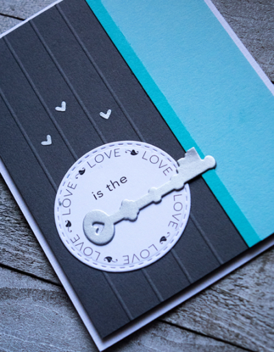
I scored the gray portion of the card to represent the gray boards in the photograph, and added two shades of turquoise to the right side of the card following the sketch. The key (Papertrey Ink “Lock and Key“) was die cut three times from silver paper and layered for another bit of dimension. I didn’t have any stamped sentiments that worked well, so went to my digital files and found this circle. It was filed without any reference to the designer. I resized it, added two words to the center to create a sentiment with the key filling in for the last “word,” and die cut it with Simon Says “Stitched Circles.” Finally I adhered the focal piece to a white card base, and then decided to add the three silver hearts that fell out of the key die.

KeyClose1

Join in with the Fusion DT and be sure to check out the gallery in a few days.

Becca Cruger

Michelle Leon

Betty J

Carol Mayne

Jeanne Jachna

Karren Johnson

Linda Callahan

Lyndal Higgins

Michelle Lupton

Michelle Williams

To play along:

1. Play with just the sketch challenge.
2. Play with just the inspiration photo challenge.
3. Or you can create FUSION by combining BOTH challenges into one card.
4. Use the challenge graphic and link back to Fusion in your post.


CASology: Gray

  • by

After the combo red, black, and white, gray might be one of my favorite colors. Strangely enough I don’t often pull that color for cards very often. But this week’s CASology Challenge encouraged me to change that. 

Week 279 - Gray

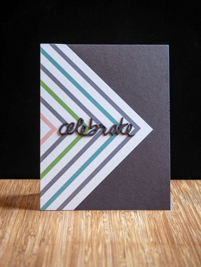
My favorite gray cardstocks are all made by Simon Says. There are three gradations of it, and this time I pulled the darkest of the three: Slate. The patterned paper came from the Pinkfresh Studio “Live More” collection, and both were part of the Simon Says Card Kit from August. (I have three boxes of papers and embellishments from old Simon Says kits, and need to pull them out more often.) The sentiment is from Papertrey Ink’s “Wet Paint II” die collections. I die cut three of them and layered them for some dimension. Couldn’t be a simpler card.

GrayCelebrate

It’s a frigid day here in Western New York, in the teens with an even colder wind chill. A friend treated me to lunch at the Monroe Golf Club. It was decorated beautifully for Christmas, and the food was superb. Home now, snuggled in with a bit of crafting time.

Two Cards; Two Challenges

  • by

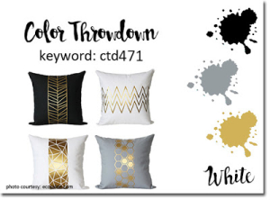
As soon as I saw the Color Throw Down Challenge this week, I knew I’d want to get a card made for it. Gold, Silver, and Black—what’s not to like? 

ColorThrowDown471

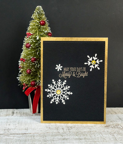
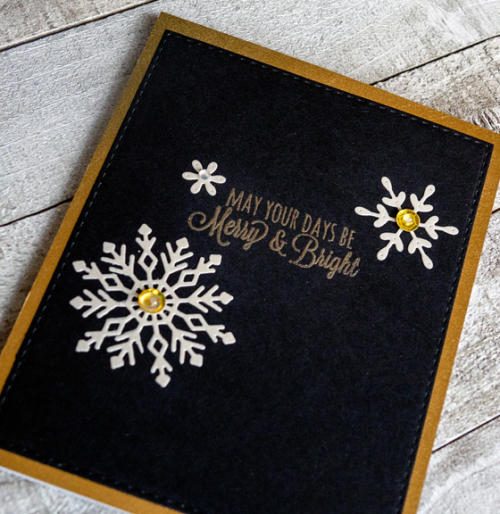
There was still a pile of silver snowflakes laying on my desk from a previous project as well as a piece of True Black cardstock with a gold sentiment that didn’t make the cut for another project. 

CTDMerry

All it took then was to die cut the black piece with a Stitched Rectangle die (Simon Says), adhere it to a piece of gold cardstock (Michael’s) and add the snowflakes. I also added two gold sequins and some PTI rainstones to the center of the snowflakes for a little bling.

CTDMerryFlat

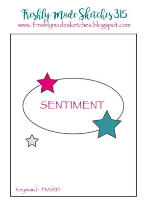
The second challenge was inspired by left-over pieces on the desk, as well. As soon as I saw the Freshly Made Sketches design, I knew I had the start of a card.

FMS Final 315-001

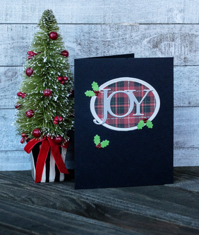
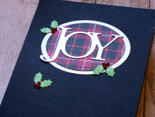
There was a plaid oval left over from the card I posted here and I found the silver JOY in my drawer of previous die cut images. I added a second silver oval, and some Holly Jolly dies with red Amuse pearls to finish off the design.

JoyFMS

I brushed the holly leaves with a Spectrum Noir clear glitter pen. This angle shows the glitter in the plaid paper by My Mind’s Eye (“Comfort & Joy”) as well.

JOYflat

Although I’ve finished the bulk of the Christmas cards that we send out each year, I’m glad to have a few extras to add to the mix.

Fusion: Red Christmas Challenge

  • by

A quick post for the Fusion: Red Christmas challenge. I’ve admired the challenges here for a long time. One of the things I particularly like is there are always three choices. You can use the photo, the sketch, or combine them. 

Fusion

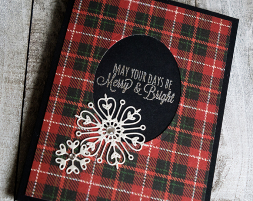
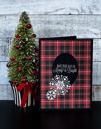
My card follows the sketch this time. I was also attracted to the photo, and although I have a sizeable collection of pitchers I don’t own any good stamps so I took the plaid runner for my inspiration. I think it’s the sketch, however, that is the real inspiration here.

Merry

I die cut an oval with one of my old Spellbinder sets from a piece of plaid paper from the My Mind’s Eye “Comfort and Joy” paper pad. I silver embossed the sentiment from Papertrey’s “Rustic Wreath” set, and added two snowflakes cut from a shimmery paper from my stash. The snowflakes are from My Favorite Things “Stylish Snowflakes.” I admired them last year but they were out of stock until after the holiday, but I picked them up on sale later. I’d forgotten about them until I reorganized my dies last week.

MerryFlat

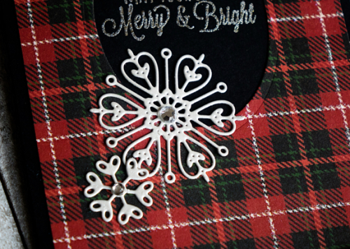
Sadly, you can’t see in any of the photos that the white line in the plaid is a glittery one. It makes the card much more festive than it appears here. To finish off the card, I added two rhinestones.

MerryClose

Hope your weekend is a lovely one. I’m looking forward to a little time with my oldest granddaughter tomorrow afternoon, and a day of crafting. Our tree is finally up, lit, and decorated and just in time as we have family coming for supper on Sunday, and the book group on Monday evening.  

Papertrey Ink November Blog Hop & Time Out Challenge

  • by

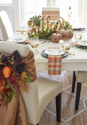
It’s the 25th of the month, and that means it’s time for the November Blog Hop at Papertrey Ink. The inspiration piece this month was really lovely.

6a00d8341c64e753ef01b7c92a6d94970b-450wi

I took my cues from the plaid napkin, the beautiful swag on the chair, and the large gold sentiment in the middle of the table.

PTIBlogHop1

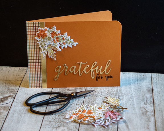
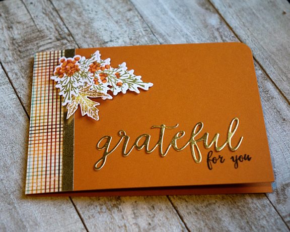
With the exception of the plaid paper (unknown from stash) and the large gold sentiment (Technique Tuesday), all the supplies are Papertrey Ink:  Winter Berries (transformed to fall berries with Canyon Clay and Terracotta Tile inks), Leaf Prints, and the tiny sentiment from Gathered Garden—all adhered to a Canyon Clay card base.

PTINovBlogHop2

This card also fits a new-to-me challenge: Time Out Challenges. The current challenge is Inspired by Words: Gratitude.

GRATITUDE BADGE

For those celebrating in the U.S., I hope you had a wonderful Thanksgiving Holiday.

Fall Cards: Part 3

  • by

I’m back to share the last of the fall birthday cards.

HB

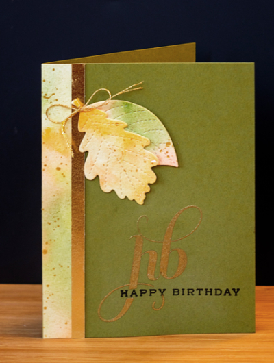
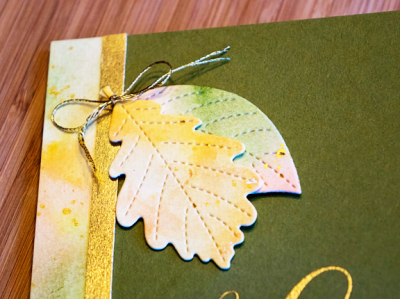
I had a few scraps of the watercolor paper I created for an earlier card, and didn’t want to throw them out. I love the unusual sentiments in Papertrey’s “Initial Sentiments: Birthday” so started with that, and added a strip of the watercolor paper and a strip of beautiful metallic gold paper from Michael’s. I’d used up all that gold paper, and couldn’t replace it at our local Michael’s, but found four sheets of it at a Michael’s in Chicago, and brought them all home. They are 12 x 12 sheets, so I think I’ll be good for a long time.

Another new die, Pretty Pink Posh’s ” Stitched Foliage” was perfect for a fall accent. I did cut two of them, and tied them with some fine gold string.

HBClose

Last, a CAS design, once again with the Pretty Pink Posh “Stitched Foliage” leaves.

3Leaves

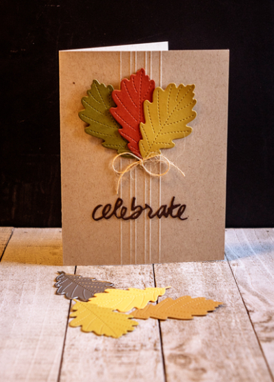
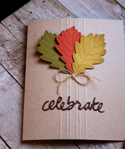
After some simple scoring on the Classic Kraft card base, I added three die cut leaves with a bow from PTI’s twine, and a die cut sentiment from “Wet Paint II” in Dark Chocolate.

3LeavesFlat

All the cards are now off in the mail to their recipients. Now I need to get busy with the early December birthday cards. (To say nothing of all the Christmas cards that need to be made!)


Fall Cards: Part 1

  • by

November brings a long list of folks with birthdays and anniversaries, so I spent much of my free time the last two weeks getting cards made. There was a group of people for whom I thought I could create the same or similar cards. I pulled out some favorite Papertrey Ink products and papers and set to work. You’d think they would have come together quickly, but it didn’t turn out that way.

4FallCards

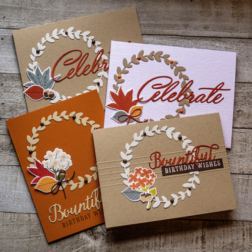
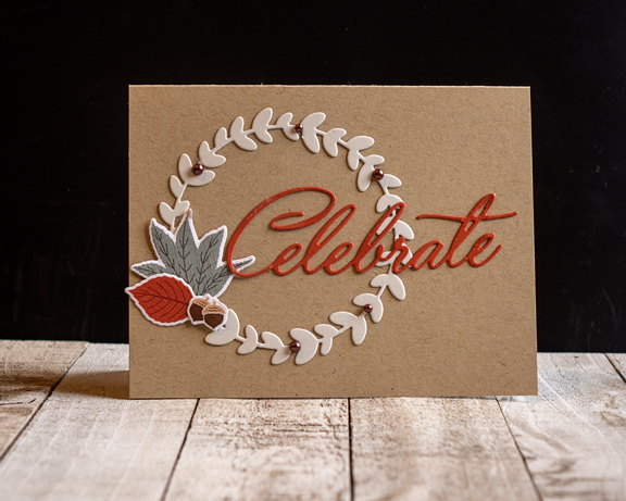
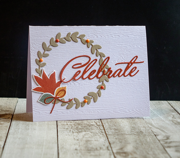
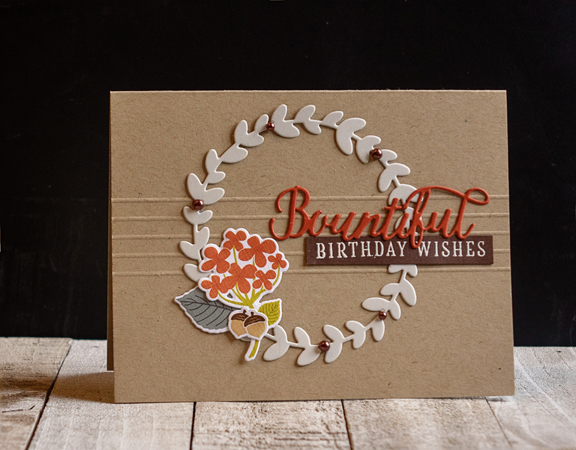
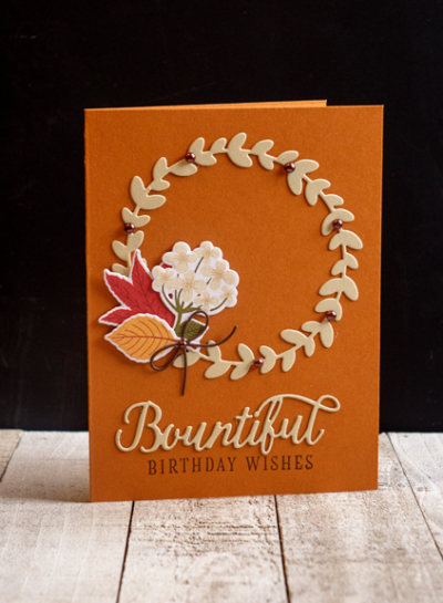
All four cards share the die cut from “Rustic Wreath” and preprinted diecuts from the “Color Pop: Autumn” Mini-Market Kit from last fall. 

Celebrate1

The card base here is Classic Kraft with the “Celebrate” from “Birthday Cheer” cut from Terracotta Tile and the wreath from Soft Stone. I added a few Amuse pearls in brown to finish it off.

Celebrate2

Essentially the same, this card uses a piece of Simon Says Woodgrain paper, the wreath from Classic Kraft as well as a die cut bow from “Gathered Garden” and some enamel dots from Freckled Fawn.

Bountiful2

Same design, but a different greeting from the Color Pop kit, and some scored lines as an accent.

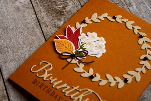
Bountiful

This is probably my favorite. A different orientation but all the elements remain the same. The card is Canyon Clay, and the wreath and sentiment were die cut from Fine Linen.

BountifulFlat

I have some more to share next time.

CASology: Cherish

  • by

Week 272 - Cherish

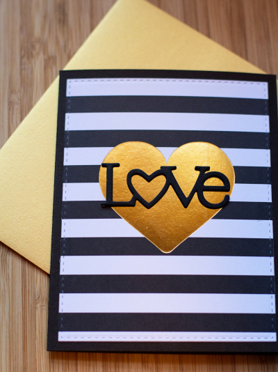
This week’s challenge at CASology is “Cherish,” and I have a quick and easy card to enter. The striped background with the metallic heart is actually a the card front from a pack of inexpensive cards I bought ages ago at Michaels. I cut down the front of it with one of the Simon Says “Stitched Rectangle” dies, and mounted it on a card made with Papertrey Ink’s True Black cardstock.

LOVE

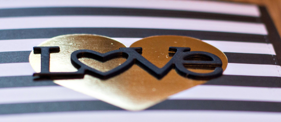
All that was left to do was to die cut Papertrey Ink’s “Wonderful Words: Love” die which I did three times, and stacked them.

LOVEstacked

Even with the striped background, to me this is clearly a CAS card—hope it fits with the CASology standards!