Skip to content

Summer Cards

  • by

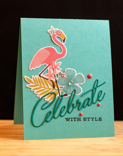
I have a couple of cards to share that shout summer to me. The first one was for a friend who has a pretty healthy dislike of flamingoes. Her brother regularly sent her flamingoes from all over the country when he was working, and once I had a “field of flamingoes” delivered to her yard that was a fund raiser for a local youth group. She responded with line of flamingoes up my sidewalk by the same group! So I couldn’t resist this year when I found this die cut flamingo in a pack of Simple Stories dies for scrapbooking. It just had to be used for her birthday card. I found a cute set of paper napkins with a gold flamingo on them to go along with her other gifts. It’s a good thing she has a sense of humor!

Flamingo

The die cut and stamped sentiments are from “Birthday Cheer” by Papertrey Ink. I added some rainstones (PTI), enamel dots, and (hard to see) some Wink of Stella glitter to liven it up.

The next card is unusual in that it has no stamping whatsoever. It’s all die cuts.

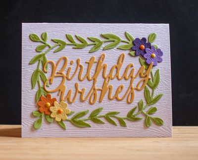
BDWishes

I started with a piece of Simon Say’s woodgrain paper, and die cut the “Garden Garland” from Limeade Ice, adding some detail with Copic markers. The pretty flowers are also part of the Garden Garland die. I finished them off with a few enamel dots for flower centers. The sentiment die, “Big Basics: Birthday,” was cut from Summer Sunrise. As soon as I saw the Garden Garland die, I had several ideas for it so you are sure to see it again!


Retirement: On the Links

  • by

For one of our friends, and definitely for my brother, retirement means more golf! This is actually the second retirement for my brother. He worked for many years, retired, needed something to do, and started driving a school bus. He actually loved the job, but after seven years or so, he decided this year he’d had enough. So here are two cards, both made with Papertrey Ink’s “On the Links” set.

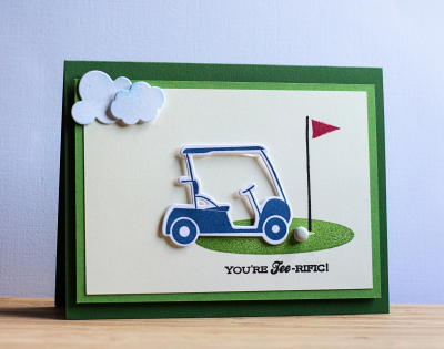
Tee-rific

For my brother’s card, I used a white brad for the golf ball, and two cloud dies in addition to the stamps and dies of the set to create a little scene.

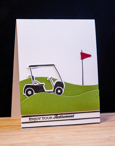
Retirement

A die meant to create snow drifts served as a little slope leading up to the tee for the second card. The paper on the bottom is from “Black & White All Over,” by Maile Belles.

I know for a fact that both these guys have put in a lot of time on the golf course this summer. And there’ll be no need to quit come September!

August Birthdays

  • by

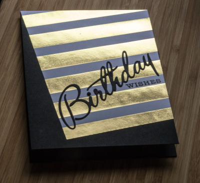
There were two special birthdays this week. The first was that of a friend who turned 80 on Monday. He certainly looks a lot younger that his age, and is quite the bridge player. We sang “Happy Birthday” to him on Friday night when we hosted our duplicate bridge group, but I failed to take any photos. Here’s the card I made for him.

BDWishes2

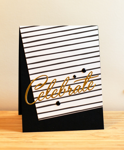
It’s a design I first saw on Maile Belle’s blog, and one that always seems appropriate for masculine cards. Here’s another one of similar design I sent out awhile ago, but never posted.

Celebrate

Both cards use die cuts from Papertrey Ink’s “Birthday Cheer” set. The top card is made with a patterned paper by Teresa Collins, and the bottom one with one of Maile Belle’s “Black and White All Over” papers.

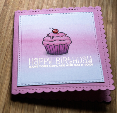
Yesterday was Sarah’s birthday. It’s the first year in quite a few that we weren’t around to help celebrate in person. 

Cupcake

She’s not one who likes particularly fussy cards, so I hope the scalloped card (Papertrey’s Noted: A2 set of dies) wasn’t too much for her. I used a stencil brush to add some color to watercolor paper, and then stamped the cupcake from Mama Elephant’s “Carnival Cupcakes.” The sentiment is from their “Carnival Toppers” set. I added some Glossy Accent to the cherry after coloring the image with Copic markers.

CupcakeInside

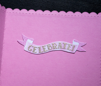
Although I’ve used the Papertrey set “Scene It: Celebration” several times, I’d never tried the banner. I stamped it, embossed the greeting, and then cut it out by hand. I love the ombre effect of the stamped banner.

Papertrey Ink Stamp-a-Faire

  • by

Papertrey Ink hosted a Stamp-a-Faire on Saturday. There were nine different challenges with video tutorials. I’ve watched all the videos, and they were all wonderful, but time constraints limited me to participating in just three of them. I picked the three I thought would be most challenging, since they involved brand new products (gold leaf paint) or techniques I often struggle with. The first was Gilded with Gold by Danielle Flanders. I didn’t start with any vision for a card, and ended up with four cards, none of which I’m thrilled with. Why four? So many attempts went south, I had bits and pieces all over my desk which ended up as cards. I definitely love the gold leaf paint (I purchased Martha Stewart’s), and learned quite a bit in the process. The next time won’t be so fraught with difficulties!

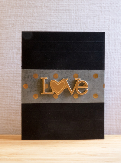
Here’s the first one, and probably my favorite.
Love

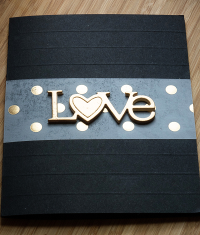
Looking for something else entirely, I came across a scrap of vellum with gold dots, and a card I had previously scored six times. The vellum piece fit in exactly right.
Love2

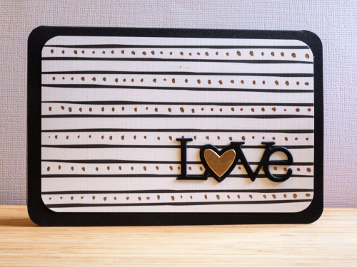
Next up, I tried adding gold leaf to a couple of Maile Belle’s “Black and White” patterned papers. The first time I dotted on some gold leaf between the black stripes.
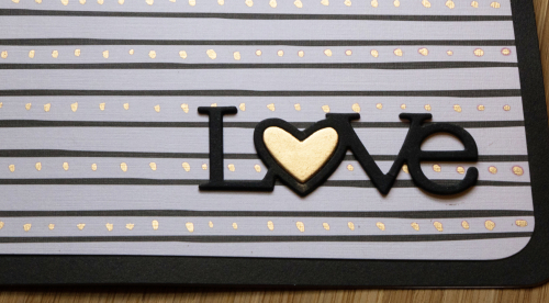
StripesGilded1

StripedGilded

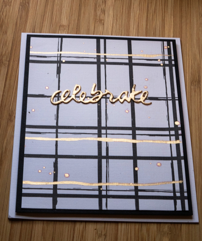
Then I tried adding some gold stripes to this design:
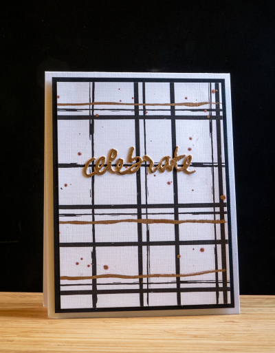
Celebrate

Celebrate2

I ended up with one Love die cut (Wonderful Words) and it fit perfectly onto this piece of patterned paper from the “Star Scribbles” pack of papers.
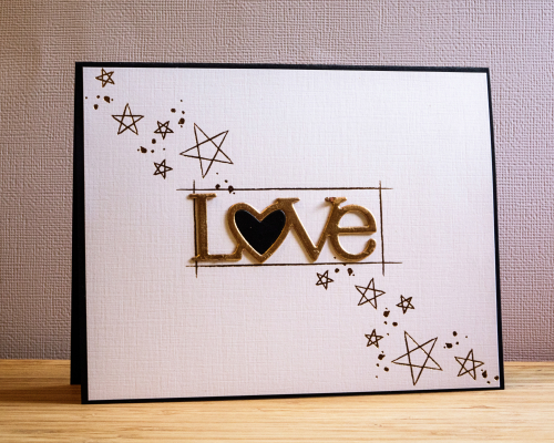


StarsGilded1

The second challenge I took on was Kay Miller’s watercolor challenge. She’s a master at watercoloring, and I was so interested in her technique which combines stamping with watercoloring. I ended up sticking very close to Kay’s design. I didn’t have the Berry Sorbet ink so substituted Melon Berry which is a much more subdued color. I think it worked out alright though, and it will make for a good fall birthday card.
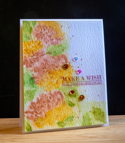
Wish

I was pretty happy with this one, and my husband who rarely comments on my cards, said he liked it a lot.
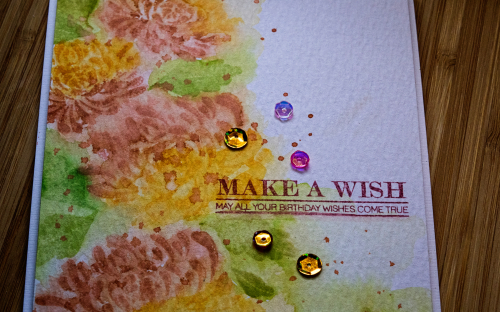
WishClose

The last challenge I took on was Amy Sheffer’s Starry Night challenge. As soon as I saw it I was taken with it, but didn’t have high hopes that I could pull it off. My ink blending skills leave a lot to be desired, so when I finished this card, I was really pleased. For once, I took my time and let everything dry before moving on to the next stage.
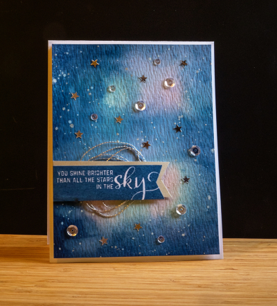
Sky

It also gave me an opportunity to use the new sentiment set, Number the Stars. I stamped the banner with Enchanted Evening, and backed it with the same banner cut from silver paper. I had some silver thread which is one of the elements on Amy’s card, and added some sequins and silver stars in my stash.
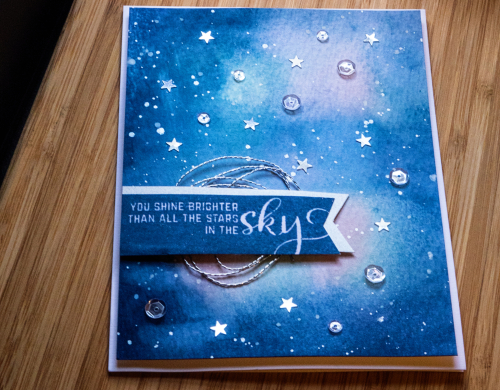
Skyclose

I also splattered some white acrylic paint and some silver metallic watercolors. Finally got the splatter technique down! You can’t see it from the photos, but I added some Wink of Stella glitter to the banner as well.

I have a couple other challenges I’d like to try, but won’t have time to get to them until long after the galleries close. Given my schedule this weekend, I’m happy to have managed these three. 
 

Papertrey Ink July 2016 Blog Hop Challenge

  • by

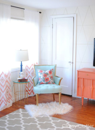
It’s the 25th of the month and the day for the Papertrey Ink Blog Hop Challenge. No surprise, I’m still working on the Stamp-a-Faire projects, and hope I’ll be back later with another post before the galleries close tomorrow morning. I didn’t want to miss the chance to participate in this month’s blog hop, though, because the minute I saw the inspiration photo, I had an idea for the card.

Pti bloghopJUly

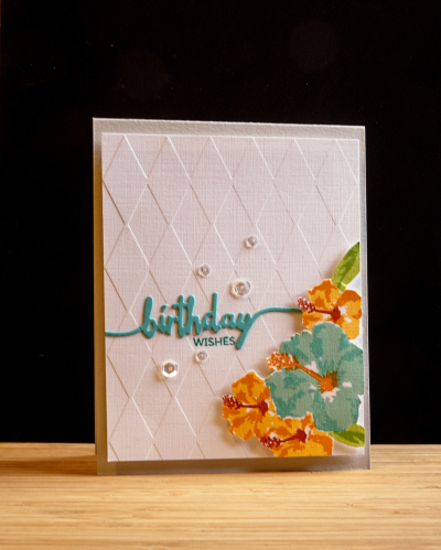
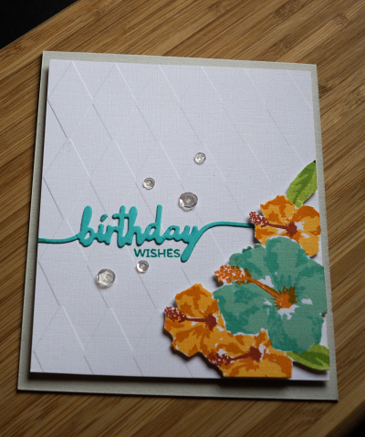
The idea was contingent on the Papertrey order arriving in time, which it did. I knew I wanted to use the new “Some Like It Hot” set which features one of my favorite flowers, the hibiscus. I used the colors in the photos–aqua and orange, the diamond pattern on the wall for my background, and the gray carpet as the card base. I would never have chosen gray had it not been for the photo, but it turned out to be a great choice.

BDWishes

It’s not often that a card turns out the way I envisioned it from the start, but this one did. I stamped the hibicus on separate card, masking them to group them together, and then fussy cut them out, and popped them up with some foam tape on the diamond embossed background. It’s been awhile since I pulled out an embossing folder (Quickcutz). I die cut “birthday” with the Swoosh die and the small stamp sentiment came from Swoosh as well. It just needed a few clear sequins to finish it off.

BDWishes2

Until I purchased a MISTI, getting the layers right for multi-stamped images was always a struggle. The MISTI solves those problems. I used three different inks for each of the flowers, and love the dimension you get with these. 

I’m babysitting for my new granddaughter this afternoon, but hope to be back in the craft room later today. You can see others’ interpretations of the inspiration piece right here.

SAF: Masterpiece Gallery

  • by

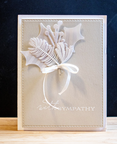
Today is the Papertrey Ink Stamp-a-Faire. Because we’ll be going to the lake soon, I won’t get to participate in the challenges as they appear, but hope to play along tomorrow. Last night they opened up a gallery so you could post one of your favorite cards made with Papertrey products. When I posted this card last January, I said it was probably my favorite sympathy card ever. I haven’t changed my mind about that.

Sympathy card

You can find the original post right here.

It’s supposed to be another 90° day here, so a good last day to be at the lake. Hope your weekend is off to a good start.

I love it!

  • by

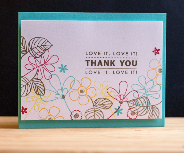
On my creative calendar was to try another technique from the Online Card Class, Heat Wave. Kristina Werner created a card that combined stamping some images with colored inks and embossing others. I ended up using three different stamp sets to create the flower border: “Build-able Bouquet” by My Favorite Things, “Handwritten Floral Greetings,” by Simon Says, and “One Big Happy,” by Papertrey Ink.

LoveIt

The sentiment is from Penny Black’s “Kind Words,” and you’ll see in a moment how very appropriate it is. After embossing the sentiment, the centers of some of the flowers, and  leaves with Liquid Platinum embossing power, I attached the card to some fun foam, and then to a card made with Hawaiian Shores.

LoveIt2

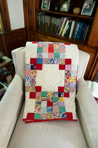
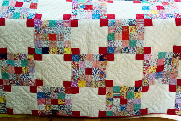
The card is for the mother of a close friend. Ruth is a wonderful quilter who is now in her 90’s. She had a collection of over 40 quilts that she hadn’t already given away, and decided it was time to share them. (She made a beautiful quilt for Sarah from quilt squares created by my great-grandmother and great aunts, and gave it to her as a high school graduation gift.) This time I was the lucky recipient. Since red is my favorite color, it was a perfect choice. Here it is folded on a chair in my living room.

QuiltChair

And spread out on the back of my couch.

Quilt

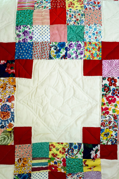
It’s entirely hand-stitched and here’s a close-up:

QuiltClose2

I’ve yet to find the perfect spot to showcase it, maybe on my bed—although I’d love to hang it. It was a very special gift, and I’m very grateful to have received it. It’s not often that I post twice in one day, but I wanted to get the card posted to the class gallery before it closes this week.


Heat Wave: Day 2

  • by

HW_participant-1

Day 2 of the Online Card Class focused on heat embossing techniques. Who knew you could emboss with a Quickie Glue pen? Not I, but I decided to give it a try.

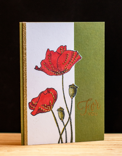
ForYou

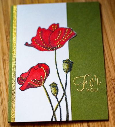
I stamped the image from Penny Black’s “Blooming Garden,” and colored it with Copic markers. Then I added the gold dots by applying tiny dots with the Quickie Glue pen and sprinkling them with gold embossing powder. Worked like a charm. I didn’t intend to cut the stamped panel, but made a mess of the sentiment, and decided that the design technique I used for Day 1 would work here as well. It’s actually a better design all the way around. Sometimes a mistake turns out for the best! I added a strip of 1/8″ Scor-tape to the edge and embossed it as well. It’s a technique I’d totally forgotten about and added just the right touch.


ForYou2

The sentiment is from Papertrey Ink’s “Friendship Jar Flowers.” I love the script font in this one. I have at least one more technique I want to try, so likely I’ll be back with another card over the weekend.

A Happy Hello!

  • by

The Online Card Classes are among my favorites, and I’m currently enrolled in “Heat Wave,” a class on embossing. The first day was lots of quick tips for embossing with different inks, embossing powders, and different kinds of cardstock. I picked up a few tips, even though I’ve been embossing for nearly 20 years now. At the same time, Papertrey Ink is in the midst of their July release. They host a challenge, “Create Along with Us,” where you choose a card one of the designers posts to use as inspiration. I always love Maile Belle’s designs and had already pinned one of her cards. So here’s an embossed design, inspired by Maile Belles, and using one of her earlier stamp sets, “Splits:  Just a Note.”

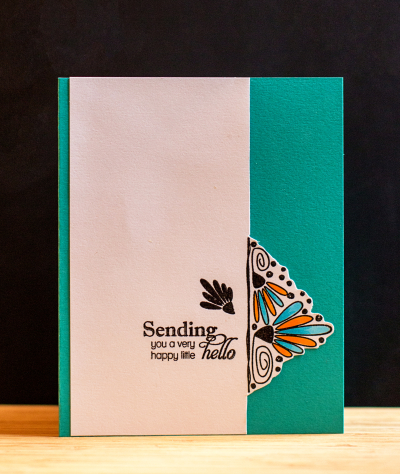
Hello

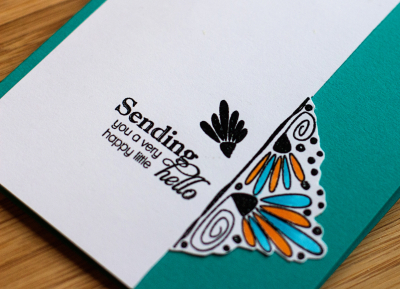
I used just half of the stamp design and turned it on its side, trimmed the white cardstock to the stamped design and fussy cut around it. I colored the petals with Copic markers, and added a sentiment from Papertrey’s “Delightful Dahlia Additions.” Then I adhered it to a Tropical Teal card. I’m pretty sure I’ll use this design concept again.

HelloClose


SNAP 27: A Birthday Party

  • by

Yesterday was my mother-in-law’s 87th birthday, and we celebrated with a family picnic at our house. I thought I’d share four photos from the party for this week’s SNAP—a photography meme of 3-4 related photos hosted every week by Helena.

SNAP27


The cake was “Chocolate Decadence” made by Leo’s bakery, and it was moist, rich, and totally delicious! Skylar and Ella had left by the time we had cake, so Caleb was the only great-grandchild available to help blow out candles. Before the little girls left, however, the three great-grandchildren provided some “musical” entertainment. Caleb and Gigi had a great time together opening all the cards and notes.

Here’s the card I made for Mom.

Mom'sBD

Once again my starting point was the fabulous Papertrey Ink Make-it Market Kit: “Don’t Forget to Write.” The kit was a big splurge, but worth every penny. The two stitched panels are from the A2 Note Card dies by Papertrey, and I die cut the letters from Neat and Tangled’s “Journaling Alpha.” The stamped sentiment is from “Retro Style Birthday” (PTI).

And while I’m here, #7 for the Summertime Photography Hunt:  a family gathering, surely not the last opportunity I’ll have this summer for this item on the list.

IMG_2806ed

Everyone looks a bit overdosed from the chocolate cake and ice cream, but we had a great time!

CAS(E) This Sketch

  • by

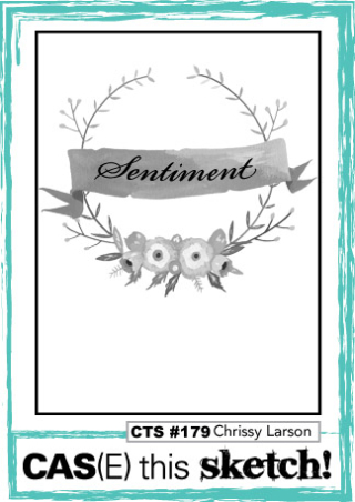
It’s been awhile since I used a sketch to inspire a card, but the current challenge at CAS(E) This Sketch intrigued me.

CTS_179

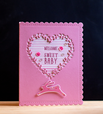
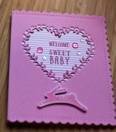
I didn’t start out with a plan to use a die cut for the wreath, but that’s where it ended up, but I’m quite happy with it. The heart die cut from Concord and 9th is so pretty, and the Ombre Stripe patterned paper (PTI) worked perfectly behind it.

Baby

The little bunny and the sentiment are both from the Mini-Market Kit “Wee Folk” by Papertrey Ink. The card itself is a die cut from their new A2 set cut from Lovely Lady (IRL not quite as bright as the photo shows.) I finished it off with a few sequins from Pretty Pink Posh.

BabyClose


I hadn’t planned on posting this card until Thursday, but the challenge ends early Thursday morning, and I won’t have a chance to write that post until later in the day. Come back to see!


2016 Summertime Photography Scavenger Hunt & A Challenge

  • by

Today is the first day for links to Rinda’s 2016 Summertime Photography Scavenger Hunt. It’s a favorite summer activity for me, and usually by this time, I have quite a few of the items checked off. Not so much this year, but I do have three.
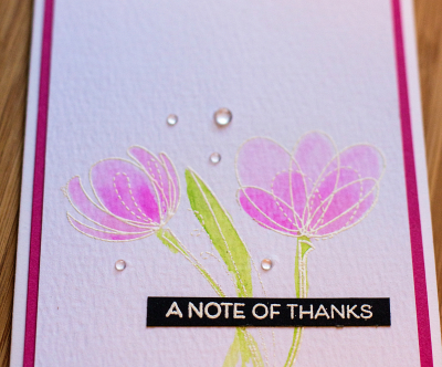
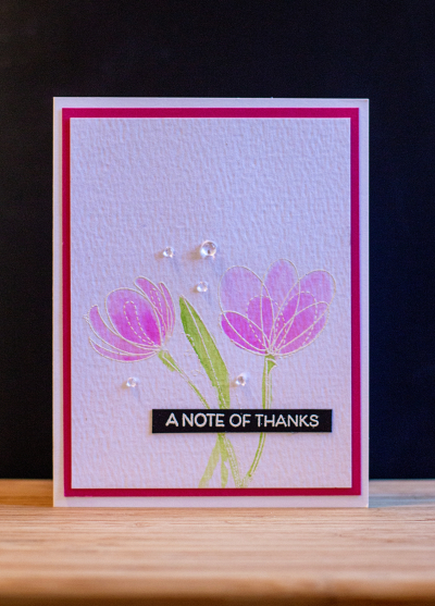
The first one is #8:  A drawing, art project, artistic photograph, greeting card . . . created by you. I’ve actually made quite a few cards since the beginning of June, but here’s my most recent one, and an entry to the Simon Says Wednesday Challenge: Anything Goes.

NoteofThanks

I used a new-to-me Simon Says stamp set called “Spring Flowers,” embossed in white and watercolored with my Zig Clean Color markers. The sentiment is from Papertrey Ink’s “Painted Petals,” white embossed on a scrap of black cardstock.

NoteClose

I added a few rainstones from Papertrey Ink, and mounted the watercolor piece onto some Raspberry Fizz cardstock and then onto a white card base. 
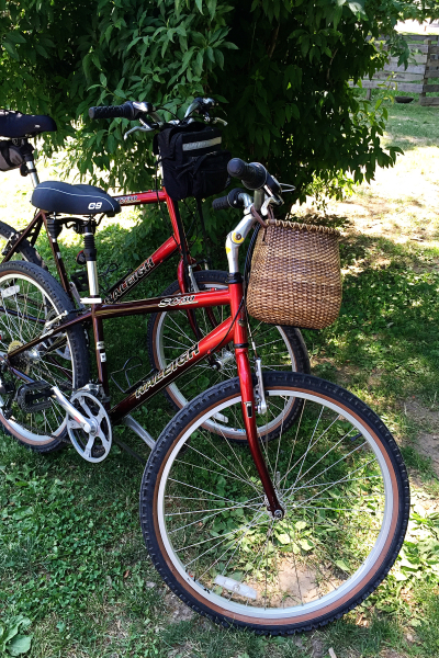
Next for the scavenger hunt is #10: a bicycle. We took our first bike ride of the season last week, riding 12.5 miles on the Erie Canal path from the Brighton town park to the Pittsford Dairy where we indulged in homemade ice cream cones. I had black walnut, and it was delicious!
IMG_2740ed

Check out my very cool basket which was a gift from Sarah last year. It’s made byt the Nantucket Basket Company, and I love the shape of it. I also have a new seat this year, also a gift from Sarah. Much more comfortable than my old one.

Last for June, is #20:  Someone laughing.

IMG_2745ed

Our friends, Pete and Arlene, were here for dinner Monday night. I wish you could hear Arlene’s laugh. It’s positively infectious! I’m not sure what the story was, but there was lots of laughing, and I quickly got in a few shots.

You can check out the other scavenger hunt posts right here.

CASology: Congratulations

  • by

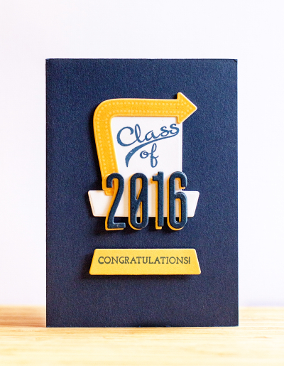
This week’s challenge at CASology is perfectly timed for high school graduations. Today is the graduation ceremony for Brighton High School (our local school), and I needed to make a card for one of the graduates. Brighton’s colors are navy and gold so that determined the color combination. I originally bought Papertrey Ink’s “Retro Style Graduation” because I wanted some of the stamps for the addition set, “Retro Style Birthday,” but I was grateful to have the set for this card which came together pretty quickly.

Graduation

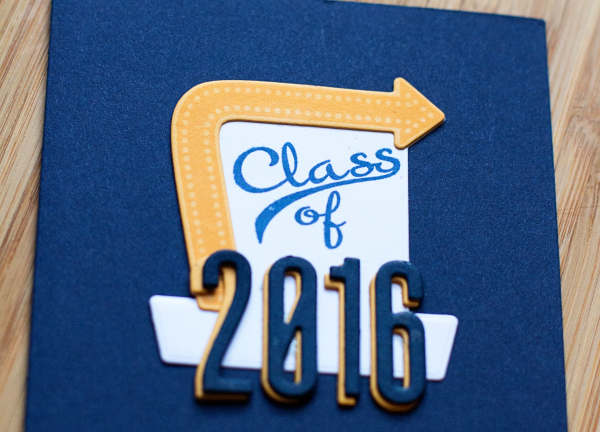
Everything except the numbers came from the stamps and dies for “Retro Style Graduation.” Stamping the die cuts is so much easier now that I have figured out the best way to use my MISTI. Papertrey Ink’s die are usually solid dies so they can be a bit more challenging (to me, anyway) to place correctly on the stamped image. The MISTI solves it perfectly. The numbers were all die cut twice from the Headline Alphabet in navy (WPlus9) and twice in Summer Sunrise and then layered to create a shadow effect. 

GraduationClose

Brighton’s graduation ceremony used to be held at the Eastman Theater, quite an elegant setting. Now it’s at the Rochester Institute of Technology’s field house, which I don’t think I’d like as much.

I’m linking to CASology’s challenge for Congratulations.

Week 203 - Congratulations

Happy Father’s Day

  • by

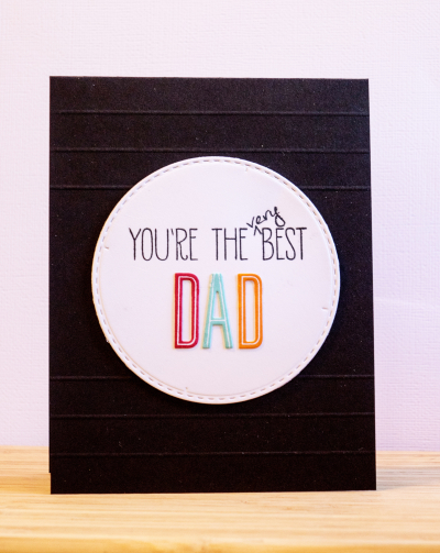
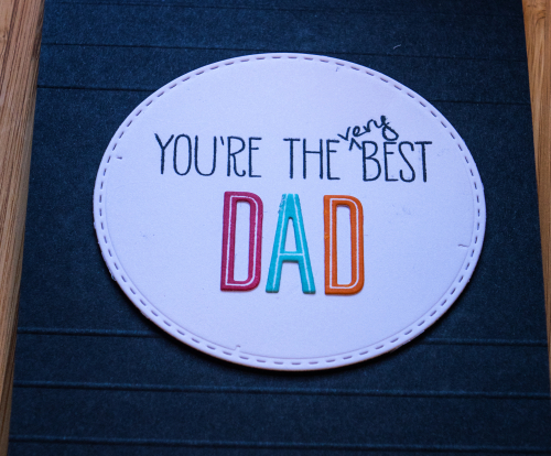
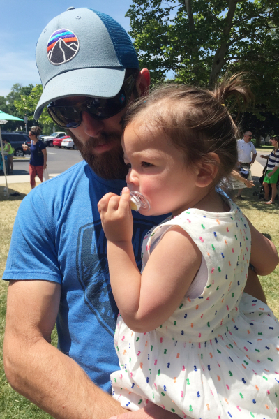
It’s Father’s Day, and I made cards for three of the “very best” dads I know:  my husband, my son, and my son-in-law. All three of them spend as much time with their kids as they can, have great relationships with their children, and are loving, caring parents. The best there is, truly.

Father's Day

Father'sDayClose

I started with Avery Elle’s sentiment set, “Handwritten Notes,” and then add “DAD” die cut and stamped with Papertrey’s “Headline” alphabet. I die cut the sentiment with a Simon Says “Stitched Circle” die and mounted it on a piece of black cardstock that I scored three times on the top and the bottom.

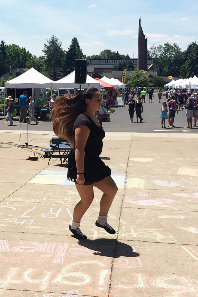
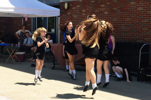
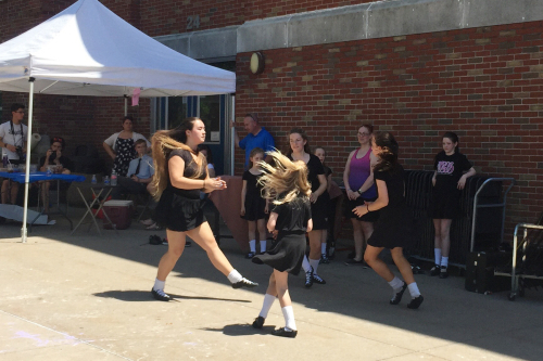
We had a nice Face Time chat with Adam, Sarah, and Caleb, and we spent some time with Matt and his family this morning after church. Betsy’s niece is an accomplished Irish dancer and her troupe was performing at the Brighton Farmer’s Market. Ella was entranced.

IMG_2696ed

I love this photo of Nadia with her gorgeous hair flying behind her as she danced. The fast foot work is amazing!

IMG_2704ed

IMG_2707ed

It was almost 90° at noon when they were dancing so they stayed as close to the shade as they could.

IMG_2709ed

This ought to be my Memorandum Monday post (my first Irish dancing performance, but surely not my last!), but by then Father’s Day will be over. We’re actually celebrating Father’s Day again tomorrow with a combined Father’s Day and Graduation party at Betsy’s father’s house. Hope you’ve had a great weekend!

Sending Sunshine

  • by

CASology’s challenge this past week was “Sunshine.” As soon as I saw it I knew I had some stamp sets that hadn’t seen much use that would be perfect for the challenge. This afternoon was the first opportunity I’ve had to sit down to play with them.

Week 201 - Sunshine

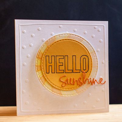
I pulled out two stamp sets, one from Papertrey Ink and one from Simon Says (last year’s August card kit which included a stamp set and a die.) 

Sunshine

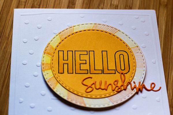
I used both stamp sets to stamp the background circle (“Hello, Sunshine” Papertrey Ink), and the HELLO (“Flip Flop Season” Simon Says), and added some Copic marker to the sentiment. The die cut is also from Simon Says. It’s all mounted on a pre-embossed square card by Lasting Impressions that’s been in my stash for years.

SunshineClose

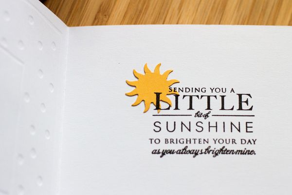
The inside sentiment is also from “Hello Sunshine,” and I added a punched shape (that’s been in my stash as long as the card!)

SunshineInside

I’m always in need of encouragement cards, so I’m happy to add this to my card box. And I’m happy to say we’re enjoying days of ample sunshine here!