Skip to content

Holiday Gift Exchange

  • by

It’s been a busy week. Aside from packing for a rather lengthy vacation, we’re also packing up our kitchen so the contractor can begin to rip out the ceiling and old cupboards while we’re away. We’ve been driving to Consesus Lake every day to visit with Tracy’s family. His mom has rented a cottage, and all of us try to gather for dinner (at least) every day. It’s been over 90° every day this week, so it’s been great to be at the lake. The last several years, we’ve taken the opportunity to draw names for the Christmas gift exchange during this week since everyone is together. I make gift tags, and if they want, the family can save them for the packages come December. (Mine is in a little dish on my dresser so I don’t lose it!)

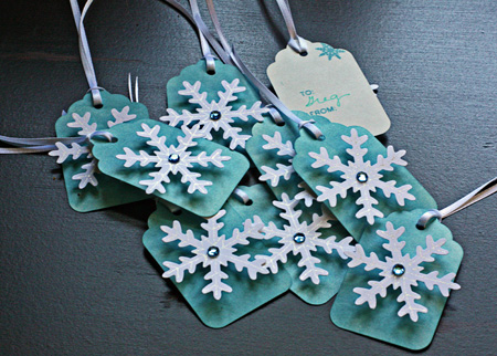
Here is this year’s version:

HolidayGiftTags

I kept it pretty simple this year. I colored some Avery tags with Tim Holtz Distress Ink (Broken China), punched some snowflakes and outlined them with a glitter pen, and added a coordinating gem. The snowflakes are popped out with a 3-D adhesive. The back was stamped with WPlus9’s “All Occasion Tags.”

This is probably my last blog post before we leave for Vancouver, BC and Alaska. It appears internet connections will be iffy, so I doubt that I’ll be able to do much blog reading or commenting (not that I expect to have much time for that), and I’m quite sure posting will be a challenge. I’m hoping to keep up with Project 64, but we’ll see how it goes. I do have a few posts pre-scheduled, and I’ll be catching up with you on my return. We’re very excited to be going on our first cruise, and to be going with good friends of over 25 years. Should be fabulous!

Fanatical About Botanical Challenge in the Moxie Fab World

  • by

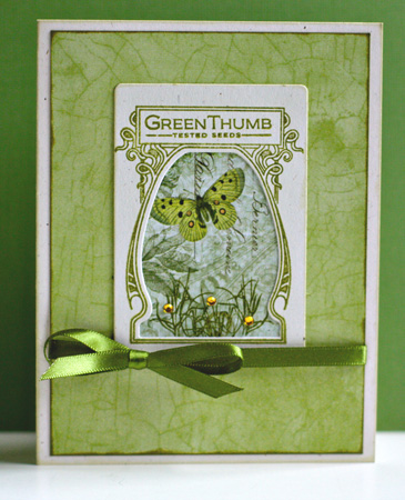
I have a card for the new Moxie Fab World challenge, botanicals. The Garden Variety stamps by Papertrey seem a perfect match for the Pink Paislee Butterfly Garden papers. Edited to add this to the Simon Says Anything Goes Challenge.

GardenVarietyMercy

The butterfly is part of the patterned paper, but I added some stamped grass to the bottom of the frame and some gems for some dimension.

Supplies:
Cardstock: Rustic White (Papertrey)
Patterned Paper: Butterfly Garden (Pink Paislee)
Stamps:  Garden Variety (Papertrey)
Die:  Seed Packet Frame (Papertrey)
Ribbon: Paper Source
Gems from stash

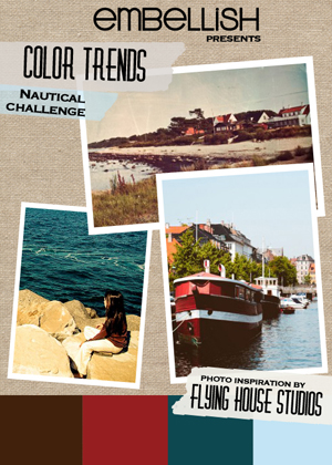
Embellish Nautical Challenge and Summer Card Camp

  • by

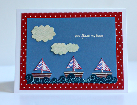
Earlier in the spring, I was the lucky winner of a new stamp set from Craft’s Meow called “It’s a Shore Thing.” When I saw the Embellish Nautical Color Challenge, I knew I’d found a way to use these cute stamps.

Nautical_ColorTrends

Although someone named the colors as brown, red, navy, and light blue, the darker blue is not quite navy in my book. Fortunately, I found an Adirondack ink pad (Stream) that was exactly the right color.

FloatBoat

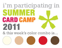
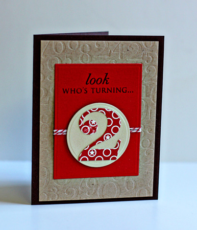
This is Week 3 of Summer Card Camp, and I’m actually on track with my first card with the new color combination which seemed perfect for my niece’s son who is turning two.

Week3-colors

Here’s my card. I was happy to get to use these fun Papertrey Ink products.

Two

It’s a bit hard to see but both the red mat and the taupe circle are cut and embossed with Nestabilities.

InsideTwo

Supplies:

You Float My Boat
Cardstock:  Neeah Solar White, Memory Box light blue
Patterned Paper: Bitty Stars (Papertrey) & clouds cut from Quite Contrary (MME)
Stamps:  It’s a Shore Thing (Craft’s Meow) & Tiny Treats: Valentine (Papertrey)
Light Blue marker:  Faber-Castell Pitt Artist Pen

Look Who’s Turning Two
Cardstock:  Dark Chocolate, Pure Poppy, Kraft (Papertrey) & scrap from stash
Patterned Paper: “Night Light Jack” (October Afternoon)
Nestabilities: Classic Rectangles & Small Classic Circles (Spellbinders)
Die:  By the Numbers (Papertrey)
Impression Plate: By the Numbers (Papertrey)
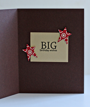
Stamps:  Birthday Bash & Big Birthday Wishes (Papertrey)
Twine: Pure Poppy (Papertrey)
Star punch; McGill

Celebrate with New Shoes

  • by

FotoFlexer_Photo-CFC10

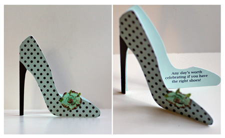
I thought it would be fun to play along with Casual Friday’s challenge this week. I quickly found a shaped card I could cut with my Silhouette, and I know just who will get this card in the fall for her birthday.

HighHeels

The Silhouette cards come together so quickly. The only challenge on this one was to figure out how to get the sentiment on the inside. I printed the sentiment on coordinating cardstock on my computer and then used the “stencil” that was left after cutting the card to trace around the shoe. I handcut it and adhered it to the inside. The shoe was cut with white cardstock and then covered with patterned paper on the outside. I hand cut the high heel from more textured cardstock. The Prima flower was colored with a BG11 Copic marker and distressed with chalk inks. Wish I could wear shoes that look like this!

Rinda asked what kinds of adhesive I use on intricate die cuts. On this card, I used the Xyron sticker maker with repositionable adhesive. Frequently I use permanent adhesive, but I knew positioning all these die cuts would take more than one try. On this card, I used my American Craft This to That dotted tape runner. I’ve never found a tape runner I like as much as this one, so I always have a supply of them in the closet. For the leaf border, I just applied adhesive selectively along the border so some of it appears three-dimensional.

Supplies:
Cardstock:  American Craft & Memory Box
Patterned Paper: “Home Grown” (3 Bugs in a Rug)
Flower:  Prima
Chalk inks: Quick Quotes
Copics

Moxie Fab Border Challenge

  • by

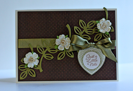
I have a more shabby chic card than usual for the current Moxie Fab Border Challenge that ends tomorrow, but I’m quite happy with it. The challenge asks that you use a border in an innovative way. I usually think of borders as going across the card horizontally or vertically, but in this case running the die cut border diagonally proved to be much more pleasing.

JustANote

 I started with a cream card and die cut the Leaf Border by Lifestyle Crafts from textured cardstock. I decided it needed a dark mat and used my favoriet dotted patterned paper by Bo Bunny. The sentiment is from Just Rite’s “Charmed” die cut with the matching dies from Spellbinders. I  distressed the mat with some chalk ink as well as the three Prima flowers. The green ribbon is from my stash.

Summer Card Camp

  • by

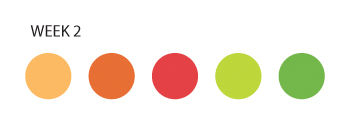
This  is week 2 of the Summer Card Camp, and I’ve barely had time to read the pdfs, to say nothing of watch the videos. Hopefully, I’ll get to the videos this afternoon or tomorrow. I do love this week’s colors, so I had to sit down and get a couple of cards made. I already have receipients for both cards, so I “killed two birds with one stone,” so to speak. Here are this week’s colors:

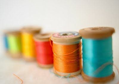
Week2

They translate into Papertrey Inks cardstock easily:  Summer Sunrise, Orange Zest, Pure Poppy, Simply Chartreuse, and New Leaf so I decided to use up some scraps and do some die cutting.

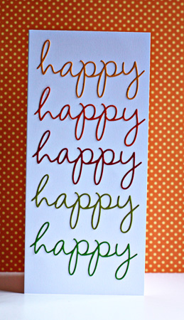
Happy

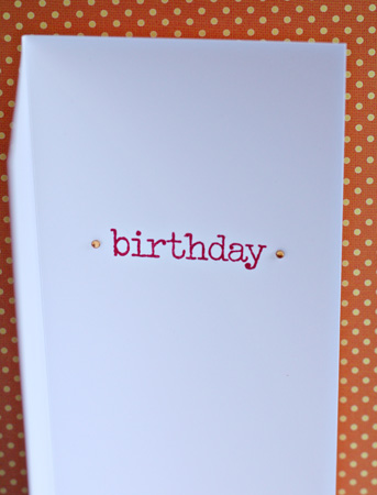
For the first card, I die cut five words from the Wonderful Words die from Papertrey. In the photo, it’s a bit hard to see the bright colors of the words. Here’s the inside, stamped with Wonderful Words Additions.

InsideHappy

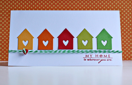
For the next card, I die cut five little houses from Love Lives Here (Papertrey Ink). It’s one of my favorite dies. The sentiment is from the coordinating stamp set.

MyHome

The twine is from Divine Twine and the button from my stash. Here’s the inside, also stamped with Love Lives Here.

InsideMyHome

Back to the To Do List. Have a great day!


Summer Card Camp Take 2

  • by

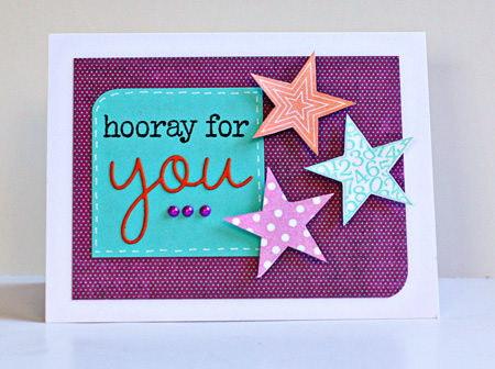
Week1-colorsOne of my former fifth graders graduated from high school a week ago. I’m missing her party because we’re traveling this weekend, but I wanted to get her card and gift to her before we left. The high school colors are pretty boring for a delightful young woman full of energy and enthusiasm, so I decided to use this week’s camp colors to create a card for her.

HoorayForYou

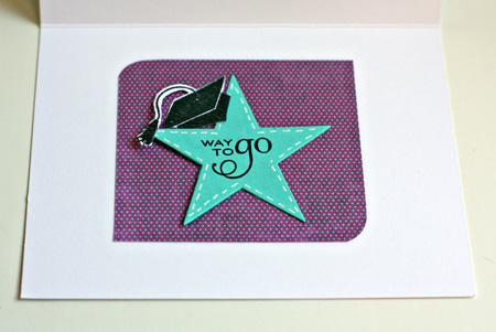
For those of you in the class, you can easily see my inspiration from Kristina’s card sketch and video. I wanted to try the faux stitching with the white gel pen, and was very pleased with how easy it was. It’s something I’ll use again for sure. Here’s a peek at the inside:

InsideAmy

We’re in Hyde Park for the holiday weekend visiting my brother and nieces. Last night was the New Paltz fireworks display, and I hoped to have some awesome photos from it. We got there early, asked where the fireworks would be set off, and got the tripod and camera set up for a site beyond some trees in the distance. Imagine our surprise when the fireworks erupted right over our heads! It was an awesome display, but we were far too close for any great photos. One of my nieces works for a local credit union and had 3-D glasses for the fireworks. They were amazing, turning the fireworks into kaleidoscope displays. It was lots of fun, but I’ll have to wait for another opportunity for my fireworks assignment in the Night Photography class.

Supplies:

Cardstock: Select White, Hawaiian Shores (PTI)
Patterned Paper: Lime Twist (MME)
Stamps: Wonderful Words Additions, Star Prints, For the Graduate (PTI)
Dies:  Stars, Wonderful Words (PTI)
Pearls (Hero Arts)
Ink: Brilliance

Summer Card Camp

  • by

I couldn’t resist a summer card camp when so many of my favorite designers are among the contributors to the projects. We’ve already had three inspirational pdfs, and a video. This week’s colors are so summery.

Week1-colors

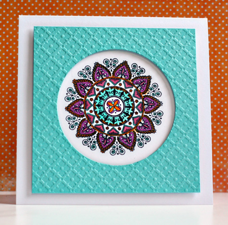
I may be back with another card later, but the rest of my day looks pretty busy, so I’ll be making up time later. This morning I saw a great idea on Laurie’s blog, and immediately thought that I could do a similar card with this week’s colors. It’s another Mehndi Medallion creation. I already love this stamp set!

SummerCardCamp1

I used the technique from the video to create a window card. The card in the video also included the sentiment on the front, but no matter what I tried, the sentiment took away from the medallion, so I finally decided to do without it.

Supplies:

Cardstock: Select White & Hawaiian Shores (PTI)
Stamps: Mendhi Medallion (PTI)
Impression Plate: Diamonds (PTI)
Copic Markers: R85, BG13, YR16, V06 & Sakura White Gelly Roll pen
Dimensional Adhesive

CKC Convention Recap

  • by

Two weeks ago, my friend and I went to Buffalo for the CKC Convention. Aside from taking a lot of photos of the layouts in the Studio Calico booth, I totally forgot to take pictures. Mary and I both took three classes. All of hers were card-making classes (and she loved them). I took one scrapbook class with Technique Tuesday and made two 2-page layouts using papers designed by Ali Edwards. I love both layouts, but haven’t chosen the photos for them yet.
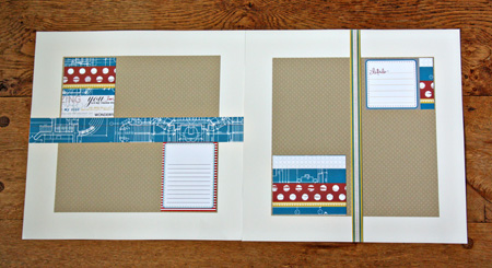
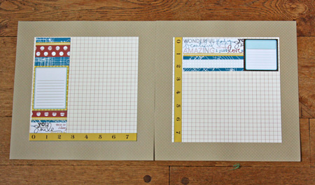
TechTuesLO1

TechTuesLO2

They use a color combination I love and I liked the papers so much I bought a pack of them, even though I had a few left from the class. The class moved right along, but it wasn’t had to keep up.

The next class I took was a copic airbrushing class. I have a small airbrush set-up using the air cans, but I’ve always been a bit afraid to give it a try. We used the expensive air compressors in the class, but they demonstrated the can set-up so I’m sure I’ll not have any trouble with it. The class was taught by instructors from Clear and Simple Stamps and we made three cards while practicing the airbrushing techniques.
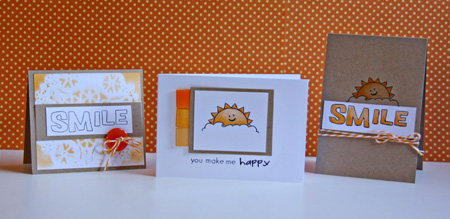
Clear&Simple

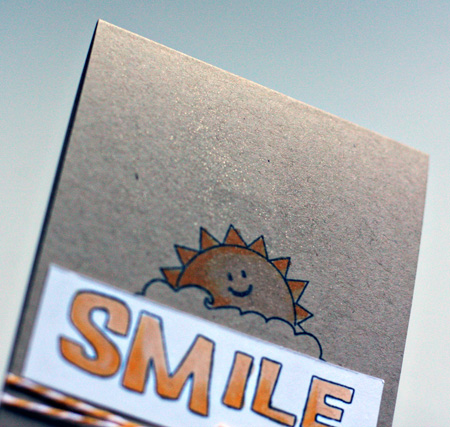
For the card on the left, we airbrushed over a doily and then lifted it up to create the background. For the middle card, we airbrushed the ribbon tags, and for the last card we airbrushed with a glitter pen. Here’s a close-up of that.
SmileGlitter

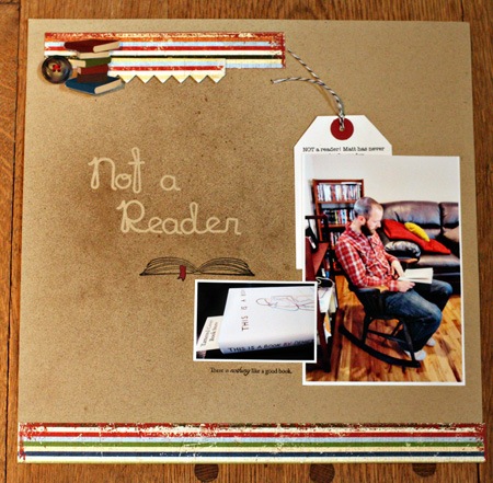
The last class I took was called Terrific Trends by Studio Calico, and it focused primarily on using the Mr. Huey mists. We created a title for a layout by putting down letter stickers, misting and then removing the letters. I liked the technique, but the papers and embellishments they used for the layout did not fit the photos I had taken, (This is frequently the case, and I’ve learned over time, to simply take the papers home with me so I can create a layout of my own.) Here’s the layout I finished this morning.
NotAReaderLO2

Matt’s ADD has always made it hard for him to read without taking his medication. He did really well in college, but when he’s working he needs the meds in order to focus on the job. One of the side effects of the medication is being unable to sleep, so he hesitates to use any after noontime. Thus the amount of reading he’s done since he graduated has been limited to newspapers and crossword puzzles. When we were in Denver we went to one of my favorite independent bookstores, The Tattered Cover. While we were browsing, Matt picked up this book, started to read, and started to chuckle. We bought the book and in just a day he had read nearly a third of it. It was too big a moment not to capture!

I used a Papertrey Ink die and some stamps from All Booked Up, a Jolee sticker and button from my stash, and some patterned papers I picked up at the convention from Simple Stories called Elementary.

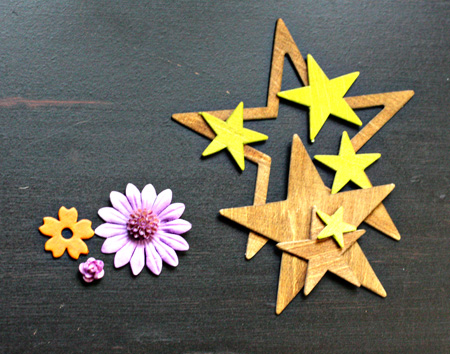
In both the Copic Airbrushing class as well as Terrific Trends, we got a chance to color some embellishments. The ones on the left were airbrushed with Copic markers and the Wood Veneer stars from Studio Calico were sprayed with Mr. Huey mists. I know I’ll find a great use for all of them before long.
AlteredEmbellishments

All in all, it was a great convention. The vendor faire was a bit better this year and I got some lovely embellishment at the Melissa Francis booth, and picked up a few papers that were on my wish list. Another benefit of the classes is I came home with three new stamp sets as well as quite a few papers and embellishments from both Technique Tuesday and Studio Calico.
 

Papertrey June Blog Hop

  • by

Bloghoplogo

It’s the 25th of June already, and that means the Papertrey Blog Hop. This month’s challenges was a color inspiration challenge.

PapertreyInk

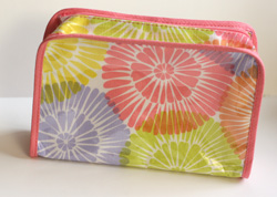
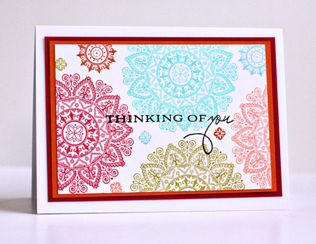
All these beautiful colors inspired me to create a card with the new Mehndi Medallion stamps that arrived this week. I was also inspired by the design of the little bag I got as a bonus at the Clinque counter this week.

Clinque

I started with the color palette from the Papertrey inspiration piece and pulled out a pile of Brilliance inks, most of which have a sheen to them which adds to the look of the card IRL. Then I used the design from the cosmetic bag, but rather than overlap the images I left some space between them and filled in with some of the smaller designs. The sentiment is from Botanical Silhouettes and I love how it just seemed to enhance the overall design of the card. So, finally, here’s my interpretation of the two.

ThinkingOfYou

Cardstock:  Select White, Pure Poppy & Orange Zest

Happy Father’s Day

  • by

In the U.S., today is the day to celebrate dads. I’m biased, of course, but I think my kids have the absolutely best dad around. He’s patient, kind, generous, intelligent, handy, and fun to be around. This year is the first year neither child was nearby for either Mother’s Day or Father’s Day. We hear from them, of course, but it does seem different.

We’ve already had a busy day. We took a longer walk than usual this morning, and clocked just about three miles. We’ve been to visit friends, the grocery store, the farmer’s market, and to the garden to water our plants. In a bit, we’re off to the pool with friends and will grab a bite to eat with them. Then we’re off to the movies. The rest of the week looks equally busy, so although I have things to share, I’m not sure how much time there’ll be for blogging.

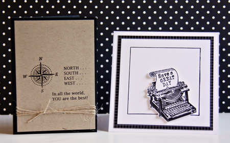
Here are the two Father’s Day cards I made this year. For Tracy on the left (based on the inside of a card by Betsy Veldman in a Card Creations magazine), and for his stepfather on the right.

Father'sDayCards

Supplies:

Compass Card:
Cardstock: True Black and Kraft (Papertrey Ink)
Stamp: Father Knows Best (Papertrey Ink)
Computer generated sentiment (Lucinda Fax font)
Twine (Papertrey Ink)

Typewriter Card:
Cardstock:  Select White (Papertrey Ink)
Patterned Paper: 2008 Bitty Box Basics (Papertrey Ink)
Stamp: Office 101 (Clear Art Stamps & Framed (Papertrey Ink)


Hats Off to the Grad!

  • by

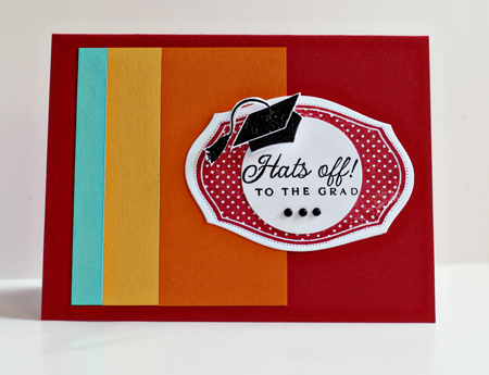
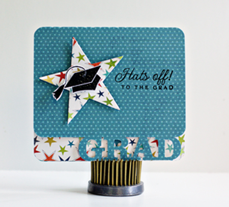
I needed three graduation cards this weekend, and was able to combine them with three different challenges. I used the same stamp set on all three, one reason why I love stamping. Just one set can give you quite different looks. The first card is for the Moxie Fab Tuesday Trigger and the Casual Friday color blocking challenge.

Here’s the Tuesday Trigger called Rainbow Bright:

RainbowBright

And the Casual Friday challenge:

FotoFlexer_Photo-CFC7

And the first of the graduation cards:

ColorBlockGrad

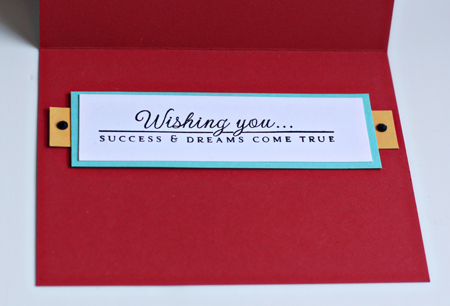
And a peek at the inside:

InsideColorBlock

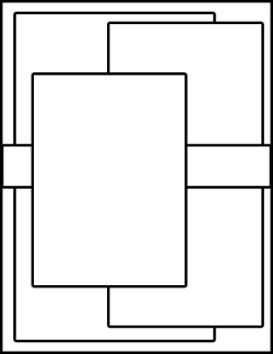
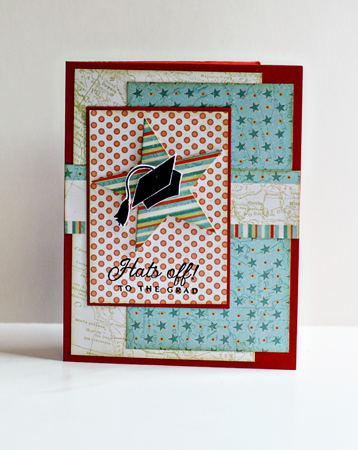
The next card, for my nephew, is based on the CPS Sketch for this week.

222

And my card:

RoadTripGrad

The last card is probably my favorite, and it’s not for any challenge. I cut the card itself on the Silhouette, and then finished it off with my stamps and dies.

SilhouetteGrad

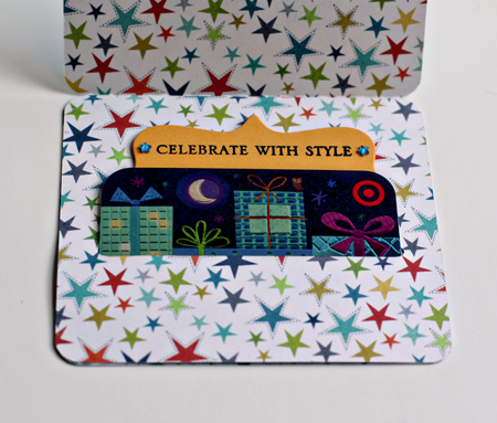
And the inside which holds a gift card. The message pulls out for a handwritten wish for the graduate.

InsideSilhouetteGrad

I’m posting this late tonight instead of tomorrow morning because my friend and I are off to Buffalo early in the morning to the CKC Convention. I wasn’t planning to attend, but Mary was interested in going, so it didn’t take much to convince me. I’m taking one scrapbook course, one technique course, and one products-based course, all by companies that I admire. There’ll be a recap in a few days!

Supplies:

Colorblock Card:
Cardstock: Pure Poppy, Hawaiian Shores, Summer Sunrise, Orange Zest (Papertrey Ink)
Stamp:  For the Graduate (Papertrey Ink)
Die: Mat Stack 1 (Papertrey Ink)
Gems: Kaiser

CPS Card:
Cardstock: Terra Cotta Tile (Papertrey Ink)
Patterned Paper: Road Trip (Papertrey Ink)
Die: Seeing Stars (Papertrey Ink)
Stamp: For the Graduate (Papertrey Ink)
Chamomile Tea Dye Ink (Papertrey Ink)

Gift Card Holder:
Silhouette
Cardstock: Summer Sunrise (Papertrey Ink)
Patterned Paper:  Lime Twist Out of the Blue (My Mind’s Eye)
Stamp: For the Graduate  & Big and Bold Wishes (Papertrey Ink)
Die:  Seeing Stars & Fillable Frames #1 for the top of the inside sentiment (Papertrey Ink)


CR84FN Color Challenge

  • by

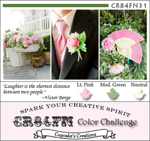
I love this week’s color combination for CR84FN. I’m getting this challenge in just under the wire, but missed the Waltzing Mouse Sketch challenge by just an hour or so! Here’s the color challenge:

CR84FN31 Graphic

And the sketch, even though it’s too late for the challenge:

WMSC51_thumb[1]

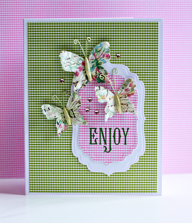
Here’s the card. No one specifically in mind for this one, so it will go into the stash. I pulled out a thank you note and a sympathy card this morning and sent them on their way. It’s good to have cards ready to go when you need them.

Enjoy

Supplies:

Cardstock: Select White (Papertrey Ink)
Patterned paper:  A Muse
Dies: Labels Four (Spellbinders)
Butterflies: Prima
Gems: Reflections (Michaels)
Sakura Jelly Roll Clear Glitter pen (for butterflies’ bodies; hard to see in the photograph)


In Appreciation

  • by

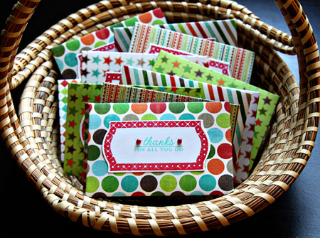
It’s that time of year here to express appreciation for all the work people do throughout the school year. Although I no longer have kids in school, I’m still involved with the Youth Ministry program at our church and have become the designated creator of gift card holders. The first batch I made with the new Papertrey Ink die “Seed Packet” after I saw these darling ones at Lime Doodle. The papers are all from MME’s Lime Twist “Fly a Kite” paper pad. Bright and cheerful, and good for both men and women. I cut the Fillable Frames #11 die and then stamped it with the coordinating frame. The sentiment came from Autumn Abundance, all Papertrey Ink products.

ThanksForAll

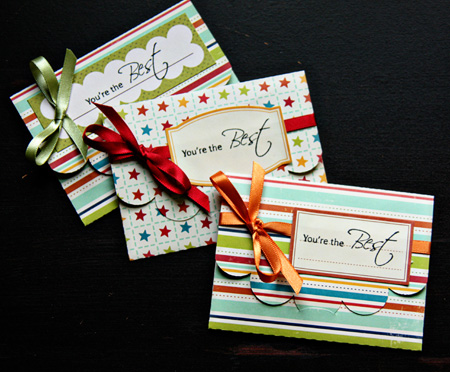
Then I made another set which I posted on the Scrap-Mart blog. These were cut on my Silhouette which makes short work of  projects like this. You can cut two at once from an 8.5X11 piece of cardstock. I used papers from October Afternoon’s Campfire papers, labels from the same line, and stamped them with a sentiment from Heartfelt Creations. On these I added a bit of ribbon.

GiftCardHolders

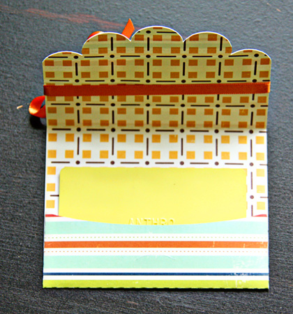
Both sets are cut from two-sided papers so the inside is pretty cute, too.

InsideGiftCard

Thanks!

  • by

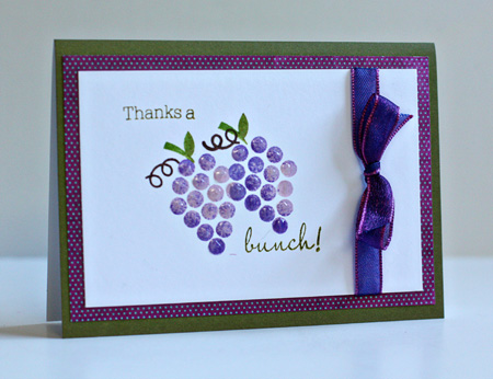
I have two thank you cards to share tonight. The first one is for two challenges, first a “fruity” challenge at the Simon Says Challenge blog and also for this week’s Make It Monday at Papertrey Ink. It’s been a few weeks since I’ve been able to play along there, and I’ve missed it. The technique this week is rock ‘n roll stamping. You can check out the video here.

ThanksABunch

I stamped the bunch of grapes (Fruit Fusion: Grapes–Papertrey Ink) first with Lavender Moon ink and then “rolled” it in Memento Grape Jelly ink. (How appropriate is that?) I painted on some Glossy Accents to give the grapes dimension and finished it off with the sentiment from the same set. The cute paper is from the MME’s Lime Twist “Happy Go Lucky” paper pad and the ribbon is from my stash. The premade card is from Memory Box. I love these cards because they have a white inside which makes it easy to write your note.

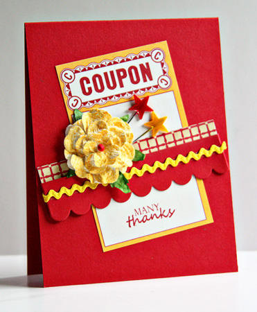
The next card isn’t for any challenge. I had some scraps laying around on my desk a week or so ago, and decided to put them to good use. It’s always good to have thank you notes in your stash.


ManyThanks

Cardstock: Pure Poppy (PTI); Patterned paper: Circa 1936 (Cosmo Cricket), journaling card (Jeni Bowlin); flower (Prima), sprayed with Mr. Huey mist (Studio Calico); star pins (Maya Road), one colored with Copic R29; die: small scallop (PTI); rick rack from stash.