Skip to content

90 Sensational Years

  • by

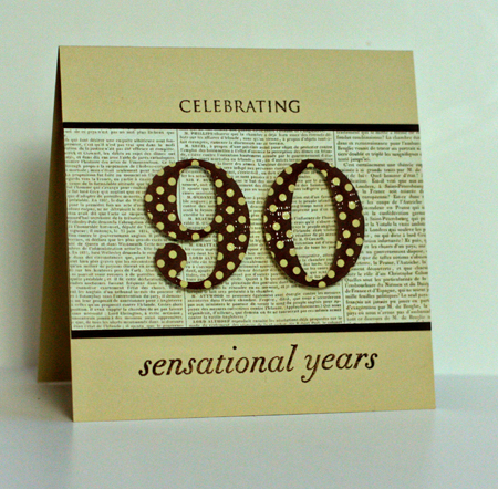
Today is Tracy’s stepfather’s 90th birthday. We’re celebrating Bill’s birthday on Easter when we’ll all be together at Tracy’s brother’s. We decided to make a donation to his favorite charity for his birthday since he doesn’t want any gifts. I was appointed to make the family birthday card, but I already had it done. I love this Papertrey Ink set and the number dies. They work for nearly any birthday. It’s safe to post the card today as Bill definitely does not read my blog!

90SensationalYears

Cardstock: Fine Linen, Dark Chocolate (Papertrey Ink); Patterned Paper: Turning a New Leaf (Papertrey Ink) & Conservatory (7 Gypsies); Stamps: Big Birthday Wishes (Papertrey Ink); Dies: By the Number (Papertrey Ink)

The Alphanumeric Blog Hop

  • by

Alphanumeric hop badge

Welcome to the Alphanumeric Blog Hop hosted by the fabulous Mel! You should have arrived here from the beautiful Peonies and Pennies.

TopTenTiles

It’s easy to see what number I drew. I thought it would be fun to share three Top Ten Lists.

First of all Ten Great Reads. I loved all of these books. It’s a mix of fiction and nonfiction. Hopefully some will be new to you, and worth adding to your “To Read” list.

Top Ten Reads

This I Believe

Undaunted Courage

The Happiness Project

People of the Book

True Notebooks

Intuition

Water for Elephants

Bel Canto

Three Cups of Tea

(Our local paper featured an article yesterday saying 60 Minutes would be showing a segment disputing the claims made in this book and the sequel, “Turning Stones into Schools.” I hope they’re wrong. This was a really inspirational read.)

Into the Beautiful North

(I recently heard Luis Urrea speak, and he was one of the most engaging speakers I’ve heard in quite a few years. I thought his book was equally engaging, and he was an author I had not heard of before.)

It’s been a few years since I did a “things I love” scrapbook page, so this seemed like the perfect opportunity to make a new one. It’s interesting how things have changed since my last one. The car and the computer are a bit newer, but essentially the same, but my camera and cell phone are much improved and many items on the list didn’t even exist when I did my last one. You can see that I kept the list to things. There’ll all things that make each day more interesting or much easier. If you click on the layout, you’ll be able to read the journaling.
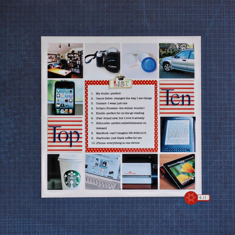
TopTenLO
The background paper is Scenic Route, the photo template by Kitty Designs, the small patterned papers by Collage Press and October Afternoon, and the two stickers from Echo Park’s For the Record.

And finally, a list of Ten Great Cardmaking Blogs, for although I love photography and scrapbooking, at heart I’m first and foremost a card maker. If you’re ever looking for inspiration for creating a card, you can usually find it somewhere on one of these blogs. They embrace every style from Clean and Simple to totally Vintage and Shabby Chic.

Ten Great Blogs by Card Makers

My Paper Secret

Inspired By

Jennifer McGuire Ink

Capture the Moment

Simply Stamped

Thinking Inking

Paper, Scissors, and Superheroes

Lime Doodle

Just Made From Paper

Lily Bean’s Paperie

Thanks for stopping by. You should be off now to Carrie’s “Rosalind Revival,” and I know you’ll have a great time there. And in case you’re lost in this wonderful hop, here’s a complete list of the blogs in the hop.

I Speak Melsh
BE Glorious

Captured On Film

Chatty Crafty Arty Pig

Creating Room

Curiouser and Curiouser

Daily Life – Bits and Pieces
Deb’s World Den’s Crafty Diary
From High In The Sky
Gallo Organico
Ginger’s Life Of Spice
Handmade By Kirsty
Havoc and Mayhem
Heather’s Scraps
Helena’s Creative Maven
Holaday’s Happy Hearts
Jeant-Jinnag
Just Jimjams
K’s Crafty Corner
Life…As I See It
{Life Behind The Purple Door}
Lisa E Design Blog
Living Life One Blessing At A Time
Mary’s Musings
Michelle Loves…
Obstinate Pursuit
Over At Our Place
Paper Turtle
Peonies and Pennies
Random Reflections
Rosalind Revival
Scrap Dreams
Scrappyjacky
Scrapworthy Lives
Staring At The Sea
Surefiredaisy Says
This Kalil Life
This Little Life Of Mine
Xnomads’ Blog
Make-It Monday 10

  • by

Make-itMonday

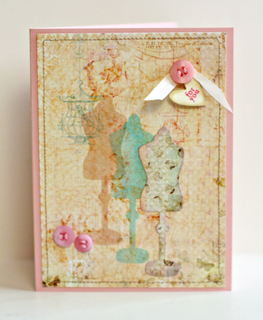
This week’s challenge at Papertrey Ink was to use a die as a mask. It’s not something I think to do often and it took me the better part of the week to come up with an idea. I ended up liking the card quite a bit, and think I’ll try the technique more often. It occurs to me that this also fits the challenge for a collage card at Mark’s Finest Papers.


MIMDressForm

I’m in love with these beautiful “Butterfly Garden” papers by Pinkpaislee which I stitched around and adhered to a piece of Sweet Blush cardstock. I cut a mask with the dress form die and inked it twice, overlapping the images. I used Tim Holtz’s Distress Inks, “Antique Linen” and “Milled Lavendar” on the first, and “Broken China” on the second. Then I die cut another dress form from the patterned paper and layered it on top inking around the edges with “Broken China Distress Ink”. The buttons and silk ribbon are from Papertrey as is the “Tiny Tag” with the sentiment.

Card Patterns Challenge and a Heads Up!

  • by

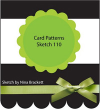
I really enjoy sketch challenges. They give you a direction, but don’t dictate too much. Once I saw the current sketch challenge on Card Patterns I knew what I wanted for the focal image, and I knew I wanted to use my new paper pad “Butterfly Garden” by Pinkpaislee. I love the soft colors and they just say “spring” to me. Here’s the sketch:

Sketch110

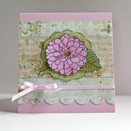
And here’s my take on it:

CardPatterns110

The focal image is from the Delightful Dahlias set by Papertrey. I colored it with Copic markers on the new X-Press Blending cardstock that Copic put out this year. I love this paper for coloring; it’s very smooth, very white, and the colors blend beautifully. I’ll be keeping a folder of it in my drawer. I stamped some text on the patterned paper cut from the Big Scalloped Circles die by Spellbinders with Background Basics: Text Style (Papertrey), stitched the patterned papers together and cut the scallop with Papertrey’s medium scallop border punch. The gingham ribbon is from my stash.

And a head’s up! This Sunday the fabulous Mel is hosting a blog hop! Be sure to come back and check it out.

Alphanumeric hop badge

I’m off with a friend tonight to hear Alice Hoffman speak. I love her novel “Story Sisters,” despite the fact that magical realism as a genre has never appealed to me. Nonetheless, I had a hard time putting the book down, and I’m anxious to hear her.

Emboss Resist–A Challenge Card

  • by

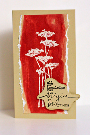
I just recently discovered the challenges at Mark’s Finest Papers. This week’s challenge is to use the emboss resist technique. It’s been a long time since I used this technique, but on Monday I purchased a few bottles of Tim Holtz’s Distress Stains and thought it would be fun to try them. The card came together really quickly.

EmbossResist

I started by stamping the floral image from Unity’s Insightful Meadows with Top Boss ink and embossing it with clear embossing powder. Then I applied Antique Linen Distress Ink, but wanted more color. Fired Brick certainly solved that problem! I tore the sides of the image and adhered it to a card made from Fine Linen (Papertrey Ink). The sentiment is also from Insightful Meadows. I hand cut it and used Papertrey Ink’s Chamomile Tea Dye ink to distress it before adhering it with dimensional adhesive.

Make-It Monday 7

  • by

Make-itMonday

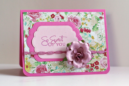
I missed participating in last week’s Make-it Monday at Papertrey Ink. I had this beautiful patterned paper from Emma’s Shoppe by Crate Paper laying on my desk after finishing a scrapbook layout so decided to get busy with this week’s challenge:  heat embossing. The card is so simple, you’d think it came together in no time, but it was one of those cards that had multiple iterations before I ended up with this:

MIMSoSweet

I heat embossed the sentiment from Signature Greetings, one of my all time favorite sets from Papertrey Ink. The cardstock is also from PTI–Hibiscus Burst and Sweet Blush. I found a jar of these beautiful roses on clearance at Michaels last week. It needed a bit of color so I misted it with Tattered Angels Creme de Rouge. The trim is from my stash and colored with a RV32 Copic marker.

Two Cards; Three Challenges

  • by

This is my second post today, for the Team-up Thursday and Kim Klassen’s texture photography challenges, scroll down.

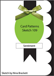
I’m on a roll this week with card challenges and enjoying it! For my Mother’s Day card, I used a sketch from Card Patterns . . .

Sketch109

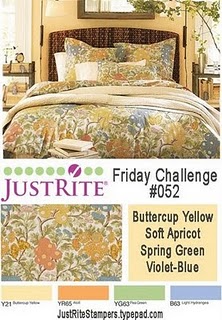
and the Just Rite Color Challenge.

Justrite inspiration


Here’s my take:

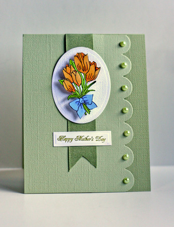
HappyMothersDay

I used two Just Rite stamp sets, “Breath of Spring” and “Happy Everything.” The two yellows and the blue in the challenge show up on the tulip image which I colored with Copic markers. The green became the card base and scallop. The dies were from Papertrey (medium scallop) and Spellbinders (tag), the ribbon from my stash, and the pearls are Hero Arts. We’ll be away for Mother’s Day so I’m happy to have this ready to put in the mail to my MIL.

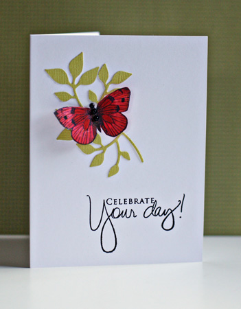
The next card is for the Less is More challenge, “a touch of red.” I had a red butterfly left from a previous card this week, so this card came together quickly. I’m very happy with it, and think it’s a design I’ll use again.

CelebrateYourDay

The cardstock is Select White from Papertrey, and a green textured cardstock from American Craft. The brand of leaves is a Sizzix die, and the stamp are Hero Arts (butterfly) and Papertrey (sentiment.)


Celebrate

  • by

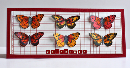
I have a blogging friend who excels at combining card challenges. Yesterday’s post was simply luck, but this time I set out to combine the sketch from Clean and Simple with the Challenge to “spotlight an animal” on a card at Mark’s Finest. Here’s the sketch which I stretched out so all my butterflies would have enough room. This card fits into a buisness style envelope perfectly.

FTL134

Here’s my take on the challenges.

Butterflies

I’m really happy with this card, and it’s in an envelope ready to send off to a good friend for her birthday later this month. The cardstock is Bazzil Blush Red Dark. It has a slight texture to it, and next time I’m at an Archiver’s I’ll be looking for more of it. The patterned paper is from October Afternoon’s Road Map series, and the tiny stickers are Cosmo Cricket. The butterflies are from an older Hero Arts clear set. Somehow I lost the name of the set, and I don’t think it’s available any more since I couldn’t find it on the HA website. All the butterflies were colored with Copic markers and then enhanced with Spica glitter pens. The photograph doesn’t pick up the sparkle very well but it’s definitely there IRL.

We are celebrating here as Matt got word yesterday that he has a full-time job with benefits in Denver, CO starting May 2. We’ll be leaving the end of the month to help him with the move, and then extending our trip to visit friends and family in Arizona, and Sarah and Adam in California. Can’t wait!

Card Set–Three Challenges

  • by

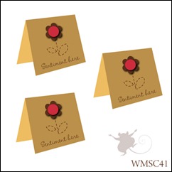
It’s not often that there are two challenges looking for the same kind of project. But the Waltzing Mouse Stamps challenge this week is to create a card set.

41-Sketch_thumb5

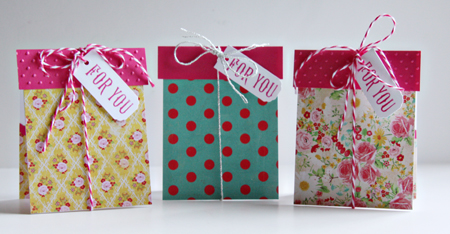
And yesterday Moxie Fab World posted a similar challenge for a card set. Today Cath posted a second challenge for Gift Card Holders, and as it happens, my card set is a set of gift card holders!

GiftCardSet

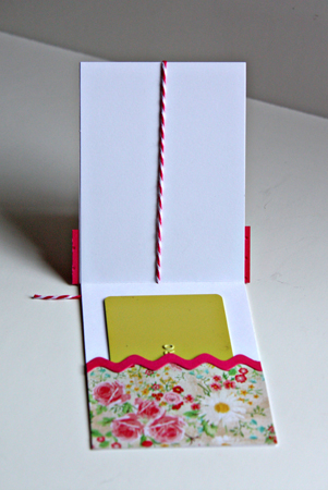
These 3X4 inch cards were designed as tiny packages that open to reveal another gift:

InsideGCHolder

I recently got the new Crate Paper “Emma’s Shoppe” paper pad, and all the patterned papers are from there. The cardstock is Neeah Solar White, and the bright pink came out of my scrap folder. I used a Sizzix embossing folder, the Papertrey Ink rickrack die, and some twine from Paper Source (silver) and The Twinery. The sentiment is from Waltzing Mouse Rescue Remedies Additions. I couldn’t find a tag die the right size so I cut them myself and used an old decorative corner punch from Carl.

Embellish Trim & Color Trend Challenge

  • by

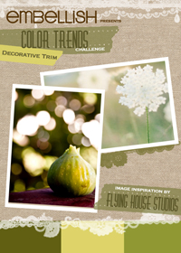
I wanted to make a thinking of you card to send to Deb’s mom, and thought I’d combine it with the current Embellish challenge. Here’s the Embellish color  inspiration:

DecorativeTrim_ColorTrimsChallenge

In addition to the color challenge, decorative trim also needed to be added to the card. Here’s my take on the challenge:

SendingYouEmbellish

Once again, the green seems much duller looking on Type Pad than IRL or on my monitor (which is color calibrated, to boot!). So frustrating! The card base is PTI’s Ripe Avocado and the sentiment panel is PTI’s Spring Moss. The patterned paper is from the Gertie pad (Stella and Rose by My Mind’s Eye). I’m loving these paper pads for card making! The stamp is Sending You by PTI. The first time I saw it, I didn’t think I’d add it to my collection, but I’m so happy I did. The sentiments and “frame” are so versatile, I know I’ll be using this again and again. The ribbon is from Paper Source and the pins came with a scrapbook kit, but I think they might be Maya Road. I also added some sage Flower Soft to the middle of the flower.


Picture Inspiration: Infinity (and a card)

  • by

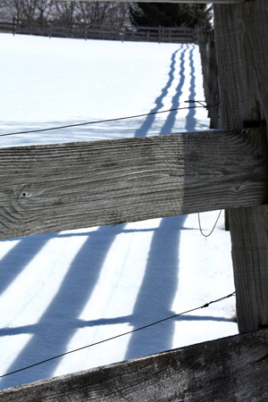
This week’s prompt was to work with diagonal lines that lead the eye to infinity. It was not an easy task. I went out shortly after we got the prompt. We had just had several inches of snow (again!) and I was hoping to find a good fence to photograph. I found one, but couldn’t position myself so the line would go into the negative space. My favorite shot from this outing uses the shadows rather than the fence to lead your eye through the photo.

  DiagShadowsw

Nonetheless the diagonal is not a strong one, so yesterday I drove up to Charlotte Beach to take a photo of the pier. It’s closed to pedestrians now, but I was able to get a couple of decent shots from the beach. (Let me say, however, it was really cold out there!) This one is the best for the diagonal line.

Lighthouse1w

But the next photo shows the waves caused by the stiff breeze that made it so cold.

Lighthouse2w

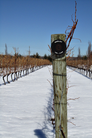
And here are a couple of shots from the archives.

RiverWalkw

GrapeVinesw

OnTheRoadw

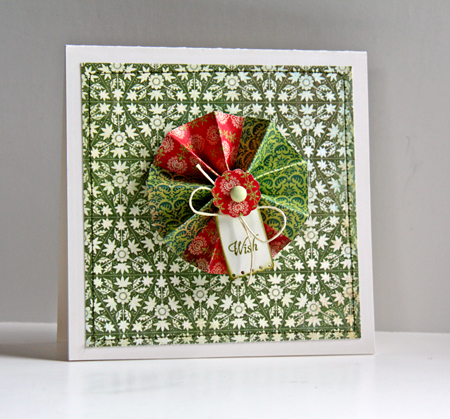
Yesterday I found a tutorial on making the paper medallions I see so frequently. So this morning, rather than just bookmark it (and forget it) I decided to try it. I just got a 6X6 paper pad called Hello Luscious which I used for both the medallion and the mat on the card. I like the card, but it would be nearly impossible to send through the mail (and I think too thick for a scrapbook page as well.) Fortunately I have a friend who will get this card hand delivered on her birthday in May.

Wish

Other products: Cardstock:  Vintage Cream (PTI); Stamps: Tiny Tags (PTI); Brad: Sassafrass Lass; Dies: Big Scalloped Circles (Spellbinders) and Tiny Tags (PTI); Twine from my stash


Masculine Color Trends Challenge

  • by

I need a few birthday cards for guys so thought I’d participate in Embellish’s latest challenge.

ColorTrends_Masculinew

I must admit I would never put these colors together, and it was a bit of a challenge. I cased this card by Nicole Heady, and I’m pretty happy with the end result.

  EmbellishMasculine

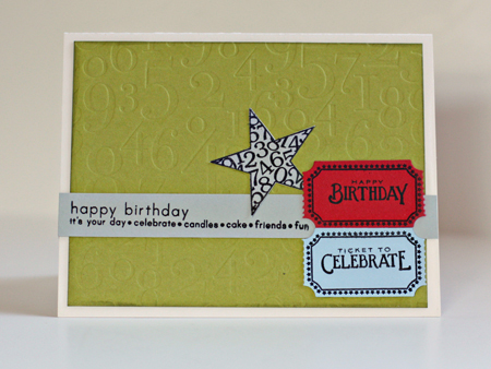
The green is showing up here on Typepad as much more muted that it is IRL (despite two efforts to correct it. It looks exactly right on my monitor). I used Pure Poppy, Spring Rain, Simply Chartreuse, & Vintage Cream cardstock from Papertrey Ink along with Light Morning Mist from Worldwin. I embossed the background paper with By the Numbers impression plate and distressed the edges with Peeled Paint distress ink. I used three different stamp sets (all Papertrey): “Simple Sentiments,” “Just the Ticket,” and “Star Prints.” This was an easy card to duplicate, so I made three of them.

Photography & Card Making–Two Challenges

  • by

MIM&Proj64

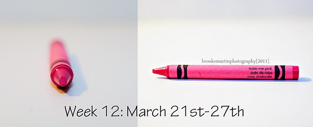
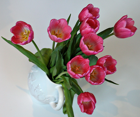
It’s not often I can combine a photograpy challenge with a card making challenge, but this week was easy. As soon as I saw the new color at Project 64, Tickled Pink, I knew it was a perfect match for Papertrey Ink’s Hibiscus Burst.

Wk12 March21_27 TicklePink
 

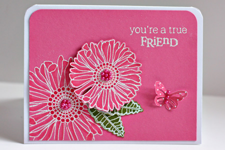
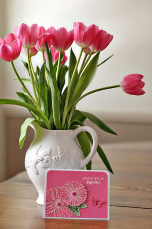
The challenge for Make It Monday was to use Copic Markers on colored cardstock. So I pulled out one of my favorite stamp sets, Friends Til the End, and embossed the flowers with Filagree White Embossing powder. I use the Hibiscus Burst Copic Trio (RV10, RV13, Rv14) and YG03 & YG05 to shade the Simply Chartreuse leaves. A few Memory Box pearls and a Martha Stewart butterfly from Bitty Dots finished it off.

MIMFriendw

The card wasn’t the only find for Tickled Pink, however.

Card&Tulipsw

Trying some new perspectives:

Tulips1w

Tulips2w

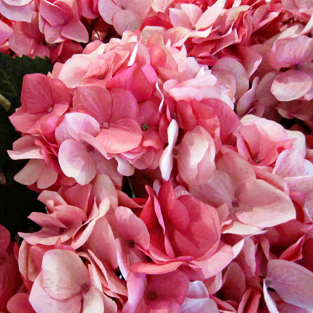
Pottery Barn flowers I noticed as I walked by the entrance this week:

PBFlowersw


Papertrey March Blog Hop
  • by

Bloghoplogo

It’s time for the Papertrey Ink monthly blog hop. How did it get to be the 25th already? I must admit, however, March is one of my least favorite months. I’m so ready for Spring by now, and we are once again buried under in several inches of new snow. Once April comes, I always feel like Spring has a chance!
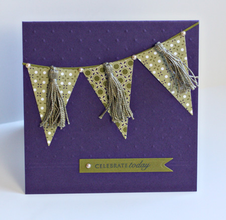
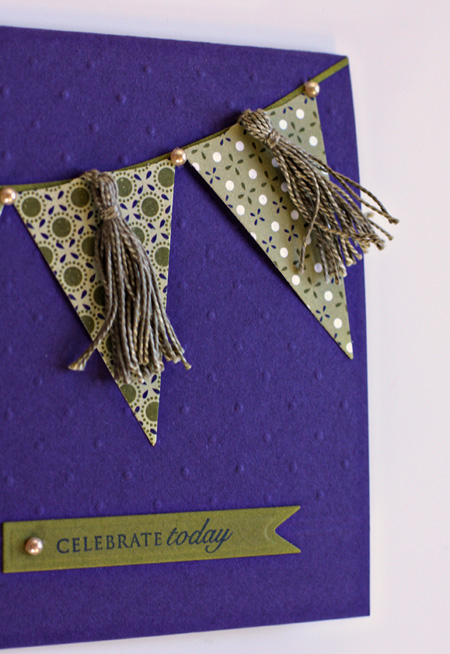
This month’s challenge was to use embroidery floss in a creative way. I decided to make some small tassels to attach to some pennant flags. I used the Pearl Cotton floss which is a little heavier, but can be found right along side the regular floss at Michaels. To create the tassels,  I used a tutorial I found here. It was very easy to follow.

PennantCardw

PennantDetailw

This turned out to be a very difficult card to photograph so the embossing would show.  I used the partial embossing technique again which I’m liking a lot, and scored two lines at the bottom of the embossed portion of the card. The pennants and banner die for the sentiment are from the Spellbinder’s Nested Pennant set. The banner line is cut from Quickutz Pennants set, and the embossed portion of the card was made with Papertrey’s Tintype Impression plate. I used Papertrey’s Royal Velvet cardstock and two designs from their Pacific Vineyard pad of papers. The sentiment is from the Papertrey “Round & Round” set. Finally, the pears are my faves: A Muse Creative Candy.


JustRite Friday Challenge: An Act of Kindness

  • by

This is the first time I’ve participated in a Just Rite challenge although I’ve long been a fan of their stamps. This challenge comes at a perfect time since I depleted the entire stash of thank you notes on Monday after writing all the friends who have helped us out since my surgery.

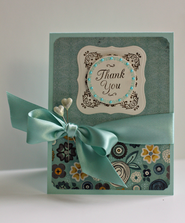
JRThankYou

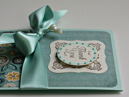
JRThankYouDetail

I combined two Just Rite sets for the focal point: the square frame come from the “Hope” set which I then cut and embossed with a Nestabilities Label One die (Spellbinders). The circle and border come from “Just a Note” which I cut with a Nestabilities Circle die. The bow is made from my favorite ribbon from The Paper Source. It’s two-sided satin which makes it so much easier to tie. The tiny pearls (which match more accurately IRL) are A Muse Creative Candy and the two stick pins came from a Scrapbook Circle kit. The beautiful papers are more My Mind’s Eye; this time from the Hattie paper pad. The card base is Aqua Mist from Papertrey.