Skip to content

A Bit of Green for Two March Birthdays

  • by

My brother-in-law and my niece’s husband both celebrate March birthdays, so the Simon Says Challenge this week for a “bit of green” fit the bill perfectly. 

Star1

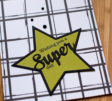
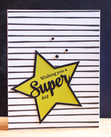
I started with PTI’s Enclosed Star die and stamp, cutting twice, once in green (Simply Chartreuse) and once in black and piecing them together. A few black enamel dots finished it off. Pretty quick and easy.

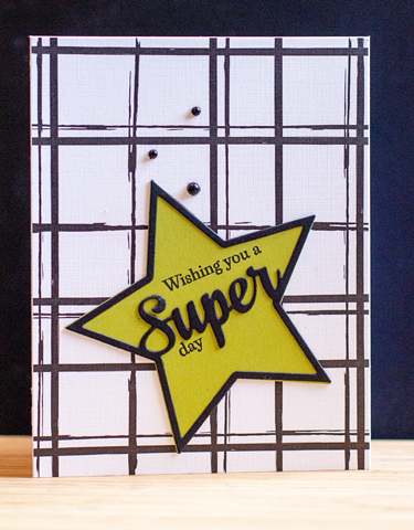
For the next card, I switched out the patterned paper (from the same pack).

Star2

Here’s a closer look:

Star2Close

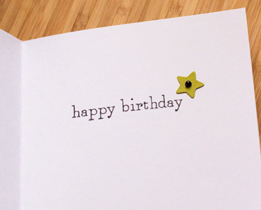
And the  a peek at the inside:

StarInside

Linking up to Simon Say’s Wednesday Challenge.

Wednesdayblog-logo

February Papertrey Ink 2016 Blog Hop Challenge and Pretty in Pink

  • by

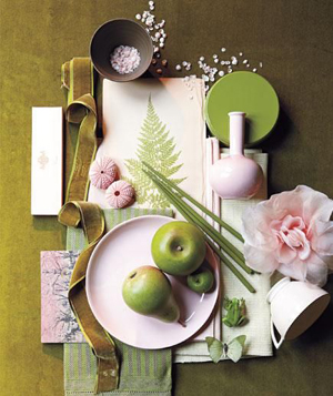
The inspiration piece for this month’s blog hop at Papertrey Ink is so lovely, soft and springlike.

PTI Feb Blog Hop

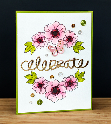
It was a great color combination for an early April birthday card that I was getting ready to work on when this inspiration piece appeared. I’d already chose the Bold Blooms watercolor paper by Papertrey Ink, so pulled out my Kuretake watercolors, and mixed up some colors to match.

PTIBlogHop

After it was watercolored, I adhered it to a Memory Box green card, added a gold die cut sentiment that was in my “die cuts to use” box, and added a few sequins. 

DebbieClose

The last touch was to add the butterfly from the inspiration piece. I used an old Martha Stewart punch and a piece of patterned paper with gold dots from the “Fancy That” paper pack by MME. It wasn’t quite the right color of pink, so I added a wash of watercolor to it, and now it’s just right.

You can check out the other creations right here.

I’m also linking this up to the FUSION challenge, Pretty in Pink. I channeled the color and also the blooms!

FusionPrettyinPink


Color Throw Down

  • by

I’ve been working on getting the cards made that I need for the next month and a half. While I had a die laying on my desk for another project, I happened across a blog where the card maker was participating in a challenge called “Color Throw Down.” I was unfamiliar with it, but when I saw the colors for this week, I knew I’d participate. The die I had on the desk worked perfectly for it. It’s one I purchased some time ago, but hadn’t put to use. Here are the inspiration colors.
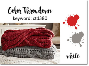
Color Throw Down

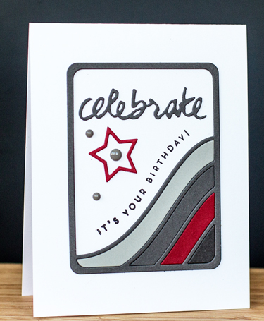
My new bathroom is functional, and almost totally “decorated.” When I post photos, you’ll know this color combination is right up my alley! It’s been painted two shades of gray with white woodwork and red accents. Even the shower curtain in red, gray, and white. Since I had to make several runs through the die cutter for the first card, I had extra pieces for a second card as well. 
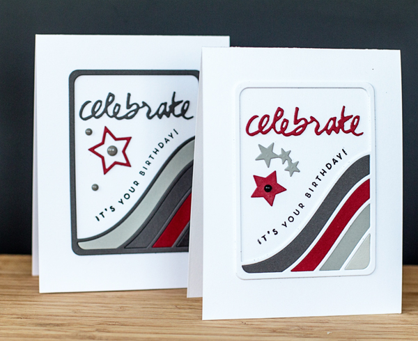
 

Celebrate2cards

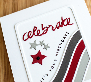
Aside from the multiple cuts on different colors of paper, this comes together quickly. I used “Fog” and ” “Smoke” from Simon Says, and “Select White,” “Pure Poppy,” and “Smoky Shadow” from Papertrey Ink. The die is the “Stars and Stripes Photo Card” by Frantic Stamper. Although it includes a die cut for “celebrate,” I preferred the Wet Paint II die from Papertrey.
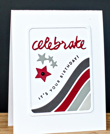
Celebrate1

CelebrateClose

Celebrate2

The star dies are also included, and that worked out well. An enamel dot or two and the cards were done.

We’ve had a busy weekend, and I’ll be back tomorrow to participate in Memorandum Monday. Hope your weekend is going well.
Happy Valentine’s Day

  • by

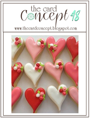
I’ll be back tomorrow with some more valentines to share for Memorandum Monday, but today I have one to submit to the Card Concept challenge blog. Here’s the inspiration photo:

CardConcept48 copy

Clearly, the hearts were my inspiration.

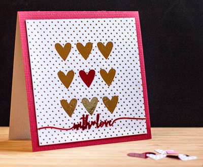
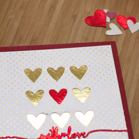
WithLove

I have to admit that photographing valentines can be a challenge in itself, especially when reflective papers are being used. I started with a piece of patterned paper from Teresa Collin’s “Studio Gold” collection, then die cut Simon Say’s “Heart Tic Tac Toe” from the middle and backed it with red and gold foil paper from Michaels. The sentiment is one of the dies from Papertrey’s “Swoosh” set. There are a variety of categories to choose from at Card Concept, but I guess this fits the CAS Layered category the best.

Here’s another look at it.

WithLoveClose

Tracy outdid himself this Valentine’s Day. I received a gorgeous bouquet of flowers, a charm for an Alex and Ani necklace, and a gift certificate for a facial. I’m a spoiled lady! Our duplicate bridge group is playing this afternoon (very unusual; it’s usually a Saturday night), and then we’re off to dinner (again!) with friends. It’s been a cold, but festive weekend.

Addicted to CAS: Bloom

  • by

The current challenge at Addicted to CAS is Bloom.

ATCAS - code word bloom

We could all use a bloom or two here today. The high was 0° and the wind is blowing hard enough that the wind chill was predicted to be -24°. I ran a few errands after helping register folks at a conference this morning, and decided I was not going out again although I should have gone to the gym. I stayed home and made soup instead.

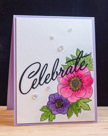
Tomorrow is my niece’s birthday. I know she reads my blog, but I hope she’s already opened the card, or won’t have time to check here before she opens this card tomorrow. I thought she should have some blooms as well. I’m guessing it’s just as cold or colder in Vermont.
JasmineBD

I chose not to purchase the “Bold Blossoms” stamp set last month at Papertrey Ink, but I did buy a pack of the watercolor sheets that already have the blossoms printed on them. I used my Kuretake watercolors. They’re not quite as transparent as the Daniel Smith ones in my palette, but they are vibrant and colorful. After watercoloring the flowers, I die cut the sentiment with “Birthday Cheers” die, and added a few Pink Posh sequins. The card was in my stash, but I’m pretty sure it’s a Simon Says cardstock.
We’re off to friends for dinner, so I am going to have to bundle up one more time.

Addicted to CAS: Red

  • by

A quick post to enter this week’s challenge at Addicted to CAS. 

ATCAS - code word red

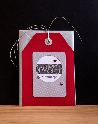
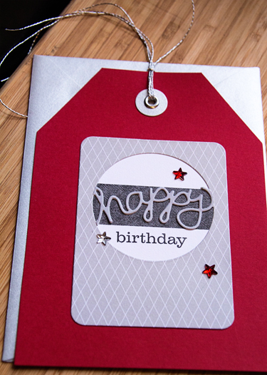
Red is my favorite color, so I wanted to play along. I started with a Paper Source tag and envelope that’s been in my stash for a long time. 

HBJune

I cut some Amy Tangerine “Plus One” patterned paper with Papertrey’s Phrase Play #5 die, backed it with a strip of paper from the scrap dish and some white card stock. I cut a second Phrase Play die from gray card stock, cut out the “happy” and layered it over the original. The stamp was also Phrase Play #5. Three Jenni Bowlin rhinestone stars (also in my stash forever) and some silver thread finished it off.

HBJuneClose

I love the silver envelope, and am glad I still have a couple of these tag sets left in my stash.

Simon Says Wednesday Challenge: Ombre

  • by

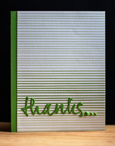
Having been on the road, I’m taking a quick and easy route to entering this week’s Wednesday Challenge, Ombre, at Simon Says. Papertrey Ink recently introduced a new paper pad called Ombre Stripes, and I snatched up a set. I’m always in need of a thank you card, and this was a quick one to create.

Thanks_blog

Among the many things I love about Papertrey Ink is how the products coordinate with one another. The ombre striped paper is a variation on New Leaf card stock, so I trimmed off one edge of the paper so there would be a border on the side. The sentiment is from the Wet Paint series of dies, and the enamel dots are My Mind’s Eye.

I have a whole list of crafty projects I’m hoping to get to now that we’re home, so hopefully, the blog will be a bit busier.

Less is More Challenge

  • by

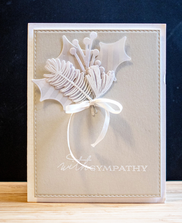
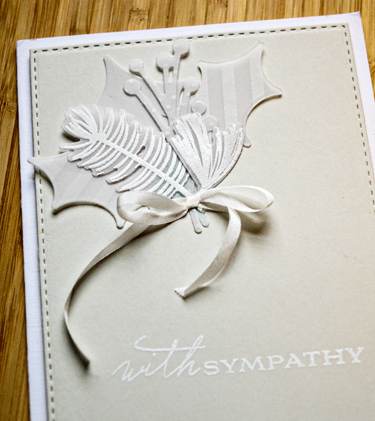
This week’s challenge at Less is More is NEUTRALS. I rarely create a sympathy card with much color, and this one is all neutrals. It might be one of my favorite sympathy cards ever.

SympathyCard

I started with a Fog card cut with Simon Says “Stitched Rectangles,” embossed the sentiment from Papertrey Inks “Botannical Silhouettes” and then arranged a group of die cuts from PTI’s “Spruce and Sprig” cut from a variety of patterned and plain vellum. The silk ribbon bow is also Papertrey Ink. They no longer carry the ribbon, so I use it sparingly. The fog card was then attached to a card of Fresh Linen (also PTI.) Here’s a closer look:

SympathyClose

The first challenge of 2016. I think I’ll try to keep track of the number of challenges I enter this year. I’d like to do one once a week, so 52 by the end of the year would be awesome. Most likely they won’t be week by week, but that’s OK too.

DECEMBER 2015 Papertrey Ink BLOG HOP CHALLENGE

  • by

Pti

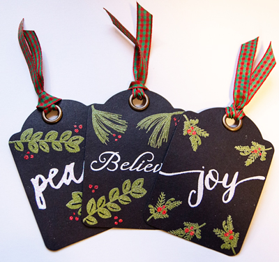
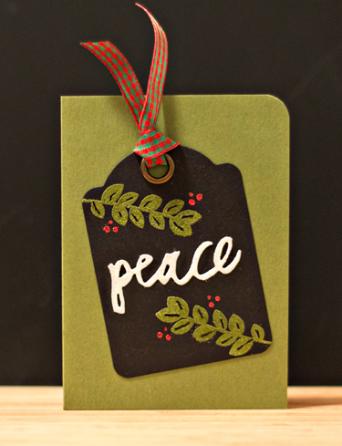
Today is the Papertrey Ink December Blog Hop. It was the colors of the inspiration piece that got to me, and I grabbed a few minutes when I first saw it to create three tags. I didn’t have anything specific in mind for them when I made them.

PTI3Tags

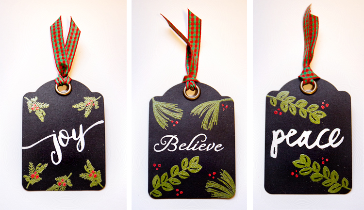
The tags were premade by Graphic 45, and then stamped and embossed using Papertrey Ink’s  Spruce and Sprigs, the Holiday Folk Mini-Market kit, Rustic Wreath,  and Believe. The “joy” is from WPlus9’s Hand-lettered Holiday set. Here’s a look at them side-by-side.

3Tags

Then just this week, I needed two quick cards, so two tags were quickly adhered to some Paper Source 4-Bar cards. I had time to grab a shot of just one of them.

PTICard

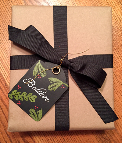
The last one was used on one of the Christmas presents. I ended up switching out the plaid ribbon for some gold thread.

PTIPackage

We’re on the road today, but Tracy assures me I’ll be able to link this up to the hop when the time comes. When I get to our destination I’ll be checking in on the rest of the blog hop projects which you can find here.

Papertrey November 2015 Blog Hop Challenge

  • by

Two days ago, I woke up with ideas for this month’s blog hop. I wanted to try the watercolor technique with the Spruce and Sprigs stamps, and it took awhile before I got anything I was happy with. I tried painting directly on the stamp with watercolor paints which I’ve see done on the card blogs with great effect. I never managed to get the right consistency, so I went back to using the Papertrey inks and spritzing them with water. I also added water directly to the watercolor paper before stamping.

The inspiration piece for this month uses pretty non-traditional colors, but I ended up liking them a lot. 

NovPTIBlogHop

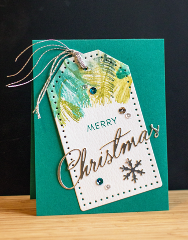
Here’s the first of two cards I created with the watercolored images.

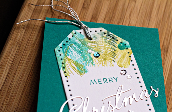
PTIMerry

I cut the watercolored piece with the Stitched Tag die and adhered it to a Tropical Teal card. Then I added a die cut sentiment (Christmas Cheer) and a snowflake (old Sizzix die) from silver adhesive paper and some sequins. The “Merry” came from the Stylish Sentiments: Holiday set from several years ago. I tied two different kinds of silver twine through the tag to finish it off. I also added some Clear Star Gelly Roll pen to the sprigs. 

MerryClose

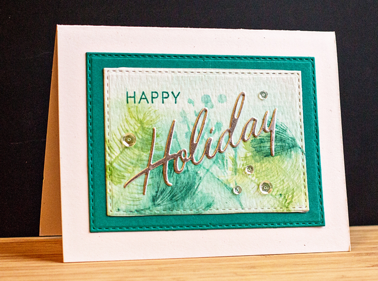
Only one card can be posted for the blog hop, so I thought I was done, but as I was cleaning up, I picked up another piece of the watercolored paper, and came up with another card, which I like just as much.

PTIHoliday

Most of the supplies are the same. The two stitched rectangle dies are from Simon Says and they’re added to a Rustic White card base. 

You can find more holiday inspiration on Nicole’s blog right here.

Ten Things on Tuesday

  • by

On this week of Thanksgiving celebrations in the U.S., the Ten Things prompt is so appropriate:  10 Things You’re Thankful For. I have a lot more than ten, but these came to mind in a matter of minutes.

  1. Our health
  2. Our family
  3. A wonderful marriage
  4. A warm and comfortable home
  5. Good friends
  6. The library
  7. Retirement
  8. Crafting space and crafting time
  9. Photography
  10. The internet—source of inspiration and ongoing learning

And a big part of the inspiration I get comes from this wonderful blogging community, so this card’s for all of you! Thanks for visiting, for taking the time to comment, and for including me in your blogging family.

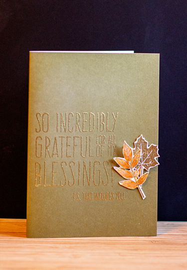
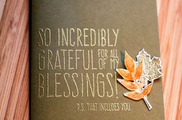
  Grateful


All the supplies except the card (Memory Box) came from the November Simon Says Card Kit. I’m linking this to the Simon Says Monday Challenge:  Thanks/Thanksgiving. 

GratefulClose

Hope your week is off to a good start!


Card Concept Challenge

  • by

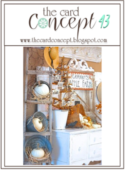
It’s been quite awhile since I participated in a card challenge, but the fall inspiration at Card Concept caught my eye this week.

Card Concept

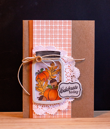
It’s an interesting challenge since you must identify your entry by its style. Typically that would be an easy one for me since most of my cards fit the category of Clean and Simple. But not this one, which was made specifically for a friend who definitely falls into the more Shabby Chic /Country category. I suppose it could also fit the Layered Clean and Simple style, but the doily, the twine bow, and button seem to put it in the Shabby Chic category.

SueBD

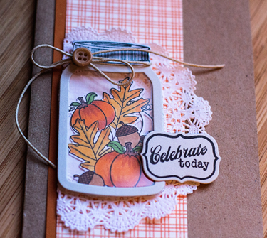
When I was die cutting and coloring images for Skylar, Ella, and Caleb’s Halloween cards, I die cut and colored some of the other images from Friendship Jar: Fall Fillers by Papertrey Ink. I was happy to have this one already for a card when it came time. I die cut the Shaker Friendship Jar, backed it with clear cardstock and bumped it up with some fun foam before adding the fall images. The patterned paper is from a Papertrey Ink pack called Autumn Abundance—just perfect!

SueClose

My thoughts and prayers are with all those who have suffered losses in the horrendous massacres in Paris this weekend. The world can be a very frightening place these days, but I do believe that it’s important to carry on so that the terrorists do not win this battle of fear and intimidation. Nonetheless, it gives one pause.


Papertrey October 2015 Blog Hop

  • by

This month’s inspiration piece for the Papertrey Ink blog hop is just gorgeous, and although I am so not ready to think about Christmas, I really wanted to create something for the blog hop.

PTIbloghop

Right before we left for Chicago, I grabbed a little time and sat down to make a tag. It gave me the perfect opportunity to use the new Mini Market Kit:  Holiday Folk. From the inspiration piece, I used the tag, and the color combination—Pure Poppy and New Leaf.

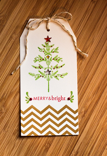
PTITag

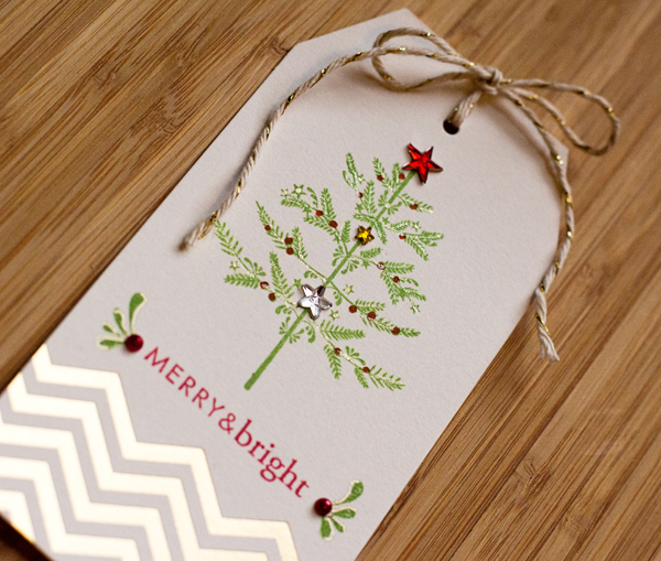
I picked up a pack of these beautiful gold embossed tags in August at The Paper Source thinking they’d be great for the holidays. I stamped the tree and the sentiment embellishment from the Holiday Folk set, and the sentiment from the 2009 Holiday Tag collection. I colored the berries with a red gel pen and covered the stars with some glittery stars from my stash.

TagGlitter

I also added some Clear Star Gelly Roll along the branches and outlined the sentiment embellishment and put a dot of gold in the tiny stars with a gold pen. It’s a bit easier to see here than in the first photo. You can check out other Christmasy creations right here on Nicole Heady’s blog.

A Card for Two Challenges

  • by

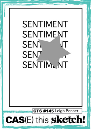
It’s been awhile since I’ve entered a card in a challenge, although I do keep track of them in Feedly. Yesterday I saw two different challenges, and knew immediately what I wanted to do. (Rather unusual, I must say.) The first is a “word” challenge and the other is a sketch challenge.

Week 168 - YOU revised

CTS_145

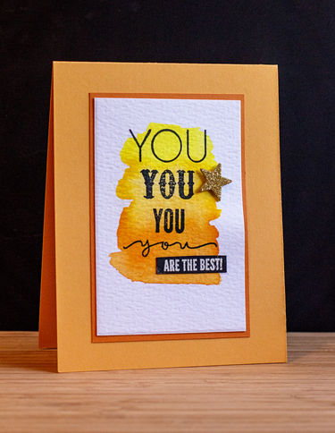
For once, the card materialized just the way I envisioned it. It was a quick one, once the watercolor background dried.

You

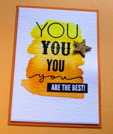
I started with a piece of Tim Holtz watercolor paper and spread some Kertake watercolors around. I have several different kinds of watercolor, but these seem to work best for this technique. All the stamps are from a small Simon Says set, “You.” Usually I use the coordinating die, but this time the word in the different fonts worked perfectly for the sketch. The last part of the sentiment was white embossed on black paper, and it was all mounted on Orange Zest and then on a Summer Sunrise card. I decided I didn’t want the star covering part of the sentiment so I took a little liberty with the sketch.

YouClose

You can check out the other entries for CAS(E) this Sketch here, and for Caseology here.


Birthday Leaves and Less is More Challege

  • by

Shortly before we left on our summer travels, I purchased a wonderful stamp with a graphic leaf design from Simon Says (“One With Nature”). I’m in need of several birthday cards for September birthdays, so it seemed to be a good stamp to put to use. I’m really pleased with the results. Both are for good friends (one female and one male.) The stamp worked well for both.

The first one meets the challenge at Less is More this week. It’s a color challenge of green and gold.

HBLeaf2

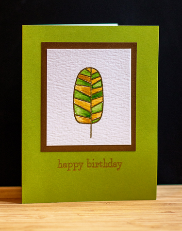
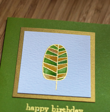
After gold embossing the leaf on watercolor paper, I used my Kuretake Gansai watercolors to color the leaf. The card is from Memory Box. I would love to find more of these in a variety of colors, but a search on the internet doesn’t produce much. I’m guessing they’ve been discontinued. They’re a wonderful cardstock, colored on the outside with a bright white interior. The gold paper framing the watercolor is from Paper Source, and the sentiment is from Papertrey’s “Petite Pots.” (Also a new stamp set ordered before vacation.)

LeafClose

This shows the lovely gold much better. 

This seemed a bit feminine, so for our other friend, I stamped the leaf in black, and colored it with some watercolor markers Sarah and Adam gave me for Christmas—Akashiya SAI. This time I mounted it on a scrap piece of black card stock and then to a Hero Arts kraft card.

HBLeaf1

We’re off to an annual Labor’s Day barbecue at friends–always held on Sunday rather than the actual holiday. It’s hot and humid, much more like July than early September.