Skip to content

Just a Note: Three Challenges

  • by

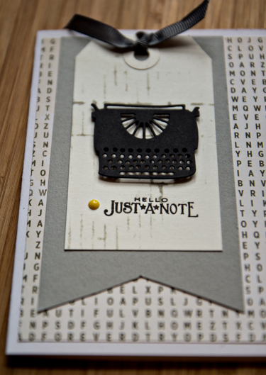
Yesterday I received an email saying a gentleman who serves with me on a Presbytery committee had been admitted to the hospital. I wanted to get a card and note off to him.

JustANoteClose

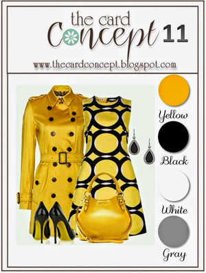
This card actually fits three current challenges, although I didn’t start out to meet the requirements of any of them. The first is one I’ve never entered before, “The Card Concept.” There’s an inspiration piece and in addition, you need to identify your card by type. This card fits the “Clean and Layering” category, and includes the following color challenge:

CardConcept

The CAS-ual Friday challenge is to create a masculine card with the following catch: no kraft cardstock, and you must use some ribbon.

Cfc132

And finally, the Simon Says Wednesday Challenge is to create a masculine or Father’s Day card.

Wednesdayblog-logo

JustANote

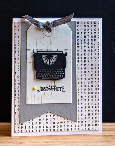
I started out with the cute Savvy die cut typewriter which was  already in my die cut basket. I pulled out an Avery tag, and used some Tim Holtz Distress Ink with a Crafter’s Workshop stencil to createsone interest on the tag. The sentiment on the tag was stamped with Papertrey Ink’s “Just The Ticket.” When I looked through my patterned paper I found the perfect match for that from Pink Paislee’s “Vintage Vogue” collection. After tying on some gray grosgrain ribbon, I layed the tag on the patterned paper and realized I needed some plain cardstock between it and the patterned paper. I hand cut a larger tag with Simon Says “Smoke Gray” cardstock, and adhered it all to a Rustic White cardbase (Papertrey Ink). Since the sentiment wasn’t stamped perfectly in the center, adding the yellow enamel dot emphasized the sentiment, and was the final color needed for the Card Concept challenge. I hope it cheers up my friend, Ben.

May Papertrey Ink Blog Hop Challenge

  • by

Not that any month seems to drag along any more, but May has really flown by. We spent all day yesterday helping Matt and Betsy move to a new (to them) house just five houses away from their previous home. They’re expecting #2 in November (!!!!) and this house has quite a bit more room, and a fabulous, huge, fenced-in yard. They’re going to love it there. We’ll be back there again today helping them get settled. When I got home last night, I had time to play around with some watercolor techniques and a new stamp and die set from Papertrey Ink.

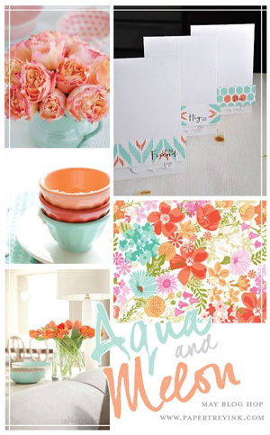
This month’s blog hop challenge was a color challenge: Aqua and Melon.

PTIBlogHop

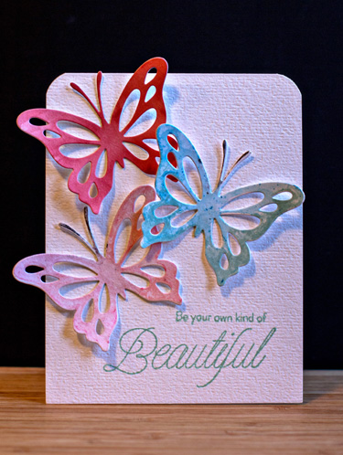
My first card meets the challenge with both colors. 

3Butterflies

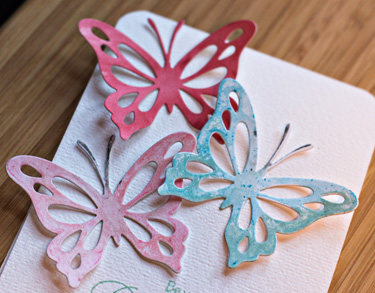
I love this new butterfly set, “A Beautiful Life.” The darkest of the butterflies was die cut from a piece of Bristol paper on which I did a watercolor wash with some Peerless watercolors. The other two butterflies were stamped after coating them with Gelatoes and spraying them with water. Then I die cut the stamped images which were amazingly easy to line up. The sentiment is also from the same set stamped in Aqua Mist.

3ButterfliesClose

I decided the butterflies were a bold enough statement that they didn’t need any other embellishment.

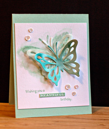
My second card is my favorite, and although I tried adding some melon accents I really like it better without them. So here it is, even though it really doesn’t meet the challenge.

AquaButterfly

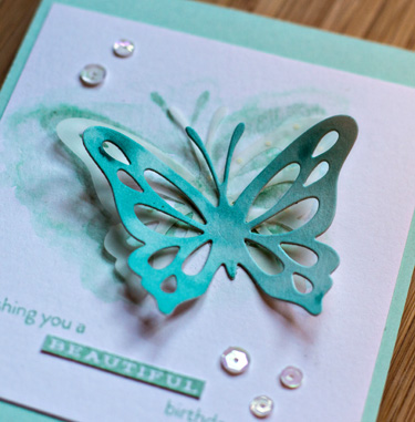
I stamped the butterfly image with Aqua Mist on a piece of Tim Holtz watercolor paper, and then “bled” the ink around the image much the way Betsy Veldman did here. Then I added a butterfly die cut from dotted vellum, and a die cut from an aqua watercolor wash with Peerless watercolors. This time a few white sequins seemed in order.

AquaButterflyClose

Hope you’re having a wonderful weekend! 

Watercolor: Part 3 & CAS(E) This Sketch

  • by

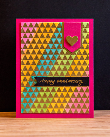
Back again with yet another card from the techniques introduced on Day 1 of the Online Card Class. This time it was the embossed resist technique which I’ve done before on a smaller scale. I didn’t have a background stamp with the open spaces they recommended but I thought this one called “Tiny Flags” by Hero Arts might work.

Anniversary

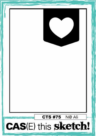
I embossed it with gold on the smooth side of Tim Holtz’s watercolor paper, and used Distress Inks to watercolor diagonal stripes, and adhered it to a card made with PTI’s Raspberry Fizz cardstock. The stamp is a very old wooden one by Savvy Stamps. I needed an anniversary card for my brother-in-law and sister-in-law and this looked appropriately festive. The card design is based on this week’s sketch from CAS(E) This Sketch. It couldn’t have been more perfect!

CTS_Sketch_75 (1)

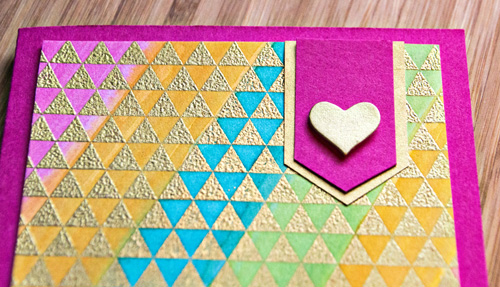
Here’s a closer look at the watercoloring.

AnniversaryClose

We’re off in just an hour or so to celebrate Mother’s Day with Tracy’s mom and siblings. We’re celebrating a day early since his brother, Greg, who’s band was inducted in the Rochester Music Hall of Fame last week, flies back to Texas tomorrow.

Watercolor for Card Makers 2

  • by

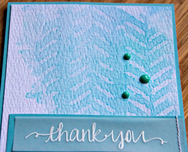
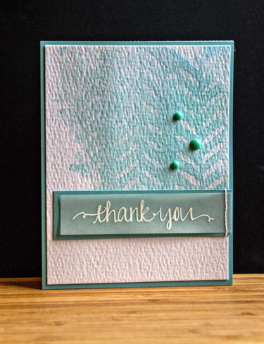
This was the first technique taught in the Online Card Class on watercolors. Once you’ve painted a watercolor background, you lay a stencil down on it, press it in, and when you lift it up here’s what you see.

ThankYouStencilClose

I absolutely love this technique and will use it again, I’m sure. Luckily it worked well on the first try!

ThankYouStencil

I used my Winsor and Newton travel watercolor set with the Crafter’s Workshop “Mini-herringbone” stencil on Tim Holtz watercolor paper. My favorite thing about this watercolor paper is how white it is. Both my cold press watercolor pad and my regular watercolor pads are more cream colored. I bordered the watercolor piece with a piece of Worldwin “Light Terrific Teal” cardstock. I used to be able to buy this paper locally. When the last of the local shops went out of business I stocked up on a lot of colors, but they’re beginning to dwindle. I love the range of colors and it’s a great weight for matting. 

The sentiment (“Oh, Happy Day” by Avery Elle) was stamped on vellum, layered on another piece of cardstock and stitched down. I’ll enter this in Virginia’s View Challenge:  Stitching, even though there’s not a lot of it!

Thinking of You & Anything Goes Challenge

  • by

Here to share two cards created for the same friend. One was sent a couple of weeks ago, and the other just yesterday. Around Christmas, she fell and broke her wrist so severely that she still is unable to drive, open her mail, or do many of the ordinary things we take for granted. It’s been a long haul, but she is one of those “glass half full” people who downplays the whole experience.

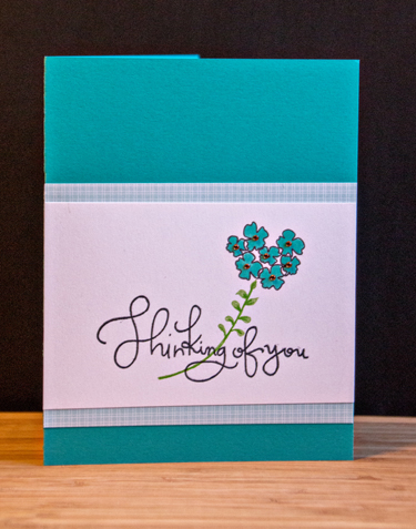
The first card is a lift from one of the inspiration pieces from the February Simon Says Card Kit.

ThinkingofYou

ThinkingClose

Everything except the gems in the center of the flowers came from the kit.

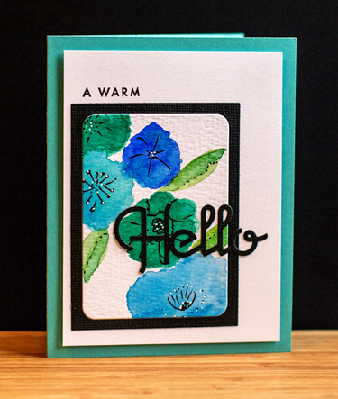
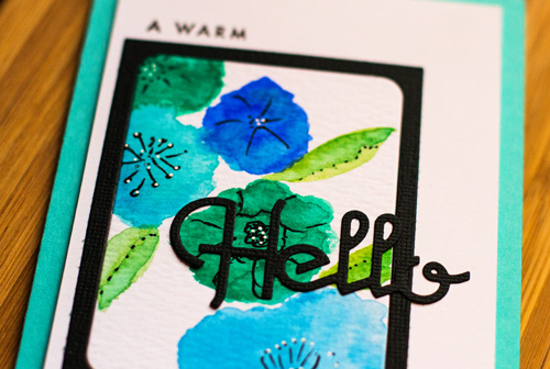
The next card is quite unusual for me. I took a variety of art materials to Chicago with me, and one day was playing around with some watercolors. I was also doing some doodling for an art journaling class I was taking, and created these flowers with watercolors on a piece of Tim Holtz watercolor paper and some Molotow paint markers.

Hello


I cut the same “Simply Framed” die I used on one of my recent Project Life cards to cut a black frame and the watercolor piece. Then I cut the new Phrase Play #3 die and used just the “Hello” from it over the watercoloring, and the coordinating “A Warm . . . ” from the accompanying stamp (all Papertrey Ink). Simon Says’ new cardstock, “Audrey Blue,” was the perfect match for the card base.

HelloClose

The Online Card Class: Watercolor began today, and although I watched all three videos, and have multiple ideas percolating in my head, there wasn’t any time at the creating table today. I am linking these cards up to the Simon Says Wednesday Challenge “Anything Goes” Challenge, for which I see there are already over 700 entries! There’s no lack of inspiration for card makers on the internet.

Wednesdayblog-logo

Make It Monday: Water Splats

  • by

Make-itMonday

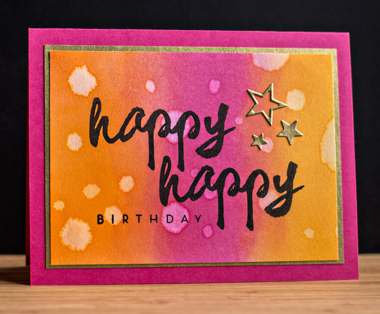
Given that Papertrey Ink is my favorite stamp company, and I own more of their stamps than all the rest of my rather extensive collection combined, I thought I’d be participating in the Make It Monday challenges on a regular basis. But it hasn’t happened. I was intrigued, however, by Nicole’s video this week about using stamp pads to blend inks, and then adding water to make “water splats.”

WaterSplatClose

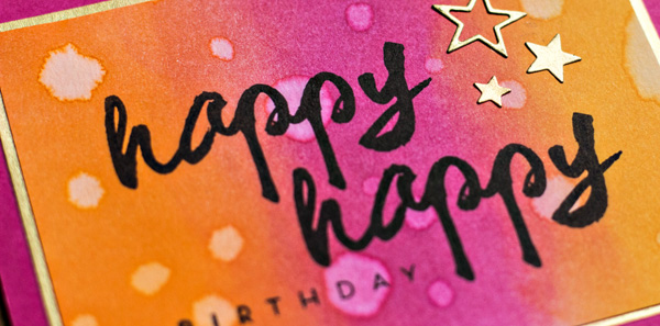
I ended up really liking this process, and the final card, which will be in the mail for my niece who turns 21 next month. I used Orange Zest, Raspberry Fizz, and Summer Sunrise for the ink blending.

WaterSplat

The Wet Paint stamp set works wonderfully with this technique. I mounted the final piece on a piece of gold cardstock, then on a Raspberry Fizz card. The star die cuts are new ones I picked up this month from Memory Box, and they’ll be getting a lot of use!

ETA: I’m entering this in the Moxie Fab “Hip on Handwriting” challenge.

April Papertrey Ink Blog Hop

  • by

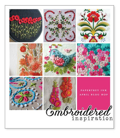
Being away for 10 days meant the month of April just flew by. Here it is, the 25th already. We’ve finally had a few spring-like days and are beginning to see the green buds on trees and bushes. What a relief! We planted some pansies yesterday, and we have a bouquet of daffodils from our yard on the kitchen table. This month’s Papertrey Ink Blog Hop challenge was to find a piece of embroidery to inspire a card, and I was anxious to use some new floral images I got in my last Papertrey Ink order.

AprilPTI

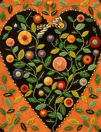
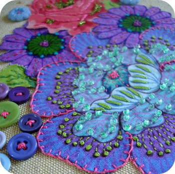
Although there’s plenty of inspiration in this inspiration board, I went off to Pinterest to see what I could find. I knew from the start that I wanted to use theBotanical Blocks stamps to create my cards. The bright colors against a black background attracted me to this piece.

Stitched heart


Source

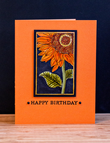
The orange, yellow, and greens seemed perfect for the sunflower image in Botanical Blocks.

Sunflower

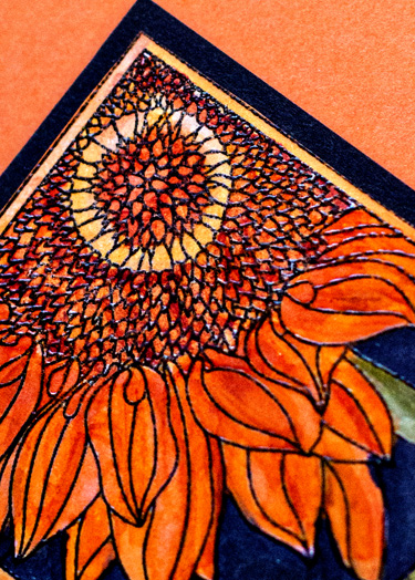
I embossed the sunflower block with Memento Luxe Ink and colored it with Copic markers. The sentiment is also from Botanical Blocks, and I added just a narrow cardstock frame and two A Muse black pearls to finish it off. Here’s a closer look.

SunflowerClose

Next I found this piece with a much different color palette.

Stitched Flowers


Source

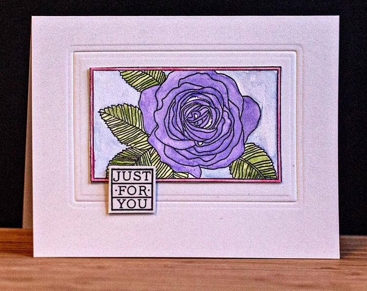
I decided to try watercolors for the image of the rose, and again embossed it with the Memento Luxe ink. I love that you still get the fine detail of the stamp after embossing.

WatercolorRose

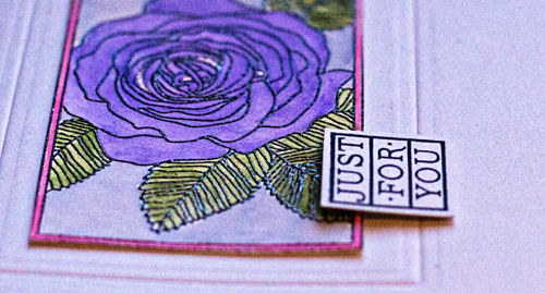
I chose the purples and greens from the inspiration piece as well as the pink border. I added a few white highlights with a Molotow paint pen in the center of the rose. I dry embossed the border with a Spellbinders Matting Basics die which made the perfect frame, then hand cut the sentiment and popped it up with a piece of adhesive foam. The Soft Stone card base seemed perfect for the watercolored piece.

WatercolorClose


I’m linking both cards to this week’s CAS-ology Challenge:  

Week 92 - Garden


It was fun to play around with a new product, and it’s good to add a couple cards to the stash for the long list of May birthdays on my calendar.

Liberate Your Art Blog Hop

  • by

2014-Blog-Hop-900

I’m a day late getting this post up, but we were on the road home from Chicago yesterday. This is the third year I’ve participated in Kats’ fabulous postcard swap, and every year I enjoy it more. When I got home I discovered the last of the postcards I received this year, and they are the lovliest ones yet.

The first card to arrive was this beauty from Barbara Hurst in Arizona. You really should take the time to visit her blog and see the wonderful photography there. 

Postcard1

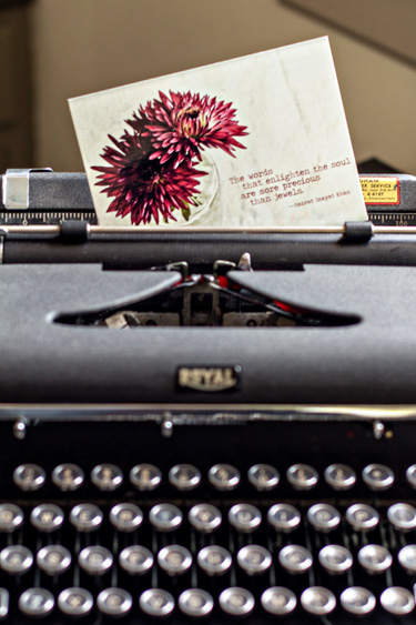
My next piece of happy mail came from Evelyn Spikes in Elgin, OR. Not only is the photograph lovely, but the quote is as well.

Postcard2

This is the second time, I’ve been lucky enough to receive a pice of art from Suzette in Texas. After a lovely quote by Clarissa Pinkola Estes, Suzette closes with this lovely thought, “May the seeds of creativity find their way to your door.” Love it, and love this postcard.

Postcard3

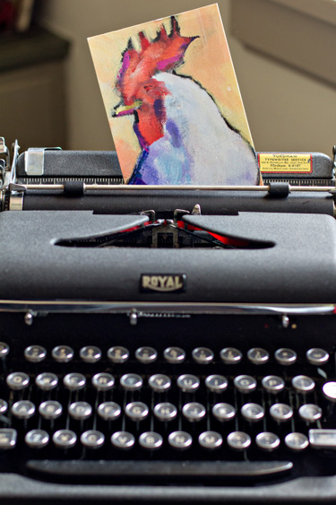
I just love this rooster painted with acrylics on canvas by Meredith Gisness. I have a collection of chickens and hens I rotate through my kitchen so this fine fellow is going to find his way to the kitchen bulletin board.

Postcard4

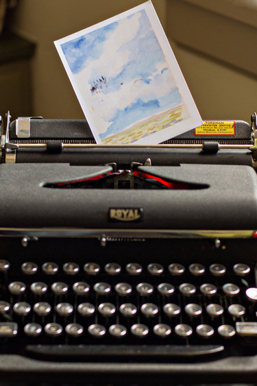
Here when I arrived home was this beauty from Sheila. I’m not sure where Sheila hails from, but you can find more of her work here on her blog.

Postcard5

Last, by not least, was the postcard from our hostess (and my long-time blog friend), Kat. I’m so annoyed that the Portland Post Office stamped the front of the postcard rather than the back! Does anyone know how I might remove it without ruining the postcard?

Kat'sPostcard

Many thanks, Kat, for taking on this huge project another year! It inspires me every year, and encourages me to get my art out there. And thanks, too, to the wonderful artists whose work I received this year! All of them will be proudly displayed!


One Little Word: March & ZIZO

  • by

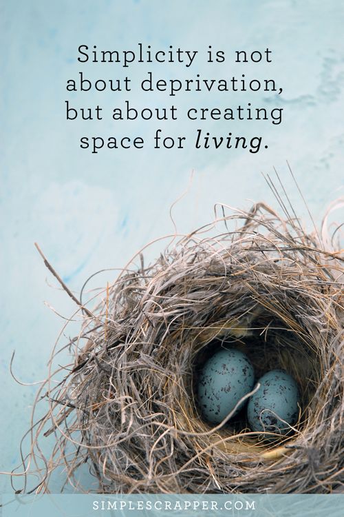
Simplify Graphic

source

In my efforts to SIMPLIFY, here were my March intentions and a progress report:

Declutter and Purge

  • Den purged. One bag of books donated to the library; closet emptied, painted, and organized; another bag of office supplies/notebooks to Goodwill
  • Feedly purged:  stopped following blogs I didn’t read regularly so it’s easier to keep up with the inspirational blogs I love

Healthy Living – increase the number of vegetarian meals:

With just a few exceptions, I’ve established a routine of eating vegetarian 2 of 3 meals each day. I’m enjoying it, and not finding it difficult at all. Some days it’s all vegetarian.

Read 4 books:

I only managed 3 books this month, but our book group book was over 700 pages long.
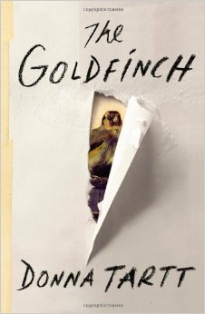
Goldfinch

I thoroughly enjoyed this book, and despite it’s length (771 pages) finished it in just two weeks. It got mixed reviews at our couples’ book group. Tracy thought it was way too long, but agreed the writing is superb.
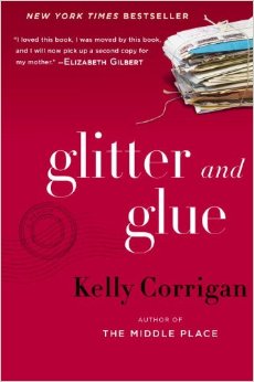
Glitter and glue

I’ve read nearly everything Kelly Corrigan has written, and enjoyed it all. This is another memoir about her time as a nanny in Australia and how it changed her relationship with her mother. In some ways, it was hard for me to read since I lost my mom at such a young age, and never got a chance to know her as an adult. Nonetheless, I enjoyed it, and it was an easy read.
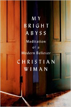
Bright Abyss

This was one of the most difficult books I’ve read in years. It was the Lenten book for our church, and our pastor led a retreat around the book a week ago Saturday. I could only go for the first hour since my Dining Room Ministry team was cooking lunch that day. The author is a poet, and I don’t find reading poetry an easy task. When the writing was more narrative, I enjoyed the book, and found some of his insights profound. In other sections the writing was elaborate, and it was difficult to extract the meaning from it. I wish I could have stayed for the whole retreat; I’m sure I would have gotten more from the book with some shared insights. (One of the big advantages to a book group.)

Classes:

Truthfully I should be working on classes I’ve yet to finish, but instead I enrolled in the Online Card Class: One Layer Cards, and tried many of the featured techniques. These classes are a great value. For each lesson there were a minimum of three videos, three more step-by-step projects, and a pdf of the lessons. Participants have access to the content of the class indefinitely; the message boards and galleries are closed for participation, but the content of those remains open as well. I always learn new tricks, and this time learned quite a few new techniques.

Photography Projects:

I’m way behind with the challenges in The Visual Toolbox as well as the online course, Practice. For the latter, the terrible weather has definitely been a factor so I think I can probably catch up once spring arrives. I am thoroughly enjoying Helena’s meme, Zoom In, Zoom Out.

 And here is this week’s, taken several days ago. Friends of ours asked if we thought Caleb would like a tricycle. We knew he didn’t have one yet, so brought it along with us. The first experience was a bit tentative, but when we “rode” it to the playground the other day, it was a huge hit. He’s just beginning to get the idea of how to pedal.

IMG_3989ed_blog

IMG_3990ed_blog


Sarah arrived home from California a “new” woman. After being a student for all but two years since she graduated from high school, she decided to say “enough.” She finished all the class work for her PhD a couple of years ago. She just finished writing her last comprehensive exams, but when she got to Berekley to defend the exams, she realized she’s lost her passion for the research needed for the dissertation. The work she now hopes to do doesn’t require a PhD. Two more years of steady research and writing seemed overwhelming. The door to the degree remains open without a second application for two more years, so she has time to reconsider, but she’s feeling very relieved. I think you just know when the time is right for these decisions. She’ll have more time to spend with Caleb, time to pursue some recreational interests, and opportunities to grow her spiritual direction practice. 

Today is Adam’s birthday, and I’ll be back tomorrow to share his birthday card as well as two others that went out this week.


One Photo & Twenty Words

  • by

IMG_3960ed_blog

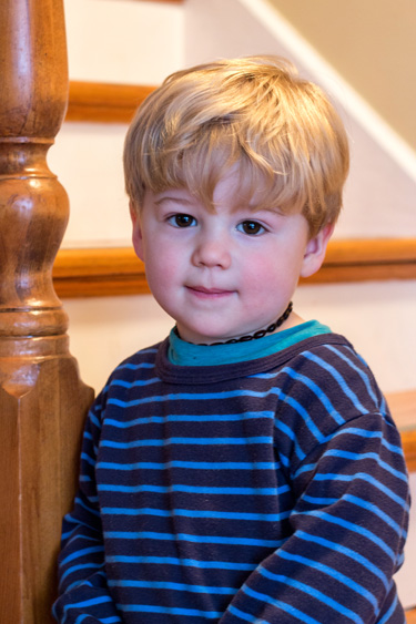
Lucky me! He wanted to “see Caleb” in the camera’s viewfinder, so was willing to sit still for a portrait.

Joining in with Abi’s One Photo & Twenty Words meme. You’ll find others here.

Happy Birthday–Two Challenges

  • by

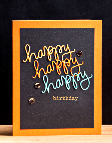
Today I have a card for two Simon Says challenges: The Wednesday challenge “Happy Birthday,” and the Work it Wednesday for bright colors.

Wednesdayblog-logo

Workitwedbanner


HappyClose

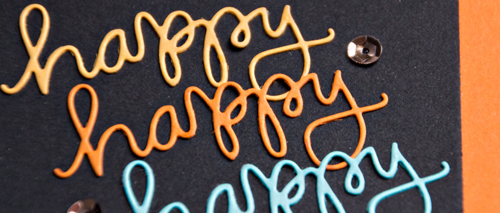
I love the Simon Stamp sets with die cut words and accompanying stamps. They work so well for so many occasions. Today’s card uses the “Happy” set. I die cut it three times in Summer Sunrise, Orange Zest and Hawaiian Shores, and layered them on a piece of True Black. I embossed “birthday” in gold, added a few gold sequins and layered it on a premade Memory Box card.
Happy

The sun is shining and the snow is melting so it’s a happy day here!

Color Fade

  • by

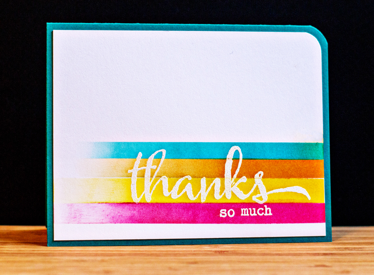
Recently I came across two cards, one by Julie Ebersole, and then one based on her card by Laura Bassen (two wonderful designers). I loved the look and since I had just gotten a new set of Winnie and Walter stamps (“The Big, The Bold, and You) I thought I’d give color fading a try.

After embossing the sentiment in white, I masked the stripes and added Distress Inks fading out to the side.

ThanksColorFade

As always, I learned a bit in the process so the next attempt should be a bit better, but overall I’m happy with another bright and springy card to add to Simon Says “Work it Wednesday” challenge.

Workitwedbanner


One More for the Online Card Class & Work It Wednesday

  • by

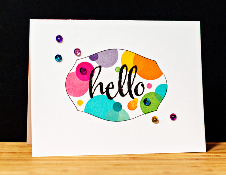
It’s been a long time since I played around with so many new (to me) techniques, but I tried another variation of masking cards that Kara shared on Day 4. This time I die cut a mask from Mat Stack #1 by Papertrey Ink and used the negative to try another series of stamped circles. When I removed the mask, I felt like it need something else, so I cut another frame from cardstock and traced around it with a fine lined pen. That was better, but I wasn’t really happy with it until I added the sequins. I think it still qualifies as a one layer card.

Hello2

I do love all these bright colors, and I’m entering it in the Simon Says “Work It Wednesday” challenge which is to “to create a card with bright colors, flowers, sunshine or anything else that makes you think of Spring!”

Workitwedbanner

Card Recipe:

Cardstock: Select White (PTI)
Stamps: Beautiful Blooms (PTI), The Big, The Bold, and The Happy (Winnie and Walter)
Die: Mat Stack #1 (PTI)
Sequins: Michaels


March 2014 Papertrey Blog Hop

  • by

It’s not often I post twice in one day, but in addition to the CASology challenge, today is the March Papertrey Blog hop.

BlogHop

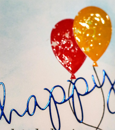
The Papertrey March Blog Hop challenge is high gloss, which leads one directly to Glossy Accents. I have to admit I have an issue with Glossy Accents. I find it nearly impossible to get it to go on smoothly. I did a Google search and didn’t find any great tips, so if you have some, I’d really appreciate it if you’d share them.

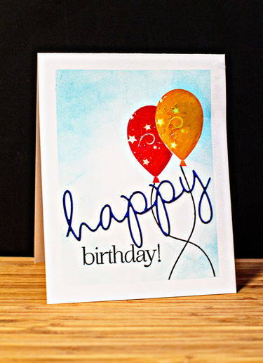
I combined an inspiration piece by Stephanie Klauck from the recent Online Card Classes for the Textural Effects Lesson–using Washi tape to mask off the edges of a card to create a frame with Distress Inks. Instead of glitter on the balloons, I used Glossy Accents. 

Birthday

The “Happy” (“Wonderful Words”) was cut from high gloss metallic blue cardstock and the rest of the sentiment came from “Stylish Sentiments: Birthday.” The balloons are from “Balloon Bash.” Here’s a closer look at the gloss. (Excuse the glare; these photos were taken after dark last night.)

HappyBDClose

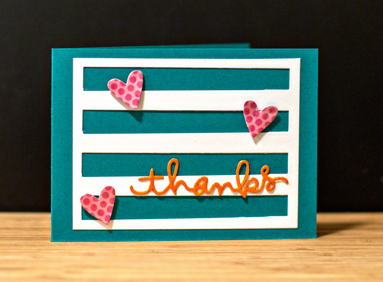
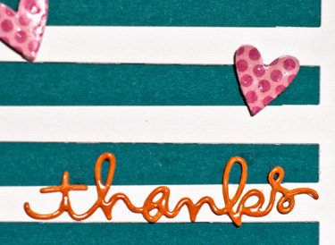
The next card was made from scrap pieces I had lying on my desk after playing around this weekend with cards for the Online Card Class: One Layer cards. The hearts and “thanks” are both Simon Says dies and I covered them with Glossy Accents. I do have an easier time covering the smaller pieces. I die cut and trimmed the “Building Blocks” die by Papertrey and adhered it to a Tropical Teal card.

Thanks

ThanksClose

You can find a lot of inspiration for card making on Nicole’s blog today.

Lucky!

  • by


Guest Designer Badge New

Two weeks ago I was honored to win the CASology challenge: Roots. That alone was exciting, but even more exciting was an invitation to be the guest designer for this week’s challenge:

Week 88 - Lucky

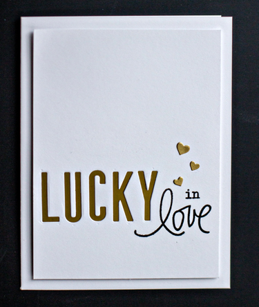
I had to think this one through since St. Patrick’s Day has come and gone, but it didn’t take long to come up with “Lucky in love” as a theme for the card.

Lucky

I die cut “LUCKY” with Papertrey’s Headliner Alphabet and used the negative. I backed it with beautiful gold metallic paper from Paper Source. Images from Winnie and Walter’s “The Big, The Bold, and the Happy,” and Simon Says “Love This” finished off the sentiment. I added three hearts die cut with Simon Says “Holiday Shapes” to finish the panel which I mounted with dimensional tape onto a white A2 card. You can find more inspiration for “lucky” here.