Skip to content

Papertrey Anniversary Challenge: Part 3

  • by

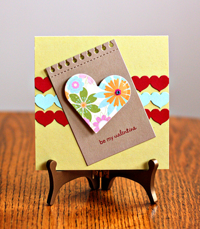
Today was a color challenge at Papertrey Ink. I was determined to get another valentine made, but the color combinations were truly a challenge. I ended up using Lisa’s colors.

ColorCombo

I punched three borders with the heart border punch (PTI) from  Pure Poppy and Aqua Mist. Then I die cut a spiral notebook page (PTI) with Classic Kraft and stamped a sentiment from Tiny Treats: Valentines. The patterned paper (Making Memories) had three of the colors in it so I decided it was a go, and cut it with a Nestability Hearts. I added a Kaiser Kraft rhinestone that matches the aqua mist to the center of one of the flowers. The best thing about this challenge is that I kept going and got two more valentines made which I’ll post once the recipients get them.

PTIColorValentine

My friend, Nancy, and I are off to see The Artist in a few minutes. Another friend recommended it highly.

L.O.A.D. Days 6 & 7

  • by

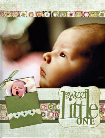
For the sixth layout, I wanted to get a photo of Caleb scrapped with basically the same layout I did for Skylar here. It’s a sketch by Jen Gallager for Shimelle’s Pretty Paper Party.

LOAD_2.6SweetLittleBaby2w

I used my Silhouette to cut the envelope for the small photo and tag as well as the title. Most of the papers came from Studio Calico kits. The heart border is a Papertrey Ink die and the gems are Hero Arts.

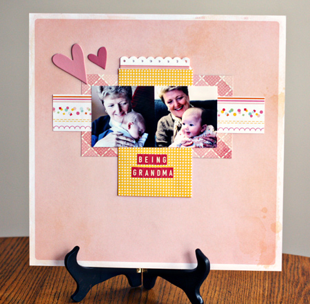
Yesterday I went back to an earlier prompt with a different subject: how things change. I reflected on how I’ve lost two roles that defined my life for so many years, but have acquired a new and wonderful role of grandma.

LOAD_2.7Grandma

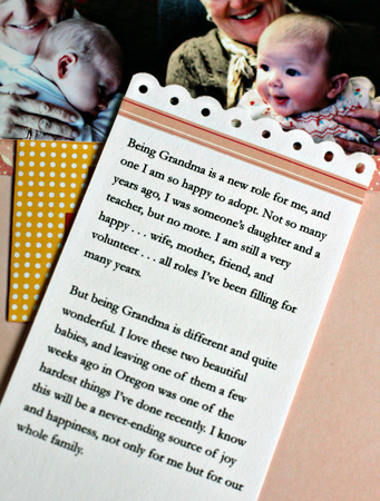
This layout is based on the current Studio Calico Challenge Sketch. The journaling is hidden in the bag. Almost all of the supplies for this layout came from the current Studio Calico kit; some are from January’s kit. The hearts are OLD Heidi Swap chipboard. I think there are only two left now, and I had several packs of them. I created the journaling card with a Fiskar’s border punch and a strip of tape from my stash.

LOAD_2.7Journaling

Last night, Tracy’s cousin and I went to our first Swing Dance lesson. It was SO MUCH FUN, but the best part is I didn’t embarass myself! It’s a four week series of lessons, and I can see myself signing up for the next set if my schedule is clear.

Papertrey Anniversary Challenge: Part 2

  • by

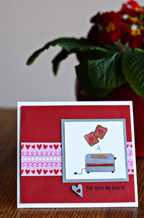
Today the designers at Papertrey created a set of printables to be used on cards. I loved the little toaster and the sentiment suggestions by Lexi Daly. Since I haven’t started making valentines yet, this was a perfect opportunity.

Toasterjpg

Cardstock:  Select White PTI, Memory Box (red) & silver metallic Paper Source; patterned paper: Simple Valentine PTI; heart punch: EK Success; heart gem: A Muse; Prisma colored pencils; font:  CK Rugged.

I’m off to a Camera Rochester meeting, and still need to finish my layout for today’s L.O.A.D. It’s all arranged; just needs to be glued down.

Papertrey Ink’s 5th Anniversary: Challenge 1

  • by

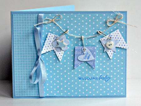
It’s not often I post twice in a day but I’ll actually be posting three times before it’s over since my yellow post for Project 64 needs to be up in just a few hours. This second post is for the first of the anniversary challenges at Papertrey Ink. The challenge was to choose one of the design team’s favorite cards and use it as inspiration. As soon as I saw Ashley Cannon Newell’s card I knew it would be a perfect design for a baby card I needed to get in the mail. You can see her card here.

WelcomeBaby

I stayed with her banner and basic card design, but used patterned paper instead of stamping the background myself. I love Papertrey’s Tiny Tags and Banner Builder dies and they were perfect for this card. I also used patterned papers from PTI: Tiny Stars and Bitty Box Basics, and the stamps from Round and Round and Tiny Tags. The ribbon is from Paper Source, and the pins and button are from my stash.


Studio Calico Challenge and L.O.A.D. Day 5

  • by

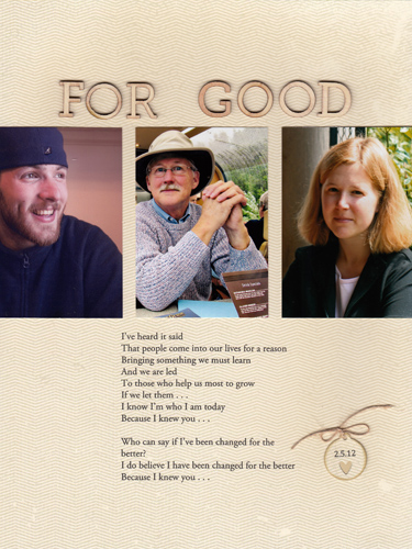
Today’s layout is for two challenges: L.O.A.D. and last Sunday’s Layout Challenge at Studio Calico which I finally read this morning. After we saw Wicked a year or so ago, I typed up some of the lyrics that spoke to me, knowing someday I’d do a layout with them. So when I saw the challenge was to use a quote or lyrics I knew it was time. This might be one of the simplest pages I’ve ever made, but it came out exactly the way I envisioned it, and says it all.

LOAD_2.5_ForGood

Patterned paper: “Boxer” Basic Grey; Wood Veneer Alphabet: Studio Calico; die: Tiny Tags Papertrey Ink; twine: Papertrey Ink 

L.O.A.D. Days 3 & 4

  • by

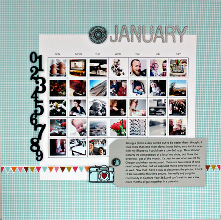
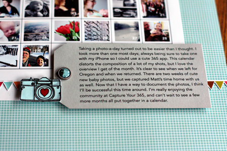
Yesterday’s layout wasn’t based on the prompt as I wanted to be sure to get my January 365+1 photos scrapped. When I was in Oregon, I purchased Ali Edwards’ 2012 calendar templates and popped in two or three photos at a time as the month went on. I ended up deleting her title, and cropped the calendar before I printed it.

LOAD_3_Jan365

Patterned paper (and banner): American Craft; photo template:  Designer Digitals; stamps: Amy Tan for American Craft & Maya Road; brads: Basic Grey; number strip: stamp by Studio Calico, scanned and printed on an inkjet transparency.

Here’s a close-up of the journaling which I printed on a tag I cut from a piece of World Win paper.

Jan365Journaling

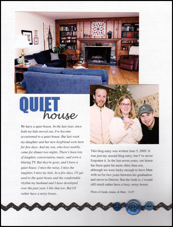
Today’s layout was based on the prompt which was to focus on how things have changed. The real impetus for the page came from a comment about using a blog entry for the journaling. I still remember the second post I ever wrote about having a quiet house, and knew I wanted to use that for this layout. The “boyfriend” in the post is now Sarah’s husband. It was his first visit with us, and he can be credited with the fact that I have a blog. I also incorporated some type tricks from Cathy Z’s current class, Ten Tips for Type. I’ve done these in the past, but had pretty much forgotten about them: two column journaling, and two type faces for the title.

LOAD-2.4Quiet

Cardstock: American Craft, die: small rickrack Papertrey Ink; buttons: Papertrey Ink

Journaling: 

We have a quiet house. In the last year, since both my kids moved out, I’ve become accustomed to a quiet house. But last week my daughter and her new boyfriend were here for five days. And my son, who lives nearby, came for dinner two nights. There’s been lots of laughter, conversation, music, and even a blaring TV. But they’re gone, and I have a quiet house. I miss the noise, I miss the laughter, I miss my kids. In a few days, I’ll get used to the quiet house and the comfortable rhythm my husband and I have developed over the past year. I like that too. But I’d rather have a noisy house.

This blog entry was written June 5, 2005. It was just my second blog entry, but I’ve never forgotten it. In the last seven years, our house has been quiet far more often than not, although we were lucky enough to have Matt with us for two years between his graduation and move to Denver. But the truth is, I would still much rather have a busy, noisy house. 

Photo of Sarah, Adam, & Matt:  12.07

I bought a new scanner today, and got a shadow around the buttons. There wasn’t any quick fix in PSE, but if anyone has experience with getting rid of it, I’d appreciate knowing about it.

Project 64: Brown & A Giveaway

  • by

Project64

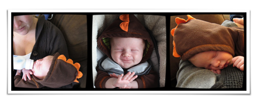
Last week it was BROWN at Project 64. When I saw Caleb in this cute dinosaur outfit, I knew I’d found my first photos for the challenge.

TriptychBrownCalebw
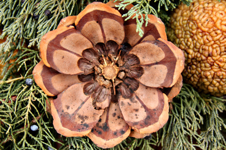
But I think folks at Project 64 would be more interested in this really lovely pinecone I found in a window box in Honeoye Falls, so I’ll be linking it instead.

Pineconew

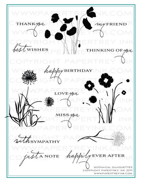
It’s amazing to me, but this is my 1,000 post on my blog. When I started in several years ago, I had no idea I’d still be at it today, or that I would ever have reached 1,000 posts. To celebrate, I’d like to give away three prizes. First, a set of Papertry Ink stamps that were an exclusive anniversary set—Botanical Silhouettes.

Botanical-Silhouettes-preview

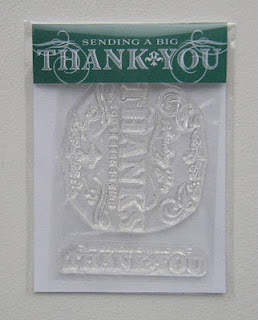
Second, a bonus set of Thank You stamps from Papertrey Ink. Much to my surprise, I received a second set in my last order. And it seems most appropriate as I definitely want to thank all of you for visiting the blog, becoming my friends online, and providing me with so much inspiration and support. It never crossed my mind when I began, that I would find a community of crafters and photographers through this blog.

PTI Thanks stamp

And, finally, a $20 gift certificate to Amazon.

A_books-thumb.90px._V194460137_

So if you’re interested in any of the prizes, just leave a comment, and I’ll draw three names on Wednesday afternoon.

CAS-ual Friday Challenge

  • by

One of my intentions this year is to limit the number of card-making challenges I read each week. I chose five to check each week, and here’s my interpretation of the CAS-ual Friday challenge to use brown paper and string. I need several birthday cards for men this month so this was a perfect combination.

FotoFlexer_Photo-CFC33

CASfri1.05

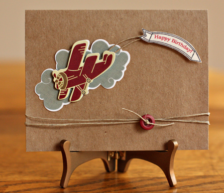
The first card uses a sticker from Imaginisce that I knew I’d use either for cards or for a travel page in a scrapbook. I adhered it to a Hero Arts card, and stamped the banner and the sentiment from Papertrey Ink’s “Fly Away” sent, attaching them with some twine. The twine and Scarlet Jewel button are also from Papertrey Ink.

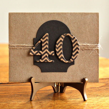
The next card is for my nephew’s 40th birthday this week. 

MarcBD

This is a really CAS card that reads inside “looks good on you!” I die cut the numbers from MME’s “Fun Day” paper pack with Papertrey’s By the Number dies and layered them on the Mat Stack #3 die cut from a dark brown scrap in my scrap file. I inked the edges with the Tea Dye ink from Papertrey.


December Papertrey Blog Hop

  • by

Bloghoplogo

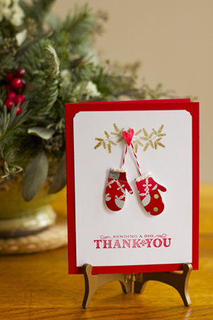
I missed last month’s blog hop because we were traveling, so I really wanted to participate in today’s. Fortunately, we have NOTHING planned for the day after Christmas so I had time to make a card. The challenge this month for the Papertrey Blog Hop was to use  any of the wrapping paper, bows, ribbon, tags, canceled postage from holiday cards you have received, photos from holiday cards and anything else you might have laying around after the holiday preparations have ended. I decided to use some of the wrapping paper and twine I used on the package and try the technique Maile posted here on her blog a week or so ago. Here’s what I came up with.

PTI Blog Hop1

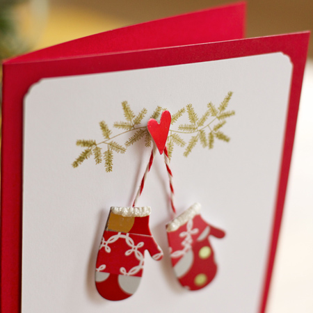
I ran a piece of cardstock through my Xyron and laid strips of wrapping paper down, then used the diecut from Love Lives Here:  Holiday to cut out the mittens. I added some white Liquid Applique to the top of both mittens and then a bit of glittery Stickles. The evergreen boughs were stamped with Love Lives Here:  Holiday and the sentiment was a surprise gift from PTI in my December order. Perfect for the thank you notes I need to write. The heart was punched from a piece of the prepared cardstock and I used the same twine I used to attach tags to my packages to attach the mittens.

Here’s a close-up:

PTIBloghop2

Hope you had a wonderful holiday! We had tremendous fun at last night’s family celebration, and we’re resting up today.

Project 64: Silver

  • by

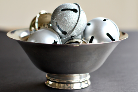
What a perfect color choice for the holidays! I had several shots I wanted to take, but only had time for one. I may yet do the others, but it’s time to post at Project 64 for last week’s color. I bought these bells at Michaels for just two dollars and they look fabulous in a silver bowl we were given as a wedding gift many years ago.

Bowl1w
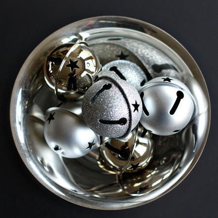
I like this view even better, and will be linking this one to Project 64.

Bowl2w

I’m hoping to have some creative time tomorrow, so I may have a JYC post ready, but in case I don’t get back here until after Christmas, have a fabulous holiday!

Project 64: Black and the New Kitchen

  • by

When I saw last week’s color at Project 64 I knew it was the perfect time to get the photos up so you can see our new kitchen–all black and white, with a little red thrown in for accents. We are in love with it, and although it took twice as long as estimated, it is perfect!

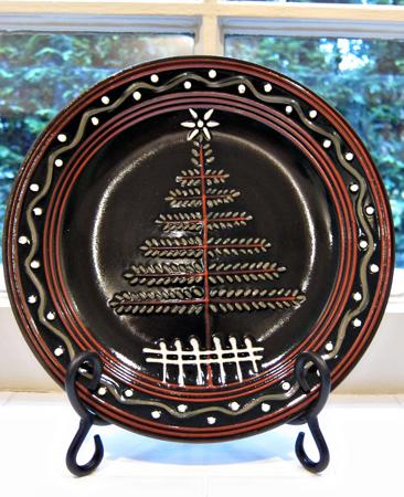
I’ll start out with the photo I’m posting at Project 64 which is really a Christmas decoration in the kitchen. I bought this last year and couldn’t believe how perfect is was for the kitchen window when I pulled it out this year. When I bought it, a new kitchen wasn’t even in the planning stage.
ChristmasPlatew

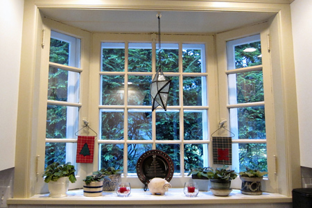
And here’s a shot of the full window–the only thing new here is the beautiful tile on the sill that matches the tile backsplash. The old window had lineoleum from the 1950’s.
KitchenWindoww

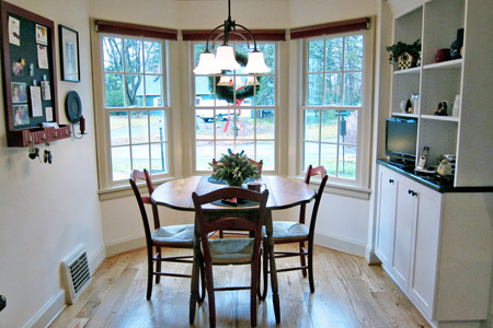
Anyone who’s been reading the blog for awhile knows our kitchen’s been under construction since the first of August. The kitchen was finished over Thanksgiving, and our red blinds arrived last week. We wanted up and down blinds—these only go down, but new ones have been ordered and we can keep these until they come in. I love the color–though you can only see the tops of them here. This is the only area where we added space (just 14 sq. ft.), but we now have three windows that give us a wonderful view of our lovely street and so much more light than we have anywhere else in the house.
NewWindoww

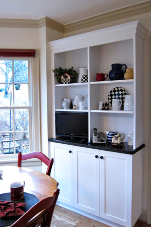
This was my only contribution to the design of the kitchen. We had an old bookcase in this spot in the previous kitchen, and I knew I wanted storage for my cookbooks and a place to display my collection of pitchers. We now have two extra shelves, but I haven’t had the time to put them in yet and rearrange.
Hutchw

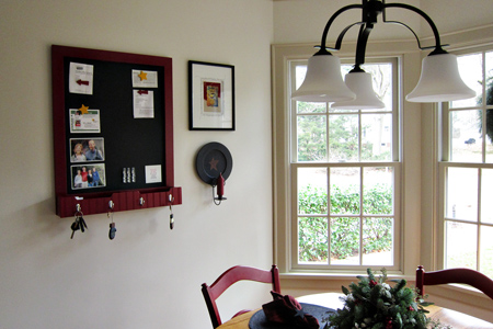
An OLD kitchen cupboard used to hang on this wall, and I had to stand on a chair to get almost any of the food stored there. I purchased this chalkboard/memo board from LL Bean and it’s working out wonderfully. I love the new light fixture which I bought from a photograph and had never seen until I got home from our trip out west. We looked at hundreds of light fixtures before I was finally shown this one in a catalog.
Blackboardw

This is the right side of the kitchen if you stand with your back to the window. In the old kitchen I had a very small cooktop on the left side of the kitchen and a very small wall oven on this side. Now I have a full-sized stove and I love it. I got two cookie sheets in side by side this weekend. The old oven barely held one! I also have a new full-sized refrigerator which I’ve never had before either.
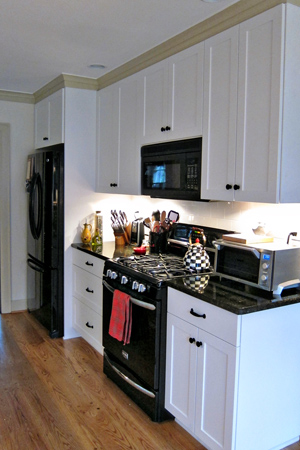
NewRightSidew

This is the left side. Now that the cooktop is gone, I have ample counter space. I’m not quite sure how Jack got so many cupboards in the existing space, but it’s amazing to me and to my friends how spacious the new kitchen seems when no additional floor space was added. 
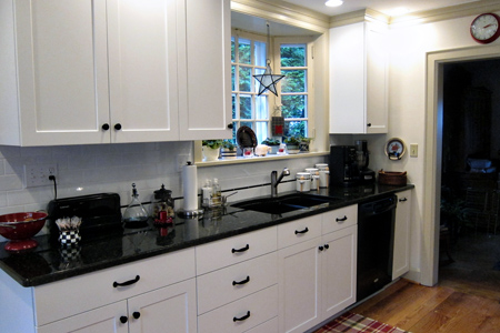
NewLeftSidew

Here’s a shot of my McKenzie-Child teapot–a bit of a splurge, but I’m not sorry. Tracy says I designed the kitchen around it, but it’s not true! It was too perfect, and I already had a couple of small pieces of the same pattern. I used it in an earlier Project 64 post, and several folks asked for a full shot.
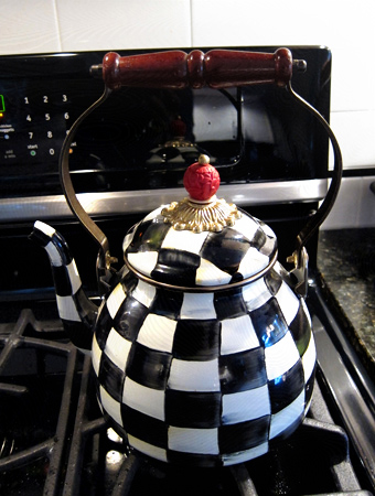
Teapotw

Project 64: Purple Mountain Majesty

  • by

Project64

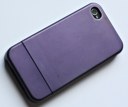
This week’s color at Project 64 was Purple Mountain Majesty. I was always lucky enough to have a big box of crayons when I was growing up, but I’m quite sure there was not any crayon with such an elegant name back then. Purple has been a favorite color of mine recently, and there are many shades and hues of it. The first item that caught my eye this week was my iPhone cover.
IPhoneCase

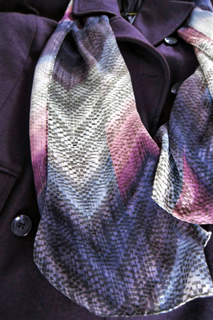
I’ve also purchased a striped turtleneck and vest this fall, but neither were quite the right purple. My new coat, however, and scarf that I purchased a year ago in California are quite right, and I’ll be linking this photo over at Project 64.

Coat:scarf

I must say that it’s a bit harder to find colors now that nature’s colors are much fewer and much less bright! I looked for Purple Mountain Majesty on all our walks last week, but there was nothing purple left in anyone’s gardens. This week’s color is orange, and it’s a bit easier to find!

Project 64: Dandelion and More iPhone Fun

  • by

Project64

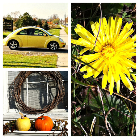
This week’s color at Project 64 has been dandelion. I was pretty amazed to find dandelions still blooming as we walked to our polling place to vote yesterday. All four of these photos were taken with the iPhone (we keep track of our walks on an app called Runkeeper so I always have my iPhone with me), and for the first time, I edited them on the iPhone as well with an app called Photogene. It was pretty easy, and then I used an app called Frame It that Adam told me about to gather them into a collage. The VW was in the shadows so I used an app I downloaded for free this morning called Camera Flash which lightened it right up. I find these apps so amazing. For some reason I’ve felt rather intimidated by the thought of editing a photo on the phone itself. Should have been trying this a long time ago!

DandelionCollage

This is the photo I’m posting at Project 64, taken with the Hipstamatic app at a cute little deli in Mt. Morris where we had a yummy lunch last week. The colors were so cheerful!

Deli

Project 64: Turquoises

  • by

Project64

Turquoise was the color at Project 64 last week. I got the photos taken, but editing them was another matter. I’m getting this posted just under the wire—only a few hours left! I’ve been super busy with lots of projects, and lots of cleaning. The kitchen should be finished by the end of this coming week, and I’ve started cleaning up after all the construction workers. The electricians caused the biggest mess, but the new wiring was badly needed. Everything in one area of the basement was covered with measurable dust. I have lots of things to post, but haven’t had time to edit any photos. Hopefully this week will be a little better.

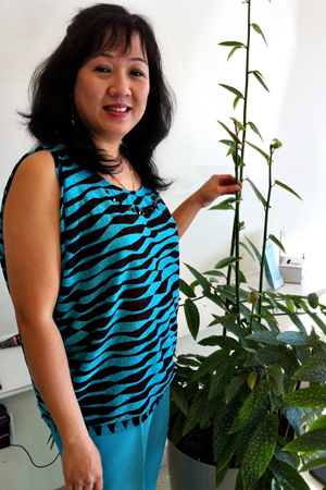
So here are my captures for turquoise. First my nail technician. As soon as I saw her outfit, I knew I needed her photo, and she was glad to oblige.


Lindaw
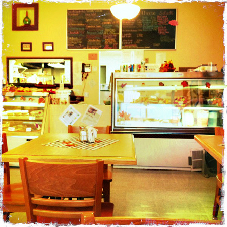
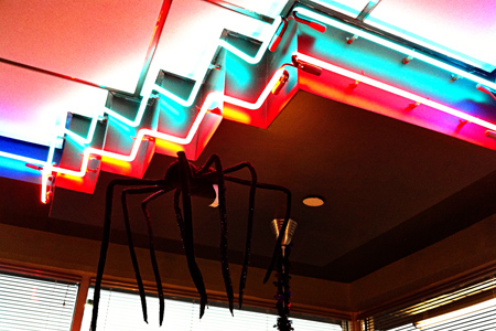
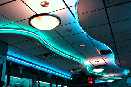
The next two photos are from a diner where Tracy and I had breakfast on Wednesday after an early morning shopping excursion to pick up some new speakers. When Matt left in May, he took his speakers with him, and we’ve been without ever since. Our favorite, local, store had an invitation only sale, and we took advantage of it. The neon lights were perfect, and I’m submitting the second one to Project 64.

Dinerw

DinerCeilingw

All three photos this week were taken with my iPhone. 


Project 64: Gold

  • by

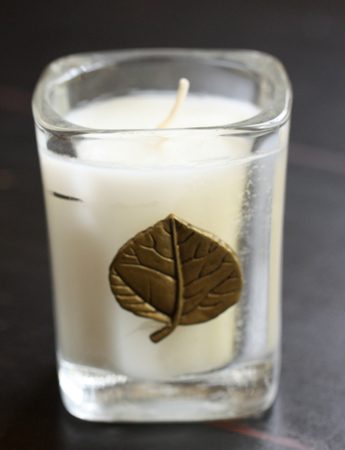
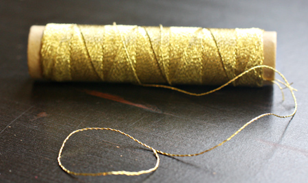
Just a quick post for my photos of gold for Project 64. I wanted to take a shot of my great-grandmother’s pocket watch, but I can’t find it. That’s a bit worrisome. So I had to settle for a pretty little candle that sits in my studio and some gold thread.

Candle

GoldThread1

There’s more gold to be found here.