Skip to content

Masculine Color Trends Challenge

  • by

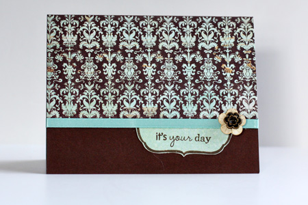
I need a few birthday cards for guys so thought I’d participate in Embellish’s latest challenge.

ColorTrends_Masculinew

I must admit I would never put these colors together, and it was a bit of a challenge. I cased this card by Nicole Heady, and I’m pretty happy with the end result.

  EmbellishMasculine

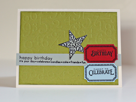
The green is showing up here on Typepad as much more muted that it is IRL (despite two efforts to correct it. It looks exactly right on my monitor). I used Pure Poppy, Spring Rain, Simply Chartreuse, & Vintage Cream cardstock from Papertrey Ink along with Light Morning Mist from Worldwin. I embossed the background paper with By the Numbers impression plate and distressed the edges with Peeled Paint distress ink. I used three different stamp sets (all Papertrey): “Simple Sentiments,” “Just the Ticket,” and “Star Prints.” This was an easy card to duplicate, so I made three of them.

Photography & Card Making–Two Challenges

  • by

MIM&Proj64

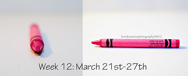
It’s not often I can combine a photograpy challenge with a card making challenge, but this week was easy. As soon as I saw the new color at Project 64, Tickled Pink, I knew it was a perfect match for Papertrey Ink’s Hibiscus Burst.

Wk12 March21_27 TicklePink
 

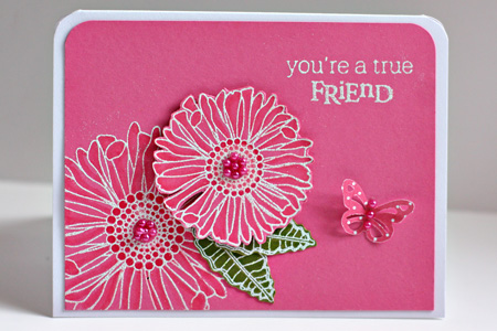
The challenge for Make It Monday was to use Copic Markers on colored cardstock. So I pulled out one of my favorite stamp sets, Friends Til the End, and embossed the flowers with Filagree White Embossing powder. I use the Hibiscus Burst Copic Trio (RV10, RV13, Rv14) and YG03 & YG05 to shade the Simply Chartreuse leaves. A few Memory Box pearls and a Martha Stewart butterfly from Bitty Dots finished it off.

MIMFriendw

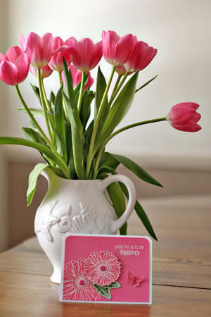
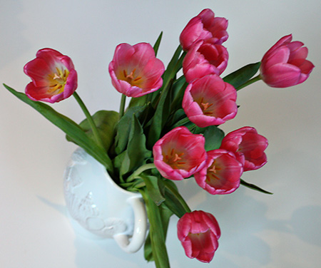
The card wasn’t the only find for Tickled Pink, however.

Card&Tulipsw

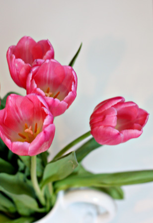
Trying some new perspectives:

Tulips1w

Tulips2w

Pottery Barn flowers I noticed as I walked by the entrance this week:

PBFlowersw


Papertrey March Blog Hop

  • by

Bloghoplogo

It’s time for the Papertrey Ink monthly blog hop. How did it get to be the 25th already? I must admit, however, March is one of my least favorite months. I’m so ready for Spring by now, and we are once again buried under in several inches of new snow. Once April comes, I always feel like Spring has a chance!

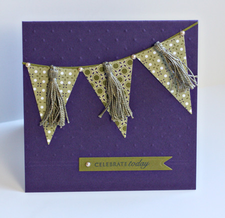
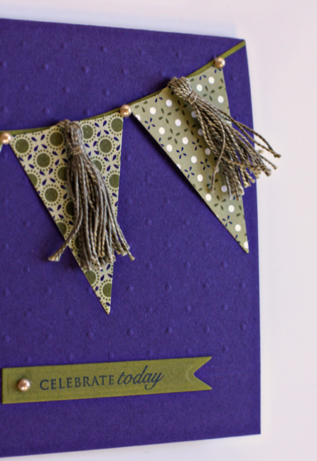
This month’s challenge was to use embroidery floss in a creative way. I decided to make some small tassels to attach to some pennant flags. I used the Pearl Cotton floss which is a little heavier, but can be found right along side the regular floss at Michaels. To create the tassels,  I used a tutorial I found here. It was very easy to follow.

PennantCardw

PennantDetailw

This turned out to be a very difficult card to photograph so the embossing would show.  I used the partial embossing technique again which I’m liking a lot, and scored two lines at the bottom of the embossed portion of the card. The pennants and banner die for the sentiment are from the Spellbinder’s Nested Pennant set. The banner line is cut from Quickutz Pennants set, and the embossed portion of the card was made with Papertrey’s Tintype Impression plate. I used Papertrey’s Royal Velvet cardstock and two designs from their Pacific Vineyard pad of papers. The sentiment is from the Papertrey “Round & Round” set. Finally, the pears are my faves: A Muse Creative Candy.


Team-up Thursday: Spring & Picture Inspiration

  • by

Teamup

It’s Team-up Thursday. Nancy and I have missed the last couple of weeks. She’s traveling, but I’m the real culprit. Our photos couldn’t be much different, but then our environments are much different right now. She’s in sunny (and hot) Florida. I’m in snowy Rochester. In fact, she says it’s a lot more like summer than spring where she is. Her photo was taken at the Florida Aquarium in Tampa. The colors reminded her of spring. Mine was taken here and represents the HOPE of spring despite the several inches of snow we got yesterday. These are winter aconites. They’re the first flowers in our yard to bloom. Sadly, they’re in the back so we don’t get to enjoy them much. By the time, we’re out in the yard, they’re gone.
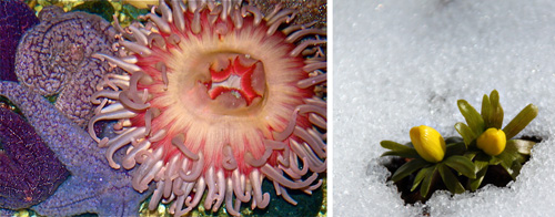
TUT_Spring

I got behind with Picture Inspiration as well, but I’m really enjoying this class at BPC with Tracey Clark. In addition to motivating me to take photographs, the gallery is a constant source of inspiration. I’m also taking Kent Weakley’s Photography Composition e-class which is wonderful. Yesterday’s lesson talked about how to look at the images you admire to discover those elements of composition that contribute to your love of the image. As I have long recognized, each of us see images very differently, and what appeals to one person may not have the same appeal to another. The key to good composition in photography is to figure out what you love so you are happy with the images you create. After all, most of what we photograph is for our personal pleasure or memory books.

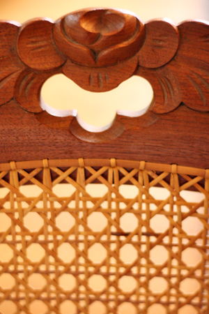
A week ago the prompt was motif. Tracey’s continued with her exploration of pattern and rhythm. Here’s part of the definition–“a distinctive and recurring form, shape, figure, etc, in a design, as in a painting or on wallpaper.” I immediately thought of our hand caned chairs that belonged to my great-aunts.
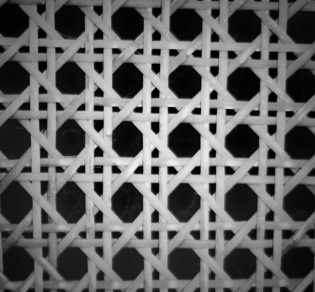
CaningBWw

MotifChairw

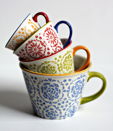
This week’s prompt was “stacked,” which was already a prompt for Team-up Thursday a while ago. I did post my cheerios photo again, but also two new ones.

Stacked Kayaksw

The kayaks stacked up along Irondequoit Bay last week before our recent snow. The bay is still covered with ice in many places, so it will still be awhile before they’re in the water.
StackedMeasuringCupsw

And these gorgeous measuring cups from Pier One that I first saw on Deb’s blog and then found on sale. They’ve found a permanent spot on my kitchen counter where we can enjoy them as well as use them.



JustRite Friday Challenge: An Act of Kindness

  • by

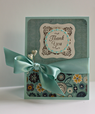
This is the first time I’ve participated in a Just Rite challenge although I’ve long been a fan of their stamps. This challenge comes at a perfect time since I depleted the entire stash of thank you notes on Monday after writing all the friends who have helped us out since my surgery.

JRThankYou

JRThankYouDetail

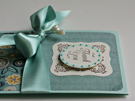
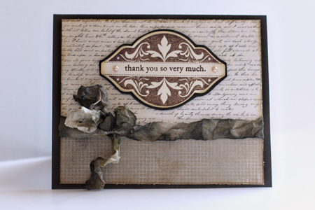
I combined two Just Rite sets for the focal point: the square frame come from the “Hope” set which I then cut and embossed with a Nestabilities Label One die (Spellbinders). The circle and border come from “Just a Note” which I cut with a Nestabilities Circle die. The bow is made from my favorite ribbon from The Paper Source. It’s two-sided satin which makes it so much easier to tie. The tiny pearls (which match more accurately IRL) are A Muse Creative Candy and the two stick pins came from a Scrapbook Circle kit. The beautiful papers are more My Mind’s Eye; this time from the Hattie paper pad. The card base is Aqua Mist from Papertrey.

Clean and Simple Challenge 132

  • by

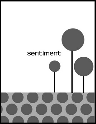
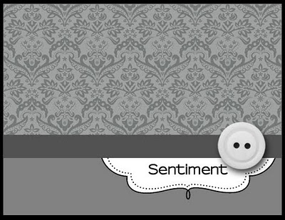
While I was recuperating, I spent a lot of time surfing the internet and got the urge to participate in some of the MANY challenges on the internet for card makers. The Clean & Simple sketches have always been a favorite of mine. Here’s last week’s sketch:

FTL132

And here’s my take on it:

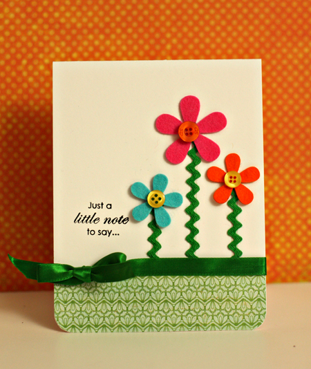
JustANote

I started with Papertrey Ink’s White Select cardstock and die (Papertrey) cut three flowers with Raspberry Fizz, Orange Zest, and Hawaiian Shores felt. The rickrack, ribbon, and buttons were all items from my stash. The patterned paper is from the Emma’s Shoppe 6X6 pad by Crate Paper. The sentiment is from Floral Frenzy (Papertrey). I haven’t used this set in a while. The inside sentiment reads “You’re in my thoughts today.” I have a friend who had a hip replacement this morning, so this will be on the way to her as soon as we know where she’ll be for rehab.

Two Challenges

  • by

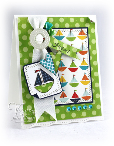
I’ve been following the CASE Study challenge for several months, but finally created a card for the current challenge. Each week they provide a card as inspiration. As soon as I saw these delightful card with sailboats, I knew I wanted to play along.

VG_Mojo168_Julee450

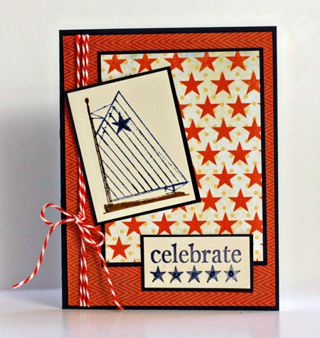
I just ordered this sailboat/sentiment stamp by Unity and it came last week. I knew it would be perfect for this challenge.

CelebrateUnity

Cardstock: from my stash; Patterned paper: “Mabel” by Stella Rose (My Minds Eye) & Celebrate (Teresa Collins); Stamps: Celebrate Webster’s Pages (Unity); Twine: The Twinery.  I colored the sailboat with Faber Castell Stampers Big Markers. Although it’s hard to see each star in the sentiment has a tiny pearl I colored with a B37 Copic marker.

Although I had the card made for last week’s Make It Monday in time to post last night, I didn’t get it photographed. I guess you can blame March Madness. The Syracuse game was only seen here on digital TV so I had to watch it downstairs. They lost in a rather sad game with nearly 18 turn-overs.

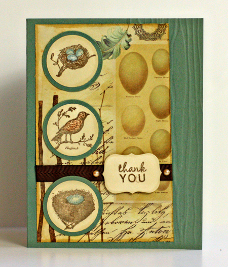
The challenge last week was to emboss just a part of your card. I used the Woodgrain Impression Plate by Papertrey Ink and embossed only the right hand side of the card. I’m also linking this to Creative Every Day where the theme for March is “nest.”

  Ced2011logo

Conservatory

I used new papers from 7 Gypsies Conservatory 6X6 paper pad, stamps from Cavallini and Papertrey Ink with a bit of distressing and distress inks from both Tim Holtz and Papertrey. The cardstock is Ocean Tides by Papertrey.

Project 64: Scarlet

  • by

Project 64

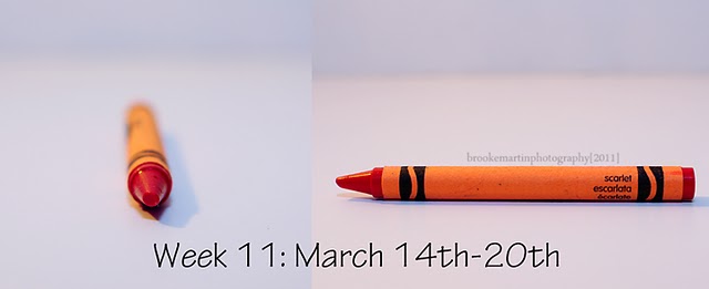
I didn’t get out much this last week, but my first foray outside the house was last Thursday when Tracy took me to the lake for lunch. I knew I wanted to make a quick stop to take a photo of kayaks along Irondequoit Bay for the prompt this week at Picture Inspiration. (That post is coming.) As we were pulling out of the parking lot, Tracy noticed these three kayaks–all scarlet–a much more orangish red that I would have imagined.

Wk11 March 14_20_Scarlet

I always think of Snow White’s evil stepmother with scarlet lips which (in my picture book) were a deep and bluer red. So this week I have just two offerings for scarlet. Hopefully, this week will be a bit better and I’ll be up and running again.

Kayaks2w

Kayaks1w


Project 64: Plum

  • by

Project 64

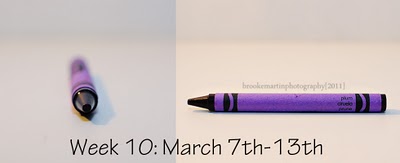
This week’s color at Project 64 was plum, actually a color I like quite a lot.

Wk10 March 7_13_Plum

Fortunately, I looked around and found some things that matched the crayon (and its scribble) before I went off for surgery. Today I managed to get shots of most of them. The first one is a newbie.

Ribbonw

A good friend who brought dinner over the other night, also brought a lovely arrangement of flowers for my dinner tray. Tracy said, “I think we ought to save these in case they match one of the crayon colors.” Good thing he was thinking about it, because one of them is a pretty good match for plum.
IPhonew

So is my iPhone cover.
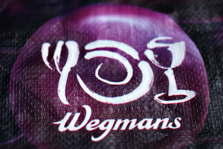
WegmansBagw

And my favorite reusable grocery bag from my favorite grocery store.  And here’s my shot for the week:

Amythest2w

This is one of my favorite necklaces. I wear it on several different chains and have two pairs of earrings that go with it as well. I grabbed the lid from one of my vintage Mason jars for the photograph. Check out the other entries. I love looking through all the other photographs to see what folks have found and to “collect” ideas for composition.


Make-It Monday 5

  • by

Make-itMonday

I got to this week’s Papertrey Ink challenge a bit earlier this week. The challenge was to do some distressing on the project. It’s not something I do often. In fact, I have a distressing tool which I used for the first time today! I must say it worked very well, although the distressing around all the edges of the patterned papers doesn’t show up particularly well here.  I also took the opportunity to use one of my new stamp sets: Mat Stack #2 Collection. It’s filled with very elegant designs for the mat stack and a good addition to my stamp collection.

MIMDistress

Quite some time ago, I dyed a lot of seam binding with a variety of mists. I chose the colors for the card based on a piece of the ribbon. I used another piece of the My Mind’s Eye paper from the Mabel collection and one from Basic Grey’s Basic Kraft collection.


Clean and Simple

  • by

FTL130

I love the sketches at Clean & Simple, but haven’t had a lot of time to play along for a while. This week’s sketch is a busy cardmaker’s dream. One piece of cardstock, one sheet of patterned paper from a 6 X 6 paper pad (I used both sides of it), a piece of ribbon, two buttons, one Fillable Frame stamp, and two sentiments (one inside and one out). It was finished in about 10 minutes. I love this color combination, too.

C&S

Cardstock: Dark Chocolate (PTI), Patterned Paper: “Mabel” Stella & Rose (My Mind’s Eye); Die: Fillable Frame #8 (PTI); Stamps: Fillable Frames #8 & #5; Buttons: LaDiDah (KI Memories)


Project 64: White

  • by

Project 64

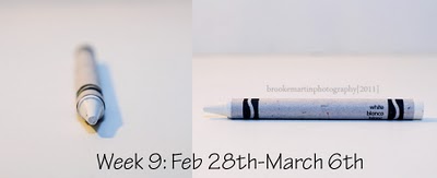
This week’s prompt at Project 64 was white, so I didn’t need to carry a crayon around with me.

Wk9 Feb28_March6_White

Initially I thought I would take photos of my white pitcher collection, but in the end didn’t use them at all. Here’s what I found.

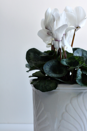
WhiteOnWhiteCyclamenw

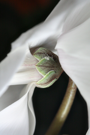
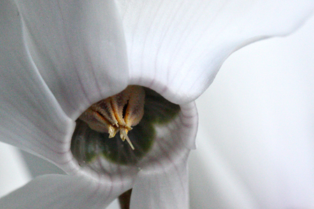
Aside from the leaves this meets Brooke’s additional challenge of white on white which I use frequently. I bought this cyclamen for a friend, but took advantage of it before I gave it away. Here are a couple of close-up shots.

CyclamenSepalsw

InnerCyclamenw

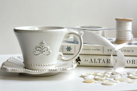
Finally I was inspired to set up a little still life.

WhiteStillLifew

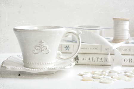
I was happy with this, but added one of Kim Klassen’s textures, Gray Day Slate, with a blending mode of Hard Light at 80%, and this turned out to be my favorite for the week.

WhiteStillLifeGreyDaySlatew

I’ll be submitting this for Sweet Shot Tuesday as well.

Sweetshotbutton


Make-It Monday 4

  • by

This is my second post today. Scroll down for a post on Exploring with Your Camera.

Make-itMonday

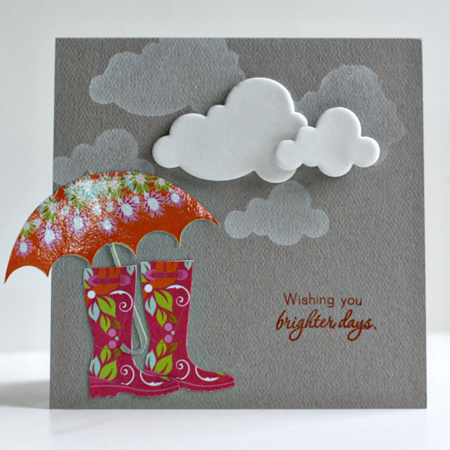
This week’s challenge was to use some fun foam and create your own stamp with a die cut. I had to go buy a piece of fun foam as it’s not something I’ve ever used. I decided to buy white, thinking I might eventually color it with mist or paint. But I knew right away that for this challenge, I’d use the white for clouds. Several years ago, I bought two sheets of paper by Autumn Leaves called “Wellies and Umbrellas, and I’ve always wanted to use the images on a card. With the introduction of “Healing Touch Sentiments” (PTI) a couple of months ago, I had the perfect sentiment for the card.

BrighterDaysMIM2

I’m really pleased with the card, and was amused to have Matt come into the studio and tell me he thought it was one of my best cards. He spent quite a bit of time examining it and asking about the challenge. I used the fun foam to stamp the clouds with Fresh Snow ink (PTI), hand cut the wellies and umbrella, and added the foam clouds. The sentiment is stamped with Pearlescent Rust by Brilliance. They’ve recently become my favorite inks although I’ve owned most of them for years.

Team-up Thursday: Everyday Beauty

  • by

Teamup

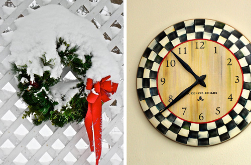
It’s hard to believe it’s Thursday already. The days are flying by! This week’s prompt was Everyday Beauty. I walked around the house and took some photos of things that give me pleasure. (No cameras, since I posted those yesterday.) Nancy sent the photo of the wreath on her deck with the note that, “This beautiful wreath has been on my deck since early Dec. and has looked pretty much like this every day!” We can’t decide if all that snow for three months is a good thing or not! I chose my MacKenzie Child clock for the diptych. It’s the same shape as Nancy’s wreath, and one of my favorite things in my studio. Sarah and Adam gave me a gift certificate for my birthday last year, and I knew exactly what I wanted. You’ll see by the other photos, that I’m a fan of MacKenzie Child as well as black and white checks!

EverydayBeauty

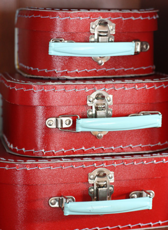
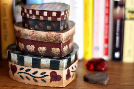
Just for fun, here are the other contenders:

RedSuitcasesw

A stack of red paper suitcases that hold Papertrey ribbons and twill and a collection of Letterpress tags.

HeartBoxesw

Folk art heart boxes on our bedroom bookshelf.

KitchenShelfw

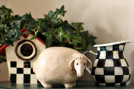
This funky sheep was sent to me by a good friend. I’ve had the birdhouse for ages, and bought the MacKenzie Child cream pitcher about a year ago. If (when) we redo our kitchen black & white tiles are on the wish list.

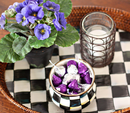
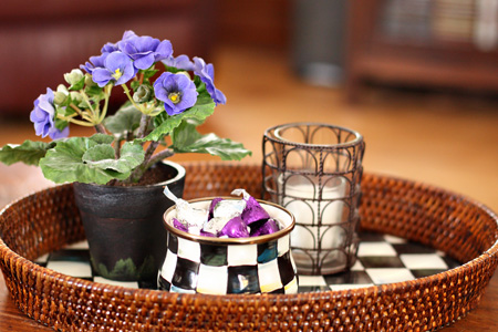
CoffeeTableTray1w

CoffeeTableTray2w

And two shots of the tray on the coffee table in the living room.


Three Things

  • by

Sweetshotbutton

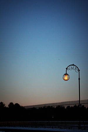
First off, my shot for Sweet Shot Tuesday (and P52). It’s the same shot I used for Team-up Thursday, but it was my favorite of the week.

InTheDistanceSLw

I also like this one, taken the same evening.

ReservoirLightHLEdgeBurn60w

Second, a layout I completed for Shimelle’s 4X6 class on 2Peas, that I also posted on the Scrap-Mart blog. I usually wait until they’ve posted there before I post here.

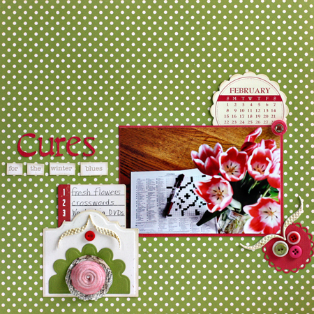
CuresLO

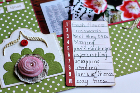
CuresLOJournaling

I followed the sketch pretty closely and used a lot more product than I usually do on this layout. I made the pocket from two of the dies in the Spellbinder’s Creative Book dies. I used a new Quickutz die for make the rose from Vintage Cream felt that I sprayed with a Perfect Pearls mist. I cut “Cures” from the Calendar cartridge with my Slice, and used embellishments from October Afternoon, Jillibean, Pink Paislee, and a Scrapbook Circle kit. I’m hoping to get the next sketch completed in the next day or two.

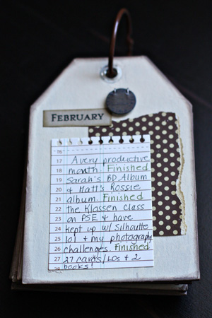
And finally, an update on my One Little Word: FINISH. Here’s the February page in the tag book.

  FebTagBookUpdate

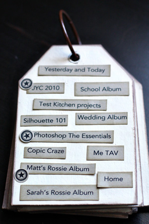
And the record page:

TagBookFebIndex

I’m very pleased with this month’s progress. I finished two big projects (Sarah’s Birthday album which I never listed on this record page, and Matt’s Rossie Album–which I’ll post soon.) I finished all the lessons for Kim Klassens’ Essentials Photoshop class where I finally grasped the concept of layer masks. I’ve been quite successful in using them as well. I’m taking a Silhouette 101 class at My Creative Classroom which has been terrific, and I’m current on all the lessons there. I read one book from my 2010 list and finished our Book Group book as well. Now I’m into Cleopatra:  A Life, which is the Book Group pick for March. I fill out a project card for almost everything I make, and there were 27 of them in the February envelope.