Skip to content

Beautiful Washi

  • by

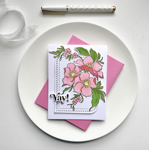
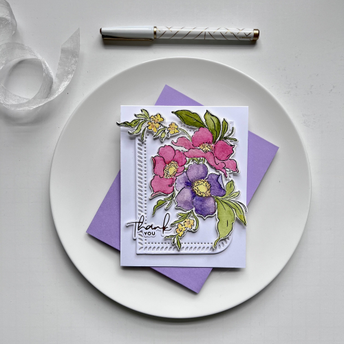
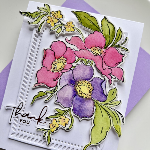
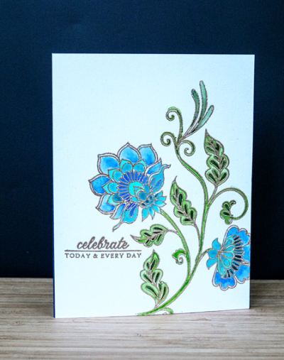
Pinkfresh Studio has some of the most beautiful Washi tape. I’ve ordered a couple of sets and have received the complete suites a couple of times for big events. This summer’s Create and Connect event featured a gorgeous Washi tape designed and watercolored by Dawy Woleslagle. I followed along with the video for her second card, and when I was finished I was a bit puzzled because I didn’t like it as much as I thought I would. Pinkfresh sends a wonderful book with directions and photographs of the cards that will be made in class in addition to Make and Takes by other designers. I had looked at the card in the book and liked it a lot. When Dawn created it in class she added a lot more floral pieces to the frame, and it was too much for me. I took my card apart and put it back together again so it’s very similar (but not identical) to the one in the book.
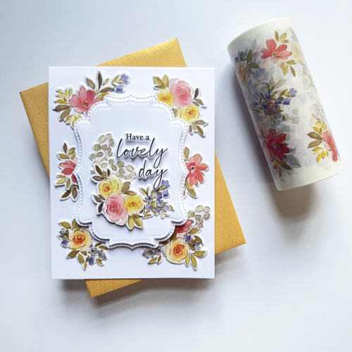
LovelyDay

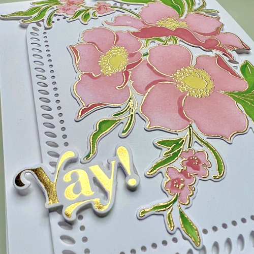
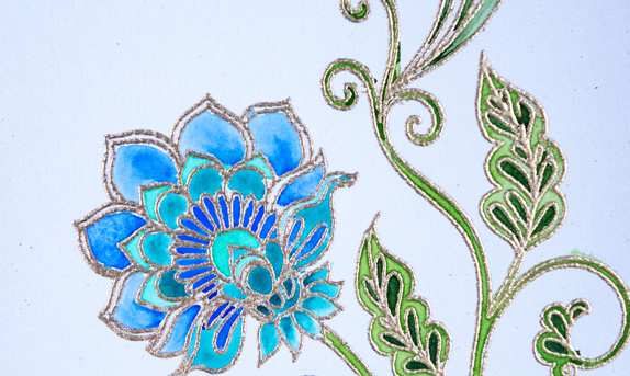
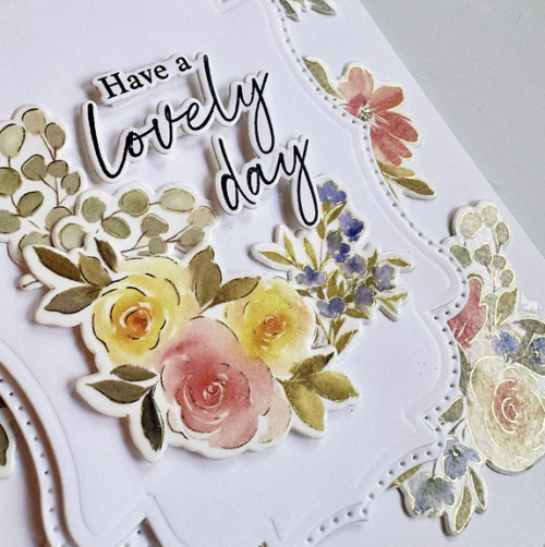
In addition to the Washi tape and coordinating dies, there is also a stamp and stencils. I’ve yet to try those, but am quite sure you’ll see some eventually. It was hard to capture the beautiful foiling in this Washi, but this photos catches a bit of it.
LovelyClose

The sentiment here is part of the stamp set, and the dies cut out the sentiments which I love. This sentiment and the floral are on another of the products for the class. When I first saw the Dotted Fancy Frames I wasn’t sure if I’d like them. But when layered together as they are here, I’m very fond of them.

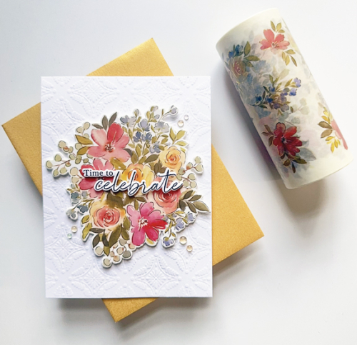
The next card is simpler and, not surprisingly, a design I came up with when I ended up with three of the large florals from the Washi Tape on my desk.
Washi

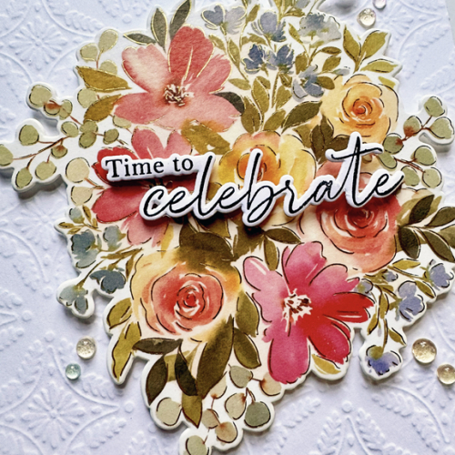
I found an already embossed Honey Bee Winter Gems card front in my stash. I know it says winter but when done white on white, I think it works with these pretty flowers as well. This card could not be simpler or quicker. I added the large image with some thin dimensional tape and another sentiment from the stamp set.
WashiClose

I also added a few of the Iridescent Dew Drops that were also part of the event kit. 

I’m getting these posted just under the wire for the Pinkfresh World Card Making Day Challenge. I was in Italy for WCMD, but am happy to have these completed before the challenge ends. 
 

Clean and Simple Florals

  • by

Knowing full well I’d be away when the latest Pinkfresh Studio Create & Connect event took place, I signed up anyway. The truth is I have a terrible time keeping up with the live videos. And too frequently, the card the designer is sharing is a bit over the top for my taste. By doing it this way, I could watch the videos and make some decision about what and how to create with the (always) fun product that comes with the class. 

In addition, I can watch the videos in any order I want. This time I started with a cling stamp, stencil, and die called Modern Botanicals. I colored two sets of the florals, knowing I want to eventually create the first card Kristina Werner designed for her class. For one set, however, I decided to make three CAS cards, using a variety of precut card fronts and dies I had in my stash.

PinkFloral

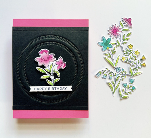
The black piece was dry embossed with The Greetery Crimped Circle dies. I thought I was going to use it on a previous card, but ended up putting it in my envelope of card fronts instead. I trimmed off the top and bottom and added a thin strip of black cardstock as a border, and added it to a bright pink card base. All the florals are from Modern Botanicals. The sentiment is a Betterpress one from Spellbinders’ Always and Forever Sentiment Strips.

PinkFloralClose

The background for the next card was die cut and given to me by a friend several years ago, and I’m just now finding the perfect use for it. It’s Scalloped Stackers: Medium from Papertrey Ink.

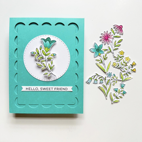
TealFloral

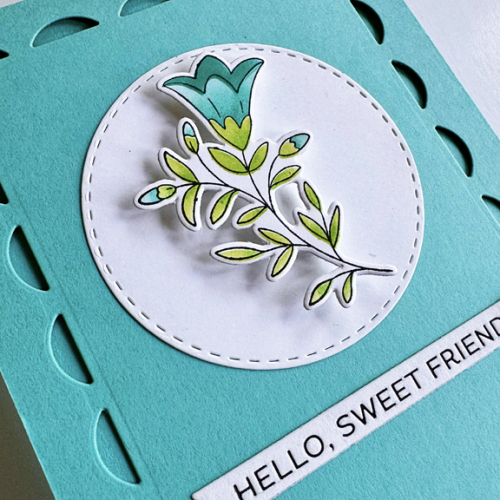
Teal isn’t a color I often choose, but it was perfect for this floral. I added a Stitched Circle from Simon Says and a another Betterpress sentiment from Always and Forever Sentiment Strips. I added some dimensional tape to it before adding it to the circle.

TealFloralClose

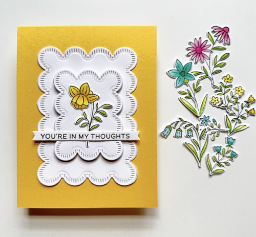
The last card uses some Stitched Scallops from The Greetery. A friend loaned these dies to me, and I die cut a good stack of them in several colors. It didn’t take me long to find a use for these.

YellowFloral

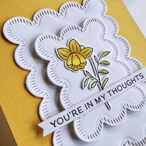
This sentiment, too, came from the same Betterpress plate by Spellbinders. I added some thin dimensional tape to the smaller Stitched Scallop for a little interest. I gave thought to embellishing all three with some pearls or enamel dots but in the end, decided I liked them as is. (Easier to mail, as well.)

YellowFloralClose

I’m sending these off to The Flower Challenge: Include a Stamped Image.

FlowerChallenge

We’re off on our next adventure tomorrow. I have a group of posts written, and depending on my time and internet access, I may get a few posted. For sure the next Color Hues Challenge will go live on October 1. I gave some thought to totally getting off the internet while we were away until Tracy asked me how many emails I thought I’d have on my return. I shuddered at the thought. I’m taking my iPad so I can read my Kindle books on the flights, but because I usually use a laptop, I’m not terribly adept at using the iPad for much other than reading. 


Crafty Weekend: Part 1

  • by

Last weekend I spent two days immersed in card making with Pinkfresh Studio. There were six classes with two hour videos for each, as well as printed instructions for “Make & Takes” for each set of products. I didn’t deviate much from the instructors’ card designs, but I thought over the next week or so, I’d share some of the cards I created during the event. All the products were created especially for these classes, although many of them will eventually be released for purchase. I definitely had my favorites, but with one possible exception, you’ll see lots more of these products.

First off, Nothing But the Best. This set was the focus of a two-hour class on watercolor technique. Before the classes began, I created the Make & Take. All the instructions and sample card designs for the Make & Takes as well as the class instructions were sent ahead of time in a lovely booklet. There were also lists of card bases and die cuts to prepare as homework for each class which enabled you to keep up during the class instruction.

Yay

For the Make & Take, I used layering stencils instead of watercoloring. I followed the card design, but my coloring was more vibrant that those suggested. 

YayClose

All the participants received a packet of pre-foiled sentiments. The one used in the sample covered a large portion of the floral design so I chose a simpler, smaller one knowing it could easily be used for a birthday or another celebration. The lovely Rounded and Braided Rectangle (in three sizes) was used over and over in the card designs, and is one of my favorite products. 

The two-hour class time for this set was spent learning about watercoloring: mixing colors, finding the right water/paint ratio, and layering watercolors. It reminded me of how much I enjoy that medium, but don’t use it often enough. 

Watercolor

There was no assembly of the card as part of the class, and I used the same design I used for the Make & Take which I preferred to the suggested design. For this card, I used a foiled sentiment from Spellbinders.

WatercolorClose

We completed a second watercolor panel, but I wasn’t happy enough with it to create a card. I’ll definitely return to this again!

Sunflowers

  • by

We bought a wonderful pot of sunflowers for our patio last week, and overnight some animal ate every leaf! Such a disappointment, although I did cut all the flowers and brought them inside. These sunflowers won’t get eaten.

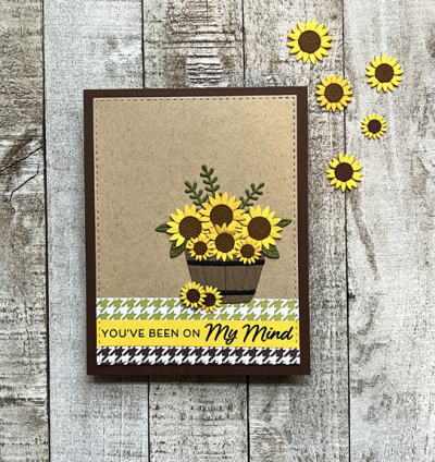
It’s a Word Challenge at Just Us Girls this week. The word is BASKET and it came at the perfect time. I couldn’t pass up My Favorite Thing’s latest kit: “Sending Sunflowers,” and it had just arrived.

WordWeek

I decided to use the sketch at this week’s Freshly Made Sketches, (linked here if you’re interested in the sketch), but missed the deadline by just a few minutes! It’s so annoying when I let that happen. But, the challenge at CAS on Friday is stripes, and I think this works there as well.

SunflowersFlat

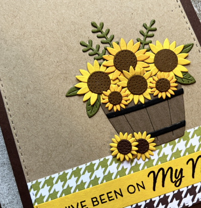
When my friend, Michelle, receives new dies, she cuts out lots and lots and assembles them. That’s not usually my style, but this time I did make a lot more than I needed for this card, so you’re sure to see a few more sunflowers before September ends. The MFT kits are a wonderful value, and this one came with two sets of dies, a sentiment stamp set, as well as a patterned paper pad with houndstooth papers (see above!) I used a Stitched Rectangle from Simon Says, but otherwise everything except the kraft cardstock came with the kit. There’s also a mason jar and a cute watering can in one of the die sets. The kit has already sold out, so I’m glad I didn’t wait.
SunflowersClose

It’s a sign of my age, probably, but I’m in need of new Thinking of You cards. I had a nice stash of them, but I’m down to the last couple. This is a start. 


Joseph’s Coat Technique

  • by

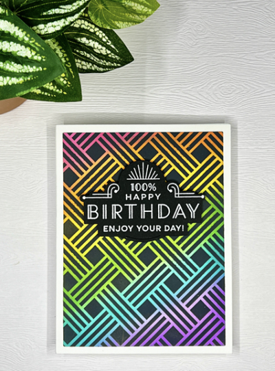
When I enrolled in the Online Card Class “Spring Card Camp 2022” I knew I wouldn’t have much time to participate. The first week of class we were in Wisconsin, and the two weeks since have been packed. I don’t think I’ve been this busy since way before the pandemic. Today is the last day you can submit a card to the gallery, and I finally had time last night to try the Joseph’s Coat technique.

Joseph'sCoat

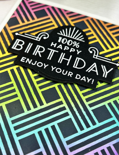
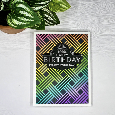
I was fascinated with the technique, and I’m really pleased with the results. I started by ink blending a piece of card stock with a variety of Distress Oxide Inks in a rainbow of colors. Then you place a stencil on top of the ink blended card stock and brush a heavy coat of Black Soot Distress Oxide Ink on top of it.

Joseph'sCoatClose

Pulling the stencil off is such an “ah ha!” experience. 

Joseph'sCoatSq

I embossed one of the sentiments from The Greetery’s “Everyday Labels” and die cut it. I love the font and Art Deco look of these sentiments, and it seems perfect for this graphic background. 

I’m entering this in Seize the Birthday Challenge: Use a Stencil and the Addicted to Stamps and More challenge where they’re looking for “Die Cuts and Stencils.” 

2022-06-26-UseAStencilAddicted

And also to the NBUS June Gallery as I’ve never used the My Favorite Things “Basket Weave” stencil before—or this technique!

NBUS

I have a list of six more techniques I want to try from this class and a nice selection of new products (thanks to birthday gifts,) so hopefully the blog will soon be a bit busier than it’s been the last few weeks. 

Stencil Fun

  • by

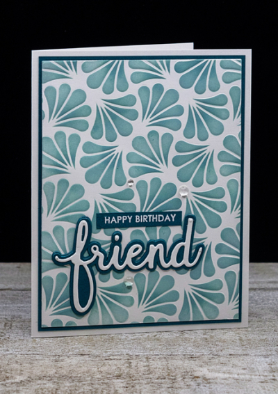
I recently completed one of Altenew Academy’s classes called “Stunningly Styled Stencils,” and finally found time right before we left on vacation to create a couple of cards inspired by the lessons. The first one uses a Gina K stencil, “Ornamental Fans.” I dry embossed it on Neenah 110# paper. I wish I had thought to photograph it, as it was lovely just embossed. But I went to the next step and repositioned the stencil over the embossing and ink blended it with Speckled Egg and Evergreen Bough Distress Oxide Inks.

OrnamentalFan

Concord and 9th’s Oceanside cardstock made a great frame for the piece which I adhered to a white card base. 

OrnamentalFanClose

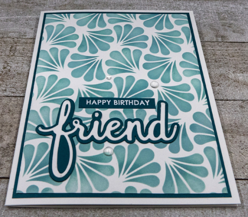
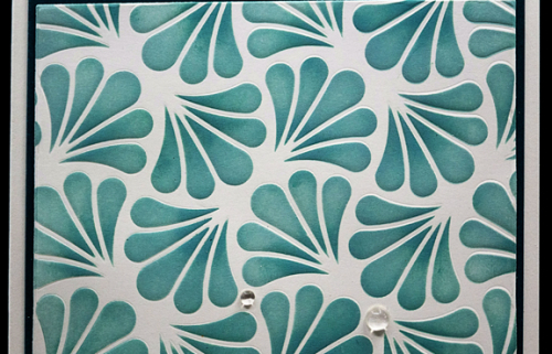
One of my Pinkfresh Studio purchases with my birthday gift cards was the Phrase Builder: Hello die set. I love that the words can be die cut alone or with a shadow. Adding the shadow with the Oceanside cardstock provided a good focal point against the somewhat busy background. Here’s an even closer look at the pattern. It’s a bit easier to see the raised embossing which I love.

OrnamentalFanDetail

The sentiment was finished off with a white embossed greeting from Sugar Peas Everyday Sentiments. 

OrnamentalFanFlat

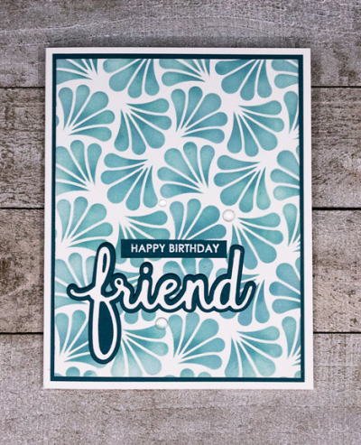
The final touch was to add three clear droplets from The Stamp Market.

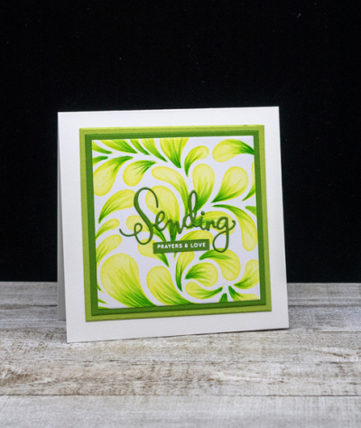
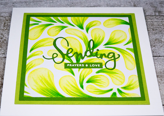
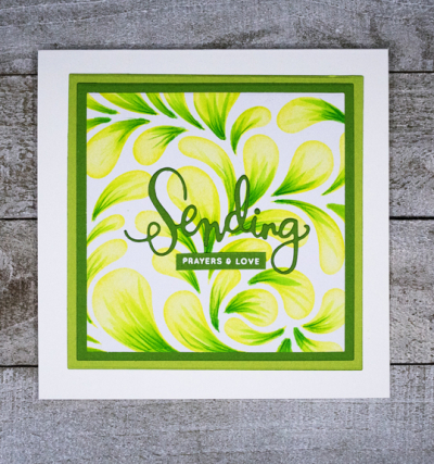
The second card uses a different technique altogether, and one I need to practice. I first ink blended some Gina K Key Lime ink onto Altenew’s Flowing Drops stencil. The next step was to flick color with some Copic markers onto the drops with the stencil in place. The first problem arose when I realized (a bit late) that my first Copic marker was too dry. (I recently read an article about the importance of keeping your markers filled. I’ve had some of my Copics for years and have never refilled them. Copic recently came out with small, easier to use refills, so I’m making a list of a few I’ll need to order.) But I moved on to the next color, and ultimately added some detail with a Polychromos pencil.

SendingPrayers

I decided to use a series of Essentials: Squares by Ellen Hutson to die cut the stenciled pattern and two mats from New Leaf and Green Parakeet cardstock. I adhered all three to a square notecard.

SendingPrayersClose

The sentiment die cut and white embossed are from Simon Says “Sending Happy Thoughts,” although this card is headed for a close friend who has just had some major surgery and a very concerning diagnosis. I hope the cheerful colors will brighten her day a bit.

SendingPrayersFlat

There are still several more techniques from the class to try as well as giving this one another shot!

Spring Card Camp

  • by

I enrolled in the Online Card Classes “Spring Card Camp,” thinking it would provide some additional inspiration for my #The100DayProject of daily coloring.

SPRSCC2020-participantParticipationbadge

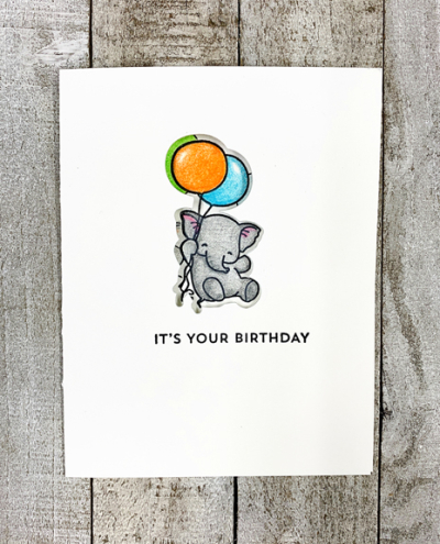
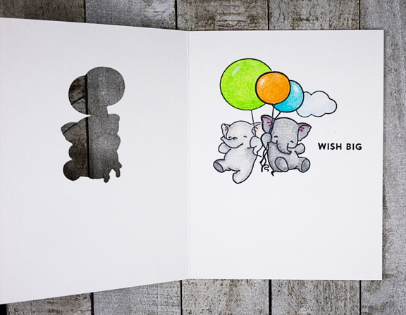
The first three lessons focused on stamping rather than coloring, but today’s lesson by Julie Ebersole was perfect, and definitely a technique I had never tried before. Each lesson in the camp is focused on creating two cards using one technique. This one was called the “Coordinating Die Cut Trick.” It requires a stamp with a matching die cut. I have plenty of those so I was a bit surprised how few stamp and die sets I had that I thought would work with for this technique. I’ve pulled a few more sets to try later, so you may see more of these. 

The first step is to stamp an image on the front of a card and then die cut. You set that die cut aside for card #2. Then you restamp the image through the die cut on the inside of the card. Here’s a look at the front of the card:

HBFlyWithMe

Before coloring the inside image, I masked off the cute little elephant and added two other images to the inside of the card.

HBFlyWithMeInside

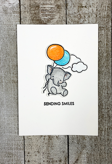
Here’s the second card. I opted to use an A4 card by Paper Source for this card, and added two die cut clouds.

SendingSmiles

I popped the little guy up with some dimensional tape after stamping the sentiment. All the coloring was done with the Polychromos colored pencils.

5 in 5 and Watercolor Challenge

  • by

Today’s the 5th of April, and time for Sandie’s meme 5 in 5—5 photos in 5 minutes. Sandie shared some of her projects during this time of isolation, and I thought I’d do a bit of the same. I shared a little on my last blog post, but today I’m focusing on coloring projects I’m working on. I lined up a bunch of projects and snapped away.

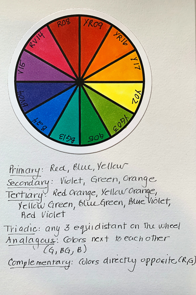
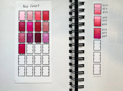
Improving my coloring skills with watercolors and Copic markers is always on my list. This increased time at home has given me ample opportunity to watch videos, pull out supplies and practice. Tracy gifted me with two Sandy Allnock classes for Christmas. I finished the videos for the colored pencil class in February, and continue to practice, but have moved on now to the Copic Jumpstart class. The first lessons focus on color theory as did the colored pencil class, but I created a new color wheel with Copics this week, and made notes on the essentials of color theory to add to a notebook I started a year or so ago. Sandy also suggested we make color wheels with a set of darker markers which I think I’ll try this week.

ColorWheel

I also updated my pages with a few markers I’ve purchased in the last six months or so.

CopicPage

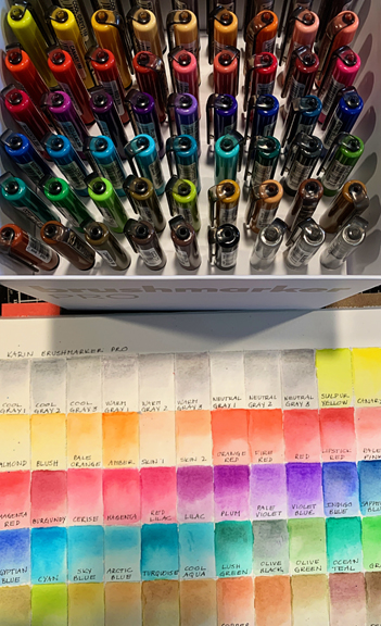
Last month I focused on watercolors, and I haven’t abandoned that effort at all. When a good sale arrived via my inbox a week ago, I decided to splurge and purchased a new set of watercolor markers. I spent one afternoon swatching out the 60 colors. It took a lot longer than I expected, but I learned a lot more than I expected as well. It was interesting to see how the colors blend out, some more easily than others, and to see in some markers a range of tones.

KarinMarkers

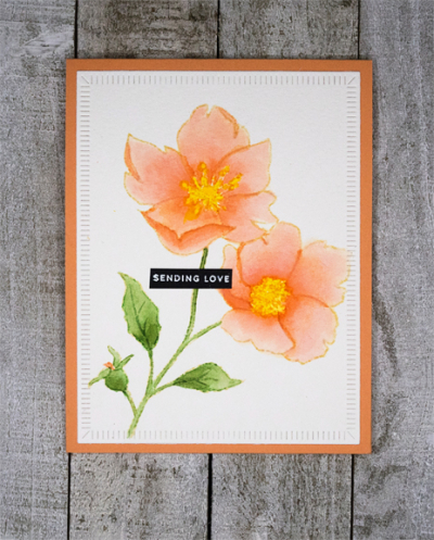
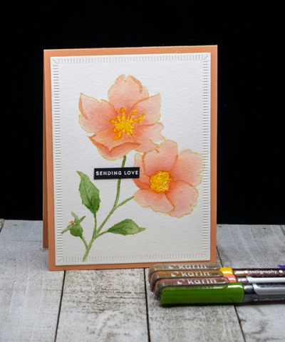
Yesterday I spent some time watercoloring the Wild Rose Stem from Memory Box. It was my best effort so far in no-line watercoloring. It was all done with just three Karin Markers and a watercolor brush to draw out the colors. 

SendingLove

Here’s another look at it. I’m taking this opportunity to share this at the CAS Watercolor Challenge which currently is “Spring Flowers.”

SendingLoveFlat

CAS Watercolor April 2020

I hope you’re finding time to destress with a comforting hobby. Crafting is the one thing that is able to take my mind off all the terrible news, and understandable fears we all have.

Using Colored Pencils

  • by

For Christmas, Tracy gifted me with two classes from Sandy Allnock’s Art Classes. I started the first one right after Christmas–Colored Pencil Jumpstart. I envisioned that it would be a one month project. Two things, however, have caused me to reassess my goal. First was the amount of time the Coloring Challenge Road Trip, Online Version took. It was so worth the time. (I blogged about it here.) The other was I had no idea how much content was included in the colored pencil class. There are 10 lessons, and each of the lessons I’ve worked through so far has included 3-5 videos with practice sheets to complete. Each practice sheet is time consuming if one wants to learn the principals behind the lessons. One night, however, I decided I wanted to use some of the skills I learned in the Road Trip class with some of the things I’ve been learning in Sandy’s class to actually complete a project. 

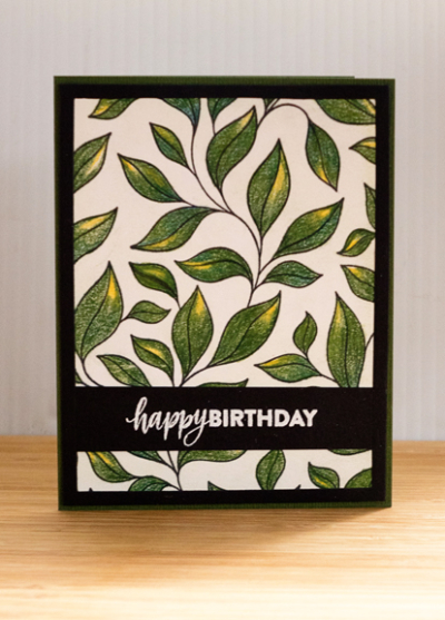
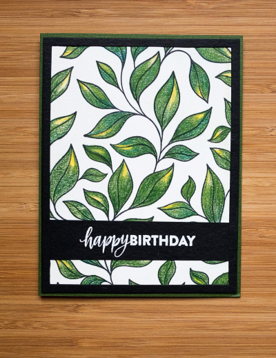
Before the holidays, I had purchased a few items from The Stamp Market, included an overall design of leaves, Just Vines. It’s not the kind of stamp I often order, but it was great for doing some coloring practice. And it took some time! I worked on it while I watched my favorite women’s basketball team play a game on television. It was a win/win. I enjoyed the game and completed a project. 

Once I had colored the background leaves, the challenge was to turn it into a card. Another Christmas gift was a gift certificate to Simon Says Stamps. I used part of it to purchase a new set of frames, A2 Thin Frames. Cut in black, it provided just the right contrast.

BDLeaves

Finally, I cut another piece of black cardstock and embossed it with the sentiment from Simon Says’ Brush Stroke Messages. 

BDLeavesFlat

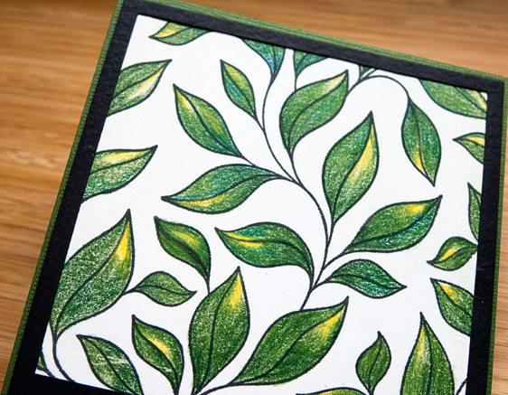
All the colored pencil work was done with my Polychromos pencils on Stonehenge paper (recommended for pencil work by Sandy Allnock.) 

BDLeavesClose

There’s a lovely texture to the paper which goes well with the leaves. 

Once again, it’s been a long time between blog posts. The days fly by. This week, however, I’ll be checking in soon with my progress for my OLW: COMMIT as I believe Honoré is hosting a link-up early in the week.

Watercolor Basics and Beyond: Part 3

  • by

Back again with another project from Altenew’s “Watercolor and Beyond” class. This has been such an easy class to keep up with. Jennifer’s video’s are short and to the point, but with enough detail to easily understand the concept she’s teaching. I have just two more lessons to complete—the one that failed the first time (I think now I know how to correct my problems), and the last lesson of the class which I watched this morning. I should be able to meet my self-imposed goal of being done by the weekend.

This lesson was about coloring a detailed embossed image with watercolor. It’s a technique I’ve used before but not with such a detailed image. Jennifer used the new Altenew “Needlework Motif” set. I’d seen a lot of beautiful projects using the stamp during Altenew’s release week, and ordered it. It was sitting on my desk awaiting this opportunity.

Motif

I’m very happy with the results. I took my time and used a very small watercolor brush, following the advice to move around the image letting one area dry before watercoloring the area next to it. It’s advice I’ve read many times before, but haven’t always heeded. It’s clear it’s advice worth following. I stuck to four colors of blue and two colors of green all from my Gansai Tambi watercolors. I do think I’m about to splurge on the Altenew set because of it’s compact size and the wide range of bright colors. I embossed the image with rose gold embossing powder which is so lovely. Here’s a closer look.

MotifClose

We’re off to lunch with our couples book group–discussion of Killers of the Flower Moon at one of the member’s home afterwards. Later this evening, we’re going to the Food Truck Rodeo at the Public Market with good friends. It’s our first of the rodeos this summer. Although summer days are waning, the heat and humidity are not, so it still feels like summer for sure. 
Watercolor Basics and Beyond: Part 2

  • by

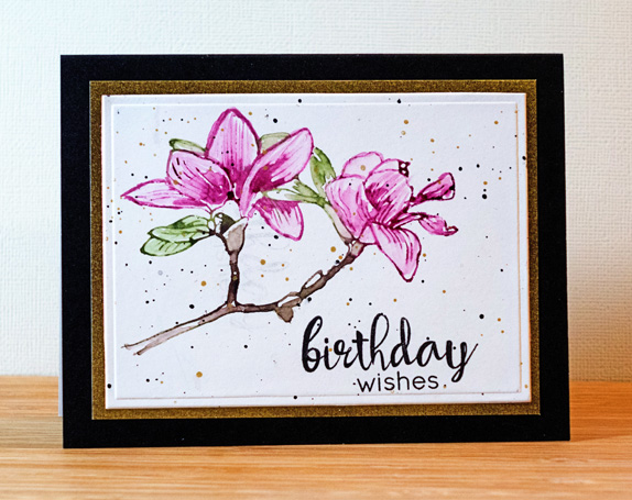
The next lesson in Altenew’s watercolor class was on using watercolors as ink. It’s important in this technique to use concentrated amounts of watercolor which you apply directly to the stamp, and then lightly spritz the stamp with water before stamping onto watercolor paper. Following that you can use a small brush to distribute some of the watercolor and enhance some of the details. I don’t have a lot of Altenew’s layering stamps (it’s a technique I’m still learning to master), but using the detail stamp for the layering was recommended. Actually, the “Build a Flower” Magnolia” worked out pretty well for this technique.

BDWishesWatercolor

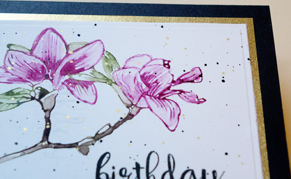
I actually had a lot more trouble turning the piece into a card than I did executing the watercolored flower. I added some black and gold splatters after stamping the sentiment (from Altenew’s “Floral Frame” stamp set) and let them dry for over three hours. When I went to adhere the watercolor piece to a card I weighted it down and when I picked it up, some of the black splatters had smeared in the upper left-hand corner! I finally found a Spellbinders die that was the right size to incorporate the flower, the sentiment, and eliminate the smeared splatters. What a pain! I added a gold border and used a Memory Box licorice card. Here’s a closer look at the gold border and splatters.

  BDWishesClose2

I’m halfway through the videos for the class, and hope to finish it before the weekend. The next technique we learned was watercoloring an embossed sentiment. Looks easy, probably should be easy, but three attempts have hit the circular file. I’m moving on, although I’ll probably come back later and try again.


Watercolor Basics and Beyond: Part 1

  • by

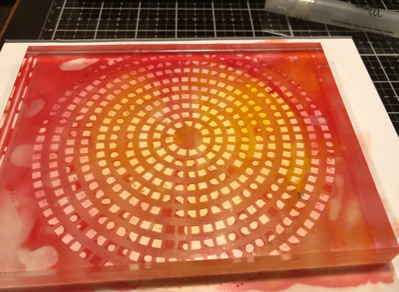
On a whim, I enrolled in Altenew’s “Watercolor Basics and Beyond” class this week. It’s designed to showcase Altenew’s new set of 36 watercolors which look lovely, but I don’t own them (yet). It doesn’t matter, as I’m already enjoying the class, and have several sets of watercolors to choose from. In lesson 2, Jennifer Raza introduced watercolor washes. I’ve done these for a variety of card backgrounds, but she added a twist I would never have thought of on my own: pressing a stencil into the watercolor wash and letting it dry. I can tell you when I set it aside to dry overnight, I did not have high hopes for it. It appeared to be a hot mess. It’s weighted down with an acrylic block.

HotMess

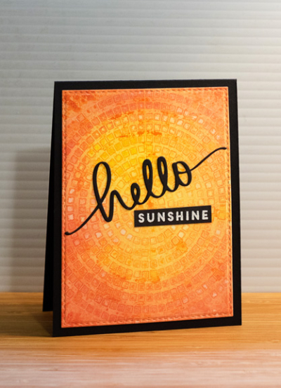
Much to my surprise the next morning, I discovered quite a lovely background which was fun to use in creating this card. 

Hello

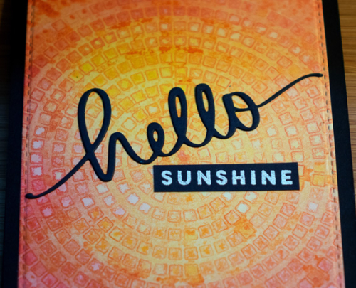
As I often do, I die cut the watercolored piece with the largest of Simon Says “Stitched Rectangles.” The die cut sentiment is from Mama Elephant, and the white embossed sentiment is from Papertrey Ink’s “Blue Skies.” After they were added to the background, I mounted it all on a True Black  top-folded card.

HelloClose

It’s definitely a technique I’ll try again, although I didn’t seem to have many stencils that I thought would work for this technique. 

I love it!

  • by

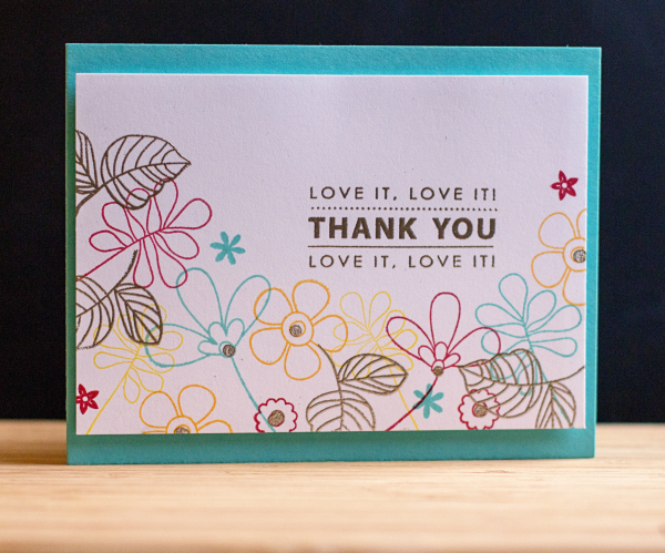
On my creative calendar was to try another technique from the Online Card Class, Heat Wave. Kristina Werner created a card that combined stamping some images with colored inks and embossing others. I ended up using three different stamp sets to create the flower border: “Build-able Bouquet” by My Favorite Things, “Handwritten Floral Greetings,” by Simon Says, and “One Big Happy,” by Papertrey Ink.

LoveIt

The sentiment is from Penny Black’s “Kind Words,” and you’ll see in a moment how very appropriate it is. After embossing the sentiment, the centers of some of the flowers, and  leaves with Liquid Platinum embossing power, I attached the card to some fun foam, and then to a card made with Hawaiian Shores.

LoveIt2

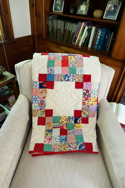
The card is for the mother of a close friend. Ruth is a wonderful quilter who is now in her 90’s. She had a collection of over 40 quilts that she hadn’t already given away, and decided it was time to share them. (She made a beautiful quilt for Sarah from quilt squares created by my great-grandmother and great aunts, and gave it to her as a high school graduation gift.) This time I was the lucky recipient. Since red is my favorite color, it was a perfect choice. Here it is folded on a chair in my living room.

QuiltChair

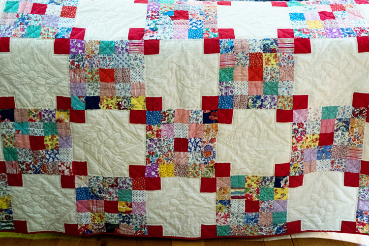
And spread out on the back of my couch.

Quilt

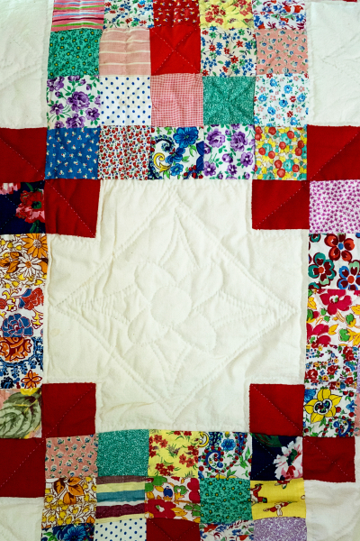
It’s entirely hand-stitched and here’s a close-up:

QuiltClose2

I’ve yet to find the perfect spot to showcase it, maybe on my bed—although I’d love to hang it. It was a very special gift, and I’m very grateful to have received it. It’s not often that I post twice in one day, but I wanted to get the card posted to the class gallery before it closes this week.


Heat Wave: Day 2

  • by

HW_participant-1

Day 2 of the Online Card Class focused on heat embossing techniques. Who knew you could emboss with a Quickie Glue pen? Not I, but I decided to give it a try.

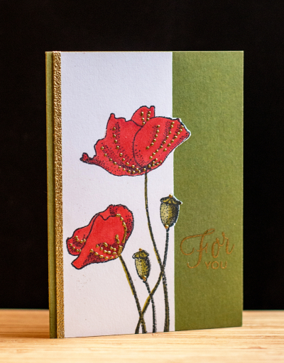
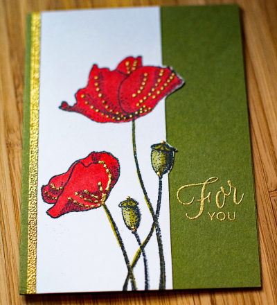
ForYou

I stamped the image from Penny Black’s “Blooming Garden,” and colored it with Copic markers. Then I added the gold dots by applying tiny dots with the Quickie Glue pen and sprinkling them with gold embossing powder. Worked like a charm. I didn’t intend to cut the stamped panel, but made a mess of the sentiment, and decided that the design technique I used for Day 1 would work here as well. It’s actually a better design all the way around. Sometimes a mistake turns out for the best! I added a strip of 1/8″ Scor-tape to the edge and embossed it as well. It’s a technique I’d totally forgotten about and added just the right touch.


ForYou2

The sentiment is from Papertrey Ink’s “Friendship Jar Flowers.” I love the script font in this one. I have at least one more technique I want to try, so likely I’ll be back with another card over the weekend.

A Happy Hello!

  • by

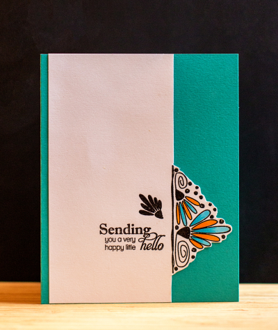
The Online Card Classes are among my favorites, and I’m currently enrolled in “Heat Wave,” a class on embossing. The first day was lots of quick tips for embossing with different inks, embossing powders, and different kinds of cardstock. I picked up a few tips, even though I’ve been embossing for nearly 20 years now. At the same time, Papertrey Ink is in the midst of their July release. They host a challenge, “Create Along with Us,” where you choose a card one of the designers posts to use as inspiration. I always love Maile Belle’s designs and had already pinned one of her cards. So here’s an embossed design, inspired by Maile Belles, and using one of her earlier stamp sets, “Splits:  Just a Note.”
Hello

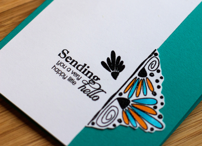
I used just half of the stamp design and turned it on its side, trimmed the white cardstock to the stamped design and fussy cut around it. I colored the petals with Copic markers, and added a sentiment from Papertrey’s “Delightful Dahlia Additions.” Then I adhered it to a Tropical Teal card. I’m pretty sure I’ll use this design concept again.
HelloClose