Skip to content

One More for the Online Card Class & Work It Wednesday

  • by

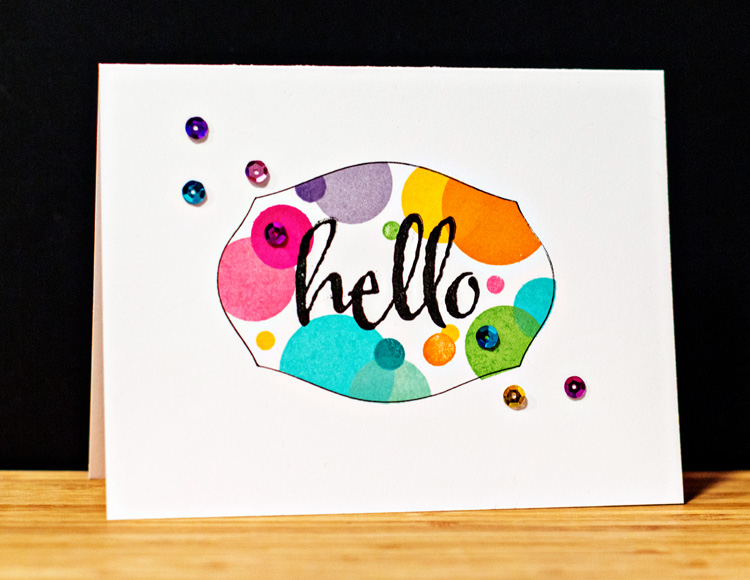
It’s been a long time since I played around with so many new (to me) techniques, but I tried another variation of masking cards that Kara shared on Day 4. This time I die cut a mask from Mat Stack #1 by Papertrey Ink and used the negative to try another series of stamped circles. When I removed the mask, I felt like it need something else, so I cut another frame from cardstock and traced around it with a fine lined pen. That was better, but I wasn’t really happy with it until I added the sequins. I think it still qualifies as a one layer card.

Hello2

I do love all these bright colors, and I’m entering it in the Simon Says “Work It Wednesday” challenge which is to “to create a card with bright colors, flowers, sunshine or anything else that makes you think of Spring!”

Workitwedbanner

Card Recipe:

Cardstock: Select White (PTI)
Stamps: Beautiful Blooms (PTI), The Big, The Bold, and The Happy (Winnie and Walter)
Die: Mat Stack #1 (PTI)
Sequins: Michaels


Online Card Class: Clean and Simple One-Layer Cards

  • by

CS3_paticipant

Despite a couple of hours of playing around with new techniques, I only have one more card to share from the Online Card Class. But I’m thrilled to have figured out how to selectively emboss using an embossing folder, and know the playing around will pay off in the future. (I also played around with a faux watercolor technique, but it wasn’t very successful.)

Baby

Two of the nicest ministers in our Presbytery are married to one another, and they just had a baby girl last week. I couldn’t wait to make a card to welcome Lydia Grace. (Isnt’ that a beautiful name?) I can’t wait to meet her.

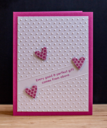
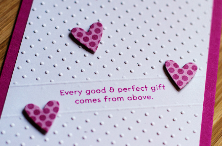
By using a shim made with a couple layers of chipboard, I was able to send my cardstock through the Cuttlebug with the embossing folder, and have a blank spot for the sentiment. Then I scored a line on each side of it. I like this look and know I’ll use it again. 

BabySentimentClose

This cute heart was cut with Papertrey’s Stitched Heart die, and made a perfect way to highlight the inside sentiment.

BabyInside

Both sentiments are from “Bitty Baby Blessings” by Papertrey Ink. The ink and cardstock are “Doll Pink” from Simon Says, and the patterned paper is from an old MME paper pad, “Happy Go Lucky.”

Online Card Class: Clean and Simple One-Layer Cards

  • by

The Online Card Classes are among the best classes I take online. I always learn new techniques, have picked up some wonderful tips, bought some very useful tools, and gotten lots of inspiration from the instructors. This recent class was no exception. 

So how does one define a one-layer card? It’s quite evident from all the card samples that it’s perfectly OK to create your card on a slightly smaller card and then layer it on the card itself. It enables you to hide Copic markers that bleed through cardstock, and tape that holds a variety of inlaid dies together. 

Although I kept up with the videos each day, I didn’t have much creative time during the last two weeks. But today I was able to spend the day playing in the studio, and created three cards for class as well as several others. If I have time tomorrow, there are a couple more techniques I’d like to try.

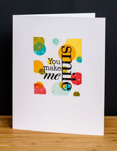
This was the first card I created, inspired by a video and card by Laura Basson for Day 3:  Optical Illusions, layered stamping. My card very closely follows Laura’s design. The biggest problem I had was finding the right ink for the background. Even with all the ink pads I own, I didn’t have a pale beige or gray dye ink pad. I ended up using the Vintage Cream Hybrid pad by Papertrey Ink, but you can see the dots through the dye inks I stamped on top of it. I can live with it, but I’ll try this technique again once I get an appropriate dye ink pad.

Smile

I used Post-it note tape to mask off the rectangle for stamping. The polka dots are from Papertrey’s Beautiful Blooms II, and the sentiment from Hero Arts “Made with Love.” The stamping on top of stamping creates an illusion of layers although there is only one.

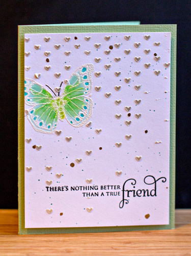
The next card is much busier than my usual card, but I wanted to try all the techniques Debby Hughes managed to pack into one video. This card was for Day 9:  Textural Effects. In addition to using mists to splatter, embossing and color with Copics, Debby also used embossing paste to add more dimension to her card. Once again, I stuck to her design very closely so I could concentrate on the techniques.

FriendUp

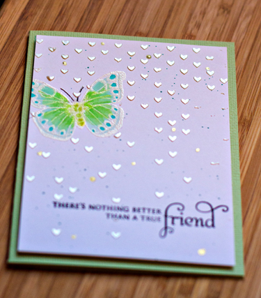
The butterfly is from an old Hero Arts set, “Antique Engravings” and the sentiment from “In Bloom” by Papertrey Ink. I think I’d use less of the Falling Hearts stencil if I tried this again, but overall it was a good learning experience. I used the Viva Modlier Creme embossing paste which I saw used during the Online Card Class: Stenciled. It has a wonderful silver gleam to it.

Friend

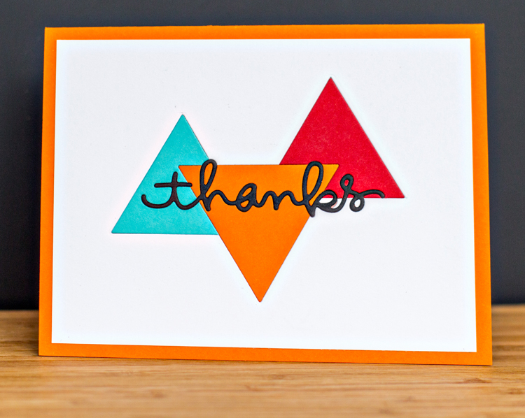
The last card for Day 2: More Faux Effects is my favorite of the bunch. I don’t have an engineer’s frame of reference, so it took two tries before I figured out in what order to do the die cuts. The trickiest part was getting all the little pieces in place once the sentiment was die cut. Again, the design of the card follows the sample by Heather Campbell.

ThanksDieCut

I used the “Two Triangles” die by Papertrey, and my go-to die “thanks” by Simon Says. I would have liked to add a few black sequins, but didn’t have any. (Hard to believe, actually.)

I’ll definitely incorporate some of these techniques into future cards, and I’ve learned some great tricks making inlaid die cuts easier to do. Hope you’re having a bit of creative time this weekend, too.


With Sympathy

  • by

One of my dearest friends passed away late last week. She was just 58 years old, and lost a two-year battle with a brain tumor. Although she and her husband had lived here for over 20 years, her funeral and burial was in New Jersey where all of her family lives. Five of us drove down for the calling hours on Sunday, and back home on Monday following the service. I was so glad I was able to go. She has three wonderful siblings, including an identical twin. Yesterday I had a chance to make some cards to send to each of them and her husband.

CS3_paticipant


The first two were made using a technique (Inlaid Die Cuts) featured on Day One of the Online Card Class: One Layer Cards. It’s a technique I’ve used before, but like always, I learned some good tricks which made them much easier. 

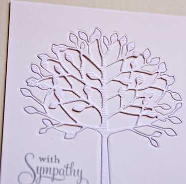
InlaidTree

I used Simon Say’s woodgrain card stock for the tree (“Arbosecllo Tree” by Memory Box) and inlaid it on Papertrey’s Select White cardstock. The sentiment is from Papertrey’s “Birds of a Feather.”

InlaidTreeClose

The next card uses a die I’ve had for awhile, but never used. I love how it came out.

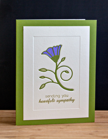
MorningGloryInlaid

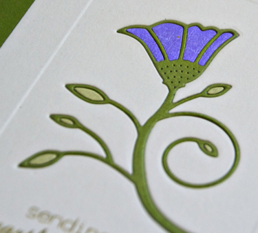
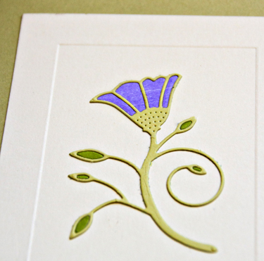
I die cut the Morning Glory Vine by Memory Box with Memory Box’s Parsley cardstock and inlaid it on a Paper Source embossed flat card. The inlaid lavender paper and the lighter green for the leaves came from my scrap folder.  The sentiment is from Papertrey’s “Sending You” set.

MorningGloryInlaidClose

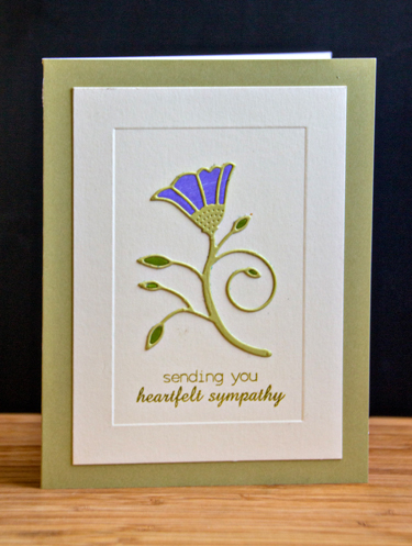
I had die cuts left over and decided to use them to make another card. It’s identical except it’s not inlaid, and the greens are reversed.

MorningGlory

MorningGloryClose

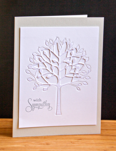
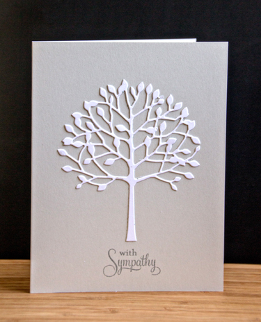
Marie was a gardener and a plant lover so these die cuts would appeal to her. On this card I used the white tree I cut from the Select White on Card #1. It ended up being one of my favorites.

Tree

I love the white tree against the Soft Stone cardstock by Papertrey Ink. The sentiment is the same one I used for the first card. I’m entering this card to the current CASEology challenge: Roots.

Week 86 - Roots

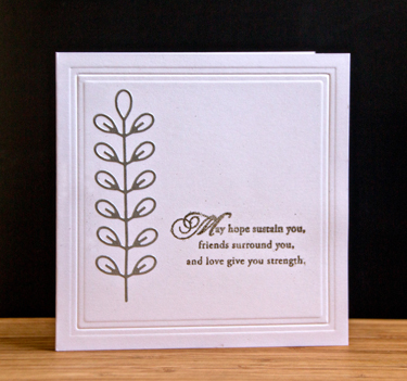
I ended up with one extra sympathy card. This one uses another die I’ve had for awhile but never used. It’s the “Leaf Column Outline” by Simon Says, and the sentiment comes from “With Sympathy” by Papertrey Ink.

Vine

I didn’t do any stamping on the inside because I’ll be writing notes to each person. As Tracy pointed out, this is the first of our friends our age (actually younger) who has passed away. We are grateful that she didn’t suffer, and was never in any significant pain, but it still feels unbelieveable.


A Challenge, and Feeling Lucky

  • by

Wednesdayblog-logo

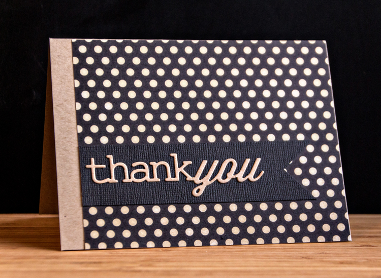
I have a thank you note to share for the Simon Says Wednesday Challenge: Get Krafty. As I was looking through some paper pads for a piece of patterned paper, I came across this polka-dot pattern from Fancy Pants’ “Ectera.” As soon as I saw it I remember the “Get Krafty” challenge. I wanted it to be CAS and this is the result:

ThankYou

After I’d glued down the banner, I wished I had die cut the “thank you” from it as well, and done an inlaid sentiment, but I wasn’t willing to try to pull it off. 

It’s not often that I win anything, but recently I’ve been lucky enough to win not one, but three, awesome prizes through blogging and the internet. The first was a seat in the BPC, Organizing FUNdamentals on the Simple Scrapper site. This class was the impetus to totally purge my studio. I didn’t participate in the class actively after the purge since I’d already given a lot of thought to how I work and how I wanted my supplies to be organized. Their excellent worksheets simpy confirmed my decisions.

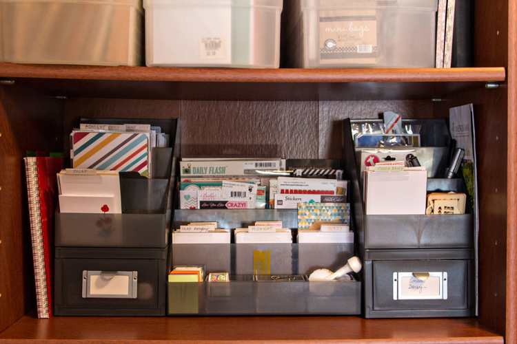
Now that I’ve purged so many of my supplies I have some empty drawers and a lot of empty containers, so I was able to make better use of my space. For example, my acrylic blocks for stamping used to be in a basket (which occasionally dumped itself onto the floor), and now they’re in a drawer right under my work table. Perfect! I’ve been working with the new organization for a week or so now, and I’m really happy with it. I was able to make better use of some of my empty containers, and  the only products I bought were these from The Container Store. 

PLStorage

I had the drawer and top unit on the right, and knew that I could organize everything I have for Project Life by adding the middle unit and another small “shelf” and drawer unit. It holds all my Project Life supplies, some office supplies, and memorabilia I may want to add to the album. As an added benefit,  each component is easy to move to my desk while I’m scrapping.

My second lucky win was on Melissa’s blog where I won a lovely new die from Simon Says. I quickly made a card with it to send to her, but didn’t take the time to photograph it as we were leaving for Florida the next morning. 

Then Saturday I scored a big win on the Papertrey Ink site during their big anniversary release party. I love making cards for their anniversary challenges, but we were away for nearly the whole party. Nonetheless, one of my comments was randomly drawn for a $70 gift certificate. So now I have a few new goodies that should be arriving by the end of the week!

In the meantime, I’m continuing to purge. This month’s project is our guest room. I’ve cleared out one cupboard and two drawers. This month is flying by, so I’m going to have to dedicate some serious time in there!

Frugal Still Life: Week 5

  • by

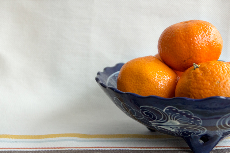
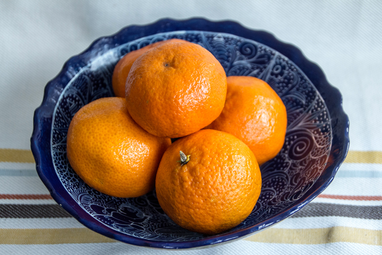
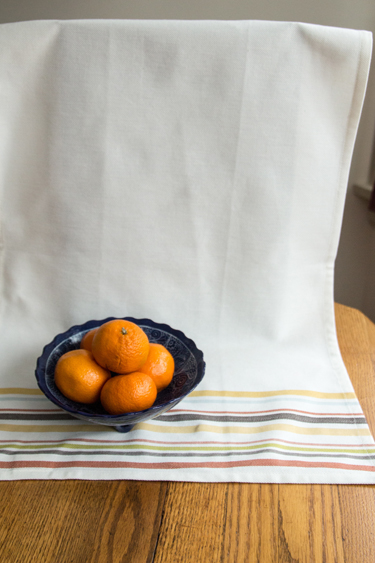
Cheryl McCain comes up with a new and interesting challenge every week for Frugal Still Life. I’m really enjoying this class. Still life is something that has always interested me, but I haven’t taken the necessary time to explore it. I’ve had a book on my Kindle Still Life Photography by Kevin Best for over a year now, but haven’t even started it. I’m quite sure I’ll get to it once this class ends. This week’s challenge was to explore complementary colors. As soon as I read the lesson, I knew I’d get out this beautiful blue bowl Sarah brought me from Mexico and fill it with tangerines. I picked up a dish towel at Target the other day which made a nice background. As usual, I played around with different perspectives, and I’m always interested in which ones appeal to you.

IMG_3090ed_blog

IMG_3092ed_blog

IMG_3096ed_blog

IMG_3099ed_blog

Here’s what the set-up looked like this week. I was back in the kitchen for good light, and used a little black board I purchased as a backdrop for photographing cards to drap the kitchen towel.

IMG_3101SetUpblog

Frugal Still Life: Week 4

  • by

Cheryl bumped up the challenge this week at Frugual Still Life with a post about metering modes, and asked us to capture some images changing the metering mode. I had to look up where to find the metering mode in the metadata in Lightroom, so right off the bat I learned something important. I forgot to take a shot of the set up this week. I used the cutting board and black board I use for taking shots of my cards in the studio window. It gets the same northern light as the windows in the kitchen, but there’s just one window instead of three, so there’s not as much light.

For the subject I chose three old volumes that sit stacked on the bookcase in our bedroom, and a watch that belonged to my maternal grandmother. She died before my parents were married, and I don’t have much that belonged to her. For many years, I was able to keep the watch in working order, and wore it on special occasions. In some of the photos, you can see the beautiful opal clasp that slides up and down the chain. The watch no longer works, but it’s one of my treasures.

My Canon Rebel 4Ti has four metering modes:

IMG_3043ed_blog

-1 EV, Pattern metering mode, Tamron 18-270 lens

IMG_3044ed_blog

-1 EV, Partial metering mode, Tamron 18-270 lens

IMG_3046ed_blog

 -1 EV, Spot metering mode, Tamron 18-270 lens

 IMG_3047ed_blog

-1 EV, Center-weight metering mode, Tamron 18-270 lens

I also wanted to play around with perspective a bit.

IMG_3053ed_blog

And finally, Cheryl gave us some textures to play around with. I haven’t played with textures in ages, and it’s not something I find very intuitive. Here’s one with her Volume 3 texture.

IMG_3044edTexVol3_blog

I think I used the Overlay blending mode, but I forgot to write it down.

Then I tried a Kim Klassesn texture that was quite a bit lighter. Again, I’m not sure what blending mode I used, even though I had a notebook right next to me!

IMG_3044edTexKKFriday_blog

I’m pretty fond of the one with Cheryl’s texture, but overall I’m happy with most of the images. I don’t see a huge difference in the different metering modes, but maybe I’m just not looking carefully enough. 

Stenciled with Some Challenges

  • by

The Online Card Classes are always excellent, and “Stenciled” is no exception. It’s been a long times since I used stencils on a card, but I’ve had them on hand for awhile, and recently purchased a few new ones. In addition to many techniques using stencils, I’ve picked up some other handy card-making tips as well. These classes are always well worth the fee!
Wednesdayblog-logo

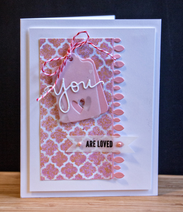
My first card uses a Simon Says stencil that came with one of the monthly card kits. I used a mist to create the stenciled pattern. I’ll be linking this card up with Simon Says Wednesday Challenge: use twine or string, and the Addicted to CAS: Love. 
ATCAS - code word love

Stenciled1

I cut a double tag because I had this darling vellum with tiny hearts on it that I wanted to use. The vellum alone just didn’t look right so I backed it with a pink cardstock tag. It’s still hard to see the hearts in the photograph, but they’re there.
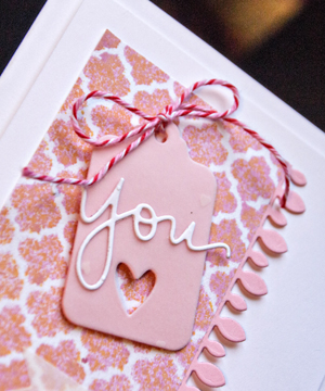
Stenciled1Detail


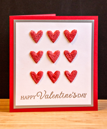
The next two cards meet the new Addicted to CAS challenge: Love as well. The first one was made with a DIY stencil. I used a Papertrey Ink coaster and die cut it with the Tic Tac Toe die from Simon Says. I wanted to create rather thick hearts using embossing paste.
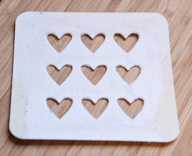
DYIStencil

Here’s the card:

DYICard

Although I let the embossing paste dry for well over an hour, it still must have been damp because I got some bubbles in the hearts when I embossed them. (Jennifer did warn us about this!) The hearts were covered with red Zing embossing powder. Here’s a close look at the dimension. 

The last card for the Addicted to CAS challenge: Love used Gesso and the Falling Hearts stencil by Simon Says. I stayed with white on white for this one and cut down a vellum envelope for the stamped heart that I cut out by hand. I finished it off with a strip of patterned paper and a Doodlebug heart pearl. 
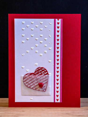
Stenciled4


Here’s a peek at the inside of this card.

Stenciled4Inside


I created the last card for this week’s challenge at CAS(e) This Sketch:
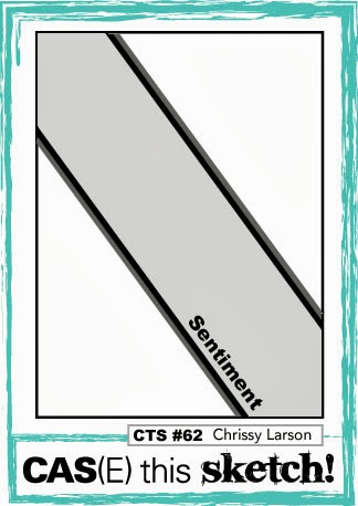
CTS_Sketch_62

I masked off the diagonal stripe with post-it notes and used three different Distress Inks to ink up the Tim Holtz “Bubble Stencil.” Then I laid down two thin strips of cardstock along each edge. (Another trick I learned from Jennifer McGuire in an earlier Online Card Class.) The sentiment was embossed in gold and I added two flat sequins by Kelly Purky.
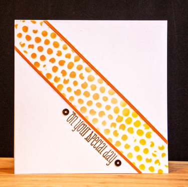
Stenciled2

Although I meant to use a slightly different technique on this card, I like how it turned out. I’ll try out that technique next time.
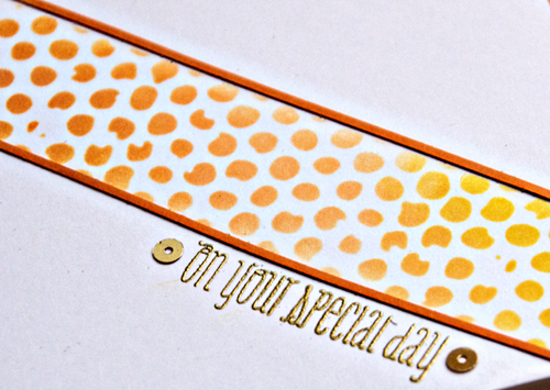
Stenciled2Detail

It’s been fun to have a day to watch class videos and play at my desk. The great purge turns out to have added benefit—I found all kinds of supplies I’d forgotten about, and I knew just where to find them!

Card Recipes:

Card #1:
Cardstock: Neenah Select, and pink from the scrap folder, vellum from stash
Stencil: “Moroccan” (Simon Says)
Mist: Creme de Rouge (Tattered Angels)
Dies: Vine Border, Tremendous Tags, & Double-ended Border (trimmed down) (Papertrey Ink), “You” (Simon Says)
Stamp: “You” (Simon Says)
Twine: Valentine collection (Doodlebug)
Pink pearl: Michaels

Card#2:
Cardstock: Select White & Pure Poppy (PTI), silver (Paper Source)
Stamp: “Celebrate Everyday” (Hero Arts)
Embossing powders: Zing (American Craft), silver (B Muse)

Card #3:
Cardstock: Select White & Pure Poppy (PTI)
Patterned Paper: Simple Valentine (PTI)
Vellum envelope: Impress
Stencil: “Falling Hearts” (Simon Says)
Heart pearl: Doodlebug
Die (inside card): Nested Hearts (Spellbinders)

Cartd#4:
Cardstock:  Select White and Orange Zest (PTI)
Stencil: “Bubble” (Tim Holtz)
Stamp: “Fresh Florals” (WPlus9)
Sequins: Kelly Purkey


January 2014 Papertrey Blog Hop and Stenciled!

  • by

Last week was one of the busiest weeks ever, and I totally forgot that today was the 25th and the Papertrey Ink Blog Hop. Before I left for Dining Room Ministry this morning I got this card started, and finished it when I returned. I combined one of the techniques from the Online Card Class “Stenciled” Day 1 with the blog hop inspiration. The very first day of class featured several techniques for using stencils, and I have tried almost none of them. It’s going to be a great class.

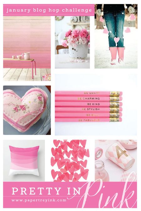
Here’s the inspiration piece for the Papertrey Blog hop. The charge was to create a card using just a variety of pinks. Neutrals like white, black and silver are allowed.

Pti January Blog Hop

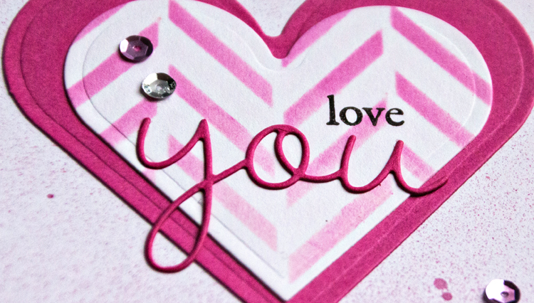
I first cut a mask with my Spellbinders Nested hearts, and used it to apply both Spun Sugar and Picked Raspberry Distress Inks over the Hero Arts “Tweed Pattern” stencil on my heart which I then die cut. 

PTIBlogDetail

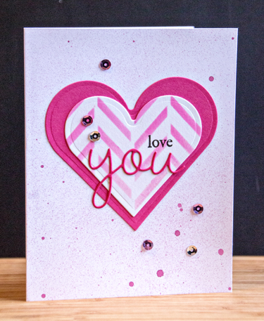
Next I cut the next size heart from Raspberry Fizz and layered them. I tried a variety of card bases and didn’t like any of them. So finally I pulled out my Tattered Angels Glimmer Mist in Creme de Rouge. For once I got the spray just the way I wanted it. 

PTIBlogHop

The sentiment combines the stamped word “love” from Rustic Branches and a die cut “you” from Wonderful Words. A few scattered pink and silver sequins and it was done. The first of the valentines completed!

Card Recipe:
Cardstock: Select White, Raspberry Fizz (PTI)
Stencil: Tweed (Hero Arts)
Stamp: Rustic Branches (PTI)
Dies: Wonderful Words (PTI), Nested Hearts (Spellbinders)
Sequins: Michael’s

Summer Feet and the BPC Phone Photography Project

  • by

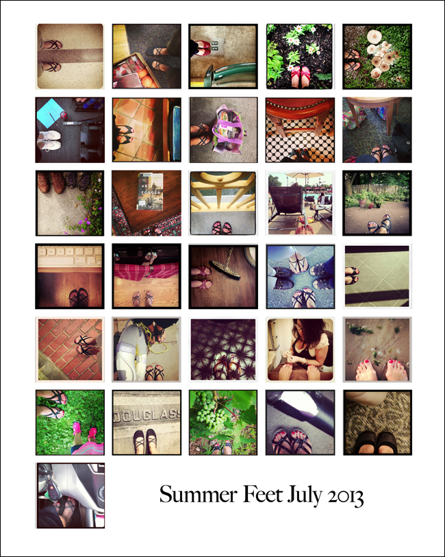
On a whim, more or less, I enrolled in the Big Picture Class “Phone Photography Project” in July. I’m not sure if I didn’t read the class description accurately, or if it wasn’t quite presented as billed, but I was a bit disappointed. From reading the message boards during class, I know I wasn’t the only one. I was hoping to get some good ideas about how to improve my iPhone photography, but there was little, if any, content related to that. There were great reviews of apps, and I learned how to use a few I already had, and picked up a new camera app that I’m quite pleased with so far. I also got in the habit of posting to Instagram regularly which I’m always meaning to do, but don’t. The bulk of the content was a project to work on each day. The first day was Summer Feet, and I decided that would be my Project 365 for the month of July.

SummerFeetCollage_blog

This turned out to be a lot of fun. Trying to capture some context to the photo was the challenge, but most days it worked out well. Here’s where I was this month (left to right, top to bottom): Strong Hospital, working at Foodlink, at an RPO concert, in the garden, under our tree where mushrooms are sprouting daily, at the gym, at church, buying groceries, at the Irish Harp for lunch in Niagara-on-the-Lake, in the OR waiting room with my friend, on a walk with Tracy, at book group, on the Ford St. Bridge walking to the Corn Hill Arts Festival, at the pool, on the patio, catching up with email, in the kitchen, getting a haircut, out to dinner, at a wedding (no context here though I really tried!), at the Dryden Theater (waited too late for good context on this one), lunch on the Erie Canal, dessert on our patio with candle light through our open work table, a midsummer pedicure, at Charlotte Beach for sunset photos, with Skylar, at the Mt. Hope Cemetery where Susan B. Anthony and Frederick Douglass are buried, at the Silver Thread Winery, pumping gas, waiting for the dermatologist, and ready to run errands. 

Most of the other projects were ones I was familiar with after doing Capture Your 365 for nearly two years. I may go back to look through them another day, but I didn’t find any of them compelling. I’m not sorry I took the course, but I’m not sure it was worth the money.


Summer Card Camp: Thursday Challenge Week 2

  • by

SCC2_participant1
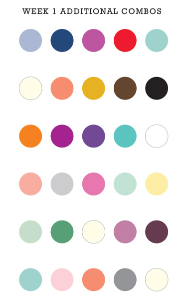
Today’s challenge was to use the week’s color combination and a holiday stamp to create a non-holiday card. To qualify for the color challenges, you need to use four of the five colors.
Screen Shot 2013-07-18 at 7.29.19 PM
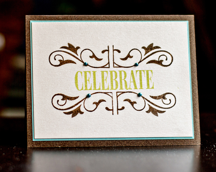
We’ve been invited to a lovely celebration this weekend, so it seemed like a perfect opportunity to get a card made. I used two flourish stamps from Papertrey’s Holiday Photo Finishers to create a “frame” for the sentiment.
Celebrate
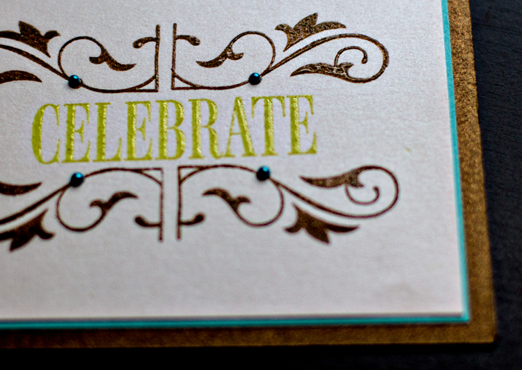
I was quite surprised to discover I didn’t have any holiday stamp with the word “celebrate” that fit into the frame, so I ended up using Papertrey’s Celebrations stamp set. Both the frame and sentiment were embossed onto Vintage Cream Shimmer cardstock. I matted that with a piece of Hawaiian Shores shimmer paper. The card was created with my favorite brown shimmer paper that I believe is by Bazzill. I added four pretty pearls in blue. Here’s a closer look at the pretty shimmer paper.
CelebrateDetail
This is a design I’m quite sure I’ll use again, and I would never have come up with it without today’s challenge—one of several reasons I enjoy these online card classes.

Summer Card Camp 2

  • by

SCC2_participant1

At the end of the first week of the Online Summer Card Camp we were given a whole set of color combinations to consider.

Screen Shot 2013-07-12 at 1.56.56 PM

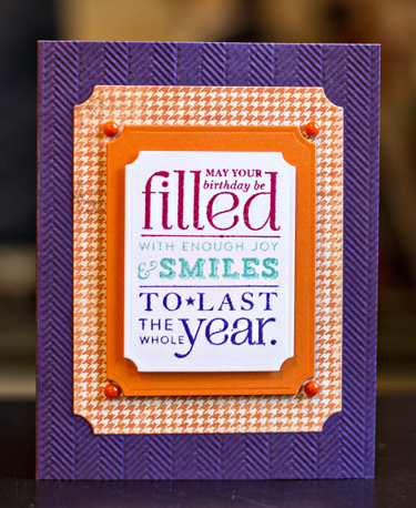
I like the third combo and wanted to try the selective inking technique Jennifer McGuire showcased on last Tuesday. I chose one of the Papertrey Ink “Stylish Sentiments: Birthday” stamps, and masked off three sections of the sentiment so it could be stamped in three different colors.  This worked surprisingly well.

SSCWk1BD

I used the herringbone striped Impression Plate to emboss the purple cardstock to play off the orange herringbone patterned paper. The patterned paper, Orange Zest mat, and sentiment were die cut with Spellbinders Label dies. Four little orange pearls from Michael’s finished off the card.

Today was another new lesson, new color combo and new sketches. Hopefully I’ll get a card finished tomorrow before I get too far behind.

Ten Things: Newport, OR

  • by

I recently took an online photography class from Kat Sloma at Kat Eye Studio. I’ve known Kat for several years through a photography site, but had never taken one of her classes. When she offered “A Sense of Place” in April, I knew the time was right. I love to photograph when we’re traveling, and we had upcoming trips to Washington, D.C. and Oregon. I hoped she’d provide some inspiration and information about capturing those places we visit more effectively. I was not disappointed. The eight week course was packed with thought-provoking information, and beautiful photographic examples. Ironically, because I was traveling, I wasn’t able to participate in the class as fully as I hoped. I did read each lesson as it arrived, however, and was able to incorporate some of it. In the next few weeks, I hope to return to each of the lessons and complete all of the written and photographic assignments Kat included in the lessons. It’s material I’ll return to again and again.

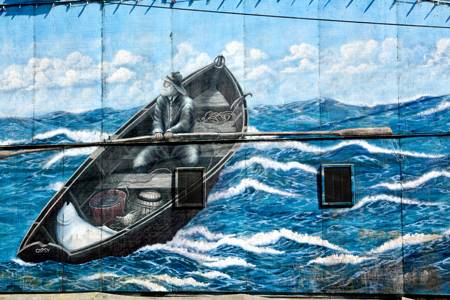
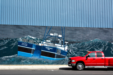
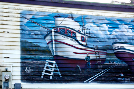
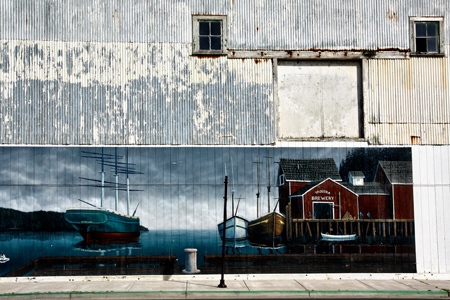
One of the things that has always interested me in travel photography are the details that make a place different from the place where I live. Newport is a harbor town, so you’d expect to see photographs of boats and fishing gear. I did capture some of those, but what really captivated me in Newport was the community artwork painted on the walls of the buildings along the main street. So without further ado, here is a look at Newport.

NewportHarborw


Ropesw


Newport_ColorfulPipesw

Not surprisingly, Newport has many fish packing plants. I loved the way the pipes had been painted such bright colors.

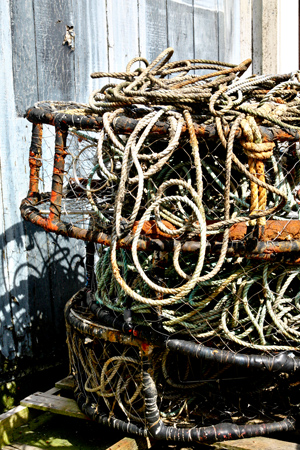
Newport_Trapsw

And now for the community artwork:

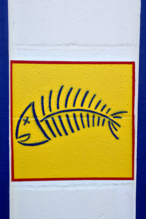
Newport_WallArt_Fishw


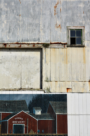
Newport_WallArt_Breweryw


Newport_WallArt_Fishermanw


Newport_WallArt_RedTruckw

This is one of my favorite shots. I love the contrast of the bright red truck with the blue boat, and the sense of scale that it lends to the mural.

Newport_WallArt_Shipw


Newport_WallArtw

I’m linking this to Shimelle’s Ten Things. You’ll find lots of interesting posts linked up here.

  10-things

April POTD

  • by

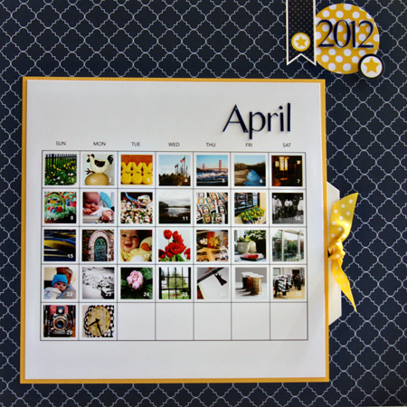
I’ve managed to take a photo a day for four months now. Some days it was pretty late by the time I got to it, but lots of times the prompt from Capture Your 365 has sent me out with my camera to explore new views and new techniques. I’m dedicated to sticking with it this year. I managed to carve out a few minutes to scrap the April layout before we leave.

AprilPOTMlayout

Patterned paper:  Teresa Collins; cardstock:  Bazzil; dotted paper, ribbon and tag from stash; sticker:  Echo Park

The journaling on the tag reads:

The weather in April was dreary and chilly, but the days flew by. 

 It was a photo intensive month. A RPEG photo shoot at Artisan Works, and a four day trip to Washington, D.C. and Frederick, MD. I also worked on my Sense of Place class and took a group of photos of Rochester icons. Matt was here for a weekend and so there are lots of family photos, too, although Skylar won the place for the POTD! A photo of mine that won a prize at Camera Rochester is hanging in the current Image City exhibit this month.

In addition to starting Sense of Place, I finally finished Finding Your Photo Flow, and now have a beginning work flow that incorporates Lightroom. Lots left to do to get the older photos into LR. Other classes this month were Kerry Bradford’s “Getting to Know You” (Silhouette), “Black & White Photography” here with Cole Thompson, and a card making class, “A Cut Above.” All were excellent! I still have work to do with both Kerry’s class and the card class.

 I finished four books this month: The Marriage Plot, Mrs. Kimble, Photographing Washington, D.C., and Wild. Tracy and I saw one movie: Salmon Fishing in the Yemen.

 Shawn Wallace was the April speaker at Arts & Lectures, and I enjoyed a panel discussion with the Magnum Photographers at the Eastman House followed by a viewing of their House of Cards exhibit at the Visual Studies workshop.

We spent Easter with the family at Randy and Susan’s and lunched with Dan and Jeannie. We enjoyed dinner with our book group and I had dinner with Mona and Jessie, and lunch with Barb & Ev, and Jane.

My OLW for this year is Balance, and I did a pretty good job this month, although scrapbooking took a back seat again to photography and card making, and I’ve yet to institute the daily practice with Copics. 

I didn’t add the information to the tag but for the numbers record, I made 18 cards and 2 layouts. Most of the cards are already sent or in envelopes to be mailed in May.

A Sense of Place: Rochester Icons

  • by

I’m really enjoying Kat’s class “A Sense of Place.” We’ve completed three weeks now, and all of it has provided lots of food for thought. The first week was on preparation. The key question was “Do you travel to photograph?” or “Do you photograph while traveling?” I definitely do the latter, but often I do a lot of preparation and thinking about the images I’d like to capture on a trip. Other times it’s more, “Oh, look at that!” — a much more spontaneous process. She also asked us to think about how we travel with our cameras and equipment. Lots of times I travel only with my Canon S95. It fits into my purse, and takes awesome photographs. Other times, I want the advantage of my zoom lens or my 50mm 1.4 lens so I travel with the SLR. I’ve yet to find a camera bag I love, but through this process think I have found a solution. When we were in Washington, D.C. I used a backpack for my camera and my tabletop tripod. It was so much easier to carry, but I worried about the lack of padding around the camera. I’ve since ordered this bag from Photojojo which slips into the backpack easily, and adds very little weight. I’ll be giving this a try on our trip next week.
The second week of class focused on Aspects of Place and we created a list of the things we might photograph while trying to capture the essence of a place. It was a great exercise, and I’ve typed it up to keep with me.

This week was about capturing icons. Initially I wished I had seen this lesson before our trip to Washington, but once I read the lesson carefully, I discovered that I did use many of the ways to capture icons after all. (Those photos are coming, I promise.) The homework assignment for this week was to capture some icons of the place where you live. I had exactly one really nice day (though windy) in which to do the assignment, and I captured several of the ones on my list. I thought I’d share them here.

Kodakw

If there’s just one icon for Rochester (and I think there are several) this would probably be it. Rochester is known for Kodak and its founder, George Eastman. His home is another Rochester icon as is the beautiful Eastman Theater downtown. Sadly, Kodak has suffered a serious decline in recent years.

HighFallsw

HighFalls2w

Two views of High Falls. Rochester was originally known as The Flour City. Pioneers settled here on the Genesee River because of the falls and the water power they could provide.

Lilacsw

Now Rochester is known as The Flower City, and hosts an annual Lilac Festival that brings thousands of tourists every spring. Luckily, we live a short walk from Highland Park so we get to enjoy them before and after the festival. This year many are already blooming though the festival does not start until May 11. Our recent cold weather means there will still be lilacs blooming during the festival as well.

GeneseeBreweryw

Genesee Brewery has been producing brews for over 100 years. I love the colors in this photograph.

Bridge&Aquaductw

And, finally, a view of the Broad Street Bridge which was built over the original aqueduct which was built in 1840. The Genesee River is one of a few that flows north, in this case into Lake Ontario.