Skip to content

Embellish Nautical Challenge and Summer Card Camp

  • by

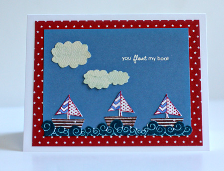
Earlier in the spring, I was the lucky winner of a new stamp set from Craft’s Meow called “It’s a Shore Thing.” When I saw the Embellish Nautical Color Challenge, I knew I’d found a way to use these cute stamps.

Nautical_ColorTrends

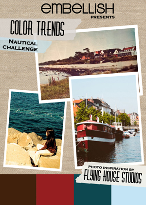
Although someone named the colors as brown, red, navy, and light blue, the darker blue is not quite navy in my book. Fortunately, I found an Adirondack ink pad (Stream) that was exactly the right color.

FloatBoat

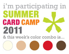
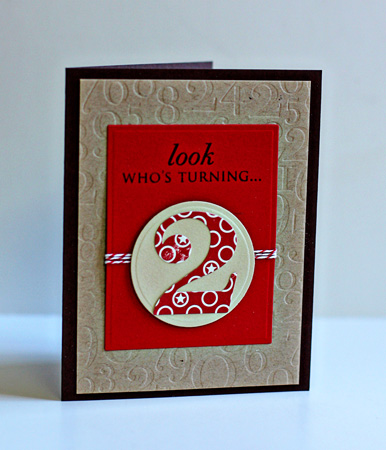
This is Week 3 of Summer Card Camp, and I’m actually on track with my first card with the new color combination which seemed perfect for my niece’s son who is turning two.

Week3-colors

Here’s my card. I was happy to get to use these fun Papertrey Ink products.

Two

It’s a bit hard to see but both the red mat and the taupe circle are cut and embossed with Nestabilities.

InsideTwo

Supplies:

You Float My Boat
Cardstock:  Neeah Solar White, Memory Box light blue
Patterned Paper: Bitty Stars (Papertrey) & clouds cut from Quite Contrary (MME)
Stamps:  It’s a Shore Thing (Craft’s Meow) & Tiny Treats: Valentine (Papertrey)
Light Blue marker:  Faber-Castell Pitt Artist Pen

Look Who’s Turning Two
Cardstock:  Dark Chocolate, Pure Poppy, Kraft (Papertrey) & scrap from stash
Patterned Paper: “Night Light Jack” (October Afternoon)
Nestabilities: Classic Rectangles & Small Classic Circles (Spellbinders)
Die:  By the Numbers (Papertrey)
Impression Plate: By the Numbers (Papertrey)
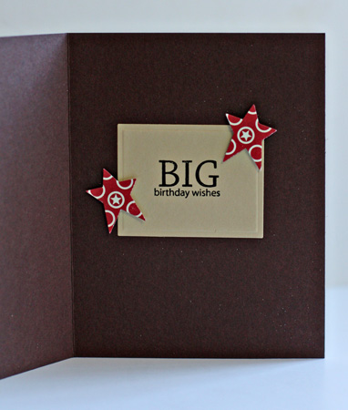
Stamps:  Birthday Bash & Big Birthday Wishes (Papertrey)
Twine: Pure Poppy (Papertrey)
Star punch; McGill

Summer Card Camp

  • by

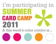
This  is week 2 of the Summer Card Camp, and I’ve barely had time to read the pdfs, to say nothing of watch the videos. Hopefully, I’ll get to the videos this afternoon or tomorrow. I do love this week’s colors, so I had to sit down and get a couple of cards made. I already have receipients for both cards, so I “killed two birds with one stone,” so to speak. Here are this week’s colors:

Week2

They translate into Papertrey Inks cardstock easily:  Summer Sunrise, Orange Zest, Pure Poppy, Simply Chartreuse, and New Leaf so I decided to use up some scraps and do some die cutting.

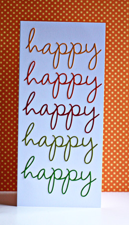
Happy

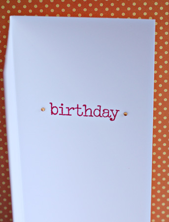
For the first card, I die cut five words from the Wonderful Words die from Papertrey. In the photo, it’s a bit hard to see the bright colors of the words. Here’s the inside, stamped with Wonderful Words Additions.

InsideHappy

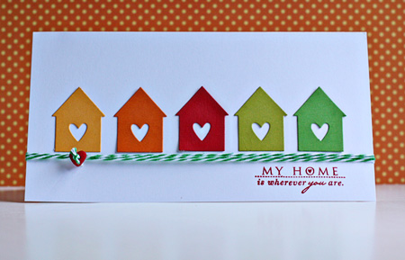
For the next card, I die cut five little houses from Love Lives Here (Papertrey Ink). It’s one of my favorite dies. The sentiment is from the coordinating stamp set.

MyHome

The twine is from Divine Twine and the button from my stash. Here’s the inside, also stamped with Love Lives Here.

InsideMyHome

Back to the To Do List. Have a great day!


Summer Card Camp Take 2

  • by

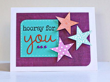
Week1-colorsOne of my former fifth graders graduated from high school a week ago. I’m missing her party because we’re traveling this weekend, but I wanted to get her card and gift to her before we left. The high school colors are pretty boring for a delightful young woman full of energy and enthusiasm, so I decided to use this week’s camp colors to create a card for her.

HoorayForYou

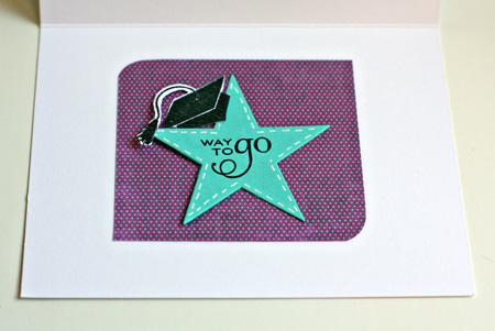
For those of you in the class, you can easily see my inspiration from Kristina’s card sketch and video. I wanted to try the faux stitching with the white gel pen, and was very pleased with how easy it was. It’s something I’ll use again for sure. Here’s a peek at the inside:

InsideAmy

We’re in Hyde Park for the holiday weekend visiting my brother and nieces. Last night was the New Paltz fireworks display, and I hoped to have some awesome photos from it. We got there early, asked where the fireworks would be set off, and got the tripod and camera set up for a site beyond some trees in the distance. Imagine our surprise when the fireworks erupted right over our heads! It was an awesome display, but we were far too close for any great photos. One of my nieces works for a local credit union and had 3-D glasses for the fireworks. They were amazing, turning the fireworks into kaleidoscope displays. It was lots of fun, but I’ll have to wait for another opportunity for my fireworks assignment in the Night Photography class.

Supplies:

Cardstock: Select White, Hawaiian Shores (PTI)
Patterned Paper: Lime Twist (MME)
Stamps: Wonderful Words Additions, Star Prints, For the Graduate (PTI)
Dies:  Stars, Wonderful Words (PTI)
Pearls (Hero Arts)
Ink: Brilliance

Summer Card Camp

  • by

I couldn’t resist a summer card camp when so many of my favorite designers are among the contributors to the projects. We’ve already had three inspirational pdfs, and a video. This week’s colors are so summery.

Week1-colors

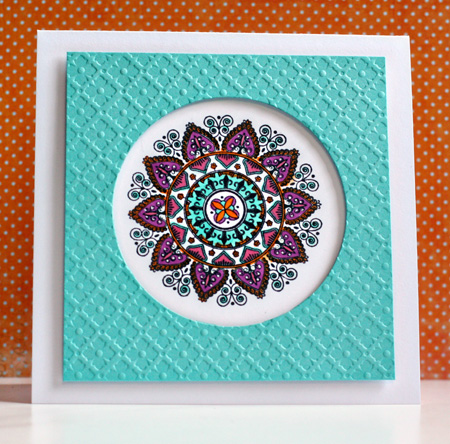
I may be back with another card later, but the rest of my day looks pretty busy, so I’ll be making up time later. This morning I saw a great idea on Laurie’s blog, and immediately thought that I could do a similar card with this week’s colors. It’s another Mehndi Medallion creation. I already love this stamp set!

SummerCardCamp1

I used the technique from the video to create a window card. The card in the video also included the sentiment on the front, but no matter what I tried, the sentiment took away from the medallion, so I finally decided to do without it.

Supplies:

Cardstock: Select White & Hawaiian Shores (PTI)
Stamps: Mendhi Medallion (PTI)
Impression Plate: Diamonds (PTI)
Copic Markers: R85, BG13, YR16, V06 & Sakura White Gelly Roll pen
Dimensional Adhesive

CKC Convention Recap

  • by

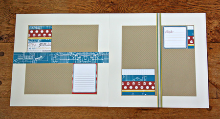
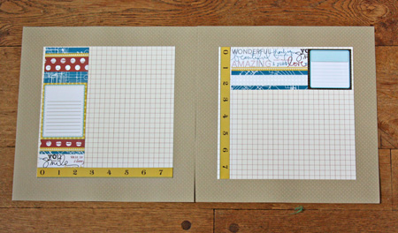
Two weeks ago, my friend and I went to Buffalo for the CKC Convention. Aside from taking a lot of photos of the layouts in the Studio Calico booth, I totally forgot to take pictures. Mary and I both took three classes. All of hers were card-making classes (and she loved them). I took one scrapbook class with Technique Tuesday and made two 2-page layouts using papers designed by Ali Edwards. I love both layouts, but haven’t chosen the photos for them yet.

TechTuesLO1

TechTuesLO2

They use a color combination I love and I liked the papers so much I bought a pack of them, even though I had a few left from the class. The class moved right along, but it wasn’t had to keep up.

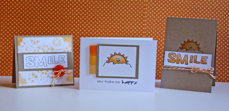
The next class I took was a copic airbrushing class. I have a small airbrush set-up using the air cans, but I’ve always been a bit afraid to give it a try. We used the expensive air compressors in the class, but they demonstrated the can set-up so I’m sure I’ll not have any trouble with it. The class was taught by instructors from Clear and Simple Stamps and we made three cards while practicing the airbrushing techniques.

Clear&Simple

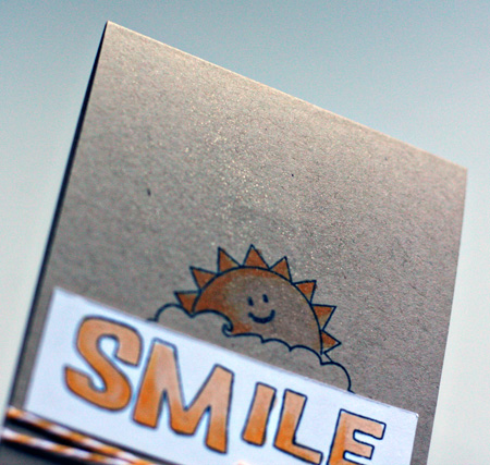
For the card on the left, we airbrushed over a doily and then lifted it up to create the background. For the middle card, we airbrushed the ribbon tags, and for the last card we airbrushed with a glitter pen. Here’s a close-up of that.

SmileGlitter

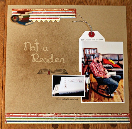
The last class I took was called Terrific Trends by Studio Calico, and it focused primarily on using the Mr. Huey mists. We created a title for a layout by putting down letter stickers, misting and then removing the letters. I liked the technique, but the papers and embellishments they used for the layout did not fit the photos I had taken, (This is frequently the case, and I’ve learned over time, to simply take the papers home with me so I can create a layout of my own.) Here’s the layout I finished this morning.

NotAReaderLO2

Matt’s ADD has always made it hard for him to read without taking his medication. He did really well in college, but when he’s working he needs the meds in order to focus on the job. One of the side effects of the medication is being unable to sleep, so he hesitates to use any after noontime. Thus the amount of reading he’s done since he graduated has been limited to newspapers and crossword puzzles. When we were in Denver we went to one of my favorite independent bookstores, The Tattered Cover. While we were browsing, Matt picked up this book, started to read, and started to chuckle. We bought the book and in just a day he had read nearly a third of it. It was too big a moment not to capture!

I used a Papertrey Ink die and some stamps from All Booked Up, a Jolee sticker and button from my stash, and some patterned papers I picked up at the convention from Simple Stories called Elementary.

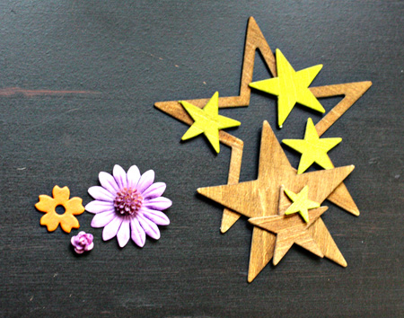
In both the Copic Airbrushing class as well as Terrific Trends, we got a chance to color some embellishments. The ones on the left were airbrushed with Copic markers and the Wood Veneer stars from Studio Calico were sprayed with Mr. Huey mists. I know I’ll find a great use for all of them before long.

AlteredEmbellishments

All in all, it was a great convention. The vendor faire was a bit better this year and I got some lovely embellishment at the Melissa Francis booth, and picked up a few papers that were on my wish list. Another benefit of the classes is I came home with three new stamp sets as well as quite a few papers and embellishments from both Technique Tuesday and Studio Calico.


The Blue Hour

  • by

I’m loving the Night Photography class with Kent Weakley. I’ve learned so much in just the first three lessons. Our first assignment was to take a photo during the Blue Hour–that time after sunset before true darkness. Here’s a set of five photos I took the other night of the Rochester skyline with the time each photo was taken. The middle photo is the one I posted for the Blue Hour assignment.

NPPhoto1w

Taken at 8:34 pm

NPPhoto2w

Taken at 8:37 pm

BlueHour4X6w

Taken at 8:40 pm “The Blue Hour”

NPPhoto3w

Taken at 8:46 pm (The sky is still very blue.)

NPPhoto4w

Taken at 8:52 (The blue is fading. This shot was taken from the bridge instead of the park along the river.)

Kent Weakley Course Review

  • by

My resolve about not taking more classes vanished in an instant when I saw that Kent Weakley was offering his night photography class this month. I’ve wanted to take this class since I first read about it last November. I think I can count on one hand the night shots I’ve taken that worked out well. But as much as I wanted to take the class then, I knew I was unlikely to venture out in the cold at night. Now the weather is perfect for night photography and Kent’s class begins tomorrow. Earlier this spring I took Kent’s e-class on composition, so now I am even more excited about this new class.

Kent’s classes work a bit differently than other online photography classes I’ve taken. Rather than getting a new lesson once or twice a week, you get access to all the lessons and galleries when the class begins. For the night photography class, there are 15 lessons and student galleries in the course, and you have 60 days to go over the material, get your shots, and post in the galleries for comments. The course material is presented so you can copy and paste the lessons into a document and refer back to it, even after the class is completed. I read and reread the lessons in the composition class, looked at the photos in the student gallery and learned even more by reading Kent’s comments about the student photos. There’s a good video and description of the Night Photography class here.

I’ve done a lot of reading about composition so there wasn’t a lot of brand new material in Kent’s composition class, but it was presented in a way that helped me internalize the principles of composition. I got lots of time to practice on our recent road trip. Despite the fact that I wasn’t feeling all that great, every time I picked up the camera I automatically started thinking about composition. There are a lot more photos from this trip that need no cropping, and to my mind, are well-composed. Kent repeatedly reminded us that we are responsible for everything in the photo! If you see something you don’t like, don’t just take the shot and hope to photoshop it later, do something about it in the field. I found that almost every time, I could improve the composition before I took the photo. The other noticeable improvement I’ve seen is in the responses I get from the photo critique I attend once a month at a local photography gallery. I’m also better able to look at others’ photos and see the compositional elements that make a photo great. Kent’s blog is a gold mind, too, if you’re looking for great advice on a wide variety of photographic topics. His short, concise videos are winners!

A couple of my favorite photos from the trip were posted here, but I’ll leave you with a couple others I like as well.

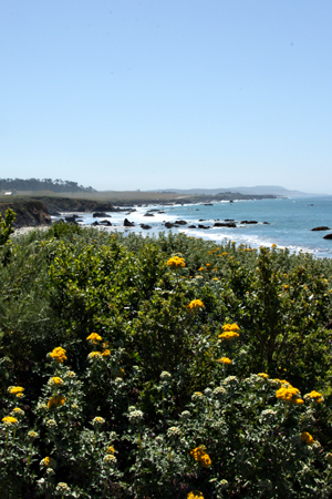
Coastw

The Pacific Coast

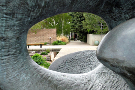
SculptureVieww

Denver Botanic Gardens

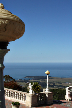
ViewSanSimeonw

The Pacific from the Hearst Castle

Scrapbook On The Road

  • by

On a whim, I purchased Ali Edward’s class “Scrapbook on the Road,” and set up an album to take with me on our next trip. I’ve never tried to scrap on the road, but I’m anxious to give it a try, and this looks totally doable. Although Ali assembled all of her scrapbook ahead of time, I decided to create the pages and take a small bag of embellishments and journaling cards with me. This way I can choose what size page I need and can decide whether or not I need an envelope or how big a journaling card each day warrants. I used the Spellbinders Creative Book Pages dies again for this album which, once again, seem just perfect. I plan to bind the book with my Bind-it All when it’s finished.
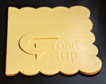
Cover

The covers were cut from plain chipboard (run through the Grand Calibur twice) and painted with Heidi Swapp paint after I adhered the Doodlebug Stickers to the front. I painted a Technique Tuesday arrow and adhered it to the cover as well.
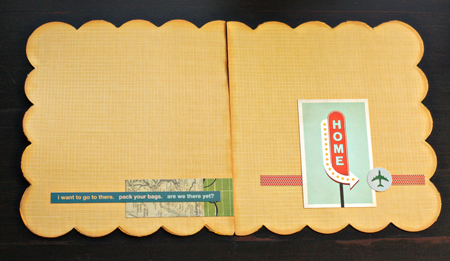
InsideCovers

Rather than paint the inside covers, I lined them with Chatterbox patterned papers that have been in my stash for years. The embellishments are a scrap of paper by Simple Stories from a page I cut for the album, and a phrase sticker from Little Yellow Bicycle. On the back inside cover is a Studio Calico Journaling Card and two stickers from Little Yellow Bicycle.
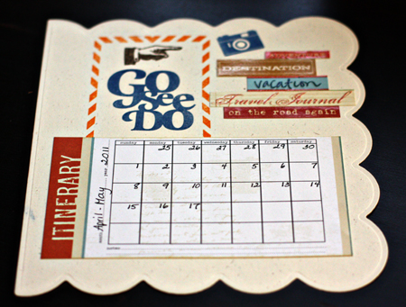
Itinerary

This is one of very few completed pages (except for filling in the calendar). The Itinerary card and word fetti stickers are Little Yellow Bicycle, the camera stamp is from October Afternoon, and the three title stamps are all Studio Calico.
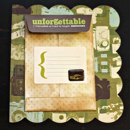
MemorabiliaPocket

When I was going through my stash to look for supplies, I found these pocket envelopes from an old Lisa Bearnson kit. I knew they’d come in handy some day! The journaling card is from October afternoon and I covered the image on the card with an SEI sticker. The patterned paper is Studio Calico.
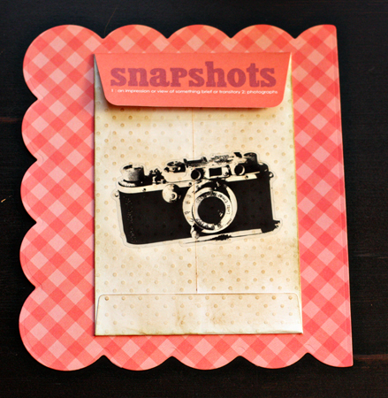
Snapshots

Another pocket envelope from the same kit and Side B of a beautiful cloud paper from this month’s Studio Calico kit.
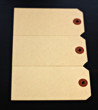
TagsSideA

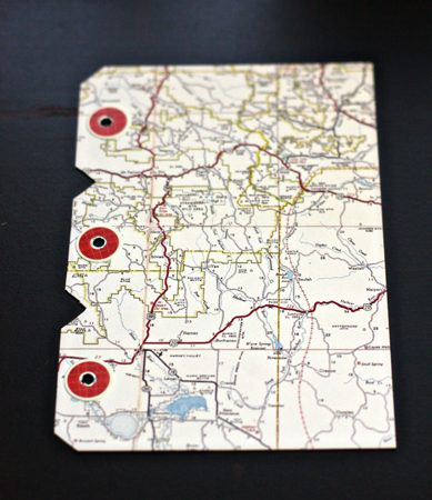
A page made from three tags glued to a piece of patterned paper.
TagsSideB

The flip side.

TransparencyOverMap

A piece of Clearly Creative cardstock (Papertrey Ink) with a Hambly rub on. I’ll probably leave the page with the map behind it. I think it’s also a Studio Calico paper, but I’m not sure.
PagesSize1

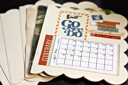
These are the largest pages, most cut from Rustic White cardstock by Papertrey Ink. They’re about 6 1/2 by 7 inches.
SamplePPpages

SamplePPwithjournaling

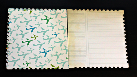
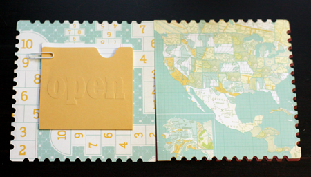
There are also a set of pages the same size as the transparency page, about 6 X 6. I think these are all Studio Calico papers, and the journaling card is from the Lisa Bearnson kit.
PagesSize2

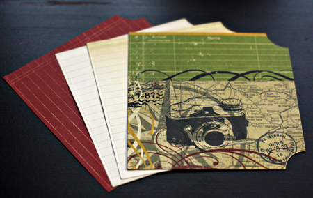
This is the third size page, about 5 X 5 1/2 inches. There are also a few pages that are about 3 1/2 X 3 1/2. The Creative Book Pages dies also have two smaller dies which I will probably use for dividers once I get home.
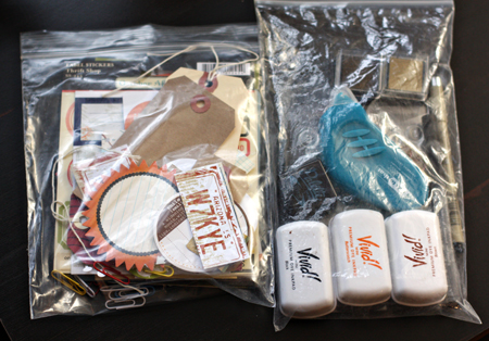
SuppliesToGo

I’m not taking the album covers with me, but I have the pages tucked into a plastic baggie as well as these two little bags of embellishments and supplies. I hope to pick up a pile of memorabilia to add to the book as I go. I know I’ll take many more photos than I can possibly use in a scrapbook this size, but I have a nice album given to me by my last class that will work wonderfully for the photos, and I won’t have to spend much time when I get home trying to recreate our road trip. This really came together quickly, just an afternoon and part of an evening. Painting the covers definitely was the hardest part for me.


Picture Inspiration: Weeks 6 & 7

  • by

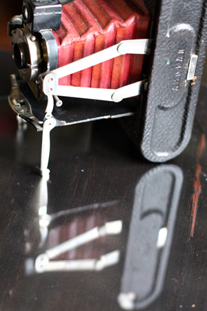
The last two prompts for Picture Inspiration have dealt with reflection. Week 6 was “Seeing Double” and the task was to capture both an object and its reflection. I looked all week and never found anything despite the fact that I had my friends looking for me as well while we were in Canada that week. Finally, right before the end of the week, I took the situation into my own hands. Tracy had a piece of glass that had been cut to replace a cracked one in our window. I put one of my favorite vintage cameras on it and put it on the lateral file in my studio.

SeeingDoublew

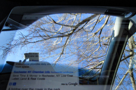
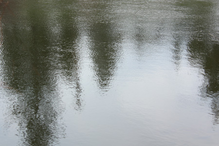
This week’s prompt was “The Shape of Surprise” and we were looking for unexpected reflections. I found several. Tracy recently purchased an iPad and I had it on my lap trying to look up some information while he was driving. The reflection through my sun roof was so strong, I couldn’t read the iPad, but I did get this photo. I like that you can see a bit of the text from the iPad as well as the reflection.

IPadw

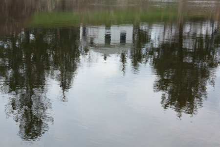
This afternoon I was out and about. I stopped at a little park on the Erie Canal outside Palmyra, NY. There’s an old bridge, the remains of a lock, and a brightly painted little house that must be used for some kind of maintenence.

House&Treesw

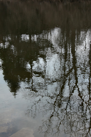
Just for fun, here are couple more from the canal.

TreesPortraitw

Treesw

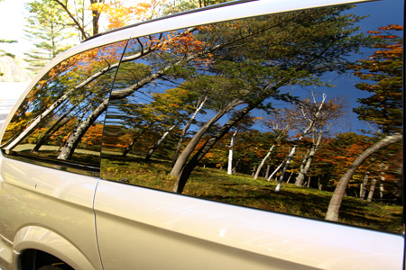
But my favorite image is one I dragged out of the archives. I took this a couple of years ago in Vermont. I’d gotten out of the van to take some photos and as I walked back to the car, this is what I saw.

Vanw

So much beautiful fall color. It’s finally beginning to feel like spring here, but it hasn’t been warm enough, long enough for the trees to bud or the daffodils to bloom. I’m hoping by the end of the week, there’ll be some color in my photos again.

Online Classes: Take 2

  • by

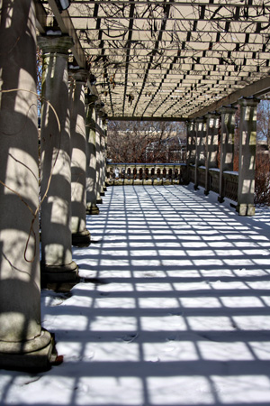
This week’s prompt for Picture Inspiration was to Find Some Rhythm. Tracy shared part of a definition for rhythm with us:  “a harmonious sequence or pattern of masses alternating with voids, of light alternating with shade, of alternating colors, etc.” The words “haromonious” and “pattern” made me think of the staircase in the George Eastman House. My brother-in-law gave me a year’s membership for Christmas so I can go as often as I like this year without any admission fees. It’s quite the lovely gift. I’ve been three times since mid-February. As it turns out I found two shots, one inside and one outside, that seemed to fit the prompt.

Staircase2w

Arborw

I love the patterns of the columns, arbor, and all the shadows. I took a few other photos there I’ll save for another time. One of the things I’m enjoying a lot with this class is working my way through the gallery of photographs posted by members of the class. Talk about inspiration!

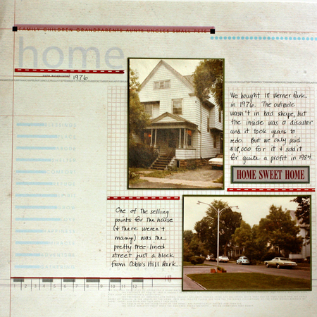
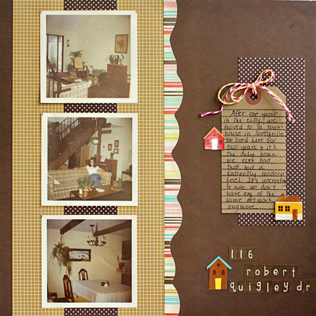
Participating in Finding Your Way has proven to be pretty motivating for scrapbooking. I finished three more layouts for the house album. It’s already getting frustrating, however, because I can’t find photos I thought I had! For instance, I have photos of how our first house looked when we moved in, but almost none of how it looked by the time we sold it seven years later. We had a beautiful kitchen put in that house, and I can’t find any photos of it. I’m sure there are negatives of the photos, but I have several boxes of those and no easy way to examine them. Oh well, I’m trying to embrace imperfection, and just get on with it.

RobertQuigley

18WernerPk

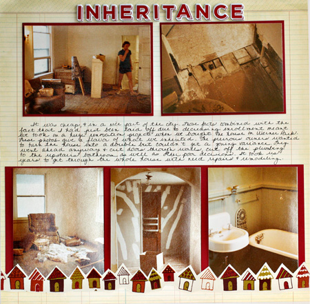
Inheritance

I’m definitely not a fan of my handwriting, but Karen G. is right, it does speed up the process considerably. Now that I’ve started it in this album, I’ll maintain it. The journaling is hard to read so here’s what it says: It was cheap and in a nice part of the city. Those facts combined with the fact that I had just been laid off due to decreasing enrollments meant we took on a huge renovation porject when we bought the house on Werner Park. These photos give a flavor of what we inherited. The previous owners wanted to turn the house into a double but couldn’t get a zoning variance. They went ahead anyway and cut doors through walls, cut off the plumbing to the upstairs bathroom as well as other poor decisions. I took us years to get through the whole house with needed repairs and remodeling.

I’m continuing to enjoy the Silhouette 101 class. It’s nearly over, and I’ve learned everything I hoped to. This week I learned out to use the print and cut feature. I printed some cute tickets on my printer and then ran them through the Silhouette which cut them perfectly. You’ll see them in a project soon, I’m sure.

I’ll be away from the computer for the next few days, but will catch up with your blogs early next week. Have a great weekend.


Online Classes: Take 1

  • by

Despite my intention not to start any new classes, I am in fact taking three. The first is a class at My Creative Classroom on using the Silhouette, and it has been fantastic. I’m learning just what I needed to know and am amazed at the capabilities of this machine. The other two are both at Big Picture Classes. I broke down at the last minute and signed up for Karen Grunberg’s Finding Your Way. I’m already happy with that decision because I’ve decided to use the assignments to work on one of my biggest 2011 FINISH albums. The last is Picture Inspiration because I’m always looking for photography inspiration and conversation. My plate feels too full right now, but I know it will ease up as I get going with each of these.

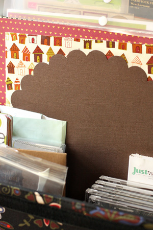
One of Karen’s first assignments was to identify the things you use on your pages so you can focus on making those accessible and stop spending money on things you don’t use. I did that when I moved my studio and did one of my first big purges. But before I started the Home Album I gathered up all the supplies (kraft paper for the basics, patterned papers, stamps, and embellishments) from my stash that I thought I might use. It has really expedited the process.

HomeKit

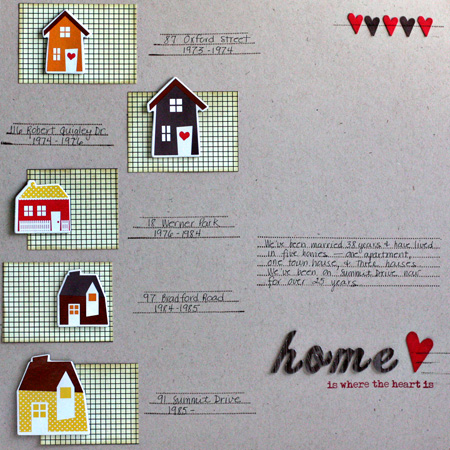
Here are the first layouts I did for Finding My Way with some Silhouette work as well.

HomeLO

This isn’t the title page which I’ll do later, but it’s an introductory page to the album. I scraplifted it from a layout I saw on Kelly Purkey’s blog a long time ago. I also incorporated journaling stamps and my own handwriting—two things Karen suggests as ways to speed up your scrapbooking process.

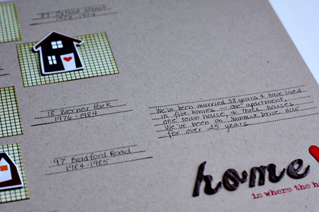
Here’s a close-up of the journaling.

HomeCloseUp

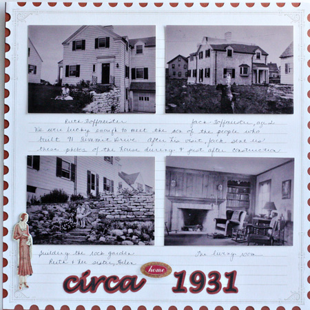
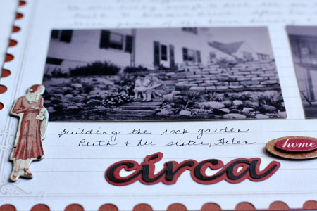
Circa1931

This page shows photos we received after a visit from the man whose family built our house in 1931.  The journaling documents the people in the photos as well as how we came to have them.

CircaCloseUp

One of the things I’ve learned how to do in the Silhouette class how to cut my own titles using the fonts on my computer. This week we learned how to weld the letters of a script font and create a shadow for the title. The chipboard accent is from Cosmo Cricket Circa 1934, which seems appropriate.
The first week’s assignment for Picture Inspiration was to take a self-portrait. I avoid these as often as possible and I didn’t take this until the last day possible. But I’m not unhappy with it and will eventually change my avatar since I finally have a photo that doesn’t use a mirror. I used my tripod and my remote and took it in my studio.

SP_PortraitPerfectw

Christmas Treats

  • by

I took two photography courses this month and will review them at the end of the week. One class was more technical and the other provided creative prompts. Both, however, encouraged taking photos of home-baked sweets. I knew I needed to take cookie photos for Sarah’s Christmas Cookie album, so I decided to try a little food styling.

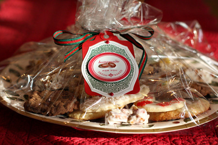
We give multiple cookie trays to neighbors and friends each year. Here’s a photo of one of the trays and the tags I made using Paptertrey Ink’s Everyday Treats set.

CookieTray2w

Just as I was setting up to take some photos, Matt showed up and got interested in the project. By the time we finished the kitchen looked like a tornado had hit it, but we had a great time. Here are a few of our photos.

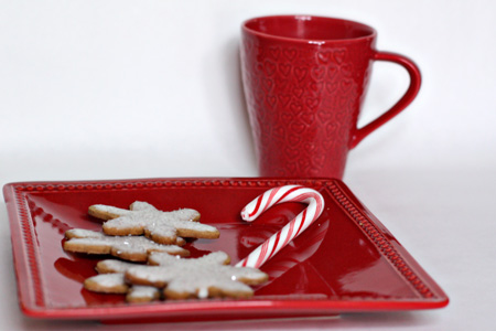
GingerbreadSnowflakesw

Gingerbread Snowflakes

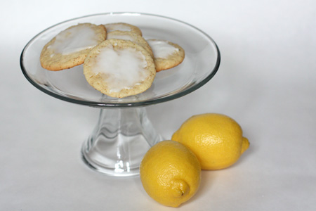
LemonDropsw

Lemon Drops

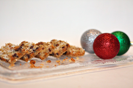
MagicBars3w

Magic Bars

MintChip2w

Double Mint Chocolate Chip

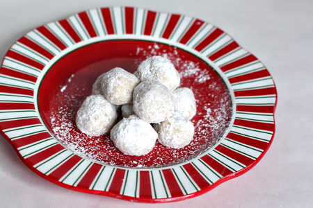
Snowballsw

Snowballs (Russian Tea Cakes)

SugarCookiesw

Sugar Cookies (always decorated by Dad)

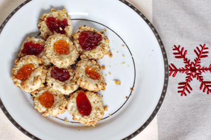
Thumbprintsw

Thumbprints

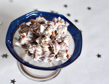
Candy3w

White Chocolate Crunch

I hope you had time to relax for a day or two after the holidays. I’ve enjoyed being totally laid back with no where to go and nothing in particular to do for a few days.

Picture the Holidays

  • by

I guess it’s not surprising, but I’m finding it hard to keep up with daily projects right now. I’m working away at the To Do list and realize that Christmas is just ten days away! I’m remarkably calm about it all, which is a bit of a surprise to me. I’ve been keeping a list of the prompts for Picture the Holidays and as I can, taking photos for them. Here are a few:

CandyHeart3w

December 3:  All You Need is Love

SummitDriveB&Ww

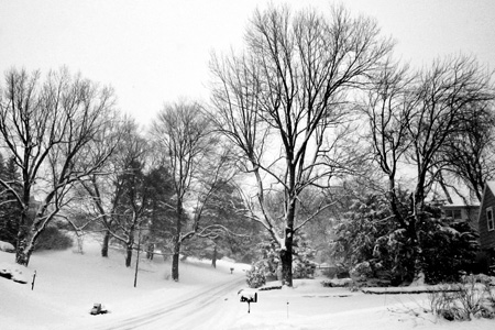
December 5:  The View From Here (We’ve had record snow for December.)

SantaSilhouettew

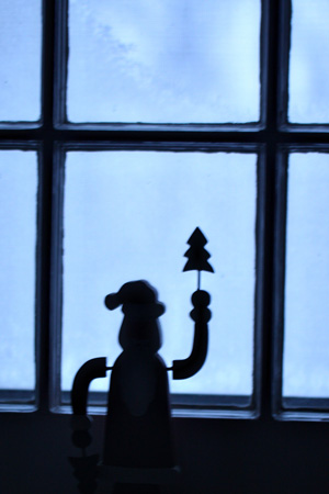
December 6:  Every Little Thing (This prompt was about capturing little details that you might miss. This little wooden Santa sits on the window sill in our bedroom. I was struck by the silhouette he made.)

FriendsSignw

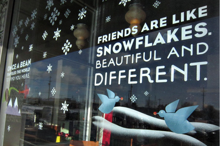
December 9: It’s a Sign

LightsFloorw

December 10:  Twinkle, Twinkle

Nativityw

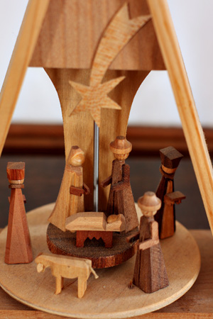
December 13:  Simply Divine (And a reminder about the true meaning of Christmas.)


Learn Something New

  • by

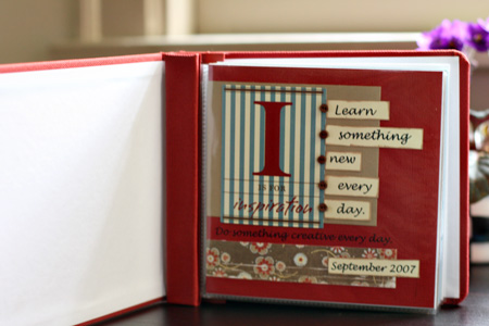
Truthfully, I was a bit surprised when I pulled out my album for Learn Something New. I did know that I had done a few pages, and that I had participated more than once, but I was quite surprised to see that I made the title page in 2007! In three years, I had created just ten pages. Nonetheless, it was really interesting to see what I chose to include. So here’s a little summary and three new pages for this year. I’ve been keeping a little list this year (although not as extensive as some of my friends, but I know I won’t do a page a day. I am hoping to finish my little album this year, however, so that next year I can try a different kind of project. I’ve seen lots of interesting ones since class began.

LSNTitlePg
I actually prepared for class the first year. I chose papers from Crate Paper and coordinating cardstock. Fortunately I kept it all together in a folder so each year I’ve had the papers all ready for the new pages. And I still like them!

LSNAlbum1-2
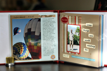
The first page was about practicing with auto-exposure bracketing and continuous shooting. We’d gone to a balloon festival and it was a great place to try something new. Page two is about Matt’s first day at Cornell. He’d had quite a rocky educational path, and this day was so important to him.

LSN3-4
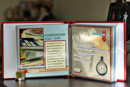
I was still teaching full-time when I started this album and page three is about making time for creative pursuits. The next page was done the following year (my first year of retirement) and I was still struggling with issues of time and my never-ending lists of projects.


LSN5-6 

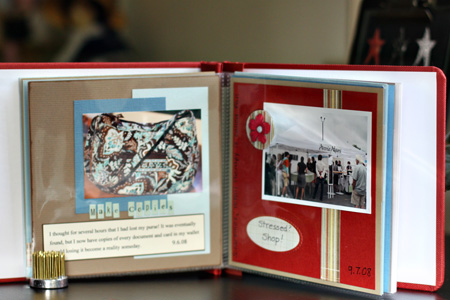
On September 6, 2008 I thought I had lost my purse, and this page was about making copies of every important card and piece of paper in your wallet. The next day’s lesson was “Sometimes retail therapy is called for.”


LSN7-8
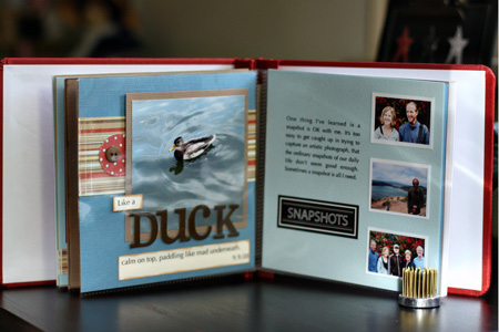
Page eight “Like a duck, calm on top, paddling like crazy underneath.” (Seems to be a theme here.) Page nine’s lesson is that every shot doesn’t need to be perfect or artistic. “A snapshot is OK with me.”


LSN9-10
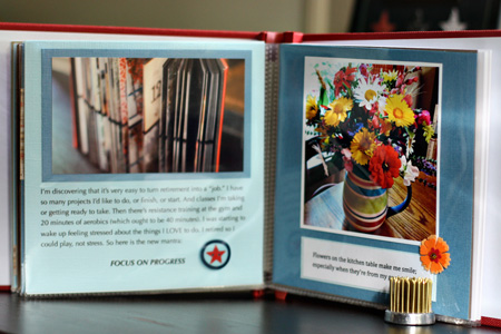
Page ten:  “Focus on progress.” Still obsessing about time.

Here’s the first page for 2010:


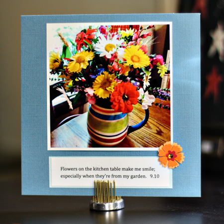
LSNFlowers
I love flowers and always have some on the kitchen table. Even in the dead of winter, we can get inexpensive flowers at the grocery store, but the ones from my garden are the best.


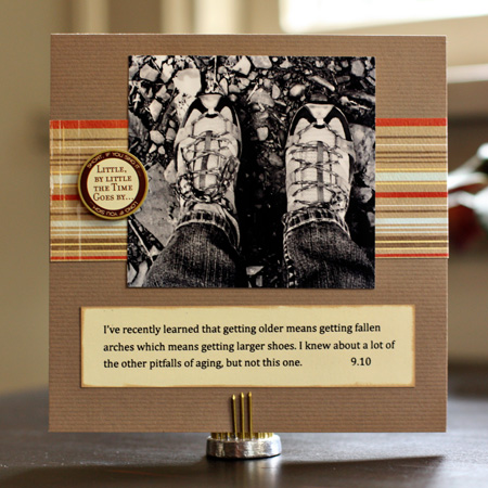
NewShoesLSN
These are my new hiking shoes, purchased after I discovered that my big toes were bruised from shoes that had become too short. (They fit fine a couple of years ago!)


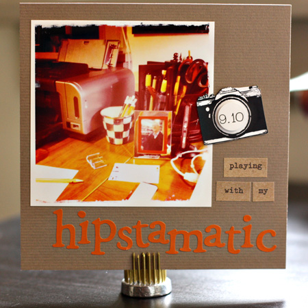
LSNHipstamatic
And it’s not a great photo, but it’s my first with my iPhone and the Hipstamatic ap. It’s also the first time I’ve ever printed directly from iPhoto, so I learned a couple of things yesterday.

Botanicals

  • by

Last week was the final class for Botanical Drawing. I could have well been intimidated by my fellow classmates as many of them have been coming for years, and some of them are professional artists. Their work is stunning. Mine, however, slowly improved and because it was such a supportive environment, I’m planning on returning for the fall semester. No, there are no drawings on this post, although there are a couple I’ve been willing to share. What I do have are some photographs from a brunch our instructor had at her home the last week. Deb lives right on Lake Ontario and her gardens are spectacular. So here are some botanicals, photographic style.

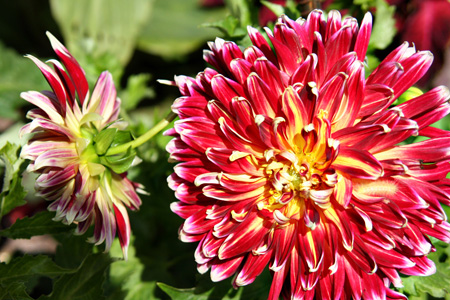
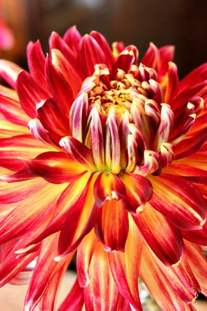
Dahlia1w 

DahliaClose2w 

DahliaClosew
Deb’s dahlias are huge and so beautiful.

Daisiesw

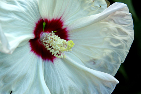
Hibiscusw

Podsw
I’d love to know what these are if anyone can identify them. I didn’t ask or take notes which turned out to be a big mistake. I have several photographs of flowers I can’t identify.

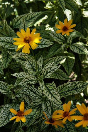
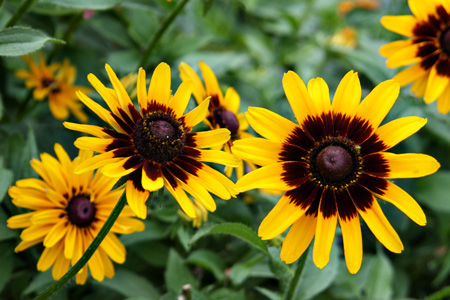
Rudbeckiaw 

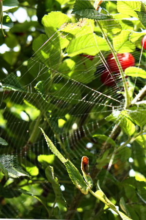
Web2w

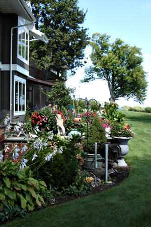
Here’s a view of one of many gardens.

Gardensw

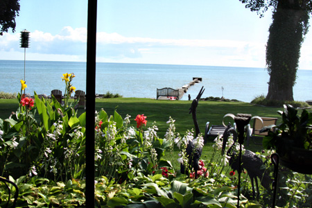
And the view from Deb’s screened-in porch.

PorchVieww

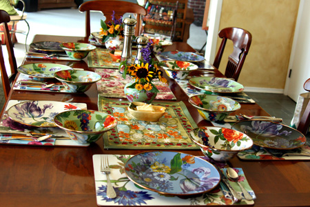
And, finally, the beautiful table she set for our brunch.

Tablew