Skip to content

Color Hues #85

  • by

It’s mid-April and time for a new Color Hues Challenge. Hannelie has chosen Yellow and Pink for this challenge. 
CH #85 Yellow and Pink.001

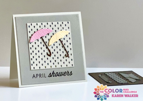
I was determined to create something a bit out of my comfort zone. The first card I created was just OK. I’ll send the card, but I wanted to try something else for the challenge. As I was looking through my dies I came upon a Memory Box die set (dated 2015) that I’ve had for many years, but never used. The images in Rain or Shine, are small so it took me awhile to figure out how to use them. The old familiar saying “April showers bring May flowers” was going through my head as I looked at the dies. The rain and the umbrellas were right there, but I needed to find the sentiment as well as some flowers. 
Showers

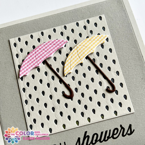
By lining up the “rain” image and repeating it I got a square of rain drops. The two cute umbrellas paper-pieced with old AMuse papers fit right on there. Luckily I had two of the (also very old) Papertrey Ink sets from the Monthly Moments sets that gave me most of my sentiment.
ShowersClose

I layered the umbrellas with two pieces of heavy cardstock and the handles with two of the handle die cuts for a bit of dimension.
Flowers


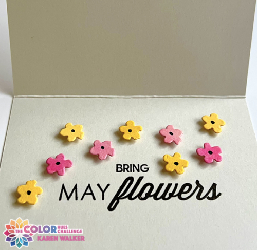
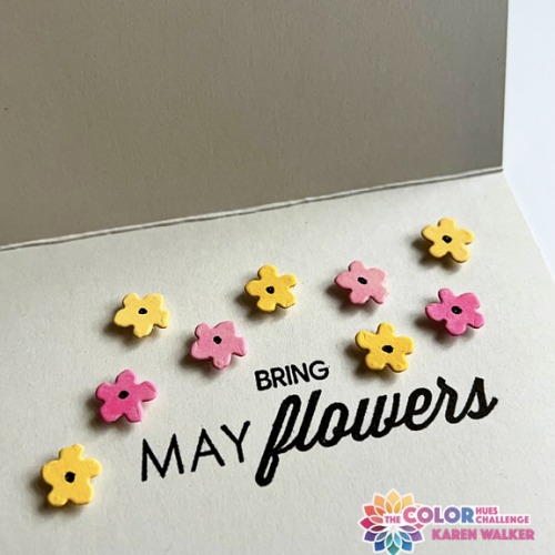
Finding the word “bring” turned out to be the most time-consuming part of the card. I could have used the computer, but I wanted the message to be on one layer. My collection of Christmas stamps turned out to be the best option. I found a couple different ones, but this one from Waffle Flowers Oversized Joy fit perfectly. I found the little flowers in The Greetery’s BotaniCut Strawberries set, and I popped them up with teeny pieces of dimensional foam.
FlowersClose

We’re hoping for lots of May flowers here, but the bulk of them won’t be planted until Memorial Day so there’s still lots of time for April showers. Personally, I’m hoping for lots of April sunshine!!! When this post goes live, we’ll be in South Carolina so we’re more likely to be enjoying sunshine than we would be in Rochester.

I hope this color combo inspires you to create a card for our gallery at Color Hues. Be sure to check out the Design Teams clever and beautiful cards!

This is going to the NBUS blog. This might be one of the oldest unused die sets in my collection! It’s also going to Juat Us Girls where the Word Week Challenge is Rain. How lucky am I as this challenge closes at 9:00 tonight!

NBUSWordWeek722


Color Hues #84

  • by

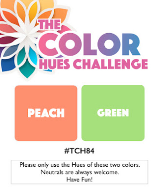
Peach and Green are the new colors for the April 1st Challenge at Color Hues. Cindy has chosen the duo, and I had a lot of fun with it.

CH #84 Peach and Green.001

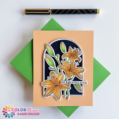
Rather impulsively I ordered the February Clear Stamp and Die of the Month from Spellbinders. I have no regrets. It was just perfect for this challenge, and I’m a big fan of lilies!
CH84

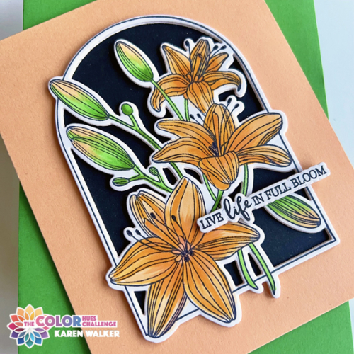
The feature that sold me on the set was the die cut which cuts the arched frame and all the inside areas at once. After coloring the image with Copic markers, I backed the arch with black cardstock, and the lilies just popped! Concord and 9th recently introduced a new set of colors. I usually invest in a sampler pack, and it arrived just as I was trying to find a piece of peach cardstock. Their Creamsicle paper was just what I needed. 

CH84Close

The stamp set included several lovely sentiments as well as the dies to cut them out. I added some dimensional foam behind the arched lilies, and then stacked several sentiments to provide more dimension. 

April usually hold some promise of consistent Spring weather in western New York, so hopefully we’ll soon see lilies beginning to peek through in the garden. In the meantime, hop over to the Color Hues blog to see the what the Design Team and our Guest Designer have created. We hope you’ll join us!

Thanks to this new stamp and die set, I’m likely to be one of the first in the gallery at Darnell’s April NBUS post.  I’m also posting this in the Seize the Birthday Challenge: Spring Florals, and The Four Seasons Challenge: Anything Goes

NBUS03-28-SpringFloralFour Seasons Spring 24

Color Hues 83

  • by

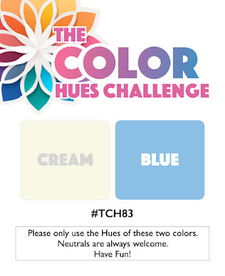
CH # 83 Cream and Blue.001

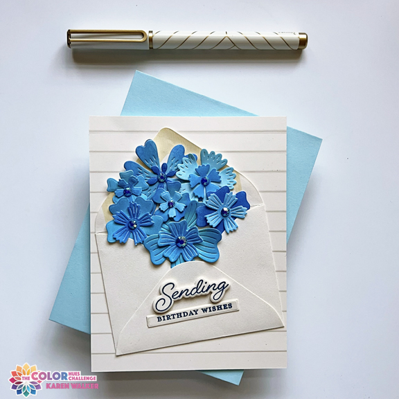
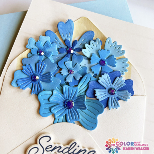
Carol has chosen Cream and Blue for the next Color Hues Challenge. I started out with one idea in mind and ink blended a group of white diecut flowers from My Favorite Things, Bold Blossoms, using two sets of Pinkfresh inks. The next morning, I totally revised my plan, but the ink blended flowers are still the centerpiece of the card. I decided to stuff an envelope with pretty blue flowers. The envelope die I own wasn’t nearly large enough, but I had exactly one small cream envelope in my stash, and it worked out perfectly.

CH83 copy

The sentiment stamp and die are new–part of the Greetery’s Love Letters release in January–Sent with Love Sentiments. To add some dimension to the greeting I stacked three of the diecuts under the stamped sentiment. Altenew’s Window Slats 3-D Embossing folder worked well as a background.

CH83Close copy

Instead of the die cut centers for the flowers I added a Pinkfresh Studio jewel to each. They add just the right amount of sparkle.

This turned out to be a fun challenge, and I hope you’ll think so, too, and join us in the gallery at Color Hues. You’re sure to find lots of inspiration from the Design Team members and our Guest Designer, Steph.

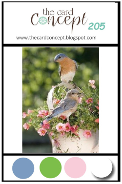
Since this is the debut of the new sentiment set, I’m sending this over to Darnell’s March NBUS Challenge. It also fits with her Dies/Die Cuts weekly “challenge” as this is the last day of Week 2. I’m also entering this in The Card Concept Challenge: Spring Has Sprung where a basket of flowers is a focal point of their inspiration photo. 

NBUSTCC205 March 2024


Color Hues #82 – Two for One

  • by

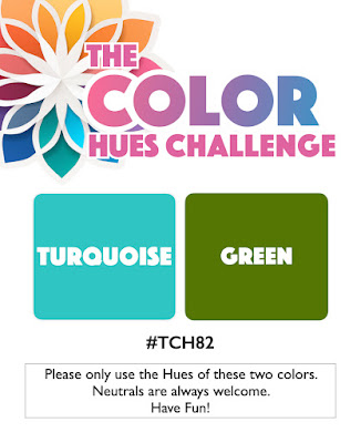
Tracey has chosen a beautiful color combination for the new Color Hues Challenge:

CH #82 Turq. and Green.001

Right away I knew I wanted to use my new Alex Syberia stencil, Modern Weave. It’s a 6X6 stencil so I had two panels I could use for cards.

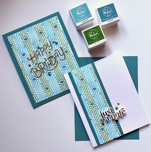
CH82X2

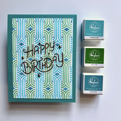
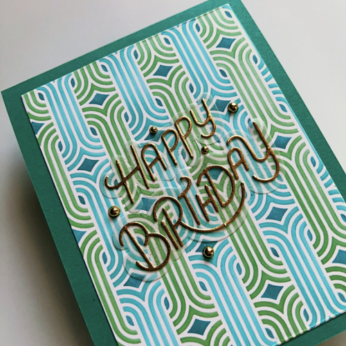
I started out by using the larger panel and adding it to a card base made with Concord and 9th’s Oceanside, a beautiful dark turquoise which matches the small diamond pattern in the stencil. You can see in this photo, the three Pinkfresh Studio inks I used to stencil the design.

CH82Birthday

Here’s a closer look. The sentiment also new to me, My Favorite Things Stylized Happy Birthday, was die cut from gold metallic paper and layered on a vellum shadow die.

CH82BDClose

After die cutting the first panel, I was left with a narrow strip of patterned paper and wanted to make good use of this gorgeous stenciled design.

CH82Note

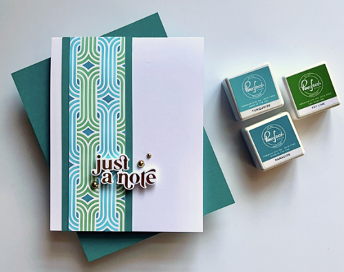
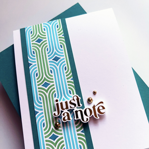
I backed the stenciled piece with some of the Oceanside cardstock and added it to a white notecard. 

CH82NoteClose

The sentiment, foiled in gold, is from Pinkfresh Studio’s Perfect Sentiments. Needless to say, this card pleases me with its CAS design. I embellished both cards with some gold pearls.

I hope you’ll check out all the great designs from the Color Hues Design Team and our Guest Designer, Tenia. Please join us for this bright and happy color challenge! 


There are two CAS challenges where my second card fits the challenge: AAA Cards: Anything CAS Goes and Addicted to CAS: Geometric. 

AAA259 ATCAS_253_Geometric


Color Hues #81

  • by

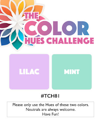
A new Color Hues Challenge is live, and Stef is our wonderful hostess. She’s chosen Lilac and Mint as our inspiration.

CH #81 Lilac and Mint.001

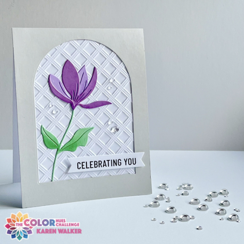
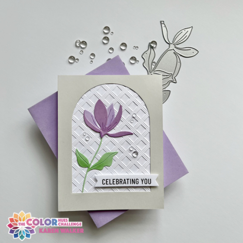
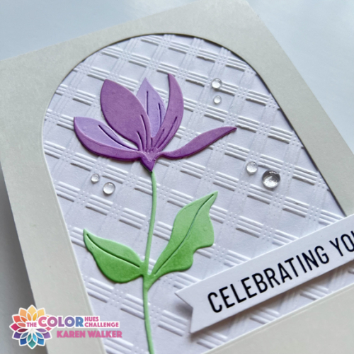
I’m continuing with my goal to use all my unused products this year and started out with an elaborate die set. About halfway through the process, I totally changed directions, choosing a new die from Simon Says and a new 3-D embossing folder from Altenew. I love the simplicity of the Fresh Cut Floral and the Basic Plaid embossing folder added wonderful texture to the background.

CH#81

The floral was die cut with “Lilac Grace” cardstock from Papertrey Ink, adding a darker hue from a 6X6 paper pack from Memory Box. The leaves were die cut from “Mint” by Paper Source. I wanted a bit more dimension so added some soft ink blending to the leaves and petals with Catherine Pooler’s “Wintergreen” ink, and Simon Says “Lilac” ink. 

CH#81Flat

The arched design is a CASE of a card by Joan Bardee that was posted on the Spellbinder’s blog. I die cut the “Soft Stone” cardstock with an arch from Ellen Hutson’s Essential Arches. The sentiment is from Pinkfresh Studio’s Basic Banners: Celebrate. I added some clear Raindrops by Lucy’s Cards to finish it off. 

CH#81Close

I’m always happy with a Clean & Simple card and glad to have another birthday card in my stash. I hope you’ll hop over to the Color Hues Blog and check out the wonderful cards created by our Guest Designer, Bonnie, and the Design Team. Hope to see your creations in the gallery in the next couple of weeks.

I’m sending this off to the Seize the Birthday: Anything Goes and the Simply Clean and Simple Challenge–Anything Goes.  And another one for NBUS! I’m hoping to fill Darnell’s gallery in the next few weeks with Never Before Used Schtuff!

STB-AnythingGoesSCS blog headerNBUS


Color Hues #80

  • by

It’s an unusual occurrence, but this is my second post of the day. My post as the Guest Designer for the AAABirthday Challenge went live at 3:00 this morning due to a time difference in England. 

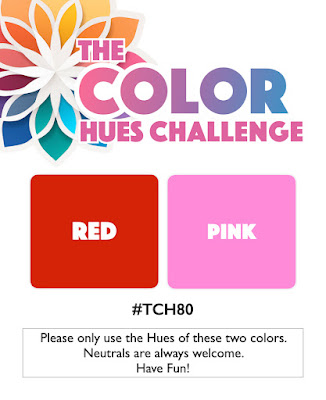
It’s February 1st and time for a new Color Hues Challenge. Sheri is our hostess this time and has chosen Red and Pink. Perfect for Valentine’s Day if you’re so inclined. And check out our new graphic–an awesome design!

#TCH80.001

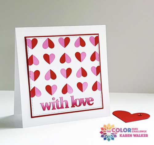
My card could easily be a valentine, but I was somewhat surprised to find I had several valentines left over from last year. I’m thinking this is more likely going to be an anniversary card for close friends of ours. I do have to make new valentines for the five grandchildren, but this one doesn’t seem quite right for any of them. 

CH#80watermark

I’ve kept my New Year’s Intention in a big way here. Every product I used was in my To Be Used Box of products purchased, but not used. I’m quite happy with all of them. I started by stenciling Papertrey Ink’s Happy Hearts with Kitsch Flamingo and Lumberjack Red Distress Oxide inks, masking off the bottom of the panel for a space for the sentiment. I die cut the panel as well as a slightly larger red panel with dies from Gina K’s Master Layout #3. I use her Master Layout #1 all the time, and purchased several more versions during sales over the past year. It’s way past time to put them to use.

CH#80FlatWM

The sentiment was die cut with a very recent purchase during the after Christmas sale at Waffle Flower. The Print and Script with Love die includes two versions of the words as well as shadows for all of them. I chose the block print ones and die cut them from a scrap piece of paper that I ink blended with the two Distress Oxide inks. 

I hope you’ll hop over to the Color Hues blog and check out all the amazing designs by our Guest Designer, Bobby, and the Design Team. We look forward to seeing what you create in the gallery.

If all goes as planned I’ll be on Day Four of a Tanzania Safari Tour when this goes live, and most likely will be checking out your creations on my return. Aside from lack of time, my understanding is internet service is hard to come by. Nancy, our fearless leader on Color Hues, has graciously offered to cover for me while I’m gone. It’s an incredible offer as she’s one of the busiest card makers I know as well as running two challenge blogs. Many thanks, Nancy!

Color Hues #79

  • by

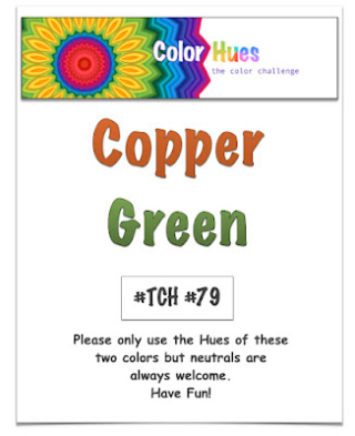
The new Color Hues Challenge is up, and I’m the hostess this time. I chose Copper and Green with a metallic planter and green plants in mind. 

CH #79 Copper and Green.001

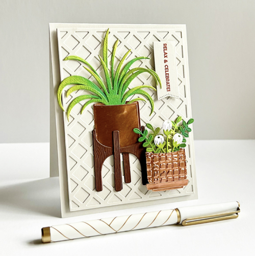
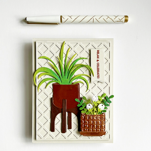
I didn’t post the first card I made on the Color Hues site, but I’m including it at the end of this post. I wasn’t 100% happy with it, and after seeing a card by my friend Kelly, created with The Greetery’s  Modern Planters I decided to do a remake. I had reward points at The Greetery which paid for a portion of the new purchases. I’m happy I own the planters as well as Plant It: Spider Plant as I think there will be lots of opportunities to use them.

CH#79-1

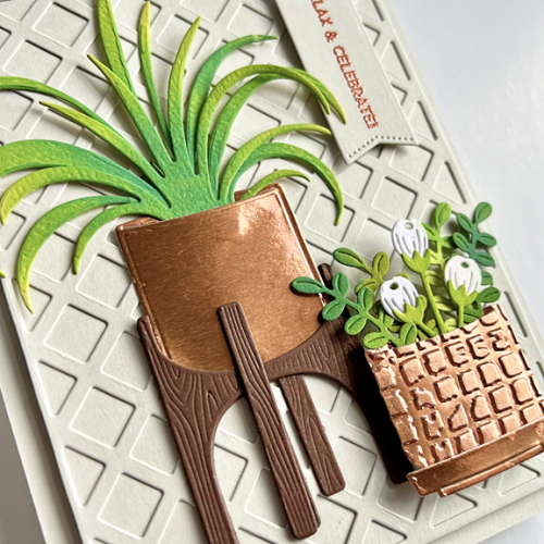
The planters come in two sizes with a stand and a saucer. I took advantage of all of them. With some copper metallic cardstock, I die cut the two pots, and ran the small pot through a Sizzix embossing folder for some texture and dimension.  The spider plant ink blended with some Distress Oxide inks after it was die cut from a yellow/green cardstock. I needed some plants for the smaller pot and found them in the Spellbinder Bold Blooms die set. 

CH#79-1Flat

I decided on Papertrey Ink’s Soft Stone cardstock for the background and die cut the smaller panel with Ellen Hutson’s Lattice Background die. I mounted it on the card base with dimensional tape.

CH#79-1Close

You can see the shine better here as well as the sentiment embossed with Copper Pearl Embossing Powder which has been in my stash for awhile. 

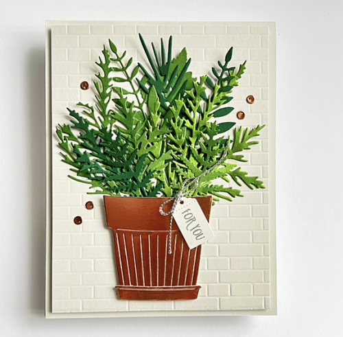
Here’s the first card I made. There’s nothing wrong with it, exactly, it just didn’t seem interesting enough. I’m sure I’ll find a good home for it one day.

CH#79-2

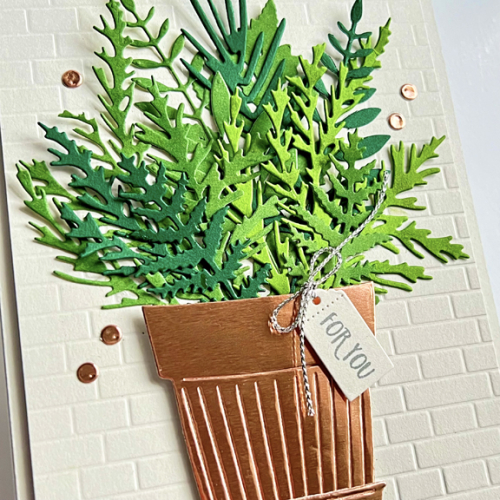
The background here is an embossing folder from Taylored Expressions, and the greenery came from a number of dies. The Pretty Pot is from The Greetery as is the tag and sentiment.

CH#79-2Close

The copper embellishments were die cut with a berry die since I didn’t have any copper gems or pearls.

Hop over to the Color Hues blog and be inspired by our Guest Designer, Greta, and the Design Team. I’ll be looking for your cards in our gallery!

I’m sending the first card to Darnell’s NBUS Challenge – my third entry which means I’m doing a better job of using new and unused stamps!

Color Hues #77

  • by

As we did last year, we’re having just one challenge for Color Hues in December so the challenge is open until December 28th at 9:00 am.  Nancy is our hostess and chose the beautiful combination of Pink and Silver.

Ch #77 Pink and Silver Anim.

CH77

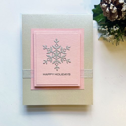
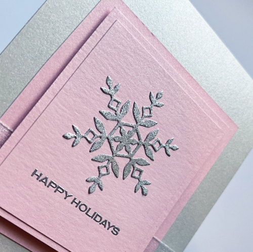
My first thoughts were that I’d use a snowflake or two with a pink card. But in looking through my desk two days ago, I found a commercially made card I’m quite sure I purchased for the design and then totally forgot about it. I have to say, it might be one of my favorite cards ever! I love the way it’s layered with the dimension coming between the second and third layers. I ended up with two pieces of shimmer cardstock–one pink from Broadway Paper in Milwaukee and the silver from Papertrey Ink. 

CH77Flat

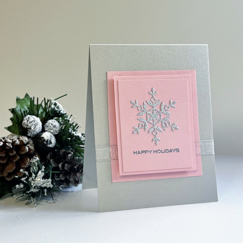
After adhering the first layer of pink shimmer I wrapped a piece of silver ribbon around the front piece of the card, hiding the ends behind the next two layers. The first layer was added with dimensional tape, and the second after I attached the silver glitter snowflake and embossed the sentiment in silver. The snowflake is Kate Snowflake from Simon Says, and the sentiment is from Reverse Confetti’s Christmas Card Greetings which I purchased during their going-out-of-business sale. This is the first time I’ve used it, but I love the simple, small font so I know you’ll see it again, perhaps with a different sentiment. 

CH77Close

This angle gives you a better sense of the shimmer and glitter, but it’s best, of course, in real life!

I hope you’ll join the festivities at Color Hues this month. If you’re a cardmaker you may be in the same predicament I’m in–too little time and not enough Christmas cards. Here’s a great opportunity to add one or more to your stash, and our gallery! Hop off to see the inspiration from our guest, Amanda, and the Design Team on the Color Hues blog.

I’m sending my card on to the Time Out Challenge: Winter/Holiday.

Badge TO Challenge 252 (1)


Color Hues #76

  • by

Jules has chose a wonderful color combination for our new Color Hues Challenge.

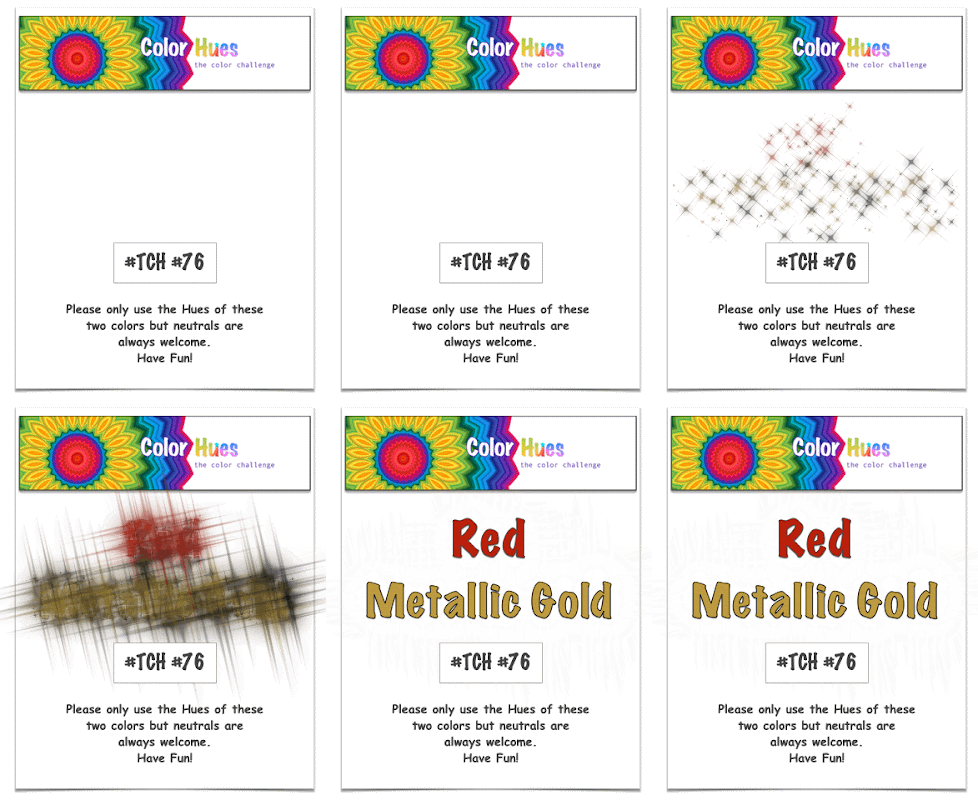
CH #76 Red and Met. Gold Anim.

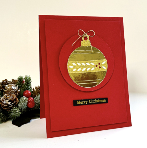
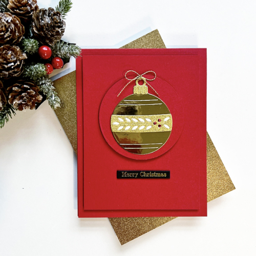
There was no doubt in my mind that I wanted to create a Christmas card. When I flipped through my holiday dies I found The Greetery’s Jumbo Curiosity Round Ornament. I’m not sure if I’ve ever used it before, but I ended up making a card for this challenge and another one I’ll share later. 

CH76

I die cut the ornament from gold mirror cardstock which always poses a challenge when you want to photograph it, but it certainly fills the bill for Gold Metallic. The red card base and circle are my favorite red cardstock, Pure Poppy by Papertrey Ink. The hanger for the ornament was die cut with gold glitter paper as well as the band in the middle. 

CH76Flat

After adding the band to the ornament, I inlaid some cream shimmer paper and some red metallic paper for the berries.  The sentiment is from a new packet I purchased this year from Memory Box called Greeting Tags. They come in a variety of fonts, but what I love about them is their thickness–no need to add any dimension. 

I’m way behind in making holiday cards this year, so it’s good to have another one in the stash. I hope you’ll take time to visit the Color Hues Blog to see the creativity of our Guest Designer, Claire, and the Design Team. And please join us if you can!


Color Hues #74

  • by

It’s mid-October already and Hannelie has gifted us with a new color combination for the Color Hues Challenge:

_CH #74 Yellow and Kraft._001

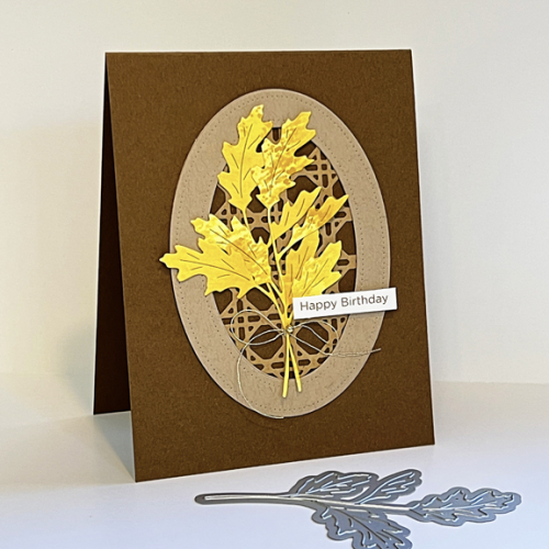
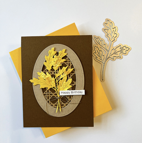
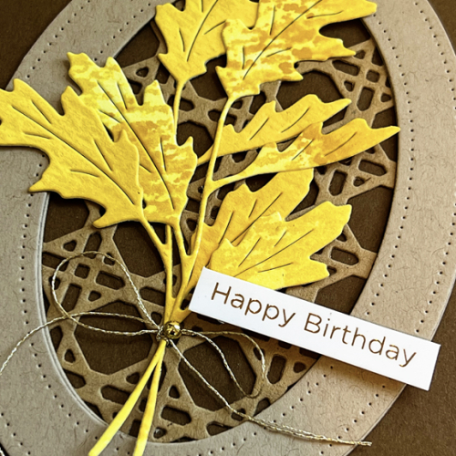
When I sat down to create a card for this challenge, a new leaf die from Pinkfresh Studio was sitting on my desk. The Fall Leaf felt like a good place to start. I have to admit that the rest of the elements took a lot longer to create than I anticipated, but when they all came together, I was quite happy with the card. I tried some ink smooshing for the first time in a long time, adding three different yellows to the mix, and letting the watercolor paper dry between the layers. 

CH#74

From the start, I wanted to incorporate The Greetery’s Woven Cane Background.  I ended up smooshing a piece of Classic Kraft in a mixture of Classic Kraft and Honey Nut inks. Being standard cardstock, it didn’t take as well to the well ink smooshing, but worked out fine when die cut with the Woven Cane Bakcground and used behind a Pierced Oval Frame from Papertrey Ink cut with Classic Kraft.

CH74Flat

I tied the leaves together with a piece of gold metallic thread from Altenew and added a tiny gold pearl to the bow. 

CH#74Close

The sentiment is gold foiled from The Stamp Market’s Foiled Card Phrases. 

I know you’ll find lots of inspiration from the Design Team, so click through and check out the amazing variety of cards. Hope to see yours in our gallery!

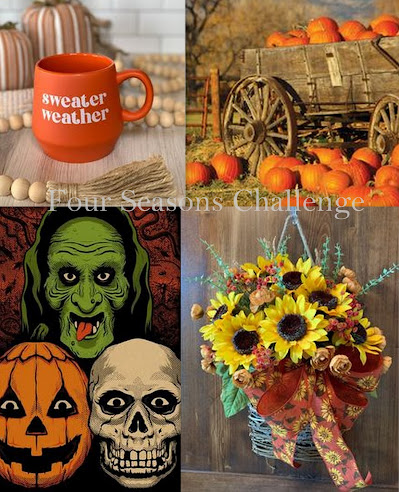
I’m adding my card to the mix at the Four Seasons Challenge where the challenge is Anything Goes for Fall. The challenge always posts an Inspiration Board to get you started, but it’s not required that you take anything specific from it. Other than two of the colors in the bottom right photo my inspiration really came from the color challenge and the fall leaf die on my desk!

2023 October Board

Color Hues #73

  • by

Cindy is the hostess this month and has chose Coral and Blue for the next Color Hues Challenge. My mind went first to florals, but I had the new Greetery All Aglow that had been siting on my desk for far too long, and decided to play with it instead.

CH # 73 Coral and Blue Anim.

In August there was a challenge to create a shaped card. I was away and never got to it, so I decide to pull our Ellen Hutson’s Essential Arches to create my card.

CH#73R

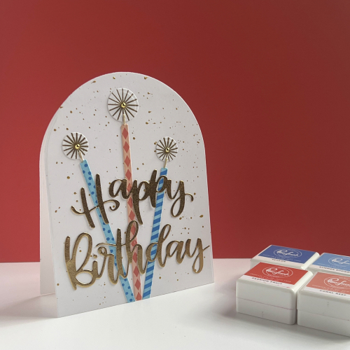
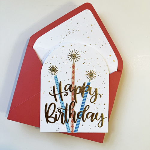
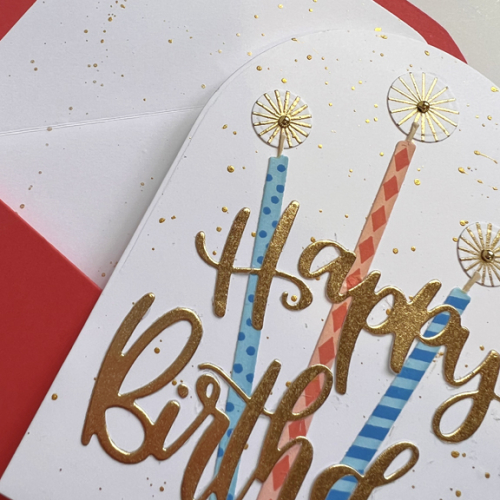
The coral background ended up looking darker than it is—I’m having ongoing photography issues which I’m working to resolve. The closest match I had for cardstock was Papertrey Ink’s Berry Sorbet and I used it for the background and for the envelope I made (see below) with Ellen Hutson’s A2 Envelope die. I used two Pinkfresh Studio coral inks and two blues when I stenciled the candles. 


CH#73Flat2

The light’s a bit better in this photograph. I’m hoping to get some consistency soon! I splattered gold paint on the background of the card and also on the envelope liner with one of the Gansai Tambi Starry Colors.  I didn’t purchase the stamp set for All Aglow, but found a stamp in Papertrey Ink’s Hello, Sunshine set that worked for the “glow” behind the wicks of the candles once they were embossed in gold.  I used the dies from All Aglow to cut them out. 

CH#73Close

The die cut sentiment is My Favorite Things Hand-lettered Happy Birthday cut with my favorite gold paper from Michaels. Three gold pearls finished the card.

As always, there’s loads of inspiration from the Design Team at Color Hues and our three special guest designers:  Jolanda, Trina P, and Fran, so pop over, take a look, and then create a Coral and Blue card for our gallery! 

Color Hues #72

  • by

Today, I’m honored to announce a very special Challenge at Color Hues!  

In conjunction with our normal Color Challenge, The Color Hues Design Team and a few guests, from our sister challenge Seize the Birthday, are participating in a Blog Hop! 

Collectively as a team and with other crafters, we are hopping in memory of our dear friend, fellow cardmaker, and Design Team member, Lindsey Martin-Penny, who sadly passed away last year from a rare and aggressive form of Ovarian Cancer. 


The purpose of this hop will be to honor Lindsey, celebrate her life and all that she loved, as well as spread the word to raise funds for Clear Cell Ovarian Cancer Research.  

How can you Help? You can find all the fabulous details and the start of the hop at Emily’s Blog HERE!

In honor of Lindsey, the Design Team has created a variety of cards using her favorite color combo of Purple and Red.

CH #72 Purple and Red Anim.

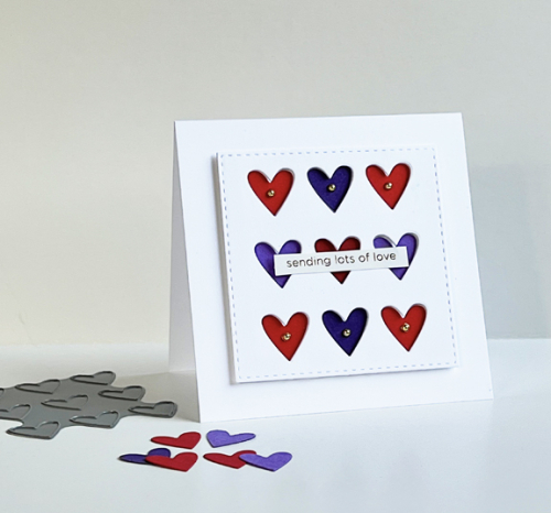
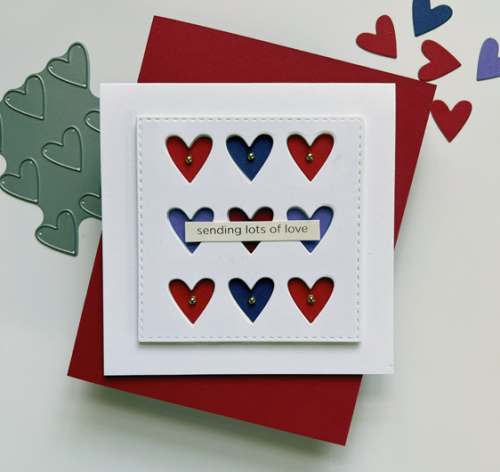
In honor of Lindsey, I chose a CAS design with hearts of red and purple. I’m not quite sure where I first saw the technique of using recessed die cuts, but I think it was one of Laura Basson’s cards. It worked perfectly for this card.

CH#72

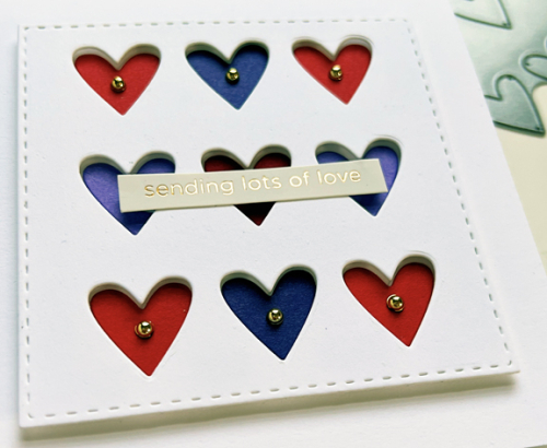
I first die cut a square of 110# Neenah cardstock with one of the Simon Says Stitched Rectangles and popped it up with dimensional tape on a square cardbase. Using Simon Says TicTacToe dies, I cut hearts in two hues of red and two hues of purple, and adhered them to the card base.

CH#72Flat2

The sentiment was a preprinted one from The Stamp Market’s Foiled Card Phrases. The final touch was to add a gold pearl to six of the hearts.

CH#72Close

I hope you’ll join the Color Hues Design Team and our Special Guests, Barbara and Glena from Seize the Birthday Challenge, and create a card in red and purple in honor of Lindsey. Please hop along and support the cause in any way you can!

Color Hues #70

  • by

The new Color Hues colors chosen by Steph are just perfect for summer. There are so many directions these colors could take you. My choice turned out to be quite different than I originally thought when I first saw the new colors. 

CH #70 Red and Yellow.001

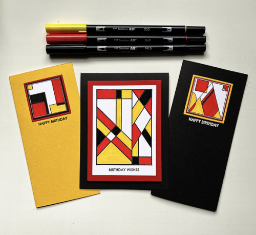
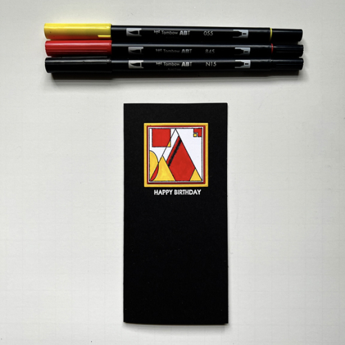
Earlier this summer, I saw some wonderful cards by Uniko. I just love the graphic design and think it will work especially well for both masculine and feminine cards as well as for a variety of occasions. Using them continues my streak of using new or unused stamps for my Color Hues cards. This is the fifth month in a row. 🙂

CH70X3

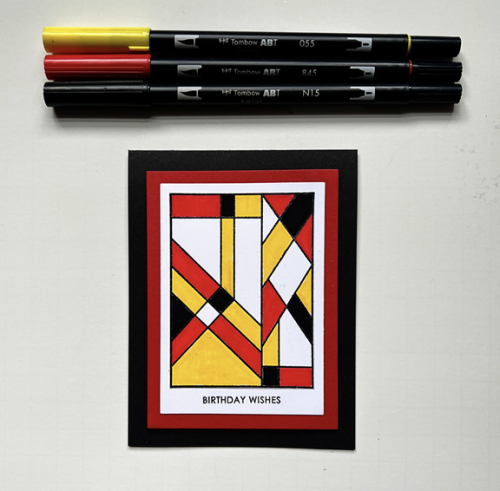
I do have to say that coloring the center card using Uniko’s Background Blocks Arts Decoratifs turned out to be a challenge. The red Copic marker bled every time I tried to use it, even when I embossed the stamp so I switched to Tombow markers and that red marker bled out of the lines once, too. I finally managed to get a clean coloring, and I do think it was worth the effort. 

CH70

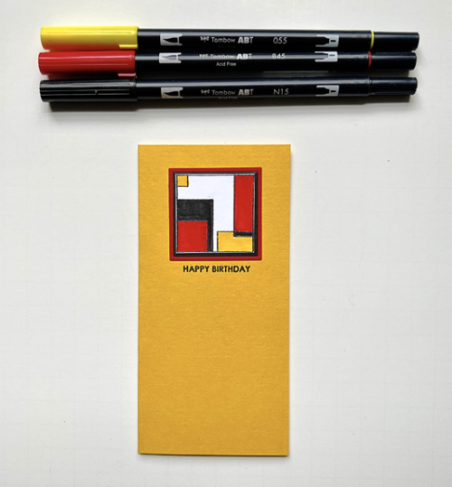
My original idea for the card, however, was to use some of the smaller designs from the Bauhaus Blocks set. There are four different designs, and I tried using three of them on a card but couldn’t find an arrangement I liked, so I went Clean and Simple—always a good decision. The layers on all three cards were cut with Ellen Hutson’s Essential Rectangles. Her Essential Shape dies are some of my most used dies. 

 CH70SLYellow

CH70SLBlack-R

All three sentiments are from Sugar Peas Everyday Sentiments. 

Be sure to check out the great designs by our Guest Designer, Annette, and my fabulous team members at the Color Hues blog, and join us with your Red and Yellow cards!


Color Hues #69

  • by

Organizing and cataloging my supplies is an ongoing process. Earlier this summer, I moved all my stencils to a three-ring binder which makes it much easier to flip through them to find what I want. As I was going through them, I discovered the Waffle Flower, Layered Triangle Stencil which I had purchased earlier, but never used. I’m quite sure I bought it because I thought it would be good for a Color Hues challenge and indeed, it is. 

Sheri has chosen a great combination for us this time: Teal and Orange.

CH #69 Teal and Orange Anim.

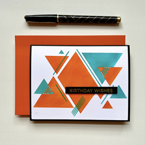
I’m always a fan of geometric patterns, and I think they make particularly good cards for guys, although I wouldn’t mind getting this card myself.

CH69

I used two Concord & 9th inks for this: Oceanside and Marmalade. The stencil takes up nearly all of an A4 card, but I trimmed it down just enough to have a narrow black border from the card base.

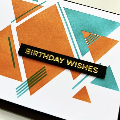
CH69Close

The gold foiled sentiment is from the Spellbinders’ Everyday Sentiments 2. Since the card base is black, I decided to add a white panel to the inside and stenciled two of the triangles on it as well. I didn’t think any embellishments were needed. 

CH69Inside

The inside sentiment is from Papertrey Ink’s Inside and Out Birthday.

I hope you’ll join us during the next two weeks and be sure to check out the Color Hues blog to see the amazing cards created by our Guest Designer, Deborah, and the Design Team. You’re sure to be inspired.

I’m also adding this to the current Inkspirational Challenge: Use Stencils, and to the August NBUS since it’s a first time use of the stencils.

Inkspirational Stencil Challenge Template NBUS


Color Hues #68

  • by

Our newest Color Hues challenge is up, and it’s another great combination: Olive and Berry.

CH #68 Olive and Berry .001

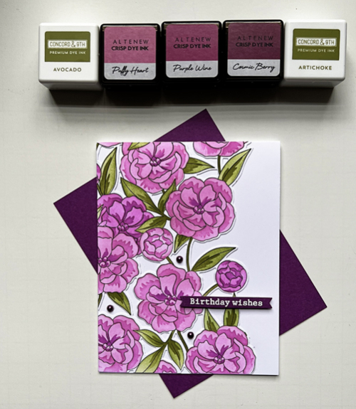
At first I wasn’t sure a lighter berry color would work, but truly, Color Hues is named that way so that different hues of the basic color can be used. In the end I chose three Altenew inks that were designed to go together with the darkest one named Cosmic Berry. Finding olive inks was easy as Concord and 9th has a great combo.

CH68Inks

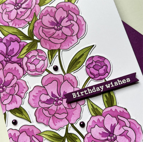
Keeping with my determination to use new stamps, I broke out one of my newest purchases, Pinkfresh Studio’s Pretty Blossoms.  It’s a full card rubber stamp with coloring stencils and a very interesting die that cuts out all the spaces between the flowers. It’s easier to see with a closer view.

CH68Close

I love the layering stencils and the variation in color you can create in a relatively brief time. 

CH68

The sentiment is also from the Pinkfresh, from the Floral Vase set. “Beet” cardstock by Paper Source was a great match for the darkest color in the floral so I embossed the sentiment in white and die cut it with the Itty Bitty Banner die from My Favorite Things. Luckily I had some beautiful berry pearls in my stash which finished the card.

There’s a wonderful variety of cards (as usual) from the Color Hues Design Team and our special Guest Designer, Bonnie. After checking out the inspiration there, I hope you’ll come and join us!