Skip to content

Color Hues #67

  • by

Marcia is our hostess at Color Hues this week, and she’s chose a rich color combination:

CH #67 Merlot and Navy Anim.

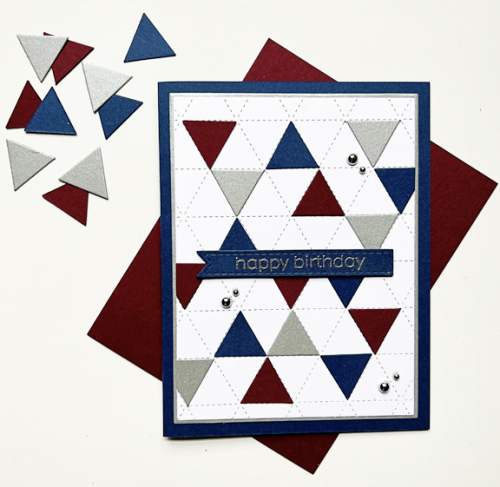
When planning this card I had two objectives: use a new-to-me but never used product (I have far too many of these) and create a masculine birthday card.
CH67

The closest paper I had is a bit deeper merlot than in the challenge logo and is from Paper Source. The navy cardstock is Concord & 9th’s Midnight paper. I was rather disappointed the last time I ordered it to discover it’s now a brighter navy than the previously released Midnight which was the darkest navy I owned. The wonderful Concord & 4th Triangle Background was the starting place. I die cut the small triangles from the merlot and navy cardstock as well as some silver shimmer paper from Paper Source.
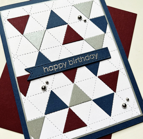
CH67Close

This angle shows the shimmer a bit better. I embossed the sentiment from The Greetery and die cut it with one of Simon Says Stitched Banners, and stacked it up with three additional banners die cut from navy. That piece had been die cut with the smaller rectangle from Gina K’s Master Layout #1, and I layered it on a larger rectangle from the silver before adding it to the navy card base. I debated about using the silver pearls, but think they are just fine even for a masculine card. 

I’m sure you’ll find lots of inspiration from the Design Team and our Guest Designer at the Color Hues blog, and I hope you’ll add your take on these colors to our gallery during the next two weeks. 

I’ll be sending this off to the new July NBUS since I’m happy to have another Never Before Used Stuff off that list!

NBUS

Color Hues #66

  • by

I’m the hostess this round for Color Hues, and I’ve chosen two colors specifically so I could play with a wonderful Spellbinders die set that a friend loaned me. These colors definitely say SUMMER to me, and we’re finally seeing the warm temperatures and sunshine.

CH #66 Yellow and Green .001

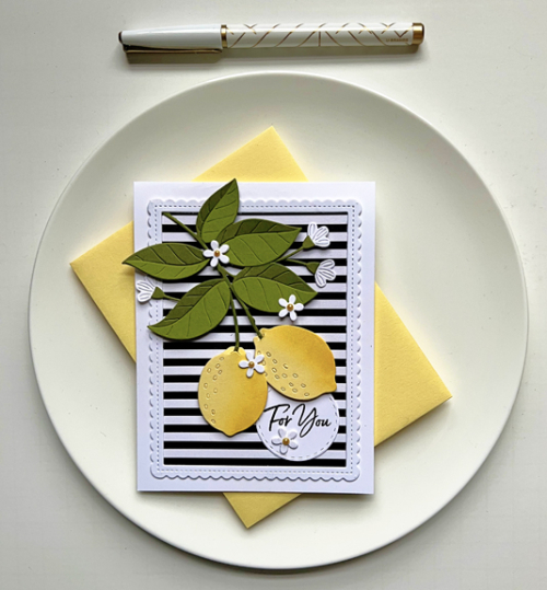
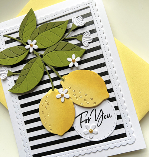
This die set of lemons and pretty white flowers makes such a happy card. I chose a sentiment that can be used for a variety of occasions, so it could easily be sent as a birthday card or a encouragement card.

CH66

Papertrey Ink’s Lemon Tart was the perfect color (and name!) for the lemons. For the leaves I chose Gina K’s Asparagus and The Stamp Market’s Leafy. One of the things I particularly like about these dies is all the detail that they add. I did do a bit of ink blending to add more dimension to the lemons and added tiny yellow pearls to the flowers.

CH66Close

I backed the pretty stitched scalloped frame with some black and white striped paper from My Favorite Things. The sentiment from Waffle Flower was stamped on a Stitched Circle from Simon Says.

Please hop over to the Color Hues blog to see what our Design Team and our fabulous Guest Designer, Michele Ferguson, have created with this color combo. It’s sure to inspire you, and I hope you’ll add your cards to our gallery in the next two weeks!
I’m throwing my card into the ring at the Double D Challenge: Lemon-Ade and the Yellow Challenge.

DD yel23

Color Hues #65

  • by

We arrived home 0n Monday from a fabulous tour of Portugal and Spain. I’ll have lots more to share in a week or so. The tour lived up to all our expectations–and more. This post was written before we left. I’m anxious to get back to the crafting table, but it will probably be another day or two. Today is the first of June and time for the new Color Hues Challenge.

Red and Aqua are such a happy combination, and Jules is our hostess at Color Hues this round.

CH #65 Red and Aqua.001

I’ve chosen a Pinkfresh Studio Suite of products, Farm Fresh, for this challenge. It was another of the products we received as part of the Create and Connect even in February, and one of my favorites.  

CH65R

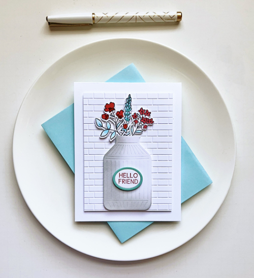
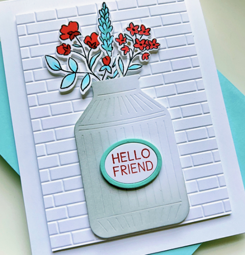
Despite several layers all with dimensional tape, it’s quite a CAS card. I chose to color the flowers with Copic markers rather than the accompanying stencils. The card photographed darker than it really is, and even photo editing didn’t quite fix it. There’s definitely more shading in those florals than is shown here. I used an embossing folder from Taylored Expressions, Subway Tiles, to create a backdrop for the milk can full of flowers.

CH65Close

I added some shading in gray to the milk can and die cut two ovals from white and aqua papers for the sentiment which also is included in the Farm Fresh set. I briefly toyed with the idea to layer the focal images on either an aqua or a red card base, but decided the clean look of white was much better.

Please hop over to the Color Hues blog to see what the Design Team and our Guest designer have in store for you! Then help us fill the gallery with your Red and Aqua creations!

Color Hues #64

  • by

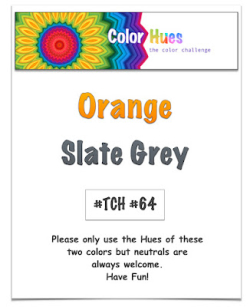
Julie has chosen a color combination I have always loved for this round of the Color Hues Challenge: Orange and Slate Gray. I have multiple orange sweaters which look great with gray, and a couple of very lovely gray and orange print scarves. 

CH #64 Orange and Slate Grey.001

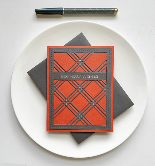
The cardstocks I chose for this were Simon Says Slate (perfect name!) and Gina K’s Tomato Soup, which is a darker hue of orange than the graphic above. One great thing about this two color challenge is the “hues” part of our name which allows for quite a bit of variation in color. 

ColorHues64

I’m trying to focus on using different techniques for the Color Hues challenges. Two challenges ago, I had a floral that was stamped and colored with stencils, and the last challenge was a geometric hot foil plate colored with stencils. This time it’s another graphic design but with Waffle Flower’s Triple Line Diamond Panel which I die cut from the gray paper. It was layered on a top folded orange card. Next up was to choose a sentiment, and after much deliberation, I chose a sentiment from Spellbinders hot foil plate: Everyday Sentiments II which was foiled in silver and die cut with one of Simon Says Sentiment Labels.

ColorHues64Close

Instead of adding embellishments. I die cut a portion of the panel again in metallic silver paper and inlaid some of the diamonds to coordinate with the silver foiled sentiment.

I hope you’ll jump over to the Color Hues blog and see what the rest of the Design Team and our Guest Designer have created, and join in the fun with your orange and gray cards!

When you read this, I’ll be about halfway through a tour of Portugal and Spain! Before the pandemic we took a tour with the same company to Morocco, and I was so tired at the end of the day, I had no energy for the internet so I’m anticipating a break from technology while we’re away. I know there won’t be any action here on the blog, but I may try to upload some photos to my Instagram account. 

Color Hues #63

  • by

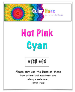
Hannelie is our hostess for the May Day Color Hues challenge. It’s a bright and vibrant combo, and I cased myself this time around.

CH # 63 HOt Pink and Cyan.001

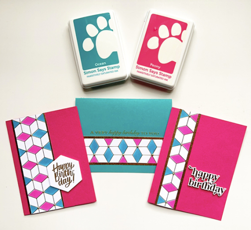
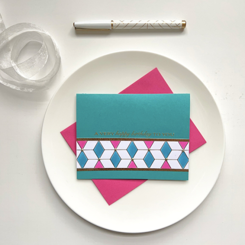
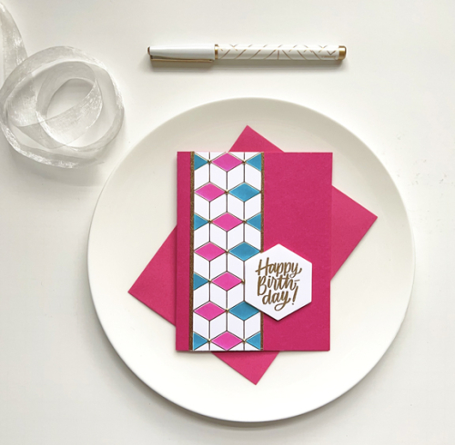
In February I created a set of masculine cards using one hot foiled panel of Geo Blocks by Pinkfresh Studio. For those cards I used only one stencil and one color of ink to create the pattern. This time I used the same stencil but alternated colors–using Simon Says Positively Saturated Inks in Peony and Ocean. They were a good match for the two cardstock papers I that were closest to hot pink and cyan: Concord & 9th’s Oceanside and Paper Source’s Fuschia. Just by changing colors, the cards are much more feminine. 

CH63X3

CH63-1

CH63-2

CH63-3

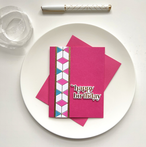
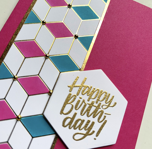
After cutting the hot foil panel in three pieces I added them to the card fronts with narrow strips of gold paper. The sentiments are exactly the same as I used on the earlier set. From the top:  a hot foiled sentiment from Pinkfresh Studio’s Wonderful Words, a gold embossed sentiment from Papertrey Ink’s Banner Sentiments, and a gold embossed sentiment stamped and then die cut with Simon Says Hexagon Greetings. I did add some dimensional tape to the back of the hexagon greeting. 

CH63Close

It’s easier to see the gold embossing and hot foiling as well as the gold pearls that were add to all three of the cards.

Please join us in the next two weeks and add some bright and happy pink and cyan cards to our gallery. For inspiration, be sure to check the Color Hues Blog to see what the Design Team and our Guest Designer, Kristin,  have created.


Color Hues #62

  • by

Cindy has chosen a great color combination for this round of Color Hues: Purple and Green.

CH # 62 Purple and Green.001

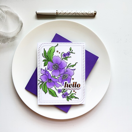
I couldn’t resist the chance to break out Pinkfresh Studio’s Nothing But the Best stamp, stencil, and die set. It was part of the package that I received for the February Create and Connect event. We used watercolors in class, but I chose the stencils this time. 

CH62

Over time I’ve acquired a few sets of Simon Says Pawsitively Saturated Inks which are fabulous for ink blending and come in set of three. I used the two lighter shades for the large flowers and then the darkest shade for the centers of the small flowers. The centers were colored with a gray Copic marker, and I added some dimension with a black Glaze pen.

CH62Close

After die cutting them, I arranged the florals on the large Rounded Braided Rectangle that was also included in our kit, but was made available during the March release. The gold foiled sentiment and Gold Glitter Drops are also from Pinkfresh Studio.

I hope you’ll check out all the amazing cards created by our Guest Designer, Amanda, and the Design Team on the Color Hues blog, and then add your own creative take to the gallery. 

Color Hues #61

  • by

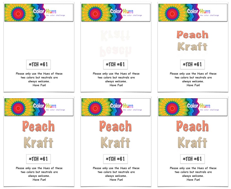
It’s April first, and there’s no fooling around here! I’m back to share the next Color Hues Challenge chosen by Stef:

Color Hues #61 Peach and Kraft Anim.

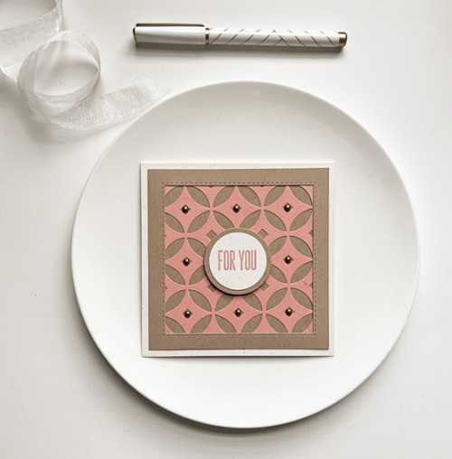
One of the things I love most about this challenge is working with color combinations I would never think of myself. This is one of them, and I turned to a new favorite coverplate of mine,  Decorative Circles by Papertrey Ink. I waited a long time for this to be back in stock, and it was worth the wait. It covers an A2 sized card, but this time I cut it down to create a square card.

CH61

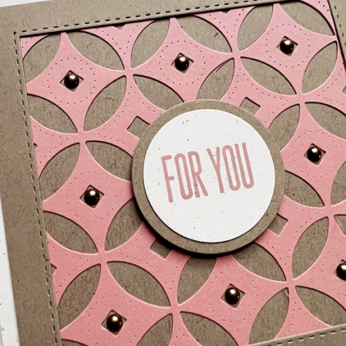
My best match for peach cardstock was Concord & 9th’s Grapefruit which I paired with Classic Kraft and Rustic Cream, both by Papertrey Ink. I created a frame using Simon Says “Stitched Squares” die.

CH61Close

I wanted a simple sentiment on a circle die to coordinate with the coverplate, so used Ellen Hutson’s Essential Circles die. The sentiment is from Waffle Flower’s Classic Sentiments. Finally I added some Pinkfresh Studio Metallic Enamel Dots to the center of each circle. 

Please hop over to the Color Hues blog to see what our Design Team has created with this color combo. It’s sure to inspire you, and I hope you’ll add your cards to our gallery in the next two weeks!

Color Hues #57

  • by

One of our new Design Team members, Jules, chose this round’s colors. It’s not one I would have thought of, but it makes a lovely floral.

CH # 57 Coral and Sage.001

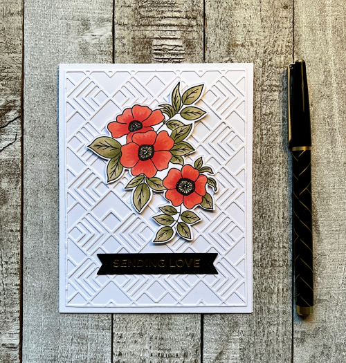
Initially, I wanted to create a card with a more geometric or patterned feel, but you can see I ended up with a floral from Simon Says Best Friend Ever stamp set. I pulled out some coral and sage cardstock and matched the Copic markers to that before coloring, using two markers on the leaves and two on the petals. 

CH57R

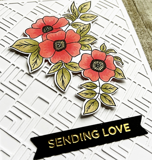
For the background, I chose Pinkfresh Studio’s  Deco Tiles coverplate which I love–especially when it’s tone on tone. And it helped satisfy my desire for some geometric design in the card. In the photo below you can see the pretty gold foiling from the Spellbinder’s hot foil plate Everyday Sentiments.

CH57Close

Making the card wasn’t a struggle, but photographing was a whole other story. Trying to get the light right for the foiled sentiment did change the light on the rest of the card as well. I finally had to just settle for what you see. 

I hope you’ll join our two Guest Designers and the Design Team at Color Hues during the next two weeks. 


Color Hues #56

  • by

Sheri has chosen two colors that are perfect for Valentine’s Day for this Color Hues Challenge. Although I gave thought to other occasions for which this color combination would work (and there are plenty!), I went with the obvious. 

Color Hues #56 Pink and Red .001

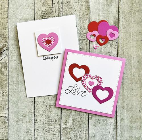
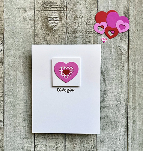
I ended up with two cards created with one die—one totally minimalist card and one CAS card. I die cut one of the heart designs from Simon Says Geometric Builders: Hearts four times: once in red, twice in different shades of pink, and once from a cute piece of patterned paper I found in my stash. I also die cut some whole hearts to use as a base if needed.

CH56X2

My husband wasn’t terribly fond of the minimalist card, but I’m perfectly happy with it. 

CH56

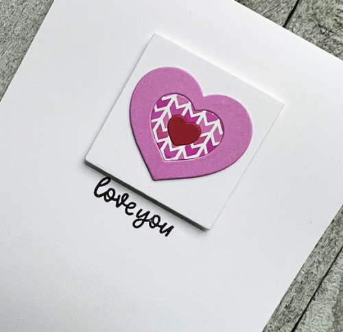
The sentiment is from Waffle Flower’s Classic Sentiments. I layered the heart onto a small square cut with an Ellen Hutson’s Essential Squares die and added it to the card base with some dimensional tape.

Ch56Close

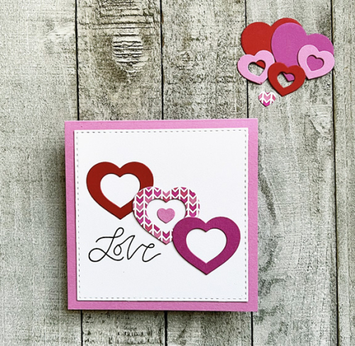
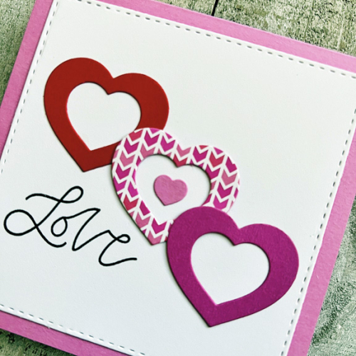
The second card using pieces left over from the first design, and a square format worked best for this card.


LoveCH56

I layered the Stitched Square by Simon Says onto a pretty pink card base. This sentiment is from Papertrey Ink’s Just Sentiments: Valentine set.

LoveClose

Whether it’s a valentine or a card for another occasion, I hope you’ll join our Guest Designer and the Design Team at the Color Hues blog and fill up the gallery with wonderful cards!

It turns out that other challenges have valentines on their mind as well. So I’ll be joining in with the TicTacToe Challenge where the middle row down is Hearts, Free, Shade of Red. And Just Us Girls where HEART is the word for word week there.

TTTC-192JUGS

Color Hues 55

  • by

Happy New Year! And what could be a better way to start than with a new Color Hues Challenge? Nancy has chosen the colors for this round of the Color Hues Challenge. It’s an elegant combination, and I decided I wanted to gold emboss a floral design and do some watercoloring. I don’t think I used watercolors for any of my Christmas cards this year. Here are her colors:

Color Hues #55 Anim.

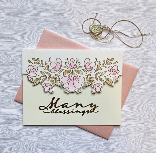
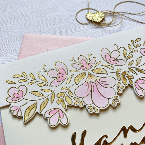
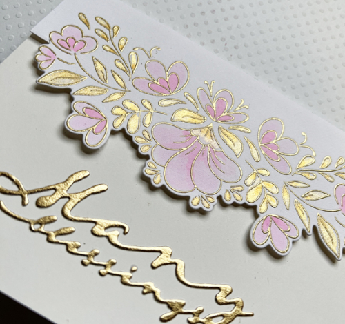
In just a few months I will need a wedding card for a dear friend so I chose the Pinkfresh Studio Charming Floral Border to watercolor.

ManyBlessings

I used the Altenew 36 pan watercolors (one hue of pink watered down for the lighter color) and two colors of gold from the Gansai Tambi Starry Colors metallic watercolor set.

ManyBlessingsClose

BlessingsClose2

It’s easy to see the pretty metallic sheen in these photos. It’s the first time I’ve ever tried partial die cutting, but it worked perfectly.  The sentiment was die cut from gold metallic paper with one of Papertrey Ink’s Scripted dies. The inside sentiment reads “on your wedding day.” (The watercolor paper by Altenew and the Ivory (Simon Says) card base appear to match much better in real life than in the photograph.)

You’ll be able to find much more inspiration on the Color Hues blog by the Design Team and our Guest Designer. Although we were sad to say good-bye to Kristie Goulet in December, we’re excited to have Jules Peddicord, Marci Hill, and Stef Perry join our Design Team. You’ll be thrilled by all their creations!

Color Hues #54

  • by

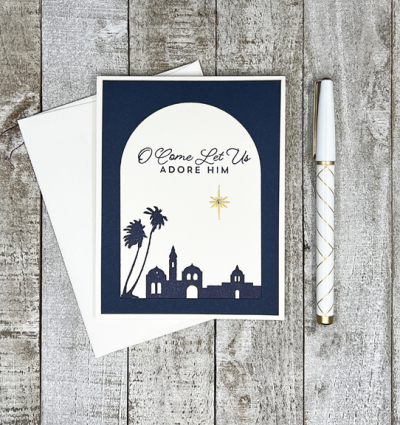
It’s my turn to be the hostess at the Color Hues Challenge this month—and it is a month-long challenge. I chose Navy and Cream, knowing I’d need more holiday cards and that my Jewish friends would find Navy and Cream a good combination for Hanukkah cards as well. And, because the holidays will be over before the challenge ends, Navy and Cream will work for many occasions beyond the holidays.

CH #54 Navy and Cream Anim.

As I did for our last challenge, I created a set of cards. This time I varied the sentiments. 

NavyCream

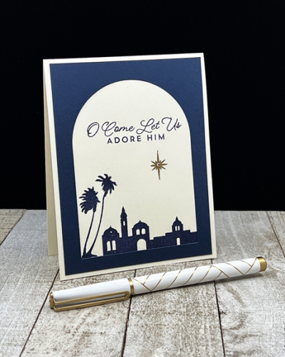
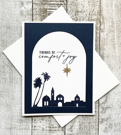
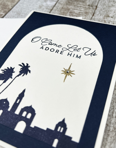
I began by die cutting a rectangle from Papertrey Ink’s Dark Indigo paper, and then cutting an arch with Ellen Hustson’s Essential Arches die. 

NavyCreamClose

On the cream card base, I stamped the Bethlehem silhouette in Dark Indigo ink as well as the sentiment. I embossed a gold star and added a rhinestone for some sparkle before overlaying the navy arch.

NavyCreamFlat

The beautiful silhouette is from Spellbinder’s Three Kings stamp set as is the first sentiment. The card below uses a different sentiment from Pinkfresh Studio’s Our Home to Yours.

NavyCreamFlat#2

I hope you’ll take advantage of the month-long challenge and join us at Color Hues. For some inspiration, head over to the blog to see what the Design Team and our guest designer have created.

Color Hues #53

  • by

The holidays are sneaking up on me once again, but Julie’s choice of Scarlet and Green for this round of the Color Hue Challenge is perfect timing.

Ch #53 Scarlet and Green Anim.

I’ve been working on creating sets of holiday cards this year, so there are ten of these.

ScarletGreen

I purchased Simon Say’s Holiday Sprigs stamp, stencil, and die set last year, but never used it. (I already have a list of products I want for next year, but I’m restraining myself from any purchases until I’m ready to make the cards! Using what I have must come first.) I love using layering stencils with stamps and it certainly speeds up the process when making multiple cards.

ScarletGreenClose

I used two shades of red and green for the stenciling to give the flowers and sprigs some dimension. Once the stenciling was complete, I die cut two flowers and sprig, attaching the flowers with a bit of dimensional tape.

ScarletGreenFlat

I love this sentiment from Simon Say’s Inside Christmas Greetings–not only the sentiment itself but the more modern combination of fonts. It turned out to be perfectly sized as well. The focal panel was added to the card base with dimensional tape. It’s nice to have another set of cards ready to go.

Scarlet and Green screamed holiday to me, but there are other options to be sure. Check out the cards by the Design Team and our guest at the Color Hues blog and play along!

Color Hues #52

  • by

Hannelie has chosen the next color combination for our Color Hues Challenge: Mustard and Turquoise.

CH #52- Turq. and Mustard Anim.

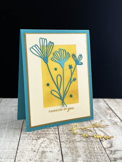
Hannelie is one of the most creative and talented card makers I know, so I’ll be curious to see what she’s come up with this time around, particularly since I found this combination quite challenging. I turned to die cuts as I often do.

MustardTurquoise

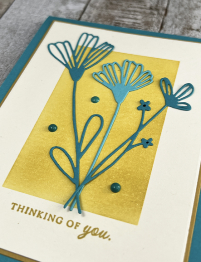
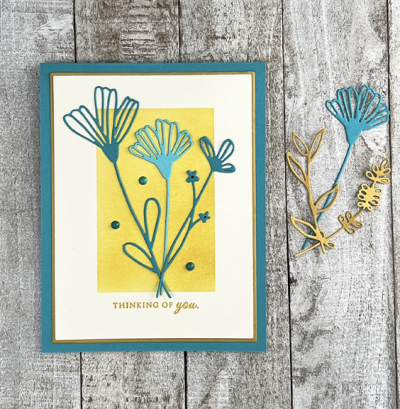
I started by ink blending a rectangle with a Taylored Expression stencil on cream cardstock with Concord and 9th’s Stardust ink, the only mustard ink and cardstock in my stash. 

MustardTurquoiseClose

After stamping the sentiment from Papertrey Ink’s Autumn Abundance set, I die cut the main panel with Gina K’s Master Layout #1 and then the slightly larger panel from Stardust for a thin border.

MustardTurquoiseFlat2

I die cut several flowers and stems with Pinkfresh Studios’s Dainty Blossoms from both Concord and 9th’s Oceanside and Papertrey Ink’s Hawaiian Shores. I ended up using only the turquoise dies, and added a few enamel dots for embellishment. 

Hop over to the Color Hues blog and see what Hannelie, the Design Team, and our guest have created. It’s sure to be inspirational. And then, come play along!


Color Hues #51

  • by

We have another pretty fall color combination for you this round at Color Hues: Orange and Green. When this post goes live I’ll be visiting with my daughter in Wisconsin, and expect to see lots of green and orange foliage on the trip there and back. 

CH #51 Orange and Green.001

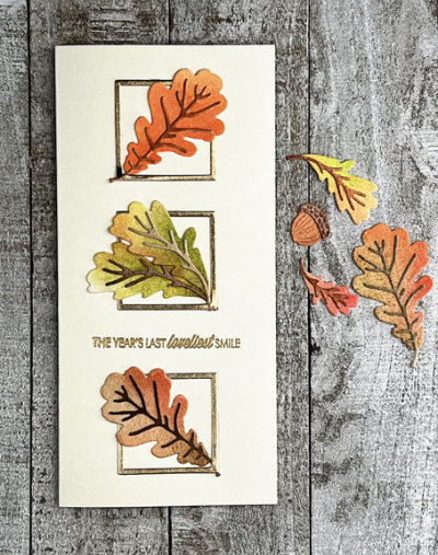
And foliage is what I chose when designing this card.

OrangeGreenFlat2
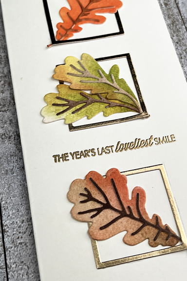
I die cut some leaves from the Greetery’s Botanicut “Mighty Oak” set and applied some green and orange Distress Inks with daubers. Once that was done, I die cut three small squares from gold metallic paper with Ellen Hustson’s “Essential Squares,” using only the frames and arranged them on an ivory mini slimline card base before tucking in the leaves.

OrangeGreenClose

The sentiment, embossed in gold, is from the Papertrey Ink “Monthly Moments: September” set—one that’s been in my collection since early in my scrapbooking days. 

I hope this color combination inspires you to create a few fall-themed cards–birthdays, Thanksgiving, even Halloween, perhaps. Be sure to check out the inspiration on the Color Hues blog by the Design Team and our guest.


Color Hues #50

  • by

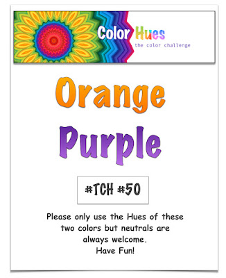
Carol chose the new colors for this round at Color Hues, and in my opinion, it is just perfect for Halloween.

Color Hues #50 Orange and Purple.001

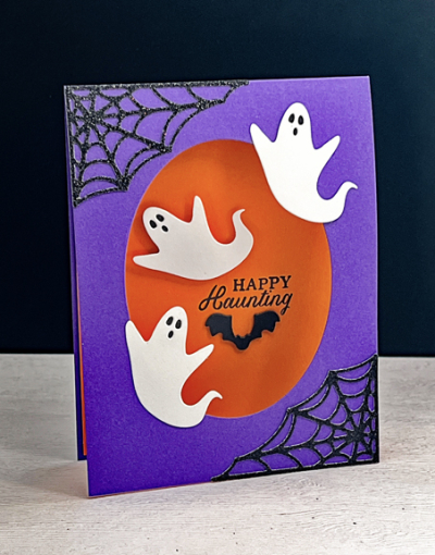
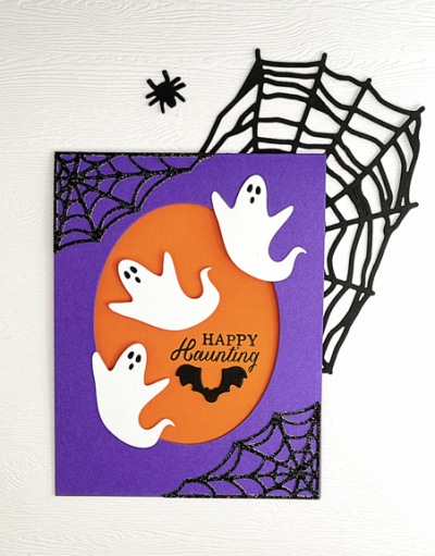
Although the card didn’t end up the way I envisioned it, I had so much fun creating it, and the end result is so much better than what I first envisioned.

OrangePurple

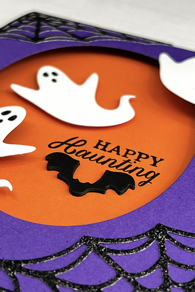
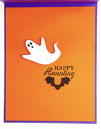
I pulled out Royal Purple (Simon Says) and Orange Zest (Papertrey Ink) for the card. After die cutting an oval into the front of the top folded purple card, I added a piece of orange to the inside of the card. Then I added the spider webs in glittery black cardstock which were die cut last fall with a friend’s die. The “Scary Ghosts” are from Poppy Stamps, and I backed their eyes with a scrap of black cardstock. The ghost on the inside of the card is adhered with dimensional tape and the others were adhered to the front of the card, partially floating as ghosts are apt to do.

OrangePurpleClose

The sentiment is from Hero Arts, “Witch Feet” set, and the bat is die cut with one of the images from Spellbinders “Spooky Boo” which I cut three times and layered for some more dimension. Here’s a look at the inside of the card.

OrangePurpleInside

So, one Halloween card down, and four to go! 

OrangePurpleFlat

Not everyone on the Design Team thought “Halloween” when the colors were announced, so be sure to hop over to the Color Hues blog and take a look at all the inspiration. We’d love to have you play along!